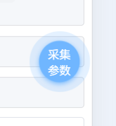
效果图:
部分代码:
javascript
<view class="topBtn" :class="{ 'disabled': disabled }" :style="{
				left: `${position.x}px`,
				top: `${position.y}px`
			}" @touchstart="onTouchStart" @touchmove="onTouchMove" @touchend="onTouchEnd">
			<slot></slot>
		</view>
javascript
.topBtn {
		position: fixed !important;
		z-index: 9999 !important;
		width: 100rpx !important;
		height: 100rpx !important;
		background: #3c9cff !important;
		border-radius: 50% !important;
		display: flex !important;
		align-items: center !important;
		justify-content: center !important;
		box-shadow: 0 4rpx 12rpx rgba(60, 156, 255, 0.6) !important;
		cursor: pointer !important;
		user-select: none !important;
		touch-action: none !important;
		/* 注意:这里不再对按钮本身做 pulse 动画 */
	}

	/* 脉冲光环 - 使用伪元素 */
	.topBtn::before {
		content: '';
		position: absolute;
		top: 0;
		left: 0;
		width: 100rpx;
		height: 100rpx;
		border-radius: 50%;
		background: #3c9cff; /* 和按钮同色 */
		opacity: 0.6;
		animation: pulseRing 2s infinite ease-out;
		z-index: -1; /* 在按钮下方 */
	}

	@keyframes pulseRing {
		0% {
			transform: scale(0.8);
			opacity: 0.6;
		}
		70% {
			transform: scale(1.4);
			opacity: 0.2;
		}
		100% {
			transform: scale(1.6);
			opacity: 0;
		}
	}