鸿蒙学习实战之路:状态管理最佳实践
状态管理是 HarmonyOS 开发中非常重要的一部分,它用于管理应用程序的数据状态和界面交互。本文将结合华为开发者联盟的官方最佳实践,介绍 HarmonyOS 中的状态管理方案和最佳实践。
关于本文
本文基于华为开发者联盟官方文档《状态管理最佳实践》整理而成,旨在帮助开发者快速掌握 HarmonyOS 中的状态管理技巧。
官方文档传送门永远是你的好伙伴,请收藏!
- 本文不能代替官方文档,所有内容均基于官方文档+个人实践经验总结
- 基本所有章节都会附上对应的文档链接,强烈建议你点击查看
- 所有代码示例建议自己动手尝试一下
- 如果英文水平不是很好,善用浏览器翻译功能
状态管理概述
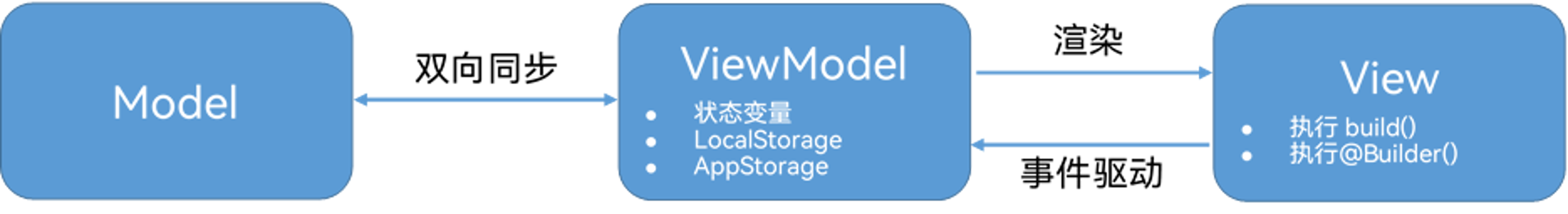
在声明式 UI 编程范式中,UI 是应用程序状态的函数,应用程序状态的修改会更新相应的 UI 界面。ArkUI 采用了 MVVM 模式,其中 ViewModel 将数据与视图绑定在一起,更新数据的时候直接更新视图。
在 HarmonyOS 中,状态管理用于管理应用程序的数据状态和界面交互。有效的状态管理可以帮助开发者:
- 提高代码的可维护性和可测试性
- 减少组件间的耦合度
- 优化应用程序的性能
- 提供更好的用户体验
HarmonyOS 提供了多种状态管理方案,包括:
- 组件级状态管理:使用
@State、@Prop、@Link等装饰器 - 父子组件间状态传递:使用
@Provide和@Consume装饰器 - 全局状态管理:使用
AppStorage和LocalStorage
组件级状态管理
1. @State 装饰器
功能说明 :@State 装饰器用于定义组件内部的状态变量,当状态变量的值发生变化时,组件会自动重新渲染。被@State 装饰器修饰后状态的修改只会触发当前组件实例的重新渲染。
实现步骤:
- 在组件中定义
@State装饰的状态变量 - 在组件的
build方法中使用该状态变量 - 当状态变量的值发生变化时,组件会自动重新渲染
代码示例:
typescript
import { State, Component, Entry, Text, Button, Column, FlexAlign, FontSize, FontWeight } from '@kit.ArkUI'

@Entry
@Component
struct StateExample {
  // 使用@State装饰器定义状态变量
  @State count: number = 0

  build() {
    Column({
      alignItems: FlexAlign.Center,
      justifyContent: FlexAlign.Center
    }) {
      Text(`当前计数: ${this.count}`)
        .fontSize(FontSize.Large)
        .fontWeight(FontWeight.Bold)
        .margin({ bottom: 20 })

      Row() {
        Button('增加')
          .fontSize(FontSize.Medium)
          .margin({ right: 10 })
          .onClick(() => {
            // 修改状态变量的值,组件会自动重新渲染
            this.count++
          })

        Button('减少')
          .fontSize(FontSize.Medium)
          .onClick(() => {
            this.count--
          })
      }
    }
    .width('100%')
    .height('100%')
  }
}
2. @Prop 装饰器
功能说明 :@Prop 装饰器用于实现父组件向子组件的单向数据传递。子组件可以使用父组件传递的数据,但不能直接修改它。
实现步骤:
- 在子组件中定义
@Prop装饰的属性 - 在父组件中使用子组件时,传递对应的属性值
- 子组件可以使用该属性值,但不能直接修改
代码示例:
typescript
import { State, Prop, Component, Entry, Text, Button, Column, FlexAlign, FontSize, FontWeight } from '@kit.ArkUI'

// 子组件
@Component
struct ChildComponent {
  // 使用@Prop装饰器定义从父组件接收的属性
  @Prop message: string

  build() {
    Column({
      alignItems: FlexAlign.Center
    }) {
      Text(`子组件接收到的消息: ${this.message}`)
        .fontSize(FontSize.Medium)
        .margin({ bottom: 20 })
    }
    .width('100%')
    .padding(20)
    .backgroundColor('#F5F5F5')
    .borderRadius(12)
  }
}

// 父组件
@Entry
@Component
struct PropExample {
  // 父组件的状态变量
  @State parentMessage: string = 'Hello from Parent'

  build() {
    Column({
      alignItems: FlexAlign.Center,
      justifyContent: FlexAlign.Center
    }) {
      Text('父组件')
        .fontSize(FontSize.Large)
        .fontWeight(FontWeight.Bold)
        .margin({ bottom: 20 })

      // 使用子组件并传递属性值
      ChildComponent({ message: this.parentMessage })

      Button('修改消息')
        .fontSize(FontSize.Medium)
        .margin({ top: 20 })
        .onClick(() => {
          // 修改父组件的状态变量,子组件会自动更新
          this.parentMessage = 'Updated Message'
        })
    }
    .width('100%')
    .height('100%')
  }
}
3. @Link 装饰器
功能说明 :@Link 装饰器用于实现父组件与子组件之间的双向数据绑定。子组件可以直接修改父组件传递的数据,并且修改后会自动同步回父组件。
实现步骤:
- 在子组件中定义
@Link装饰的属性 - 在父组件中使用子组件时,使用
$符号传递状态变量的引用 - 子组件可以直接修改该属性值,并且修改会自动同步回父组件
代码示例:
typescript
import { State, Link, Component, Entry, Text, Button, Column, FlexAlign, FontSize, FontWeight } from '@kit.ArkUI'

// 子组件
@Component
struct ChildComponent {
  // 使用@Link装饰器定义双向绑定的属性
  @Link count: number

  build() {
    Column({
      alignItems: FlexAlign.Center
    }) {
      Text(`子组件中的计数: ${this.count}`)
        .fontSize(FontSize.Medium)
        .margin({ bottom: 20 })

      Button('子组件增加计数')
        .fontSize(FontSize.Medium)
        .onClick(() => {
          // 直接修改@Link装饰的属性,父组件的状态变量会自动更新
          this.count++
        })
    }
    .width('100%')
    .padding(20)
    .backgroundColor('#F5F5F5')
    .borderRadius(12)
  }
}

// 父组件
@Entry
@Component
struct LinkExample {
  // 父组件的状态变量
  @State parentCount: number = 0

  build() {
    Column({
      alignItems: FlexAlign.Center,
      justifyContent: FlexAlign.Center
    }) {
      Text(`父组件中的计数: ${this.parentCount}`)
        .fontSize(FontSize.Large)
        .fontWeight(FontWeight.Bold)
        .margin({ bottom: 20 })

      // 使用子组件并传递状态变量的引用(使用$符号)
      ChildComponent({ count: $parentCount })

      Button('父组件增加计数')
        .fontSize(FontSize.Medium)
        .margin({ top: 20 })
        .onClick(() => {
          this.parentCount++
        })
    }
    .width('100%')
    .height('100%')
  }
}
父子组件间状态传递
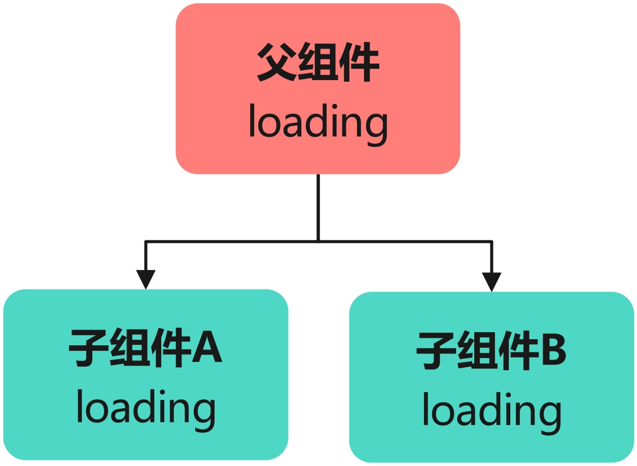
组件间需要共享的状态
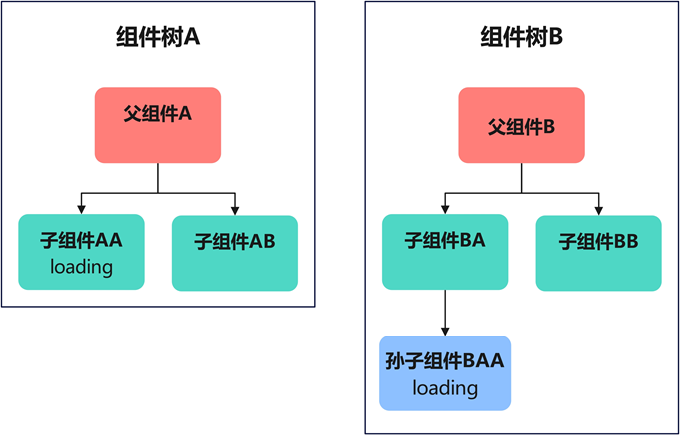
组件间需要共享的状态,按照共享范围从小到大依次有三种场景:父子组件间共享状态,不同子树上组件间共享状态和不同组件树间共享状态。
父子组件间共享状态
不同子树上组件间共享状态
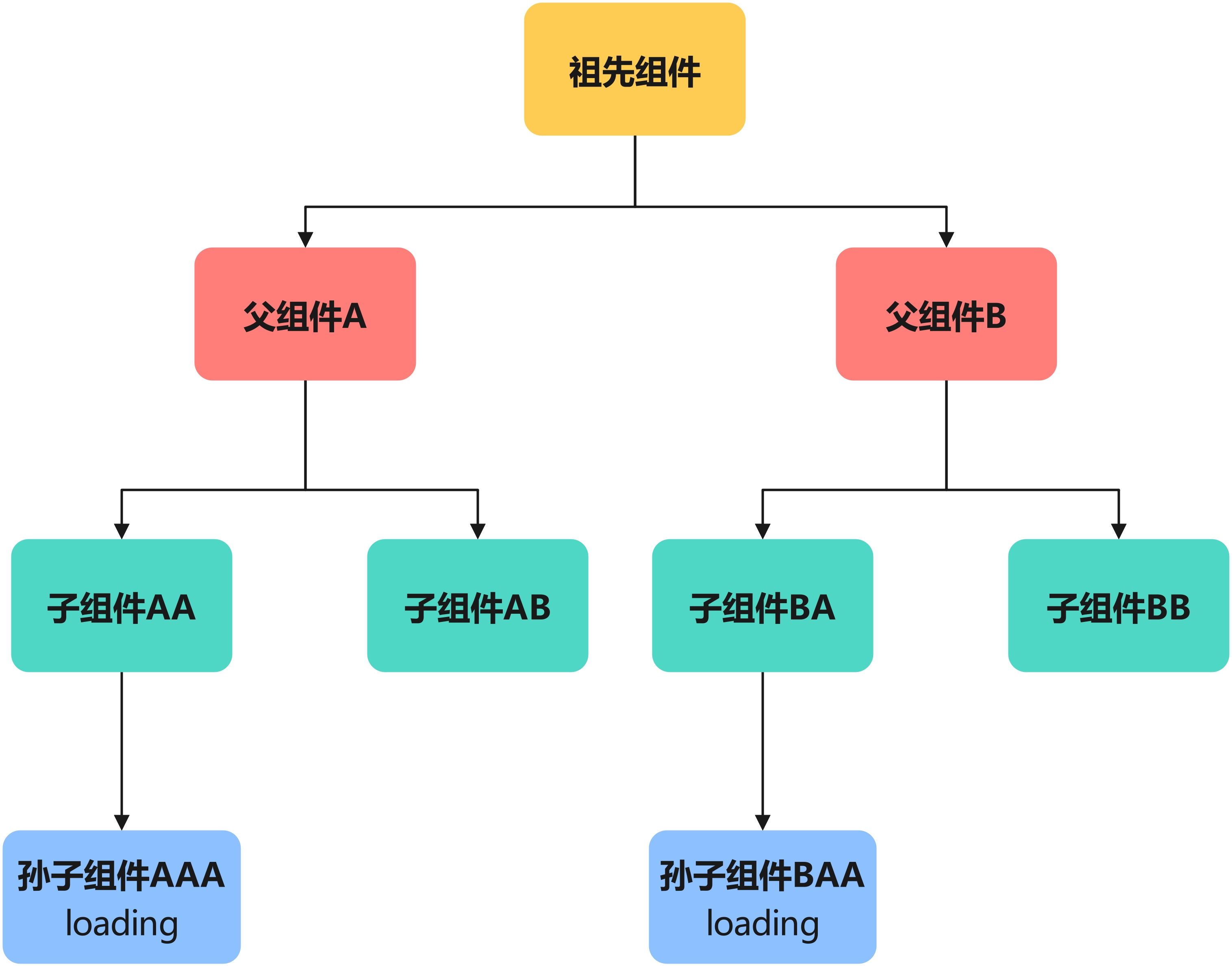
不同组件树间共享状态
@Provide 和 @Consume 装饰器
功能说明 :@Provide 和 @Consume 装饰器用于实现跨层级组件间的状态共享,父组件使用 @Provide 提供状态,子组件使用 @Consume 消费状态。
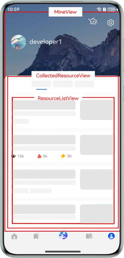
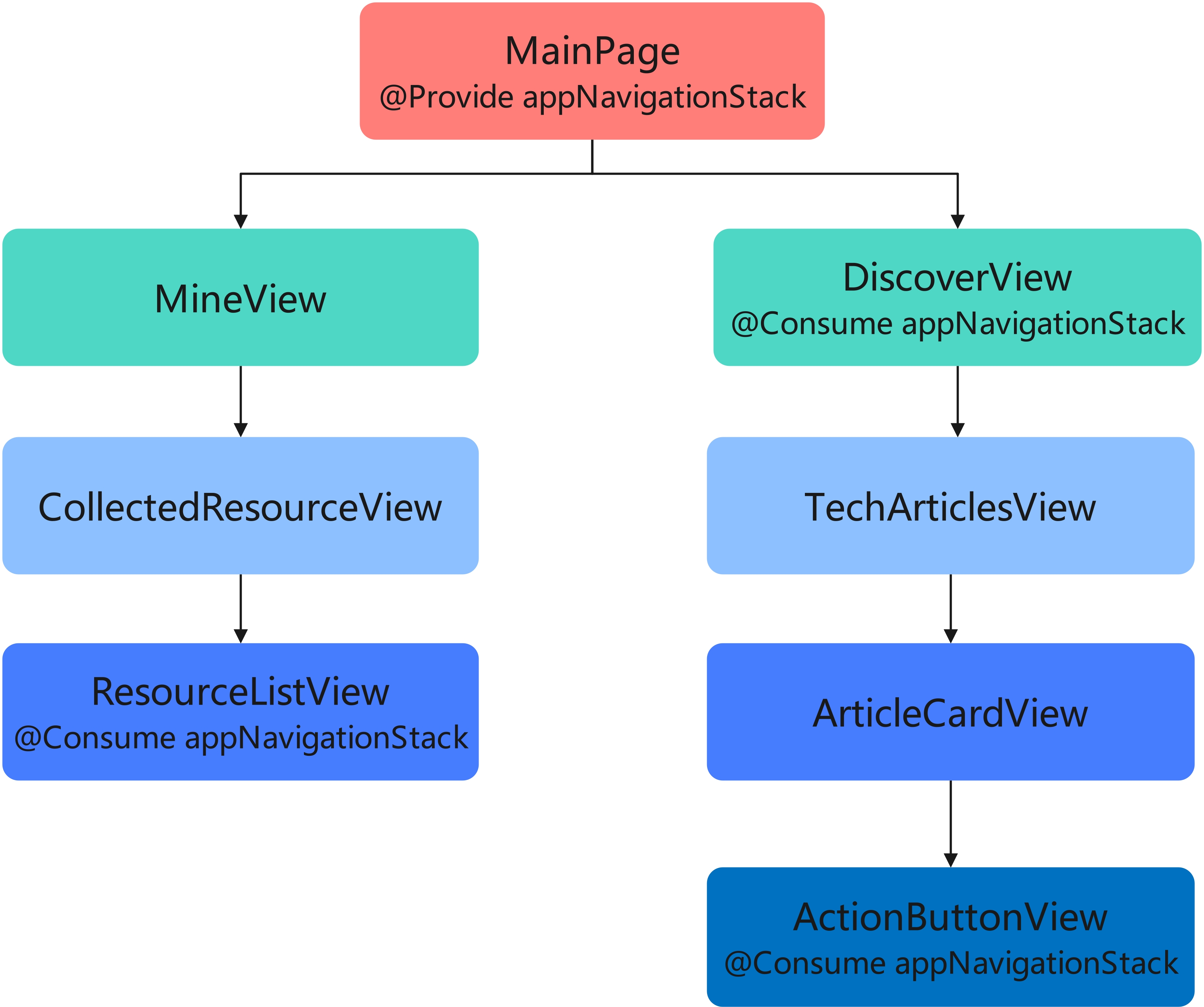
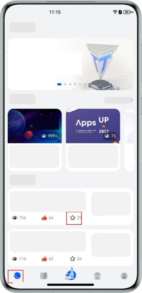
以 HMOS 世界 App 为例,其"探索"Tab 和"我的"Tab 界面组件示意图如下:

组件结构说明:
- "MainPage"是主页面,该页面有 2 个子组件"MineView"和"DiscoverView"。
- "MineView"是"我的"Tab 对应的内容视图组件,"CollectedResourceView"是该组件内展示收藏列表的视图组件,"ResourceListView"是"CollectedResourceView"的子组件。
- "DiscoverView"是"探索"Tab 对应的内容视图组件,"TechArticlesView"是该组件内展示文章列表的视图组件,"ArticleCardView"是列表上单个卡片视图组件,"ActionButtonView"是卡片上交互视图组件。
若使用@State+@Prop 方式实现组件间状态共享,当前组件设计图如下:

存在的问题:为了实现"ResourceListView"组件和"DiscoverView"组件共享状态,需要将状态定义在两者的最近公共祖先"MainPage"组件上,并通过@Prop 装饰器层层传递,直到两个需要共享状态的组件。
若新增功能要求在"DiscoverView"组件的后代"ActionButtonView"组件上新增对路由信息的判断逻辑,需要修改多个组件:
问题分析:新功能的逻辑原本只是在"ActionButtonView"这一个组件中使用,却需要修改从"DiscoverView"组件到"ActionButtonView"组件路径上 3 个组件的结构。
使用@Provide+@Consume 方案更为合理,组件设计图如下:
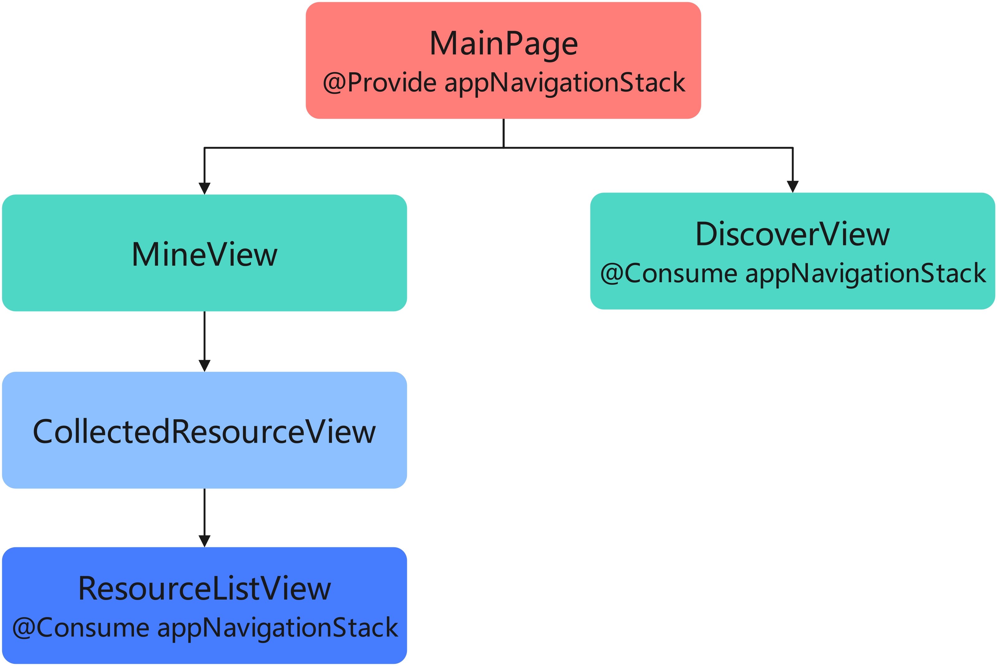
优势:通过在最顶部组件"MainPage"中注入路由信息状态,其后代组件均可以通过@Consume 装饰器获取该状态值,无需修改中间组件结构。
当业务变动需要"DiscoverView"的后代"ActionButtonView"组件也共享路由信息时,只需在"ActionButtonView"组件上使用@Consume 装饰器直接获取路由信息状态,无需修改其他组件:
总结:当共享状态的组件间跨层级较深时,或共享的信息对于整个组件树是"全局"的存在时,选择@Provide+@Consume 的装饰器组合代替层层传递的方式,能够提升代码的可维护性和可拓展性。
实现步骤:
- 在父组件中使用
@Provide装饰器定义共享状态 - 在子组件或孙组件中使用
@Consume装饰器消费该状态 - 当共享状态的值发生变化时,所有消费该状态的组件都会自动重新渲染
代码示例:
typescript
import { Provide, Consume, Component, Entry, Text, Button, Column, Row, FlexAlign, FontSize, FontWeight } from '@kit.ArkUI'

// 孙子组件
@Component
struct GrandChildComponent {
  // 使用@Consume装饰器消费共享状态
  @Consume themeColor: string

  build() {
    Column({
      alignItems: FlexAlign.Center
    }) {
      Text('孙子组件')
        .fontSize(FontSize.Medium)
        .fontWeight(FontWeight.Bold)
        .margin({ bottom: 10 })

      Text(`当前主题颜色: ${this.themeColor}`)
        .fontSize(FontSize.Small)
        .margin({ bottom: 10 })

      Button('红色主题')
        .fontSize(FontSize.Small)
        .margin({ right: 5 })
        .onClick(() => {
          // 直接修改@Consume装饰的状态,所有消费该状态的组件都会更新
          this.themeColor = 'red'
        })

      Button('蓝色主题')
        .fontSize(FontSize.Small)
        .onClick(() => {
          this.themeColor = 'blue'
        })
    }
    .width('100%')
    .padding(20)
    .backgroundColor('#F5F5F5')
    .borderRadius(12)
  }
}

// 子组件
@Component
struct ChildComponent {
  build() {
    Column({
      alignItems: FlexAlign.Center
    }) {
      Text('子组件')
        .fontSize(FontSize.Medium)
        .fontWeight(FontWeight.Bold)
        .margin({ bottom: 20 })

      // 孙子组件会自动继承父组件提供的状态
      GrandChildComponent()
    }
    .width('100%')
    .padding(20)
    .backgroundColor('#E5E5E5')
    .borderRadius(12)
  }
}

// 父组件
@Entry
@Component
struct ProvideConsumeExample {
  // 使用@Provide装饰器提供共享状态
  @Provide themeColor: string = 'green'

  build() {
    Column({
      alignItems: FlexAlign.Center,
      justifyContent: FlexAlign.Center
    }) {
      Text('父组件')
        .fontSize(FontSize.Large)
        .fontWeight(FontWeight.Bold)
        .margin({ bottom: 20 })

      Text(`当前主题颜色: ${this.themeColor}`)
        .fontSize(FontSize.Medium)
        .margin({ bottom: 20 })

      // 子组件和孙子组件可以消费父组件提供的状态
      ChildComponent()
    }
    .width('100%')
    .height('100%')
  }
}
全局状态管理
1. AppStorage
功能说明 :AppStorage 是应用级别的全局状态存储,用于存储整个应用程序共享的状态数据,如用户信息、主题设置等。
以 HMOS 世界 App 为例,其点赞高亮状态和用户信息组件视图如下:
应用场景:
- "我的"模块顶部有展示用户信息的组件"UserInfoView",底部有展示用户收藏列表,列表卡片上需要高亮展示用户是否点赞了当前文章。
- "探索"模块首页展示技术文章列表,列表卡片上同样需要展示用户是否点赞了当前文章。
- 当两个模块中任一模块的卡片有点赞交互时,需要同步用户是否对文章点赞的状态给另一个模块。
实现步骤:
- 在应用程序的入口文件中初始化
AppStorage - 在组件中使用
@StorageProp或@StorageLink装饰器访问AppStorage中的数据 - 当
AppStorage中的数据发生变化时,所有访问该数据的组件都会自动重新渲染
代码示例:
typescript
import { StorageProp, StorageLink, Component, Entry, Text, Button, Column, FlexAlign, FontSize, FontWeight } from '@kit.ArkUI'

// 组件A
@Entry
@Component
struct ComponentA {
  // 使用@StorageLink装饰器访问AppStorage中的数据(双向绑定)
  @StorageLink('globalCount') count: number = 0

  build() {
    Column({
      alignItems: FlexAlign.Center,
      justifyContent: FlexAlign.Center
    }) {
      Text('组件A')
        .fontSize(FontSize.Large)
        .fontWeight(FontWeight.Bold)
        .margin({ bottom: 20 })

      Text(`全局计数: ${this.count}`)
        .fontSize(FontSize.Medium)
        .margin({ bottom: 20 })

      Button('增加计数')
        .fontSize(FontSize.Medium)
        .onClick(() => {
          this.count++
        })
    }
    .width('100%')
    .height('50%')
  }
}

// 组件B
@Component
struct ComponentB {
  // 使用@StorageProp装饰器访问AppStorage中的数据(单向绑定)
  @StorageProp('globalCount') count: number = 0

  build() {
    Column({
      alignItems: FlexAlign.Center,
      justifyContent: FlexAlign.Center
    }) {
      Text('组件B')
        .fontSize(FontSize.Large)
        .fontWeight(FontWeight.Bold)
        .margin({ bottom: 20 })

      Text(`全局计数: ${this.count}`)
        .fontSize(FontSize.Medium)
        .margin({ bottom: 20 })

      Button('减少计数')
        .fontSize(FontSize.Medium)
        .onClick(() => {
          // 使用AppStorage的API修改数据
          AppStorage.setOrCreate('globalCount', this.count - 1)
        })
    }
    .width('100%')
    .height('50%')
  }
}

// 应用入口
@Entry
@Component
struct AppStorageExample {
  build() {
    Column() {
      ComponentA()
      ComponentB()
    }
    .width('100%')
    .height('100%')
  }
}
2. LocalStorage
功能说明 :LocalStorage 是页面级别的全局状态存储,用于存储单个页面内多个组件共享的状态数据。
实现步骤:
- 创建
LocalStorage实例并初始化数据 - 在组件中使用
@LocalStorageProp或@LocalStorageLink装饰器访问LocalStorage中的数据 - 当
LocalStorage中的数据发生变化时,所有访问该数据的组件都会自动重新渲染
代码示例:
typescript
import { LocalStorageProp, LocalStorageLink, Component, Entry, Text, Button, Column, FlexAlign, FontSize, FontWeight } from '@kit.ArkUI'

// 初始化LocalStorage
const localStorage = new LocalStorage({
  'localCount': 0
})

// 组件A
@Component
struct LocalComponentA {
  // 使用@LocalStorageLink装饰器访问LocalStorage中的数据(双向绑定)
  @LocalStorageLink('localCount', localStorage) count: number = 0

  build() {
    Column({
      alignItems: FlexAlign.Center,
      justifyContent: FlexAlign.Center
    }) {
      Text('本地存储组件A')
        .fontSize(FontSize.Large)
        .fontWeight(FontWeight.Bold)
        .margin({ bottom: 20 })

      Text(`本地计数: ${this.count}`)
        .fontSize(FontSize.Medium)
        .margin({ bottom: 20 })

      Button('增加计数')
        .fontSize(FontSize.Medium)
        .onClick(() => {
          this.count++
        })
    }
    .width('100%')
    .height('50%')
  }
}

// 组件B
@Component
struct LocalComponentB {
  // 使用@LocalStorageProp装饰器访问LocalStorage中的数据(单向绑定)
  @LocalStorageProp('localCount', localStorage) count: number = 0

  build() {
    Column({
      alignItems: FlexAlign.Center,
      justifyContent: FlexAlign.Center
    }) {
      Text('本地存储组件B')
        .fontSize(FontSize.Large)
        .fontWeight(FontWeight.Bold)
        .margin({ bottom: 20 })

      Text(`本地计数: ${this.count}`)
        .fontSize(FontSize.Medium)
        .margin({ bottom: 20 })

      Button('减少计数')
        .fontSize(FontSize.Medium)
        .onClick(() => {
          // 使用LocalStorage的API修改数据
          localStorage.set('localCount', this.count - 1)
        })
    }
    .width('100%')
    .height('50%')
  }
}

// 页面入口
@Entry
@Component
struct LocalStorageExample {
  build() {
    Column() {
      LocalComponentA()
      LocalComponentB()
    }
    .width('100%')
    .height('100%')
  }
}
状态管理最佳实践
按照状态复杂度选择装饰器
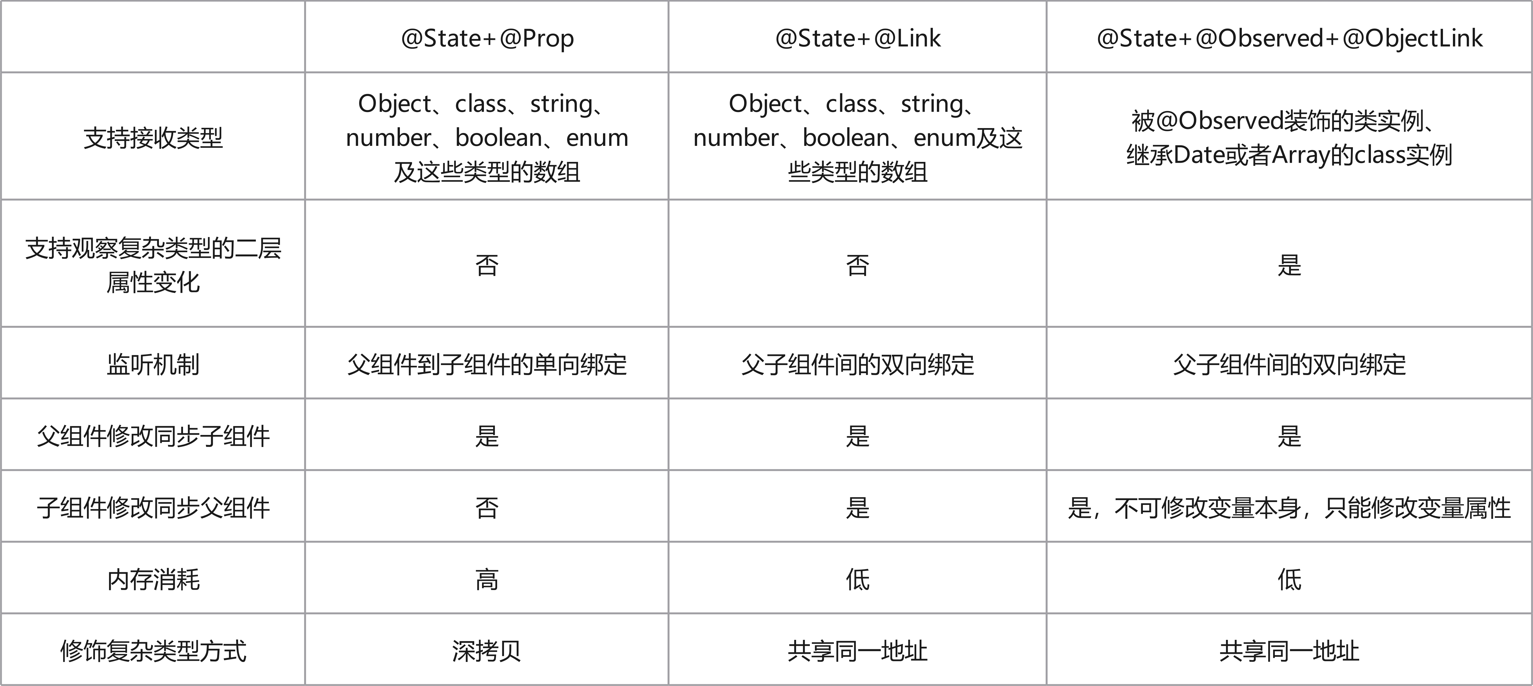
对于具有相同优先级的装饰器选择方案@State+@Prop、@State+@Link 和@State+@Observed+@ObjectLink,在选择方案时,需要结合具体的业务场景和状态数据结构的复杂度。这三种不同的装饰器组合方案在内存消耗、性能消耗和对数据类型的支持能力都不相同:
1. 选择合适的状态管理方案
根据应用程序的规模和复杂度选择合适的状态管理方案:
- 组件内部状态:使用@State
- 父子组件间状态:根据复杂度选择@Prop、@Link 或@Observed+@ObjectLink
- 跨层级组件状态:使用@Provide+@Consume
- 全局共享状态:使用 AppStorage 或 LocalStorage
2. 最小化状态范围
将状态变量的范围限制在必要的最小范围内,避免不必要的状态共享和组件重新渲染。
3. 避免过度使用全局状态
全局状态应该用于真正需要在多个组件间共享的数据,如用户信息、主题设置等,避免将所有状态都放入全局存储。
4. 使用不可变数据
尽量使用不可变数据来管理状态,避免直接修改对象或数组,这样可以提高应用程序的性能和可预测性。
5. 合理使用生命周期函数
在适当的生命周期函数中初始化和清理状态,如 onPageShow、onPageHide 等。
6. 优化性能
避免不必要的状态更新和组件重新渲染:
- 使用条件渲染避免不必要的组件创建
- 合理使用@Watch 装饰器监听状态变化
- 对于大型列表,使用 VirtualList 等高性能组件
常见问题与解决方案
1. 状态更新后组件没有重新渲染
问题:当状态变量的值发生变化时,组件没有自动重新渲染。
解决方案:
- 确保状态变量使用了正确的装饰器(如
@State、@Link等) - 确保状态变量的类型是可观察的(如基本类型、数组、对象等)
- 对于对象或数组,确保创建了新的引用而不是直接修改原对象
2. 组件间状态传递复杂
问题:当应用程序的组件层级较深时,状态传递变得复杂。
解决方案:
- 使用
@Provide和@Consume装饰器实现跨层级状态共享 - 使用全局状态管理方案(如
AppStorage或LocalStorage) - 考虑使用状态管理库(如
Redux或MobX)
3. 性能问题
问题:频繁的状态更新导致应用程序性能下降。
解决方案:
- 避免不必要的状态更新
- 使用
memo或shouldComponentUpdate优化组件渲染 - 合理使用
debounce或throttle限制状态更新的频率 - 考虑使用
VirtualList等组件优化长列表的性能
参考文档
总结
状态管理是 HarmonyOS 开发中非常重要的一部分,本文介绍了 HarmonyOS 提供的多种状态管理方案,包括组件级状态管理、父子组件间状态传递和全局状态管理。通过合理使用这些状态管理方案,可以提高代码的可维护性、可测试性和性能,提供更好的用户体验。
希望本文能够帮助你快速掌握 HarmonyOS 中的状态管理技巧,如果你想了解更多关于状态管理的内容,建议查看华为开发者联盟的官方文档。