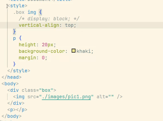
去除图片下边的空白间隙
元素宽高等比缩放
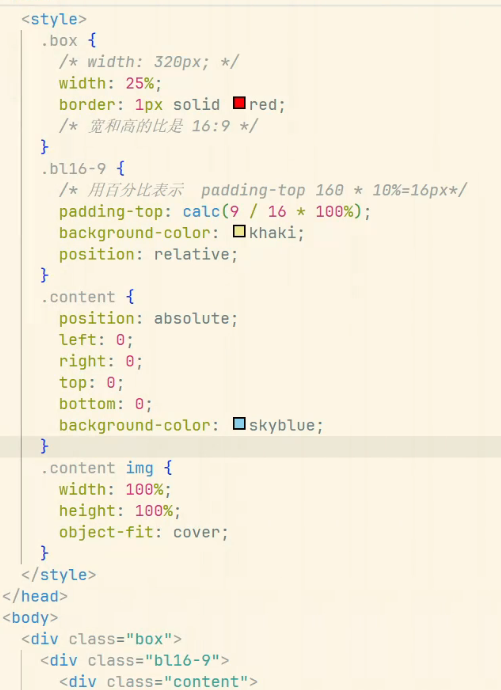
百分比实现
aspect-ratio实现
css
.aspect-16-9 {
	width: 100%; /* 可改为固定值 */
	aspect-ratio: 16 / 9;
}

.aspect-1-1 {
    width: 200px;
    aspect-ratio: 1;
    object-fit: cover;
}
html
<div class="aspect-16-9"></div>
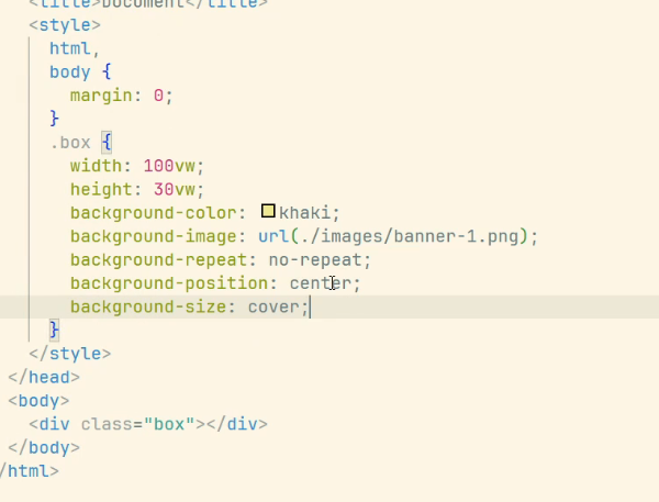
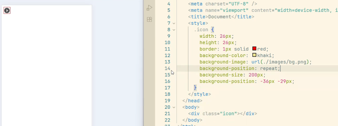
<img src="image.jpg" class="aspect-1-1" alt="正方形图片">背景图等比缩放
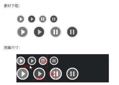
2倍精灵图
精灵图采用的是2倍图
所以在处理精灵图时,我们需要通过background-size来将背景图片大小缩小一半
测量尺寸时,也需要按一半的大小来测量
1px问题
各方案优缺点对比
| 方案 | 优点 | 缺点 |
|---|---|---|
| 伪元素+transform | 兼容性好,实现简单 | 需要为每个边框单独处理 |
| 媒体查询 | 精确适配不同dpr | 代码量较大 |
| viewport缩放 | 实现简单 | 影响整个页面布局 |
| SVG | 精确控制 | 兼容性问题 |
| box-shadow | 实现简单 | 兼容性较差 |
| border-image | 可复用 | 图片资源维护成本高 |
html
<!DOCTYPE html>
<html lang="en">

<head>
    <meta charset="UTF-8">
    <meta name="viewport" content="width=device-width, initial-scale=1.0">
    <title>Document</title>
    <style>
        .box {
            height: 300px;
            position: relative;
        }

        .box::after {
            position: absolute;
            content: "";
            height: 1px;
            width: 100%;
            background-color: red;
            left: 0;
            bottom: 0;
        }

        @media screen and (-webkit-min-device-pixel-ratio: 2) {
            .box::after {
                transform: scaleY(0.5);
            }
        }

        @media screen and (-webkit-min-device-pixel-ratio: 3) {
            .box::after {
                transform: scaleY(0.33);
            }
        }
    </style>
</head>

<body>
    <div class="box"></div>
</body>

</html>