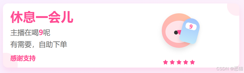
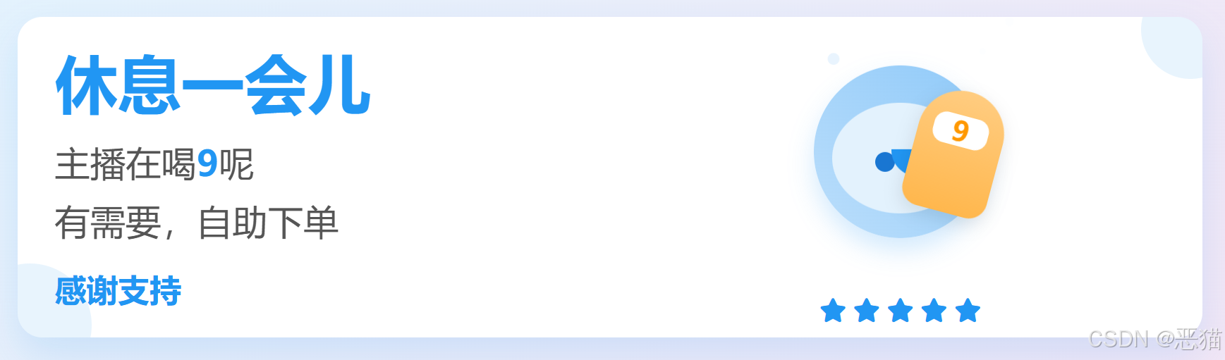
无人或有人直播时,临时离开,就弄个小窗口提示一下'人不在'......
自用的小工具,感觉还挺友好的,分享给大家。代码/实现方式如下:。
html
<!DOCTYPE html>
<html lang="zh-CN">
<head>
    <meta charset="UTF-8">
    <meta name="viewport" content="width=device-width, initial-scale=1.0">
    <title>主播正在喝9 | 大家自助下单</title>
    <link rel="stylesheet" href="https://cdnjs.cloudflare.com/ajax/libs/font-awesome/6.4.0/css/all.min.css">
    <style>
        * {
            margin: 0;
            padding: 0;
            box-sizing: border-box;
            font-family: 'Microsoft YaHei', sans-serif;
        }

        body {
            background: linear-gradient(135deg, #f9f0ff 0%, #fff0f6 100%);
            color: #333;
            width: 1000px;
            height: 300px;
            overflow: hidden;
            display: flex;
            align-items: center;
            justify-content: center;
        }

        .container {
            width: 100%;
            height: 100%;
            display: flex;
            align-items: center;
            justify-content: center;
            padding: 20px;
        }

        .main-content {
            width: 100%;
            height: 100%;
            background: white;
            border-radius: 20px;
            padding: 30px;
            box-shadow: 0 15px 30px rgba(255, 77, 148, 0.15);
            display: flex;
            align-items: center;
            justify-content: center;
            position: relative;
            overflow: hidden;
            animation: fadeIn 1s ease-out;
        }

        .content-wrapper {
            display: flex;
            align-items: center;
            justify-content: space-around;
            width: 100%;
            height: 100%;
        }

        .text-section {
            flex: 1;
            padding-right: 40px;
        }

        .title {
            font-size: 3.2rem;
            color: #ff4d94;
            margin-bottom: 15px;
            line-height: 1.2;
        }

        .subtitle {
            font-size: 1.8rem;
            color: #666;
            margin-bottom: 10px;
        }

        .action-text {
            font-size: 1.6rem;
            color: #ff4d94;
            margin-top: 20px;
            font-weight: bold;
        }

        .host-section {
            flex: 1;
            display: flex;
            flex-direction: column;
            align-items: center;
            justify-content: center;
            position: relative;
        }

        .host-container {
            position: relative;
            width: 200px;
            height: 200px;
            display: flex;
            align-items: center;
            justify-content: center;
        }

        .host {
            width: 140px;
            height: 140px;
            background: linear-gradient(45deg, #ffafbd, #ffc3a0);
            border-radius: 50%;
            position: relative;
            overflow: hidden;
            z-index: 2;
            box-shadow: 0 10px 20px rgba(0,0,0,0.1);
            animation: float 3s ease-in-out infinite;
        }

        .host-face {
            position: absolute;
            width: 110px;
            height: 90px;
            background: #ffe4e9;
            border-radius: 50%;
            top: 30px;
            left: 15px;
        }

        .host-eye {
            position: absolute;
            width: 16px;
            height: 16px;
            background: #333;
            border-radius: 50%;
            top: 40px;
        }

        .host-eye.left {
            left: 35px;
        }

        .host-eye.right {
            right: 35px;
        }

        .host-mouth {
            position: absolute;
            width: 45px;
            height: 22px;
            background: #ff4d94;
            border-radius: 0 0 25px 25px;
            bottom: 30px;
            left: 48px;
        }

        .drink {
            position: absolute;
            width: 70px;
            height: 100px;
            background: linear-gradient(to bottom, #a1c4fd, #c2e9fb);
            border-radius: 35px 35px 15px 15px;
            top: 50px;
            right: 20px;
            z-index: 3;
            transform: rotate(15deg);
            animation: drink 4s infinite alternate ease-in-out;
            box-shadow: 0 5px 15px rgba(0,0,0,0.1);
        }

        .drink-label {
            position: absolute;
            width: 45px;
            height: 25px;
            background: white;
            border-radius: 10px;
            top: 20px;
            left: 12px;
            display: flex;
            align-items: center;
            justify-content: center;
            font-weight: bold;
            color: #ff4d94;
            font-size: 1.4rem;
        }

        .bubble {
            position: absolute;
            background: rgba(255, 255, 255, 0.8);
            border-radius: 50%;
            animation: bubbleUp 4s infinite ease-in-out;
        }

        .rating {
            margin-top: 15px;
            color: #ff4d94;
            font-size: 1.2rem;
        }

        /* 动画定义 */
        @keyframes float {
            0%, 100% { transform: translateY(0); }
            50% { transform: translateY(-15px); }
        }

        @keyframes drink {
            0%, 30% { transform: rotate(15deg) translateY(0); }
            70%, 100% { transform: rotate(5deg) translateY(15px); }
        }

        @keyframes bubbleUp {
            0% {
                transform: translateY(0) scale(0);
                opacity: 0;
            }
            10% {
                opacity: 0.8;
                transform: translateY(-8px) scale(1);
            }
            100% {
                transform: translateY(-150px) scale(0.5);
                opacity: 0;
            }
        }

        @keyframes fadeIn {
            from { opacity: 0; }
            to { opacity: 1; }
        }

        /* 装饰元素 */
        .decoration {
            position: absolute;
            background: #ff4d94;
            opacity: 0.1;
            border-radius: 50%;
        }

        .decoration-1 {
            width: 100px;
            height: 100px;
            bottom: -40px;
            left: -40px;
        }

        .decoration-2 {
            width: 80px;
            height: 80px;
            top: -30px;
            right: -30px;
        }
    </style>
</head>
<body>
    <div class="container">
        <div class="main-content">
            <!-- 装饰元素 -->
            <div class="decoration decoration-1"></div>
            <div class="decoration decoration-2"></div>

            <div class="content-wrapper">
                <div class="text-section">
                    <h1 class="title">休息一会儿</h1>
                    <p class="subtitle">主播在喝<span style="color:#ff4d94; font-weight:bold;">9</span>呢</p>
                    <p class="subtitle">有需要,自助下单</p>
                    <p class="action-text">感谢支持</p>
                </div>

                <div class="host-section">
                    <div class="host-container">
                        <div class="host">
                            <div class="host-face">
                                <div class="host-eye left"></div>
                                <div class="host-eye right"></div>
                                <div class="host-mouth"></div>
                            </div>
                        </div>
                        <div class="drink">
                            <div class="drink-label">9</div>
                        </div>
                        <!-- 气泡 -->
                        <div class="bubble" style="width: 14px; height: 14px; top: 100px; left: 140px; animation-delay: 0.5s;"></div>
                        <div class="bubble" style="width: 10px; height: 10px; top: 120px; left: 90px; animation-delay: 1s;"></div>
                        <div class="bubble" style="width: 18px; height: 18px; top: 80px; left: 180px; animation-delay: 1.5s;"></div>
                    </div>

                    <div class="rating">
                        <i class="fas fa-star"></i> <i class="fas fa-star"></i> <i class="fas fa-star"></i> <i class="fas fa-star"></i> <i class="fas fa-star"></i>
                    </div>
                </div>
            </div>
        </div>
    </div>

    <script>
        // 创建气泡
        function createBubbles() {
            const hostContainer = document.querySelector('.host-container');
            for (let i = 0; i < 6; i++) {
                const bubble = document.createElement('div');
                bubble.className = 'bubble';
                const size = Math.random() * 12 + 6;
                bubble.style.width = `${size}px`;
                bubble.style.height = `${size}px`;
                bubble.style.top = `${Math.random() * 100 + 80}px`;
                bubble.style.left = `${Math.random() * 180 + 30}px`;
                bubble.style.animationDelay = `${Math.random() * 4}s`;
                hostContainer.appendChild(bubble);
            }
        }

        // 页面加载完成后创建气泡
        window.addEventListener('load', createBubbles);

        // 添加随机气泡生成
        setInterval(() => {
            const hostContainer = document.querySelector('.host-container');
            if (hostContainer.children.length < 10) { // 限制气泡数量
                const bubble = document.createElement('div');
                bubble.className = 'bubble';
                const size = Math.random() * 10 + 5;
                bubble.style.width = `${size}px`;
                bubble.style.height = `${size}px`;
                bubble.style.top = `${Math.random() * 50 + 120}px`;
                bubble.style.left = `${Math.random() * 180 + 30}px`;
                bubble.style.animationDelay = '0s';
                hostContainer.appendChild(bubble);

                // 动画结束后移除气泡
                setTimeout(() => {
                    if (bubble.parentNode) {
                        bubble.remove();
                    }
                }, 4000);
            }
        }, 3000);
    </script>
</body>
</html>
有点友好吧,哈。
这个小工具是我'小工具集'里的一个。如果大家对这类工具感兴趣,欢迎留言交流。