文章目录
- [Flutter 通用文本输入框封装实践:兼顾跨平台与开源鸿蒙特性](#Flutter 通用文本输入框封装实践:兼顾跨平台与开源鸿蒙特性)
-
- 引言
- 一、核心需求分析:通用文本输入框的必备特性
- [二、Flutter 通用文本输入框封装实现](#二、Flutter 通用文本输入框封装实现)
-
- [2.1 组件架构设计](#2.1 组件架构设计)
- [2.2 基础层封装:BaseInputWidget](#2.2 基础层封装:BaseInputWidget)
- [2.3 功能层封装:核心功能实现](#2.3 功能层封装:核心功能实现)
-
- [2.3.1 输入验证功能](#2.3.1 输入验证功能)
- [2.3.2 防抖功能](#2.3.2 防抖功能)
- [2.3.3 密码显示/隐藏切换](#2.3.3 密码显示/隐藏切换)
- [2.4 展示层封装:CommonTextInput(最终对外组件)](#2.4 展示层封装:CommonTextInput(最终对外组件))
- [2.5 组件运行效果展示](#2.5 组件运行效果展示)
- [三、与开源鸿蒙 ArkUI 文本输入组件的对比与适配](#三、与开源鸿蒙 ArkUI 文本输入组件的对比与适配)
-
- [3.1 开源鸿蒙 ArkUI 文本输入组件核心特性](#3.1 开源鸿蒙 ArkUI 文本输入组件核心特性)
- [3.2 跨平台适配思路](#3.2 跨平台适配思路)
- [3.3 混合开发场景适配](#3.3 混合开发场景适配)
- 四、实战技巧与性能优化
-
- [4.1 常见使用场景扩展](#4.1 常见使用场景扩展)
-
- [4.1.1 搜索输入框(带防抖和搜索图标)](#4.1.1 搜索输入框(带防抖和搜索图标))
- [4.1.2 带计数的文本输入框(如备注)](#4.1.2 带计数的文本输入框(如备注))
- [4.2 性能优化建议](#4.2 性能优化建议)
- [4.3 常见问题解决方案](#4.3 常见问题解决方案)
- 五、总结与展望
Flutter 通用文本输入框封装实践:兼顾跨平台与开源鸿蒙特性
引言
在移动应用开发中,文本输入框是最基础且高频使用的组件之一。无论是登录注册、表单填写还是搜索功能,都离不开文本输入交互。然而,原生开发中存在两大痛点:一是不同平台(Android/iOS/开源鸿蒙)的输入框样式、行为存在差异,导致跨平台一致性难以保障;二是重复开发相似功能(如输入验证、防抖、密码隐藏)导致效率低下。
Flutter 作为跨平台框架,通过自绘 UI 引擎实现了多端视觉一致性,但原生 TextField 组件的配置分散、扩展性不足,仍需二次封装才能满足复杂业务需求。同时,随着开源鸿蒙(OpenHarmony)生态的崛起,跨平台开发逐渐需要兼顾 Flutter 与开源鸿蒙的特性适配。本文将详细讲解如何封装一个功能全面、可扩展、适配开源鸿蒙设计理念的 Flutter 通用文本输入框,并对比分析其与开源鸿蒙 ArkUI 文本输入组件的设计思路,帮助开发者提升跨平台开发效率。
本文配套完整代码案例,可直接集成到实际项目中,同时提供组件设计思路和优化技巧,适合 Flutter 初学者和有跨平台开发需求的开发者参考。
一、核心需求分析:通用文本输入框的必备特性
在封装前,需结合业务场景和跨平台特性,明确通用文本输入框的核心需求。通过调研 Flutter 项目和开源鸿蒙应用的常见场景,总结出以下关键功能点:
| 功能类别 | 具体需求 |
|---|---|
| 基础输入功能 | 支持文本/密码/数字/手机号等输入类型,支持占位提示、输入长度限制 |
| 视觉样式定制 | 统一边框、圆角、背景色,支持聚焦/失焦状态切换,自定义前缀/后缀图标 |
| 输入验证 | 实时输入校验、提交时校验,支持自定义错误提示文案和样式 |
| 交互体验优化 | 输入防抖(避免频繁回调)、密码显示/隐藏切换、清空输入、回车触发提交 |
| 跨平台适配 | 兼容 Android/iOS 系统特性,借鉴开源鸿蒙设计规范,保障多端交互一致性 |
| 扩展性 | 支持自定义输入回调、样式扩展、功能开关(如是否显示清空按钮、是否允许粘贴) |
其中,开源鸿蒙特性适配主要体现在:借鉴 ArkUI 组件的「原子化设计」理念,将输入框拆分为基础容器、输入核心、辅助元素(图标/提示)等独立模块;参考开源鸿蒙的「自适应布局」思路,确保组件在不同屏幕尺寸下的适配性;对齐开源鸿蒙的「交互规范」,如输入框聚焦时的边框高亮效果、错误提示的展示样式等。
二、Flutter 通用文本输入框封装实现
2.1 组件架构设计
采用「分层封装 + 组合模式」设计组件架构,将通用输入框拆分为三个核心层级:
- 基础层(BaseInput):封装原生
TextField的核心输入功能,处理输入类型、长度限制、基础样式等; - 功能层(FeatureInput):基于基础层扩展验证、防抖、密码切换等核心功能;
- 展示层(CommonInput):整合基础层和功能层,提供统一的外部接口,支持样式定制和辅助元素配置。
2.2 基础层封装:BaseInputWidget
基础层主要负责封装 TextField 的核心属性,提供统一的基础配置,减少重复代码。
dart
import 'package:flutter/material.dart';

/// 基础文本输入框组件(封装核心输入功能)
class BaseInputWidget extends StatelessWidget {
  /// 输入控制器(必填,用于获取/设置输入值)
  final TextEditingController controller;

  /// 输入类型(文本/密码/数字等)
  final TextInputType inputType;

  /// 占位提示文案
  final String hintText;

  /// 输入最大长度
  final int? maxLength;

  /// 是否隐藏输入内容(密码类型)
  final bool obscureText;

  /// 输入样式(文本大小、颜色等)
  final TextStyle textStyle;

  /// 占位提示样式
  final TextStyle hintStyle;

  /// 输入框背景色
  final Color backgroundColor;

  /// 输入框边框
  final InputBorder border;

  /// 聚焦时边框
  final InputBorder focusedBorder;

  /// 输入回调
  final ValueChanged<String>? onChanged;

  /// 回车回调
  final VoidCallback? onSubmitted;

  /// 构造函数(通过 required 和默认值约束参数)
  const BaseInputWidget({
    super.key,
    required this.controller,
    this.inputType = TextInputType.text,
    this.hintText = "",
    this.maxLength,
    this.obscureText = false,
    this.textStyle = const TextStyle(fontSize: 16, color: Colors.black87),
    this.hintStyle = const TextStyle(fontSize: 16, color: Colors.grey),
    this.backgroundColor = Colors.white,
    this.border = const OutlineInputBorder(
      borderSide: BorderSide(color: Colors.grey),
      borderRadius: BorderRadius.all(Radius.circular(8)),
    ),
    this.focusedBorder = const OutlineInputBorder(
      borderSide: BorderSide(color: Colors.blue, width: 2),
      borderRadius: BorderRadius.all(Radius.circular(8)),
    ),
    this.onChanged,
    this.onSubmitted,
  });

  @override
  Widget build(BuildContext context) {
    return TextField(
      controller: controller,
      keyboardType: inputType,
      obscureText: obscureText,
      maxLength: maxLength,
      style: textStyle,
      decoration: InputDecoration(
        hintText: hintText,
        hintStyle: hintStyle,
        fillColor: backgroundColor,
        filled: true,
        border: border,
        focusedBorder: focusedBorder,
        counterText: "", // 隐藏默认长度计数器
        contentPadding: const EdgeInsets.symmetric(horizontal: 16, vertical: 14),
      ),
      onChanged: onChanged,
      onSubmitted: (_) => onSubmitted?.call(),
      textInputAction: TextInputAction.done, // 回车按钮类型
    );
  }
}设计说明:
- 通过构造函数的默认值统一基础样式,如边框圆角、内边距等,避免重复配置;
- 暴露核心参数(如
controller、inputType),同时隐藏次要参数(如contentPadding),简化外部使用; - 聚焦边框默认使用蓝色高亮,对齐开源鸿蒙的设计规范(开源鸿蒙输入框聚焦时通常有明显的边框颜色变化)。
2.3 功能层封装:核心功能实现
功能层基于基础层扩展输入验证、防抖、密码切换等核心功能,通过组合方式集成到基础组件中。
2.3.1 输入验证功能
定义验证规则接口,支持自定义验证逻辑,实时反馈错误信息。
dart
/// 输入验证规则接口
typedef InputValidator = String? Function(String? value);

/// 内置常见验证规则
class InputValidators {
  /// 非空验证
  static String? required(String? value, {String message = "请输入内容"}) {
    if (value == null || value.trim().isEmpty) {
      return message;
    }
    return null;
  }

  /// 手机号验证(简化版)
  static String? phone(String? value) {
    if (value == null || value.trim().isEmpty) {
      return "请输入手机号";
    }
    final regex = RegExp(r'^1[3-9]\d{9}$');
    if (!regex.hasMatch(value.trim())) {
      return "请输入正确的手机号";
    }
    return null;
  }

  /// 密码验证(6-18位字符)
  static String? password(String? value) {
    if (value == null || value.trim().isEmpty) {
      return "请输入密码";
    }
    if (value.trim().length < 6 || value.trim().length > 18) {
      return "密码长度为6-18位";
    }
    return null;
  }
}
2.3.2 防抖功能
通过 Timer 实现输入防抖,避免频繁触发 onChanged 回调(如搜索输入场景)。
dart
import 'dart:async';

/// 防抖工具类
class DebounceUtil {
  Timer? _timer;

  /// 防抖执行(默认延迟500ms)
  void run(VoidCallback callback, {Duration duration = const Duration(milliseconds: 500)}) {
    _timer?.cancel();
    _timer = Timer(duration, callback);
  }

  /// 取消防抖
  void cancel() {
    _timer?.cancel();
  }
}
2.3.3 密码显示/隐藏切换
通过状态管理控制 obscureText 参数,实现密码显示切换功能。
2.4 展示层封装:CommonTextInput(最终对外组件)
整合基础层和功能层,提供完整的通用输入框组件,支持前缀/后缀图标、错误提示、清空输入等功能。
dart
class CommonTextInput extends StatefulWidget {
  /// 输入控制器(可选,内部会自动创建默认控制器)
  final TextEditingController? controller;

  /// 输入类型
  final TextInputType inputType;

  /// 占位提示文案
  final String hintText;

  /// 最大输入长度
  final int? maxLength;

  /// 是否为密码类型(自动显示切换图标)
  final bool isPassword;

  /// 验证规则(支持多个)
  final List<InputValidator>? validators;

  /// 输入回调(防抖)
  final ValueChanged<String>? onChanged;

  /// 提交回调(回车或失去焦点时触发)
  final ValueChanged<String>? onSubmitted;

  /// 前缀图标
  final Widget? prefixIcon;

  /// 自定义后缀图标(优先级高于默认图标,如密码切换、清空)
  final Widget? suffixIcon;

  /// 是否显示清空按钮(输入不为空时显示)
  final bool showClearIcon;

  /// 错误提示文案
  final String? errorText;

  /// 样式配置(背景色、边框等)
  final InputStyleConfig styleConfig;

  const CommonTextInput({
    super.key,
    this.controller,
    this.inputType = TextInputType.text,
    this.hintText = "",
    this.maxLength,
    this.isPassword = false,
    this.validators,
    this.onChanged,
    this.onSubmitted,
    this.prefixIcon,
    this.suffixIcon,
    this.showClearIcon = true,
    this.errorText,
    this.styleConfig = const InputStyleConfig(),
  });

  @override
  State<CommonTextInput> createState() => _CommonTextInputState();
}

class _CommonTextInputState extends State<CommonTextInput> {
  /// 内部控制器(优先使用外部传入的controller)
  late TextEditingController _controller;

  /// 焦点节点
  final FocusNode _focusNode = FocusNode();

  /// 密码显示状态
  bool _showPassword = false;

  /// 防抖工具
  final DebounceUtil _debounce = DebounceUtil();

  /// 当前错误提示
  String? _currentErrorText;

  @override
  void initState() {
    super.initState();
    // 初始化控制器
    _controller = widget.controller ?? TextEditingController();
    // 监听输入变化
    _controller.addListener(_onInputChanged);
    // 监听焦点变化
    _focusNode.addListener(_onFocusChanged);
  }

  @override
  void dispose() {
    // 释放资源
    if (widget.controller == null) {
      _controller.dispose(); // 外部传入的controller由外部管理
    }
    _focusNode.dispose();
    _debounce.cancel();
    super.dispose();
  }

  /// 输入变化回调(带防抖)
  void _onInputChanged() {
    final value = _controller.text.trim();
    // 防抖触发外部回调
    _debounce.run(() {
      widget.onChanged?.call(value);
    });
    // 实时验证(如果有验证规则)
    if (widget.validators != null && widget.validators!.isNotEmpty) {
      _validateInput(value);
    }
    setState(() {}); // 刷新UI(如清空按钮显示/隐藏)
  }

  /// 焦点变化回调(失去焦点时触发完整验证)
  void _onFocusChanged() {
    if (!_focusNode.hasFocus && widget.validators != null && widget.validators!.isNotEmpty) {
      _validateInput(_controller.text.trim(), isSubmit: true);
    }
  }

  /// 输入验证逻辑
  void _validateInput(String value, {bool isSubmit = false}) {
    String? error;
    for (final validator in widget.validators!) {
      error = validator(value);
      if (error != null) {
        break; // 只要有一个验证失败,立即返回
      }
    }
    setState(() {
      _currentErrorText = error;
    });
    // 提交时如果验证通过,触发外部提交回调
    if (isSubmit && error == null) {
      widget.onSubmitted?.call(value);
    }
  }

  /// 构建后缀图标(密码切换/清空按钮)
  Widget? _buildSuffixIcon() {
    // 优先使用自定义后缀图标
    if (widget.suffixIcon != null) {
      return widget.suffixIcon;
    }

    // 密码类型:显示密码切换图标
    if (widget.isPassword) {
      return IconButton(
        icon: Icon(
          _showPassword ? Icons.visibility : Icons.visibility_off,
          color: Colors.grey,
        ),
        onPressed: () {
          setState(() {
            _showPassword = !_showPassword;
          });
        },
        padding: const EdgeInsets.all(0),
        iconSize: 20,
      );
    }

    // 显示清空按钮(输入不为空且开启显示)
    if (widget.showClearIcon && _controller.text.isNotEmpty) {
      return IconButton(
        icon: const Icon(Icons.clear, color: Colors.grey, size: 20),
        onPressed: () {
          _controller.clear();
          _onInputChanged(); // 触发输入变化回调
        },
        padding: const EdgeInsets.all(0),
      );
    }

    return null;
  }

  @override
  Widget build(BuildContext context) {
    // 合并错误提示(外部传入的errorText优先级高于内部验证的错误)
    final errorText = widget.errorText ?? _currentErrorText;

    return Column(
      crossAxisAlignment: CrossAxisAlignment.start,
      mainAxisSize: MainAxisSize.min,
      children: [
        BaseInputWidget(
          controller: _controller,
          inputType: widget.isPassword ? TextInputType.visiblePassword : widget.inputType,
          obscureText: widget.isPassword && !_showPassword,
          hintText: widget.hintText,
          maxLength: widget.maxLength,
          textStyle: widget.styleConfig.textStyle,
          hintStyle: widget.styleConfig.hintStyle,
          backgroundColor: widget.styleConfig.backgroundColor,
          border: errorText != null ? widget.styleConfig.errorBorder : widget.styleConfig.border,
          focusedBorder: errorText != null ? widget.styleConfig.focusedErrorBorder : widget.styleConfig.focusedBorder,
          onChanged: (_) {}, // 内部已通过controller监听,此处仅为占位
          onSubmitted: () {
            _focusNode.unfocus(); // 失去焦点
            _onFocusChanged(); // 触发验证和提交
          },
        ),
        // 错误提示(距离输入框底部4px)
        if (errorText != null)
          Padding(
            padding: const EdgeInsets.only(top: 4),
            child: Text(
              errorText,
              style: widget.styleConfig.errorTextStyle,
              maxLines: 1,
              overflow: TextOverflow.ellipsis,
            ),
          ),
      ],
    );
  }
}

/// 输入框样式配置类(统一管理样式参数)
class InputStyleConfig {
  /// 文本样式
  final TextStyle textStyle;

  /// 占位提示样式
  final TextStyle hintStyle;

  /// 背景色
  final Color backgroundColor;

  /// 正常状态边框
  final InputBorder border;

  /// 聚焦状态边框
  final InputBorder focusedBorder;

  /// 错误状态边框
  final InputBorder errorBorder;

  /// 聚焦错误状态边框
  final InputBorder focusedErrorBorder;

  /// 错误提示文本样式
  final TextStyle errorTextStyle;

  const InputStyleConfig({
    this.textStyle = const TextStyle(fontSize: 16, color: Colors.black87),
    this.hintStyle = const TextStyle(fontSize: 16, color: Colors.grey),
    this.backgroundColor = Colors.white,
    this.border = const OutlineInputBorder(
      borderSide: BorderSide(color: Colors.grey, width: 1),
      borderRadius: BorderRadius.all(Radius.circular(8)),
    ),
    this.focusedBorder = const OutlineInputBorder(
      borderSide: BorderSide(color: Color(0xFF2196F3), width: 2),
      borderRadius: BorderRadius.all(Radius.circular(8)),
    ),
    this.errorBorder = const OutlineInputBorder(
      borderSide: BorderSide(color: Colors.red, width: 1),
      borderRadius: BorderRadius.all(Radius.circular(8)),
    ),
    this.focusedErrorBorder = const OutlineInputBorder(
      borderSide: BorderSide(color: Colors.red, width: 2),
      borderRadius: BorderRadius.all(Radius.circular(8)),
    ),
    this.errorTextStyle = const TextStyle(fontSize: 12, color: Colors.red),
  });

  /// 复制并修改样式(方便自定义样式)
  InputStyleConfig copyWith({
    TextStyle? textStyle,
    TextStyle? hintStyle,
    Color? backgroundColor,
    InputBorder? border,
    InputBorder? focusedBorder,
    InputBorder? errorBorder,
    InputBorder? focusedErrorBorder,
    TextStyle? errorTextStyle,
  }) {
    return InputStyleConfig(
      textStyle: textStyle ?? this.textStyle,
      hintStyle: hintStyle ?? this.hintStyle,
      backgroundColor: backgroundColor ?? this.backgroundColor,
      border: border ?? this.border,
      focusedBorder: focusedBorder ?? this.focusedBorder,
      errorBorder: errorBorder ?? this.errorBorder,
      focusedErrorBorder: focusedErrorBorder ?? this.focusedErrorBorder,
      errorTextStyle: errorTextStyle ?? this.errorTextStyle,
    );
  }
}核心设计亮点:
- 控制器管理:支持外部传入或内部创建控制器,避免内存泄漏;
- 状态联动:输入内容、焦点状态、错误提示实时联动,提升交互体验;
- 样式统一 :通过
InputStyleConfig类统一管理样式,支持复制修改,适配不同主题; - 功能开关 :通过
isPassword、showClearIcon等参数灵活控制功能启用/禁用; - 错误提示:支持外部传入错误提示和内部验证错误提示,优先级清晰。
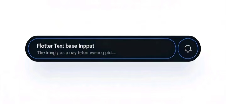
2.5 组件运行效果展示
封装完成后,通过不同场景的使用示例展示组件效果。以下是登录页面的用户名、密码输入框示例:
dart
class LoginPage extends StatelessWidget {
  final TextEditingController _phoneController = TextEditingController();
  final TextEditingController _passwordController = TextEditingController();

  LoginPage({super.key});

  @override
  Widget build(BuildContext context) {
    return Scaffold(
      appBar: AppBar(title: const Text("登录")),
      body: Padding(
        padding: const EdgeInsets.symmetric(horizontal: 20, vertical: 30),
        child: Column(
          children: [
            // 手机号输入框
            CommonTextInput(
              controller: _phoneController,
              inputType: TextInputType.phone,
              hintText: "请输入手机号",
              prefixIcon: const Padding(
                padding: EdgeInsets.symmetric(horizontal: 12),
                child: Icon(Icons.phone, color: Colors.grey, size: 20),
              ),
              validators: [InputValidators.phone],
              showClearIcon: true,
              onSubmitted: (value) {
                print("手机号提交:$value");
              },
            ),
            const SizedBox(height: 20),
            // 密码输入框
            CommonTextInput(
              controller: _passwordController,
              isPassword: true,
              hintText: "请输入密码",
              prefixIcon: const Padding(
                padding: EdgeInsets.symmetric(horizontal: 12),
                child: Icon(Icons.lock, color: Colors.grey, size: 20),
              ),
              validators: [InputValidators.password],
              showClearIcon: true,
              onSubmitted: (value) {
                print("密码提交:$value");
              },
              // 自定义错误提示样式
              styleConfig: InputStyleConfig().copyWith(
                errorTextStyle: const TextStyle(fontSize: 12, color: Color(0xFFFF4444)),
              ),
            ),
            const SizedBox(height: 30),
            // 登录按钮
            SizedBox(
              width: double.infinity,
              child: ElevatedButton(
                onPressed: () {
                  // 手动触发验证
                  _phoneController.notifyListeners();
                  _passwordController.notifyListeners();
                },
                child: const Text("登录"),
              ),
            ),
          ],
        ),
      ),
    );
  }
}
三、与开源鸿蒙 ArkUI 文本输入组件的对比与适配
3.1 开源鸿蒙 ArkUI 文本输入组件核心特性
开源鸿蒙的 ArkUI 框架提供了 TextInput 组件,其核心设计理念与 Flutter 有相似之处,但也存在平台特性差异:
| 特性 | Flutter CommonTextInput | 开源鸿蒙 ArkUI TextInput |
|---|---|---|
| 基础输入功能 | 支持多种输入类型、长度限制 | 支持输入类型控制、长度限制 |
| 样式定制 | 通过 InputStyleConfig 统一管理 |
通过 TextInputStyle 配置 |
| 辅助元素 | 前缀/后缀图标通过参数配置 | 支持 prefix、suffix 子组件 |
| 输入验证 | 内置验证规则,支持实时/提交验证 | 需手动结合 form 组件或自定义验证 |
| 交互体验 | 内置防抖、密码切换、清空功能 | 需手动实现防抖、密码切换,支持清空API |
| 跨平台适配 | 自绘UI,多端视觉一致 | 适配开源鸿蒙不同设备(手机、平板等) |
3.2 跨平台适配思路
在 Flutter 项目中兼顾开源鸿蒙特性,主要从以下三个方面入手:
- 样式对齐 :参考开源鸿蒙的设计规范(如默认边框圆角、颜色值、内边距),在
InputStyleConfig中提供「开源鸿蒙风格」的默认配置:
dart
/// 开源鸿蒙风格样式配置
extension OpenHarmonyStyle on InputStyleConfig {
  static InputStyleConfig get ohosStyle => InputStyleConfig(
        textStyle: const TextStyle(fontSize: 16, color: Color(0xFF1A1A1A)),
        hintStyle: const TextStyle(fontSize: 16, color: Color(0xFF8A8A8A)),
        backgroundColor: const Color(0xFFF5F5F5),
        border: const OutlineInputBorder(
          borderSide: BorderSide.none,
          borderRadius: BorderRadius.all(Radius.circular(12)),
        ),
        focusedBorder: const OutlineInputBorder(
          borderSide: BorderSide(color: Color(0xFF007DFF), width: 2),
          borderRadius: BorderRadius.all(Radius.circular(12)),
        ),
        errorTextStyle: const TextStyle(fontSize: 12, color: Color(0xFFFF4D4F)),
      );
}

// 使用方式
CommonTextInput(
  hintText: "请输入内容",
  styleConfig: InputStyleConfig.ohosStyle,
)- 功能借鉴 :吸收开源鸿蒙
TextInput的优点,如支持自定义prefix/suffix子组件(而非仅支持图标),扩展CommonTextInput的参数:
dart
// 扩展前缀/后缀组件参数
final Widget? prefix;
final Widget? suffix;

// 构建时替换原有的prefixIcon/suffixIcon
prefix: widget.prefix ?? (widget.prefixIcon != null ? Padding(padding: const EdgeInsets.symmetric(horizontal: 12), child: widget.prefixIcon) : null),
suffix: widget.suffix ?? _buildSuffixIcon(),- 设备适配 :参考开源鸿蒙的自适应布局思路,在 Flutter 中通过
MediaQuery适配不同屏幕尺寸,确保输入框在手机、平板等设备上的显示效果一致:
dart
// 自适应内边距
final padding = MediaQuery.of(context).size.width > 600 ? 20.0 : 16.0;

// 在BaseInputWidget中使用
contentPadding: EdgeInsets.symmetric(horizontal: padding, vertical: 14),
3.3 混合开发场景适配
如果项目采用「Flutter + 开源鸿蒙混合开发」(如 Flutter 模块嵌入开源鸿蒙应用),需注意以下两点:
- 数据交互:通过 MethodChannel 实现 Flutter 输入框与开源鸿蒙原生代码的数据传递,确保输入状态同步;
- 样式统一 :在混合开发中,统一 Flutter 和开源鸿蒙的输入框样式(如颜色、圆角、间距),避免视觉割裂。
四、实战技巧与性能优化
4.1 常见使用场景扩展
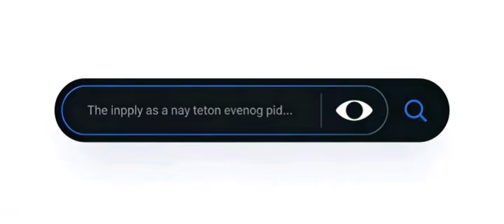
4.1.1 搜索输入框(带防抖和搜索图标)
dart
CommonTextInput(
  inputType: TextInputType.text,
  hintText: "请输入搜索内容",
  prefixIcon: const Icon(Icons.search, color: Colors.grey, size: 20),
  showClearIcon: true,
  onChanged: (value) {
    // 防抖搜索回调,避免频繁请求接口
    print("搜索关键词:$value");
  },
  styleConfig: InputStyleConfig.ohosStyle.copyWith(
    backgroundColor: Colors.white,
    border: const OutlineInputBorder(
      borderSide: BorderSide(color: Colors.grey[200]!),
      borderRadius: BorderRadius.all(Radius.circular(20)),
    ),
  ),
)
4.1.2 带计数的文本输入框(如备注)
dart
CommonTextInput(
  inputType: TextInputType.multiline,
  maxLines: 3,
  hintText: "请输入备注(最多50字)",
  maxLength: 50,
  suffix: Padding(
    padding: const EdgeInsets.only(right: 12),
    child: Text(
      "${_controller.text.length}/50",
      style: const TextStyle(fontSize: 12, color: Colors.grey),
    ),
  ),
  styleConfig: InputStyleConfig().copyWith(
    border: const OutlineInputBorder(
      borderSide: BorderSide(color: Colors.grey[200]!),
      borderRadius: BorderRadius.all(Radius.circular(8)),
    ),
  ),
)
4.2 性能优化建议
-
避免不必要的重建:
- 使用
const构造函数创建固定样式的InputStyleConfig; - 外部传入
controller时,避免在build方法中创建新实例(应存储在State或Provider中)。
- 使用
-
防抖优化:
- 根据场景调整防抖延迟时间(如搜索场景用 500ms,实时验证用 300ms);
- 输入完成后(如失去焦点)立即取消防抖,触发最终回调。
-
内存管理:
- 外部传入的
controller由外部负责销毁,内部创建的控制器在dispose中销毁; - 避免在
initState中创建过多临时对象。
- 外部传入的
4.3 常见问题解决方案
- 输入框被键盘遮挡 :在
Scaffold中设置resizeToAvoidBottomInset: true(默认开启),或使用SingleChildScrollView包裹表单。 - 密码切换时光标位置重置 :Flutter 原生
TextField的obscureText变化会导致光标重置,可通过保存光标位置解决:
dart
// 密码切换时保存光标位置
final selection = _controller.selection;
setState(() {
  _showPassword = !_showPassword;
});
_controller.selection = selection;- 验证规则不生效 :确保
validators参数传入的是InputValidator类型的列表,且每个验证函数返回String?类型。
五、总结与展望
本文详细讲解了 Flutter 通用文本输入框的封装过程,从需求分析、架构设计到具体实现,逐步构建了一个功能全面、可扩展、适配开源鸿蒙特性的组件。通过封装,不仅解决了跨平台开发中文本输入框的一致性问题,还提升了开发效率,降低了维护成本。
核心收获
- 掌握「分层封装 + 组合模式」的组件设计思路,实现功能模块化;
- 理解 Flutter 与开源鸿蒙文本输入组件的设计差异,实现跨平台特性适配;
- 学会通过状态管理、防抖、验证规则等技巧提升组件交互体验和性能。
后续扩展方向
- 支持更多输入类型(如身份证、邮箱、日期等)的内置验证规则;
- 集成输入框动画效果(如聚焦时的缩放、错误提示的渐变);
- 适配更多开源鸿蒙特性,如输入框的语音输入、表情输入功能;
- 封装成独立的开源库,发布到 pub.dev,方便更多开发者使用。
通过本文的实践,希望能帮助开发者在 Flutter 跨平台开发中打造更优质的文本输入体验,如果在使用过程中有任何优化建议,欢迎在评论区交流讨论!