DevUI 是一套以「设计系统为灵魂、组件库为核心、工程化工具为支撑」的企业级前端解决方案,核心优势在于「企业级场景适配、全链路一致性设计、高可定制性与工程化效率协同」。

在当今快速迭代的互联网时代,企业级前端开发面临着效率、一致性、可维护性等多重挑战。作为华为内部多年业务沉淀的结晶,DevUI应运而生------这是一款基于Angular框架的开源前端解决方案,以"高效、开放、可信、乐趣"为设计价值观,致力于为企业中后台产品提供开箱即用的前端组件库。
DevUI 为 Web 应用提供了丰富的基础 UI 组件,我们还将持续探索企业级应用的最佳 UI 实践,欢迎尝试使用 DevUI。
表单布局
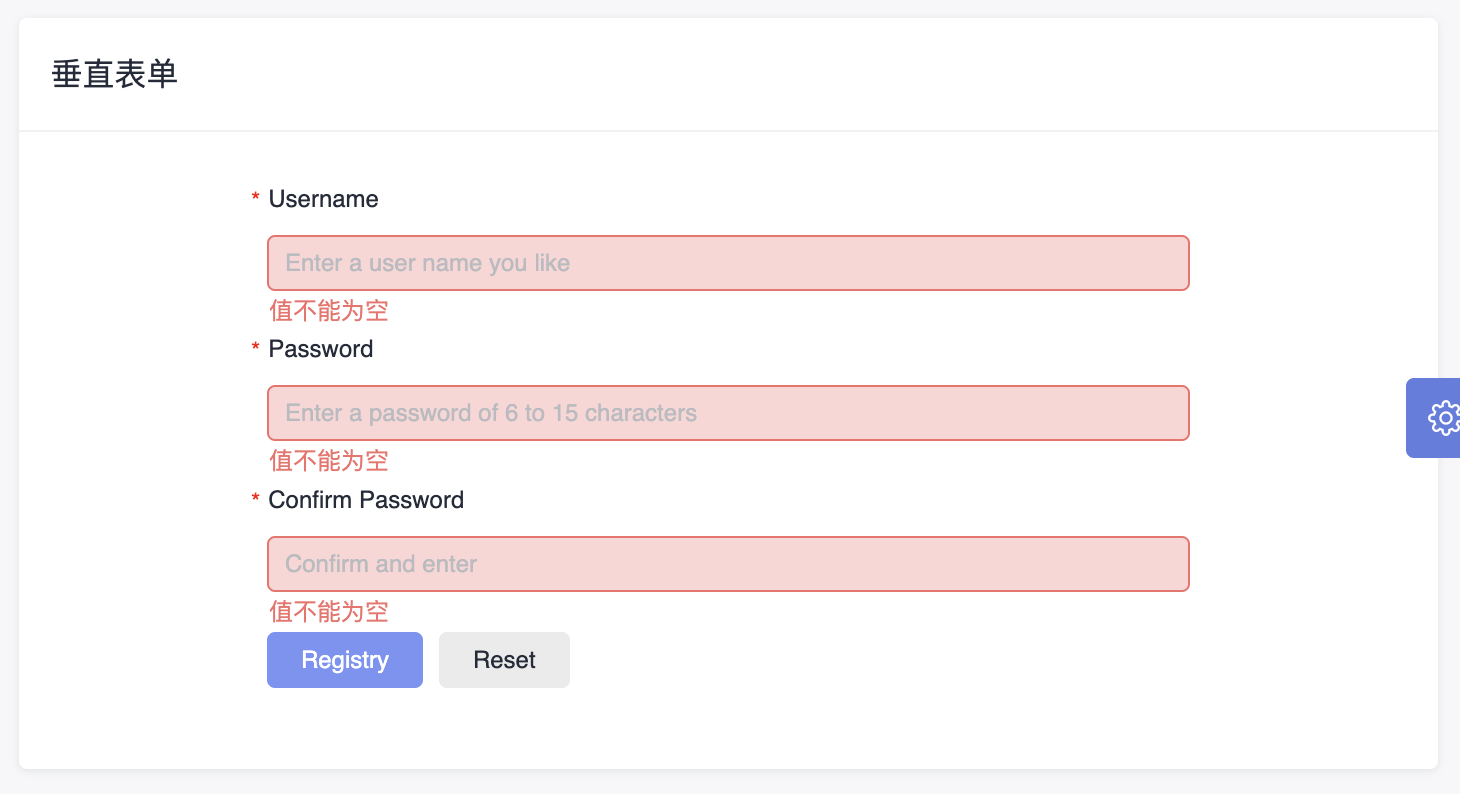
表单布局页展示了多种布局形式的表单,包含横向、垂直、弹框、多列等形式。
js
<da-layout-row [daGutter]="[24, 24]">
  <da-col-item [daSpan]="24" [daXs]="24">
    <div class="da-form">
      <form dForm ngForm [dValidateRules]="formRules.rule" [layout]="verticalLayout" #userForm="dValidateRules">
        <d-form-item>
          <d-form-label [required]="true">Username</d-form-label>
          <d-form-control>
            <input
              dTextInput
              autocomplete="off"
              name="username"
              placeholder="Enter a user name you like"
              [(ngModel)]="formData.userName"
              [dValidateRules]="formRules.usernameRules"
              autocomplete="off"
            />
          </d-form-control>
        </d-form-item>
        <d-form-item>
          <d-form-label [required]="true">Password</d-form-label>
          <d-form-control>
            <input
              dTextInput
              dValidateSyncKey="password"
              type="password"
              name="password"
              [(ngModel)]="formData.password"
              placeholder="Enter a password of 6 to 15 characters"
              [dValidateRules]="formRules.passwordRules"
            />
          </d-form-control>
        </d-form-item>
        <d-form-item>
          <d-form-label [required]="true">Confirm Password</d-form-label>
          <d-form-control>
            <input
              dTextInput
              dValidateSyncKey="password"
              type="password"
              name="confirmPassword"
              [(ngModel)]="formData.confirmPassword"
              placeholder="Confirm and enter"
              [dValidateRules]="formRules.confirmPasswordRules"
            />
          </d-form-control>
        </d-form-item>
        <d-form-operation>
          <d-button class="mr-element-spacing" [title]="userForm.errorMessage || ''" circled="true" style="margin-right: 8px" dFormSubmit
            >Registry</d-button
          >
          <d-button bsStyle="common" circled="true" dFormReset>Reset</d-button>
        </d-form-operation>
      </form>
    </div>
  </da-col-item>
</da-layout-row>
这段代码是一个使用 DevUI 组件库构建的 Angular 注册表单模板,详细分析:
整体结构
- 使用 da-layout-row 和 da-col-item 创建响应式布局容器
- 表单采用垂直布局方式展示各个输入项
- 核心组件说明
表单容器 (form)
- dForm 和 ngForm: DevUI 表单指令,启用表单验证功能
- dValidateRules="formRules.rule": 绑定全局验证规则
- #userForm="dValidateRules": 创建模板引用变量用于访问表单状态
表单项 (d-form-item)
- 每个表单项包含标签(d-form-label)和控件容器(d-form-control)
- 三个必填字段:用户名、密码、确认密码
输入控件 (input)
- dTextInput: DevUI 文本输入框样式指令
- (ngModel): 双向数据绑定到 formData 对象相应属性
操作按钮区 (d-form-operation)
- 提交按钮 (dFormSubmit): 触发表单验证和提交
- 重置按钮 (dFormReset): 清空表单内容
特殊功能点
- 异步验证: 用户名输入时会检查是否已存在
- 同步验证: 密码确认字段与密码字段实时比对
- 响应式布局: 使用 DevUI 栅格系统适配不同屏幕尺寸
- 国际化支持: 错误信息同时提供中英文版本
这个表单实现了完整的用户注册功能,包含实时验证、异步查重、密码一致性检查等特性。
js
import { Component } from '@angular/core';
import { DValidateRules } from 'ng-devui/form';
import { of } from 'rxjs';
import { delay } from 'rxjs/operators';
import { FormLayout } from 'ng-devui';

@Component({
  selector: 'da-vertical-form',
  templateUrl: './vertical-form.component.html',
  styleUrls: ['./vertical-form.component.scss'],
})
export class VerticalFormComponent {
  existUsernames = ['Lily', 'Goffy', 'Nancy'];

  formData = {
    userName: '',
    password: '',
    confirmPassword: '',
  };

  verticalLayout: FormLayout = FormLayout.Vertical;

  formRules: { [key: string]: DValidateRules } = {
    rule: { message: 'The form verification failed, please check.', messageShowType: 'text' },
    usernameRules: {
      validators: [
        { required: true },
        { minlength: 3 },
        { maxlength: 128 },
        {
          pattern: /^[a-zA-Z0-9]+(\s+[a-zA-Z0-9]+)*$/,
          message: {
            'zh-cn': '用户名仅允许输入数字与大小写字母',
            'en-us': 'The user name cannot contain characters except uppercase, lowercase letters or numbers.'
          },
        },
      ],
      asyncValidators: [{ sameName: this.checkName.bind(this), message: {
        'zh-cn': '用户名重名',
        'en-us': 'Duplicate name.'
      } }],
    },
    passwordRules: {
      validators: [{ required: true }, { minlength: 6 }, { maxlength: 15 }, { pattern: /^[a-zA-Z0-9]+(\s+[a-zA-Z0-9]+)*$/ }],
      message: {
        'zh-cn': '密码为6-15位数字和字母',
        'en-us': 'Enter a password that contains 6 to 15 digits and letters.'
      }
    },
    confirmPasswordRules: [
      { required: true },
      { sameToPassWord: this.sameToPassWord.bind(this), message: {
        'zh-cn': '密码与确认密码不一致',
        'en-us': 'Ensure that the two passwords are the same.'
        }
      },
      { minlength: 6 },
      { maxlength: 15 },
      { pattern: /^[a-zA-Z0-9]+(\s+[a-zA-Z0-9]+)*$/, message: {
        'zh-cn': '密码必须包含数字和字母',
        'en-us': 'The password must contain only letters and digits.'
        }
      },
    ],
  };

  checkName(value) {
    let res = true;
    if (this.existUsernames.indexOf(value) !== -1) {
      res = false;
    }
    return of(res).pipe(delay(500));
  }

  sameToPassWord(value) {
    return value === this.formData.password;
  }
}
这段代码是一个基于 Angular 框架的表单组件,使用了 DevUI 库来实现垂直布局的注册表单。下面是对代码的逐部分解析:
1. 组件装饰器与基本配置
js
@Component({
  selector: 'da-vertical-form',
  templateUrl: './vertical-form.component.html',
  styleUrls: ['./vertical-form.component.scss'],
})- selector: 定义组件的选择器,可在模板中通过 使用此组件。
- templateUrl: 指定组件的 HTML 模板文件路径。
- styleUrls: 指定组件的样式文件路径。
2. 表单数据模型
js
formData = {
  userName: '',
  password: '',
  confirmPassword: '',
};
定义表单数据对象,包含三个字段:用户名、密码和确认密码,默认值为空字符串。
3. 表单布局配置
js
verticalLayout: FormLayout = FormLayout.Vertical;设置表单为垂直布局(FormLayout.Vertical 是 DevUI 提供的枚举类型)。
4. 表单校验规则
js
formRules: { [key: string]: DValidateRules } = {
  rule: { ... },
  usernameRules: { ... },
  passwordRules: { ... },
  confirmPasswordRules: [ ... ],
};
整体规则 (rule)
- 当表单验证失败时显示统一提示信息:"The form verification failed, please check.",并以文本形式展示。
用户名校验规则 (usernameRules)
- 必填项 (required)
- 长度限制:最少3个字符,最多128个字符
- 正则表达式校验:只允许字母和数字,不能有特殊字符
- 异步校验:检查用户名是否已存在(调用 checkName 方法)
密码校验规则 (passwordRules)
- 必填项
- 密码长度在6~15之间
- 只允许字母和数字
- 自定义错误消息提示
确认密码校验规则 (confirmPasswordRules)
- 必填项
- 自定义校验方法 sameToPassWord:确保两次输入密码一致
- 其他规则同密码字段
5. 异步校验方法
js
checkName(value) {
  let res = true;
  if (this.existUsernames.indexOf(value) !== -1) {
    res = false;
  }
  return of(res).pipe(delay(500));
}
检查用户名是否存在预设列表 existUsernames 中。
返回一个延迟500毫秒的 Observable,模拟异步请求(比如查询数据库)。
6. 同步校验方法
js
sameToPassWord(value) {
  return value === this.formData.password;
}
判断确认密码是否与原始密码相同。
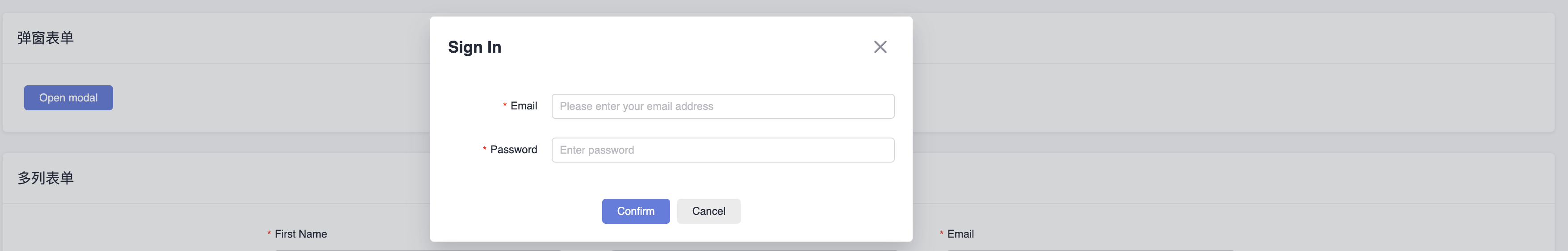
弹框表单:
js
import { Component } from '@angular/core';
import { ModalFormContentComponent } from './modal-form-content/modal-form-content.component';
import { DialogService } from 'ng-devui/modal';

@Component({
  selector: 'da-modal-form',
  templateUrl: './modal-form.component.html',
  styleUrls: ['./modal-form.component.scss'],
})
export class ModalFormComponent {
  constructor(private dialogService: DialogService) {}

  openstandardDialog(dialogtype?: string) {
    const results = this.dialogService.open({
      id: 'dialog-service',
      maxHeight: '300px',
      title: 'Sign In',
      content: ModalFormContentComponent,
      backdropCloseable: true,
      dialogtype: dialogtype,
      onClose: () => {
        console.log('on dialog closed');
      },
      buttons: [
        {
          cssClass: 'stress',
          text: 'Confirm',
          handler: ($event: Event) => {
            results.modalInstance.hide();
          },
        },
        {
          id: 'btn-cancel',
          cssClass: 'common',
          text: 'Cancel',
          handler: ($event: Event) => {
            results.modalInstance.hide();
          },
        },
      ],
      data: {
        name: 'Tom',
        age: 10,
        address: 'Chengdu',
      },
    });
  }
}
这段代码实现了一个 Angular 组件,用于通过 DevUI 模态框(Modal)展示表单内容。以下是详细分析:
1. 组件声明
js
@Component({
  selector: 'da-modal-form',
  templateUrl: './modal-form.component.html',
  styleUrls: ['./modal-form.component.scss'],
})
export class ModalFormComponent {
  constructor(private dialogService: DialogService) {}
}- 选择器: 可在模板中使用
- 模板/样式: 分别指向 HTML 和 SCSS 文件
- 依赖注入: 注入 DialogService 用于管理模态框
2. 模态框打开方法
js
openstandardDialog(dialogtype?: string) {
  const results = this.dialogService.open({
    id: 'dialog-service',
    maxHeight: '300px',
    title: 'Sign In',
    content: ModalFormContentComponent,
    backdropCloseable: true,
    dialogtype: dialogtype,
    onClose: () => {
      console.log('on dialog closed');
    },
    buttons: [
      {
        cssClass: 'stress',
        text: 'Confirm',
        handler: ($event: Event) => {
          results.modalInstance.hide();
        },
      },
      {
        id: 'btn-cancel',
        cssClass: 'common',
        text: 'Cancel',
        handler: ($event: Event) => {
          results.modalInstance.hide();
        },
      },
    ],
    data: {
      name: 'Tom',
      age: 10,
      address: 'Chengdu',
    },
  });
}
关键配置项说明
| 配置项 | 作用 |
|---|---|
| id | 模态框唯一标识符 |
| maxHeight | 设置模态框最大高度为 300px |
| title | 模态框标题为 "Sign In" |
| content | 模态框内容组件为 ModalFormContentComponent(需实现表单逻辑) |
| backdropCloseable | 点击背景可关闭模态框 |
| dialogtype | 可选参数,用于传递额外类型信息 |
| onClose | 模态框关闭时触发回调,输出日志 "on dialog closed" |
| buttons | 定义两个按钮:确认(隐藏模态框)和取消(隐藏模态框) |
| data | 传递给模态框内容组件的数据对象(如用户信息) |
3. 模态框内容组件
js
import { Component } from '@angular/core';

@Component({
  selector: 'modal-form-content',
  templateUrl: './modal-form-content.component.html',
  styleUrls: ['./modal-form-content.component.scss'],
})
export class ModalFormContentComponent {
  // 表单逻辑实现
}- 选择器: 用于在模态框中渲染表单
- 模板/样式: 分别指向 HTML 和 SCSS 文件
- 功能: 实现具体的表单交互逻辑(如输入验证、提交处理等)
总结
该组件通过 DevUI 的 DialogService 打开一个模态框,展示 ModalFormContentComponent 组件作为表单内容。模态框包含标题、表单区域、确认/取消按钮,并支持背景点击关闭。通过 data 属性传递初始数据,按钮点击时会隐藏模态框。
DevUI是华为开源的企业级Angular前端解决方案,提供丰富的UI组件和工程化工具。其表单布局示例展示了垂直表单的实现,包含用户名、密码等字段的实时验证、异步查重及密码一致性检查功能。通过响应式布局和国际化支持,DevUI简化了企业级应用开发,确保高可定制性和一致性设计。
MateChat:https://gitcode.com/DevCloudFE/MateChat
MateChat官网:https://matechat.gitcode.com
DevUI官网:https://devui.design/home