DevUI 的 Modal 组件是用于构建模态对话框的核心组件,它基于 Angular ^18.0.0 版本,提供了标准对话框、信息提示、自定义内容等多种弹窗模式,能够满足中后台产品中丰富的交互场景。
一、 标准对话框
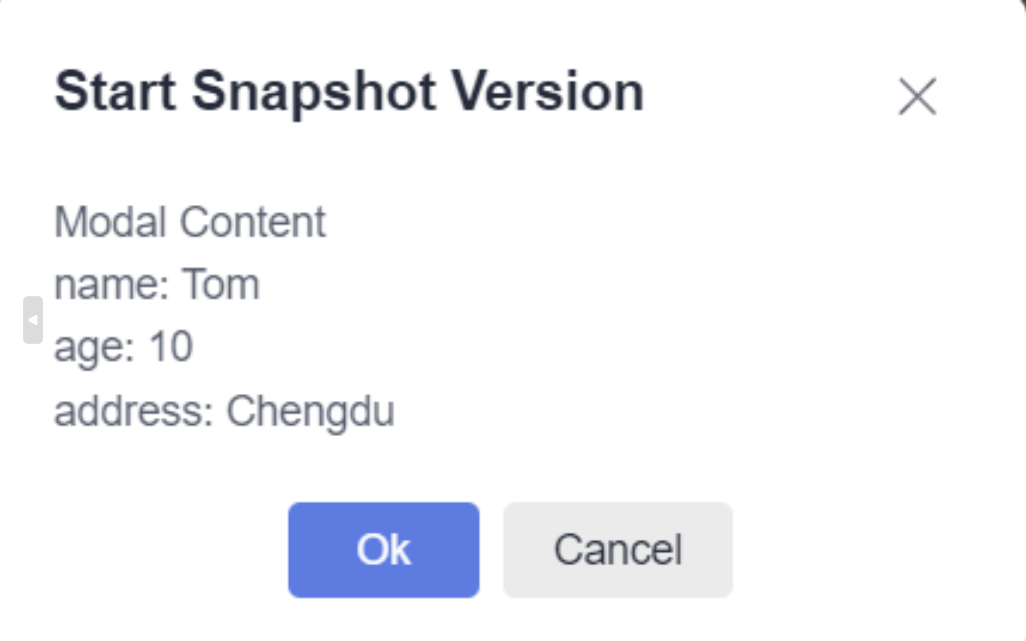
标准对话框是最常用的模态窗口,通过 dialogService 服务打开。
代码示例:
html代码
html
<!-- 在组件模板中添加触发按钮 -->
<d-button (click)="openDialog()">打开标准对话框</d-button>
<d-button bsStyle="common" (click)="openDialog('standard', false)">打开无动画对话框</d-button>
Ts代码
ts
import { Component } from '@angular/core';
import { DialogService } from 'ng-devui/modal';
import { ModalTestComponent } from '../modal-test.component';

@Component({
  selector: 'd-basic',
  templateUrl: './basic.component.html',
})
export class BasicComponent {
  config = {
    id: 'dialog-service',
    width: '346px',
    maxHeight: '600px',
    title: 'Start Snapshot Version',
    content: ModalTestComponent,
    backdropCloseable: true,
    onClose: () => console.log('on dialog closed'),
    data: {
      name: 'Tom',
      age: 10,
      address: 'Chengdu',
    },
  };

  constructor(private dialogService: DialogService) {}

  openDialog(dialogtype?: string, showAnimation?: boolean) {
    const results = this.dialogService.open({
      ...this.config,
      dialogtype: dialogtype,
      showAnimation: showAnimation,
      placement: 'unset',
      buttons: [
        {
          cssClass: 'primary',
          text: 'Ok',
          disabled: false,
          handler: ($event: Event) => {
            results.modalInstance.hide();
          },
        },
        {
          id: 'btn-cancel',
          cssClass: 'common',
          text: 'Cancel',
          handler: ($event: Event) => {
            results.modalInstance.hide();
          },
        },
      ],
    });
    console.log(results.modalContentInstance);
  }
}
组件逻辑说明:
在对应的 TypeScript 组件中,你需要注入 DialogService 并定义 openDialog 方法。dialogService.open 方法接收一个配置对象,用于定义对话框的标题、内容、按钮等。
二、 最大化对话框
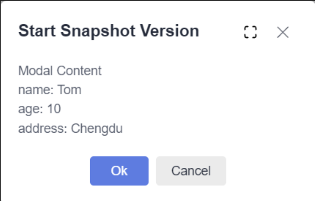
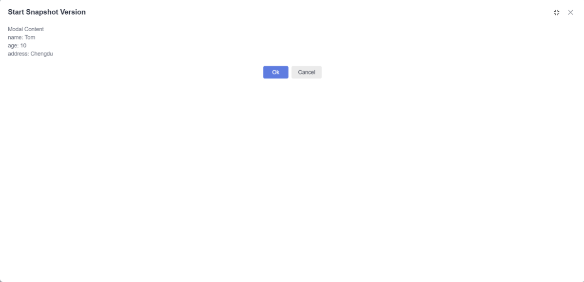
通过配置 showMaximizeBtn: true,可以在对话框标题栏显示最大化/还原按钮,方便用户全屏查看内容。
关键配置:
在调用 dialogService.open 时,在传入的配置对象中设置 showMaximizeBtn 属性。
TS
import { Component } from '@angular/core';
import { DialogService } from 'ng-devui/modal';
import { ModalTestComponent } from '../modal-test.component';
@Component({
selector: 'd-maximize',
templateUrl: './maximize.component.html',
})
export class MaximizeComponent {
config = {
id: 'dialog-service',
width: '346px',
maxHeight: '600px',
title: 'Start Snapshot Version',
content: ModalTestComponent,
backdropCloseable: true,
onClose: () => console.log('on dialog closed'),
data: {
name: 'Tom',
age: 10,
address: 'Chengdu',
},
};
constructor(private dialogService: DialogService) {}
openDialog(dialogtype?: string, showAnimation?: boolean) {
const results = this.dialogService.open({
...this.config,
showMaximizeBtn: true,
dialogtype: dialogtype,
showAnimation: showAnimation,
buttons: [
{
cssClass: 'primary',
text: 'Ok',
disabled: false,
handler: ($event: Event) => {
results.modalInstance.hide();
},
},
{
id: 'btn-cancel',
cssClass: 'common',
text: 'Cancel',
handler: ($event: Event) => {
results.modalInstance.hide();
},
},
],
});
console.log(results.modalContentInstance);
}
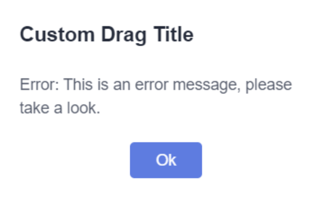
}三、 自定义对话框
如果你需要完全控制对话框的内部结构和样式,可以使用 modalService 来创建。
代码示例:
html代码
html
<d-button bsStyle="primary" (click)="openModal()">打开自定义模态框</d-button>
<d-button bsStyle="common" (click)="openModalWithoutBtn()">打开无按钮模态框</d-button>
TS代码
TS
mport { Component } from '@angular/core';
import { ModalService } from 'ng-devui/modal';
import { ModalAlertComponent } from './modal-alert.component';
import { ModalNoBtnComponent } from './modal-no-btn.component';

@Component({
  selector: 'd-customize',
  templateUrl: './customize.component.html',
})
export class CustomizeComponent {
  constructor(private modalService: ModalService) {}

  openModal() {
    const results = this.modalService.open({
      id: 'modal-modal',
      width: '300px',
      backdropCloseable: false,
      component: ModalAlertComponent,
      onClose: () => {
        console.log('on modal closed.');
      },
      data: {
        content: 'Error: This is an error message, please take a look.',
        cancelBtnText: 'Ok',
        onClose: (event) => {
          results.modalInstance.hide();
        },
      },
    });
    console.log(results);
  }

  openModalWithoutBtn() {
    const results = this.modalService.open({
      id: 'modal-no-btn',
      width: '300px',
      backdropCloseable: true,
      component: ModalNoBtnComponent,
      onClose: () => {
        console.log('on modal closed.');
      },
      data: {
        content: 'Error: This is an error message, please take a look.',
        cancelBtnText: 'Ok',
        onClose: (event) => {
          results.modalInstance.hide();
        },
      },
    });
    console.log(results);
  }
}
ModalAlert HTML
html
<div [dMovable]="true" [handle]="header" [moveEl]="parent">
  <div class="modal-header" #header>Custom Drag Title</div>
  <div class="modal-body">
    <div *ngIf="!!data.content">{{ data.content }}</div>
  </div>
  <div class="modal-footer">
    <d-button (click)="close($event)" bsStyle="primary" circled="true">{{ data.cancelBtnText }} </d-button>
  </div>
</div>
逻辑说明:
modalService.open 方法允许你传入自定义的组件或模板作为弹窗内容,提供了最高的灵活性。
四、 拦截对话框关闭
在用户尝试关闭对话框(如点击关闭按钮、遮罩层或按ESC键)时,可以通过 beforeHidden 回调函数进行拦截。常用于表单填写未保存时的二次确认。
代码示例:
html
<d-button bsStyle="common" (btnClick)="openPreventCloseDialog()">打开可拦截关闭的对话框</d-button>关键配置:
在对话框配置中定义 beforeHidden 函数,该函数需要返回一个 Promise<boolean> 或 Observable<boolean>。返回 false 或解析为 false 的 Promise/Observable 可以阻止关闭。
五、 信息提示
DevUI 提供了便捷的方法来打开成功、失败、警告和信息提示四种类型的提示框,样式和图标已内置。
代码示例:
html
<div class="btn-group">
  <d-button bsStyle="common" (click)="openDialog('success')">成功提示</d-button>
  <d-button bsStyle="common" (click)="openDialog('failed')">失败提示</d-button>
  <d-button bsStyle="common" (click)="openDialog('warning')">警告提示</d-button>
  <d-button bsStyle="common" (click)="openDialog('info')">信息提示</d-button>
</div>
六、 更新弹出框按钮状态
对话框打开后,可以通过获取到的对话框实例引用,动态更新其按钮的配置(如文字、禁用状态等)。
关键方法:
在 open 方法返回的对话框实例上调用 update 方法,传入新的 buttons 配置数组。
七、 配置按钮自动获得焦点
通过配置 buttons 数组中的 autofocus 属性,可以让对话框内的某个按钮在打开后自动获得焦点,用户可以直接按回车键触发。
配置示例:
typescript
buttons: [
  {
    id: 'btn-ok',
    text: '确定',
    autofocus: true, // 此按钮将自动获得焦点
    handler: ($event: Event) => { /* 处理逻辑 */ }
  }
]
八、 自定义弹出框内容模板
除了传入组件,还可以通过 Angular 的 <ng-template> 定义内容模板,为对话框提供灵活的内容。
代码示例:
html
<d-button bsStyle="common" (click)="openTemplateDialog()">打开模板对话框</d-button>
<ng-template #dialogContent let-modalInstance="modalInstance">
  <!-- 你的自定义内容 -->
  <p>这里是通过模板传入的内容。</p>
  <p>可以获取到模态框实例:{{ modalInstance }}</p>
</ng-template>
逻辑说明:
在调用服务打开时,将模板引用变量作为 contentTemplate 参数传入。模板可以通过上下文获取到 modalInstance 等实例进行交互。
九、 通过外层 fixed 同时避免滚动和抖动
在复杂页面中,为了避免弹窗打开时背景页面滚动或发生抖动,可以将弹窗挂载到具有 fixed 定位的外层容器中。
注意事项:
使用此方式时,页面内所有其他 fixed 定位的元素需要给定具体的位置值(如 top, left),使用默认的 auto 可能会导致位置偏移。
十、 场景案例与设计理念
Modal 组件旨在模拟真实的页面交互场景,其设计遵循 DevUI 高效、开放、可信、乐趣 的价值观,源自华为内部大量业务实践的沉淀。它通过丰富的配置项和 API,帮助开发者在各类中后台场景中快速构建稳定、易用的弹窗交互。
总结
DevUI 的 Modal 组件是一个功能强大且灵活的企业级弹窗解决方案。从简单的信息提示到复杂的自定义内容交互,它都能通过清晰的服务接口和配置项予以实现。掌握上述核心用法,将能有效提升你在 Angular 项目中处理模态交互的效率与体验。
参考资料
MateChat:https://gitcode.com/DevCloudFE/MateChat
MateChat官网:https://matechat.gitcode.com
DevUI官网:https://devui.design/home