最近在给编辑器做工具栏时,被一个优雅的CSS新特性惊艳到了------当工具栏空间不足时,时间信息自动隐藏;侧边栏收起后,它又神奇地出现。这不是JavaScript的功劳,而是CSS容器查询(Container Queries)的杰作。今天就以这个真实案例,聊聊这个让组件"自适应"的革命性特性。
一、从一个编辑器工具栏说起
先看这段生产环境代码:
html
<template>
  <div class="top-function-show-area">
    <div class="center-section">...</div>

    <!-- 这个时间信息会根据容器宽度自动显隐 -->
    <div class="process-info">
      当前时间: {{ currentProcess.toFixed(2) }} 秒 / 总体时长: {{ totalProcess.toFixed(2) }} 秒
    </div>
  </div>
</template>

<style scoped>
/* 关键1:声明容器 */
.top-function-show-area {
  width: 100%; /* 容器查询需要明确的宽度 */
  container-type: inline-size;
}

/* 关键2:基于容器宽度做响应 */
@container (max-width: 799px) {
  .process-info {
    display: none;
  }
}
</style>就这么简单的两行CSS,实现了一个智能响应逻辑:当工具栏宽度小于800px时,自动隐藏时间信息。没有媒体查询的"全局断点",没有JavaScript的resize监听,纯粹靠CSS就完成了组件级的自适应。
二、为什么需要容器查询?传统方案的痛点
在容器查询出现前,我们只能用**媒体查询(@media)**实现响应式:
css
/* ❌ 传统方案:基于视口宽度 */
@media (max-width: 799px) {
  .process-info { display: none; }
}媒体查询的致命缺点:
-
全局生效:影响页面上所有同名元素,无法局部控制
-
脱离上下文:组件无法知道自己的"生存空间"有多大
-
维护噩梦:组件在不同页面表现不一致,需要写很多例外逻辑
真实场景痛点:
html
<!-- 侧边栏展开时,主内容区域变窄 -->
<PageLayout>
  <Sidebar /> <!-- 宽度可变 -->
  <MainContent> <!-- 宽度随之变化 -->
    <VideoEditor>
      <Toolbar> <!-- 需要基于自身宽度做响应 -->
        <TimeInfo /> <!-- 这里要自动隐藏 -->
      </Toolbar>
    </VideoEditor>
  </MainContent>
</PageLayout>用媒体查询根本无法精确控制,因为视口宽度没变,变的是容器宽度。
三、容器查询核心语法拆解
1. 声明容器:container-type
css
/* 语法 */
container-type: normal; /* 默认,不建立容器 */
container-type: size;   /* 监听宽度和高度 */
container-type: inline-size; /* 仅监听宽度(最常用) */

/* 你的代码 */
.top-function-show-area {
  container-type: inline-size; /* 成为响应式参照物 */
}
为什么用 inline-size 而不是 size?
-
inline-size= 行内方向尺寸(水平方向) -
在LTR(从左到右)和RTL(从右到左)布局中自动适配
-
性能更好,浏览器只需监听宽度变化
2. 查询条件:@container
css
/* 语法 */
@container (条件) { /* 条件支持 min-width, max-width, width 等 */ }

/* 你的代码 */
@container (max-width: 799px) {
  .process-info { display: none; }
}条件支持:
-
(min-width: 600px):容器宽度 ≥ 600px -
(max-width: 799px):容器宽度 ≤ 799px -
(width > 500px):新语法,更直观 -
(600px < width < 1200px):范围查询
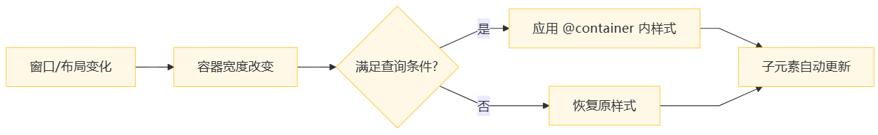
3. 工作流程图
四、容器查询 vs 媒体查询:全方位对比
| 对比维度 | 媒体查询 @media |
容器查询 @container |
|---|---|---|
| 参照物 | 视口(Viewport) | 父容器(Container) |
| 作用域 | 全局生效 | 局部组件生效 |
| 适用场景 | 页面级布局 | 组件级自适应 |
| 灵活性 | 低(断点固定) | 高(容器自适应) |
| 性能 | 页面重绘 | 局部重绘 |
| 维护成本 | 高(需要上下文) | 低(组件自给自足) |
| 支持嵌套 | ❌ 不支持 | ✅ 支持多层嵌套 |
五、5个真实生产环境案例
案例1:响应式卡片网格(电商产品列表)
TypeScript
<template>
  <div class="product-grid">
    <div v-for="item in products" :key="item.id" class="product-card">
      <img :src="item.image" class="product-image" />
      <h3 class="product-title">{{ item.title }}</h3>
      <p class="product-desc">{{ item.description }}</p>
    </div>
  </div>
</template>

<style scoped>
.product-grid {
  display: grid;
  grid-template-columns: repeat(auto-fill, minmax(240px, 1fr));
  container-type: inline-size; /* 声明容器 */
}

/* 容器宽度 < 600px:单列布局,隐藏描述 */
@container (max-width: 599px) {
  .product-grid {
    grid-template-columns: 1fr;
  }
  .product-desc { display: none; }
}

/* 600px ≤ 容器宽度 < 1000px:两列布局 */
@container (min-width: 600px) and (max-width: 999px) {
  .product-grid {
    grid-template-columns: repeat(2, 1fr);
  }
}

/* 容器宽度 ≥ 1000px:三列布局,显示所有信息 */
@container (min-width: 1000px) {
  .product-grid {
    grid-template-columns: repeat(3, 1fr);
  }
  .product-image { height: 200px; }
}
</style>优势:卡片组件在任何地方使用都能自动适配容器宽度,无需关心父级布局。
案例2:自适应表单(后台管理系统)
html
<template>
  <div class="form-container">
    <div class="form-row">
      <label>姓名</label>
      <input type="text" />
    </div>
    <div class="form-row">
      <label>邮箱</label>
      <input type="email" />
    </div>
  </div>
</template>

<style scoped>
.form-container {
  container-type: inline-size;
}

.form-row {
  display: flex;
  gap: 16px;
  align-items: center;
}

/* 容器宽度 < 500px:标签在上,输入框在下 */
@container (max-width: 499px) {
  .form-row {
    flex-direction: column;
    align-items: stretch;
  }
  label { margin-bottom: 4px; }
}
</style>优势:表单在弹窗、侧边栏、主内容区都能自动选择最佳布局。
案例3:智能仪表盘(数据可视化)
html
<template>
  <div class="dashboard">
    <div class="stat-card">
      <h4>销售额</h4>
      <div class="stat-value">¥128,456</div>
      <div class="stat-chart">图表</div>
    </div>
  </div>
</template>

<style scoped>
.dashboard {
  container-type: inline-size;
}

/* 容器宽度 < 400px:只显示总值,隐藏图表 */
@container (max-width: 399px) {
  .stat-chart { display: none; }
  .stat-value { font-size: 24px; }
}

/* 400px ≤ 容器宽度 < 800px:显示简化图表 */
@container (min-width: 400px) and (max-width: 799px) {
  .stat-chart { height: 100px; }
}

/* 容器宽度 ≥ 800px:显示完整图表和详细信息 */
@container (min-width: 800px) {
  .stat-chart { height: 200px; }
  .stat-value { font-size: 32px; }
}
</style>优势:数据卡片在不同尺寸的网格区域中自动选择展示精度。
案例4:表格列显隐(数据密集场景)
html
<template>
  <div class="table-wrapper">
    <table>
      <thead>
        <tr>
          <th class="col-id">ID</th>
          <th class="col-name">名称</th>
          <th class="col-desc">描述</th>
          <th class="col-status">状态</th>
          <th class="col-action">操作</th>
        </tr>
      </thead>
    </table>
  </div>
</template>

<style scoped>
.table-wrapper {
  container-type: inline-size;
  overflow-x: auto;
}

/* 容器宽度 < 600px:只保留关键列 */
@container (max-width: 599px) {
  .col-desc, .col-status { display: none; }
}

/* 600px ≤ 容器宽度 < 900px:显示大部分列 */
@container (min-width: 600px) and (max-width: 899px) {
  .col-desc { display: table-cell; }
  .col-status { display: none; }
}

/* 容器宽度 ≥ 900px:显示所有列 */
@container (min-width: 900px) {
  th, td { display: table-cell; }
}
</style>优势:表格在窄空间自动隐藏非关键列,保证核心数据可读性。
案例5:组件库设计(通用 Button 组件)
html
<!-- Button.vue -->
<template>
  <button class="my-button">
    <slot name="icon" />
    <span class="button-text"><slot /></span>
  </button>
</template>

<style scoped>
.my-button {
  container-type: inline-size;
  display: inline-flex;
  align-items: center;
  gap: 8px;
}

/* 按钮宽度 < 80px:隐藏文字,只显示图标 */
@container (max-width: 79px) {
  .button-text { display: none; }
}

/* 按钮宽度 ≥ 80px:正常显示 */
@container (min-width: 80px) {
  .button-text { display: inline; }
}
</style>

<!-- 使用示例 -->
<div class="toolbar">
  <MyButton>
    <template #icon><Icon /></template>
    保存
  </MyButton>
</div>

<div class="small-actions">
  <MyButton>
    <template #icon><Icon /></template>
    保存
  </MyButton>
</div>优势:同一个按钮组件在不同宽度容器中自动切换图标/文字模式。
六、进阶技巧与最佳实践
1. 命名容器:避免冲突
css
/* 多个容器时,用名字区分 */
.toolbar {
  container-type: inline-size;
  container-name: toolbar; /* 命名 */
}

.sidebar {
  container-type: inline-size;
  container-name: sidebar;
}

/* 精确控制 */
@container toolbar (max-width: 599px) {
  .process-info { display: none; }
}

@container sidebar (max-width: 299px) {
  .menu-text { display: none; }
}
2. 容器单位:cqw, cqh, cqi
css
@container (min-width: 400px) {
  .stat-value {
    font-size: 10cqi; /* 字体大小 = 容器宽度的 10% */
  }
}-
cqw:容器宽度的 1% -
cqh:容器高度的 1% -
cqi:容器行内尺寸的 1%(推荐,支持RTL)
3. 嵌套容器:复杂布局
css
.dashboard {
  container-type: inline-size; /* 父容器 */
}

.stat-card {
  container-type: inline-size; /* 子容器 */
}

/* 父容器宽度的响应 */
@container (max-width: 799px) {
  .dashboard { grid-template-columns: 1fr; }
}

/* 子容器宽度的响应 */
@container (max-width: 399px) {
  .stat-card { padding: 12px; }
}
4. 与 @media 配合使用
css
/* 页面级:用 @media */
@media (max-width: 1200px) {
  .page-layout { grid-template-columns: 1fr; }
}

/* 组件级:用 @container */
@container (max-width: 600px) {
  .toolbar { flex-wrap: wrap; }
}
最佳实践 :@media 管页面,@container 管组件,各司其职。
七、浏览器支持与优雅降级
当前支持情况(2024年12月)
| 浏览器 | 版本 | 全球使用率 |
|---|---|---|
| Chrome | ≥ 105 | ✅ 95%+ |
| Safari | ≥ 16 | ✅ 90%+ |
| Firefox | ≥ 110 | ✅ 92%+ |
| Edge | ≥ 105 | ✅ 自动更新 |
总体支持率 :约 93% 的用户可以使用(数据来源:Can I Use)
优雅降级方案
css
/* 1. 基础样式(所有浏览器) */
.process-info {
  display: block;
}

/* 2. 增强体验(支持 @container 的浏览器) */
@supports (container-type: inline-size) {
  @container (max-width: 799px) {
    .process-info { display: none; }
  }
}

/* 3. 备选方案(不支持时的兜底) */
@supports not (container-type: inline-size) {
  @media (max-width: 799px) {
    .process-info { display: none; }
  }
}
JavaScript Polyfill(生产环境不推荐)
TypeScript
// 仅在必要时使用
import 'container-query-polyfill';

// 然后在 CSS 中正常写 @container注意:Polyfill 性能开销较大,建议渐进增强而非强制兼容。
八、性能优化与注意事项
1. 性能优势
-
局部重绘:只有容器内的元素会重绘,不影响整个页面
-
自动节流:浏览器内部优化,比 JavaScript resize 监听更高效
-
计算量小:仅计算容器尺寸,不触发整个布局树
2. 注意事项
-
不要滥用:每个容器都会增加浏览器计算负担,一般一个组件一个容器
-
避免嵌套过深:建议不超过 3 层嵌套容器
-
与 flex/grid 配合最佳:容器查询 + 现代布局 = 黄金搭档
3. 调试技巧
css
/* 1. 在 DevTools 中查看容器 */
/* Chrome: Elements -> Layout -> Container Queries */

/* 2. 临时高亮容器 */
.top-function-show-area {
  container-type: inline-size;
  outline: 2px solid red; /* 调试时查看容器范围 */
}
九、总结:何时使用容器查询?
✅ 推荐使用场景:
-
组件需要在不同父容器中自动适配
-
弹窗、侧边栏、卡片等可变宽度场景
-
需要基于局部空间调整 UI 密度
-
设计系统/组件库开发
❌ 不适合场景:
-
页面级整体布局(继续用
@media) -
需要支持 IE11 等老旧浏览器
-
容器尺寸变化极其频繁(如动画)
十、一句话记住容器查询
把响应式从"全局断点"升级到"组件自适应",让每个组件学会"看菜吃饭、量体裁衣"。
就像你的编辑器工具栏一样,空间充足时展示完整信息,空间紧张时自动收起,全程无需 JavaScript 干预。这就是 CSS 容器查询的魔力------让样式回归样式,让组件拥有智慧。