Vue 转盘抽奖 transform
简介:电商食用级转盘抽奖
讲在前面
在我们日常生活,电子购物已是必不可少的环节了。营销手段更是层出不穷,要数经典的还是转盘抽奖了,紧张又刺激(其实概率还不都是咱们程序猿弄的,刺激个der~)
虽说如此...
但 还是决定自己搞一个试试!
核心 transform
transform 属性向元素应用 2D 或 3D 转换。该属性允许我们对元素进行旋转、缩放、移动或倾斜。
但是既然我们说转盘,当然用到的是旋转啦:rotate
简单示例 顺时针旋转10deg
transform:rotate(10deg);
什么?你已经会这个css属性了? 那恭喜你,你已经能自己独立制作转盘抽奖啦~
核心代码
1. 转盘UI
xml
<template>
<view class="">
<!-- 转盘包裹 -->
<view class="rotate">
<!-- 绘制圆点 -->
<view :class="'circle circle_' + index" v-for="(item, index) in circleList" :key="index"
:style="{ background: index % 2 == 0 ? colorCircleFirst : colorCircleSecond }"></view>
<!-- 转盘图片 -->
<image class="dish" src="/static/demo/pan.png" :style="{ transform: rotate_deg, transition: rotate_transition }" ></image>
<!-- 指针图片 -->
<image class="pointer" src="/static/demo/zhen.png" @click="start" ></image>
</view>
</view>
</template>
<style lang="scss" scoped>
.rotate {
width: 600rpx;
height: 600rpx;
background: #ffbe04;
border-radius: 50%;
display: flex;
flex-direction: column;
align-items: center;
justify-content: center;
position: absolute;
top: 48%;
left: 50%;
transform: translate(-50%, -50%);
}
.rotate .dish {
width: 550rpx;
height: 550rpx;
}
.pointer {
width: 142rpx;
height: 200rpx;
position: absolute;
top: 46%;
left: 50%;
transform: translate(-50%, -50%);
}
/* 圆点 */
.rotate .circle {
position: absolute;
display: block;
border-radius: 50%;
height: 20rpx;
width: 20rpx;
background: black;
}
/*这里只写了一个点的位置,其他的自己补充一下 调调位置就好啦*/
.rotate .circle_0 {
top: 2rpx;
left: 284rpx;
}
</style>
2.让转盘转动起来
ini
var light_timer; //灯光定时器
data() {
return {
circleList: [], //圆点列表
colorCircleFirst: "#FF0000", //圆点闪烁颜色一
colorCircleSecond: "#fff", //圆点闪烁颜色二
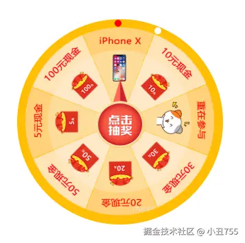
cat: 45, //总共8个扇形区域,每个区域45度,这就取决去奖品池的UI图了
isAllowClick: true, //是否能够点击
rotate_deg: 0, //指针旋转的角度
rotate_transition: "transform 3s ease-in-out" //过渡属性,渐入渐出
};
},
onLoad() {
this.showcircleList();
},
methods: {
// 设置边缘一圈16个圆点,可以根据需要修改
showcircleList() {
let circleList = [];
for (var i = 0; i < 16; i++) {
circleList.push(i);
}
this.circleList = circleList;
this.light();
},
//设置边缘灯光闪动效果
light: function() {
var that = this;
clearInterval(light_timer);
light_timer = setInterval(function() {
if (that.colorCircleFirst == "#FF0000") {
that.colorCircleFirst = "#fff";
that.colorCircleSecond = "#FF0000";
} else {
that.colorCircleFirst = "#FF0000";
that.colorCircleSecond = "#fff";
}
}, 300); //设置圆点闪烁的间隔时间效果
},
//点击开始抽奖
start() {
this.rotating();
},
//旋转
rotating() {
if (!this.isAllowClick) return;
this.isAllowClick = false;
this.rotate_transition = "transform 3s ease-in-out";
this.LuckyClick--;
var rand_circle = 5; //默认多旋转5圈
var winningIndex = this.set(); //设置概率
console.log(winningIndex);
var randomDeg = 360 - winningIndex * 45; //8个区域。一圈是360度,对应区域旋转度数就是顺时针的 360 - winningIndex*45°
var deg = rand_circle * 360 + randomDeg; //把本来定义多转的圈数度数也加上
this.rotate_deg = "rotate(" + deg + "deg)";
var that = this;
setTimeout(function() {
that.isAllowClick = true;
that.rotate_deg = "rotate(" + randomDeg + "deg)"; //定时器关闭的时候角度调回五圈之前相同位置,依照产品需求可以自己更改
that.rotate_transition = "";
if (winningIndex == 0) {
console.log("恭喜您,IphoneX");
} else if (winningIndex == 1) {
console.log("恭喜您,获得10元现金");
} else if (winningIndex == 2) {
console.log("很遗憾,重在参与");
uni.showToast({
title:"很遗憾,重在参与",
icon:"none"
})
} else if (winningIndex == 3) {
console.log("恭喜您,获得30元现金");
} else if (winningIndex == 4) {
console.log("恭喜您,获得20元现金");
} else if (winningIndex == 5) {
console.log("恭喜您,获得50元现金");
} else if (winningIndex == 6) {
console.log("恭喜您,获得5元现金");
} else if (winningIndex == 7) {
console.log("恭喜您,获得100元现金");
}
}, 3500);
},
//设置概率
set() {
var winIndex;
var __rand__ = Math.random();
// 随机数 设置抽奖概率 winIndex 记得参考奖品池的UI图
if (__rand__ < 0.30) winIndex = 2;
else if (__rand__ < 0.55) winIndex = 6;
else if (__rand__ < 0.75) winIndex = 1;
else if (__rand__ < 0.85) winIndex = 4;
else if (__rand__ < 0.92) winIndex = 3;
else if (__rand__ < 0.97) winIndex = 5;
else if (__rand__ < 0.99) winIndex = 7;
else if (__rand__ == 0.99) winIndex = 0;
return winIndex;
},
}最终效果展示
总结
其实就是利用背景图进行旋转,设置好旋转角度!如果有兴趣的话就快速行动吧,冲冲冲!!!