1.flex布局控制子元素的边距
sql
<!DOCTYPE html>
<html lang="zh-CN">
<head>
  <meta charset="UTF-8" />
  <meta name="viewport" content="width=device-width, initial-scale=1.0"/>
  <title>Flex 三栏布局</title>
  <style>
    * {
      margin: 0;
      padding: 0;
      box-sizing: border-box;
    }

    .flex-container {
      display: flex;
      width: 100%;
      min-height: 100vh;
      background-color: #f5f5f5;
      align-items: center;
      padding: 0; /* 确保无内边距干扰 */
    }

    .item {
      width: 80px;
      height: 60px;
      display: flex;
      align-items: center;
      justify-content: center;
      font-weight: bold;
      color: white;
    }

    .item1 {
      background-color: #4CAF50;
      margin-left: 10px;   /* 距离容器左边 10px */
    }

    .item2 {
      background-color: #2196F3;
      margin-left: 20px;   /* 与 item1 间隔 20px */
    }

    .item3 {
      background-color: #FF9800;
      margin-right: 10px;  /* 距离容器右边 10px */
      margin-left: auto;  /* 关键自适应边距*/
    }
  </style>
</head>
<body>
  <div class="flex-container">
    <div class="item item1">1</div>
    <div class="item item2">2</div>
    <div class="item item3">3</div>
  </div>
</body>
</html>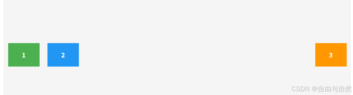
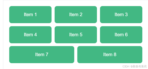
2.使用gap控制子元素中间边距
sql
<!DOCTYPE html>
<html lang="zh-CN">
<head>
  <meta charset="UTF-8" />
  <meta name="viewport" content="width=device-width, initial-scale=1.0"/>
  <title>3列等宽 Flex 布局</title>
  <style>
    * {
      margin: 0;
      padding: 0;
      box-sizing: border-box;
    }

    .container {
      display: flex;
      flex-wrap: wrap;
      gap: 10px; /* 水平和垂直间距均为 10px */
      padding: 20px;
      max-width: 1200px;
      margin: 0 auto;
    }

    .item {
      /* 关键:3列布局,2个间隙 × 10px = 20px */
      flex: 1 1 calc((100% - 20px) / 3);
      min-width: 0; /* 防止长内容撑破布局 */

      background-color: #42b883;
      color: white;
      padding: 20px;
      text-align: center;
      border-radius: 8px;
      font-family: Arial, sans-serif;
    }
  </style>
</head>
<body>
  <div class="container" id="container">
    <!-- 动态生成 8 个 item -->
  </div>

  <script>
    // 使用原生 JS 动态创建 8 个 item(模拟 Vue 的 v-for)
    const container = document.getElementById('container');
    for (let i = 1; i <= 8; i++) {
      const item = document.createElement('div');
      item.className = 'item';
      item.textContent = `Item ${i}`;
      container.appendChild(item);
    }
  </script>
</body>
</html>