前言
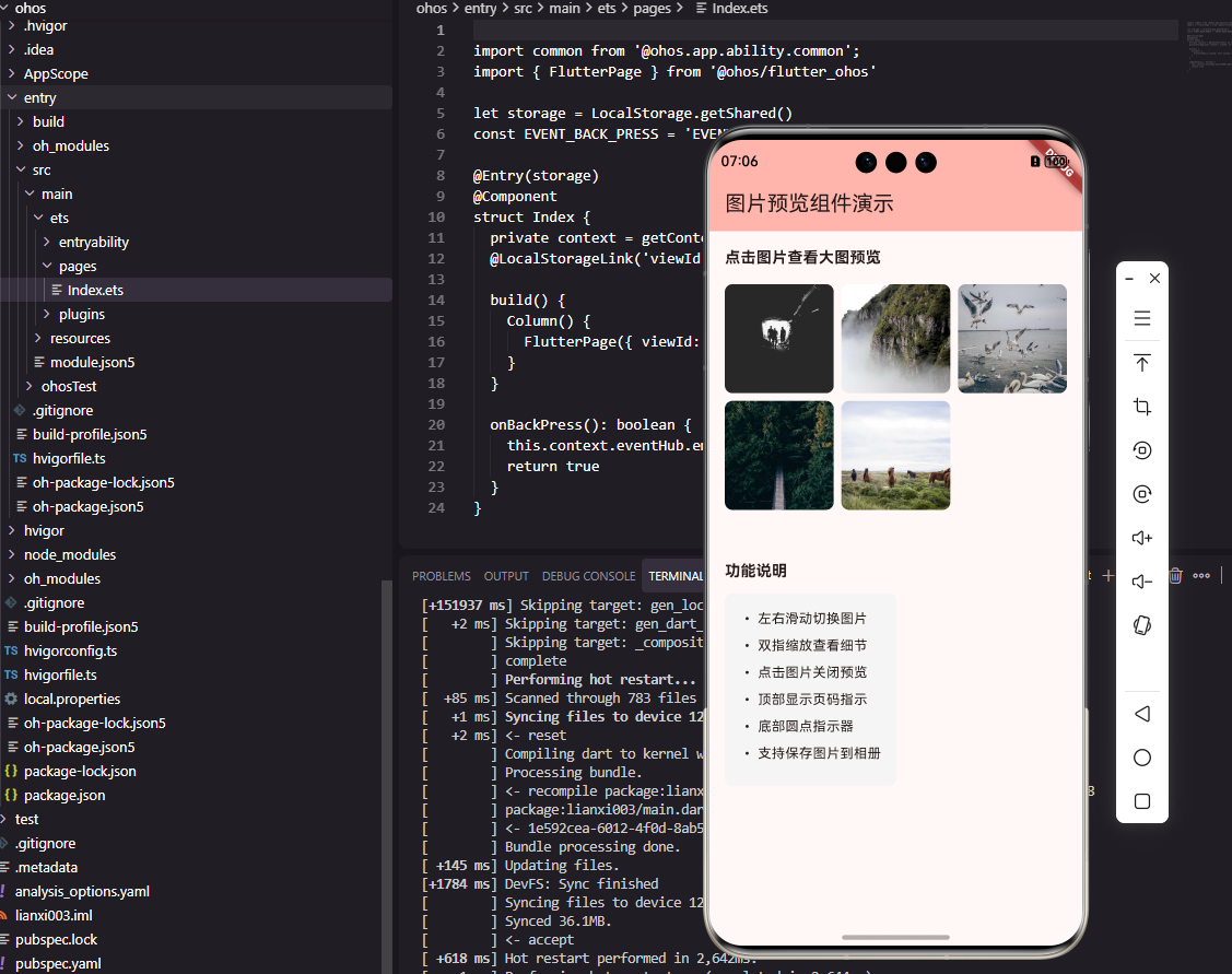
图片预览是商城应用中查看商品详情图、评价图等场景的重要功能。用户需要能够放大查看图片细节、左右滑动切换图片、双击缩放等操作。一个设计良好的图片预览组件需要提供流畅的手势交互和清晰的图片展示效果。本文将详细介绍如何在Flutter和OpenHarmony平台上开发图片预览组件。
图片预览的设计需要考虑手势的自然性和图片的加载性能。用户期望能够像操作实体照片一样自然地缩放和移动图片,同时大图的加载不应该造成明显的等待。通过合理的手势处理和图片缓存策略,我们可以为用户提供流畅的图片浏览体验。
Flutter图片预览基础结构
首先定义图片预览组件的基础结构:
dart
class ImagePreview extends StatefulWidget {
  final List<String> images;
  final int initialIndex;
  final VoidCallback? onClose;

  const ImagePreview({
    Key? key,
    required this.images,
    this.initialIndex = 0,
    this.onClose,
  }) : super(key: key);

  @override
  State<ImagePreview> createState() => _ImagePreviewState();
}

class _ImagePreviewState extends State<ImagePreview> {
  late PageController _pageController;
  late int _currentIndex;

  @override
  void initState() {
    super.initState();
    _currentIndex = widget.initialIndex;
    _pageController = PageController(initialPage: _currentIndex);
  }

  @override
  void dispose() {
    _pageController.dispose();
    super.dispose();
  }
}
ImagePreview组件接收图片列表和初始显示索引。PageController控制图片的左右滑动切换,initialPage设置初始显示的图片。_currentIndex记录当前显示的图片索引,用于更新页码指示器。dispose方法中释放控制器资源。这种设计支持多图预览和指定初始图片的场景。
预览界面构建:
dart
@override
Widget build(BuildContext context) {
  return Scaffold(
    backgroundColor: Colors.black,
    body: Stack(
      children: [
        _buildImageViewer(),
        _buildTopBar(),
        _buildBottomIndicator(),
      ],
    ),
  );
}

Widget _buildImageViewer() {
  return PageView.builder(
    controller: _pageController,
    itemCount: widget.images.length,
    onPageChanged: (index) {
      setState(() {
        _currentIndex = index;
      });
    },
    itemBuilder: (context, index) {
      return InteractiveViewer(
        minScale: 1.0,
        maxScale: 4.0,
        child: Center(
          child: Image.network(
            widget.images[index],
            fit: BoxFit.contain,
            loadingBuilder: (context, child, progress) {
              if (progress == null) return child;
              return Center(
                child: CircularProgressIndicator(
                  value: progress.expectedTotalBytes != null
                    ? progress.cumulativeBytesLoaded /
                      progress.expectedTotalBytes!
                    : null,
                  color: Colors.white,
                ),
              );
            },
          ),
        ),
      );
    },
  );
}
Scaffold使用黑色背景,营造沉浸式的图片浏览环境。Stack层叠图片查看器、顶部栏和底部指示器。PageView.builder实现图片的左右滑动切换,onPageChanged更新当前索引。InteractiveViewer提供缩放和平移手势支持,minScale和maxScale限制缩放范围。loadingBuilder显示图片加载进度,提供清晰的加载反馈。
顶部操作栏
dart
Widget _buildTopBar() {
  return Positioned(
    top: 0,
    left: 0,
    right: 0,
    child: Container(
      padding: EdgeInsets.only(
        top: MediaQuery.of(context).padding.top + 10,
        left: 16,
        right: 16,
        bottom: 10,
      ),
      decoration: BoxDecoration(
        gradient: LinearGradient(
          begin: Alignment.topCenter,
          end: Alignment.bottomCenter,
          colors: [
            Colors.black.withOpacity(0.5),
            Colors.transparent,
          ],
        ),
      ),
      child: Row(
        mainAxisAlignment: MainAxisAlignment.spaceBetween,
        children: [
          GestureDetector(
            onTap: () {
              Navigator.of(context).pop();
              widget.onClose?.call();
            },
            child: const Icon(
              Icons.close,
              color: Colors.white,
              size: 24,
            ),
          ),
          Text(
            '${_currentIndex + 1}/${widget.images.length}',
            style: const TextStyle(
              color: Colors.white,
              fontSize: 16,
            ),
          ),
          GestureDetector(
            onTap: _saveImage,
            child: const Icon(
              Icons.download,
              color: Colors.white,
              size: 24,
            ),
          ),
        ],
      ),
    ),
  );
}
顶部操作栏包含关闭按钮、页码指示和保存按钮。Container使用渐变背景,从半透明黑色渐变到透明,既不遮挡图片又保证按钮可见。padding考虑了状态栏高度,确保内容不被遮挡。页码显示当前图片位置和总数,帮助用户了解浏览进度。关闭按钮返回上一页,保存按钮将图片保存到相册。
底部指示器
dart
Widget _buildBottomIndicator() {
  if (widget.images.length <= 1) {
    return const SizedBox.shrink();
  }

  return Positioned(
    bottom: MediaQuery.of(context).padding.bottom + 20,
    left: 0,
    right: 0,
    child: Row(
      mainAxisAlignment: MainAxisAlignment.center,
      children: List.generate(
        widget.images.length,
        (index) => Container(
          width: _currentIndex == index ? 16 : 6,
          height: 6,
          margin: const EdgeInsets.symmetric(horizontal: 3),
          decoration: BoxDecoration(
            color: _currentIndex == index
              ? Colors.white
              : Colors.white.withOpacity(0.5),
            borderRadius: BorderRadius.circular(3),
          ),
        ),
      ),
    ),
  );
}
底部指示器显示当前图片在列表中的位置。当只有一张图片时不显示指示器。当前图片的指示点宽度更大呈椭圆形,其他指示点呈圆形。选中状态使用纯白色,未选中使用半透明白色。Row居中排列所有指示点,margin设置点之间的间距。这种设计让用户能够直观地了解当前位置和总图片数量。
双击缩放功能
dart
class ZoomableImage extends StatefulWidget {
  final String imageUrl;

  const ZoomableImage({
    Key? key,
    required this.imageUrl,
  }) : super(key: key);

  @override
  State<ZoomableImage> createState() => _ZoomableImageState();
}

class _ZoomableImageState extends State<ZoomableImage>
    with SingleTickerProviderStateMixin {
  final TransformationController _controller = TransformationController();
  late AnimationController _animationController;
  Animation<Matrix4>? _animation;

  @override
  void initState() {
    super.initState();
    _animationController = AnimationController(
      vsync: this,
      duration: const Duration(milliseconds: 200),
    );
  }

  void _handleDoubleTap() {
    final currentScale = _controller.value.getMaxScaleOnAxis();

    Matrix4 targetMatrix;
    if (currentScale > 1.5) {
      targetMatrix = Matrix4.identity();
    } else {
      targetMatrix = Matrix4.identity()..scale(2.5);
    }

    _animation = Matrix4Tween(
      begin: _controller.value,
      end: targetMatrix,
    ).animate(CurvedAnimation(
      parent: _animationController,
      curve: Curves.easeOut,
    ));

    _animation!.addListener(() {
      _controller.value = _animation!.value;
    });

    _animationController.forward(from: 0);
  }

  @override
  Widget build(BuildContext context) {
    return GestureDetector(
      onDoubleTap: _handleDoubleTap,
      child: InteractiveViewer(
        transformationController: _controller,
        minScale: 1.0,
        maxScale: 4.0,
        child: Image.network(
          widget.imageUrl,
          fit: BoxFit.contain,
        ),
      ),
    );
  }
}
ZoomableImage组件实现双击缩放功能。TransformationController控制图片的变换矩阵,AnimationController实现缩放动画。_handleDoubleTap方法判断当前缩放比例,如果已放大则恢复原始大小,否则放大到2.5倍。Matrix4Tween创建矩阵动画,CurvedAnimation添加缓动效果。这种设计让用户可以通过双击快速切换放大和原始状态。
OpenHarmony图片预览实现
typescript
@Component
struct ImagePreview {
  @State currentIndex: number = 0
  @Prop images: string[] = []
  @Prop initialIndex: number = 0
  private onClose: () => void = () => {}
  private swiperController: SwiperController = new SwiperController()

  aboutToAppear() {
    this.currentIndex = this.initialIndex
  }

  build() {
    Stack() {
      Swiper(this.swiperController) {
        ForEach(this.images, (imageUrl: string) => {
          this.ZoomableImage(imageUrl)
        })
      }
      .index(this.initialIndex)
      .indicator(false)
      .loop(false)
      .onChange((index: number) => {
        this.currentIndex = index
      })

      this.TopBar()
      this.BottomIndicator()
    }
    .width('100%')
    .height('100%')
    .backgroundColor(Color.Black)
  }
}
OpenHarmony的图片预览使用Swiper组件实现图片切换。@State装饰的currentIndex管理当前索引,aboutToAppear生命周期方法初始化索引值。Swiper的index属性设置初始显示图片,indicator设为false隐藏默认指示器,loop设为false禁用循环滑动。Stack层叠图片、顶部栏和底部指示器。这种实现方式与Flutter版本结构一致。
可缩放图片ArkUI实现:
typescript
@Builder
ZoomableImage(imageUrl: string) {
  Image(imageUrl)
    .width('100%')
    .height('100%')
    .objectFit(ImageFit.Contain)
    .gesture(
      PinchGesture()
        .onActionUpdate((event: GestureEvent) => {
          // 处理缩放手势
        })
    )
    .gesture(
      TapGesture({ count: 2 })
        .onAction(() => {
          // 处理双击缩放
        })
    )
}
@Builder装饰器定义了可缩放图片的构建方法。Image组件设置100%宽高和Contain适应模式。PinchGesture处理双指缩放手势,TapGesture配合count: 2处理双击手势。ArkUI的手势系统支持多种手势的组合使用,可以实现复杂的交互效果。
顶部栏ArkUI实现
typescript
@Builder
TopBar() {
  Row() {
    Image($r('app.media.close'))
      .width(24)
      .height(24)
      .onClick(() => this.onClose())

    Text((this.currentIndex + 1) + '/' + this.images.length)
      .fontSize(16)
      .fontColor(Color.White)

    Image($r('app.media.download'))
      .width(24)
      .height(24)
      .onClick(() => this.saveImage())
  }
  .width('100%')
  .height(60)
  .padding({ left: 16, right: 16, top: 30 })
  .justifyContent(FlexAlign.SpaceBetween)
  .linearGradient({
    direction: GradientDirection.Bottom,
    colors: [['#80000000', 0], ['#00000000', 1]]
  })
  .position({ x: 0, y: 0 })
}
顶部栏使用Row水平排列关闭按钮、页码和保存按钮。justifyContent设为FlexAlign.SpaceBetween实现两端对齐。linearGradient设置渐变背景,从半透明黑色渐变到透明。position将顶部栏定位在Stack的顶部。onClick事件处理器分别处理关闭和保存操作。这种实现方式与Flutter版本的视觉效果一致。
图片保存功能
dart
Future<void> _saveImage() async {
  try {
    final imageUrl = widget.images[_currentIndex];

    // 显示加载提示
    showDialog(
      context: context,
      barrierDismissible: false,
      builder: (context) => const Center(
        child: CircularProgressIndicator(color: Colors.white),
      ),
    );

    // 下载图片
    final response = await http.get(Uri.parse(imageUrl));

    // 保存到相册
    final result = await ImageGallerySaver.saveImage(
      response.bodyBytes,
      quality: 100,
    );

    Navigator.of(context).pop();

    if (result['isSuccess']) {
      ScaffoldMessenger.of(context).showSnackBar(
        const SnackBar(content: Text('图片已保存到相册')),
      );
    }
  } catch (e) {
    Navigator.of(context).pop();
    ScaffoldMessenger.of(context).showSnackBar(
      const SnackBar(content: Text('保存失败,请重试')),
    );
  }
}
图片保存功能下载当前显示的图片并保存到设备相册。首先显示加载提示,然后使用http包下载图片数据,最后使用ImageGallerySaver保存到相册。保存成功或失败都会显示对应的提示信息。try-catch捕获可能的异常,确保用户得到明确的反馈。这种设计让用户可以方便地保存喜欢的商品图片。
图片预览入口
dart
class ImagePreviewHelper {
  static void show(
    BuildContext context, {
    required List<String> images,
    int initialIndex = 0,
  }) {
    Navigator.of(context).push(
      PageRouteBuilder(
        opaque: false,
        pageBuilder: (context, animation, secondaryAnimation) {
          return FadeTransition(
            opacity: animation,
            child: ImagePreview(
              images: images,
              initialIndex: initialIndex,
            ),
          );
        },
      ),
    );
  }
}
ImagePreviewHelper工具类封装了图片预览的显示方法。PageRouteBuilder创建自定义路由,opaque设为false使背景透明。FadeTransition添加淡入动画效果,使预览界面的出现更加自然。调用者只需传入图片列表和初始索引即可显示预览界面。这种封装方式使图片预览的调用更加便捷。
总结
本文详细介绍了Flutter和OpenHarmony平台上图片预览组件的开发过程。图片预览作为商城应用的重要功能,其设计质量直接影响用户查看商品详情的体验。通过缩放手势、双击缩放、图片切换、保存功能等特性的合理设计,我们为用户提供了流畅的图片浏览体验。在实际项目中,还可以进一步添加图片分享、长按菜单、视频预览等功能。
欢迎加入开源鸿蒙跨平台社区:https://openharmonycrossplatform.csdn.net