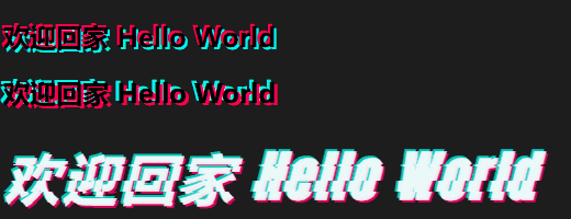
本文展示了如何使用CSS实现抖音风格的文字特效。通过HTML和CSS代码,演示了三种抖音Logo风格的效果:眩晕文字效果(使用text-shadow和动画)、彩色抖动文字(通过关键帧实现颜色变化)以及经典的"摇屁股"动画(利用position和动画实现位移效果)。
目录
运行环境:
- Windows-10-BusinessEditions-22h2-x64
- Google Chrome-143.0.7499.170-x64
1、效果演示
2、HTML代码
html
<!doctype html>
<html lang="zh" data-hairline="true" class="itcauecng" data-theme="light">
<head>
<meta charSet="utf-8" />
<meta http-equiv="X-UA-Compatible" content="IE=edge,chrome=1" />
<title data-rh="true">CSS 实现抖音LOGO STYLE</title>
<meta name="description" content="CSS 实现抖音LOGO STYLE" />
<meta name="viewport" content="width=device-width,initial-scale=1,maximum-scale=1" />
<meta name="renderer" content="webkit" />
<meta name="force-rendering" content="webkit" />
<link href="https://fonts.googleapis.com/css?family=Anton" rel="stylesheet">
<style>
html {
    background: rgb(29, 29, 29);
}

/** 眩晕文字 */
.n-xy {
    text-shadow: -2px -2px 0 #ff004f, 2px 2px 0 #00f7ef;
    animation: shake-it .5s reverse infinite cubic-bezier(0.68, -0.55, 0.27, 1.55);
}

/** 彩色抖动文字 */
.doudong{
    animation: uk-text-shadow-glitch .65s cubic-bezier(1,-1.91,0,2.79) 0s infinite normal both running;
}
@keyframes uk-text-shadow-glitch {
    0% {
       text-shadow: none
    }
    25% {
       text-shadow: -2px -2px 0 #ff004f,2px 2px 0 #00f7ef
    }
    50% {
       text-shadow: 2px -2px 0 #ff004f,-2px 2px 0 #00f7ef
    }
    75% {
       text-shadow: -2px 2px 0 #ff004f,2px -2px 0 #00f7ef
    }
    100% {
       text-shadow: 2px 2px 0 #ff004f,-2px -2px 0 #00f7ef
    }
}
@keyframes uk-flicker {
    0% {
        opacity: 0
    }
    10% {
        opacity: .6;
        transform: scale(.8)
    }
    20% {
        opacity: 0
    }
    40% {
        opacity: 1
    }
    50% {
        opacity: .2;
        transform: scale(1.1)
    }
    100% {
        opacity: 1;
        transform: scale(1)
    }
}

/** 摇屁股动画 */
.douyin-style {
    position: relative;
}
.douyin-style-font {
    font-weight: 700;
    width:640px;
    position: relative;
    animation: debounce 1s steps(3) infinite;
    /** font style **/
    font-size: 50px;
    font-style: italic;
    font-weight: bold;
    letter-spacing: 3px;
    font-family: 'Anton', sans-serif;
}
.douyin-style-font .douyin-style-title {
    position: absolute;
    top: 3px;
    left: 3px;
    width: inherit;
}
.douyin-style-font .douyin-style-title:before {
    position: absolute;
    top: -2px;
    left: -2px;
    color: #00f5e7;
    opacity: .8;
    z-index: 2;
    content: attr(data-title);
}
.douyin-style-font .douyin-style-title span{
    position: relative;
    color: #FFF;
    z-index: 3;
    opacity: .9;
}
.douyin-style-font .douyin-style-title:after {
    position: absolute;
    top: 2px;
    left: 2px;
    opacity: .8;
    color: #ff0068;
    z-index: 1;
    content: attr(data-title);
}
.douyin-style-font.shake {
    position: absolute;
    z-index: 9;
    left: var(--shake-offset);
    height: var(--shake-height);
    overflow: hidden;
    background:rgb(29, 29, 29);
    animation: shake-body 1s steps(4) infinite;
    animation-delay: var(--shake-delay);
}
 .douyin-style-font.shake .douyin-style-title {
    animation: shake-content 1s steps(4) infinite;
    animation-delay: var(--shake-delay);
}
@keyframes debounce {
    0% {
        margin-left: 2px;
    }
    0% {
        margin-left: -4px;
    }
}
@keyframes shake-body {
    0% {
        top: 0;
    }
    100% {
        top: 60px;
    }
}
@keyframes shake-content {
    0% {
        margin-top: 0;
    }
    100% {
        margin-top: -60px;
    }
}
</style>
</head>
<body>
    <h2 class="n-xy">欢迎回家 Hello World</h2>
    <h2 class="doudong">欢迎回家 Hello World</h2>
    <div class="douyin-style">
       <div class="douyin-style-font">
          <div class="douyin-style-title" data-title="欢迎回家 Hello World">
             <span>欢迎回家 Hello World</span>
          </div>
       </div>
       <div class="douyin-style-font shake" style="--shake-offset: -2px; --shake-height: 20px;--shake-delay:0s;">
          <div class="douyin-style-title" data-title="欢迎回家 Hello World">
             <span>欢迎回家 Hello World</span>
          </div>
       </div>
       <div class="douyin-style-font shake" style="--shake-offset: -3px; --shake-height: 2px;--shake-delay:0.2s;">
          <div class="douyin-style-title" data-title="欢迎回家 Hello World">
             <span>欢迎回家 Hello World</span>
          </div>
       </div>
       <div class="douyin-style-font shake" style="--shake-offset: -5px; --shake-height: 10px;--shake-delay:0.1s;">
          <div class="douyin-style-title" data-title="欢迎回家 Hello World">
             <span>欢迎回家 Hello World</span>
          </div>
       </div>
    </div>
</body>
</html>
3、实践总结
本文展示了如何使用CSS实现抖音风格的文字特效。通过HTML和CSS代码,演示了三种抖音Logo风格的效果:眩晕文字效果(使用text-shadow和动画)、彩色抖动文字(通过关键帧实现颜色变化)以及经典的"摇屁股"动画(利用position和动画实现位移效果)。
代码中定义了多个动画关键帧,通过调整偏移量、延迟时间和高度参数,模拟出抖音标志性的动态效果。这些效果可以在现代浏览器中运行,为网页添加独特的视觉体验。
附录: