前言
图标选择器在打卡工具类应用中用于为习惯设置代表性的图标。合适的图标可以帮助用户快速识别不同的习惯,同时也让习惯列表更加生动有趣。本文将详细介绍如何在Flutter和OpenHarmony平台上实现功能完善的图标选择器组件。
图标选择器的设计需要考虑图标的分类、搜索功能和选择体验。我们将实现一个支持分类浏览和搜索的图标选择器,提供丰富的图标选项。
Flutter图标选择器实现
首先定义图标数据和分类:
dart
class IconCategory {
final String name;
final List<IconData> icons;
const IconCategory({required this.name, required this.icons});
}
class IconPickerData {
static const categories = [
IconCategory(name: '运动健身', icons: [
Icons.fitness_center, Icons.directions_run, Icons.directions_bike,
Icons.pool, Icons.sports_basketball, Icons.sports_soccer,
]),
IconCategory(name: '学习成长', icons: [
Icons.book, Icons.school, Icons.edit, Icons.language,
Icons.psychology, Icons.lightbulb,
]),
IconCategory(name: '健康生活', icons: [
Icons.favorite, Icons.local_drink, Icons.restaurant,
Icons.bedtime, Icons.self_improvement, Icons.spa,
]),
IconCategory(name: '工作效率', icons: [
Icons.work, Icons.laptop, Icons.schedule, Icons.task_alt,
Icons.trending_up, Icons.analytics,
]),
IconCategory(name: '兴趣爱好', icons: [
Icons.music_note, Icons.palette, Icons.camera_alt,
Icons.videogame_asset, Icons.travel_explore, Icons.pets,
]),
];
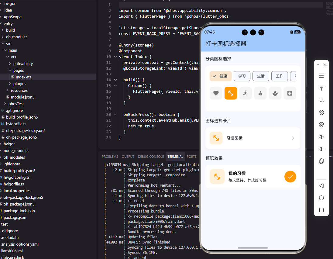
}IconCategory定义了图标分类,每个分类包含名称和图标列表。预设了运动健身、学习成长、健康生活、工作效率、兴趣爱好五个常见分类,每个分类包含6个相关图标。这种分类设计让用户能够快速找到合适的图标。
创建图标选择器组件:
dart
class IconPicker extends StatefulWidget {
  final IconData selectedIcon;
  final ValueChanged<IconData> onIconChanged;

  const IconPicker({
    Key? key,
    required this.selectedIcon,
    required this.onIconChanged,
  }) : super(key: key);

  @override
  State<IconPicker> createState() => _IconPickerState();
}

class _IconPickerState extends State<IconPicker> {
  int _selectedCategoryIndex = 0;

  @override
  Widget build(BuildContext context) {
    return Column(
      children: [
        _buildCategoryTabs(),
        const SizedBox(height: 16),
        _buildIconGrid(),
      ],
    );
  }

  Widget _buildCategoryTabs() {
    return SingleChildScrollView(
      scrollDirection: Axis.horizontal,
      child: Row(
        children: IconPickerData.categories.asMap().entries.map((entry) {
          final isSelected = entry.key == _selectedCategoryIndex;
          return Padding(
            padding: const EdgeInsets.only(right: 8),
            child: ChoiceChip(
              label: Text(entry.value.name),
              selected: isSelected,
              onSelected: (_) => setState(() => _selectedCategoryIndex = entry.key),
            ),
          );
        }).toList(),
      ),
    );
  }

  Widget _buildIconGrid() {
    final icons = IconPickerData.categories[_selectedCategoryIndex].icons;
    return GridView.builder(
      shrinkWrap: true,
      physics: const NeverScrollableScrollPhysics(),
      gridDelegate: const SliverGridDelegateWithFixedCrossAxisCount(
        crossAxisCount: 5,
        mainAxisSpacing: 12,
        crossAxisSpacing: 12,
      ),
      itemCount: icons.length,
      itemBuilder: (context, index) => _buildIconItem(icons[index]),
    );
  }

  Widget _buildIconItem(IconData icon) {
    final isSelected = icon == widget.selectedIcon;
    return GestureDetector(
      onTap: () => widget.onIconChanged(icon),
      child: AnimatedContainer(
        duration: const Duration(milliseconds: 200),
        decoration: BoxDecoration(
          color: isSelected ? Colors.blue.shade100 : Colors.grey.shade100,
          borderRadius: BorderRadius.circular(12),
          border: Border.all(
            color: isSelected ? Colors.blue : Colors.transparent,
            width: 2,
          ),
        ),
        child: Icon(
          icon,
          size: 28,
          color: isSelected ? Colors.blue : Colors.grey.shade700,
        ),
      ),
    );
  }
}
图标选择器使用分类标签和图标网格的组合布局。ChoiceChip实现分类切换,选中的分类有明显的视觉区分。GridView显示当前分类的图标,5列布局适合手机屏幕。选中的图标使用蓝色背景和边框,未选中的使用灰色背景。
OpenHarmony图标选择器实现
在鸿蒙系统中创建图标选择器:
typescript
interface IconCategory {
  name: string
  icons: Resource[]
}

@Component
struct IconPicker {
  @Prop selectedIcon: Resource
  private onIconChanged: (icon: Resource) => void = () => {}
  @State selectedCategoryIndex: number = 0

  categories: IconCategory[] = [
    { name: '运动健身', icons: [$r('app.media.fitness'), $r('app.media.run'), $r('app.media.bike')] },
    { name: '学习成长', icons: [$r('app.media.book'), $r('app.media.school'), $r('app.media.edit')] },
    { name: '健康生活', icons: [$r('app.media.heart'), $r('app.media.water'), $r('app.media.food')] },
  ]

  build() {
    Column() {
      this.CategoryTabs()
      this.IconGrid()
    }
  }

  @Builder
  CategoryTabs() {
    Scroll() {
      Row() {
        ForEach(this.categories, (category: IconCategory, index: number) => {
          Text(category.name)
            .fontSize(14)
            .fontColor(index === this.selectedCategoryIndex ? '#007AFF' : '#666666')
            .backgroundColor(index === this.selectedCategoryIndex ? '#E3F2FD' : '#F5F5F5')
            .padding({ left: 16, right: 16, top: 8, bottom: 8 })
            .borderRadius(20)
            .margin({ right: 8 })
            .onClick(() => {
              this.selectedCategoryIndex = index
            })
        })
      }
    }
    .scrollable(ScrollDirection.Horizontal)
    .margin({ bottom: 16 })
  }

  @Builder
  IconGrid() {
    Grid() {
      ForEach(this.categories[this.selectedCategoryIndex].icons, (icon: Resource) => {
        GridItem() {
          this.IconItem(icon)
        }
      })
    }
    .columnsTemplate('1fr 1fr 1fr 1fr 1fr')
    .rowsGap(12)
    .columnsGap(12)
  }

  @Builder
  IconItem(icon: Resource) {
    Column() {
      Image(icon)
        .width(28)
        .height(28)
        .fillColor(this.isSelected(icon) ? '#007AFF' : '#666666')
    }
    .width('100%')
    .aspectRatio(1)
    .backgroundColor(this.isSelected(icon) ? '#E3F2FD' : '#F5F5F5')
    .borderRadius(12)
    .border({
      width: this.isSelected(icon) ? 2 : 0,
      color: '#007AFF'
    })
    .justifyContent(FlexAlign.Center)
    .onClick(() => this.onIconChanged(icon))
  }

  isSelected(icon: Resource): boolean {
    return icon === this.selectedIcon
  }
}
鸿蒙的图标选择器使用Scroll实现分类标签的水平滚动,Grid实现图标网格布局。columnsTemplate设置5列等宽布局。fillColor为图标着色,选中和未选中使用不同颜色。aspectRatio(1)确保图标项为正方形。
图标搜索功能
实现图标搜索:
dart
class SearchableIconPicker extends StatefulWidget {
  final IconData selectedIcon;
  final ValueChanged<IconData> onIconChanged;

  @override
  State<SearchableIconPicker> createState() => _SearchableIconPickerState();
}

class _SearchableIconPickerState extends State<SearchableIconPicker> {
  String _searchQuery = '';

  static const allIcons = {
    '运动': Icons.fitness_center,
    '跑步': Icons.directions_run,
    '骑行': Icons.directions_bike,
    '阅读': Icons.book,
    '学习': Icons.school,
    '写作': Icons.edit,
    '喝水': Icons.local_drink,
    '睡眠': Icons.bedtime,
    '冥想': Icons.self_improvement,
    '工作': Icons.work,
    '音乐': Icons.music_note,
    '绘画': Icons.palette,
  };

  List<MapEntry<String, IconData>> get filteredIcons {
    if (_searchQuery.isEmpty) return allIcons.entries.toList();
    return allIcons.entries
        .where((e) => e.key.contains(_searchQuery))
        .toList();
  }

  @override
  Widget build(BuildContext context) {
    return Column(
      children: [
        TextField(
          decoration: InputDecoration(
            hintText: '搜索图标...',
            prefixIcon: const Icon(Icons.search),
            border: OutlineInputBorder(borderRadius: BorderRadius.circular(8)),
          ),
          onChanged: (value) => setState(() => _searchQuery = value),
        ),
        const SizedBox(height: 16),
        Expanded(
          child: GridView.builder(
            gridDelegate: const SliverGridDelegateWithFixedCrossAxisCount(
              crossAxisCount: 4,
              mainAxisSpacing: 12,
              crossAxisSpacing: 12,
            ),
            itemCount: filteredIcons.length,
            itemBuilder: (context, index) {
              final entry = filteredIcons[index];
              return _buildSearchResultItem(entry.key, entry.value);
            },
          ),
        ),
      ],
    );
  }

  Widget _buildSearchResultItem(String name, IconData icon) {
    final isSelected = icon == widget.selectedIcon;
    return GestureDetector(
      onTap: () => widget.onIconChanged(icon),
      child: Column(
        mainAxisAlignment: MainAxisAlignment.center,
        children: [
          Container(
            padding: const EdgeInsets.all(12),
            decoration: BoxDecoration(
              color: isSelected ? Colors.blue.shade100 : Colors.grey.shade100,
              borderRadius: BorderRadius.circular(12),
            ),
            child: Icon(icon, color: isSelected ? Colors.blue : Colors.grey.shade700),
          ),
          const SizedBox(height: 4),
          Text(name, style: const TextStyle(fontSize: 11), overflow: TextOverflow.ellipsis),
        ],
      ),
    );
  }
}
搜索功能让用户可以通过关键词快速找到图标。allIcons Map将图标与中文名称关联,filteredIcons根据搜索词过滤图标列表。搜索结果显示图标和名称,帮助用户确认选择。这种设计适合图标数量较多的场景。
习惯图标设置
实现习惯编辑页面的图标设置:
dart
class HabitIconSetting extends StatelessWidget {
  final IconData currentIcon;
  final Color iconColor;
  final ValueChanged<IconData> onIconChanged;

  void _showIconPicker(BuildContext context) {
    showModalBottomSheet(
      context: context,
      isScrollControlled: true,
      backgroundColor: Colors.transparent,
      builder: (context) => DraggableScrollableSheet(
        initialChildSize: 0.7,
        maxChildSize: 0.9,
        minChildSize: 0.5,
        builder: (context, scrollController) => Container(
          decoration: const BoxDecoration(
            color: Colors.white,
            borderRadius: BorderRadius.vertical(top: Radius.circular(20)),
          ),
          child: Column(
            children: [
              Container(
                width: 40,
                height: 4,
                margin: const EdgeInsets.symmetric(vertical: 12),
                decoration: BoxDecoration(
                  color: Colors.grey.shade300,
                  borderRadius: BorderRadius.circular(2),
                ),
              ),
              const Padding(
                padding: EdgeInsets.all(16),
                child: Text('选择图标', style: TextStyle(fontSize: 18, fontWeight: FontWeight.bold)),
              ),
              Expanded(
                child: Padding(
                  padding: const EdgeInsets.symmetric(horizontal: 16),
                  child: IconPicker(
                    selectedIcon: currentIcon,
                    onIconChanged: (icon) {
                      onIconChanged(icon);
                      Navigator.pop(context);
                    },
                  ),
                ),
              ),
            ],
          ),
        ),
      ),
    );
  }

  @override
  Widget build(BuildContext context) {
    return ListTile(
      leading: Container(
        width: 48,
        height: 48,
        decoration: BoxDecoration(
          color: iconColor.withOpacity(0.15),
          borderRadius: BorderRadius.circular(12),
        ),
        child: Icon(currentIcon, color: iconColor),
      ),
      title: const Text('习惯图标'),
      subtitle: const Text('点击更换图标'),
      trailing: const Icon(Icons.chevron_right),
      onTap: () => _showIconPicker(context),
    );
  }
}
HabitIconSetting使用DraggableScrollableSheet实现可拖动的底部面板,用户可以上下拖动调整面板高度。当前图标以带背景色的方式显示,与习惯的主题色配合。选择图标后自动关闭面板,提供流畅的交互体验。
总结
本文详细介绍了在Flutter和OpenHarmony平台上实现图标选择器组件的完整方案。图标选择器通过分类浏览、搜索功能和网格布局,为用户提供了便捷的图标选择体验。分类标签帮助用户快速定位,搜索功能支持关键词查找。两个平台的实现都注重视觉效果和操作便捷,让图标选择成为一种愉悦的体验。
欢迎加入开源鸿蒙跨平台社区:https://openharmonycrossplatform.csdn.net