版权声明
- 本文原创作者:谷哥的小弟
- 作者博客地址:http://blog.csdn.net/lfdfhl

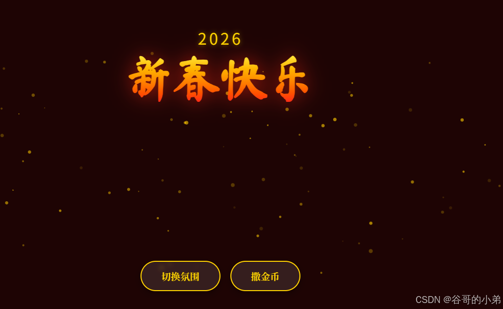
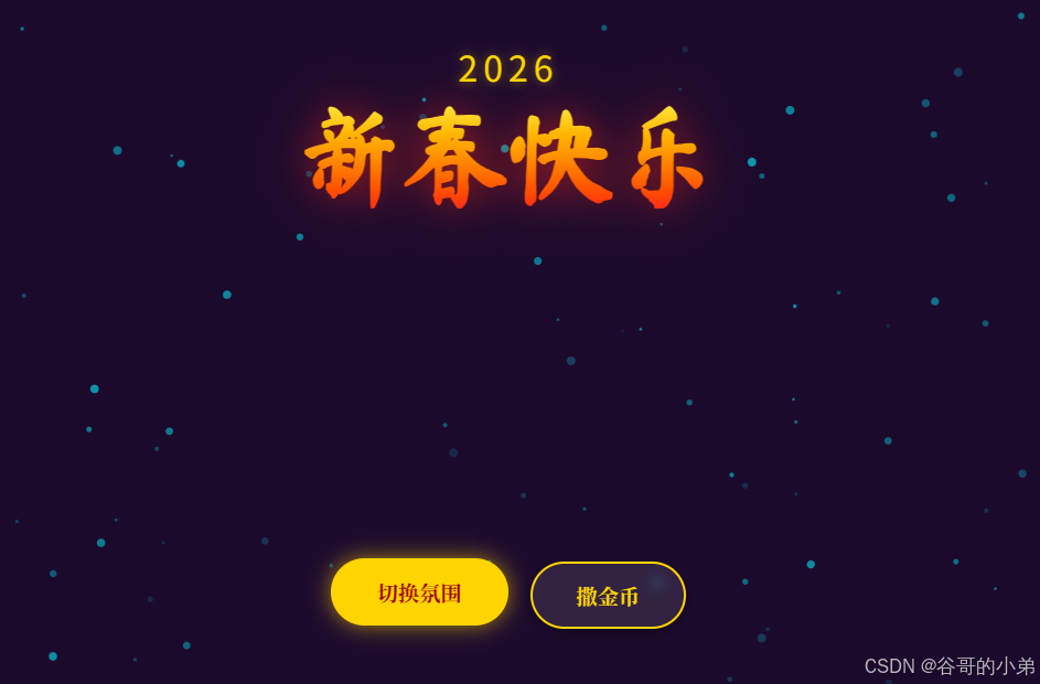
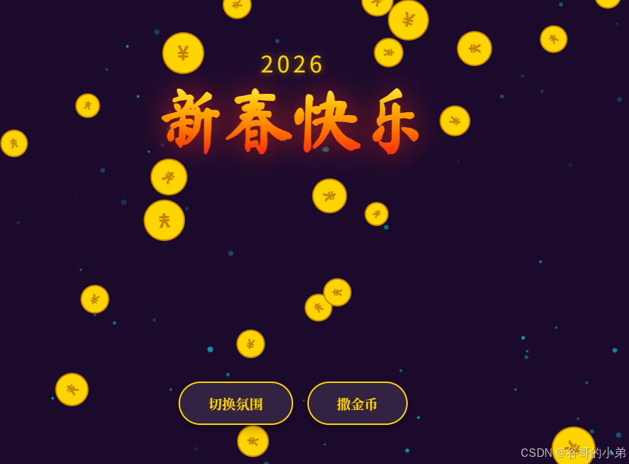
效果展示
项目源码
html
<!DOCTYPE html>
<html lang="zh-CN">
<head>
    <meta charset="UTF-8">
    <meta name="viewport" content="width=device-width, initial-scale=1.0">
    <title>新春快乐 2026</title>
    <style>
        @import url('https://fonts.googleapis.com/css2?family=Ma+Shan+Zheng&family=Noto+Serif+SC:wght@700&display=swap');

        body {
            margin: 0;
            overflow: hidden;
            background-color: #1a0505; /* 深红背景 */
            font-family: 'Noto Serif SC', serif;
            transition: background-color 1s ease;
        }

        /* 画布全屏 */
        canvas {
            display: block;
            position: absolute;
            top: 0;
            left: 0;
            z-index: 1;
        }

        /* UI 层 */
        #ui-layer {
            position: absolute;
            top: 0;
            left: 0;
            width: 100%;
            height: 100%;
            z-index: 10;
            pointer-events: none; /* 让鼠标事件穿透到 Canvas */
            display: flex;
            flex-direction: column;
            justify-content: space-between;
            align-items: center;
            padding: 40px;
            box-sizing: border-box;
        }

        /* 标题区 */
        .header {
            text-align: center;
            margin-top: 5vh;
            animation: fadeInDown 1.5s ease-out;
            pointer-events: auto;
        }

        .year {
            font-family: 'Orbitron', sans-serif;
            font-size: 2em;
            color: #ffd700;
            letter-spacing: 5px;
            text-shadow: 0 0 10px rgba(255, 215, 0, 0.5);
            margin-bottom: 10px;
        }

        h1 {
            font-family: 'Ma Shan Zheng', cursive;
            font-size: 6em;
            margin: 0;
            background: linear-gradient(to bottom, #ffeb3b, #ff9800, #f44336);
            -webkit-background-clip: text;
            -webkit-text-fill-color: transparent;
            filter: drop-shadow(0 0 20px rgba(244, 67, 54, 0.6));
        }

        /* 底部按钮区 */
        .controls {
            pointer-events: auto;
            display: flex;
            gap: 20px;
            margin-bottom: 5vh;
            animation: fadeInUp 1.5s ease-out;
        }

        button {
            background: rgba(255, 255, 255, 0.1);
            backdrop-filter: blur(5px);
            border: 2px solid #ffd700;
            color: #ffd700;
            padding: 15px 40px;
            font-size: 1.2em;
            font-family: 'Noto Serif SC', serif;
            border-radius: 50px;
            cursor: pointer;
            transition: all 0.3s;
            box-shadow: 0 5px 15px rgba(0,0,0,0.3);
            font-weight: bold;
        }

        button:hover {
            background: #ffd700;
            color: #8b0000;
            transform: translateY(-3px);
            box-shadow: 0 0 20px rgba(255, 215, 0, 0.6);
        }

        button:active {
            transform: translateY(1px);
        }

        /* 动画 */
        @keyframes fadeInDown {
            from { opacity: 0; transform: translateY(-30px); }
            to { opacity: 1; transform: translateY(0); }
        }
        @keyframes fadeInUp {
            from { opacity: 0; transform: translateY(30px); }
            to { opacity: 1; transform: translateY(0); }
        }
    </style>
</head>
<body>

    <canvas id="mainCanvas"></canvas>

    <div id="ui-layer">
        <div class="header">
            <div class="year">2026</div>
            <h1>新春快乐</h1>
        </div>

        <div class="controls">
            <button onclick="toggleTheme()">切换氛围</button>
            <button onclick="dropCoins()">撒金币</button>
        </div>
    </div>

    <script>
        const canvas = document.getElementById('mainCanvas');
        const ctx = canvas.getContext('2d');

        let width, height;
        let particles = [];
        let coins = [];
        let theme = 'red'; // 'red' or 'purple'

        // 初始化尺寸
        function resize() {
            width = canvas.width = window.innerWidth;
            height = canvas.height = window.innerHeight;
        }
        window.addEventListener('resize', resize);
        resize();

        // 粒子类 (背景上升的火花)
        class Particle {
            constructor() {
                this.reset();
            }

            reset() {
                this.x = Math.random() * width;
                this.y = height + Math.random() * 100;
                this.speed = Math.random() * 2 + 1;
                this.size = Math.random() * 3 + 1;
                this.opacity = Math.random() * 0.5 + 0.1;
            }

            update() {
                this.y -= this.speed;
                if (this.y < -10) this.reset();
            }

            draw() {
                ctx.beginPath();
                ctx.arc(this.x, this.y, this.size, 0, Math.PI * 2);
                ctx.fillStyle = theme === 'red'
                    ? `rgba(255, 215, 0, ${this.opacity})` // 金色
                    : `rgba(0, 242, 255, ${this.opacity})`; // 青色
                ctx.fill();
            }
        }

        // 初始化背景粒子
        for (let i = 0; i < 100; i++) {
            particles.push(new Particle());
        }

        // 金币类
        class Coin {
            constructor() {
                this.x = Math.random() * width;
                this.y = -50;
                this.vy = Math.random() * 5 + 5; // 下落速度
                this.vx = (Math.random() - 0.5) * 4; // 水平飘动
                this.size = Math.random() * 15 + 15;
                this.rotation = Math.random() * Math.PI * 2;
                this.rotationSpeed = (Math.random() - 0.5) * 0.2;
            }

            update() {
                this.y += this.vy;
                this.x += this.vx;
                this.rotation += this.rotationSpeed;
                this.vy += 0.2; // 重力加速
            }

            draw() {
                ctx.save();
                ctx.translate(this.x, this.y);
                ctx.rotate(this.rotation);

                // 金币本体
                ctx.beginPath();
                ctx.arc(0, 0, this.size, 0, Math.PI * 2);
                ctx.fillStyle = '#ffd700';
                ctx.fill();
                ctx.lineWidth = 2;
                ctx.strokeStyle = '#b8860b';
                ctx.stroke();

                // 内部 ¥ 符号
                ctx.fillStyle = '#b8860b';
                ctx.font = `bold ${this.size}px Arial`;
                ctx.textAlign = 'center';
                ctx.textBaseline = 'middle';
                ctx.fillText('¥', 0, 2);

                ctx.restore();
            }
        }

        // 动画循环
        function animate() {
            ctx.clearRect(0, 0, width, height);

            // 绘制背景粒子
            particles.forEach(p => {
                p.update();
                p.draw();
            });

            // 绘制金币
            for (let i = coins.length - 1; i >= 0; i--) {
                const c = coins[i];
                c.update();
                c.draw();
                // 移除超出屏幕的金币
                if (c.y > height + 50) {
                    coins.splice(i, 1);
                }
            }

            requestAnimationFrame(animate);
        }
        animate();

        // 功能一:切换氛围
        function toggleTheme() {
            if (theme === 'red') {
                theme = 'purple';
                document.body.style.backgroundColor = '#1a0b2e'; // 深紫背景
            } else {
                theme = 'red';
                document.body.style.backgroundColor = '#1a0505'; // 深红背景
            }
        }

        // 功能二:撒金币
        function dropCoins() {
            // 一次生成 50 个金币
            for (let i = 0; i < 50; i++) {
                setTimeout(() => {
                    coins.push(new Coin());
                }, i * 30); // 每隔30ms生成一个,形成连续感
            }
        }

        // 点击屏幕任意位置也可以产生少量金币(增加互动性)
        document.addEventListener('click', (e) => {
            if (e.target.tagName === 'BUTTON') return;
            for(let i=0; i<5; i++) {
                const c = new Coin();
                c.x = e.clientX;
                c.y = e.clientY;
                c.vy = Math.random() * 5 + 2; // 点击产生的金币速度慢一点
                coins.push(c);
            }
        });

    </script>
</body>
</html>