企业协同办公系统(OA)-【图标选择器】模块开发详解
1. 功能需求
图标选择器是系统功能设置模块中的一个重要组件,用于为各种系统功能选择合适的图标。其主要功能需求如下:
- 双模式图标选择:支持Font Awesome字体图标和系统符号图标(Emoji)两种类型
- 图标搜索过滤:提供搜索功能,根据图标名称快速过滤显示结果
- 颜色选择:支持为Font Awesome图标选择不同颜色
- 图标预览:实时预览选中的图标及其应用颜色后的效果
- 模态框交互:以模态框形式展示,提供清晰的选择界面
- 响应式设计:适配不同屏幕尺寸的显示需求
- 集成性:与系统功能表单无缝集成,支持图标数据的双向绑定
2. 第三方字体库介绍
本图标选择器主要依赖Font Awesome字体库:
Font Awesome
- 版本 :4.x (通过
fas fa-*类名判断) - 类型:矢量图标库
- 主要用途:提供丰富的可缩放图标,支持自定义颜色和大小
- 特点 :
- 轻量级,加载速度快
- 支持CSS样式自定义(颜色、大小、阴影等)
- 图标数量丰富,覆盖多种应用场景
- 支持响应式设计
- 引用方式 :通过CSS类名直接引用,如
<i class="fas fa-home"></i>
3. 功能运行流程图
flowchart TD
A[开始] --> B[打开图标选择器模态框]
B --> C[选择图标类型 Font Awesome系统符号]
C --> D{输入搜索关键词}
D -->|是| E[过滤图标列表]
D -->|否| F[显示全部图标]
E --> G
F --> G
G{选择图标颜色仅Font Awesome支持}
G -->|是| H[应用选择的颜色]
G -->|否| I[保持默认颜色]
H --> J
I --> J
J[选择目标图标] --> K{点击确认按钮}
K -->|是| L[保存选择结果]
K -->|否| M[点击取消按钮]
L --> N[关闭模态框]
M --> N
N --> O[结束]
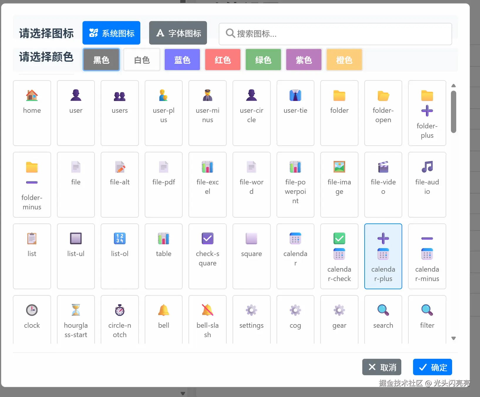
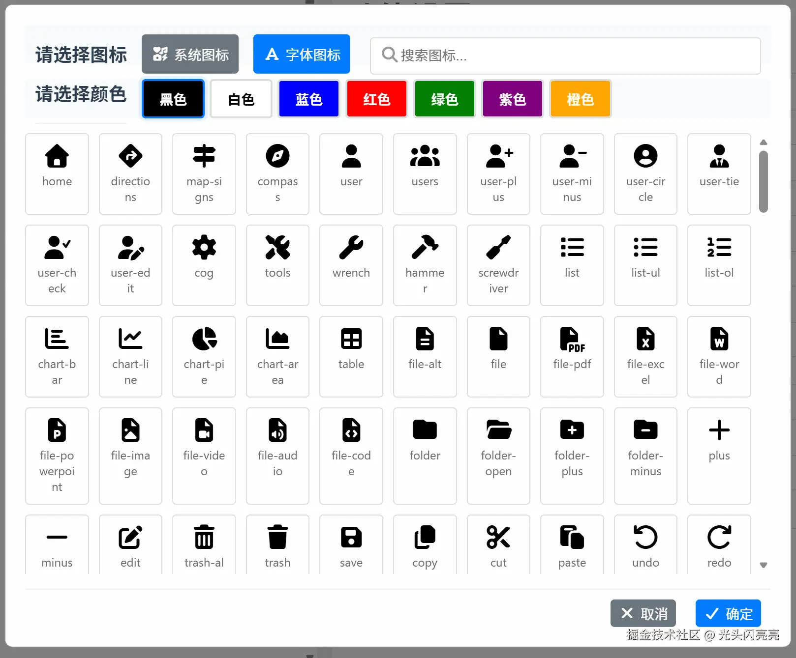
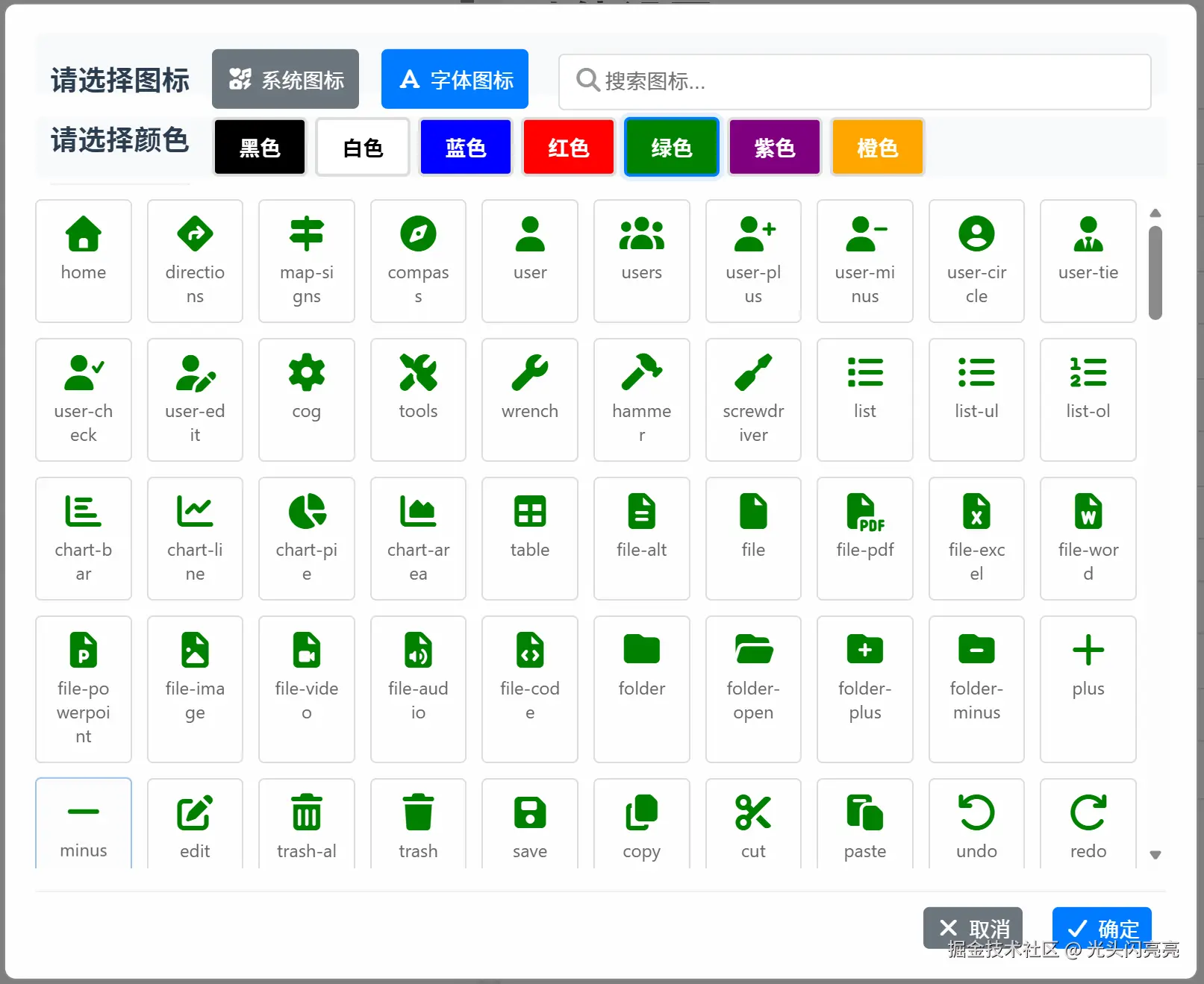
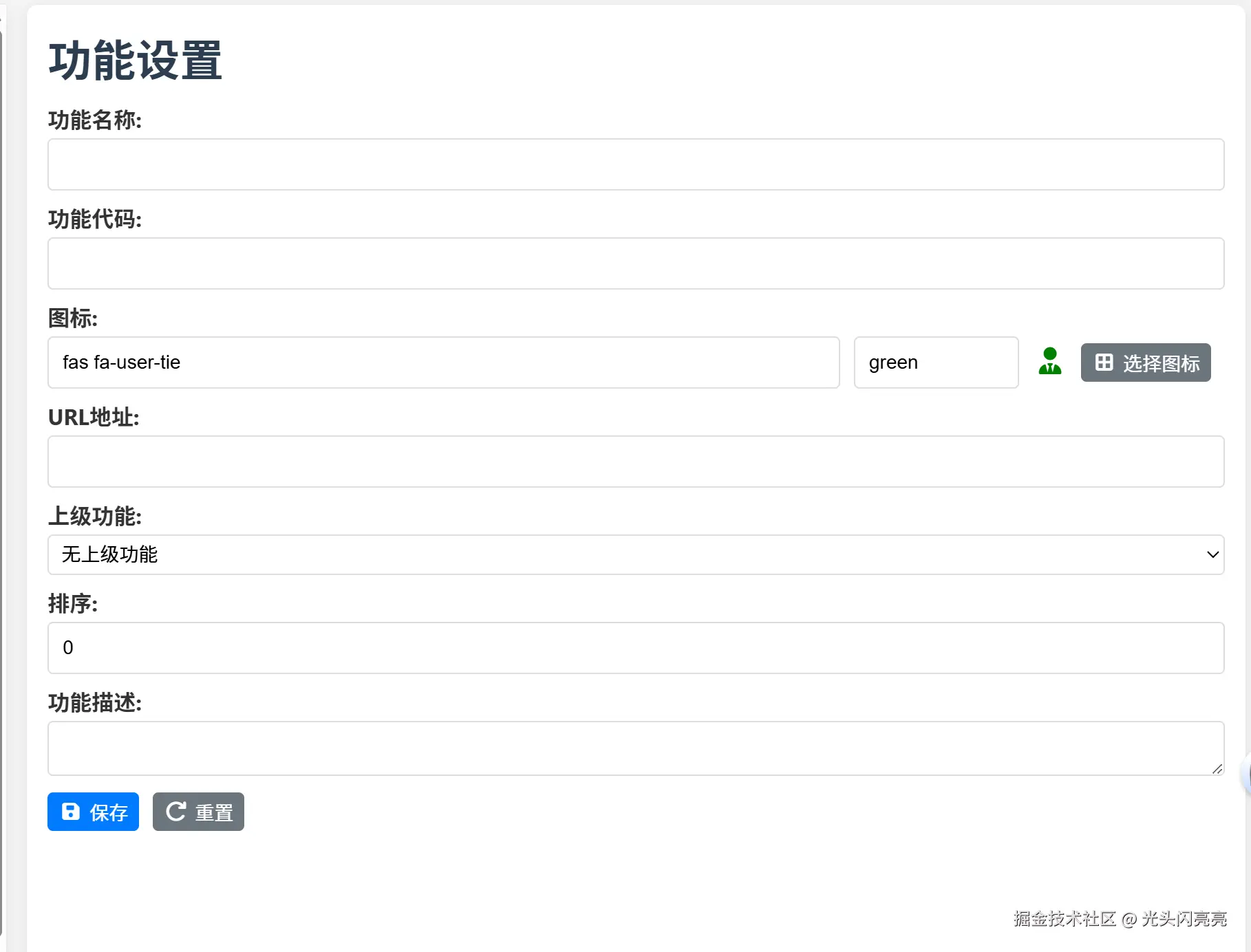
运行效果
系统图标
字体图标
字体图标颜色切换
选择图标后点击确定进行文本框图标名称、颜色赋值,并显示选定图标
4. 功能实现分步拆解及源代码
4.1 界面结构设计
HTML模板(system_function_setting.html)
html
<!-- 图标选择器模态框 -->
<div id="iconSelectorModal" class="icon-selector-modal" ref="iconSelectorModal">
    <div class="icon-selector-content">
        <!-- 搜索和模式切换容器 -->
        <div class="icon-color-selection" style="margin-top: 0; display: flex; align-items: flex-start; justify-content: left; gap: 15px; height: 40px; line-height: 40px;">
            <div class="icon-selector-header" style="margin: 0;">
                <h3 style="margin: 0;">请选择图标</h3>
            </div>
            <div style="display: flex; gap: 5px;">
                <button class="btn btn-secondary" :class="{ active: iconDisplayMode === 'system' }" @click="switchToSystemIcons" style="padding: 10px;">
                    <i class="fas fa-icons"></i> 系统图标
                </button>
                <button class="btn btn-secondary" :class="{ active: iconDisplayMode === 'fontawesome' }" @click="switchToFontAwesomeIcons" style="margin-right: 5px; padding: 10px;">
                    <i class="fas fa-font"></i> 字体图标
                </button>
            </div>
            <div class="icon-search" style="flex: 1; min-width: 200px; position: relative;">
                <i class="fas fa-search" style="position: absolute; left: 10px; top: 50%; transform: translateY(-50%); color: #999;"></i>
                <input type="text" v-model="iconSearchTerm" placeholder="搜索图标..." @input="filterIcons" style="padding-left: 30px; width: 100%; box-sizing: border-box;">
            </div>
        </div>
        <!-- 颜色选择区域 -->
        <div class="icon-color-selection" style="margin-top: 0.5px; display: flex; align-items: center; justify-content: left; gap: 15px; height: 40px; line-height: 40px;">
            <div class="icon-selector-header" style="margin: 0;">
                <h3 style="margin: 0;">请选择颜色</h3>
            </div>
            <div class="color-options" style="display: flex; gap: 5px;">
                <button v-for="color in colorOptions" :key="color.value" class="color-option" :class="{ selected: selectedColor === color.value }" :style="{ backgroundColor: color.value === 'white' ? '#fff' : color.value, color: color.value === 'white' ? '#000' : '#fff' }" @click="selectedColor = color.value" :disabled="iconDisplayMode === 'system'">
                    {{ color.name }}
                </button>
            </div>
        </div>
        <!-- 图标网格展示 -->
        <div class="icon-grid">
            <!-- Font Awesome图标展示 -->
            <div v-if="iconDisplayMode === 'fontawesome'" v-for="icon in filteredIcons" :key="icon.class" class="icon-item" :class="{ selected: selectedIcon === icon.class }" @click="selectIcon(icon.class)">
                <i :class="icon.class" class="icon-preview" :style="{ color: selectedColor }"></i>
                <span class="icon-name">{{ icon.name }}</span>
            </div>
            <!-- 系统符号图标展示 -->
            <div v-else v-for="icon in filteredIcons" :key="icon.key" class="icon-item" :class="{ selected: selectedIcon === icon.value }" @click="selectIcon(icon.value)">
                <span class="icon-preview" style="color: black; font-size: 20px;">{{ icon.value }}</span>
                <span class="icon-name">{{ icon.name }}</span>
            </div>
        </div>
        <!-- 底部操作按钮 -->
        <div class="icon-selector-footer">
            <button class="btn btn-secondary" @click="hideIconSelector"><i class="fas fa-times"></i> 取消</button>
            <button class="btn btn-primary" @click="confirmIconSelection"><i class="fas fa-check"></i> 确定</button>
        </div>
    </div>
</div>
CSS样式(system_function_setting.html)
css
/* 图标选择器模态框 */
.icon-selector-modal {
  display: none;
  position: fixed;
  top: 0;
  left: 0;
  width: 100%;
  height: 100%;
  background-color: rgba(0, 0, 0, 0.5);
  z-index: 1000;
  overflow: auto;
}

/* 图标选择器内容 */
.icon-selector-content {
  background-color: #fefefe;
  margin: 5% auto;
  padding: 20px;
  border: 1px solid #888;
  width: 80%;
  max-width: 800px;
  max-height: 80vh;
  overflow-y: auto;
  border-radius: 8px;
  box-shadow: 0 5px 15px rgba(0, 0, 0, 0.3);
}

/* 图标选择器头部 */
.icon-selector-header {
  margin-bottom: 15px;
}

.icon-selector-header h3 {
  margin: 0;
  font-size: 18px;
  color: #333;
}

/* 图标网格 */
.icon-grid {
  display: grid;
  grid-template-columns: repeat(auto-fill, minmax(80px, 1fr));
  gap: 10px;
  margin: 20px 0;
  max-height: 400px;
  overflow-y: auto;
}

/* 图标项 */
.icon-item {
  display: flex;
  flex-direction: column;
  align-items: center;
  justify-content: center;
  padding: 10px;
  border: 1px solid #ddd;
  border-radius: 5px;
  cursor: pointer;
  transition: all 0.2s ease;
}

.icon-item:hover {
  border-color: #007bff;
  background-color: #f8f9fa;
}

.icon-item.selected {
  border-color: #007bff;
  background-color: #e3f2fd;
}

/* 图标预览 */
.icon-preview {
  font-size: 24px;
  margin-bottom: 5px;
}

/* 图标名称 */
.icon-name {
  font-size: 12px;
  text-align: center;
  white-space: nowrap;
  overflow: hidden;
  text-overflow: ellipsis;
  max-width: 100%;
}

/* 图标选择器底部 */
.icon-selector-footer {
  display: flex;
  justify-content: flex-end;
  gap: 10px;
  margin-top: 20px;
}
4.2 数据模型设计
图标数据定义(icon_selector.js)
javascript
// Font Awesome图标列表
window.commonIcons = [
  // 导航图标
  { class: 'fas fa-home', name: 'home' },
  { class: 'fas fa-directions', name: 'directions' },
  { class: 'fas fa-map-signs', name: 'map-signs' },
  { class: 'fas fa-compass', name: 'compass' },

  // 用户相关图标
  { class: 'fas fa-user', name: 'user' },
  { class: 'fas fa-users', name: 'users' },
  { class: 'fas fa-user-plus', name: 'user-plus' },
  { class: 'fas fa-user-minus', name: 'user-minus' },

  // 工具和设置图标
  { class: 'fas fa-cog', name: 'cog' },
  { class: 'fas fa-tools', name: 'tools' },
  { class: 'fas fa-wrench', name: 'wrench' },

  // 更多图标...
];

// 系统符号图标映射
window.iconMap = {
  'home': '🏠',
  'user': '👤',
  'users': '👥',
  'folder': '📁',
  'folder-open': '📂',
  'file': '📄',
  'search': '🔍',
  'edit': '✏️',
  'trash-alt': '🗑️',
  'save': '💾',
  'plus': '➕',
  'minus': '➖',
  'times': '❌',
  'check': '✅',
  // 更多图标映射...
};

// 颜色选项
window.colorOptions = [
  { name: '黑色', value: 'black' },
  { name: '白色', value: 'white' },
  { name: '蓝色', value: 'blue' },
  { name: '红色', value: 'red' },
  { name: '绿色', value: 'green' },
  { name: '紫色', value: 'purple' },
  { name: '橙色', value: 'orange' }
];
4.3 核心功能实现
Vue组件实现(system_function_setting.html)
javascript
// 图标选择器相关变量
const iconSelectorModal = ref(null);
const iconDisplayMode = ref('fontawesome'); // 'fontawesome' or 'system'
const iconSearchTerm = ref('');
const filteredIcons = ref([]);
const selectedIcon = ref('');
const selectedColor = ref('black');

// 从全局对象获取图标数据
const commonIcons = window.commonIcons || [];
const iconMap = window.iconMap || {};
const colorOptions = window.colorOptions || [
  { name: '黑色', value: 'black' },
  { name: '白色', value: 'white' },
  { name: '蓝色', value: 'blue' },
  { name: '红色', value: 'red' },
  { name: '绿色', value: 'green' },
  { name: '紫色', value: 'purple' },
  { name: '橙色', value: 'orange' }
];

// 初始化图标列表
onMounted(() => {
  filteredIcons.value = [...commonIcons];
});

// 显示图标选择器
const showIconSelector = () => {
  if (iconSelectorModal.value) {
    iconSelectorModal.value.style.display = 'block';
    // 重置选择状态
    iconDisplayMode.value = 'fontawesome';
    iconSearchTerm.value = '';
    filteredIcons.value = [...commonIcons];
    selectedColor.value = 'black';

    // 如果已有选中图标,保持选择状态
    if (functionForm.icon) {
      selectedIcon.value = functionForm.icon;
    } else {
      selectedIcon.value = '';
    }
  }
};

// 隐藏图标选择器
const hideIconSelector = () => {
  if (iconSelectorModal.value) {
    iconSelectorModal.value.style.display = 'none';
  }
};

// 切换到系统图标
const switchToSystemIcons = () => {
  iconDisplayMode.value = 'system';

  // 转换系统图标格式
  const systemIcons = Object.entries(iconMap).map(([key, value]) => ({
    key: key,
    value: value,
    name: key
  }));

  filteredIcons.value = systemIcons;

  // 清空搜索词
  iconSearchTerm.value = '';

  // 重置选择状态
  selectedIcon.value = '';
};

// 切换到Font Awesome图标
const switchToFontAwesomeIcons = () => {
  iconDisplayMode.value = 'fontawesome';
  filteredIcons.value = [...commonIcons];

  // 清空搜索词
  iconSearchTerm.value = '';

  // 重置选择状态
  selectedIcon.value = '';
};

// 过滤图标
const filterIcons = () => {
  if (!iconSearchTerm.value) {
    if (iconDisplayMode.value === 'fontawesome') {
      filteredIcons.value = [...commonIcons];
    } else {
      const systemIcons = Object.entries(iconMap).map(([key, value]) => ({
        key: key,
        value: value,
        name: key
      }));
      filteredIcons.value = systemIcons;
    }
    return;
  }

  const searchTerm = iconSearchTerm.value.toLowerCase();

  if (iconDisplayMode.value === 'fontawesome') {
    filteredIcons.value = commonIcons.filter(icon =>
      icon.name.toLowerCase().includes(searchTerm)
    );
  } else {
    const systemIcons = Object.entries(iconMap)
      .filter(([key]) => key.toLowerCase().includes(searchTerm))
      .map(([key, value]) => ({
        key: key,
        value: value,
        name: key
      }));
    filteredIcons.value = systemIcons;
  }
};

// 选择图标
const selectIcon = (iconValue) => {
  selectedIcon.value = iconValue;
};

// 确认选择图标
const confirmIconSelection = () => {
  if (selectedIcon.value) {
    // 根据图标类型设置值
    if (iconDisplayMode.value === 'system') {
      // 系统图标存储格式:'system:emoji'
      functionForm.icon = `system:${selectedIcon.value}`;
    } else {
      // Font Awesome图标存储格式:'class:color'
      functionForm.icon = `${selectedIcon.value}:${selectedColor.value}`;
    }

    // 更新图标预览
    updateIconPreview();

    // 隐藏图标选择器
    hideIconSelector();
  }
};

// 更新图标预览
const updateIconPreview = () => {
  if (functionForm.icon) {
    const iconPreviewElement = document.querySelector('.icon-preview');
    if (iconPreviewElement) {
      if (functionForm.icon.startsWith('system:')) {
        // 系统图标
        const emoji = functionForm.icon.split(':')[1];
        iconPreviewElement.innerHTML = emoji;
        iconPreviewElement.className = 'icon-preview';
        iconPreviewElement.style.color = 'black';
      } else {
        // Font Awesome图标
        const [iconClass, color] = functionForm.icon.split(':');
        iconPreviewElement.className = `icon-preview ${iconClass}`;
        iconPreviewElement.style.color = color;
        iconPreviewElement.innerHTML = '';
      }
    }
  }
};

// 点击模态框外部关闭
window.addEventListener('click', (event) => {
  if (iconSelectorModal.value &&
      event.target === iconSelectorModal.value) {
    hideIconSelector();
  }
});
5. 总结
5.1 实现特点
- 模块化设计:将图标选择功能封装为独立组件,便于维护和扩展
- 双模式支持:同时支持Font Awesome和系统符号图标,满足不同场景需求
- 用户友好界面:直观的网格布局,清晰的图标预览,便捷的搜索和过滤功能
- 灵活的颜色定制:支持为Font Awesome图标自定义颜色,增强视觉表现力
- 响应式设计:适配不同屏幕尺寸,提供一致的用户体验
- 无缝集成:与系统功能表单深度集成,支持数据双向绑定
5.2 技术亮点
- 动态图标类型切换:通过Vue的条件渲染实现不同类型图标的无缝切换
- 高效的图标过滤:实时搜索过滤功能,提升用户选择效率
- 灵活的数据格式:采用特定格式存储图标信息,便于解析和渲染
- 事件驱动架构:基于事件驱动的交互设计,提高代码可维护性
- 跨浏览器兼容性:使用标准Web技术,确保在主流浏览器中的兼容性
5.3 应用场景
图标选择器主要应用于系统功能设置模块,具体场景包括:
- 菜单功能图标配置
- 系统功能入口图标选择
- 控制面板功能图标设置
- 报表和数据可视化图表图标选择
- 通知和提醒图标配置
通过这个图标选择器,用户可以方便地为系统中的各种功能选择合适的图标,提升系统的可视化效果和用户体验。