📅 今天我们继续 50 个小项目挑战!------RangeSlider组件
仓库地址:https://gitee.com/hhm-hhm/50days50projects.git
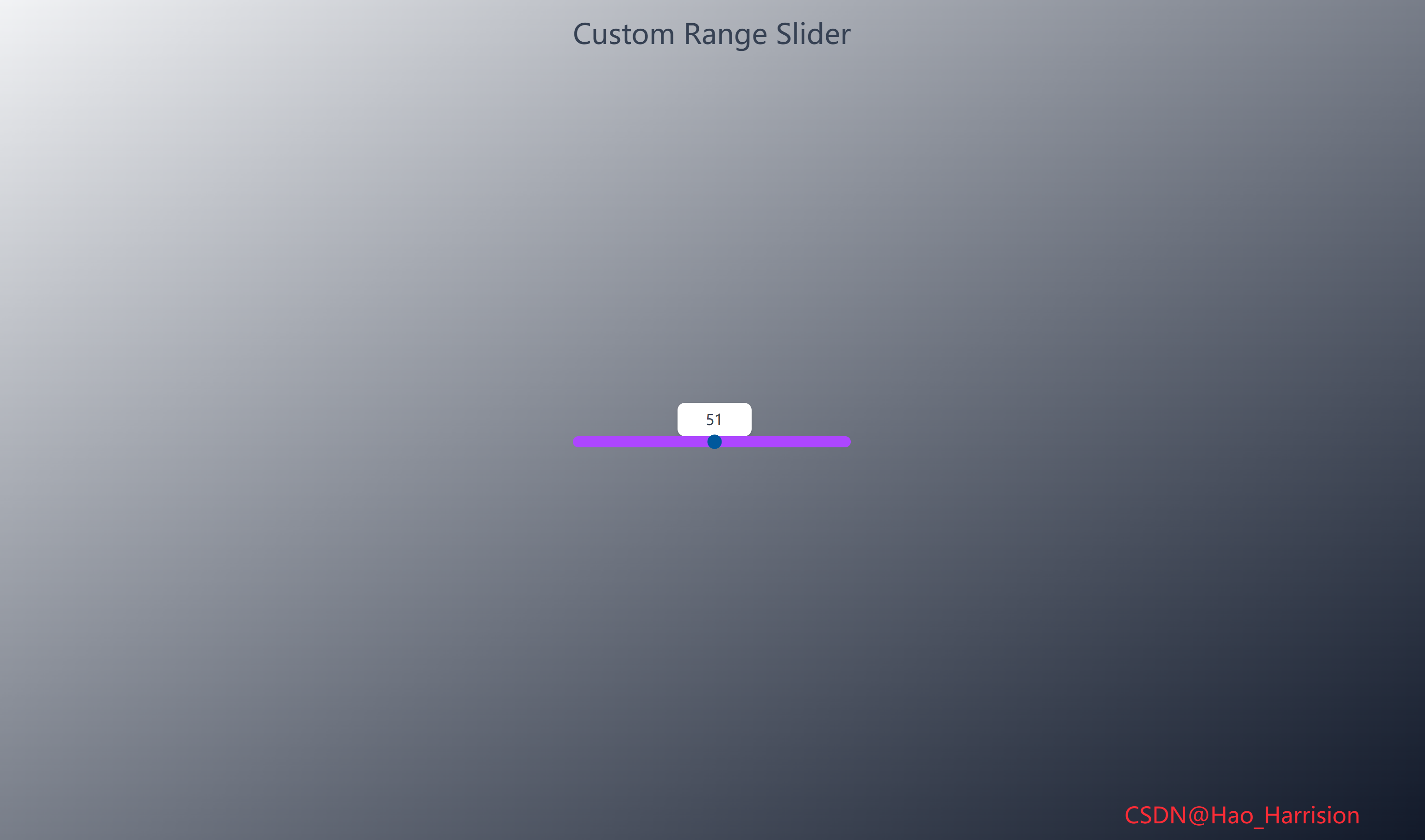
构建一个视觉效果出众的自定义范围滑块(Range Slider)。这个滑块的独特之处在于,它的数值标签会随着滑块的拖动而动态移动,并始终保持在滑块拇指(thumb)的正上方,提供极佳的用户体验。
让我们开始吧!🚀
🌀 组件目标
- 创建一个样式完全自定义的 HTML
<input type="range">组件 - 实现一个动态数值标签,该标签会跟随滑块拇指的位置移动
- 确保标签始终位于滑块上方且居中对齐
- 利用 Tailwind CSS 快速构建基础样式,并通过内联样式实现精确控制
🔧 RangeSlider.tsx组件实现
TypeScript
import React, { useState, useEffect, useRef } from 'react'

const RangeSlider: React.FC = () => {
    const [sliderValue, setSliderValue] = useState<number>(50)
    const [labelLeft, setLabelLeft] = useState<string>('110px')
    const rangeRef = useRef<HTMLInputElement>(null)
    const labelRef = useRef<HTMLLabelElement>(null)

    // 数值映射函数(等价于 Vue 中的 scale)
    const scale = (
        num: number,
        inMin: number,
        inMax: number,
        outMin: number,
        outMax: number
    ): number => {
        return ((num - inMin) * (outMax - outMin)) / (inMax - inMin) + outMin
    }

    // 处理滑块输入
    const handleSliderInput = () => {
        if (!rangeRef.current || !labelRef.current) return

        const value = Number(rangeRef.current.value)
        const rangeWidth = rangeRef.current.offsetWidth // 更可靠的方式获取宽度
        const labelWidth = labelRef.current.offsetWidth

        const max = Number(rangeRef.current.max)
        const min = Number(rangeRef.current.min)

        // 计算偏移:线性位置 + 动态微调(scale 函数提供非线性补偿)
        const left = value * (rangeWidth / max) - labelWidth / 2 + scale(value, min, max, 10, -10)

        setLabelLeft(`${left}px`)
        setSliderValue(value)
    }

    // 初始化:确保组件挂载后能正确读取 DOM 尺寸
    useEffect(() => {
        // 初始计算位置(可选,因 input 事件会立即触发)
        handleSliderInput()
    }, [])

    return (
        <div className="m-0 flex min-h-screen flex-col items-center justify-center overflow-hidden bg-linear-to-br from-gray-100 to-gray-900 font-sans">
            <h2 className="absolute top-5 text-3xl font-medium text-gray-700">
                Custom Range Slider
            </h2>

            <div className="relative mt-10">
                {/* 滑块 */}
                <input
                    ref={rangeRef}
                    type="range"
                    min="0"
                    max="100"
                    value={sliderValue}
                    onInput={handleSliderInput}
                    className="relative z-10 h-3 w-[300px] cursor-pointer appearance-none rounded-md bg-purple-500 outline-none"
                />

                {/* 动态标签 */}
                <label
                    ref={labelRef}
                    className="absolute z-0 w-20 rounded-md bg-white py-1.5 text-center text-gray-700 shadow-md transition-all duration-300"
                    style={{ left: labelLeft, top: '-30px' }}>
                    {sliderValue}
                </label>
            </div>
            <div className="fixed right-20 bottom-5 z-100 text-2xl text-red-500">
                CSDN@Hao_Harrision
            </div>
        </div>
    )
}

export default RangeSlider
🔄 关键差异总结
| 功能 | Vue 3 | React + TS |
|---|---|---|
| 状态 | ref, reactive |
useState |
| DOM 引用 | 隐式 $refs / nextElementSibling |
显式 useRef |
| 生命周期 | onMounted |
useEffect |
| 事件 | @input |
onInput |
| 样式重置 | JS 设置 webkitAppearance |
Tailwind appearance-none |
| 类型安全 | --- | 完整 TS 类型标注 |
🔁 转换说明
1. 状态管理:ref / reactive → useState
| Vue | React |
|---|---|
const sliderValue = ref(50) |
const [sliderValue, setSliderValue] = useState(50) |
const labelStyle = reactive({ left: '110px', ... }) |
const [labelLeft, setLabelLeft] = useState('110px') |
✅ 由于 labelStyle 只用到 left 和固定 top,我们只对 left 做响应式更新,top 直接写死在 style 中。
2. DOM 引用:ref → useRef
- Vue 中通过
$refs或直接操作 DOM(如e.target.nextElementSibling); - React 中应使用
useRef显式引用 DOM 元素,避免依赖 DOM 结构顺序。
TypeScript
const rangeRef = useRef<HTMLInputElement>(null);
const labelRef = useRef<HTMLLabelElement>(null);
⚠️ 避免使用
e.target.nextElementSibling,因为:
- React 渲染顺序可能变化;
- 类型不安全;
- 不符合 React 响应式理念。
3. 生命周期:onMounted → useEffect
- Vue 的
onMounted用于初始化样式(如-webkit-appearance: none); - 但在 React + Tailwind 中,这些样式可通过 CSS 或内联完全控制;
- 实际上,
appearance: none已通过 Tailwind 的appearance-none类实现,无需 JS 设置。
✅ 因此,原 onMounted 中的样式设置可省略。
4. 事件处理:@input → onInput
- Vue:
@input="handleSliderInput" - React:
onInput={handleSliderInput}
✅ 注意:React 中 onInput 比 onChange 更适合实时拖动反馈。
5. 动态样式计算
关键逻辑迁移:
| Vue | React |
|---|---|
getComputedStyle(range).width |
rangeRef.current.offsetWidth |
e.target.nextElementSibling |
labelRef.current(更安全) |
labelStyle.left = ... |
setLabelLeft(...) |
✅ 使用 offsetWidth 比解析 getComputedStyle().width 字符串更可靠、高效。
6. scale 函数迁移
- 完全保留数学逻辑;
- 添加 TypeScript 类型注解。
TypeScript
const scale = (num: number, inMin: number, inMax: number, outMin: number, outMax: number): number => {
  return ((num - inMin) * (outMax - outMin)) / (inMax - inMin) + outMin;
};
7. 样式与 Tailwind
appearance-none:移除浏览器默认滑块样式;bg-purple-500:自定义滑块轨道颜色;transition-all duration-300:标签平滑移动;z-10/z-0:确保滑块在标签上方,可点击。
✅ 注意事项
- 不要依赖 DOM 顺序 :始终用
ref获取元素; - 初始位置计算 :
useEffect中调用一次handleSliderInput()确保初始位置正确; - 性能 :
handleSliderInput在拖动时高频触发,但仅做简单计算,无性能问题; - 移动端兼容 :
onInput在 iOS/Android 上均能实时响应。
💡 可选优化
- 将
scale提取为工具函数; - 支持自定义
min/maxprops; - 添加 ARIA 属性提升无障碍性。
🎨 TailwindCSS 样式重点讲解
| 类名 | 作用 |
|---|---|
m-0 |
外边距为0 |
flex |
启用 Flexbox 布局 |
min-h-screen |
最小高度为视口高度 |
flex-col |
Flex 方向为垂直 |
items-center / justify-center |
水平和垂直居中 |
overflow-hidden |
隐藏溢出内容 |
bg-gradient-to-br from-gray-100 to-gray-300 |
从左上到右下的灰色渐变背景 |
font-sans |
无衬线字体 |
absolute / relative |
定位上下文和绝对定位 |
top-5 |
距离顶部 1.25rem |
font-medium |
中等粗细字体 |
text-gray-700 |
深灰色文字 |
mt-10 |
上外边距 2.5rem |
h-3 |
高度 0.75rem |
w-[300px] |
宽度 300px (使用任意值语法) |
cursor-pointer |
手型光标 |
appearance-none |
移除元素默认外观 |
rounded-md |
中等圆角 |
bg-purple-500 |
紫色背景 |
outline-none |
移除聚焦轮廓 |
z-10 / z-0 |
控制层叠顺序 (z-index) |
w-[80px] |
标签固定宽度 80px |
py-1.5 |
垂直内边距 (0.375rem + 0.375rem) |
text-center |
文本居中 |
shadow-md |
中等阴影 |
transition-all duration-300 |
所有属性变化在 300ms 内平滑过渡 |
| [🎯 TailwindCSS 样式说明] |
🦌 路由组件 + 常量定义
router/index.tsx 中 children数组中添加子路由
TypeScript
{
    path: '/',
    element: <App />,
    children: [
       ...
        {
                path: '/RangeSlider',
                lazy: () =>
                    import('@/projects/RangeSlider').then((mod) => ({
                        Component: mod.default,
                    })),
            },
    ],
},constants/index.tsx 添加组件预览常量
TypeScript
import demo42Img from '@/assets/pic-demo/demo-42.png'
省略部分....
export const projectList: ProjectItem[] = [
    省略部分....
     {
        id: 42,
        title: 'Range Slider',
        image: demo42Img,
        link: 'RangeSlider',
    },
]
🚀 小结
通过这篇文章,我们使用 React19 和 TailwindCSS 创建了一个功能完整且视觉上吸引人的自定义范围滑块。我们解决了动态元素定位的关键挑战,并通过 scale 函数实现了智能的边界处理。
这个自定义滑块组件有很大的扩展空间:
✅ 样式美化:为滑块拇指(thumb)添加自定义样式(通常需要额外的 CSS 伪元素如 ::-webkit-slider-thumb)。
✅ 步长 (step):添加 step 属性控制滑块的增量。
✅ 多滑块:创建一个支持双滑块(范围选择)的组件。
✅ 垂直滑块:修改样式和计算逻辑,创建垂直方向的滑块。
✅键盘支持:添加键盘事件(如左右箭头键)来控制滑块。
✅ 单位显示:在标签中添加单位(如 {{ sliderValue }}%)。
📅 明日预告: 我们将完成LiveUserFilter组件,一个功能强大且视觉美观的实时用户搜索过滤组件。🚀
感谢阅读,欢迎点赞、收藏和分享 😊
原文链接:https://blog.csdn.net/qq_44808710/article/details/149783131
每天造一个轮子,码力暴涨不是梦!🚀