设置页面是几乎每个 App 都有的功能,它让用户可以自定义 App 的行为和外观。一个好的设置页面应该结构清晰、操作简单,让用户能快速找到想要修改的选项。
这篇文章我们来实现设置页面,重点讨论主题切换 的实现、动态样式 的处理、以及设置页面的交互模式设计。
设置页面的设计原则
在开始写代码之前,先思考一下设置页面应该怎么设计:
分组展示:把相关的设置项放在一起,用分组标题区分。比如"显示"、"存储"、"关于"等。
操作类型:设置项通常有几种操作类型:
- 开关型:用 Switch 组件,比如"深色模式"
- 跳转型:点击后跳转到子页面,比如"关于"
- 操作型:点击后执行某个操作,比如"清除缓存"
- 展示型:只显示信息,不可操作,比如"版本号"
视觉一致性:所有设置项使用相同的卡片样式,形成统一的视觉语言。
主题系统的实现
在看设置页面之前,先了解一下主题系统是怎么实现的。主题切换是设置页面最重要的功能之一。
tsx
import React, {createContext, useContext, useState, ReactNode, useMemo} from 'react';

// 主题类型
type ThemeType = 'dark' | 'light';

// 完整颜色配置
interface ThemeColors {
  primary: string;
  primaryDark: string;
  primaryLight: string;
  background: string;
  backgroundLight: string;
  backgroundCard: string;
  backgroundModal: string;
  textPrimary: string;
  textSecondary: string;
  textMuted: string;
  textGold: string;
  success: string;
  warning: string;
  error: string;
  info: string;
  border: string;
  borderLight: string;
  borderGold: string;
  white: string;
  black: string;
  transparent: string;
  overlay: string;
  // 职业颜色
  fighter: string;
  mage: string;
  assassin: string;
  marksman: string;
  support: string;
  tank: string;
  // 难度颜色
  difficultyLow: string;
  difficultyMedium: string;
  difficultyHigh: string;
}
ThemeColors 接口定义了主题中所有可用的颜色。这个接口非常详细,包含了:
| 颜色类别 | 包含的颜色 | 用途 |
|---|---|---|
| 主色调 | primary, primaryDark, primaryLight | 品牌色、强调色 |
| 背景色 | background, backgroundCard, backgroundModal | 页面、卡片、弹窗背景 |
| 文字色 | textPrimary, textSecondary, textMuted, textGold | 不同层级的文字 |
| 状态色 | success, warning, error, info | 成功、警告、错误、信息 |
| 边框色 | border, borderLight, borderGold | 普通边框、浅色边框、金色边框 |
| 职业色 | fighter, mage, assassin... | 英雄职业的标识色 |
| 难度色 | difficultyLow, difficultyMedium, difficultyHigh | 英雄难度的标识色 |
深色主题与浅色主题
tsx
// 暗色主题
const darkTheme: ThemeColors = {
  primary: '#C89B3C',
  primaryDark: '#785A28',
  primaryLight: '#F0E6D2',
  background: '#010A13',
  backgroundLight: '#0A1428',
  backgroundCard: '#1E2328',
  backgroundModal: '#0A323C',
  textPrimary: '#F0E6D2',
  textSecondary: '#A09B8C',
  textMuted: '#5B5A56',
  textGold: '#C89B3C',
  // ... 其他颜色
};

// 亮色主题
const lightTheme: ThemeColors = {
  primary: '#C89B3C',
  primaryDark: '#785A28',
  primaryLight: '#F0E6D2',
  background: '#F5F5F5',
  backgroundLight: '#FFFFFF',
  backgroundCard: '#FFFFFF',
  backgroundModal: '#FFFFFF',
  textPrimary: '#1A1A1A',
  textSecondary: '#666666',
  textMuted: '#999999',
  textGold: '#C89B3C',
  // ... 其他颜色
};两套主题的设计思路:
- 深色主题:背景色很深(#010A13 接近纯黑),文字色很浅(#F0E6D2 接近米白),符合英雄联盟游戏的暗黑风格
- 浅色主题:背景色很浅(#F5F5F5 浅灰),文字色很深(#1A1A1A 深灰),适合白天使用
注意 :两套主题的 primary(主色调)保持一致,都是金色 #C89B3C。这是品牌色,不应该随主题变化。
ThemeContext 的实现
tsx
// Context 类型
interface ThemeContextType {
  theme: ThemeType;
  colors: ThemeColors;
  toggleTheme: () => void;
  setTheme: (theme: ThemeType) => void;
  isDark: boolean;
}

const ThemeContext = createContext<ThemeContextType | undefined>(undefined);

// Provider
export function ThemeProvider({children}: {children: ReactNode}) {
  const [theme, setThemeState] = useState<ThemeType>('dark');

  const value = useMemo(() => ({
    theme,
    colors: theme === 'dark' ? darkTheme : lightTheme,
    isDark: theme === 'dark',
    toggleTheme: () => setThemeState(prev => (prev === 'dark' ? 'light' : 'dark')),
    setTheme: (newTheme: ThemeType) => setThemeState(newTheme),
  }), [theme]);

  return (
    <ThemeContext.Provider value={value}>
      {children}
    </ThemeContext.Provider>
  );
}
Context 提供的能力:
| 属性/方法 | 类型 | 用途 |
|---|---|---|
| theme | 'dark' | 'light' | 当前主题名称 |
| colors | ThemeColors | 当前主题的颜色配置 |
| toggleTheme | () => void | 切换主题(深色↔浅色) |
| setTheme | (theme) => void | 设置指定主题 |
| isDark | boolean | 是否是深色主题 |
useMemo 的作用:
tsx
const value = useMemo(() => ({...}), [theme]);useMemo 缓存 context value 对象,只有当 theme 变化时才重新创建。这可以避免不必要的重渲染------如果每次渲染都创建新对象,所有消费这个 context 的组件都会重渲染。
设置页面的实现
tsx
import React, {useState, useMemo} from 'react';
import {View, Text, ScrollView, TouchableOpacity, Switch, StyleSheet, Alert} from 'react-native';
import {useTheme} from '../../context/ThemeContext';
import {useNavigation} from '../../context/NavigationContext';

export function SettingsPage() {
  const {theme, colors, toggleTheme} = useTheme();
  const {navigate} = useNavigation();
const [cacheSize] = useState('0 B');依赖说明:
useTheme:获取主题相关的状态和方法useNavigation:获取导航方法,用于跳转到子页面cacheSize:缓存大小,当前是静态值,实际项目中应该动态计算
动态样式的实现
tsx
  const styles = useMemo(() => StyleSheet.create({
    container: {flex: 1, backgroundColor: colors.background, padding: 16},
    section: {marginBottom: 24},
    sectionTitle: {fontSize: 14, color: colors.textMuted, marginBottom: 8, textTransform: 'uppercase', letterSpacing: 1},
    settingItem: {flexDirection: 'row', justifyContent: 'space-between', alignItems: 'center', backgroundColor: colors.backgroundCard, padding: 16, borderRadius: 8, marginBottom: 8, borderWidth: 1, borderColor: colors.border},
    settingLabel: {fontSize: 16, color: colors.textPrimary},
    settingValue: {fontSize: 14, color: colors.textSecondary},
    settingAction: {fontSize: 14, color: colors.error},
    arrow: {fontSize: 20, color: colors.textMuted},
  }), [colors]);
为什么样式要放在组件内部?
通常我们把 StyleSheet.create 放在组件外部,这样样式对象只创建一次。但在这个页面,样式依赖于主题颜色,而主题颜色可能会变化。
把样式放在组件内部,配合 useMemo,可以实现:
- 主题切换时样式自动更新 :当
colors变化时,样式会重新创建 - 性能优化 :
useMemo确保只有colors变化时才重新创建样式
sectionTitle 的样式设计:
tsx
sectionTitle: {
  fontSize: 14,
  color: colors.textMuted,
  marginBottom: 8,
  textTransform: 'uppercase',
  letterSpacing: 1
}
textTransform: 'uppercase':文字转大写,增加标题感letterSpacing: 1:字母间距加大,提升可读性color: colors.textMuted:使用最淡的文字颜色,不抢设置项的风头
这种设计让分组标题低调但清晰,用户能看到分组,但注意力集中在设置项上。
清除缓存的交互
tsx
  const handleClearCache = () => {
    Alert.alert('清除缓存', '确定要清除所有缓存数据吗?', [
      {text: '取消', style: 'cancel'},
      {text: '确定', onPress: () => {
        Alert.alert('提示', '缓存已清除');
      }},
    ]);
  };
为什么需要确认对话框?
清除缓存是一个破坏性操作,执行后无法撤销。用确认对话框可以:
- 防止误操作:用户可能不小心点到
- 告知后果:让用户知道这个操作会做什么
- 给用户选择权:可以取消操作
Alert.alert 的参数:
tsx
Alert.alert(
  '清除缓存',           // 标题
  '确定要清除所有缓存数据吗?',  // 内容
  [                      // 按钮数组
    {text: '取消', style: 'cancel'},
    {text: '确定', onPress: () => {...}},
  ]
);
style: 'cancel' 会让按钮显示为取消样式(在 iOS 上是蓝色普通文字,在 Android 上可能有不同表现)。
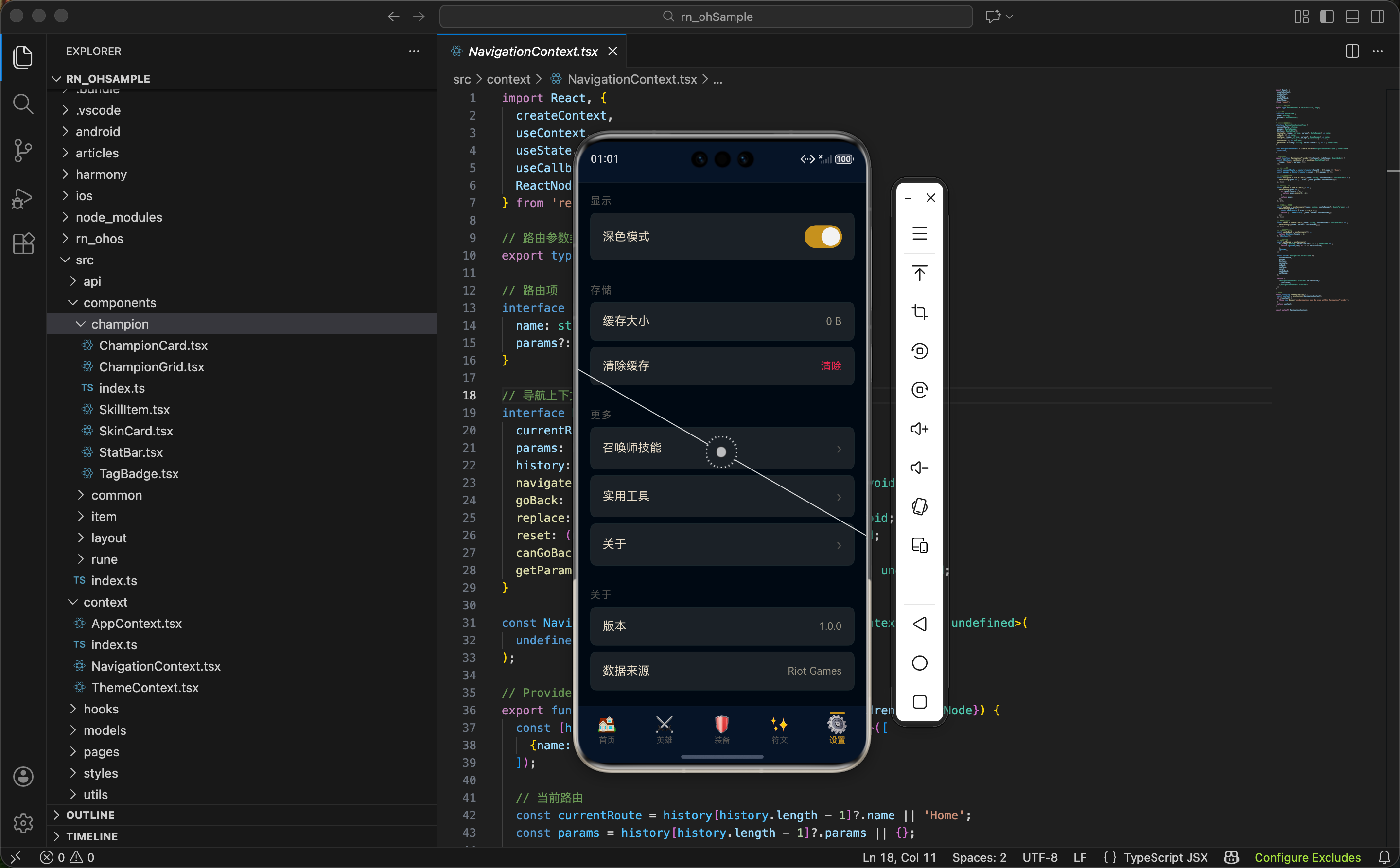
显示设置区域
tsx
  return (
    <ScrollView style={styles.container} showsVerticalScrollIndicator={false}>
      <View style={styles.section}>
        <Text style={styles.sectionTitle}>显示</Text>
        <View style={styles.settingItem}>
          <Text style={styles.settingLabel}>深色模式</Text>
          <Switch
            value={theme === 'dark'}
            onValueChange={toggleTheme}
            trackColor={{false: colors.border, true: colors.primary}}
            thumbColor={colors.white}
          />
        </View>
      </View>
Switch 组件的属性:
| 属性 | 值 | 说明 |
|---|---|---|
| value | theme === 'dark' | 开关状态,深色主题时为开 |
| onValueChange | toggleTheme | 切换时调用的函数 |
| trackColor | {false: ..., true: ...} | 轨道颜色,关闭时灰色,打开时金色 |
| thumbColor | colors.white | 滑块颜色,始终为白色 |
trackColor 的设计:
- 关闭时 (false):使用边框色
colors.border,低调不显眼 - 打开时 (true):使用主色调
colors.primary(金色),表示激活状态
这种设计让用户一眼就能看出开关状态。
存储设置区域
tsx
      <View style={styles.section}>
        <Text style={styles.sectionTitle}>存储</Text>
        <View style={styles.settingItem}>
          <Text style={styles.settingLabel}>缓存大小</Text>
          <Text style={styles.settingValue}>{cacheSize}</Text>
        </View>
        <TouchableOpacity style={styles.settingItem} onPress={handleClearCache}>
          <Text style={styles.settingLabel}>清除缓存</Text>
          <Text style={styles.settingAction}>清除</Text>
        </TouchableOpacity>
</View>两种设置项的对比:
| 设置项 | 组件 | 右侧内容 | 可交互 |
|---|---|---|---|
| 缓存大小 | View | 数值文字 | 否 |
| 清除缓存 | TouchableOpacity | 操作文字 | 是 |
"清除"文字的样式:
tsx
settingAction: {fontSize: 14, color: colors.error}使用 colors.error(红色)表示这是一个危险操作。红色在用户心中有"警告"的含义,提醒用户谨慎操作。
更多设置区域
tsx
      <View style={styles.section}>
        <Text style={styles.sectionTitle}>更多</Text>
        <TouchableOpacity style={styles.settingItem} onPress={() => navigate('SpellList')}>
          <Text style={styles.settingLabel}>召唤师技能</Text>
          <Text style={styles.arrow}>›</Text>
        </TouchableOpacity>
        <TouchableOpacity style={styles.settingItem} onPress={() => navigate('Tools')}>
          <Text style={styles.settingLabel}>实用工具</Text>
          <Text style={styles.arrow}>›</Text>
        </TouchableOpacity>
        <TouchableOpacity style={styles.settingItem} onPress={() => navigate('About')}>
          <Text style={styles.settingLabel}>关于</Text>
          <Text style={styles.arrow}>›</Text>
        </TouchableOpacity>
</View>跳转型设置项的设计:
右侧显示 › 箭头,这是一个通用的 UI 约定,表示"点击后会跳转到另一个页面"。用户看到箭头就知道这个设置项可以点击,而且会打开新页面。
为什么用文字箭头而不是图标?
- 简单:不需要额外的图标资源
- 轻量:文字渲染比图片更快
- 一致:在所有平台上显示效果相同
当然,也可以用 Icon 组件显示更精美的箭头图标。
关于信息区域
tsx
      <View style={styles.section}>
        <Text style={styles.sectionTitle}>关于</Text>
        <View style={styles.settingItem}>
          <Text style={styles.settingLabel}>版本</Text>
          <Text style={styles.settingValue}>1.0.0</Text>
        </View>
        <View style={styles.settingItem}>
          <Text style={styles.settingLabel}>数据来源</Text>
          <Text style={styles.settingValue}>Riot Games</Text>
        </View>
      </View>
    </ScrollView>
  );
}展示型设置项:
这两个设置项只显示信息,不可交互。使用 View 而不是 TouchableOpacity,用户点击不会有任何反馈。
版本号的用途:
显示版本号有几个作用:
- 用户反馈:用户报告问题时可以提供版本号
- 更新提示:可以和服务器版本对比,提示用户更新
- 调试定位:开发者可以根据版本号定位问题
数据来源的声明:
显示"Riot Games"是一种版权声明,表明数据来自官方,同时也是对 Riot Games 的致敬。
扩展:主题持久化
当前实现中,主题状态存储在内存中,App 重启后会恢复默认值。可以用 AsyncStorage 持久化:
tsx
import AsyncStorage from '@react-native-async-storage/async-storage';

export function ThemeProvider({children}: {children: ReactNode}) {
  const [theme, setThemeState] = useState<ThemeType>('dark');
  const [isLoaded, setIsLoaded] = useState(false);

  // 加载保存的主题
  useEffect(() => {
    AsyncStorage.getItem('theme').then(savedTheme => {
      if (savedTheme === 'dark' || savedTheme === 'light') {
        setThemeState(savedTheme);
      }
      setIsLoaded(true);
    });
  }, []);

  // 切换主题时保存
  const toggleTheme = useCallback(() => {
    setThemeState(prev => {
      const newTheme = prev === 'dark' ? 'light' : 'dark';
      AsyncStorage.setItem('theme', newTheme);
      return newTheme;
    });
  }, []);

  // 等待加载完成再渲染
  if (!isLoaded) return null;

  // ...
}
扩展:计算真实缓存大小
当前缓存大小是硬编码的 "0 B",可以实现真实的缓存计算:
tsx
const [cacheSize, setCacheSize] = useState('计算中...');

useEffect(() => {
  calculateCacheSize().then(size => {
    setCacheSize(formatBytes(size));
  });
}, []);

// 格式化字节数
const formatBytes = (bytes: number): string => {
  if (bytes === 0) return '0 B';
  const k = 1024;
  const sizes = ['B', 'KB', 'MB', 'GB'];
  const i = Math.floor(Math.log(bytes) / Math.log(k));
  return parseFloat((bytes / Math.pow(k, i)).toFixed(2)) + ' ' + sizes[i];
};

// 计算缓存大小(示例)
const calculateCacheSize = async (): Promise<number> => {
  // 这里需要根据实际的缓存策略来计算
  // 比如图片缓存、API 响应缓存等
  return 0;
};
扩展:更多设置选项
可以添加更多实用的设置选项:
tsx
// 语言设置
<TouchableOpacity style={styles.settingItem} onPress={() => navigate('LanguageSettings')}>
  <Text style={styles.settingLabel}>语言</Text>
  <View style={styles.settingRight}>
    <Text style={styles.settingValue}>简体中文</Text>
    <Text style={styles.arrow}>›</Text>
  </View>
</TouchableOpacity>

// 通知设置
<View style={styles.settingItem}>
  <Text style={styles.settingLabel}>推送通知</Text>
  <Switch value={notificationEnabled} onValueChange={setNotificationEnabled} />
</View>

// 数据版本
<TouchableOpacity style={styles.settingItem} onPress={checkDataUpdate}>
  <Text style={styles.settingLabel}>数据版本</Text>
  <View style={styles.settingRight}>
    <Text style={styles.settingValue}>{dataVersion}</Text>
    {hasUpdate && <View style={styles.updateDot} />}
  </View>
</TouchableOpacity>
扩展:跟随系统主题
可以添加"跟随系统"选项,让 App 主题自动跟随系统设置:
tsx
import {useColorScheme} from 'react-native';

type ThemeMode = 'dark' | 'light' | 'system';

export function ThemeProvider({children}: {children: ReactNode}) {
  const systemColorScheme = useColorScheme();
  const [themeMode, setThemeMode] = useState<ThemeMode>('system');

  // 计算实际主题
  const actualTheme = themeMode === 'system'
    ? (systemColorScheme || 'dark')
    : themeMode;

  // ...
}
useColorScheme 是 React Native 提供的 Hook,返回系统当前的颜色方案('dark' 或 'light')。
小结
设置页面展示了几个重要的实现模式:
- 主题系统:用 Context 管理主题状态,提供颜色配置和切换方法
- 动态样式:把 StyleSheet 放在组件内部,配合 useMemo 实现主题响应
- 设置项类型:开关型、跳转型、操作型、展示型,各有不同的交互方式
- 确认对话框:对破坏性操作使用 Alert 确认,防止误操作
- 视觉语义:用颜色传达含义(红色=危险,箭头=跳转)
设置页面虽然看起来简单,但涉及到的交互模式和设计细节很多,是一个很好的学习案例。
下一篇我们来实现关于页面,展示 App 的基本信息。
欢迎加入开源鸿蒙跨平台社区:https://openharmonycrossplatform.csdn.net