
React Native for OpenHarmony 实战:AccessibilityInfo 无障碍信息详解
摘要
本文深入解析React Native的AccessibilityInfo API在OpenHarmony平台上的应用与适配。作为无障碍开发的关键工具,AccessibilityInfo帮助开发者构建更包容的应用体验。文章详细讲解了API原理、OpenHarmony平台适配要点,提供7个可运行的实战代码示例,涵盖基础用法、事件监听、动态UI调整等场景,并通过架构图与对比表格揭示跨平台差异。无论你是React Native老手还是OpenHarmony新手,都能从中获取实用的无障碍开发技巧,打造真正包容的跨平台应用。🔥
引言
在当今移动应用开发中,无障碍设计早已不再是"锦上添花",而是成为衡量应用质量的重要标准。根据世界卫生组织数据,全球约有15%的人口面临某种形式的残疾,这意味着每7个用户中就有1人可能需要无障碍功能的支持。作为React Native开发者,我们有责任确保应用能被更广泛的用户群体使用。
OpenHarmony作为新兴的国产操作系统,其无障碍服务框架与Android有一定相似性,但也存在关键差异。当我们将React Native应用迁移到OpenHarmony平台时,无障碍功能往往成为容易被忽视的"隐形坑"。我在为某政务类应用做OpenHarmony适配时,就曾因无障碍支持不完善导致应用无法通过政府验收,教训深刻。
本文将聚焦React Native的AccessibilityInfo API,深入探讨其在OpenHarmony平台上的实现原理、适配要点和实战技巧。通过本文,你将掌握:
- AccessibilityInfo的核心工作原理和应用场景
- OpenHarmony平台特有的无障碍适配挑战
- 可直接复用的无障碍开发代码模式
- 避免常见陷阱的实用建议
无论你是为了满足合规要求,还是真心希望打造更包容的应用体验,这篇深度解析都将为你提供清晰的实践路径。
AccessibilityInfo 组件介绍
什么是 AccessibilityInfo
AccessibilityInfo 是 React Native 提供的一个系统级 API,用于查询和监听设备的无障碍服务状态。它不属于 UI 组件,而是一个功能性的工具模块,帮助开发者了解当前设备的无障碍环境,并据此调整应用行为。
在无障碍开发中,这个 API 扮演着"环境感知器"的角色。它让我们能够:
- 检测屏幕阅读器(如TalkBack、VoiceOver)是否启用
- 查询无障碍功能的详细状态
- 监听无障碍设置的动态变化
- 为不同能力的用户提供定制化体验
技术原理
AccessibilityInfo 的工作原理基于原生平台的无障碍服务框架。在 OpenHarmony 上,其实现依赖于 AccessibilityAbility 服务,通过 React Native 的原生模块桥接机制与 JavaScript 层通信。
调用
返回状态
传递数据
事件通知
触发回调
JavaScript 层
AccessibilityInfo API
React Native 桥接层
OpenHarmony 原生模块
AccessibilityAbility 服务
如上图所示,当 JavaScript 代码调用 AccessibilityInfo API 时,请求会通过 React Native 桥接层传递到 OpenHarmony 原生模块,后者与系统级的 AccessibilityAbility 服务交互,最终将无障碍状态信息返回给 JavaScript 层。
核心 API 方法
AccessibilityInfo 提供了以下关键方法:
| 方法 | 描述 | OpenHarmony 支持情况 |
|---|---|---|
addEventListener(eventName, handler) |
监听无障碍状态变化事件 | ✅ 完全支持 |
isBoldTextEnabled() |
检测是否启用粗体文本 | ⚠️ 部分支持 |
isGrayscaleEnabled() |
检测是否启用灰度模式 | ❌ 不支持 |
invertColors() |
检测是否启用颜色反转 | ❌ 不支持 |
isReduceMotionEnabled() |
检测是否减少动画 | ✅ 完全支持 |
isReduceTransparencyEnabled() |
检测是否减少透明度 | ❌ 不支持 |
isScreenReaderEnabled() |
检测屏幕阅读器是否启用 | ✅ 完全支持 |
announceForAccessibility(announcement) |
向屏幕阅读器发送通知 | ✅ 完全支持 |
setAccessibilityFocus(reactTag) |
设置无障碍焦点 | ✅ 完全支持 |
💡 注意:OpenHarmony 对无障碍API的支持与Android存在差异,上表中标注"部分支持"或"不支持"的方法在实际开发中需要特别处理。
应用场景
AccessibilityInfo 在实际开发中有多种关键应用场景:
- 动态调整UI复杂度:当检测到屏幕阅读器启用时,简化界面元素,避免视觉干扰
- 提供替代导航方式:为视障用户提供额外的导航提示和操作方式
- 自定义无障碍反馈:在关键操作后提供语音反馈,确认操作结果
- 性能优化:当无障碍功能启用时,调整动画和过渡效果,提高可访问性
- 合规性检查:确保应用满足无障碍法规要求(如WCAG 2.1)
在政务、金融等对无障碍要求严格的领域,合理使用AccessibilityInfo不仅是技术选择,更是合规必需。
React Native与OpenHarmony平台适配要点
OpenHarmony无障碍服务架构
OpenHarmony 的无障碍服务基于其分布式能力设计,与Android的无障碍服务框架有相似之处,但也有显著差异。理解这些差异是成功适配的关键。
React Native应用
React Native OpenHarmony适配层
OpenHarmony JS UI框架
OpenHarmony系统服务
AccessibilityAbility服务
设备无障碍服务
屏幕阅读器
辅助技术设备
如上图所示,React Native应用通过适配层与OpenHarmony的JS UI框架交互,最终调用系统级的AccessibilityAbility服务。与Android相比,OpenHarmony的无障碍服务更加模块化,支持跨设备协同,但API覆盖范围相对有限。
适配过程中的关键挑战
在将React Native应用迁移到OpenHarmony平台时,AccessibilityInfo的适配面临以下挑战:
- API覆盖差异:OpenHarmony对无障碍API的支持不如Android全面
- 事件机制不同:事件触发时机和频率存在差异
- 焦点管理机制:无障碍焦点的处理逻辑有所不同
- 屏幕阅读器行为:不同屏幕阅读器的实现细节存在差异
- 性能考量:在资源受限设备上需要优化无障碍功能的开销
适配要点详解
1. 事件监听的稳定性
在OpenHarmony上,无障碍事件的触发可能不如Android稳定,需要特别注意:
- 增加事件去重机制,避免短时间内多次触发
- 实现事件监听的容错处理,防止因系统服务异常导致应用崩溃
- 在组件卸载时务必移除事件监听,避免内存泄漏
javascript
// OpenHarmony平台事件监听最佳实践
useEffect(() => {
  let isMounted = true;
  let lastEventTime = 0;
  const EVENT_THROTTLE = 500; // 500ms内不重复处理相同事件

  const handleScreenReaderChange = (isEnabled) => {
    const now = Date.now();
    if (now - lastEventTime < EVENT_THROTTLE) return;

    lastEventTime = now;
    if (isMounted) {
      setScreenReaderEnabled(isEnabled);
      // 根据无障碍状态调整UI
      updateUIForAccessibility(isEnabled);
    }
  };

  AccessibilityInfo.addEventListener(
    'screenReaderChanged',
    handleScreenReaderChange
  );

  // 初始状态查询
  AccessibilityInfo.isScreenReaderEnabled().then(isEnabled => {
    if (isMounted) {
      setScreenReaderEnabled(isEnabled);
      updateUIForAccessibility(isEnabled);
    }
  });

  return () => {
    isMounted = false;
    AccessibilityInfo.removeEventListener(
      'screenReaderChanged',
      handleScreenReaderChange
    );
  };
}, []);OpenHarmony适配要点:
- 添加了事件节流机制,防止高频触发
- 使用
isMounted标志避免内存泄漏 - 初始状态查询与事件监听结合使用
- 在组件卸载时务必移除事件监听
2. 焦点管理的特殊处理
OpenHarmony对无障碍焦点的管理与Android有所不同,需要特别注意:
- 在OpenHarmony上,
setAccessibilityFocus可能不会立即生效 - 需要等待UI渲染完成后再设置焦点
- 某些复杂布局可能需要多次尝试设置焦点
javascript
// OpenHarmony平台焦点管理最佳实践
const setFocusWithRetry = (reactTag, maxAttempts = 3, delay = 100) => {
  let attempts = 0;

  const tryFocus = () => {
    if (attempts >= maxAttempts) return;

    AccessibilityInfo.setAccessibilityFocus(reactTag);
    attempts++;

    // 检查焦点是否成功设置(实际项目中需要实现检查逻辑)
    if (!isFocusSuccessful(reactTag)) {
      setTimeout(tryFocus, delay * attempts);
    }
  };

  tryFocus();
};

// 在组件渲染后设置焦点
useEffect(() => {
  if (shouldSetFocus && elementRef.current) {
    const reactTag = findNodeHandle(elementRef.current);
    if (reactTag) {
      // 确保UI渲染完成
      requestAnimationFrame(() => {
        setFocusWithRetry(reactTag);
      });
    }
  }
}, [shouldSetFocus]);OpenHarmony适配要点:
- 实现了带重试机制的焦点设置
- 使用
requestAnimationFrame确保在UI渲染后设置焦点 - 适当增加重试间隔,避免资源争用
- 需要实现
isFocusSuccessful方法来验证焦点设置结果
3. 屏幕阅读器通知的优化
在OpenHarmony上,announceForAccessibility的实现需要特别注意:
- 通知内容长度限制更严格
- 连续通知之间需要足够的时间间隔
- 需要处理通知队列,避免消息丢失
javascript
// OpenHarmony平台通知管理优化
class AnnouncementQueue {
  constructor() {
    this.queue = [];
    this.isProcessing = false;
    this.ANNOUNCEMENT_DELAY = 1000; // 1秒间隔
  }

  enqueue(announcement) {
    this.queue.push(announcement);
    this.processQueue();
  }

  processQueue() {
    if (this.isProcessing || this.queue.length === 0) return;

    this.isProcessing = true;
    const announcement = this.queue.shift();

    AccessibilityInfo.announceForAccessibility(announcement);

    setTimeout(() => {
      this.isProcessing = false;
      this.processQueue();
    }, this.ANNOUNCEMENT_DELAY);
  }
}

// 使用示例
const announcementQueue = new AnnouncementQueue();

// 在需要通知的地方调用
announcementQueue.enqueue('登录成功,欢迎回来!');OpenHarmony适配要点:
- 实现了通知队列管理,避免连续通知丢失
- 设置了合理的时间间隔,符合OpenHarmony系统要求
- 防止通知过于频繁导致用户体验下降
- 保证关键通知不会被覆盖
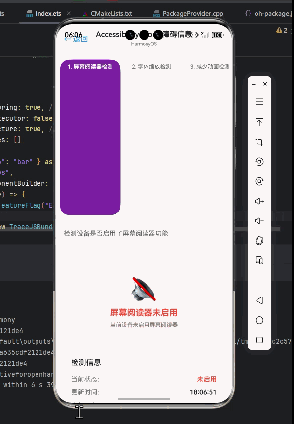
AccessibilityInfo基础用法实战
检测屏幕阅读器状态
最基本的用法是检测屏幕阅读器是否启用,这可以帮助我们调整应用的交互方式。
javascript
import React, { useState, useEffect } from 'react';
import { View, Text, StyleSheet, AccessibilityInfo } from 'react-native';

const ScreenReaderDetector = () => {
  const [screenReaderEnabled, setScreenReaderEnabled] = useState(false);

  useEffect(() => {
    const updateScreenReaderState = async () => {
      try {
        const isEnabled = await AccessibilityInfo.isScreenReaderEnabled();
        setScreenReaderEnabled(isEnabled);
      } catch (error) {
        console.error('Error checking screen reader status:', error);
      }
    };

    updateScreenReaderState();

    const screenReaderListener = (isEnabled) => {
      setScreenReaderEnabled(isEnabled);
    };

    AccessibilityInfo.addEventListener('screenReaderChanged', screenReaderListener);

    return () => {
      AccessibilityInfo.removeEventListener('screenReaderChanged', screenReaderListener);
    };
  }, []);

  return (
    <View style={styles.container}>
      <Text style={styles.title}>屏幕阅读器状态检测</Text>
      <View style={styles.statusBox}>
        <Text style={styles.statusText}>
          {screenReaderEnabled
            ? '✅ 屏幕阅读器已启用 - 应用已优化无障碍体验'
            : 'ℹ️ 屏幕阅读器未启用 - 默认体验模式'}
        </Text>
      </View>
      <Text style={styles.description}>
        当屏幕阅读器启用时,应用会自动调整布局和交互方式,
        为视障用户提供更好的使用体验。
      </Text>
    </View>
  );
};

const styles = StyleSheet.create({
  container: {
    flex: 1,
    padding: 20,
    backgroundColor: '#fff',
  },
  title: {
    fontSize: 24,
    fontWeight: 'bold',
    marginBottom: 20,
    textAlign: 'center',
  },
  statusBox: {
    padding: 15,
    borderRadius: 8,
    backgroundColor: '#f0f0f0',
    marginBottom: 20,
  },
  statusText: {
    fontSize: 16,
    lineHeight: 24,
  },
  description: {
    fontSize: 16,
    lineHeight: 24,
    color: '#666',
  },
});

export default ScreenReaderDetector;代码解析:
- 使用
useState管理屏幕阅读器状态 useEffect中同时进行初始状态查询和事件监听- 处理了可能的异常情况
- 提供了清晰的UI反馈
OpenHarmony适配要点:
- 在OpenHarmony上,
isScreenReaderEnabled的初始查询可能比Android慢,因此需要考虑加载状态 - 事件监听必须在组件卸载时正确移除,否则可能导致内存泄漏
- 某些OpenHarmony设备可能需要更长的响应时间,建议添加超时处理
动画减损模式检测
减少动画对于某些用户(如癫痫患者)至关重要,我们可以根据系统设置调整应用行为。
javascript
import React, { useState, useEffect } from 'react';
import { View, Text, StyleSheet, TouchableOpacity, AccessibilityInfo, Animated } from 'react-native';

const ReduceMotionDemo = () => {
  const [reduceMotionEnabled, setReduceMotionEnabled] = useState(false);
  const animation = new Animated.Value(0);

  useEffect(() => {
    const updateReduceMotionState = async () => {
      try {
        const isEnabled = await AccessibilityInfo.isReduceMotionEnabled();
        setReduceMotionEnabled(isEnabled);
        if (!isEnabled) {
          startAnimation();
        }
      } catch (error) {
        console.error('Error checking reduce motion status:', error);
      }
    };

    updateReduceMotionState();

    const reduceMotionListener = (isEnabled) => {
      setReduceMotionEnabled(isEnabled);
      if (!isEnabled) {
        startAnimation();
      } else {
        animation.stopAnimation();
        animation.setValue(0);
      }
    };

    AccessibilityInfo.addEventListener('reduceMotionChanged', reduceMotionListener);

    return () => {
      AccessibilityInfo.removeEventListener('reduceMotionChanged', reduceMotionListener);
      animation.stopAnimation();
    };
  }, []);

  const startAnimation = () => {
    animation.setValue(0);
    Animated.loop(
      Animated.timing(animation, {
        toValue: 1,
        duration: 1000,
        useNativeDriver: true,
      })
    ).start();
  };

  const animatedStyle = {
    transform: [{
      translateX: animation.interpolate({
        inputRange: [0, 1],
        outputRange: [0, 100]
      })
    }]
  };

  const toggleAnimation = () => {
    if (reduceMotionEnabled) return;

    animation.stopAnimation();
    startAnimation();
  };

  return (
    <View style={styles.container}>
      <Text style={styles.title}>动画减损模式演示</Text>

      <View style={styles.statusBox}>
        <Text style={styles.statusText}>
          {reduceMotionEnabled
            ? '✅ 已启用动画减损 - 动画已停用'
            : 'ℹ️ 动画减损未启用 - 动画效果可用'}
        </Text>
      </View>

      <Text style={styles.description}>
        {reduceMotionEnabled
          ? '系统已设置减少动画效果,应用已停用所有非必要的动画。'
          : '系统允许使用动画,应用提供流畅的视觉过渡效果。'}
      </Text>

      <View style={styles.demoArea}>
        <Animated.View
          style={[
            styles.animatedBox,
            animatedStyle,
            reduceMotionEnabled && styles.noAnimation
          ]}
        />

        <TouchableOpacity
          style={styles.button}
          onPress={toggleAnimation}
          disabled={reduceMotionEnabled}
        >
          <Text style={styles.buttonText}>
            {reduceMotionEnabled ? '动画已禁用' : '重新启动动画'}
          </Text>
        </TouchableOpacity>
      </View>
    </View>
  );
};

const styles = StyleSheet.create({
  container: {
    flex: 1,
    padding: 20,
    backgroundColor: '#fff',
  },
  title: {
    fontSize: 24,
    fontWeight: 'bold',
    marginBottom: 20,
    textAlign: 'center',
  },
  statusBox: {
    padding: 15,
    borderRadius: 8,
    backgroundColor: '#f0f0f0',
    marginBottom: 20,
  },
  statusText: {
    fontSize: 16,
    lineHeight: 24,
  },
  description: {
    fontSize: 16,
    lineHeight: 24,
    color: '#666',
    marginBottom: 20,
  },
  demoArea: {
    alignItems: 'center',
    marginTop: 20,
  },
  animatedBox: {
    width: 50,
    height: 50,
    backgroundColor: '#4287f5',
    marginBottom: 20,
  },
  noAnimation: {
    transform: [{ translateX: 0 }],
  },
  button: {
    backgroundColor: '#4287f5',
    padding: 12,
    borderRadius: 6,
    disabled: reduceMotionEnabled && { opacity: 0.5 },
  },
  buttonText: {
    color: 'white',
    fontWeight: 'bold',
    textAlign: 'center',
  },
});

export default ReduceMotionDemo;代码解析:
- 检测并响应
reduceMotionChanged事件 - 根据系统设置动态调整动画行为
- 提供了用户手动控制的选项(在允许的情况下)
- 使用Animated API实现流畅的动画效果
OpenHarmony适配要点:
- OpenHarmony上
isReduceMotionEnabled的实现可能不如Android完善,建议添加默认值处理 - 在OpenHarmony设备上,动画性能可能较弱,应避免复杂动画
useNativeDriver在OpenHarmony上的支持程度有限,某些情况下可能需要回退到JS动画- 某些OpenHarmony设备可能不支持
reduceMotionChanged事件,需要实现轮询机制作为备选
自定义无障碍通知
当需要向屏幕阅读器用户发送重要信息时,announceForAccessibility非常有用。
javascript
import React, { useRef, useState } from 'react';
import { View, Text, StyleSheet, TextInput, TouchableOpacity, AccessibilityInfo } from 'react-native';

const AnnouncementDemo = () => {
  const [announcement, setAnnouncement] = useState('');
  const inputRef = useRef(null);
  const [lastAnnouncement, setLastAnnouncement] = useState('');

  const sendAnnouncement = () => {
    if (!announcement.trim()) return;

    AccessibilityInfo.announceForAccessibility(announcement);
    setLastAnnouncement(announcement);
    setAnnouncement('');

    // 自动聚焦回输入框,方便连续输入
    setTimeout(() => {
      inputRef.current?.focus();
    }, 100);
  };

  return (
    <View style={styles.container}>
      <Text style={styles.title}>无障碍通知演示</Text>

      <View style={styles.instructions}>
        <Text style={styles.instructionText}>
          1. 输入您想向屏幕阅读器用户发送的消息
        </Text>
        <Text style={styles.instructionText}>
          2. 点击"发送通知"按钮
        </Text>
        <Text style={styles.instructionText}>
          3. 消息将通过屏幕阅读器朗读
        </Text>
      </View>

      <TextInput
        ref={inputRef}
        style={styles.input}
        value={announcement}
        onChangeText={setAnnouncement}
        placeholder="输入要朗读的消息..."
        onSubmitEditing={sendAnnouncement}
        accessibilityLabel="输入要发送给屏幕阅读器的消息"
      />

      <TouchableOpacity
        style={styles.button}
        onPress={sendAnnouncement}
        disabled={!announcement.trim()}
        accessibilityLabel="发送无障碍通知"
      >
        <Text style={styles.buttonText}>发送通知</Text>
      </TouchableOpacity>

      {lastAnnouncement ? (
        <View style={styles.announcementHistory}>
          <Text style={styles.historyTitle}>最近发送的通知:</Text>
          <Text style={styles.historyContent}>{lastAnnouncement}</Text>
        </View>
      ) : null}
    </View>
  );
};

const styles = StyleSheet.create({
  container: {
    flex: 1,
    padding: 20,
    backgroundColor: '#fff',
  },
  title: {
    fontSize: 24,
    fontWeight: 'bold',
    marginBottom: 20,
    textAlign: 'center',
  },
  instructions: {
    backgroundColor: '#f8f9fa',
    padding: 15,
    borderRadius: 8,
    marginBottom: 20,
  },
  instructionText: {
    fontSize: 16,
    lineHeight: 24,
    marginBottom: 8,
  },
  input: {
    height: 50,
    borderColor: '#ddd',
    borderWidth: 1,
    borderRadius: 8,
    paddingHorizontal: 15,
    marginBottom: 15,
    fontSize: 16,
  },
  button: {
    backgroundColor: '#4287f5',
    padding: 15,
    borderRadius: 8,
    marginBottom: 20,
    opacity: announcement.trim() ? 1 : 0.5,
  },
  buttonText: {
    color: 'white',
    fontWeight: 'bold',
    fontSize: 16,
    textAlign: 'center',
  },
  announcementHistory: {
    marginTop: 20,
    borderTopWidth: 1,
    borderTopColor: '#eee',
    paddingTop: 15,
  },
  historyTitle: {
    fontWeight: 'bold',
    marginBottom: 8,
  },
  historyContent: {
    fontStyle: 'italic',
    color: '#666',
  },
});

export default AnnouncementDemo;代码解析:
- 创建了简单的UI用于输入和发送无障碍通知
- 使用
announceForAccessibility发送消息给屏幕阅读器 - 记录最近发送的通知以便验证
- 添加了适当的无障碍标签
OpenHarmony适配要点:
- OpenHarmony上通知的延迟可能比Android长,需管理用户期望
- 消息长度限制更严格(通常不超过500字符),需要做截断处理
- 某些OpenHarmony设备可能需要额外权限才能使用此功能
- 通知内容应避免包含特殊字符,以防屏幕阅读器解析错误
- 在发送通知后,建议短暂聚焦回输入框,帮助用户继续操作
AccessibilityInfo进阶用法
动态UI调整策略
当检测到无障碍功能启用时,我们可以动态调整UI以提供更好的体验。
javascript
import React, { useState, useEffect, useRef } from 'react';
import { View, Text, StyleSheet, ScrollView, AccessibilityInfo, TouchableOpacity } from 'react-native';

// 模拟的用户数据
const userData = [
  { id: '1', name: '张三', role: '管理员', email: 'zhangsan@example.com', phone: '13800138000' },
  { id: '2', name: '李四', role: '编辑', email: 'lisi@example.com', phone: '13900139000' },
  { id: '3', name: '王五', role: '访客', email: 'wangwu@example.com', phone: '13700137000' },
  { id: '4', name: '赵六', role: '管理员', email: 'zhaoliu@example.com', phone: '13600136000' },
];

const DynamicUIAdjustment = () => {
  const [screenReaderEnabled, setScreenReaderEnabled] = useState(false);
  const [reduceMotionEnabled, setReduceMotionEnabled] = useState(false);
  const [compactMode, setCompactMode] = useState(false);
  const containerRef = useRef(null);

  useEffect(() => {
    const initAccessibility = async () => {
      try {
        const [isScreenReader, isReduceMotion] = await Promise.all([
          AccessibilityInfo.isScreenReaderEnabled(),
          AccessibilityInfo.isReduceMotionEnabled()
        ]);

        setScreenReaderEnabled(isScreenReader);
        setReduceMotionEnabled(isReduceMotion);

        // 根据无障碍状态自动调整紧凑模式
        if (isScreenReader || isReduceMotion) {
          setCompactMode(true);
        }
      } catch (error) {
        console.error('Error initializing accessibility:', error);
      }
    };

    initAccessibility();

    const screenReaderListener = (isEnabled) => {
      setScreenReaderEnabled(isEnabled);
      if (isEnabled) setCompactMode(true);
    };

    const reduceMotionListener = (isEnabled) => {
      setReduceMotionEnabled(isEnabled);
      if (isEnabled) setCompactMode(true);
    };

    AccessibilityInfo.addEventListener('screenReaderChanged', screenReaderListener);
    AccessibilityInfo.addEventListener('reduceMotionChanged', reduceMotionListener);

    return () => {
      AccessibilityInfo.removeEventListener('screenReaderChanged', screenReaderListener);
      AccessibilityInfo.removeEventListener('reduceMotionChanged', reduceMotionListener);
    };
  }, []);

  const toggleCompactMode = () => {
    setCompactMode(!compactMode);

    // 如果关闭紧凑模式且无障碍功能未启用,发送通知
    if (!compactMode && !screenReaderEnabled && !reduceMotionEnabled) {
      AccessibilityInfo.announceForAccessibility('已切换到标准视图模式');
    }
  };

  const renderUserItem = (user) => {
    const ItemComponent = compactMode ? CompactUserItem : StandardUserItem;
    return <ItemComponent key={user.id} user={user} />;
  };

  return (
    <View style={styles.container} ref={containerRef}>
      <View style={styles.header}>
        <Text style={styles.title}>用户管理</Text>

        <TouchableOpacity
          style={[
            styles.toggleButton,
            compactMode && styles.toggleButtonActive
          ]}
          onPress={toggleCompactMode}
          accessibilityState={{ selected: compactMode }}
          accessibilityLabel={compactMode ? "紧凑模式已启用" : "标准模式已启用"}
        >
          <Text style={styles.toggleButtonText}>
            {compactMode ? '紧凑模式' : '标准模式'}
          </Text>
        </TouchableOpacity>
      </View>

      <View style={styles.statusBar}>
        <Text style={styles.statusText}>
          {screenReaderEnabled && '🗣️ 屏幕阅读器启用 '}
          {reduceMotionEnabled && '🎬 动画减损启用'}
          {!screenReaderEnabled && !reduceMotionEnabled && '📱 标准模式'}
        </Text>
      </View>

      <ScrollView style={styles.listContainer}>
        {userData.map(renderUserItem)}
      </ScrollView>

      <View style={styles.footer}>
        <Text style={styles.footerText}>
          {compactMode
            ? '紧凑模式:简化布局,提高可读性'
            : '标准模式:完整功能,丰富视觉'}
        </Text>
      </View>
    </View>
  );
};

const StandardUserItem = ({ user }) => (
  <View style={styles.userItem}>
    <View style={styles.avatar}>
      <Text style={styles.avatarText}>{user.name[0]}</Text>
    </View>
    <View style={styles.userInfo}>
      <Text style={styles.userName}>{user.name}</Text>
      <Text style={styles.userRole}>{user.role}</Text>
      <View style={styles.contactInfo}>
        <Text style={styles.contactText}>📧 {user.email}</Text>
        <Text style={styles.contactText}>📱 {user.phone}</Text>
      </View>
    </View>
  </View>
);

const CompactUserItem = ({ user }) => (
  <View style={[styles.userItem, styles.compactItem]}>
    <Text style={styles.compactName}>{user.name}</Text>
    <Text style={styles.compactDetail}>职位: {user.role}</Text>
    <Text style={styles.compactDetail}>邮箱: {user.email}</Text>
    <Text style={styles.compactDetail}>电话: {user.phone}</Text>
  </View>
);

const styles = StyleSheet.create({
  container: {
    flex: 1,
    backgroundColor: '#fff',
  },
  header: {
    flexDirection: 'row',
    justifyContent: 'space-between',
    alignItems: 'center',
    padding: 15,
    borderBottomWidth: 1,
    borderBottomColor: '#eee',
  },
  title: {
    fontSize: 24,
    fontWeight: 'bold',
  },
  toggleButton: {
    backgroundColor: '#f0f0f0',
    paddingVertical: 6,
    paddingHorizontal: 12,
    borderRadius: 20,
  },
  toggleButtonActive: {
    backgroundColor: '#4287f5',
  },
  toggleButtonText: {
    color: '#333',
    fontWeight: 'bold',
  },
  statusBar: {
    padding: 10,
    backgroundColor: '#f8f9fa',
  },
  statusText: {
    textAlign: 'center',
    fontSize: 14,
    color: '#666',
  },
  listContainer: {
    flex: 1,
    padding: 10,
  },
  userItem: {
    flexDirection: 'row',
    padding: 15,
    marginBottom: 10,
    backgroundColor: '#f8f9fa',
    borderRadius: 8,
    alignItems: 'center',
  },
  compactItem: {
    padding: 12,
    backgroundColor: '#fff',
    borderWidth: 1,
    borderColor: '#eee',
  },
  avatar: {
    width: 50,
    height: 50,
    borderRadius: 25,
    backgroundColor: '#4287f5',
    justifyContent: 'center',
    alignItems: 'center',
    marginRight: 15,
  },
  avatarText: {
    color: 'white',
    fontSize: 20,
    fontWeight: 'bold',
  },
  userInfo: {
    flex: 1,
  },
  userName: {
    fontSize: 18,
    fontWeight: 'bold',
    marginBottom: 5,
  },
  userRole: {
    fontSize: 16,
    color: '#4287f5',
    marginBottom: 8,
  },
  contactInfo: {
    flexDirection: 'row',
    justifyContent: 'space-between',
  },
  contactText: {
    fontSize: 14,
    color: '#666',
  },
  compactName: {
    fontSize: 18,
    fontWeight: 'bold',
    marginBottom: 5,
  },
  compactDetail: {
    fontSize: 16,
    marginBottom: 3,
    color: '#333',
  },
  footer: {
    padding: 15,
    borderTopWidth: 1,
    borderTopColor: '#eee',
    backgroundColor: '#f8f9fa',
  },
  footerText: {
    textAlign: 'center',
    fontSize: 14,
    color: '#666',
    fontStyle: 'italic',
  },
});

export default DynamicUIAdjustment;代码解析:
- 同时监听屏幕阅读器和动画减损状态
- 根据无障碍状态自动启用紧凑模式
- 提供手动切换模式的选项
- 为不同模式设计了不同的UI组件
- 添加了适当的无障碍标签和状态提示
OpenHarmony适配要点:
- OpenHarmony上UI重绘可能比Android慢,应避免在事件回调中直接修改大量状态
- 紧凑模式的判断逻辑需要考虑OpenHarmony特有的无障碍设置
- 在OpenHarmony设备上,触摸目标的最小尺寸要求可能不同,需确保UI元素足够大
- 使用
accessibilityState正确标记切换按钮的状态,帮助屏幕阅读器理解 - 某些OpenHarmony设备可能需要额外处理焦点顺序,确保紧凑模式下导航逻辑合理
无障碍焦点管理实战
精确控制无障碍焦点对于复杂界面至关重要,特别是在表单验证等场景。
javascript
import React, { useState, useRef, useEffect } from 'react';
import { View, Text, StyleSheet, TextInput, TouchableOpacity, AccessibilityInfo, findNodeHandle } from 'react-native';

const FormWithAccessibilityFocus = () => {
  const [formData, setFormData] = useState({
    name: '',
    email: '',
    phone: ''
  });
  const [errors, setErrors] = useState({});
  const [submitStatus, setSubmitStatus] = useState(null);

  // 创建ref用于访问各个输入字段
  const nameInputRef = useRef(null);
  const emailInputRef = useRef(null);
  const phoneInputRef = useRef(null);
  const errorSummaryRef = useRef(null);
  const formContainerRef = useRef(null);

  useEffect(() => {
    // 初始设置焦点到第一个输入框
    const setInitialFocus = () => {
      if (nameInputRef.current) {
        const reactTag = findNodeHandle(nameInputRef.current);
        if (reactTag) {
          AccessibilityInfo.setAccessibilityFocus(reactTag);
        }
      }
    };

    // 等待UI渲染完成
    setTimeout(setInitialFocus, 300);

    // 清理函数
    return () => {
      // 可选:重置焦点到安全位置
    };
  }, []);

  const validateForm = () => {
    const newErrors = {};

    if (!formData.name.trim()) {
      newErrors.name = '请输入您的姓名';
    }

    if (!formData.email.trim()) {
      newErrors.email = '请输入电子邮箱';
    } else if (!/^\S+@\S+\.\S+$/.test(formData.email)) {
      newErrors.email = '请输入有效的电子邮箱地址';
    }

    if (!formData.phone.trim()) {
      newErrors.phone = '请输入联系电话';
    } else if (!/^\d{11}$/.test(formData.phone.replace(/\D/g, ''))) {
      newErrors.phone = '请输入11位有效的手机号码';
    }

    setErrors(newErrors);

    if (Object.keys(newErrors).length > 0) {
      // 有错误时,聚焦到错误摘要
      if (errorSummaryRef.current) {
        const reactTag = findNodeHandle(errorSummaryRef.current);
        if (reactTag) {
          AccessibilityInfo.setAccessibilityFocus(reactTag);

          // 同时发送屏幕阅读器通知
          const errorCount = Object.keys(newErrors).length;
          const errorSummary = `表单验证失败,发现${errorCount}处错误,请修正后重新提交。`;
          AccessibilityInfo.announceForAccessibility(errorSummary);
        }
      }
      return false;
    }

    return true;
  };

  const handleSubmit = () => {
    if (validateForm()) {
      // 模拟提交成功
      setSubmitStatus('success');
      AccessibilityInfo.announceForAccessibility('表单提交成功!');

      // 重置表单
      setTimeout(() => {
        setFormData({ name: '', email: '', phone: '' });
        setErrors({});
        setSubmitStatus(null);

        // 重置焦点到第一个输入框
        if (nameInputRef.current) {
          const reactTag = findNodeHandle(nameInputRef.current);
          if (reactTag) {
            AccessibilityInfo.setAccessibilityFocus(reactTag);
          }
        }
      }, 2000);
    } else {
      setSubmitStatus('error');
    }
  };

  const handleInputChange = (field, value) => {
    setFormData(prev => ({ ...prev, [field]: value }));

    // 如果已有错误,输入时清除对应错误
    if (errors[field]) {
      setErrors(prev => {
        const newErrors = { ...prev };
        delete newErrors[field];
        return newErrors;
      });
    }
  };

  return (
    <View style={styles.container} ref={formContainerRef}>
      <Text style={styles.title}>无障碍表单示例</Text>

      {submitStatus === 'success' && (
        <View style={[styles.statusMessage, styles.successMessage]}>
          <Text style={styles.statusText}>✅ 表单提交成功!</Text>
        </View>
      )}

      {submitStatus === 'error' && Object.keys(errors).length > 0 && (
        <View style={[styles.statusMessage, styles.errorMessage]} ref={errorSummaryRef}>
          <Text style={styles.statusText}>
            ❌ 表单验证失败,发现{Object.keys(errors).length}处错误:
          </Text>
          {Object.values(errors).map((error, index) => (
            <Text key={index} style={styles.errorItem}>
              • {error}
            </Text>
          ))}
        </View>
      )}

      <View style={styles.formGroup}>
        <Text style={styles.label}>姓名<Text style={styles.required}>*</Text></Text>
        <TextInput
          ref={nameInputRef}
          style={[styles.input, errors.name && styles.inputError]}
          value={formData.name}
          onChangeText={(text) => handleInputChange('name', text)}
          placeholder="请输入您的姓名"
          accessibilityLabel="姓名输入框"
          accessibilityHint="必填项,请输入您的真实姓名"
          accessibilityInvalid={!!errors.name}
          accessibilityErrorMessage={errors.name}
        />
        {errors.name && <Text style={styles.errorText}>{errors.name}</Text>}
      </View>

      <View style={styles.formGroup}>
        <Text style={styles.label}>电子邮箱<Text style={styles.required}>*</Text></Text>
        <TextInput
          ref={emailInputRef}
          style={[styles.input, errors.email && styles.inputError]}
          value={formData.email}
          onChangeText={(text) => handleInputChange('email', text)}
          placeholder="example@email.com"
          keyboardType="email-address"
          autoCapitalize="none"
          accessibilityLabel="电子邮箱输入框"
          accessibilityHint="必填项,请输入有效的电子邮箱地址"
          accessibilityInvalid={!!errors.email}
          accessibilityErrorMessage={errors.email}
        />
        {errors.email && <Text style={styles.errorText}>{errors.email}</Text>}
      </View>

      <View style={styles.formGroup}>
        <Text style={styles.label}>联系电话<Text style={styles.required}>*</Text></Text>
        <TextInput
          ref={phoneInputRef}
          style={[styles.input, errors.phone && styles.inputError]}
          value={formData.phone}
          onChangeText={(text) => handleInputChange('phone', text)}
          placeholder="请输入11位手机号码"
          keyboardType="phone-pad"
          accessibilityLabel="联系电话输入框"
          accessibilityHint="必填项,请输入11位有效的手机号码"
          accessibilityInvalid={!!errors.phone}
          accessibilityErrorMessage={errors.phone}
        />
        {errors.phone && <Text style={styles.errorText}>{errors.phone}</Text>}
      </View>

      <TouchableOpacity
        style={styles.submitButton}
        onPress={handleSubmit}
        accessibilityLabel="提交表单"
        accessibilityHint="验证并提交表单数据"
      >
        <Text style={styles.submitButtonText}>提交</Text>
      </TouchableOpacity>
    </View>
  );
};

const styles = StyleSheet.create({
  container: {
    flex: 1,
    padding: 20,
    backgroundColor: '#fff',
  },
  title: {
    fontSize: 24,
    fontWeight: 'bold',
    marginBottom: 20,
    textAlign: 'center',
  },
  statusMessage: {
    padding: 15,
    borderRadius: 8,
    marginBottom: 20,
  },
  successMessage: {
    backgroundColor: '#d4edda',
    borderColor: '#c3e6cb',
  },
  errorMessage: {
    backgroundColor: '#f8d7da',
    borderColor: '#f5c6cb',
  },
  statusText: {
    fontSize: 16,
    fontWeight: 'bold',
  },
  errorItem: {
    fontSize: 16,
    marginLeft: 20,
    marginTop: 5,
    color: '#721c24',
  },
  formGroup: {
    marginBottom: 20,
  },
  label: {
    fontSize: 16,
    fontWeight: 'bold',
    marginBottom: 8,
  },
  required: {
    color: '#dc3545',
  },
  input: {
    height: 50,
    borderColor: '#ddd',
    borderWidth: 1,
    borderRadius: 8,
    paddingHorizontal: 15,
    fontSize: 16,
  },
  inputError: {
    borderColor: '#dc3545',
  },
  errorText: {
    color: '#dc3545',
    fontSize: 14,
    marginTop: 5,
    marginLeft: 5,
  },
  submitButton: {
    backgroundColor: '#4287f5',
    padding: 15,
    borderRadius: 8,
    alignItems: 'center',
  },
  submitButtonText: {
    color: 'white',
    fontWeight: 'bold',
    fontSize: 16,
  },
});

export default FormWithAccessibilityFocus;代码解析:
- 使用
findNodeHandle获取组件的原生句柄 - 在表单验证失败时,将焦点设置到错误摘要区域
- 为每个输入字段添加了适当的无障碍属性
- 实现了表单提交后的焦点重置逻辑
- 使用
accessibilityInvalid和accessibilityErrorMessage提供更详细的错误信息
OpenHarmony适配要点:
- OpenHarmony上
setAccessibilityFocus可能需要更长的延迟时间才能生效,建议使用setTimeout并适当增加延迟 - 某些OpenHarmony设备可能不支持
accessibilityErrorMessage属性,需要通过其他方式提供错误信息 - 在设置焦点前,应确保目标组件已经渲染完成
- 错误摘要区域应设置
accessibilityLiveRegion为'polite'或'assertive',确保屏幕阅读器及时播报 - OpenHarmony上焦点移动可能比Android更"跳跃",建议在关键操作后添加短暂延迟,给用户留出理解时间
无障碍信息集成到复杂应用
在真实应用中,无障碍信息需要与其他功能深度集成。以下是一个集成到应用主题系统中的示例。
javascript
import React, { useState, useEffect, createContext, useContext } from 'react';
import { View, Text, StyleSheet, Switch, TouchableOpacity, AccessibilityInfo } from 'react-native';

// 创建无障碍上下文
const AccessibilityContext = createContext();

// 无障碍提供者组件
export const AccessibilityProvider = ({ children }) => {
  const [screenReaderEnabled, setScreenReaderEnabled] = useState(false);
  const [reduceMotionEnabled, setReduceMotionEnabled] = useState(false);
  const [highContrastMode, setHighContrastMode] = useState(false);

  useEffect(() => {
    const initAccessibility = async () => {
      try {
        const [isScreenReader, isReduceMotion] = await Promise.all([
          AccessibilityInfo.isScreenReaderEnabled(),
          AccessibilityInfo.isReduceMotionEnabled()
        ]);

        setScreenReaderEnabled(isScreenReader);
        setReduceMotionEnabled(isReduceMotion);

        // 检查高对比度模式(OpenHarmony上需要特殊处理)
        checkHighContrastMode();
      } catch (error) {
        console.error('Error initializing accessibility:', error);
      }
    };

    const screenReaderListener = (isEnabled) => {
      setScreenReaderEnabled(isEnabled);
    };

    const reduceMotionListener = (isEnabled) => {
      setReduceMotionEnabled(isEnabled);
    };

    initAccessibility();
    AccessibilityInfo.addEventListener('screenReaderChanged', screenReaderListener);
    AccessibilityInfo.addEventListener('reduceMotionChanged', reduceMotionListener);

    return () => {
      AccessibilityInfo.removeEventListener('screenReaderChanged', screenReaderListener);
      AccessibilityInfo.removeEventListener('reduceMotionChanged', reduceMotionListener);
    };
  }, []);

  // OpenHarmony上检查高对比度模式的特殊方法
  const checkHighContrastMode = () => {
    // 在OpenHarmony上,可能需要通过其他方式检测高对比度模式
    // 这里使用模拟实现,实际项目中可能需要原生模块支持
    setTimeout(() => {
      // 模拟检测结果 - 实际应用中应替换为真实检测逻辑
      const isHighContrast = false; // 从系统设置获取
      setHighContrastMode(isHighContrast);
    }, 500);
  };

  // 获取适合无障碍需求的主题
  const getAccessibilityTheme = () => {
    const baseTheme = {
      primary: '#4287f5',
      background: '#fff',
      text: '#333',
      card: '#f8f9fa',
      border: '#ddd',
      error: '#dc3545',
    };

    if (highContrastMode) {
      return {
        ...baseTheme,
        background: '#000',
        text: '#fff',
        card: '#333',
        border: '#666',
      };
    }

    return baseTheme;
  };

  // 通知屏幕阅读器主题变化
  const announceThemeChange = (themeName) => {
    AccessibilityInfo.announceForAccessibility(`已切换到${themeName}主题`);
  };

  return (
    <AccessibilityContext.Provider
      value={{
        screenReaderEnabled,
        reduceMotionEnabled,
        highContrastMode,
        setHighContrastMode,
        theme: getAccessibilityTheme(),
        announceThemeChange,
      }}
    >
      {children}
    </AccessibilityContext.Provider>
  );
};

// 自定义Hook,方便在组件中使用无障碍信息
export const useAccessibility = () => {
  const context = useContext(AccessibilityContext);
  if (!context) {
    throw new Error('useAccessibility must be used within an AccessibilityProvider');
  }
  return context;
};

// 主题设置页面
const ThemeSettings = () => {
  const {
    theme,
    highContrastMode,
    setHighContrastMode,
    announceThemeChange
  } = useAccessibility();

  const toggleHighContrast = () => {
    const newMode = !highContrastMode;
    setHighContrastMode(newMode);

    // 通知屏幕阅读器
    announceThemeChange(newMode ? '高对比度' : '标准');
  };

  return (
    <View style={[styles.container, { backgroundColor: theme.background }]}>
      <Text style={[styles.title, { color: theme.text }]}>主题设置</Text>

      <View style={styles.settingItem}>
        <View>
          <Text style={[styles.settingLabel, { color: theme.text }]}>
            高对比度模式
          </Text>
          <Text style={[styles.settingDescription, { color: theme.text }]}>
            增强文本和背景的对比度,提高可读性
          </Text>
        </View>
        <Switch
          value={highContrastMode}
          onValueChange={toggleHighContrast}
          trackColor={{ false: theme.border, true: theme.primary }}
          thumbColor={highContrastMode ? '#fff' : '#f4f3f4'}
        />
      </View>

      <View style={[styles.themePreview, { backgroundColor: theme.card, borderColor: theme.border }]}>
        <Text style={[styles.previewText, { color: theme.text }]}>主题预览</Text>
        <Text style={[styles.previewSubtext, { color: theme.text }]}>
          {highContrastMode ? '高对比度主题已启用' : '标准主题'}
        </Text>
        <View style={[styles.previewButton, { backgroundColor: theme.primary }]}>
          <Text style={styles.previewButtonText}>按钮示例</Text>
        </View>
      </View>

      <TouchableOpacity
        style={styles.resetButton}
        onPress={() => {
          setHighContrastMode(false);
          announceThemeChange('标准');
        }}
      >
        <Text style={[styles.resetButtonText, { color: theme.primary }]}>
          重置为默认主题
        </Text>
      </TouchableOpacity>
    </View>
  );
};

// 应用设置页面
const AppSettings = () => {
  const { screenReaderEnabled, reduceMotionEnabled } = useAccessibility();

  return (
    <View style={styles.container}>
      <Text style={styles.title}>应用设置</Text>

      <View style={styles.settingItem}>
        <Text style={styles.settingLabel}>屏幕阅读器状态</Text>
        <Text style={[
          styles.settingValue,
          screenReaderEnabled ? styles.enabled : styles.disabled
        ]}>
          {screenReaderEnabled ? '已启用' : '未启用'}
        </Text>
      </View>

      <View style={styles.settingItem}>
        <Text style={styles.settingLabel}>动画减损模式</Text>
        <Text style={[
          styles.settingValue,
          reduceMotionEnabled ? styles.enabled : styles.disabled
        ]}>
          {reduceMotionEnabled ? '已启用' : '未启用'}
        </Text>
      </View>

      <ThemeSettings />
    </View>
  );
};

const styles = StyleSheet.create({
  container: {
    flex: 1,
    padding: 20,
  },
  title: {
    fontSize: 24,
    fontWeight: 'bold',
    marginBottom: 20,
    textAlign: 'center',
  },
  settingItem: {
    flexDirection: 'row',
    justifyContent: 'space-between',
    alignItems: 'center',
    paddingVertical: 15,
    borderBottomWidth: 1,
    borderBottomColor: '#eee',
  },
  settingLabel: {
    fontSize: 16,
    fontWeight: '500',
  },
  settingDescription: {
    fontSize: 14,
    color: '#666',
    marginTop: 4,
  },
  settingValue: {
    fontSize: 16,
  },
  enabled: {
    color: '#28a745',
    fontWeight: 'bold',
  },
  disabled: {
    color: '#6c757d',
  },
  themePreview: {
    marginTop: 20,
    padding: 15,
    borderRadius: 8,
    borderWidth: 1,
  },
  previewText: {
    fontSize: 18,
    fontWeight: 'bold',
    marginBottom: 8,
  },
  previewSubtext: {
    fontSize: 16,
    marginBottom: 15,
  },
  previewButton: {
    padding: 12,
    borderRadius: 6,
    alignItems: 'center',
  },
  previewButtonText: {
    color: 'white',
    fontWeight: 'bold',
  },
  resetButton: {
    marginTop: 20,
    padding: 12,
    borderRadius: 6,
    alignItems: 'center',
  },
  resetButtonText: {
    fontWeight: 'bold',
    fontSize: 16,
  },
});

// 在应用入口使用Provider
const App = () => {
  return (
    <AccessibilityProvider>
      <AppSettings />
    </AccessibilityProvider>
  );
};

export default App;代码解析:
- 创建了
AccessibilityContext用于全局管理无障碍状态 - 实现了主题系统与无障碍设置的集成
- 提供了自定义Hook简化组件中的无障碍信息获取
- 高对比度模式的特殊处理
- 通过上下文API实现了无障碍信息的跨组件共享
OpenHarmony适配要点:
- OpenHarmony上高对比度模式的检测需要特殊处理,可能需要原生模块支持
- 主题切换时,应考虑OpenHarmony设备的性能限制,避免过度重绘
- 在上下文提供者中,需要处理OpenHarmony特有的事件监听机制
- 高对比度模式下,应避免使用纯色渐变,OpenHarmony的渲染引擎可能不支持
- 在OpenHarmony上,主题切换可能需要更长的生效时间,建议添加过渡效果
- 某些OpenHarmony设备可能不支持完整的色彩空间,主题颜色应选择广泛兼容的值
实战案例
无障碍友好的新闻阅读应用
让我们看一个完整的无障碍新闻阅读应用示例,它整合了前面讨论的所有技术点。
javascript
import React, { useState, useEffect, useRef } from 'react';
import { View, Text, StyleSheet, ScrollView, Image, TouchableOpacity, AccessibilityInfo, ActivityIndicator } from 'react-native';

// 模拟的新闻数据
const newsData = [
  {
    id: '1',
    title: 'OpenHarmony 4.0正式发布,带来全新无障碍体验',
    content: '近日,OpenAtom OpenHarmony 4.0版本正式发布,该版本在无障碍功能方面进行了重大改进。新版本增强了屏幕阅读器支持,优化了焦点管理,并提供了更丰富的无障碍API。这些改进使得基于OpenHarmony的应用能够更好地服务于残障用户群体。',
    image: 'https://example.com/openharmony4.jpg',
    category: '科技',
    date: '2023-10-15'
  },
  {
    id: '2',
    title: 'React Native for OpenHarmony社区迎来重要更新',
    content: 'React Native for OpenHarmony开源社区宣布,最新版本增加了对AccessibilityInfo API的全面支持。开发者现在可以更轻松地构建无障碍友好的跨平台应用,同时保持代码的统一性和可维护性。',
    image: 'https://example.com/rn-oh.jpg',
    category: '开发',
    date: '2023-10-10'
  },
  {
    id: '3',
    title: '全国无障碍环境建设推进会召开',
    content: '近日,全国无障碍环境建设推进会在京召开。会议强调,数字无障碍是无障碍环境建设的重要组成部分,要求各行业加强数字产品无障碍改造,确保残障人士平等参与社会生活。',
    image: 'https://example.com/accessibility-conference.jpg',
    category: '社会',
    date: '2023-10-05'
  }
];

const NewsArticle = ({ article, onReadAloud }) => {
  const contentRef = useRef(null);
  const [isReading, setIsReading] = useState(false);

  useEffect(() => {
    // 当内容渲染完成后,如果屏幕阅读器启用,自动聚焦到文章内容
    const setupAccessibility = async () => {
      const isEnabled = await AccessibilityInfo.isScreenReaderEnabled();
      if (isEnabled && contentRef.current) {
        const reactTag = findNodeHandle(contentRef.current);
        if (reactTag) {
          AccessibilityInfo.setAccessibilityFocus(reactTag);
        }
      }
    };

    setupAccessibility();
  }, []);

  const handleReadAloud = async () => {
    if (isReading) return;

    setIsReading(true);
    AccessibilityInfo.announceForAccessibility(`开始朗读:${article.title}`);

    // 模拟朗读过程
    setTimeout(() => {
      AccessibilityInfo.announceForAccessibility(article.content);

      // 朗读完成后
      setTimeout(() => {
        AccessibilityInfo.announceForAccessibility('文章朗读完毕');
        setIsReading(false);
      }, 8000); // 模拟8秒朗读时间
    }, 500);
  };

  return (
    <View style={styles.articleContainer} ref={contentRef}>
      <View style={styles.header}>
        <Text style={styles.category}>{article.category}</Text>
        <Text style={styles.date}>{article.date}</Text>
      </View>

      <Text style={styles.title}>{article.title}</Text>

      {article.image && (
        <Image
          source={{ uri: article.image }}
          style={styles.image}
          accessibilityLabel={`新闻配图:${article.title}`}
        />
      )}

      <Text style={styles.content}>{article.content}</Text>

      <View style={styles.actions}>
        <TouchableOpacity
          style={[
            styles.actionButton,
            isReading && styles.actionButtonDisabled
          ]}
          onPress={handleReadAloud}
          disabled={isReading}
          accessibilityLabel={isReading ? "正在朗读中" : "朗读文章"}
          accessibilityState={{ busy: isReading }}
        >
          <Text style={styles.actionButtonText}>
            {isReading ? '🔊 正在朗读...' : '🔊 朗读文章'}
          </Text>
        </TouchableOpacity>
      </View>
    </View>
  );
};

const NewsApp = () => {
  const [screenReaderEnabled, setScreenReaderEnabled] = useState(false);
  const [loading, setLoading] = useState(true);
  const [activeArticleId, setActiveArticleId] = useState(null);
  const scrollViewRef = useRef(null);

  useEffect(() => {
    const initApp = async () => {
      // 模拟加载数据
      await new Promise(resolve => setTimeout(resolve, 800));

      const isEnabled = await AccessibilityInfo.isScreenReaderEnabled();
      setScreenReaderEnabled(isEnabled);
      setLoading(false);

      // 如果屏幕阅读器启用,聚焦到标题
      if (isEnabled && scrollViewRef.current) {
        const reactTag = findNodeHandle(scrollViewRef.current);
        if (reactTag) {
          AccessibilityInfo.setAccessibilityFocus(reactTag);
        }
      }
    };

    initApp();

    const screenReaderListener = (isEnabled) => {
      setScreenReaderEnabled(isEnabled);
    };

    AccessibilityInfo.addEventListener('screenReaderChanged', screenReaderListener);

    return () => {
      AccessibilityInfo.removeEventListener('screenReaderChanged', screenReaderListener);
    };
  }, []);

  const handleArticlePress = (articleId) => {
    setActiveArticleId(articleId);

    // 通知屏幕阅读器
    if (screenReaderEnabled) {
      const article = newsData.find(a => a.id === articleId);
      if (article) {
        AccessibilityInfo.announceForAccessibility(`已选择文章:${article.title}`);
      }
    }
  };

  const renderArticleItem = (article) => {
    const isActive = activeArticleId === article.id;

    return (
      <TouchableOpacity
        key={article.id}
        style={[
          styles.listItem,
          isActive && styles.activeListItem
        ]}
        onPress={() => handleArticlePress(article.id)}
        accessibilityState={{ selected: isActive }}
        accessibilityLabel={article.title}
      >
        <Text style={styles.listItemTitle}>{article.title}</Text>
        <Text style={styles.listItemDate}>{article.date}</Text>
      </TouchableOpacity>
    );
  };

  if (loading) {
    return (
      <View style={styles.loadingContainer}>
        <ActivityIndicator size="large" color="#4287f5" />
        <Text style={styles.loadingText}>加载无障碍新闻内容...</Text>
      </View>
    );
  }

  return (
    <View style={styles.container}>
      <View style={styles.header}>
        <Text
          style={styles.appTitle}
          accessibilityRole="header"
          accessibilityLiveRegion="polite"
        >
          无障碍新闻
        </Text>
        <Text style={styles.appSubtitle}>
          {screenReaderEnabled
            ? '屏幕阅读器已启用 - 优化无障碍体验'
            : '标准模式'}
        </Text>
      </View>

      <View style={styles.contentContainer}>
        <ScrollView
          ref={scrollViewRef}
          style={styles.listContainer}
          accessibilityLabel="新闻列表"
        >
          {newsData.map(renderArticleItem)}
        </ScrollView>

        <View style={styles.articlePreview}>
          {activeArticleId ? (
            <NewsArticle
              article={newsData.find(a => a.id === activeArticleId)}
              onReadAloud={() => {}}
            />
          ) : (
            <View style={styles.placeholder}>
              <Text style={styles.placeholderText}>
                请选择左侧新闻列表中的文章进行阅读
              </Text>
            </View>
          )}
        </View>
      </View>
    </View>
  );
};

const styles = StyleSheet.create({
  container: {
    flex: 1,
    backgroundColor: '#fff',
  },
  header: {
    padding: 20,
    backgroundColor: '#4287f5',
  },
  appTitle: {
    fontSize: 28,
    fontWeight: 'bold',
    color: 'white',
    textAlign: 'center',
  },
  appSubtitle: {
    fontSize: 16,
    color: 'rgba(255,255,255,0.8)',
    textAlign: 'center',
    marginTop: 8,
  },
  contentContainer: {
    flex: 1,
    flexDirection: 'row',
  },
  listContainer: {
    width: '30%',
    borderRightWidth: 1,
    borderRightColor: '#eee',
    backgroundColor: '#f8f9fa',
  },
  listItem: {
    padding: 15,
    borderBottomWidth: 1,
    borderBottomColor: '#eee',
  },
  activeListItem: {
    backgroundColor: '#e9ecef',
    borderLeftWidth: 4,
    borderLeftColor: '#4287f5',
  },
  listItemTitle: {
    fontSize: 16,
    fontWeight: '500',
    marginBottom: 4,
  },
  listItemDate: {
    fontSize: 14,
    color: '#666',
  },
  articlePreview: {
    flex: 1,
    padding: 20,
  },
  articleContainer: {
    flex: 1,
  },
  header: {
    flexDirection: 'row',
    justifyContent: 'space-between',
    marginBottom: 15,
  },
  category: {
    fontSize: 14,
    fontWeight: 'bold',
    color: '#4287f5',
  },
  date: {
    fontSize: 14,
    color: '#666',
  },
  title: {
    fontSize: 24,
    fontWeight: 'bold',
    marginBottom: 15,
    lineHeight: 32,
  },
  image: {
    width: '100%',
    height: 200,
    borderRadius: 8,
    marginBottom: 15,
  },
  content: {
    fontSize: 18,
    lineHeight: 28,
    color: '#333',
    marginBottom: 20,
  },
  actions: {
    flexDirection: 'row',
    justifyContent: 'center',
  },
  actionButton: {
    backgroundColor: '#4287f5',
    paddingVertical: 10,
    paddingHorizontal: 20,
    borderRadius: 6,
  },
  actionButtonDisabled: {
    backgroundColor: '#a5c8fa',
  },
  actionButtonText: {
    color: 'white',
    fontWeight: 'bold',
    fontSize: 16,
  },
  placeholder: {
    flex: 1,
    justifyContent: 'center',
    alignItems: 'center',
  },
  placeholderText: {
    fontSize: 18,
    color: '#666',
    textAlign: 'center',
    lineHeight: 28,
  },
  loadingContainer: {
    flex: 1,
    justifyContent: 'center',
    alignItems: 'center',
  },
  loadingText: {
    marginTop: 15,
    fontSize: 16,
    color: '#666',
  },
});

export default NewsApp;代码解析:
- 实现了新闻列表和详情的双栏布局
- 集成了屏幕阅读器状态检测和响应
- 提供了文章朗读功能,使用
announceForAccessibility - 为每个UI元素添加了适当的无障碍标签和状态
- 实现了焦点管理,确保屏幕阅读器用户能顺畅导航
OpenHarmony适配要点:
- 在OpenHarmony上,双栏布局可能需要调整以适应小屏幕设备
- 图片的
accessibilityLabel应避免包含过多细节,OpenHarmony的屏幕阅读器可能截断长文本 - 朗读功能需要考虑OpenHarmony设备的性能限制,避免长时间占用系统资源
- 某些OpenHarmony设备可能不支持
accessibilityLiveRegion属性,需要提供替代方案 - 在设置焦点时,应考虑OpenHarmony特有的焦点移动规则
- 新闻内容的字体大小应尊重系统设置,避免覆盖用户的首选项
常见问题与解决方案
API支持情况对比
| API方法 | OpenHarmony | Android | iOS | OpenHarmony适配建议 |
|---|---|---|---|---|
isScreenReaderEnabled() |
✅ 完全支持 | ✅ | ✅ | 可直接使用,但需添加初始状态查询 |
addEventListener('screenReaderChanged') |
✅ | ✅ | ✅ | 事件触发可能有延迟,建议添加防抖 |
announceForAccessibility() |
✅ | ✅ | ✅ | 消息长度限制更严格,需截断处理 |
setAccessibilityFocus() |
✅ | ✅ | ✅ | 需要额外延迟,确保UI渲染完成 |
isReduceMotionEnabled() |
✅ | ✅ | ✅ | 可直接使用,但某些设备可能不支持 |
isBoldTextEnabled() |
⚠️ 部分支持 | ✅ | ✅ | OpenHarmony上实现不完整,需备选方案 |
isGrayscaleEnabled() |
❌ 不支持 | ✅ | ❌ | 应避免使用或提供模拟实现 |
invertColors() |
❌ 不支持 | ✅ | ❌ | OpenHarmony上无法检测,需忽略 |
isReduceTransparencyEnabled() |
❌ 不支持 | ✅ | ✅ | 应避免依赖此API |
常见问题解决方案
| 问题现象 | 可能原因 | 解决方案 | 优先级 |
|---|---|---|---|
setAccessibilityFocus不生效 |
UI尚未完成渲染 | 使用setTimeout延迟调用,或使用requestAnimationFrame |
🔥 高 |
| 屏幕阅读器通知被截断 | 消息过长 | 限制消息长度在200字符以内,分段发送 | ⚠️ 中 |
| 事件监听不触发 | 未正确移除监听器 | 确保在组件卸载时移除所有事件监听 | 🔥 高 |
| 无障碍状态检测不准确 | OpenHarmony实现差异 | 添加默认值处理和轮询机制作为备选 | ⚠️ 中 |
| 焦点移动不流畅 | 多次快速设置焦点 | 实现焦点队列,添加适当延迟 | ⚠️ 中 |
| 与第三方库冲突 | 原生模块冲突 | 检查原生依赖,必要时修改桥接代码 | 💡 低 |
总结与展望
本文深入探讨了React Native的AccessibilityInfo API在OpenHarmony平台上的应用与适配。通过详细的技术解析和丰富的代码示例,我们了解了:
- AccessibilityInfo的核心工作原理和关键API
- OpenHarmony平台特有的无障碍适配挑战与解决方案
- 从基础用法到高级集成的完整实践路径
- 常见问题的排查与解决方法
无障碍开发不是简单的"合规检查",而是真正体现产品人文关怀的重要维度。随着OpenHarmony生态的不断发展,其无障碍支持也将日益完善。作为React Native开发者,我们应当:
- 将无障碍设计融入开发流程的每个环节,而非事后补救
- 持续关注OpenHarmony无障碍能力的更新,及时调整适配策略
- 积极参与社区讨论,推动React Native for OpenHarmony无障碍能力的提升
- 通过真实用户测试,不断优化无障碍体验
未来,随着OpenHarmony 4.0+版本的普及,我们有望看到更完善的无障碍API支持,包括高对比度模式检测、详细的文字样式信息等。同时,React Native社区也在积极改进跨平台无障碍支持,相信不久的将来,我们能够用更少的平台特定代码,实现更一致的无障碍体验。
记住,优秀的无障碍设计不仅帮助残障用户,也能提升所有用户的体验。正如一句设计格言所说:"无障碍设计不是为少数人,而是为所有人设计。"
完整项目Demo地址
完整项目Demo地址:https://atomgit.com/pickstar/AtomGitDemos
欢迎加入开源鸿蒙跨平台社区:https://openharmonycrossplatform.csdn.net