从零开始封装一个优雅的图片上传组件 - 基于 Layui 的实战教程
写在前面:最近在做一个后台管理系统,需要实现头像上传和证件照上传的功能。市面上的上传组件要么太重,要么不够灵活,索性自己封装了两个组件。今天就来分享一下整个封装过程,希望能给大家一些启发。
先看效果吧
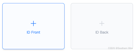
例1:默认效果:
上传图片效果:
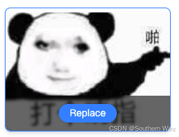
点击Replace可进行替换,点击图片可以进行预览

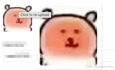
例2:还有一种样式是这样的效果

预览效果:
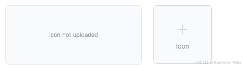
例3:这里又新增了一个预览效果(右侧上传完图片后会显示在左侧,然后右侧是空的可以重新添加,点击图片可以放大预览和例2一个效果)

一、为什么要自己封装
说实话,一开始我也想直接用现成的。Layui 自带的 upload 模块功能挺全的,但是有几个痛点:
- 每次用都要写一堆重复代码,什么 before、done、error 回调
- 预览功能要自己实现,hover 放大、点击查看大图这些都得手写
- 样式和业务逻辑耦合在一起,换个页面又得 copy 一遍
后来项目里有十几个地方要用上传,我实在受不了了,决定封装一下。封装完之后,一行代码就能搞定一个上传功能,真香。
二、整体设计思路
在动手之前,我先梳理了一下需求:
第一个场景是头像上传。特点是图片比较小,通常是正方形,需要 hover 时显示放大预览,点击可以重新上传。
第二个场景是证件/文档上传。特点是图片比较大,需要显示替换按钮,点击图片要能查看大图,还要支持只读模式(比如审核页面只能看不能改)。
基于这两个场景,我设计了两个类:
AvatarUploadLayui:轻量级的头像上传,基于 Layui upload 模块DocUploadBox:功能更丰富的文档上传,使用原生 Ajax + Tailwind CSS
为什么要分成两个?因为它们的交互逻辑差异还挺大的,硬塞到一个类里会很臃肿。分开之后,各司其职,代码也更清晰。
三、代码结构概览
先看一下整体的代码结构:
javascript
(function (window) {
    'use strict';

    const $ = layui.$;
    const layer = layui.layer;

    // 头像上传组件
    class AvatarUploadLayui {
        // ...
    }

    // 文档上传组件
    class DocUploadBox {
        // ...
    }

    // 工具函数
    function setUploadReadOnly(containerId) {
        // ...
    }

    // 暴露到全局
    window.AvatarUploadLayui = AvatarUploadLayui;
    window.DocUploadBox = DocUploadBox;
    window.setUploadReadOnly = setUploadReadOnly;

})(window);
这里用了 IIFE(立即执行函数表达式)来包裹整个代码。这样做的好处是:
- 避免污染全局命名空间,内部变量不会泄露出去
- 只暴露需要的接口,保持 API 的简洁
- 代码更容易维护,改内部实现不影响外部调用
开头的 'use strict' 是启用严格模式,能帮我们避免一些常见的 JavaScript 陷阱,比如意外创建全局变量。
四、AvatarUploadLayui 详解
4.1 构造函数与参数校验
先来看头像上传组件的构造函数:
javascript
class AvatarUploadLayui {
    constructor(options) {
        if (!options.elem) {
            console.error('AvatarUploadLayui: elem 参数是必填的');
            return;
        }
        if (!options.uploadUrl) {
            console.error('AvatarUploadLayui: uploadUrl 参数是必填的');
            return;
        }

        this.options = {
            elem: options.elem,
            uploadUrl: options.uploadUrl,
            placeholderId: options.placeholderId || 'uploadPlaceholder',
            previewId: options.previewId || 'avatarPreview',
            valueId: options.valueId || 'avatarValue',
            previewSize: options.previewSize || 200,
            onSuccess: options.onSuccess || null,
            onError: options.onError || null
        };

        this.tipsIndex = null;
        this.init();
    }
    // ...
}
这段代码做了几件事:
首先是参数校验。elem 和 uploadUrl 是必填的,没有这两个参数组件根本没法工作。这里用 console.error 而不是抛异常,是因为抛异常会中断整个页面的 JavaScript 执行,对用户体验不太友好。当然,如果你的项目有完善的错误处理机制,抛异常也是可以的。
然后是参数合并。用户传入的 options 和默认值合并,这样用户只需要传必要的参数,其他的用默认值就行。这种模式在 jQuery 插件里很常见,叫做"配置对象模式"。
this.tipsIndex 是用来存储 layer.tips 的索引的,后面关闭提示框的时候会用到。
最后调用 this.init() 开始初始化。把初始化逻辑单独抽成一个方法,而不是全写在构造函数里,代码会更清晰,也方便以后扩展(比如加一个 reinit 方法)。
4.2 初始化与上传逻辑
javascript
init() {
    layui.use(['upload', 'layer'], () => {
        const upload = layui.upload;

        this.uploadInst = upload.render({
            elem: this.options.elem,
            url: this.options.uploadUrl,
            before: (obj) => {
                obj.preview((index, file, result) => {
                    $(`#${this.options.previewId}`).removeClass('layui-hide').attr('src', result);
                    $(`#${this.options.placeholderId}`).addClass('layui-hide');
                });
                layer.msg('Uploading...', { icon: 16, time: 0 });
            },
            done: (res) => {
                layer.closeAll('loading');
                if (res.code > 0) {
                    layer.msg('Upload failed');
                    this.options.onError?.(res);
                } else {
                    layer.msg('Upload successful');
                    $(`#${this.options.placeholderId}`).parent().addClass('layui-hide');
                    $(`#${this.options.previewId}`).removeClass('layui-hide');
                    $(`#${this.options.valueId}`).val(res.data.pic);
                    this.bindHoverPreview();
                    this.options.onSuccess?.(res);
                }
            },
            error: () => {
                layer.closeAll('loading');
                layer.msg('Upload error');
                $(`#${this.options.previewId}`).addClass('layui-hide');
                $(`#${this.options.placeholderId}`).removeClass('layui-hide');
                this.options.onError?.();
            }
        });
    });
}
这里有几个值得注意的点:
第一,layui.use 的使用。Layui 是模块化的,使用任何模块之前都要先 use。这里我们需要 upload 和 layer 两个模块。回调函数用的是箭头函数,这样 this 指向的就是组件实例,而不是 window 或者 undefined。
第二,before 回调里的预览逻辑。obj.preview 是 Layui 提供的方法,可以在上传之前预览图片。result 是图片的 base64 编码,直接设置到 img 的 src 就能显示。这样用户选完图片立刻就能看到效果,不用等上传完成,体验很好。
第三,done 回调里的判断逻辑。这里约定 res.code > 0 表示失败,res.code === 0 表示成功。这是后端接口的约定,你的项目可能不一样,需要根据实际情况调整。
第四,可选链操作符 ?. 的使用。this.options.onSuccess?.(res) 这种写法是 ES2020 引入的,意思是"如果 onSuccess 存在就调用它"。比起 if (this.options.onSuccess) this.options.onSuccess(res) 简洁多了。
第五,this.uploadInst 保存了 upload.render 的返回值。虽然在这个组件里没用到,但保留它是个好习惯,以后可能需要调用 uploadInst.reload() 之类的方法。
4.3 Hover 预览功能
javascript
bindHoverPreview() {
    const avatarPreview = $(`#${this.options.previewId}`);
    const size = this.options.previewSize;

    avatarPreview.off('mouseenter').on('mouseenter', (e) => {
        const imgSrc = $(e.currentTarget).attr('src');
        this.tipsIndex = layer.tips(
            `<img src="${imgSrc}" style="width:${size}px;height:${size}px;object-fit:cover;border-radius:8px;">`,
            e.currentTarget,
            { tips: [2, '#fff'], time: 0, area: [`${size + 20}px`, `${size + 20}px`] }
        );
    });

    avatarPreview.off('mouseleave').on('mouseleave', () => {
        if (this.tipsIndex !== null) {
            layer.close(this.tipsIndex);
            this.tipsIndex = null;
        }
    });

    avatarPreview.off('click').on('click', () => {
        $(`#${this.options.elem.replace('#', '')}`).click();
    });
}
这个方法实现了三个交互:
鼠标移入时显示放大预览。用的是 layer.tips,它会在目标元素旁边显示一个提示框。tips: [2, '#fff'] 表示提示框显示在右边,背景色是白色。time: 0 表示不自动关闭。area 设置提示框的大小,比图片大 20px 是为了留点内边距。
鼠标移出时关闭预览。这里用 this.tipsIndex 来追踪当前打开的提示框,关闭后置为 null。为什么要判断 !== null?因为 layer.tips 返回的索引可能是 0,直接用 if (this.tipsIndex) 会出问题。
点击图片时触发重新上传。这里有个小技巧:this.options.elem 可能是 #avatarUpload 这样的选择器,但我们需要触发的是这个元素的 click 事件。用 replace('#', '') 去掉井号,再拼成选择器。
还有一个细节:每次绑定事件之前都先 off 解绑。这是为了防止重复绑定。比如用户上传了多次,每次上传成功都会调用 bindHoverPreview,如果不解绑,事件就会绑定多次,导致一些奇怪的 bug。
4.4 辅助方法
javascript
setPreview(imgUrl) {
    $(`#${this.options.placeholderId}`).parent().addClass('layui-hide');
    $(`#${this.options.previewId}`).removeClass('layui-hide').attr('src', imgUrl);
    this.bindHoverPreview();
}

reset() {
    $(`#${this.options.placeholderId}`).parent().removeClass('layui-hide');
    $(`#${this.options.previewId}`).addClass('layui-hide').attr('src', '');
    $(`#${this.options.valueId}`).val('');
}

getValue() {
    return $(`#${this.options.valueId}`).val();
}
这三个方法都很简单,但很实用:
setPreview 用于手动设置预览图。比如编辑页面,需要显示用户之前上传的头像,就可以调用这个方法。
reset 用于重置组件状态。比如用户点了"取消"按钮,需要清空已选择的图片。
getValue 用于获取当前的图片地址。表单提交的时候会用到。
你可能会问,为什么不直接操作 DOM,而是提供这些方法?这就是封装的意义:外部代码不需要知道组件内部的 DOM 结构,只需要调用方法就行。以后如果要改 DOM 结构,只需要改组件内部的代码,外部调用不受影响。
五、DocUploadBox 详解
接下来看文档上传组件。这个组件比头像上传复杂不少,因为它需要自己渲染 DOM、处理更多的交互逻辑。
5.1 构造函数
javascript
class DocUploadBox {
    constructor(options) {
        if (!options.container) {
            console.error('DocUploadBox: container 参数是必填的');
            return;
        }
        if (!options.uploadUrl) {
            console.error('DocUploadBox: uploadUrl 参数是必填的');
            return;
        }
        if (!options.fieldName) {
            console.error('DocUploadBox: fieldName 参数是必填的');
            return;
        }

        this.options = {
            container: options.container,
            uploadUrl: options.uploadUrl,
            fieldName: options.fieldName,
            width: options.width || 'w-[300px]',
            height: options.height || 'h-[200px]',
            defaultImage: options.defaultImage || '',
            replaceText: options.replaceText || '替换',
            placeholder: options.placeholder || '+',
            placeholderText: options.placeholderText || '',
            maxSize: options.maxSize || 5,
            readOnly: options.readOnly || false,
            onSuccess: options.onSuccess || null,
            onError: options.onError || null
        };

        this.uniqueId = `doc_upload_${Math.random().toString(36).slice(2, 11)}`;
        this.value = '';
        this.init();
    }
    // ...
}
和 AvatarUploadLayui 相比,这个组件多了几个参数:
container 是容器选择器,组件会把 DOM 渲染到这个容器里。
fieldName 是隐藏 input 的 name 属性,表单提交的时候会用到。
width 和 height 用的是 Tailwind CSS 的类名,比如 w-[300px]。这样做的好处是可以直接用 Tailwind 的响应式类,比如 md:w-[400px]。
placeholderText 是加号下面的提示文字,比如"点击上传身份证正面"。
readOnly 是只读模式,审核页面会用到。
maxSize 是文件大小限制,单位是 MB。
还有一个 this.uniqueId,用 Math.random().toString(36).slice(2, 11) 生成一个随机字符串。为什么需要这个?因为一个页面可能有多个上传组件,每个组件的 DOM 元素需要有唯一的 id,不然会冲突。
5.2 初始化流程
javascript
init() {
    this.render();
    this.cacheElements();

    if (this.options.defaultImage) {
        this.setPreview(this.options.defaultImage);
    }

    if (this.options.readOnly) {
        this.setReadOnly();
    } else {
        this.bindEvents();
    }
}

cacheElements() {
    this.$container = $(this.options.container);
    this.$uploadBox = this.$container.find('.doc-upload-box');
    this.$previewImg = this.$container.find('.doc-preview-img');
    this.$placeholder = this.$container.find('.doc-upload-placeholder');
    this.$placeholderText = this.$container.find('.doc-placeholder-text');
    this.$replaceBtn = this.$container.find('.doc-replace-btn');
    this.$fileInput = this.$container.find('.doc-file-input');
    this.$valueInput = this.$container.find('.doc-value-input');
}
初始化分成几个步骤:
第一步,render() 渲染 DOM。这个方法会生成组件的 HTML 结构,插入到容器里。
第二步,cacheElements() 缓存 DOM 元素。把常用的元素存到实例属性里,后面用的时候就不用每次都 $container.find() 了。这是一个性能优化的小技巧,虽然现代浏览器的 DOM 查询很快,但能省则省。
第三步,如果有默认图片,调用 setPreview() 显示出来。
第四步,根据是否只读,决定是调用 setReadOnly() 还是 bindEvents()。这里用 if-else 而不是两个都调用,是因为只读模式下不需要绑定事件,绑了也没用。
5.3 DOM 渲染
这是整个组件最复杂的部分,我们一段一段来看:
javascript
render() {
    const { defaultImage, placeholder, placeholderText, replaceText, fieldName, width, height } = this.options;
    const hasImg = defaultImage ? 'has-img' : '';
    const imgStyle = defaultImage ? '' : 'display:none;';
    const placeholderStyle = defaultImage ? 'display:none;' : '';

    const html = `
<div class="doc-upload-box ${hasImg} ${width} ${height} group relative flex cursor-pointer flex-col items-center justify-center overflow-hidden rounded-lg border border-solid border-gray-300 bg-gray-50 transition-all duration-300 hover:border-blue-500 hover:bg-blue-50/30 hover:shadow-md" id="${this.uniqueId}_box">

    <!-- 图片层 -->
    <img class="doc-preview-img h-full w-full object-contain transition-transform duration-500 ease-out group-hover:scale-105"
         id="${this.uniqueId}_preview"
         src="${defaultImage}"
         style="${imgStyle}"
         data-preview="true">

    <!-- 占位符层 -->
    <div class="doc-upload-placeholder flex flex-col items-center justify-center transition-all duration-300" style="${placeholderStyle}">
        <span class="text-4xl font-light text-gray-300 transition-all duration-300 group-hover:scale-110 group-hover:text-blue-500">${placeholder}</span>
        ${placeholderText ? `<span class="doc-placeholder-text mt-2 text-sm text-gray-400 transition-colors duration-300 group-hover:text-blue-500">${placeholderText}</span>` : ''}
    </div>

    <!-- 操作栏 -->
    <div class="doc-action-buttons absolute bottom-0 left-0 w-full transform items-center justify-center bg-black/60 py-3 backdrop-blur-[2px] transition-transform duration-300 ease-out translate-y-full group-hover:translate-y-0" style="display:none;">
        <button type="button" class="doc-replace-btn rounded-full bg-white/90 px-4 py-1 text-xs font-medium text-gray-800 shadow transition-colors hover:bg-blue-500 hover:text-white">
            ${replaceText}
        </button>
    </div>

    <input type="file" class="doc-file-input" id="${this.uniqueId}_input" accept="image/*" style="display:none;">
    <input type="hidden" class="doc-value-input" name="${fieldName}" id="${this.uniqueId}_value" value="${defaultImage}">
</div>
`;

    $(this.options.container).html(html);
    this.addStyles();
}
这段代码信息量很大,我来拆解一下:
首先是解构赋值。const { defaultImage, placeholder, ... } = this.options 把需要的配置项提取出来,后面用起来更方便。
然后是条件变量。hasImg 决定是否添加 has-img 类,imgStyle 和 placeholderStyle 决定图片和占位符的初始显示状态。有默认图片就显示图片、隐藏占位符,没有就反过来。
接下来是 HTML 模板。这里用了模板字符串,可以很方便地插入变量和写多行字符串。
关于 CSS 类名,这里用的是 Tailwind CSS。如果你不熟悉 Tailwind,我简单解释一下几个关键的类:
group 是 Tailwind 的一个特殊类,配合 group-hover: 前缀使用。当鼠标悬停在带有 group 类的元素上时,它的子元素可以通过 group-hover: 来响应这个悬停状态。比如 group-hover:scale-105 表示父元素被悬停时,这个元素放大到 105%。
translate-y-full 表示向下偏移自身高度的 100%,也就是完全移出可视区域。配合 group-hover:translate-y-0,就实现了"从底部滑入"的效果。
bg-black/60 表示黑色背景,透明度 60%。这是 Tailwind 3.0 引入的语法,很方便。
backdrop-blur-[2px] 是背景模糊效果,让操作栏看起来更有质感。
最后是两个 input 元素。file 类型的用于选择文件,hidden 类型的用于存储上传后的图片地址,表单提交时会带上这个值。
5.4 动态样式注入
javascript
addStyles() {
    const styleId = 'doc-upload-box-styles';
    if (document.getElementById(styleId)) return;

    const css = `
/* 当有图片时,显示操作栏容器(flex),配合 Tailwind 的 translate 类实现滑入滑出 */
.doc-upload-box.has-img .doc-action-buttons { display: flex !important; }

/* 当有图片时,彻底隐藏占位符 */
.doc-upload-box.has-img .doc-upload-placeholder { display: none !important; }
`;

    const style = document.createElement('style');
    style.id = styleId;
    style.textContent = css;
    document.head.appendChild(style);
}
这个方法往页面里注入一些 CSS。为什么不直接写在 CSS 文件里?因为这个组件是独立的,我希望它能"即插即用",不需要额外引入 CSS 文件。
注意这里的防重复逻辑:先检查页面里有没有这个 style 元素,有就直接返回。这样即使页面上有多个上传组件,样式也只会注入一次。
这两条 CSS 规则的作用是:
第一条,当上传框有 has-img 类时,显示操作栏。操作栏默认是 display:none,有图片后变成 display:flex,配合 Tailwind 的 translate-y-full 和 group-hover:translate-y-0,就实现了悬停时从底部滑入的效果。
第二条,当有图片时隐藏占位符。虽然在 render 的时候已经通过 inline style 隐藏了,但加上这条规则更保险,也方便后续通过 JavaScript 切换状态。
5.5 事件绑定
javascript
bindEvents() {
    // 替换按钮点击
    this.$replaceBtn.on('click', (e) => {
        e.stopPropagation();
        this.$fileInput[0].click();
    });

    // 图片点击预览
    this.bindPreviewEvent();

    // 上传框点击(仅在没有图片时)
    this.$uploadBox.on('click', (e) => {
        if ($(e.target).hasClass('doc-replace-btn')) return;
        if ($(e.target).hasClass('doc-preview-img')) return;
        if (!this.$uploadBox.hasClass('has-img')) {
            this.$fileInput[0].click();
        }
    });

    // 文件选择
    this.$fileInput.on('change', (e) => {
        const file = e.target.files[0];
        if (file) {
            this.handleFileSelect(file);
        }
    });
}
这里绑定了四个事件:
替换按钮点击。e.stopPropagation() 阻止事件冒泡,不然会触发上传框的点击事件。this.$fileInput[0].click() 触发文件选择框,注意这里要用 [0] 获取原生 DOM 元素,因为 jQuery 对象没有 click 方法(准确说是有,但行为不一样)。
图片点击预览。这个逻辑单独抽成了 bindPreviewEvent 方法,因为上传成功后也需要重新绑定。
上传框点击。这里有几个判断:如果点击的是替换按钮或预览图片,就不处理(让它们各自的事件处理器来处理);如果已经有图片了,也不处理(有图片时应该点替换按钮)。只有在没有图片的情况下,点击上传框才会触发文件选择。
文件选择。当用户选择了文件后,调用 handleFileSelect 处理上传。
5.6 文件上传处理
javascript
handleFileSelect(file) {
    // 验证文件类型
    if (!file.type.startsWith('image/')) {
        layer.msg('Please select an image file');
        return;
    }

    // 验证文件大小
    if (file.size > this.options.maxSize * 1024 * 1024) {
        layer.msg(`Image size cannot exceed ${this.options.maxSize}MB`);
        return;
    }

    const formData = new FormData();
    formData.append('file', file);

    const loadIndex = layer.load(1, { shade: [0.1, '#fff'] });

    $.ajax({
        url: this.options.uploadUrl,
        type: 'POST',
        data: formData,
        processData: false,
        contentType: false,
        success: (response) => {
            layer.close(loadIndex);

            if (typeof response === 'string') {
                try {
                    response = JSON.parse(response);
                } catch (e) {
                    layer.msg('Response format error');
                    this.options.onError?.('Response format error');
                    return;
                }
            }

            if (response.code === 0) {
                layer.msg(response.msg || 'Upload successful');
                const picUrl = response.data.pic_src || response.data.pic;
                this.setPreview(picUrl);
                this.value = response.data.pic;
                this.$valueInput.val(response.data.pic);
                this.options.onSuccess?.(response, picUrl);
            } else {
                layer.msg(response.msg || 'Upload failed');
                this.options.onError?.(response.msg || 'Upload failed');
            }
        },
        error: () => {
            layer.close(loadIndex);
            layer.msg('Network error, please try again');
            this.options.onError?.('Network error');
        }
    });
}
这个方法是上传的核心逻辑,我来逐段分析:
首先是文件验证。file.type.startsWith('image/') 检查是否是图片文件,file.size 检查文件大小。这两个验证在前端做一遍,可以避免无效的网络请求,提升用户体验。当然,后端也要做验证,前端验证只是第一道防线。
然后是构造 FormData。FormData 是浏览器提供的 API,专门用于构造表单数据,支持文件上传。formData.append('file', file) 把文件添加进去,键名是 file,后端要用这个键名来接收。
接下来是显示 loading。layer.load(1, { shade: [0.1, '#fff'] }) 显示一个加载动画,shade 是遮罩层的配置,[0.1, '#fff'] 表示透明度 0.1、颜色白色。返回值 loadIndex 用于后面关闭 loading。
然后是 Ajax 请求。这里有两个关键配置:
processData: false 告诉 jQuery 不要处理 data,因为 FormData 已经是处理好的格式了。
contentType: false 告诉 jQuery 不要设置 Content-Type,让浏览器自动设置。上传文件时,Content-Type 应该是 multipart/form-data,而且还要带上 boundary 参数,浏览器会自动处理这些。
成功回调里,先判断 response 是不是字符串。有些后端返回的是 JSON 字符串而不是对象,需要手动解析。这是一个兼容性处理,实际项目中最好和后端约定好返回格式。
response.data.pic_src || response.data.pic 这里用了短路运算,优先取 pic_src,没有的话取 pic。这也是为了兼容不同的后端接口。
5.7 预览与状态管理
javascript
setPreview(imgUrl) {
    this.$previewImg.attr('src', imgUrl).css('display', 'block');
    this.$placeholder.css('display', 'none');
    this.$placeholderText.css('display', 'none');
    this.$uploadBox.addClass('has-img');
    this.value = imgUrl;
    this.$valueInput.val(imgUrl);
    this.bindPreviewEvent();
}

bindPreviewEvent() {
    const self = this;
    this.$previewImg.off('click').on('click', function (e) {
        e.stopPropagation();
        const imgSrc = $(this).attr('src');
        if (imgSrc) {
            layer.open({
                type: 1,
                title: false,
                closeBtn: 1,
                shadeClose: true,
                area: ['auto', 'auto'],
                maxWidth: window.innerWidth * 0.9,
                maxHeight: window.innerHeight * 0.9,
                content: `<img src="${imgSrc}" style="max-width:${window.innerWidth * 0.85}px;max-height:${window.innerHeight * 0.85}px;display:block;">`,
                skin: 'layui-layer-nobg'
            });
        }
    });
}

reset() {
    this.$previewImg.attr('src', '').css('display', 'none');
    this.$placeholder.css('display', 'block');
    this.$placeholderText.css('display', 'block');
    this.$uploadBox.removeClass('has-img');
    this.$valueInput.val('');
    this.$fileInput.val('');
    this.value = '';
}

getValue() {
    return this.$valueInput.val();
}
setPreview 方法做了这些事:显示图片、隐藏占位符、添加 has-img 类、更新 value、绑定预览事件。这个方法在上传成功后会调用,也可以在初始化时用来显示默认图片。
bindPreviewEvent 实现了点击图片查看大图的功能。这里用了 layer.open 打开一个弹窗,type: 1 表示页面层(可以放任意 HTML),shadeClose: true 表示点击遮罩层可以关闭,skin: 'layui-layer-nobg' 去掉弹窗的背景色。
图片的最大宽高设置为视口的 85%,这样在大屏幕上不会太大,在小屏幕上也不会超出屏幕。
reset 方法把组件恢复到初始状态。注意 this.$fileInput.val('') 这一行,清空 file input 的值,不然用户选择同一个文件时不会触发 change 事件。
5.8 只读模式
javascript
setReadOnly() {
    // 禁用所有交互
    this.$uploadBox.css({
        'pointer-events': 'none',
        'cursor': 'default'
    });

    // 移除 hover 效果的类
    this.$uploadBox.removeClass('hover:border-blue-500 hover:bg-blue-50/30 hover:shadow-md');

    // 如果没有图片,显示"未上传"提示
    if (!this.options.defaultImage) {
        // 移除 + 号图标
        this.$container.find('.doc-upload-placeholder span:first-child').remove();

        // 替换提示文字为"未上传"
        const docType = this.options.placeholderText || 'Document';
        this.$placeholderText.text(`No ${docType} uploaded`)
            .removeClass('group-hover:text-blue-500')
            .addClass('text-gray-400');
    } else {
        // 有图片时,移除占位符相关元素
        this.$container.find('.doc-upload-placeholder span:first-child').remove();
        this.$container.find('.doc-placeholder-text').removeClass('group-hover:text-blue-500');
    }

    // 如果有图片,允许点击预览(但不允许替换)
    this.$previewImg.css({
        'pointer-events': 'auto',
        'cursor': 'pointer'
    });

    // 隐藏替换按钮
    this.$container.find('.doc-action-buttons').remove();
}
只读模式在审核页面很常用,用户只能查看,不能修改。这个方法做了几件事:
禁用整个上传框的交互。pointer-events: none 让元素不响应任何鼠标事件。
移除 hover 效果。Tailwind 的 hover 类是通过 CSS 实现的,用 JavaScript 移除类名就能去掉效果。
处理占位符。如果没有图片,把加号和提示文字改成"未上传";如果有图片,移除占位符相关的元素。
保留图片预览功能。虽然整个上传框禁用了交互,但图片元素单独设置了 pointer-events: auto,这样用户还是可以点击图片查看大图。
移除替换按钮。直接从 DOM 里删掉,比隐藏更彻底。
5.9 销毁方法
javascript
destroy() {
    $(this.options.container).empty();
}
这个方法很简单,就是清空容器。在单页应用里,组件不用了要记得销毁,不然可能会有内存泄漏。
虽然这个方法只有一行,但提供它是个好习惯。以后如果需要做更多清理工作(比如解绑全局事件、清除定时器),直接在这个方法里加就行。
六、工具函数
javascript
function setUploadReadOnly(containerId) {
    const $container = $(containerId);
    const $uploadBox = $container.find('.doc-upload-box');

    // 禁用所有交互
    $uploadBox.css({
        'pointer-events': 'none',
        'cursor': 'default'
    });

    // 移除 hover 效果的类
    $uploadBox.removeClass('hover:border-blue-500 hover:bg-blue-50/30 hover:shadow-md');

    // 修改占位符样式
    $container.find('.doc-upload-placeholder span:first-child').remove();
    $container.find('.doc-placeholder-text').removeClass('group-hover:text-blue-500');

    // 如果有图片,允许点击预览
    $container.find('.doc-preview-img').css({
        'pointer-events': 'auto',
        'cursor': 'pointer'
    });

    // 隐藏替换按钮
    $container.find('.doc-action-buttons').remove();
}
这个函数和 DocUploadBox.setReadOnly 方法功能类似,但它是独立的,可以用于已经创建好的组件实例。
什么时候会用到?比如页面上有多个上传组件,初始化的时候不知道是否只读,后来根据某个条件需要把它们都设成只读。这时候如果没有保存组件实例的引用,就可以用这个函数。
不过代码注释里标记了 @deprecated,意思是"已弃用"。推荐的做法是在初始化时就传入 readOnly: true,而不是后来再调用这个函数。为什么?因为初始化时设置只读,可以避免不必要的事件绑定,性能更好,代码也更清晰。
七、使用示例
7.1 AvatarUploadLayui 基础用法
HTML 结构:
html
<div class="avatar-upload-wrapper">
    <!-- 上传触发区域 -->
    <div id="avatarUpload" class="upload-trigger">
        <!-- 占位符 -->
        <div id="uploadPlaceholder" class="placeholder">
            <i class="layui-icon layui-icon-upload"></i>
            <span>点击上传头像</span>
        </div>
        <!-- 预览图 -->
        <img id="avatarPreview" class="layui-hide" src="" alt="头像预览">
    </div>
    <!-- 存储上传后的图片地址 -->
    <input type="hidden" id="avatarValue" name="avatar">
</div>
JavaScript 初始化:
javascript
const avatarUpload = new AvatarUploadLayui({
    elem: '#avatarUpload',
    uploadUrl: '/api/upload/avatar',
    placeholderId: 'uploadPlaceholder',
    previewId: 'avatarPreview',
    valueId: 'avatarValue',
    previewSize: 200,
    onSuccess: (res) => {
        console.log('上传成功,图片地址:', res.data.pic);
    },
    onError: (res) => {
        console.error('上传失败:', res);
    }
});
编辑页面显示已有头像:
javascript
// 假设从接口获取到了用户数据
const userData = await fetchUserData();
if (userData.avatar) {
    avatarUpload.setPreview(userData.avatar);
}
表单提交时获取值:
javascript
$('#submitBtn').on('click', () => {
    const avatar = avatarUpload.getValue();
    // 或者直接从隐藏 input 获取
    // const avatar = $('#avatarValue').val();

    $.post('/api/user/update', { avatar }, (res) => {
        // 处理响应
    });
});
7.2 DocUploadBox 基础用法
HTML 结构(只需要一个容器):
html
<div id="idCardFront"></div>JavaScript 初始化:
javascript
const idCardUpload = new DocUploadBox({
    container: '#idCardFront',
    uploadUrl: '/api/upload/document',
    fieldName: 'id_card_front',
    width: 'w-[300px]',
    height: 'h-[200px]',
    placeholder: '+',
    placeholderText: '身份证正面',
    maxSize: 5,
    onSuccess: (res, picUrl) => {
        console.log('上传成功:', picUrl);
    },
    onError: (msg) => {
        console.error('上传失败:', msg);
    }
});
7.3 响应式布局
利用 Tailwind 的响应式类,可以轻松实现不同屏幕尺寸下的不同大小:
javascript
const docUpload = new DocUploadBox({
    container: '#uploadContainer',
    uploadUrl: '/api/upload',
    fieldName: 'document',
    // 移动端 200px,平板 300px,桌面 400px
    width: 'w-[200px] md:w-[300px] lg:w-[400px]',
    height: 'h-[150px] md:h-[200px] lg:h-[250px]'
});
7.4 只读模式
审核页面通常需要只读模式:
javascript
const docUpload = new DocUploadBox({
    container: '#uploadContainer',
    uploadUrl: '/api/upload',
    fieldName: 'document',
    defaultImage: 'https://example.com/uploaded-image.jpg',
    readOnly: true  // 开启只读模式
});
7.5 多个上传组件
一个页面上可以有多个上传组件,它们互不干扰:
javascript
const uploads = {};

// 身份证正面
uploads.idFront = new DocUploadBox({
    container: '#idFront',
    uploadUrl: '/api/upload',
    fieldName: 'id_front',
    placeholderText: '身份证正面'
});

// 身份证背面
uploads.idBack = new DocUploadBox({
    container: '#idBack',
    uploadUrl: '/api/upload',
    fieldName: 'id_back',
    placeholderText: '身份证背面'
});

// 营业执照
uploads.license = new DocUploadBox({
    container: '#license',
    uploadUrl: '/api/upload',
    fieldName: 'business_license',
    placeholderText: '营业执照',
    width: 'w-[400px]',
    height: 'h-[300px]'
});

// 表单提交时获取所有值
$('#submitBtn').on('click', () => {
    const formData = {
        idFront: uploads.idFront.getValue(),
        idBack: uploads.idBack.getValue(),
        license: uploads.license.getValue()
    };

    // 验证必填项
    if (!formData.idFront || !formData.idBack) {
        layer.msg('请上传身份证正反面');
        return;
    }

    // 提交表单
    $.post('/api/submit', formData, (res) => {
        // 处理响应
    });
});
7.6 动态创建和销毁
在单页应用中,可能需要动态创建和销毁组件:
javascript
let uploadInstance = null;

// 打开弹窗时创建
function openUploadModal() {
    layer.open({
        type: 1,
        title: '上传文件',
        content: '<div id="dynamicUpload"></div>',
        success: () => {
            uploadInstance = new DocUploadBox({
                container: '#dynamicUpload',
                uploadUrl: '/api/upload',
                fieldName: 'file'
            });
        },
        end: () => {
            // 关闭弹窗时销毁
            if (uploadInstance) {
                uploadInstance.destroy();
                uploadInstance = null;
            }
        }
    });
}
八、设计思想与最佳实践
8.1 为什么用 Class 而不是函数
ES6 的 Class 语法让代码更清晰、更易维护。虽然 JavaScript 的 Class 本质上还是基于原型的,但它提供了更直观的语法:
javascript
// Class 写法
class DocUploadBox {
    constructor(options) { /* ... */ }
    init() { /* ... */ }
    render() { /* ... */ }
}

// 传统函数写法
function DocUploadBox(options) { /* ... */ }
DocUploadBox.prototype.init = function() { /* ... */ };
DocUploadBox.prototype.render = function() { /* ... */ };
Class 写法的优势:
- 所有方法都在一个代码块里,一目了然
- 不用写
prototype,代码更简洁 constructor明确标识了构造函数- 更容易实现继承(虽然这个组件没用到)
8.2 配置对象模式
两个组件都采用了配置对象模式,即把所有参数放在一个对象里传入:
javascript
// 配置对象模式
new DocUploadBox({
    container: '#upload',
    uploadUrl: '/api/upload',
    fieldName: 'file',
    maxSize: 10
});

// 对比:多参数模式
new DocUploadBox('#upload', '/api/upload', 'file', 10);
配置对象模式的优势:
- 参数有名字,代码自解释
- 参数顺序无所谓,不容易搞混
- 可以只传需要的参数,其他用默认值
- 扩展新参数不影响已有代码
8.3 关于默认值的处理
代码里用了 || 运算符来设置默认值:
javascript
this.options = {
    maxSize: options.maxSize || 5,
    readOnly: options.readOnly || false
};
这种写法有个小坑:如果用户传入 0 或 false,也会被当成"没传"而使用默认值。
对于 maxSize,传 0 没有意义,所以问题不大。但对于 readOnly,如果用户显式传入 false,我们应该尊重这个值。
更严谨的写法是用 ??(空值合并运算符)或者显式判断 undefined:
javascript
// 空值合并运算符(只有 null 和 undefined 才会使用默认值)
maxSize: options.maxSize ?? 5,
readOnly: options.readOnly ?? false

// 或者显式判断
readOnly: options.readOnly !== undefined ? options.readOnly : false不过在这个组件里,|| 的行为是符合预期的,因为没人会传 maxSize: 0 或 readOnly: false(false 本来就是默认值)。
8.4 事件委托 vs 直接绑定
代码里的事件绑定用的是直接绑定:
javascript
this.$replaceBtn.on('click', (e) => { /* ... */ });另一种方式是事件委托:
javascript
this.$container.on('click', '.doc-replace-btn', (e) => { /* ... */ });事件委托的优势是:即使元素是后来动态添加的,事件也能生效。但在这个组件里,DOM 结构是固定的,不会动态添加元素,所以直接绑定就够了。
直接绑定的好处是性能稍好一点(不需要事件冒泡和选择器匹配),而且代码意图更明确。
8.5 为什么要缓存 DOM 元素
cacheElements 方法把常用的 DOM 元素存到实例属性里:
javascript
cacheElements() {
    this.$container = $(this.options.container);
    this.$uploadBox = this.$container.find('.doc-upload-box');
    this.$previewImg = this.$container.find('.doc-preview-img');
    // ...
}
这样做的好处:
-
性能优化。虽然现代浏览器的 DOM 查询很快,但频繁查询还是有开销的。缓存之后,后续操作直接用缓存的引用,不需要再查询。
-
代码更简洁。
this.$previewImg比this.$container.find('.doc-preview-img')短多了。 -
便于调试。可以在控制台直接访问
instance.$previewImg查看元素状态。
8.6 错误处理策略
组件里的错误处理采用了"优雅降级"的策略:
javascript
if (!options.container) {
    console.error('DocUploadBox: container 参数是必填的');
    return;
}
用 console.error 而不是 throw new Error,是因为:
- 不会中断页面其他 JavaScript 的执行
- 开发者可以在控制台看到错误信息
- 用户不会看到一个吓人的错误页面
当然,这种策略也有缺点:错误可能被忽略。如果你的项目有完善的错误监控系统,抛异常可能更合适,这样可以被监控系统捕获。
8.7 关于 this 的处理
JavaScript 里 this 的指向是个老大难问题。这个组件里用了两种方式来处理:
第一种是箭头函数:
javascript
this.$replaceBtn.on('click', (e) => {
    e.stopPropagation();
    this.$fileInput[0].click();  // this 指向组件实例
});
箭头函数没有自己的 this,它会捕获外层的 this。在这里,外层的 this 就是组件实例。
第二种是保存引用:
javascript
bindPreviewEvent() {
    const self = this;
    this.$previewImg.off('click').on('click', function (e) {
        // 这里如果用 this,指向的是被点击的元素
        // 用 self 才能访问组件实例
        const imgSrc = $(this).attr('src');
        // ...
    });
}
这里用普通函数而不是箭头函数,是因为需要用 this 来访问被点击的元素。同时用 self 保存组件实例的引用,以备不时之需(虽然这段代码里没用到 self)。
其实这段代码可以改成箭头函数 + e.currentTarget:
javascript
this.$previewImg.off('click').on('click', (e) => {
    const imgSrc = $(e.currentTarget).attr('src');
    // ...
});
两种写法都可以,看个人习惯。
九、Tailwind CSS 在组件中的应用
9.1 为什么选择 Tailwind
这个组件的样式用的是 Tailwind CSS,而不是传统的 CSS 文件。原因有几个:
-
组件更独立。不需要额外引入 CSS 文件,只要项目里有 Tailwind 就能用。
-
样式即文档。看类名就知道样式是什么,不用在 CSS 文件里找。
-
响应式很方便。
md:w-[300px]一个类就搞定了媒体查询。 -
状态样式很直观。
hover:bg-blue-500、group-hover:scale-105这些类名一看就懂。
9.2 group 和 group-hover 的妙用
Tailwind 的 group 功能在这个组件里用得很多:
html
<div class="group ...">
    <img class="group-hover:scale-105" ...>
    <div class="group-hover:translate-y-0" ...>
</div>
group 类标记了一个"组",它的子元素可以用 group-hover: 前缀来响应这个组的悬停状态。
这个功能特别适合做"悬停时子元素变化"的效果。比如这个组件里:
- 悬停时图片放大 5%(
group-hover:scale-105) - 悬停时操作栏从底部滑入(
group-hover:translate-y-0) - 悬停时加号变蓝(
group-hover:text-blue-500)
如果用传统 CSS,需要写:
css
.upload-box:hover .preview-img {
    transform: scale(1.05);
}
.upload-box:hover .action-bar {
    transform: translateY(0);
}
Tailwind 的写法更直观,而且不用起类名、不用写 CSS 文件。
9.3 任意值语法
Tailwind 3.0 引入了任意值语法,用方括号包裹:
html
<div class="w-[300px] h-[200px]">这样就不用在配置文件里定义 w-300 这样的类了。对于组件来说特别方便,因为用户可能需要各种尺寸。
9.4 透明度语法
html
<div class="bg-black/60">bg-black/60 表示黑色背景,透明度 60%。这是 Tailwind 3.0 的语法糖,等价于 background-color: rgba(0, 0, 0, 0.6)。
9.5 动画与过渡
组件里用了很多过渡效果:
html
<div class="transition-all duration-300 ease-out">transition-all:所有属性都有过渡效果duration-300:过渡时长 300msease-out:缓动函数,开始快结束慢
还有 transition-transform、transition-colors 这些更精确的类,只对特定属性应用过渡。
9.6 backdrop-blur 毛玻璃效果
html
<div class="backdrop-blur-[2px]">这个类给操作栏加了毛玻璃效果,让它看起来更有质感。backdrop-blur 是 CSS 的 backdrop-filter: blur() 属性,可以模糊元素后面的内容。
注意这个属性在某些旧浏览器上不支持,但不影响功能,只是没有模糊效果而已。
十、常见问题与解决方案
10.1 上传后图片不显示
可能的原因:
-
后端返回的图片地址不对。检查
response.data.pic或response.data.pic_src是否是完整的 URL。 -
图片地址是相对路径,但当前页面的 base URL 不对。可以在后端返回完整的 URL,或者在前端拼接。
-
跨域问题。如果图片在 CDN 上,可能需要配置 CORS。
解决方案:
javascript
onSuccess: (res, picUrl) => {
    console.log('返回的图片地址:', picUrl);
    // 如果是相对路径,拼接成完整 URL
    if (!picUrl.startsWith('http')) {
        picUrl = 'https://your-cdn.com' + picUrl;
    }
}
10.2 选择同一个文件不触发上传
这是浏览器的行为:如果 file input 的值没变,change 事件不会触发。
解决方案是在每次上传后清空 file input 的值:
javascript
// 在 handleFileSelect 的 success 回调里
this.$fileInput.val('');
组件的 reset 方法里已经有这个处理了,但如果你只是上传成功而不是重置,也需要清空。
10.3 大文件上传超时
默认的 Ajax 请求没有设置超时时间,大文件可能会超时。
解决方案:
javascript
$.ajax({
    url: this.options.uploadUrl,
    type: 'POST',
    data: formData,
    processData: false,
    contentType: false,
    timeout: 60000,  // 60 秒超时
    // ...
});
或者在后端实现分片上传,但那就是另一个话题了。
10.4 移动端点击不灵敏
移动端的 click 事件有 300ms 延迟,可能导致点击不灵敏。
解决方案:
- 使用 FastClick 库消除延迟
- 或者用 touchend 事件代替 click
javascript
this.$uploadBox.on('click touchend', (e) => {
    if (e.type === 'touchend') {
        e.preventDefault();  // 防止触发 click
    }
    // 处理逻辑
});
10.5 IE 兼容性
这个组件用了很多现代 JavaScript 特性(Class、箭头函数、模板字符串、可选链),不支持 IE。
如果需要支持 IE,可以用 Babel 转译,但 Tailwind CSS 的一些特性(比如 CSS 变量)在 IE 上也不支持。
说实话,2024 年了,建议直接放弃 IE 支持。微软自己都放弃了。
10.6 与 Vue/React 集成
这个组件是基于 jQuery 的,在 Vue 或 React 项目里使用需要注意:
- 在组件挂载后初始化(Vue 的
mounted,React 的useEffect) - 在组件卸载前销毁(调用
destroy方法) - 避免和框架的响应式系统冲突
Vue 示例:
javascript
export default {
    mounted() {
        this.uploadInstance = new DocUploadBox({
            container: this.$refs.uploadContainer,
            uploadUrl: '/api/upload',
            fieldName: 'file',
            onSuccess: (res) => {
                this.imageUrl = res.data.pic;  // 更新 Vue 的数据
            }
        });
    },
    beforeUnmount() {
        this.uploadInstance?.destroy();
    }
}
不过说实话,如果项目是 Vue 或 React,建议用对应框架的上传组件,比如 Element UI 的 el-upload 或 Ant Design 的 Upload。
十一、性能优化建议
11.1 图片压缩
上传前在前端压缩图片,可以减少上传时间和服务器存储压力:
javascript
function compressImage(file, maxWidth = 1920, quality = 0.8) {
    return new Promise((resolve) => {
        const reader = new FileReader();
        reader.onload = (e) => {
            const img = new Image();
            img.onload = () => {
                const canvas = document.createElement('canvas');
                let width = img.width;
                let height = img.height;

                if (width > maxWidth) {
                    height = (maxWidth / width) * height;
                    width = maxWidth;
                }

                canvas.width = width;
                canvas.height = height;

                const ctx = canvas.getContext('2d');
                ctx.drawImage(img, 0, 0, width, height);

                canvas.toBlob(resolve, 'image/jpeg', quality);
            };
            img.src = e.target.result;
        };
        reader.readAsDataURL(file);
    });
}

// 在 handleFileSelect 里使用
async handleFileSelect(file) {
    // 如果文件大于 1MB,压缩一下
    if (file.size > 1024 * 1024) {
        file = await compressImage(file);
    }
    // 继续上传逻辑
}
11.2 懒加载
如果页面上有很多上传组件,可以考虑懒加载,只有滚动到可视区域才初始化:
javascript
const observer = new IntersectionObserver((entries) => {
    entries.forEach((entry) => {
        if (entry.isIntersecting) {
            const container = entry.target;
            new DocUploadBox({
                container: container,
                // ...
            });
            observer.unobserve(container);  // 初始化后取消观察
        }
    });
});

document.querySelectorAll('.upload-container').forEach((el) => {
    observer.observe(el);
});
11.3 防抖处理
如果用户快速点击上传按钮,可能会触发多次上传。可以加个防抖:
javascript
handleFileSelect(file) {
    if (this.uploading) return;  // 正在上传中,忽略
    this.uploading = true;

    // 上传逻辑...

    // 在 success 和 error 回调里
    this.uploading = false;
}
11.4 预加载
如果知道用户接下来可能会上传图片,可以预加载上传接口,减少首次上传的延迟:
javascript
// 页面加载时预热接口
fetch('/api/upload', { method: 'OPTIONS' });
这会触发一次 CORS 预检请求,后续的实际上传请求就不需要预检了。
十二、扩展思路
12.1 添加裁剪功能
很多场景需要裁剪图片,比如头像要求正方形。可以集成 Cropper.js:
javascript
// 选择文件后,先打开裁剪弹窗
handleFileSelect(file) {
    const reader = new FileReader();
    reader.onload = (e) => {
        this.openCropper(e.target.result, (croppedBlob) => {
            this.uploadFile(croppedBlob);
        });
    };
    reader.readAsDataURL(file);
}

openCropper(imageSrc, callback) {
    layer.open({
        type: 1,
        title: '裁剪图片',
        content: `<div id="cropperContainer"><img src="${imageSrc}"></div>`,
        btn: ['确定', '取消'],
        success: () => {
            this.cropper = new Cropper(document.querySelector('#cropperContainer img'), {
                aspectRatio: 1,  // 正方形
                viewMode: 1
            });
        },
        yes: () => {
            this.cropper.getCroppedCanvas().toBlob(callback);
            layer.closeAll();
        }
    });
}
12.2 添加拖拽上传
拖拽上传体验更好:
javascript
bindDragEvents() {
    this.$uploadBox.on('dragover', (e) => {
        e.preventDefault();
        this.$uploadBox.addClass('drag-over');
    });

    this.$uploadBox.on('dragleave', () => {
        this.$uploadBox.removeClass('drag-over');
    });

    this.$uploadBox.on('drop', (e) => {
        e.preventDefault();
        this.$uploadBox.removeClass('drag-over');

        const file = e.originalEvent.dataTransfer.files[0];
        if (file) {
            this.handleFileSelect(file);
        }
    });
}
12.3 添加进度条
显示上传进度,体验更好:
javascript
$.ajax({
    url: this.options.uploadUrl,
    type: 'POST',
    data: formData,
    processData: false,
    contentType: false,
    xhr: () => {
        const xhr = new XMLHttpRequest();
        xhr.upload.addEventListener('progress', (e) => {
            if (e.lengthComputable) {
                const percent = Math.round((e.loaded / e.total) * 100);
                this.updateProgress(percent);
            }
        });
        return xhr;
    },
    // ...
});

updateProgress(percent) {
    // 更新进度条 UI
    this.$progressBar.css('width', percent + '%');
    this.$progressText.text(percent + '%');
}
12.4 多文件上传
如果需要一次上传多个文件:
javascript
// 修改 file input
<input type="file" multiple accept="image/*">

// 修改 handleFileSelect
handleFileSelect(files) {
    Array.from(files).forEach((file) => {
        this.uploadSingleFile(file);
    });
}
当然,多文件上传的 UI 也需要相应调整,比如显示文件列表、每个文件的上传状态等。
十三、总结
回顾一下这篇文章的内容:
我们从零开始封装了两个图片上传组件。AvatarUploadLayui 是一个轻量级的头像上传组件,基于 Layui 的 upload 模块,适合简单的头像上传场景。DocUploadBox 是一个功能更丰富的文档上传组件,支持自定义样式、只读模式、点击预览等功能,适合证件照、文档等上传场景。
在封装过程中,我们用到了很多实用的技巧:
- IIFE 避免全局污染
- Class 语法组织代码
- 配置对象模式处理参数
- 事件委托和直接绑定的选择
- DOM 元素缓存优化性能
- Tailwind CSS 实现样式
- group-hover 实现联动效果
这两个组件的代码量不大,但涵盖了前端组件封装的很多知识点。希望通过这篇文章,你不仅学会了怎么用这两个组件,更重要的是理解了背后的设计思想和实现技巧。
下次遇到类似的需求,你也可以自己封装一个组件了。
如果你有任何问题或建议,欢迎在评论区留言交流。
十四、完整代码
完整封装代码如下:
js
/**
* 头像上传组件 (基于 Layui upload)
* 依赖: Layui (upload, layer)
*
* 使用示例:
* const avatarUpload = new AvatarUploadLayui({
* elem: '#avatarUpload',
* uploadUrl: '/index/uploadpiccompress/',
* placeholderId: 'uploadPlaceholder',
* previewId: 'avatarPreview',
* valueId: 'avatarValue',
* onSuccess: (res) => console.log('上传成功:', res)
* });
*/
(function (window) {
'use strict';
const $ = layui.$;
const layer = layui.layer;
/**
* 头像上传组件
*/
class AvatarUploadLayui {
constructor(options) {
if (!options.elem) {
console.error('AvatarUploadLayui: elem 参数是必填的');
return;
}
if (!options.uploadUrl) {
console.error('AvatarUploadLayui: uploadUrl 参数是必填的');
return;
}
this.options = {
elem: options.elem,
uploadUrl: options.uploadUrl,
placeholderId: options.placeholderId || 'uploadPlaceholder',
previewId: options.previewId || 'avatarPreview',
valueId: options.valueId || 'avatarValue',
previewSize: options.previewSize || 200,
onSuccess: options.onSuccess || null,
onError: options.onError || null
};
this.tipsIndex = null;
this.init();
}
init() {
layui.use(['upload', 'layer'], () => {
const upload = layui.upload;
this.uploadInst = upload.render({
elem: this.options.elem,
url: this.options.uploadUrl,
before: (obj) => {
obj.preview((index, file, result) => {
$(`#${this.options.previewId}`).removeClass('layui-hide').attr('src', result);
$(`#${this.options.placeholderId}`).addClass('layui-hide');
});
layer.msg('Uploading...', { icon: 16, time: 0 });
},
done: (res) => {
layer.closeAll('loading');
if (res.code > 0) {
layer.msg('Upload failed');
this.options.onError?.(res);
} else {
layer.msg('Upload successful');
$(`#${this.options.placeholderId}`).parent().addClass('layui-hide');
$(`#${this.options.previewId}`).removeClass('layui-hide');
$(`#${this.options.valueId}`).val(res.data.pic);
this.bindHoverPreview();
this.options.onSuccess?.(res);
}
},
error: () => {
layer.closeAll('loading');
layer.msg('Upload error');
$(`#${this.options.previewId}`).addClass('layui-hide');
$(`#${this.options.placeholderId}`).removeClass('layui-hide');
this.options.onError?.();
}
});
});
}
bindHoverPreview() {
const avatarPreview = $(`#${this.options.previewId}`);
const size = this.options.previewSize;
avatarPreview.off('mouseenter').on('mouseenter', (e) => {
const imgSrc = $(e.currentTarget).attr('src');
this.tipsIndex = layer.tips(
`<img src="${imgSrc}" style="width:${size}px;height:${size}px;object-fit:cover;border-radius:8px;">`,
e.currentTarget,
{ tips: [2, '#fff'], time: 0, area: [`${size + 20}px`, `${size + 20}px`] }
);
});
avatarPreview.off('mouseleave').on('mouseleave', () => {
if (this.tipsIndex !== null) {
layer.close(this.tipsIndex);
this.tipsIndex = null;
}
});
avatarPreview.off('click').on('click', () => {
$(`#${this.options.elem.replace('#', '')}`).click();
});
}
setPreview(imgUrl) {
$(`#${this.options.placeholderId}`).parent().addClass('layui-hide');
$(`#${this.options.previewId}`).removeClass('layui-hide').attr('src', imgUrl);
this.bindHoverPreview();
}
reset() {
$(`#${this.options.placeholderId}`).parent().removeClass('layui-hide');
$(`#${this.options.previewId}`).addClass('layui-hide').attr('src', '');
$(`#${this.options.valueId}`).val('');
}
getValue() {
return $(`#${this.options.valueId}`).val();
}
}
/**
* 证件/文档上传组件 (带替换按钮样式,使用 Tailwind CSS)
* 依赖: Layui (layer), jQuery, Tailwind CSS
*
* 使用示例:
* const docUpload = new DocUploadBox({
* container: '#uploadContainer',
* uploadUrl: '/index/uploadpiccompress',
* fieldName: 'identity_file1',
* width: 'w-[300px]',
* height: 'h-[200px]',
* defaultImage: '',
* replaceText: 'Replace',
* placeholder: '+',
* maxSize: 5,
* onSuccess: (res, picUrl) => console.log('上传成功:', res)
* });
*/
class DocUploadBox {
constructor(options) {
if (!options.container) {
console.error('DocUploadBox: container 参数是必填的');
return;
}
if (!options.uploadUrl) {
console.error('DocUploadBox: uploadUrl 参数是必填的');
return;
}
if (!options.fieldName) {
console.error('DocUploadBox: fieldName 参数是必填的');
return;
}
this.options = {
container: options.container,
uploadUrl: options.uploadUrl,
fieldName: options.fieldName,
width: options.width || 'w-[300px]',
height: options.height || 'h-[200px]',
defaultImage: options.defaultImage || '',
replaceText: options.replaceText || '替换',
placeholder: options.placeholder || '+',
placeholderText: options.placeholderText || '', // 新增:+号下方的提示文字
maxSize: options.maxSize || 5,
readOnly: options.readOnly || false, // 新增:是否只读模式,默认 false
onSuccess: options.onSuccess || null,
onError: options.onError || null
};
this.uniqueId = `doc_upload_${Math.random().toString(36).slice(2, 11)}`;
this.value = '';
this.init();
}
init() {
this.render();
this.cacheElements();
if (this.options.defaultImage) {
this.setPreview(this.options.defaultImage);
}
// 如果是只读模式,应用只读样式
if (this.options.readOnly) {
this.setReadOnly();
} else {
this.bindEvents();
}
}
cacheElements() {
this.$container = $(this.options.container);
this.$uploadBox = this.$container.find('.doc-upload-box');
this.$previewImg = this.$container.find('.doc-preview-img');
this.$placeholder = this.$container.find('.doc-upload-placeholder');
this.$placeholderText = this.$container.find('.doc-placeholder-text');
this.$replaceBtn = this.$container.find('.doc-replace-btn');
this.$fileInput = this.$container.find('.doc-file-input');
this.$valueInput = this.$container.find('.doc-value-input');
}
render() {
const { defaultImage, placeholder, placeholderText, replaceText, fieldName, width, height } = this.options;
const hasImg = defaultImage ? 'has-img' : '';
// 保持原来的显示逻辑
const imgStyle = defaultImage ? '' : 'display:none;';
const placeholderStyle = defaultImage ? 'display:none;' : '';
const html = `
<div class="doc-upload-box ${hasImg} ${width} ${height} group relative flex cursor-pointer flex-col items-center justify-center overflow-hidden rounded-lg border border-solid border-gray-300 bg-gray-50 transition-all duration-300 hover:border-blue-500 hover:bg-blue-50/30 hover:shadow-md" id="${this.uniqueId}_box">
<!-- 图片层:放大效果-->
<img class="doc-preview-img h-full w-full object-contain transition-transform duration-500 ease-out group-hover:scale-105"
id="${this.uniqueId}_preview"
src="${defaultImage}"
style="${imgStyle}"
data-preview="true">
<!-- 占位符层:添加 group-hover 变色逻辑 -->
<div class="doc-upload-placeholder flex flex-col items-center justify-center transition-all duration-300" style="${placeholderStyle}">
<!-- 图标/符号:悬停变蓝,轻微放大 -->
<span class="text-4xl font-light text-gray-300 transition-all duration-300 group-hover:scale-110 group-hover:text-blue-500">${placeholder}</span>
<!-- 提示文字:悬停变蓝 -->
${placeholderText ? `<span class="doc-placeholder-text mt-2 text-sm text-gray-400 transition-colors duration-300 group-hover:text-blue-500">${placeholderText}</span>` : ''}
</div>
<!-- 操作栏:改为底部滑入 (Slide Up) -->
<!-- translate-y-full 把它推到容器外面,悬停时变回 0 -->
<div class="doc-action-buttons absolute bottom-0 left-0 w-full transform items-center justify-center bg-black/60 py-3 backdrop-blur-[2px] transition-transform duration-300 ease-out translate-y-full group-hover:translate-y-0" style="display:none;">
<button type="button" class="doc-replace-btn rounded-full bg-white/90 px-4 py-1 text-xs font-medium text-gray-800 shadow transition-colors hover:bg-blue-500 hover:text-white">
${replaceText}
</button>
</div>
<input type="file" class="doc-file-input" id="${this.uniqueId}_input" accept="image/*" style="display:none;">
<input type="hidden" class="doc-value-input" name="${fieldName}" id="${this.uniqueId}_value" value="${defaultImage}">
</div>
`;
$(this.options.container).html(html);
this.addStyles();
}
addStyles() {
const styleId = 'doc-upload-box-styles';
if (document.getElementById(styleId)) return;
const css = `
/* 当有图片时,显示操作栏容器(flex),配合 Tailwind 的 translate 类实现滑入滑出 */
.doc-upload-box.has-img .doc-action-buttons { display: flex !important; }
/* 当有图片时,彻底隐藏占位符 */
.doc-upload-box.has-img .doc-upload-placeholder { display: none !important; }
`;
const style = document.createElement('style');
style.id = styleId;
style.textContent = css;
document.head.appendChild(style);
}
bindEvents() {
// 替换按钮点击
this.$replaceBtn.on('click', (e) => {
e.stopPropagation();
this.$fileInput[0].click();
});
// 图片点击预览
this.bindPreviewEvent();
// 上传框点击(仅在没有图片时)
this.$uploadBox.on('click', (e) => {
if ($(e.target).hasClass('doc-replace-btn')) return;
if ($(e.target).hasClass('doc-preview-img')) return;
if (!this.$uploadBox.hasClass('has-img')) {
this.$fileInput[0].click();
}
});
// 文件选择
this.$fileInput.on('change', (e) => {
const file = e.target.files[0];
if (file) {
this.handleFileSelect(file);
}
});
}
handleFileSelect(file) {
// Validate file type
if (!file.type.startsWith('image/')) {
layer.msg('Please select an image file');
return;
}
// Validate file size
if (file.size > this.options.maxSize * 1024 * 1024) {
layer.msg(`Image size cannot exceed ${this.options.maxSize}MB`);
return;
}
const formData = new FormData();
formData.append('file', file);
const loadIndex = layer.load(1, { shade: [0.1, '#fff'] });
$.ajax({
url: this.options.uploadUrl,
type: 'POST',
data: formData,
processData: false,
contentType: false,
success: (response) => {
layer.close(loadIndex);
if (typeof response === 'string') {
try {
response = JSON.parse(response);
} catch (e) {
layer.msg('Response format error');
this.options.onError?.('Response format error');
return;
}
}
if (response.code === 0) {
layer.msg(response.msg || 'Upload successful');
const picUrl = response.data.pic_src || response.data.pic;
this.setPreview(picUrl);
this.value = response.data.pic;
this.$valueInput.val(response.data.pic);
this.options.onSuccess?.(response, picUrl);
} else {
layer.msg(response.msg || 'Upload failed');
this.options.onError?.(response.msg || 'Upload failed');
}
},
error: () => {
layer.close(loadIndex);
layer.msg('Network error, please try again');
this.options.onError?.('Network error');
}
});
}
setPreview(imgUrl) {
this.$previewImg.attr('src', imgUrl).css('display', 'block');
this.$placeholder.css('display', 'none');
this.$placeholderText.css('display', 'none');
this.$uploadBox.addClass('has-img');
this.value = imgUrl;
this.$valueInput.val(imgUrl);
this.bindPreviewEvent();
}
bindPreviewEvent() {
const self = this;
this.$previewImg.off('click').on('click', function (e) {
e.stopPropagation();
const imgSrc = $(this).attr('src');
if (imgSrc) {
layer.open({
type: 1,
title: false,
closeBtn: 1,
shadeClose: true,
area: ['auto', 'auto'],
maxWidth: window.innerWidth * 0.9,
maxHeight: window.innerHeight * 0.9,
content: `<img src="${imgSrc}" style="max-width:${window.innerWidth * 0.85}px;max-height:${window.innerHeight * 0.85}px;display:block;">`,
skin: 'layui-layer-nobg'
});
}
});
}
reset() {
this.$previewImg.attr('src', '').css('display', 'none');
this.$placeholder.css('display', 'block');
this.$placeholderText.css('display', 'block');
this.$uploadBox.removeClass('has-img');
this.$valueInput.val('');
this.$fileInput.val('');
this.value = '';
}
getValue() {
return this.$valueInput.val();
}
/**
* 设置为只读模式
*/
setReadOnly() {
// 禁用所有交互
this.$uploadBox.css({
'pointer-events': 'none',
'cursor': 'default'
});
// 移除 hover 效果的类
this.$uploadBox.removeClass('hover:border-blue-500 hover:bg-blue-50/30 hover:shadow-md');
// 如果没有图片,显示"未上传"提示
if (!this.options.defaultImage) {
// 移除 + 号图标
this.$container.find('.doc-upload-placeholder span:first-child').remove();
// 替换提示文字为"未上传"
const docType = this.options.placeholderText || 'Document';
this.$placeholderText.text(`No ${docType} uploaded`)
.removeClass('group-hover:text-blue-500')
.addClass('text-gray-400');
} else {
// 有图片时,移除占位符相关元素
this.$container.find('.doc-upload-placeholder span:first-child').remove();
this.$container.find('.doc-placeholder-text').removeClass('group-hover:text-blue-500');
}
// 如果有图片,允许点击预览(但不允许替换)
this.$previewImg.css({
'pointer-events': 'auto',
'cursor': 'pointer'
});
// 隐藏替换按钮
this.$container.find('.doc-action-buttons').remove();
}
destroy() {
$(this.options.container).empty();
}
}
/**
* 设置上传组件为只读状态(独立工具函数,用于已创建的实例)
* @param {string} containerId - 容器选择器 (如 '#uploadContainer')
* @deprecated 推荐在初始化时使用 readOnly: true 配置项
*/
function setUploadReadOnly(containerId) {
const $container = $(containerId);
const $uploadBox = $container.find('.doc-upload-box');
// 禁用所有交互
$uploadBox.css({
'pointer-events': 'none',
'cursor': 'default'
});
// 移除 hover 效果的类
$uploadBox.removeClass('hover:border-blue-500 hover:bg-blue-50/30 hover:shadow-md');
// 修改占位符样式 - 移除图标和文字的动画效果
$container.find('.doc-upload-placeholder span:first-child').remove(); // 移除 + 号图标
$container.find('.doc-placeholder-text').removeClass('group-hover:text-blue-500');
// 如果有图片,允许点击预览(但不允许替换)
$container.find('.doc-preview-img').css({
'pointer-events': 'auto',
'cursor': 'pointer'
});
// 隐藏替换按钮
$container.find('.doc-action-buttons').remove();
}
// 暴露到全局
window.AvatarUploadLayui = AvatarUploadLayui;
window.DocUploadBox = DocUploadBox;
window.setUploadReadOnly = setUploadReadOnly;
})(window);参考资料:
- Layui 官方文档:https://layui.dev/
- Tailwind CSS 官方文档:https://tailwindcss.com/
- MDN Web Docs - FormData:https://developer.mozilla.org/zh-CN/docs/Web/API/FormData
- MDN Web Docs - Intersection Observer:https://developer.mozilla.org/zh-CN/docs/Web/API/Intersection_Observer_API