前言
在音乐播放器应用中,主题设置是提升用户体验的重要功能。不同用户对界面风格有不同的偏好,有人喜欢活力四射的橙色,有人偏爱沉稳的深蓝。本篇我们将实现一个完整的主题设置页面,包含深色模式切换、多种主题色选择以及实时预览功能。
功能分析
在动手写代码之前,我们先梳理一下主题设置页面需要实现哪些功能。首先是显示模式的切换,用户可以选择深色模式或浅色模式,也可以设置跟随系统自动切换。其次是主题颜色的选择,我们提供8种预设的主题色供用户挑选。最后是预览功能,用户在选择主题色后可以立即看到效果,确认满意后再应用。
页面结构搭建
我们的主题设置页面采用 StatefulWidget 来实现,因为页面中有多个需要动态更新的状态。先来看页面的基础结构:
dart
class ThemePage extends StatefulWidget {
  const ThemePage({super.key});

  @override
  State<ThemePage> createState() => _ThemePageState();
}
这里使用了 super.key 的简写语法,这是 Dart 2.17 引入的特性,让代码更加简洁。接下来定义页面的状态类,我们需要管理三个状态变量:当前选中的主题索引、深色模式开关状态、以及是否跟随系统。
dart
class _ThemePageState extends State<ThemePage> {
  int _selectedTheme = 0;
  bool _darkMode = true;
  bool _followSystem = false;
_selectedTheme 用于记录用户选择的主题颜色索引,默认值为0表示选中第一个主题。_darkMode 控制深色模式的开关,默认开启。_followSystem 决定是否跟随系统的深浅色设置。
定义主题色数据
为了让代码更易维护,我们把所有可选的主题色定义在一个列表中:
dart
  final List<Map<String, dynamic>> themes = [
    {'name': '经典粉', 'color': const Color(0xFFE91E63)},
    {'name': '活力橙', 'color': const Color(0xFFFF5722)},
    {'name': '清新绿', 'color': const Color(0xFF4CAF50)},
    {'name': '天空蓝', 'color': const Color(0xFF2196F3)},
    {'name': '神秘紫', 'color': const Color(0xFF9C27B0)},
    {'name': '土豪金', 'color': const Color(0xFFFFD700)},
    {'name': '深邃黑', 'color': const Color(0xFF424242)},
    {'name': '纯净白', 'color': const Color(0xFFFFFFFF)},
  ];
每个主题包含名称和对应的颜色值。使用 const Color 可以在编译期创建颜色对象,提升运行时性能。这8种颜色覆盖了大部分用户的审美偏好,从温暖的粉色到冷静的蓝色,从活泼的橙色到低调的黑色。
构建页面主体
页面主体使用 ListView 作为容器,内部包含三个主要区块:
dart
  @override
  Widget build(BuildContext context) {
    return Scaffold(
      appBar: AppBar(title: const Text('主题设置')),
      body: ListView(
        padding: const EdgeInsets.all(16),
        children: [
          _buildModeSection(),
          const SizedBox(height: 24),
          _buildThemeSection(),
          const SizedBox(height: 24),
          _buildPreviewSection(),
        ],
      ),
    );
  }
ListView 自带滚动功能,当内容超出屏幕高度时用户可以滑动查看。三个区块之间使用 SizedBox 添加24像素的间距,让页面看起来不那么拥挤。
显示模式区块
显示模式区块包含两个开关选项,让用户控制深色模式和系统跟随:
dart
  Widget _buildModeSection() {
    return Container(
      padding: const EdgeInsets.all(16),
      decoration: BoxDecoration(
        color: const Color(0xFF1E1E1E),
        borderRadius: BorderRadius.circular(16)
      ),
外层 Container 设置了深灰色背景和圆角,与整体的深色主题保持一致。
dart
      child: Column(
        crossAxisAlignment: CrossAxisAlignment.start,
        children: [
          const Text('显示模式',
            style: TextStyle(fontSize: 18, fontWeight: FontWeight.bold)),
          const SizedBox(height: 16),
          SwitchListTile(
            title: const Text('深色模式'),
            subtitle: const Text('使用深色背景'),
            value: _darkMode,
            activeColor: themes[_selectedTheme]['color'],
            onChanged: _followSystem ? null : (v) => setState(() => _darkMode = v),
          ),
这里有个细节值得注意:当 _followSystem 为 true 时,onChanged 传入 null,这会让开关变成禁用状态。因为既然选择了跟随系统,手动切换深色模式就没有意义了。
dart
          SwitchListTile(
            title: const Text('跟随系统'),
            subtitle: const Text('自动切换深色/浅色模式'),
            value: _followSystem,
            activeColor: themes[_selectedTheme]['color'],
            onChanged: (v) => setState(() => _followSystem = v),
          ),
        ],
      ),
    );
}跟随系统的开关始终可用,用户可以随时开启或关闭这个功能。activeColor 使用当前选中的主题色,让开关的颜色与整体主题协调。
主题颜色选择区块
这是整个页面的核心部分,使用网格布局展示所有可选的主题色:
dart
  Widget _buildThemeSection() {
    return Container(
      padding: const EdgeInsets.all(16),
      decoration: BoxDecoration(
        color: const Color(0xFF1E1E1E),
        borderRadius: BorderRadius.circular(16)
      ),
      child: Column(
        crossAxisAlignment: CrossAxisAlignment.start,
        children: [
          const Text('主题颜色',
            style: TextStyle(fontSize: 18, fontWeight: FontWeight.bold)),
          const SizedBox(height: 16),
容器样式与上一个区块保持一致,视觉上形成统一的卡片风格。
dart
          GridView.builder(
            shrinkWrap: true,
            physics: const NeverScrollableScrollPhysics(),
            gridDelegate: const SliverGridDelegateWithFixedCrossAxisCount(
              crossAxisCount: 4,
              mainAxisSpacing: 16,
              crossAxisSpacing: 16
            ),
            itemCount: themes.length,
GridView.builder 用于构建网格布局。shrinkWrap: true 让网格高度自适应内容,NeverScrollableScrollPhysics 禁用网格自身的滚动,因为外层已经有 ListView 处理滚动了。crossAxisCount: 4 表示每行显示4个主题色选项。
dart
            itemBuilder: (context, index) {
              final theme = themes[index];
              final isSelected = _selectedTheme == index;
              return GestureDetector(
                onTap: () => setState(() => _selectedTheme = index),
                child: Column(
                  children: [
                    Container(
                      width: 50, height: 50,
                      decoration: BoxDecoration(
                        color: theme['color'],
                        shape: BoxShape.circle,
                        border: isSelected
                          ? Border.all(color: Colors.white, width: 3)
                          : null,
                        boxShadow: isSelected
                          ? [BoxShadow(
                              color: (theme['color'] as Color).withOpacity(0.5),
                              blurRadius: 10
                            )]
                          : null,
                      ),
                      child: isSelected
                        ? const Icon(Icons.check, color: Colors.white)
                        : null,
),每个主题色用一个圆形容器展示。选中状态下会有白色边框、发光阴影和对勾图标,让用户清楚知道当前选择的是哪个主题。BoxShadow 的颜色使用主题色的半透明版本,营造出柔和的光晕效果。
dart
                    const SizedBox(height: 4),
                    Text(theme['name'],
                      style: TextStyle(
                        fontSize: 12,
                        color: isSelected ? theme['color'] : Colors.grey
                      )
                    ),
                  ],
                ),
              );
            },
          ),
        ],
      ),
    );
  }
主题名称显示在圆形下方,选中时文字颜色与主题色一致,未选中时显示灰色。
预览效果区块
预览区块让用户在应用主题前先看到效果,这是提升用户体验的关键设计:
dart
  Widget _buildPreviewSection() {
    final themeColor = themes[_selectedTheme]['color'] as Color;
    return Container(
      padding: const EdgeInsets.all(16),
      decoration: BoxDecoration(
        color: const Color(0xFF1E1E1E),
        borderRadius: BorderRadius.circular(16)
      ),
首先获取当前选中的主题色,后续的预览组件都会使用这个颜色。
dart
      child: Column(
        crossAxisAlignment: CrossAxisAlignment.start,
        children: [
          const Text('预览效果',
            style: TextStyle(fontSize: 18, fontWeight: FontWeight.bold)),
          const SizedBox(height: 16),
          Container(
            padding: const EdgeInsets.all(16),
            decoration: BoxDecoration(
              color: const Color(0xFF121212),
              borderRadius: BorderRadius.circular(12)
            ),
预览区使用更深的背景色,与外层容器形成层次感。
dart
            child: Column(
              children: [
                Row(
                  children: [
                    Container(
                      width: 60, height: 60,
                      decoration: BoxDecoration(
                        color: themeColor.withOpacity(0.3),
                        borderRadius: BorderRadius.circular(8)
                      ),
                      child: Icon(Icons.music_note, color: themeColor)
                    ),
                    const SizedBox(width: 12),
                    const Expanded(
                      child: Column(
                        crossAxisAlignment: CrossAxisAlignment.start,
                        children: [
                          Text('示例歌曲',
                            style: TextStyle(fontWeight: FontWeight.bold)),
                          Text('示例歌手',
                            style: TextStyle(color: Colors.grey, fontSize: 12))
                        ]
                      )
                    ),
                    Icon(Icons.favorite, color: themeColor),
                  ],
                ),
预览区模拟了一个迷你播放器的样式,包含歌曲封面、歌曲信息和收藏按钮。封面背景使用主题色的30%透明度版本,图标和收藏按钮都使用主题色。
dart
                const SizedBox(height: 16),
                LinearProgressIndicator(
                  value: 0.6,
                  backgroundColor: Colors.grey.withOpacity(0.3),
                  valueColor: AlwaysStoppedAnimation(themeColor)
),进度条是展示主题色效果的绝佳位置,valueColor 使用 AlwaysStoppedAnimation 包装主题色,让进度条的已播放部分显示为主题色。
dart
                const SizedBox(height: 16),
                Row(
                  mainAxisAlignment: MainAxisAlignment.spaceEvenly,
                  children: [
                    const Icon(Icons.shuffle, color: Colors.grey),
                    const Icon(Icons.skip_previous),
                    Container(
                      width: 50, height: 50,
                      decoration: BoxDecoration(
                        color: themeColor,
                        shape: BoxShape.circle
                      ),
                      child: const Icon(Icons.play_arrow, color: Colors.white)
                    ),
                    const Icon(Icons.skip_next),
                    const Icon(Icons.repeat, color: Colors.grey),
                  ],
                ),
              ],
            ),
          ),
播放控制栏中,播放按钮使用主题色作为背景,这是整个播放器界面最醒目的元素。其他控制按钮保持默认或灰色,突出主按钮的视觉重心。
dart
          const SizedBox(height: 16),
          SizedBox(
            width: double.infinity,
            child: ElevatedButton(
              style: ElevatedButton.styleFrom(
                backgroundColor: themeColor,
                padding: const EdgeInsets.symmetric(vertical: 14)
              ),
              onPressed: () => Get.back(),
              child: const Text('应用主题', style: TextStyle(color: Colors.white)),
            ),
          ),
        ],
      ),
    );
}最后是应用主题按钮,同样使用当前选中的主题色作为背景。width: double.infinity 让按钮撑满整个宽度,vertical: 14 的内边距让按钮有足够的点击区域。点击后调用 Get.back() 返回上一页,实际项目中这里应该先保存用户的主题选择。
页面入口
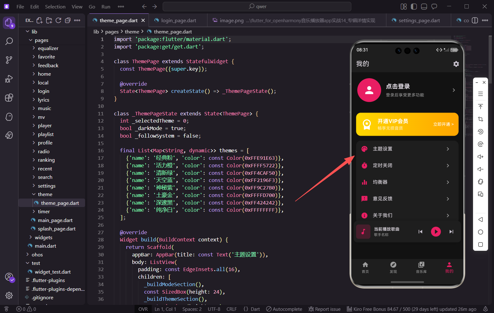
主题设置页面的入口在个人中心页面,用户点击"主题设置"菜单项即可进入:
dart
{'icon': Icons.palette, 'label': '主题设置', 'page': () => const ThemePage()},使用调色板图标 Icons.palette 直观地表达主题设置的含义。
小结
本篇我们实现了一个功能完整的主题设置页面,包含显示模式切换、8种主题色选择和实时预览功能。通过合理的状态管理和组件拆分,代码结构清晰易懂。预览功能的加入让用户在应用主题前就能看到效果,大大提升了使用体验。在实际项目中,还可以结合状态管理框架将主题设置持久化,让用户下次打开应用时自动应用上次的选择。
欢迎加入开源鸿蒙跨平台社区:https://openharmonycrossplatform.csdn.net