BottomNavigationBar底部导航栏详解
一、BottomNavigationBar组件概述
BottomNavigationBar是Material Design中常用的底部导航组件,它位于应用底部,提供3-5个主要功能的快速访问入口。底部导航栏是移动应用中最常见的导航模式之一,用户可以通过点击不同的图标在不同的页面之间切换。
BottomNavigationBar的设计理念
BottomNavigationBar
快速导航
状态指示
视觉统一
易于访问
主要功能入口
常用页面切换
最少点击
当前页面标识
视觉状态变化
图标+文字
Material规范
固定位置
一致样式
拇指可及区域
大触摸目标
直观交互
底部导航栏的设计遵循Material Design规范,强调可访问性和直观性。它固定在屏幕底部,位于用户拇指最容易到达的区域,可以大大提高操作效率。
二、BottomNavigationBar的主要属性
核心属性详解表
| 属性名 | 类型 | 说明 | 必需 | 默认值 |
|---|---|---|---|---|
| items | List | 导航项列表 | 是 | \[\] |
| currentIndex | int | 当前选中项的索引 | 是 | 0 |
| onTap | ValueChanged | 点击回调 | 否 | null |
| type | BottomNavigationBarType | 类型 | 否 | BottomNavigationBarType.fixed |
| iconSize | double | 图标大小 | 否 | 24.0 |
| selectedFontSize | double | 选中文字大小 | 否 | 14.0 |
| unselectedFontSize | double | 未选中文字大小 | 否 | 12.0 |
| selectedIconTheme | IconThemeData | 选中图标主题 | 否 | null |
| unselectedIconTheme | IconThemeData | 未选中图标主题 | 否 | null |
| backgroundColor | Color | 背景颜色 | 否 | null |
| selectedItemColor | Color | 选中项颜色 | 否 | 主题primaryColor |
| unselectedItemColor | Color | 未选中项颜色 | 否 | null |
| showSelectedLabels | bool | 是否显示选中标签 | 否 | true |
| showUnselectedLabels | bool | 是否显示未选中标签 | 否 | true |
| elevation | double | 阴影高度 | 否 | 8.0 |
| landscapeLayout | BottomNavigationBarLandscapeLayout | 横屏布局 | 否 | null |
BottomNavigationBarItem属性
| 属性名 | 类型 | 说明 | 必需 | 默认值 |
|---|---|---|---|---|
| icon | Widget | 图标组件 | 是 | null |
| label | String | 标签文字 | 是 | null |
| activeIcon | Widget | 选中时的图标 | 否 | null |
| tooltip | String | 提示文字 | 否 | null |
| backgroundColor | Color | 背景颜色 | 否 | null |
三、基础BottomNavigationBar使用
简单的底部导航栏
dart
class BasicBottomNavPage extends StatefulWidget {
const BasicBottomNavPage({super.key});
@override
State<BasicBottomNavPage> createState() => _BasicBottomNavPageState();
}
class _BasicBottomNavPageState extends State<BasicBottomNavPage> {
int _currentIndex = 0;
final List<Widget> _pages = [
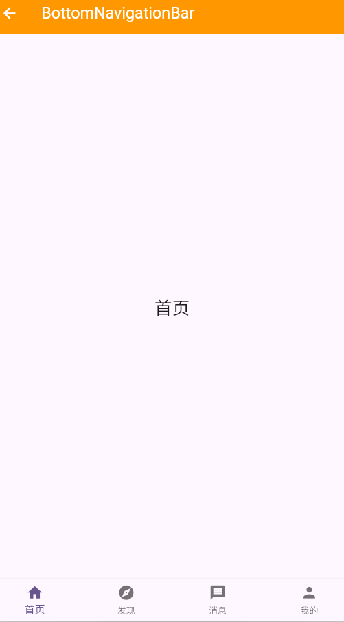
_buildPage('首页', Colors.blue, Icons.home),
_buildPage('发现', Colors.green, Icons.explore),
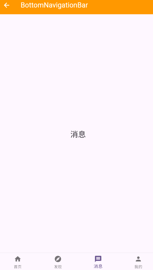
_buildPage('消息', Colors.orange, Icons.message),
_buildPage('我的', Colors.purple, Icons.person),
];
@override
Widget build(BuildContext context) {
return Scaffold(
appBar: AppBar(
title: const Text('底部导航栏基础'),
backgroundColor: Colors.deepPurple,
foregroundColor: Colors.white,
),
body: _pages[_currentIndex],
bottomNavigationBar: BottomNavigationBar(
currentIndex: _currentIndex,
onTap: (index) {
setState(() {
_currentIndex = index;
});
},
type: BottomNavigationBarType.fixed,
items: const [
BottomNavigationBarItem(
icon: Icon(Icons.home),
label: '首页',
),
BottomNavigationBarItem(
icon: Icon(Icons.explore),
label: '发现',
),
BottomNavigationBarItem(
icon: Icon(Icons.message),
label: '消息',
),
BottomNavigationBarItem(
icon: Icon(Icons.person),
label: '我的',
),
],
),
);
}
Widget _buildPage(String title, Color color, IconData icon) {
return Center(
child: Column(
mainAxisAlignment: MainAxisAlignment.center,
children: [
Icon(icon, size: 80, color: color),
const SizedBox(height: 20),
Text(
title,
style: const TextStyle(
fontSize: 24,
fontWeight: FontWeight.bold,
),
),
const SizedBox(height: 10),
Text(
'这是$title页面',
style: TextStyle(
fontSize: 16,
color: Colors.grey[600],
),
),
],
),
);
}
}实现要点说明
这个示例展示了BottomNavigationBar的最基本使用方式。关键点包括:
- 状态管理 :使用StatefulWidget管理当前选中的索引值
_currentIndex - 页面切换:根据当前索引显示对应的页面内容
- 点击事件:onTap回调中更新状态,触发UI重新渲染
- 类型选择:使用fixed类型,确保所有项目都可见
当用户点击底部导航栏的某个项目时,会触发onTap回调,更新_currentIndex的值,从而显示对应的页面。
四、BottomNavigationBar的两种类型
Fixed类型vs Shifting类型
dart
class BottomNavTypesPage extends StatefulWidget {
  const BottomNavTypesPage({super.key});

  @override
  State<BottomNavTypesPage> createState() => _BottomNavTypesPageState();
}

class _BottomNavTypesPageState extends State<BottomNavTypesPage> {
  int _currentIndex = 0;
  BottomNavigationBarType _navType = BottomNavigationBarType.fixed;

  @override
  Widget build(BuildContext context) {
    return Scaffold(
      appBar: AppBar(
        title: const Text('BottomNavigationBar类型'),
        backgroundColor: Colors.indigo,
        foregroundColor: Colors.white,
        actions: [
          SegmentedButton<BottomNavigationBarType>(
            segments: const [
              ButtonSegment(
                value: BottomNavigationBarType.fixed,
                label: Text('Fixed'),
              ),
              ButtonSegment(
                value: BottomNavigationBarType.shifting,
                label: Text('Shifting'),
              ),
            ],
            selected: {_navType},
            onSelectionChanged: (Set<BottomNavigationBarType> newSelection) {
              setState(() {
                _navType = newSelection.first;
              });
            },
          ),
        ],
      ),
      body: Center(
        child: Column(
          mainAxisAlignment: MainAxisAlignment.center,
          children: [
            const Icon(Icons.info, size: 80, color: Colors.indigo),
            const SizedBox(height: 20),
            Text(
              '当前类型: ${_navType == BottomNavigationBarType.fixed ? 'Fixed' : 'Shifting'}',
              style: const TextStyle(fontSize: 20),
            ),
            const SizedBox(height: 10),
            Text(
              _navType == BottomNavigationBarType.fixed
                  ? 'Fixed类型:所有项目固定宽度,显示所有标签'
                  : 'Shifting类型:选中项展开,未选中项只显示图标',
              style: TextStyle(color: Colors.grey[600]),
            ),
          ],
        ),
      ),
      bottomNavigationBar: BottomNavigationBar(
        currentIndex: _currentIndex,
        onTap: (index) {
          setState(() {
            _currentIndex = index;
          });
        },
        type: _navType,
        items: const [
          BottomNavigationBarItem(
            icon: Icon(Icons.home),
            label: '首页',
            backgroundColor: Colors.blue,
          ),
          BottomNavigationBarItem(
            icon: Icon(Icons.explore),
            label: '发现',
            backgroundColor: Colors.green,
          ),
          BottomNavigationBarItem(
            icon: Icon(Icons.message),
            label: '消息',
            backgroundColor: Colors.orange,
          ),
          BottomNavigationBarItem(
            icon: Icon(Icons.person),
            label: '我的',
            backgroundColor: Colors.purple,
          ),
        ],
      ),
    );
  }
}
类型选择指南
Fixed类型:
- 所有项目固定宽度,始终可见
- 显示所有项目的标签文字
- 适合3-5个导航项的场景
- 每个项目等宽,视觉效果更平衡
Shifting类型:
- 选中项展开显示图标和标签
- 未选中项只显示图标
- 需要3-5个导航项
- 每个项目可以有不同的背景色
- 适合需要强调选中状态的场景
选择哪种类型主要取决于设计需求。Fixed类型更传统、更稳定,而Shifting类型更具动感和视觉冲击力。
五、自定义样式和主题
个性化底部导航栏
dart
class CustomBottomNavPage extends StatefulWidget {
  const CustomBottomNavPage({super.key});

  @override
  State<CustomBottomNavPage> createState() => _CustomBottomNavPageState();
}

class _CustomBottomNavPageState extends State<CustomBottomNavPage> {
  int _currentIndex = 0;

  final List<Widget> _pages = [
    _buildPage('首页', Colors.teal),
    _buildPage('商城', Colors.amber),
    _buildPage('社区', Colors.red),
    _buildPage('我的', Colors.deepPurple),
  ];

  @override
  Widget build(BuildContext context) {
    return Scaffold(
      appBar: AppBar(
        title: const Text('自定义样式'),
        backgroundColor: Colors.teal,
        foregroundColor: Colors.white,
      ),
      body: _pages[_currentIndex],
      bottomNavigationBar: BottomNavigationBar(
        currentIndex: _currentIndex,
        onTap: (index) {
          setState(() {
            _currentIndex = index;
          });
        },
        type: BottomNavigationBarType.fixed,
        backgroundColor: Colors.white,
        elevation: 0,
        selectedItemColor: Colors.teal,
        unselectedItemColor: Colors.grey,
        selectedFontSize: 14,
        unselectedFontSize: 12,
        iconSize: 28,
        selectedIconTheme: const IconThemeData(
          size: 28,
          color: Colors.teal,
        ),
        unselectedIconTheme: IconThemeData(
          size: 24,
          color: Colors.grey[400],
        ),
        items: [
          BottomNavigationBarItem(
            icon: const Icon(Icons.home_outlined),
            activeIcon: const Icon(Icons.home),
            label: '首页',
          ),
          BottomNavigationBarItem(
            icon: const Icon(Icons.shopping_bag_outlined),
            activeIcon: const Icon(Icons.shopping_bag),
            label: '商城',
          ),
          BottomNavigationBarItem(
            icon: const Icon(Icons.forum_outlined),
            activeIcon: const Icon(Icons.forum),
            label: '社区',
          ),
          BottomNavigationBarItem(
            icon: const Icon(Icons.person_outline),
            activeIcon: const Icon(Icons.person),
            label: '我的',
          ),
        ],
      ),
    );
  }

  Widget _buildPage(String title, Color color) {
    return Center(
      child: Column(
        mainAxisAlignment: MainAxisAlignment.center,
        children: [
          Icon(
            Icons.palette,
            size: 80,
            color: color,
          ),
          const SizedBox(height: 20),
          Text(
            title,
            style: TextStyle(
              fontSize: 24,
              fontWeight: FontWeight.bold,
              color: color,
            ),
          ),
          const SizedBox(height: 10),
          const Text('自定义颜色、大小、图标样式'),
        ],
      ),
    );
  }
}
自定义要点
通过自定义主题属性,可以创建符合应用风格的底部导航栏:
- 颜色定制:selectedItemColor和unselectedItemColor分别设置选中项和未选中项的颜色
- 图标大小:iconSize控制图标的基础大小,配合selectedIconTheme和unselectedIconTheme可以实现选中时图标变大
- 字体大小:selectedFontSize和unselectedFontSize分别控制选中项和未选中项的字体大小
- 图标切换:使用icon和activeIcon可以在选中时切换不同的图标,比如从轮廓图标切换到实心图标
- 去除阴影:将elevation设置为0可以创建无边框的扁平化设计
六、带徽标的底部导航栏
实现徽标提示
dart
class BadgeBottomNavPage extends StatefulWidget {
  const BadgeBottomNavPage({super.key});

  @override
  State<BadgeBottomNavPage> createState() => _BadgeBottomNavPageState();
}

class _BadgeBottomNavPageState extends State<BadgeBottomNavPage> {
  int _currentIndex = 0;
  int _messageCount = 5;
  int _cartCount = 3;

  @override
  Widget build(BuildContext context) {
    return Scaffold(
      appBar: AppBar(
        title: const Text('带徽标的底部导航'),
        backgroundColor: Colors.red,
        foregroundColor: Colors.white,
      ),
      body: Center(
        child: Column(
          mainAxisAlignment: MainAxisAlignment.center,
          children: [
            const Icon(Icons.notifications, size: 80, color: Colors.red),
            const SizedBox(height: 20),
            ElevatedButton(
              onPressed: () {
                setState(() {
                  _messageCount++;
                });
              },
              style: ElevatedButton.styleFrom(
                backgroundColor: Colors.red,
                foregroundColor: Colors.white,
              ),
              child: const Text('增加消息数量'),
            ),
            const SizedBox(height: 10),
            ElevatedButton(
              onPressed: () {
                setState(() {
                  if (_messageCount > 0) _messageCount--;
                });
              },
              style: ElevatedButton.styleFrom(
                backgroundColor: Colors.red,
                foregroundColor: Colors.white,
              ),
              child: const Text('清除消息'),
            ),
          ],
        ),
      ),
      bottomNavigationBar: BottomNavigationBar(
        currentIndex: _currentIndex,
        onTap: (index) {
          if (index == 2) {
            setState(() {
              _messageCount = 0;
            });
          }
          setState(() {
            _currentIndex = index;
          });
        },
        type: BottomNavigationBarType.fixed,
        items: [
          const BottomNavigationBarItem(
            icon: Icon(Icons.home),
            label: '首页',
          ),
          const BottomNavigationBarItem(
            icon: Icon(Icons.shopping_cart),
            label: '购物车',
          ),
          BottomNavigationBarItem(
            icon: Badge(
              label: _messageCount > 99 ? '99+' : _messageCount.toString(),
              child: const Icon(Icons.message),
            ),
            label: '消息',
          ),
          const BottomNavigationBarItem(
            icon: Icon(Icons.person),
            label: '我的',
          ),
        ],
      ),
    );
  }
}
徽标使用场景
徽标(Badge)是向用户展示未读消息、购物车数量、通知数量等信息的重要方式:
- 消息提示:显示未读消息数量,点击后清零
- 购物车:显示购物车中的商品数量
- 通知:显示待处理的通知数量
- 更新提示:使用小红点提示有更新内容
使用徽标时要注意数量上限,当数量超过99时,应该显示"99+"而不是具体数字,避免数字过长影响布局。
七、响应式底部导航栏
适应不同屏幕尺寸
dart
class ResponsiveBottomNavPage extends StatefulWidget {
  const ResponsiveBottomNavPage({super.key});

  @override
  State<ResponsiveBottomNavPage> createState() => _ResponsiveBottomNavPageState();
}

class _ResponsiveBottomNavPageState extends State<ResponsiveBottomNavPage> {
  int _currentIndex = 0;

  final List<Widget> _pages = [
    _buildPage('首页', Colors.blue),
    _buildPage('发现', Colors.green),
    _buildPage('消息', Colors.orange),
    _buildPage('我的', Colors.purple),
  ];

  @override
  Widget build(BuildContext context) {
    final screenWidth = MediaQuery.of(context).size.width;
    final isWideScreen = screenWidth > 600;

    return Scaffold(
      appBar: AppBar(
        title: const Text('响应式底部导航'),
        backgroundColor: Colors.cyan,
        foregroundColor: Colors.white,
      ),
      body: isWideScreen
          ? Row(
              children: [
                NavigationRail(
                  selectedIndex: _currentIndex,
                  onDestinationSelected: (index) {
                    setState(() {
                      _currentIndex = index;
                    });
                  },
                  labelType: NavigationRailLabelType.all,
                  destinations: const [
                    NavigationRailDestination(
                      icon: Icon(Icons.home),
                      selectedIcon: Icon(Icons.home),
                      label: Text('首页'),
                    ),
                    NavigationRailDestination(
                      icon: Icon(Icons.explore),
                      selectedIcon: Icon(Icons.explore),
                      label: Text('发现'),
                    ),
                    NavigationRailDestination(
                      icon: Icon(Icons.message),
                      selectedIcon: Icon(Icons.message),
                      label: Text('消息'),
                    ),
                    NavigationRailDestination(
                      icon: Icon(Icons.person),
                      selectedIcon: Icon(Icons.person),
                      label: Text('我的'),
                    ),
                  ],
                ),
                Expanded(child: _pages[_currentIndex]),
              ],
            )
          : _pages[_currentIndex],
      bottomNavigationBar: isWideScreen
          ? null
          : BottomNavigationBar(
              currentIndex: _currentIndex,
              onTap: (index) {
                setState(() {
                  _currentIndex = index;
                });
              },
              type: BottomNavigationBarType.fixed,
              items: const [
                BottomNavigationBarItem(
                  icon: Icon(Icons.home),
                  label: '首页',
                ),
                BottomNavigationBarItem(
                  icon: Icon(Icons.explore),
                  label: '发现',
                ),
                BottomNavigationBarItem(
                  icon: Icon(Icons.message),
                  label: '消息',
                ),
                BottomNavigationBarItem(
                  icon: Icon(Icons.person),
                  label: '我的',
                ),
              ],
            ),
    );
  }

  Widget _buildPage(String title, Color color) {
    return Center(
      child: Column(
        mainAxisAlignment: MainAxisAlignment.center,
        children: [
          Icon(Icons.devices, size: 80, color: color),
          const SizedBox(height: 20),
          Text(
            title,
            style: TextStyle(
              fontSize: 24,
              fontWeight: FontWeight.bold,
              color: color,
            ),
          ),
          const SizedBox(height: 10),
          Text(
            '屏幕宽度: ${MediaQuery.of(context).size.width.toStringAsFixed(0)}',
            style: TextStyle(color: Colors.grey[600]),
          ),
        ],
      ),
    );
  }
}
响应式设计原则
在不同尺寸的设备上,底部导航栏的展示方式也应该有所区别:
- 小屏幕(<600dp):使用BottomNavigationBar,位于底部
- 大屏幕(>=600dp):使用NavigationRail,位于左侧
- 超宽屏:可以考虑使用导航抽屉或者顶部的Tab栏
响应式设计可以提高应用在各种设备上的用户体验,让应用界面更加合理和高效。
八、BottomNavigationBar最佳实践
实践总结表
| 实践要点 | 说明 | 优先级 |
|---|---|---|
| 导航项数量 | 3-5个为最佳,避免过多 | 高 |
| 图标选择 | 使用Material Icons,清晰易识别 | 高 |
| 标签简洁 | 每个标签1-2个字,中文优先 | 高 |
| 视觉反馈 | 选中状态要有明显区别 | 高 |
| 徽标管理 | 及时清理,避免数字过大 | 中 |
| 类型选择 | 根据设计需求选择fixed或shifting | 中 |
| 响应式 | 大屏考虑使用侧边导航 | 中 |
| 动画流畅 | 切换时使用流畅的过渡动画 | 低 |
关键实践建议
-
合理规划导航项:底部导航栏最适合展示应用的主要功能入口,通常建议3-5个。如果需要更多导航项,应该考虑使用Drawer或者其他导航方式。
-
图标和文字搭配:图标应该简洁明了,易于识别。标签文字应该简短,最好不超过2个汉字或4个字母。图标和文字应该相互补充,用户即使不看文字也能理解图标含义。
-
状态管理优化:对于每个页面的内容,应该使用独立的状态管理方式,避免不必要的重建。可以考虑使用IndexedStack来保持页面状态。
-
性能考虑:底部导航栏的页面切换应该快速流畅。如果页面内容复杂,可以考虑预加载或者使用懒加载策略。
-
测试不同场景:在实际设备上测试底部导航栏的表现,包括不同屏幕尺寸、不同方向(横竖屏)、不同主题(深色/浅色模式)等场景。
通过遵循这些最佳实践,可以创建出既美观又实用的底部导航栏,为用户提供优秀的导航体验。
欢迎加入开源鸿蒙跨平台社区:https://openharmonycrossplatform.csdn.net