Flutter for OpenHarmony 实战:按钮类 Widget 完全指南
文章目录
- [Flutter for OpenHarmony 实战:按钮类 Widget 完全指南](#Flutter for OpenHarmony 实战:按钮类 Widget 完全指南)
-
- 摘要
- 前言
- [1. ElevatedButton](#1. ElevatedButton)
-
- [1.1 基本用法与构造函数](#1.1 基本用法与构造函数)
- [1.2 ButtonStyle 样式系统](#1.2 ButtonStyle 样式系统)
- [1.3 按钮状态管理](#1.3 按钮状态管理)
- [1.4 图标按钮](#1.4 图标按钮)
- [2. TextButton](#2. TextButton)
-
- [2.1 基本用法](#2.1 基本用法)
- [2.2 样式自定义](#2.2 样式自定义)
- [2.3 使用场景](#2.3 使用场景)
- [3. OutlinedButton](#3. OutlinedButton)
-
- [3.1 基本用法](#3.1 基本用法)
- [3.2 样式自定义](#3.2 样式自定义)
- [3.3 与其他按钮配合使用](#3.3 与其他按钮配合使用)
- [4. 特殊按钮 Widget](#4. 特殊按钮 Widget)
- [5. 按钮设计指南与最佳实践](#5. 按钮设计指南与最佳实践)
-
- [5.1 按钮层级指南](#5.1 按钮层级指南)
- [5.2 按钮尺寸指南](#5.2 按钮尺寸指南)
- [5.3 按钮组合模式](#5.3 按钮组合模式)
- [6. 常见问题与解决方案](#6. 常见问题与解决方案)
-
- [问题 1:按钮不响应点击](#问题 1:按钮不响应点击)
- [问题 2:按钮样式不生效](#问题 2:按钮样式不生效)
- [问题 3:自定义按钮点击效果](#问题 3:自定义按钮点击效果)
- 总结
- 参考资料
- 社区支持
摘要
按钮是用户交互的核心组件。Flutter 提供了多种按钮 Widget 以满足不同场景的需求。本文全面讲解了 ElevatedButton、TextButton、OutlinedButton 等按钮的使用方法、样式自定义、状态管理以及最佳实践,帮助开发者掌握 Flutter 按钮系统的完整知识。
关键词:Flutter、OpenHarmony、ElevatedButton、TextButton、OutlinedButton、IconButton、FloatingActionButton、按钮样式
前言
在 Flutter for OpenHarmony 开发中,按钮是最常用的交互组件。Flutter 最初提供了 RaisedButton、FlatButton、OutlineButton 等按钮,但这些 API 已经被废弃。现在推荐使用 ElevatedButton、TextButton 和 OutlinedButton,它们使用统一的 ButtonStyle API,更加灵活和强大。
本文将深入讲解 Flutter 按钮系统的完整用法,从基础 API 到高级自定义,从状态管理到最佳实践。
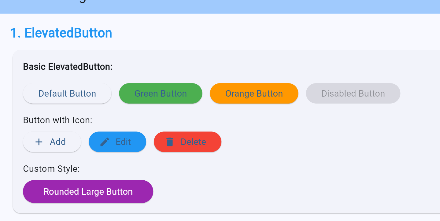
1. ElevatedButton
ElevatedButton 是 Material Design 中的主要按钮,具有凸起的阴影效果,用于最重要的操作。
1.1 基本用法与构造函数
dart
class BasicElevatedButton extends StatelessWidget {
  const BasicElevatedButton({super.key});

  @override
  Widget build(BuildContext context) {
    return Column(
      children: [
        // 最简单的用法
        ElevatedButton(
          onPressed: () {
            print('Button clicked');
          },
          child: const Text('Elevated Button'),
        ),

        // 禁用状态
        ElevatedButton(
          onPressed: null, // null 表示禁用
          child: const Text('Disabled Button'),
        ),

        // 使用 .icon 构造函数
        ElevatedButton.icon(
          onPressed: () {},
          icon: const Icon(Icons.send),
          label: const Text('Send'),
        ),
      ],
    );
  }
}
ElevatedButton 构造函数参数:
| 参数 | 类型 | 说明 |
|---|---|---|
| onPressed | VoidCallback? | 点击回调,null 表示禁用 |
| onLongPress | VoidCallback? | 长按回调 |
| onHover | ValueChanged? | 悬停回调 |
| style | ButtonStyle? | 按钮样式 |
| child | Widget | 按钮内容 |
| focusNode | FocusNode? | 焦点节点 |
| autofocus | bool? | 自动聚焦 |
1.2 ButtonStyle 样式系统
Flutter 使用 ButtonStyle 统一管理按钮样式,支持基于状态的样式配置。
dart
class StyledElevatedButton extends StatelessWidget {
  const StyledElevatedButton({super.key});

  @override
  Widget build(BuildContext context) {
    return Column(
      children: [
        // 使用 styleFrom 快速创建样式
        ElevatedButton(
          onPressed: () {},
          style: ElevatedButton.styleFrom(
            backgroundColor: Colors.blue,
            foregroundColor: Colors.white,
            disabledBackgroundColor: Colors.grey,
            disabledForegroundColor: Colors.white70,
            padding: const EdgeInsets.symmetric(horizontal: 24, vertical: 12),
            textStyle: const TextStyle(fontSize: 16),
            elevation: 4,
            shape: RoundedRectangleBorder(
              borderRadius: BorderRadius.circular(8),
            ),
            minimumSize: const Size(120, 48),
          ),
          child: const Text('Custom Style'),
        ),

        // 使用 ButtonStyle 进行完整控制
        ElevatedButton(
          onPressed: () {},
          style: ButtonStyle(
            backgroundColor: MaterialStateProperty.resolveWith((states) {
              if (states.contains(MaterialState.pressed)) {
                return Colors.green; // 按下时为绿色
              }
              if (states.contains(MaterialState.disabled)) {
                return Colors.grey; // 禁用时为灰色
              }
              return Colors.blue; // 默认为蓝色
            }),
            foregroundColor: MaterialStateProperty.all(Colors.white),
            elevation: MaterialStateProperty.resolveWith((states) {
              return states.contains(MaterialState.pressed) ? 8 : 4;
            }),
            shape: MaterialStateProperty.all(
              RoundedRectangleBorder(
                borderRadius: BorderRadius.circular(16),
              ),
            ),
          ),
          child: const Text('State Style'),
        ),
      ],
    );
  }
}
MaterialState 状态类型:
| 状态 | 说明 |
|---|---|
| MaterialState.pressed | 按下状态 |
| MaterialState.hovered | 悬停状态 |
| MaterialState.focused | 聚焦状态 |
| MaterialState.disabled | 禁用状态 |
| MaterialState.dragged | 拖拽状态 |
| MaterialState.selected | 选中状态 |
1.3 按钮状态管理
dart
class ButtonStates extends StatefulWidget {
  const ButtonStates({super.key});

  @override
  State<ButtonStates> createState() => _ButtonStatesState();
}

class _ButtonStatesState extends State<ButtonStates> {
  bool _isLoading = false;
  bool _isDisabled = false;

  Future<void> _handlePress() async {
    if (_isLoading || _isDisabled) return;

    setState(() {
      _isLoading = true;
    });

    // 模拟异步操作
    await Future.delayed(const Duration(seconds: 2));

    setState(() {
      _isLoading = false;
    });
  }

  @override
  Widget build(BuildContext context) {
    return Column(
      children: [
        // 加载状态按钮
        ElevatedButton(
          onPressed: _isLoading ? null : _handlePress,
          style: ElevatedButton.styleFrom(
            minimumSize: const Size(200, 48),
          ),
          child: _isLoading
              ? const SizedBox(
                  width: 20,
                  height: 20,
                  child: CircularProgressIndicator(
                    strokeWidth: 2,
                    color: Colors.white,
                  ),
                )
              : const Text('Click to Load'),
        ),

        // 禁用切换按钮
        Row(
          children: [
            ElevatedButton(
              onPressed: _isDisabled ? null : () {},
              style: ElevatedButton.styleFrom(
                backgroundColor: _isDisabled ? Colors.grey : Colors.blue,
              ),
              child: Text(_isDisabled ? 'Disabled' : 'Normal'),
            ),
            const SizedBox(width: 16),
            ElevatedButton(
              onPressed: () {
                setState(() {
                  _isDisabled = !_isDisabled;
                });
              },
              child: const Text('Toggle State'),
            ),
          ],
        ),
      ],
    );
  }
}
1.4 图标按钮
dart
class IconButtons extends StatelessWidget {
  const IconButtons({super.key});

  @override
  Widget build(BuildContext context) {
    return Column(
      children: [
        // 带图标的按钮
        ElevatedButton.icon(
          onPressed: () {},
          icon: const Icon(Icons.add_shopping_cart),
          label: const Text('Add to Cart'),
          style: ElevatedButton.styleFrom(
            padding: const EdgeInsets.symmetric(horizontal: 16, vertical: 12),
          ),
        ),

        // 圆形图标按钮
        ElevatedButton(
          onPressed: () {},
          style: ElevatedButton.styleFrom(
            padding: EdgeInsets.zero,
            minimumSize: const Size(56, 56),
            shape: const CircleBorder(),
          ),
          child: const Icon(Icons.add, size: 28),
        ),

        // 仅图标按钮
        ElevatedButton(
          onPressed: () {},
          style: ElevatedButton.styleFrom(
            padding: const EdgeInsets.all(16),
            shape: RoundedRectangleBorder(
              borderRadius: BorderRadius.circular(12),
            ),
          ),
          child: const Icon(Icons.favorite, color: Colors.red),
        ),
      ],
    );
  }
}
这里因为中文上网页会乱码,我全部使用英文
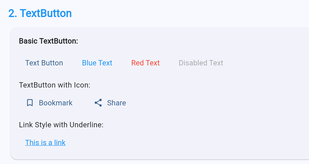
2. TextButton
TextButton 是扁平的文本按钮,没有边框和阴影,用于次要操作。
2.1 基本用法
dart
class BasicTextButton extends StatelessWidget {
  const BasicTextButton({super.key});

  @override
  Widget build(BuildContext context) {
    return Column(
      children: [
        // 最简单的 TextButton
        TextButton(
          onPressed: () {},
          child: const Text('Text Button'),
        ),

        // 带图标的 TextButton
        TextButton.icon(
          onPressed: () {},
          icon: const Icon(Icons.bookmark_border),
          label: const Text('Bookmark'),
        ),

        // 禁用状态
        TextButton(
          onPressed: null,
          child: const Text('Disabled Text'),
        ),
      ],
    );
  }
}
2.2 样式自定义
dart
class StyledTextButton extends StatelessWidget {
  const StyledTextButton({super.key});

  @override
  Widget build(BuildContext context) {
    return Column(
      children: [
        // 自定义颜色
        TextButton(
          onPressed: () {},
          style: TextButton.styleFrom(
            foregroundColor: Colors.blue,
            disabledForegroundColor: Colors.grey,
            textStyle: const TextStyle(
              fontSize: 16,
              fontWeight: FontWeight.w500,
            ),
          ),
          child: const Text('Blue Text Button'),
        ),

        // 链接样式带下划线
        TextButton(
          onPressed: () {},
          style: TextButton.styleFrom(
            foregroundColor: Colors.blue,
            textStyle: const TextStyle(
              decoration: TextDecoration.underline,
            ),
          ),
          child: const Text('Link Style'),
        ),

        // 大号文本按钮
        TextButton(
          onPressed: () {},
          style: TextButton.styleFrom(
            foregroundColor: Colors.green,
            textStyle: const TextStyle(
              fontSize: 20,
              fontWeight: FontWeight.bold,
            ),
            padding: const EdgeInsets.symmetric(
              horizontal: 24,
              vertical: 16,
            ),
          ),
          child: const Text('Large Button'),
        ),
      ],
    );
  }
}
2.3 使用场景
dart
class TextButtonUsage extends StatelessWidget {
  const TextButtonUsage({super.key});

  @override
  Widget build(BuildContext context) {
    return AlertDialog(
      title: const Text('Confirm Action'),
      content: const Text('Are you sure you want to perform this action?'),
      actions: [
        // 取消按钮 - 使用 TextButton
        TextButton(
          onPressed: () => Navigator.pop(context, false),
          child: const Text('Cancel'),
        ),
        // 确认按钮 - 使用 ElevatedButton
        ElevatedButton(
          onPressed: () => Navigator.pop(context, true),
          child: const Text('Confirm'),
        ),
      ],
    );
  }
}
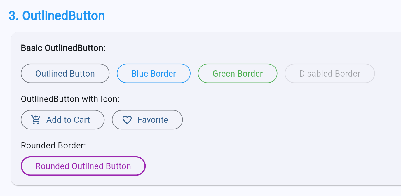
3. OutlinedButton
OutlinedButton 有边框但没有阴影,重要程度介于 ElevatedButton 和 TextButton 之间。
3.1 基本用法
dart
class BasicOutlinedButton extends StatelessWidget {
  const BasicOutlinedButton({super.key});

  @override
  Widget build(BuildContext context) {
    return Column(
      children: [
        // 基本的 OutlinedButton
        OutlinedButton(
          onPressed: () {},
          child: const Text('Outlined Button'),
        ),

        // 带图标的 OutlinedButton
        OutlinedButton.icon(
          onPressed: () {},
          icon: const Icon(Icons.edit),
          label: const Text('Edit'),
        ),
      ],
    );
  }
}
3.2 样式自定义
dart
class StyledOutlinedButton extends StatelessWidget {
  const StyledOutlinedButton({super.key});

  @override
  Widget build(BuildContext context) {
    return Column(
      children: [
        // 自定义边框
        OutlinedButton(
          onPressed: () {},
          style: OutlinedButton.styleFrom(
            foregroundColor: Colors.purple,
            side: const BorderSide(
              color: Colors.purple,
              width: 2,
            ),
            shape: RoundedRectangleBorder(
              borderRadius: BorderRadius.circular(12),
            ),
          ),
          child: const Text('Purple Outline'),
        ),

        // 虚线边框
        OutlinedButton(
          onPressed: () {},
          style: OutlinedButton.styleFrom(
            side: const BorderSide(
              color: Colors.orange,
              width: 2,
              style: BorderStyle.solid,
            ),
            shape: RoundedRectangleBorder(
              borderRadius: BorderRadius.circular(8),
            ),
          ),
          child: const Text('Orange Border'),
        ),

        // 状态样式
        OutlinedButton(
          onPressed: () {},
          style: ButtonStyle(
            side: MaterialStateProperty.resolveWith((states) {
              final color = states.contains(MaterialState.pressed)
                  ? Colors.red
                  : Colors.blue;
              return BorderSide(color: color, width: 2);
            }),
            foregroundColor: MaterialStateProperty.resolveWith((states) {
              return states.contains(MaterialState.pressed)
                  ? Colors.red
                  : Colors.blue;
            }),
          ),
          child: const Text('State Border'),
        ),
      ],
    );
  }
}
3.3 与其他按钮配合使用
dart
class ButtonCombination extends StatelessWidget {
  const ButtonCombination({super.key});

  @override
  Widget build(BuildContext context) {
    return Row(
      children: [
        // 次要操作 - OutlinedButton
        Expanded(
          child: OutlinedButton(
            onPressed: () {},
            style: OutlinedButton.styleFrom(
              padding: const EdgeInsets.symmetric(vertical: 16),
            ),
            child: const Text('Cancel'),
          ),
        ),
        const SizedBox(width: 16),
        // 主要操作 - ElevatedButton
        Expanded(
          child: ElevatedButton(
            onPressed: () {},
            style: ElevatedButton.styleFrom(
              padding: const EdgeInsets.symmetric(vertical: 16),
            ),
            child: const Text('Confirm'),
          ),
        ),
      ],
    );
  }
}
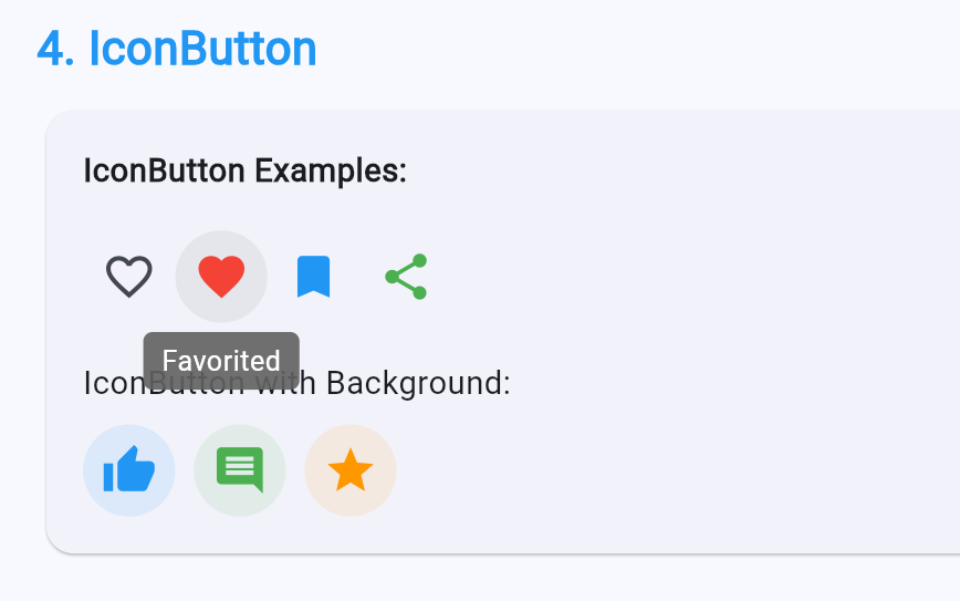
4. 特殊按钮 Widget
IconButton
dart
class IconButtonDemo extends StatelessWidget {
const IconButtonDemo({super.key});
@override
Widget build(BuildContext context) {
return Row(
mainAxisAlignment: MainAxisAlignment.spaceAround,
children: [
// 基本的 IconButton
IconButton(
onPressed: () {},
icon: const Icon(Icons.favorite_border),
tooltip: 'Bookmark',
),
// 带颜色的 IconButton
IconButton(
onPressed: () {},
icon: const Icon(Icons.favorite),
color: Colors.red,
iconSize: 32,
),
// 带徽章的 IconButton
Stack(
clipBehavior: Clip.none,
children: [
const IconButton(
onPressed: null,
icon: Icon(Icons.notifications),
),
Positioned(
right: 4,
top: 4,
child: Container(
padding: const EdgeInsets.all(4),
decoration: const BoxDecoration(
color: Colors.red,
shape: BoxShape.circle,
),
constraints: const BoxConstraints(
minWidth: 16,
minHeight: 16,
),
child: const Text(
'3',
style: TextStyle(
color: Colors.white,
fontSize: 10,
),
textAlign: TextAlign.center,
),
),
),
],
),
],
);
}
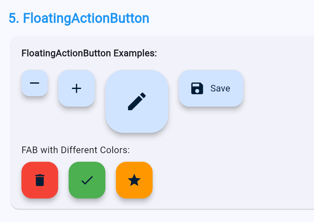
}FloatingActionButton
dart
class FABDemo extends StatelessWidget {
  const FABDemo({super.key});

  @override
  Widget build(BuildContext context) {
    return Scaffold(
      appBar: AppBar(title: const Text('FAB Demo')),
      body: const Center(child: Text('Content')),
      // 标准 FAB
      floatingActionButton: FloatingActionButton(
        onPressed: () {},
        child: const Icon(Icons.add),
      ),
      // 扩展 FAB
      floatingActionButton: FloatingActionButton.extended(
        onPressed: () {},
        icon: const Icon(Icons.edit),
        label: const Text('Edit'),
      ),
      // 小号 FAB
      floatingActionButton: FloatingActionButton.small(
        onPressed: () {},
        heroTag: 'small',
        child: const Icon(Icons.remove),
      ),
      // 大号 FAB
      floatingActionButton: FloatingActionButton.large(
        onPressed: () {},
        heroTag: 'large',
        child: const Icon(Icons.add),
      ),
    );
  }
}
自定义按钮
dart
class CustomButton extends StatelessWidget {
  final String label;
  final VoidCallback? onPressed;
  final Color? color;
  final bool isLoading;

  const CustomButton({
    super.key,
    required this.label,
    this.onPressed,
    this.color,
    this.isLoading = false,
  });

  @override
  Widget build(BuildContext context) {
    final buttonColor = color ?? Theme.of(context).primaryColor;

    return GestureDetector(
      onTap: isLoading ? null : onPressed,
      child: Container(
        padding: const EdgeInsets.symmetric(horizontal: 24, vertical: 14),
        decoration: BoxDecoration(
          color: isLoading ? buttonColor.withOpacity(0.6) : buttonColor,
          borderRadius: BorderRadius.circular(8),
          boxShadow: [
            BoxShadow(
              color: buttonColor.withOpacity(0.3),
              blurRadius: 8,
              offset: const Offset(0, 4),
            ),
          ],
        ),
        child: Center(
          child: isLoading
              ? const SizedBox(
                  width: 20,
                  height: 20,
                  child: CircularProgressIndicator(
                    strokeWidth: 2,
                    valueColor: AlwaysStoppedAnimation<Color>(Colors.white),
                  ),
                )
              : Text(
                  label,
                  style: const TextStyle(
                    color: Colors.white,
                    fontSize: 16,
                    fontWeight: FontWeight.bold,
                  ),
                ),
        ),
      ),
    );
  }
}
5. 按钮设计指南与最佳实践
5.1 按钮层级指南
| 操作重要性 | 推荐按钮 | 说明 |
|---|---|---|
| 主要操作 | ElevatedButton | 最突出的按钮,每个屏幕最多一个 |
| 次要操作 | OutlinedButton | 中等突出程度,可以有多个 |
| 第三级操作 | TextButton | 最不突出,可以有多个 |
| 工具操作 | IconButton | 工具栏、列表项 |
5.2 按钮尺寸指南
dart
class ButtonSizes extends StatelessWidget {
  const ButtonSizes({super.key});

  @override
  Widget build(BuildContext context) {
    return Column(
      children: [
        // 大号按钮 - 主要操作
        ElevatedButton(
          onPressed: () {},
          style: ElevatedButton.styleFrom(
            minimumSize: const Size(double.infinity, 56),
            textStyle: const TextStyle(fontSize: 18),
          ),
          child: const Text('Large Button'),
        ),
        const SizedBox(height: 16),
        // 中号按钮 - 常规操作
        ElevatedButton(
          onPressed: () {},
          style: ElevatedButton.styleFrom(
            minimumSize: const Size(120, 48),
          ),
          child: const Text('Medium Button'),
        ),
        const SizedBox(height: 16),
        // 小号按钮 - 紧凑布局
        ElevatedButton(
          onPressed: () {},
          style: ElevatedButton.styleFrom(
            minimumSize: const Size(88, 36),
            padding: const EdgeInsets.symmetric(horizontal: 12),
            textStyle: const TextStyle(fontSize: 14),
          ),
          child: const Text('Small Button'),
        ),
      ],
    );
  }
}
5.3 按钮组合模式
dart
class ButtonGroups extends StatelessWidget {
  const ButtonGroups({super.key});

  @override
  Widget build(BuildContext context) {
    return Column(
      children: [
        // 按钮组
        Row(
          children: [
            Expanded(
              child: OutlinedButton(
                onPressed: () {},
                style: OutlinedButton.styleFrom(
                  shape: const RoundedRectangleBorder(
                    borderRadius: BorderRadius.only(
                      topLeft: Radius.circular(8),
                      bottomLeft: Radius.circular(8),
                    ),
                  ),
                ),
                child: const Text('Yesterday'),
              ),
            ),
            Expanded(
              child: ElevatedButton(
                onPressed: () {},
                style: ElevatedButton.styleFrom(
                  shape: const RoundedRectangleBorder(
                    borderRadius: BorderRadius.zero,
                  ),
                ),
                child: const Text('Today'),
              ),
            ),
            Expanded(
              child: OutlinedButton(
                onPressed: () {},
                style: OutlinedButton.styleFrom(
                  shape: const RoundedRectangleBorder(
                    borderRadius: BorderRadius.only(
                      topRight: Radius.circular(8),
                      bottomRight: Radius.circular(8),
                    ),
                  ),
                ),
                child: const Text('Tomorrow'),
              ),
            ),
          ],
        ),
      ],
    );
  }
}
6. 常见问题与解决方案
问题 1:按钮不响应点击
dart
// 检查 onPressed 是否为 null
ElevatedButton(
  onPressed: someCondition ? () {} : null, // 确保条件正确
  child: const Text('Button'),
)
问题 2:按钮样式不生效
dart
// 确保使用正确的 style 属性
ElevatedButton(
  onPressed: () {},
  style: ElevatedButton.styleFrom(  // 使用 styleFrom 而不是直接 new ButtonStyle
    backgroundColor: Colors.blue,
  ),
  child: const Text('Button'),
)
问题 3:自定义按钮点击效果
dart
// 使用 Material 包装实现水波纹效果
Material(
  child: InkWell(
    onTap: () {},
    splashColor: Colors.blue.withOpacity(0.3),
    child: Container(
      padding: const EdgeInsets.symmetric(horizontal: 24, vertical: 12),
      decoration: BoxDecoration(
        color: Colors.blue,
        borderRadius: BorderRadius.circular(8),
      ),
      child: const Text('Custom Button'),
    ),
  ),
)
总结
Flutter 提供了完整的按钮系统,使用统一的 ButtonStyle API,使样式自定义更加灵活。
核心要点回顾:
- ElevatedButton:凸起按钮,用于主要操作
- TextButton:扁平按钮,用于次要操作
- OutlinedButton:边框按钮,用于中等重要性的操作
- ButtonStyle:统一样式 API,支持基于状态的样式设置
- MaterialState:按钮状态管理系统
最佳实践总结:
- 每个屏幕最多一个主要按钮
- 使用按钮层级指南指导设计
- 提供清晰的视觉反馈
- 处理禁用和加载状态
- 保持按钮样式一致性
参考资料
- Flutter 官方文档 - 按钮
- Material Design 按钮指南
- Flutter ButtonStyle API
- Flutter 交互式 Widget
- AtomGit - 开源 OpenHarmony 跨平台社区
社区支持
欢迎加入开源 OpenHarmony 跨平台社区,获取更多技术支持和资源:
- 社区论坛 :开源 OpenHarmony 跨平台开发者社区
- 技术交流:参与社区讨论,分享开发经验
如果本文对您有帮助,欢迎点赞、收藏和评论。您的支持是我持续创作的动力!