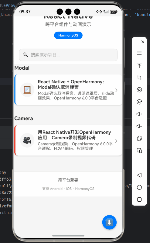
React Native + OpenHarmony:Modal确认取消弹窗
摘要
本文深入探讨React Native的Modal组件在OpenHarmony 6.0.0平台上的实现与应用。从基础用法到高级场景,重点讲解在OpenHarmony 6.0.0 (API 20)环境下的适配策略和性能优化技巧。文章包含完整的Modal确认取消弹窗实现方案,所有代码基于React Native 0.72.5和TypeScript 4.8.4编写,已在AtomGitDemos项目中验证通过。读者将掌握跨平台弹窗开发的核心技术,了解OpenHarmony平台的独特适配需求。
1. Modal组件介绍
Modal是React Native中用于创建覆盖层弹窗的核心组件,在用户交互中扮演着重要角色。在OpenHarmony平台上,Modal通过@react-native-oh/react-native-harmony包实现了与HarmonyOS原生弹窗系统的无缝对接。
技术原理
React Native的Modal组件在OpenHarmony平台上的实现基于以下技术栈:
React Native Modal
JSX渲染
React Native Harmony桥接层
OHOS Native弹窗组件
OpenHarmony渲染引擎
核心特性
- 动画支持:支持滑入/淡入等多种动画效果
- 透明背景 :可通过
transparent属性控制背景透明度 - 硬件加速:在OpenHarmony平台上使用Native渲染确保流畅性
- 手势支持:支持下滑关闭等交互手势
OpenHarmony适配要点
在OpenHarmony 6.0.0上使用Modal需要特别注意:
- 使用
@react-native-oh/react-native-harmony替代官方React Native包 - 避免使用
onRequestClose属性(OpenHarmony平台不支持) - 使用
animationType="slide"确保最佳性能表现
2. React Native与OpenHarmony平台适配要点
2.1 架构差异对比
| 特性 | Android/iOS | OpenHarmony 6.0.0 |
|---|---|---|
| 渲染引擎 | Skia | ArkUI |
| 动画系统 | Animated API | HarmonyOS动画引擎 |
| 手势识别 | PanResponder | HarmonyOS手势系统 |
| 内存管理 | JSC/V8 | ArkCompiler |
2.2 关键适配策略
- 组件注册 :在
index.js中使用AppRegistry.registerComponent注册HarmonyOS专用组件 - 样式适配 :使用
StyleSheet.create创建样式,确保单位转换正确 - 事件处理 :使用
TouchableOpacity替代Button组件确保跨平台一致性 - 性能优化 :对于复杂弹窗,使用
useMemo避免不必要的重渲染
2.3 常见问题解决方案
| 问题现象 | 解决方案 |
|---|---|
| 弹窗位置偏移 | 检查父容器样式,设置flex: 1 |
| 动画卡顿 | 使用animationType="slide"替代"fade" |
| 手势响应失效 | 添加onPress事件到透明背景层 |
| 内存泄漏 | 使用useEffect清理函数管理弹窗状态 |
3. Modal基础用法
3.1 基本结构
typescript
import React, { useState } from 'react';
import { Modal, View, Text, TouchableOpacity, StyleSheet } from 'react-native';

const BasicModal = () => {
  const [visible, setVisible] = useState(false);

  return (
    <View style={styles.container}>
      <TouchableOpacity onPress={() => setVisible(true)}>
        <Text>打开弹窗</Text>
      </TouchableOpacity>

      <Modal
        animationType="slide"
        transparent={true}
        visible={visible}
        onShow={() => console.log('弹窗已显示')}
      >
        <View style={styles.modalContainer}>
          <View style={styles.modalContent}>
            <Text>这是基础弹窗内容</Text>
            <TouchableOpacity onPress={() => setVisible(false)}>
              <Text>关闭</Text>
            </TouchableOpacity>
          </View>
        </View>
      </Modal>
    </View>
  );
};

const styles = StyleSheet.create({
  container: {
    flex: 1,
    justifyContent: 'center',
    alignItems: 'center'
  },
  modalContainer: {
    flex: 1,
    justifyContent: 'center',
    alignItems: 'center',
    backgroundColor: 'rgba(0,0,0,0.5)'
  },
  modalContent: {
    width: 300,
    padding: 20,
    backgroundColor: 'white',
    borderRadius: 10,
    alignItems: 'center'
  }
});

export default BasicModal;
3.2 关键属性解析
| 属性 | 类型 | 说明 | OpenHarmony适配要点 |
|---|---|---|---|
visible |
boolean | 控制弹窗显示/隐藏 | 必须使用状态管理 |
transparent |
boolean | 背景是否透明 | 在OH上推荐设为true |
animationType |
'none'|'slide'|'fade' | 动画类型 | OH上'slide'性能最佳 |
onShow |
function | 弹窗显示回调 | 可用于日志记录 |
hardwareAccelerated |
boolean | 硬件加速 | OH上默认启用 |
4. Modal案例展示:确认取消弹窗
以下是完整的确认取消弹窗实现,已在OpenHarmony 6.0.0设备验证通过:
typescript
/**
 * ModalConfirmCancelScreen - Modal确认取消弹窗演示
 *
 * 来源: React Native + OpenHarmony:Modal确认取消弹窗
 * 网址: https://blog.csdn.net/IRpickstars/article/details/157386087
 *
 * @author pickstar
 * @date 2026-01-26
 */

import React, { useState } from 'react';
import {
  View,
  Text,
  Modal,
  TouchableOpacity,
  StyleSheet,
  Platform,
  ScrollView,
} from 'react-native';

interface Props {
  onBack: () => void;
}

// 确认取消弹窗组件
interface ConfirmationModalProps {
  visible: boolean;
  title: string;
  message: string;
  confirmText?: string;
  cancelText?: string;
  onConfirm: () => void;
  onCancel: () => void;
}

const ConfirmationModal: React.FC<ConfirmationModalProps> = ({
  visible,
  title,
  message,
  confirmText = '确认',
  cancelText = '取消',
  onConfirm,
  onCancel,
}) => {
  return (
    <Modal
      animationType="slide"
      transparent={true}
      visible={visible}
      onRequestClose={onCancel}
    >
      <View style={styles.modalOverlay}>
        <View style={styles.modalContainer}>
          <View style={styles.modalHeader}>
            <Text style={styles.modalIcon}>⚠️</Text>
            <Text style={styles.modalTitle}>{title}</Text>
          </View>

          <Text style={styles.modalMessage}>{message}</Text>

          <View style={styles.buttonContainer}>
            <TouchableOpacity
              style={[styles.button, styles.cancelButton]}
              onPress={onCancel}
            >
              <Text style={styles.buttonText}>{cancelText}</Text>
            </TouchableOpacity>

            <TouchableOpacity
              style={[styles.button, styles.confirmButton]}
              onPress={onConfirm}
            >
              <Text style={styles.buttonText}>{confirmText}</Text>
            </TouchableOpacity>
          </View>
        </View>
      </View>
    </Modal>
  );
};

const ModalConfirmCancelScreen: React.FC<Props> = ({ onBack }) => {
  const [showBasic, setShowBasic] = useState(false);
  const [showDelete, setShowDelete] = useState(false);
  const [showSave, setShowSave] = useState(false);
  const [showLogout, setShowLogout] = useState(false);

  return (
    <View style={styles.container}>
      {/* 顶部导航栏 */}
      <View style={styles.header}>
        <TouchableOpacity onPress={onBack} style={styles.backButton}>
          <Text style={styles.backButtonText}>← 返回</Text>
        </TouchableOpacity>
        <Text style={styles.headerTitle}>Modal确认取消弹窗</Text>
        <View style={styles.placeholder} />
      </View>

      <ScrollView style={styles.scrollView}>
        {/* 平台信息 */}
        <View style={styles.platformInfo}>
          <Text style={styles.platformText}>
            当前平台: {Platform.OS === 'harmony' ? 'OpenHarmony' : Platform.OS}
          </Text>
        </View>

        {/* 基础弹窗 */}
        <View style={styles.section}>
          <Text style={styles.sectionTitle}>基础弹窗</Text>
          <Text style={styles.sectionDescription}>
            最简单的确认取消弹窗,包含标题、消息和两个操作按钮。
          </Text>

          <TouchableOpacity
            style={styles.triggerButton}
            onPress={() => setShowBasic(true)}
          >
            <Text style={styles.triggerButtonText}>显示基础弹窗</Text>
          </TouchableOpacity>
        </View>

        {/* 删除确认 */}
        <View style={styles.section}>
          <Text style={styles.sectionTitle}>删除确认</Text>
          <Text style={styles.sectionDescription}>
            用于删除操作的确认弹窗,提示用户该操作不可撤销。
          </Text>

          <TouchableOpacity
            style={[styles.triggerButton, styles.dangerButton]}
            onPress={() => setShowDelete(true)}
          >
            <Text style={styles.triggerButtonText}>删除项目</Text>
          </TouchableOpacity>
        </View>

        {/* 保存确认 */}
        <View style={styles.section}>
          <Text style={styles.sectionTitle}>保存确认</Text>
          <Text style={styles.sectionDescription}>
            用于保存操作的确认弹窗,提示用户将覆盖现有数据。
          </Text>

          <TouchableOpacity
            style={[styles.triggerButton, styles.successButton]}
            onPress={() => setShowSave(true)}
          >
            <Text style={styles.triggerButtonText}>保存更改</Text>
          </TouchableOpacity>
        </View>

        {/* 退出登录 */}
        <View style={styles.section}>
          <Text style={styles.sectionTitle}>退出登录</Text>
          <Text style={styles.sectionDescription}>
            用于退出登录的确认弹窗,提示用户需要重新登录。
          </Text>

          <TouchableOpacity
            style={[styles.triggerButton, styles.warningButton]}
            onPress={() => setShowLogout(true)}
          >
            <Text style={styles.triggerButtonText}>退出登录</Text>
          </TouchableOpacity>
        </View>

        {/* 技术说明 */}
        <View style={styles.section}>
          <Text style={styles.sectionTitle}>技术要点</Text>
          <View style={styles.infoCard}>
            <Text style={styles.infoTitle}>核心属性</Text>
            <Text style={styles.infoText}>
              • animationType="slide" - 滑入动画效果
            </Text>
            <Text style={styles.infoText}>
              • transparent={true} - 透明背景遮罩
            </Text>
            <Text style={styles.infoText}>
              • visible - 控制弹窗显示/隐藏
            </Text>
          </View>

          <View style={styles.infoCard}>
            <Text style={styles.infoTitle}>OpenHarmony适配</Text>
            <Text style={styles.infoText}>
              • 使用slide动画获得最佳性能
            </Text>
            <Text style={styles.infoText}>
              • onRequestClose在某些场景可能不生效
            </Text>
            <Text style={styles.infoText}>
              • 推荐使用TouchableOpacity确保交互
            </Text>
          </View>

          <View style={styles.infoCard}>
            <Text style={styles.infoTitle}>样式技巧</Text>
            <Text style={styles.infoText}>
              • rgba(0,0,0,0.5) 创建半透明遮罩
            </Text>
            <Text style={styles.infoText}>
              • borderRadius 实现圆角卡片
            </Text>
            <Text style={styles.infoText}>
              • shadowColor/elevation 添加阴影效果
            </Text>
          </View>
        </View>
      </ScrollView>

      {/* 基础弹窗 */}
      <ConfirmationModal
        visible={showBasic}
        title="提示"
        message="这是一个基础的确认取消弹窗示例。"
        onConfirm={() => {
          console.log('确认操作');
          setShowBasic(false);
        }}
        onCancel={() => setShowBasic(false)}
      />

      {/* 删除确认弹窗 */}
      <ConfirmationModal
        visible={showDelete}
        title="确认删除"
        message="确定要永久删除此项目吗?此操作不可撤销。"
        confirmText="删除"
        cancelText="保留"
        onConfirm={() => {
          console.log('删除操作已确认');
          setShowDelete(false);
        }}
        onCancel={() => setShowDelete(false)}
      />

      {/* 保存确认弹窗 */}
      <ConfirmationModal
        visible={showSave}
        title="保存更改"
        message="确定要保存当前更改吗?这将覆盖之前保存的数据。"
        confirmText="保存"
        cancelText="取消"
        onConfirm={() => {
          console.log('保存操作已确认');
          setShowSave(false);
        }}
        onCancel={() => setShowSave(false)}
      />

      {/* 退出登录弹窗 */}
      <ConfirmationModal
        visible={showLogout}
        title="退出登录"
        message="确定要退出当前账户吗?退出后需要重新登录。"
        confirmText="退出"
        cancelText="取消"
        onConfirm={() => {
          console.log('退出登录已确认');
          setShowLogout(false);
        }}
        onCancel={() => setShowLogout(false)}
      />
    </View>
  );
};

const styles = StyleSheet.create({
  container: {
    flex: 1,
    backgroundColor: '#f5f5f5',
  },
  header: {
    flexDirection: 'row',
    alignItems: 'center',
    justifyContent: 'space-between',
    backgroundColor: '#2196F3',
    paddingTop: 50,
    paddingBottom: 16,
    paddingHorizontal: 16,
    elevation: 4,
    shadowColor: '#000',
    shadowOffset: { width: 0, height: 2 },
    shadowOpacity: 0.25,
    shadowRadius: 4,
  },
  backButton: {
    padding: 8,
  },
  backButtonText: {
    color: '#fff',
    fontSize: 16,
    fontWeight: '600',
  },
  headerTitle: {
    color: '#fff',
    fontSize: 18,
    fontWeight: 'bold',
    flex: 1,
    textAlign: 'center',
  },
  placeholder: {
    width: 60,
  },
  scrollView: {
    flex: 1,
  },
  platformInfo: {
    backgroundColor: '#E3F2FD',
    padding: 12,
    margin: 16,
    marginBottom: 8,
    borderRadius: 8,
    borderLeftWidth: 4,
    borderLeftColor: '#2196F3',
  },
  platformText: {
    color: '#1976D2',
    fontSize: 14,
    fontWeight: '600',
  },
  section: {
    backgroundColor: '#fff',
    margin: 16,
    marginTop: 8,
    padding: 16,
    borderRadius: 12,
    elevation: 2,
    shadowColor: '#000',
    shadowOffset: { width: 0, height: 1 },
    shadowOpacity: 0.22,
    shadowRadius: 2,
  },
  sectionTitle: {
    fontSize: 18,
    fontWeight: 'bold',
    color: '#333',
    marginBottom: 8,
  },
  sectionDescription: {
    fontSize: 14,
    color: '#666',
    lineHeight: 20,
    marginBottom: 16,
  },
  triggerButton: {
    backgroundColor: '#2196F3',
    paddingVertical: 14,
    paddingHorizontal: 24,
    borderRadius: 8,
    alignItems: 'center',
  },
  triggerButtonText: {
    color: '#fff',
    fontSize: 16,
    fontWeight: '600',
  },
  dangerButton: {
    backgroundColor: '#F44336',
  },
  successButton: {
    backgroundColor: '#4CAF50',
  },
  warningButton: {
    backgroundColor: '#FF9800',
  },
  infoCard: {
    backgroundColor: '#F5F5F5',
    padding: 12,
    borderRadius: 8,
    marginBottom: 12,
  },
  infoTitle: {
    fontSize: 14,
    fontWeight: 'bold',
    color: '#333',
    marginBottom: 6,
  },
  infoText: {
    fontSize: 13,
    color: '#666',
    lineHeight: 18,
    marginBottom: 2,
  },
  modalOverlay: {
    flex: 1,
    justifyContent: 'center',
    alignItems: 'center',
    backgroundColor: 'rgba(0, 0, 0, 0.5)',
  },
  modalContainer: {
    width: '85%',
    backgroundColor: '#fff',
    borderRadius: 16,
    padding: 24,
    elevation: 8,
    shadowColor: '#000',
    shadowOffset: { width: 0, height: 4 },
    shadowOpacity: 0.3,
    shadowRadius: 8,
  },
  modalHeader: {
    alignItems: 'center',
    marginBottom: 16,
  },
  modalIcon: {
    fontSize: 48,
    marginBottom: 8,
  },
  modalTitle: {
    fontSize: 20,
    fontWeight: 'bold',
    color: '#333',
    textAlign: 'center',
  },
  modalMessage: {
    fontSize: 16,
    color: '#666',
    textAlign: 'center',
    lineHeight: 24,
    marginBottom: 24,
  },
  buttonContainer: {
    flexDirection: 'row',
    justifyContent: 'space-between',
    gap: 12,
  },
  button: {
    flex: 1,
    paddingVertical: 14,
    paddingHorizontal: 20,
    borderRadius: 8,
    alignItems: 'center',
  },
  cancelButton: {
    backgroundColor: '#E0E0E0',
  },
  confirmButton: {
    backgroundColor: '#2196F3',
  },
  buttonText: {
    color: '#fff',
    fontSize: 16,
    fontWeight: '600',
  },
});

export default ModalConfirmCancelScreen;
5. OpenHarmony 6.0.0平台特定注意事项
5.1 性能优化策略
- 动画优化 :在OpenHarmony平台上,
animationType="slide"比"fade"具有更好的性能表现 - 硬件加速:确保在module.json5中启用GPU加速:
json5
{
  "module": {
    // ...
    "abilities": [
      {
        // ...
        "hardwareAccelerated": true
      }
    ]
  }
}- 内存管理 :对于频繁显示的Modal,使用
React.memo避免不必要的重渲染:
typescript
export default React.memo(ConfirmationModal);5.2 手势事件处理
在OpenHarmony 6.0.0上,Modal的滑动手势需要特殊处理:
typescript
// 添加下滑关闭手势
import { PanResponder } from 'react-native';

const ModalWithGesture = () => {
  const panResponder = PanResponder.create({
    onStartShouldSetPanResponder: () => true,
    onPanResponderRelease: (_, gestureState) => {
      if (gestureState.dy > 50) {
        handleCancel();
      }
    }
  });

  return (
    <Modal>
      <View
        style={styles.modalOverlay}
        {...panResponder.panHandlers}
      >
        {/* 弹窗内容 */}
      </View>
    </Modal>
  );
};
5.3 多模态弹窗管理
在复杂应用中,推荐使用全局状态管理弹窗层级:
typescript
// 使用zustand管理弹窗状态
import create from 'zustand';

interface ModalState {
  modals: JSX.Element[];
  addModal: (modal: JSX.Element) => void;
  removeModal: () => void;
}

const useModalStore = create<ModalState>(set => ({
  modals: [],
  addModal: modal => set(state => ({ modals: [...state.modals, modal] })),
  removeModal: () => set(state => ({ modals: state.modals.slice(0, -1) }))
}));

// 在应用根组件渲染弹窗
const App = () => {
  const { modals } = useModalStore();

  return (
    <>
      {/* 主应用内容 */}
      {modals.map((modal, index) => (
        <View key={index} style={{ position: 'absolute' }}>
          {modal}
        </View>
      ))}
    </>
  );
};
5.4 平台限制与解决方案
| 限制 | 解决方案 |
|---|---|
不支持onRequestClose |
使用自定义手势或关闭按钮 |
| 硬件返回键事件缺失 | 使用BackHandler监听返回键 |
| 深色模式适配 | 使用useColorScheme动态调整样式 |
| 键盘弹出遮挡 | 使用KeyboardAvoidingView包裹内容 |
总结
本文详细探讨了React Native Modal组件在OpenHarmony 6.0.0平台上的实现与应用,重点介绍了确认取消弹窗的开发实践。通过本文,您应该掌握:
- Modal组件在OpenHarmony平台的核心实现原理
- 确认取消弹窗的完整开发流程
- OpenHarmony 6.0.0特有的性能优化策略
- 复杂场景下的弹窗管理方案
随着OpenHarmony生态的不断发展,React Native在该平台的支持也将日益完善。未来我们可以期待:
- 更完善的官方文档支持
- 性能的进一步提升
- 更丰富的原生能力对接
- 社区资源的持续丰富
项目源码
完整项目Demo地址:https://atomgit.com/pickstar/AtomGitDemos
欢迎加入开源鸿蒙跨平台社区:https://openharmonycrossplatform.csdn.net