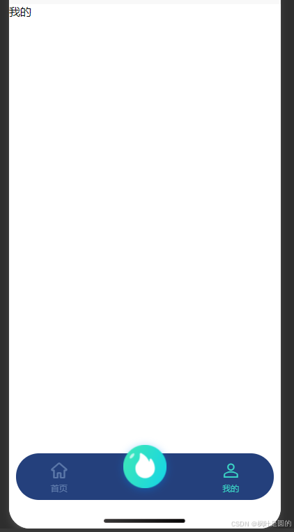
1.效果图
2.代码样式
html
<!-- 底部导航栏 -->
<view class="tabbar_box">
	<uv-tabbar :customStyle="tabbarStyle" :border="false" :fixed="true" iconSize="30" :safeAreaInsetBottom="
		:value="tabbarValue" @change="tabbarChange" activeColor="#3BD8C7" inactiveColor="#C7E3FF59">
		<uv-tabbar-item text="首页" icon="home" name="home"></uv-tabbar-item>
		<!-- 中间按钮突出 -->
		<uv-tabbar-item class="mid-tab-item" name="circle">
			<template v-slot:active-icon>
				<!-- 自定义突出按钮(放在 icon 插槽内) -->
				<view class="mid-btn">
					<image src="../../static/home-img/首页1.png" style="height: 100%; width: 100%;" mode=""></image>
				</view>
			</template>
			<template v-slot:inactive-icon>
				<view class="mid-btn">
					<image src="../../static/home-img/首页1.png" style="height: 100%; width: 100%;" mode=""></image>
				</view>
			</template>
		</uv-tabbar-item>
		<uv-tabbar-item text="我的" icon="account" name="account"></uv-tabbar-item>
	</uv-tabbar>
</view>
css
/* 中间tab项的容器样式(核心) */
		::v-deep .mid-tab-item {
			/* 允许内部按钮超出容器 */
			overflow: visible !important;
			/* 重置默认内边距,避免按钮偏移 */
			padding: 0 !important;
			flex: 1;
			display: flex;
			justify-content: center;
			align-items: center;
		}

		/* 中间突出按钮样式 */
		.mid-btn {
			/* 按钮尺寸,可自定义 */
			width: 120rpx;
			height: 120rpx;
			/* 圆形按钮,强化突出视觉 */
			border-radius: 50%;
			/* 向上突出20px,突破tabbar边界 */
			margin-top: -52rpx;
			/* 阴影增强立体感 */
			box-shadow: 0 2px 12px rgba(0, 136, 255, 0.4);
			/* 防止按钮被点击穿透 */
			position: relative;
			z-index: 99;
		}

		.tabbar_box {
			::v-deep .uv-tabbar__content__item-wrapper {
				height: 136rpx;
			}

			::v-deep .uv-border-top {
				border-color: #11234990 !important;
			}

			::v-deep .uv-tabbar__content {
				justify-content: center !important;
			}

			/* 中间tab项的容器样式(核心) */
			::v-deep .mid-tab-item {
				/* 允许内部按钮超出容器 */
				overflow: visible !important;
				/* 重置默认内边距,避免按钮偏移 */
				padding: 0 !important;
				/* 确保5个tab项宽度均匀 */
				flex: 1;
				display: flex;
				justify-content: center;
				align-items: center;
			}

			/* 重置tabbar默认样式,确保布局均匀 */
			::v-deep .uv-tabbar__item {
				flex: 1;
				display: flex;
				flex-direction: column;
				justify-content: center;
				align-items: center;
			}
		}
javascript
<script setup>
	import {
		ref
	} from 'vue';

	const tabbarValue = ref('home')
	const tabbarStyle = ref({
		'border-radius': '100rpx',
		'background-color': '#24407C',
		'margin': '0 20rpx 80rpx 20rpx',
		'height': '130rpx',
		// 'box-shadow': '0 4rpx 10rpx 0 #336284'
	})
	// 切换底部导航栏--跳转逻辑
	const tabbarChange = (name) => {
		tabbarValue.value = name
		if (name == 'circle') {

		} else if (name == 'account') {

		}
	}
</script>
本文展示了一个自定义底部导航栏的实现方案,通过UV-UI框架开发。核心特点是中间按钮突出效果,采用圆形设计并向上凸出52rpx,配合阴影增强视觉层次。代码实现了三个导航项(首页、中间突出按钮、我的),包含状态切换逻辑和样式定制,包括圆角背景、固定高度和均匀布局。特别处理了中间按钮的容器样式,确保其能突破tabbar边界显示,同时保持整体布局平衡。方案适用于uni-app多端开发环境,兼顾美观性和功能性。
参考组件链接:
Tabbar 底部导航栏 | 我的资料管理-uv-ui 是全面兼容vue3+2、nvue、app、h5、小程序等多端的uni-app生态框架