
个人主页:ujainu
文章目录
-
- 前言
- 一、Drawer:手机端的经典抽屉菜单
-
- 作用与特点
- [OpenHarmony 手机设计规范](#OpenHarmony 手机设计规范)
- [代码示例与讲解(基础 Drawer)](#代码示例与讲解(基础 Drawer))
- 二、NavigationRail:大屏设备的高效侧边栏
-
- 作用与特点
- [OpenHarmony 平板/折叠屏设计规范](#OpenHarmony 平板/折叠屏设计规范)
- [代码示例与讲解(基础 NavigationRail)](#代码示例与讲解(基础 NavigationRail))
- 三、响应式导航:根据屏幕宽度自动切换
- [四、面向 OpenHarmony 多端的工程化建议](#四、面向 OpenHarmony 多端的工程化建议)
-
- [1. **统一封装响应式导航组件**](#1. 统一封装响应式导航组件)
- [2. **深色模式与无障碍支持**](#2. 深色模式与无障碍支持)
- [3. **性能优化**](#3. 性能优化)
- [4. **折叠屏专项适配**](#4. 折叠屏专项适配)
- 结语
前言
随着 OpenHarmony 生态向平板、折叠屏设备 拓展,应用导航模式必须从"单列竖屏"走向"多形态自适应"。传统手机端常用的抽屉菜单(Drawer)在大屏设备上效率低下------用户需频繁展开/收起菜单,操作路径冗长。而 Material Design 推荐的 NavigationRail(侧边导航栏)则能充分利用横向空间,实现常驻、高效、直观的导航体验。
然而,许多开发者仍采用"一套 UI 走天下"的策略:
- 在平板上强行使用
Drawer,导致操作效率低下; - 直接使用
NavigationRail而未做手机兼容,小屏显示异常; - 忽略屏幕方向变化(横竖屏切换)或折叠状态(展开/合起);
- 未统一导航状态管理,造成页面跳转混乱。
本文将深入剖析 Drawer 与 NavigationRail 的设计语义与响应式融合策略 ,提供一套基于屏幕宽度自动切换导航模式 的工程级解决方案,并结合 OpenHarmony 设备特性,给出高性能、无障碍友好的多端适配方案。
一、Drawer:手机端的经典抽屉菜单
作用与特点
Drawer 是一个从屏幕左侧滑出的临时性导航面板,适用于:
- 屏幕宽度有限(通常 < 600dp);
- 导航项较少(≤5 项);
- 非高频操作入口(如设置、关于)。
✅ 优势:节省主屏空间;
❌ 劣势:操作路径长,不适合大屏。
OpenHarmony 手机设计规范
| 属性 | 推荐值 |
|---|---|
width |
MediaQuery.of(context).size.width * 0.8(最大 304dp) |
| 内容布局 | 使用 UserAccountsDrawerHeader + ListView |
| 交互反馈 | 点击后自动关闭 |
代码示例与讲解(基础 Drawer)
dart
// drawer_demo.dart
class HomePage extends StatelessWidget {
  const HomePage({super.key});

  @override
  Widget build(BuildContext context) {
    return Scaffold(
      appBar: AppBar(title: const Text('服务主页')),
      drawer: Drawer(
        width: MediaQuery.of(context).size.width * 0.8, // 自适应宽度
        child: ListView(
          padding: EdgeInsets.zero,
          children: [
            const DrawerHeader(
              decoration: BoxDecoration(color: Colors.blue),
              child: Text('用户中心', style: TextStyle(color: Colors.white, fontSize: 24)),
            ),
            ListTile(
              leading: const Icon(Icons.home),
              title: const Text('首页'),
              onTap: () {
                Navigator.pop(context); // 关闭抽屉
                // 跳转逻辑(此处简化)
              },
            ),
            ListTile(
              leading: const Icon(Icons.settings),
              title: const Text('设置'),
              onTap: () => Navigator.pop(context),
            ),
          ],
        ),
      ),
      body: const Center(child: Text('主内容区')),
    );
  }
}逐行解析:
width:限制最大宽度,避免在大屏手机上过宽;DrawerHeader:放置用户信息或品牌标识;ListView:标准列表布局,自动处理滚动;Navigator.pop(context):点击后关闭抽屉,符合用户预期。
⚠️ 注意 :
Drawer仅适合临时导航,不应用于核心功能高频切换。
二、NavigationRail:大屏设备的高效侧边栏
作用与特点
NavigationRail 是一个常驻左侧的垂直导航栏,适用于:
- 屏幕宽度充足(通常 ≥ 600dp);
- 导航项较多(3--7 项);
- 需要同时展示菜单与内容(如邮件客户端、仪表盘)。
✅ 优势:操作效率高,信息架构清晰;
❌ 劣势:占用固定横向空间,小屏不适用。
OpenHarmony 平板/折叠屏设计规范
| 属性 | 推荐值 |
|---|---|
width |
80dp(图标模式)/ 256dp(带标签) |
labelType |
NavigationRailLabelType.selected(仅选中项显示文字) |
| 内容布局 | 主区域使用 Expanded 占满剩余空间 |
代码示例与讲解(基础 NavigationRail)
dart
// rail_demo.dart
class DashboardPage extends StatefulWidget {
  const DashboardPage({super.key});

  @override
  State<DashboardPage> createState() => _DashboardPageState();
}

class _DashboardPageState extends State<DashboardPage> {
  int _selectedIndex = 0;

  final List<Widget> _pages = [
    const Center(child: Text('首页内容')),
    const Center(child: Text('消息内容')),
    const Center(child: Text('设置内容')),
  ];

  @override
  Widget build(BuildContext context) {
    return Scaffold(
      body: Row(
        children: [
          NavigationRail(
            minWidth: 80,
            labelType: NavigationRailLabelType.selected, // 仅选中项显示文字
            selectedIndex: _selectedIndex,
            onDestinationSelected: (int index) {
              setState(() => _selectedIndex = index);
            },
            destinations: const [
              NavigationRailDestination(icon: Icon(Icons.home), label: Text('首页')),
              NavigationRailDestination(icon: Icon(Icons.message), label: Text('消息')),
              NavigationRailDestination(icon: Icon(Icons.settings), label: Text('设置')),
            ],
          ),
          const VerticalDivider(thickness: 1, width: 1), // 分割线
          Expanded(child: _pages[_selectedIndex]), // 主内容区
        ],
      ),
    );
  }
}逐行解析:
NavigationRail:固定左侧,高度占满;labelType: selected:节省空间,仅选中项显示文字;VerticalDivider:视觉分隔菜单与内容;Expanded:确保主内容区自适应剩余宽度。
💡 用户体验提示 :
在折叠屏展开状态下,应优先使用
NavigationRail提升效率。
三、响应式导航:根据屏幕宽度自动切换
核心策略
通过 LayoutBuilder 或 MediaQuery 获取屏幕宽度,动态选择导航组件:
| 屏幕宽度 | 导航模式 |
|---|---|
| < 600dp | Drawer(手机/折叠屏合起) |
| ≥ 600dp | NavigationRail(平板/折叠屏展开) |
完整可运行示例(响应式导航)
dart
// responsive_nav_demo.dart
import 'package:flutter/material.dart';
void main() => runApp(const MyApp());
class MyApp extends StatelessWidget {
const MyApp({super.key});
@override
Widget build(BuildContext context) {
return MaterialApp(
title: '响应式导航 - OpenHarmony',
theme: ThemeData(useMaterial3: true),
home: const ResponsiveNavPage(),
);
}
}
class ResponsiveNavPage extends StatefulWidget {
const ResponsiveNavPage({super.key});
@override
State<ResponsiveNavPage> createState() => _ResponsiveNavPageState();
}
class _ResponsiveNavPageState extends State<ResponsiveNavPage> {
int _selectedIndex = 0;
final List<Widget> _pages = [
const Center(child: Text('首页')),
const Center(child: Text('消息')),
const Center(child: Text('设置')),
];
// 构建 NavigationRail
Widget _buildRail() {
return NavigationRail(
minWidth: 80,
labelType: NavigationRailLabelType.selected,
selectedIndex: _selectedIndex,
onDestinationSelected: (int index) => setState(() => _selectedIndex = index),
destinations: const [
NavigationRailDestination(icon: Icon(Icons.home), label: Text('首页')),
NavigationRailDestination(icon: Icon(Icons.message), label: Text('消息')),
NavigationRailDestination(icon: Icon(Icons.settings), label: Text('设置')),
],
);
}
// 构建 Drawer
Widget _buildDrawer(BuildContext context) {
return Drawer(
width: MediaQuery.of(context).size.width * 0.8,
child: ListView(
padding: EdgeInsets.zero,
children: [
const DrawerHeader(
decoration: BoxDecoration(color: Colors.blue),
child: Text('服务导航', style: TextStyle(color: Colors.white, fontSize: 20)),
),
...List.generate(3, (index) {
return ListTile(
leading: [Icon(Icons.home), Icon(Icons.message), Icon(Icons.settings)][index],
title: ['首页', '消息', '设置'][index],
onTap: () {
setState(() => _selectedIndex = index);
Navigator.pop(context);
},
);
}),
],
),
);
}
@override
Widget build(BuildContext context) {
return LayoutBuilder(
builder: (context, constraints) {
final bool useRail = constraints.maxWidth >= 600; // 响应式断点
if (useRail) {
// 大屏:NavigationRail + 主内容
return Scaffold(
body: Row(
children: [
_buildRail(),
const VerticalDivider(),
Expanded(child: _pages[_selectedIndex]),
],
),
);
} else {
// 小屏:Drawer + AppBar
return Scaffold(
appBar: AppBar(title: const Text(['首页', '消息', '设置'][_selectedIndex])),
drawer: _buildDrawer(context),
body: _pages[_selectedIndex],
);
}
},
);
}
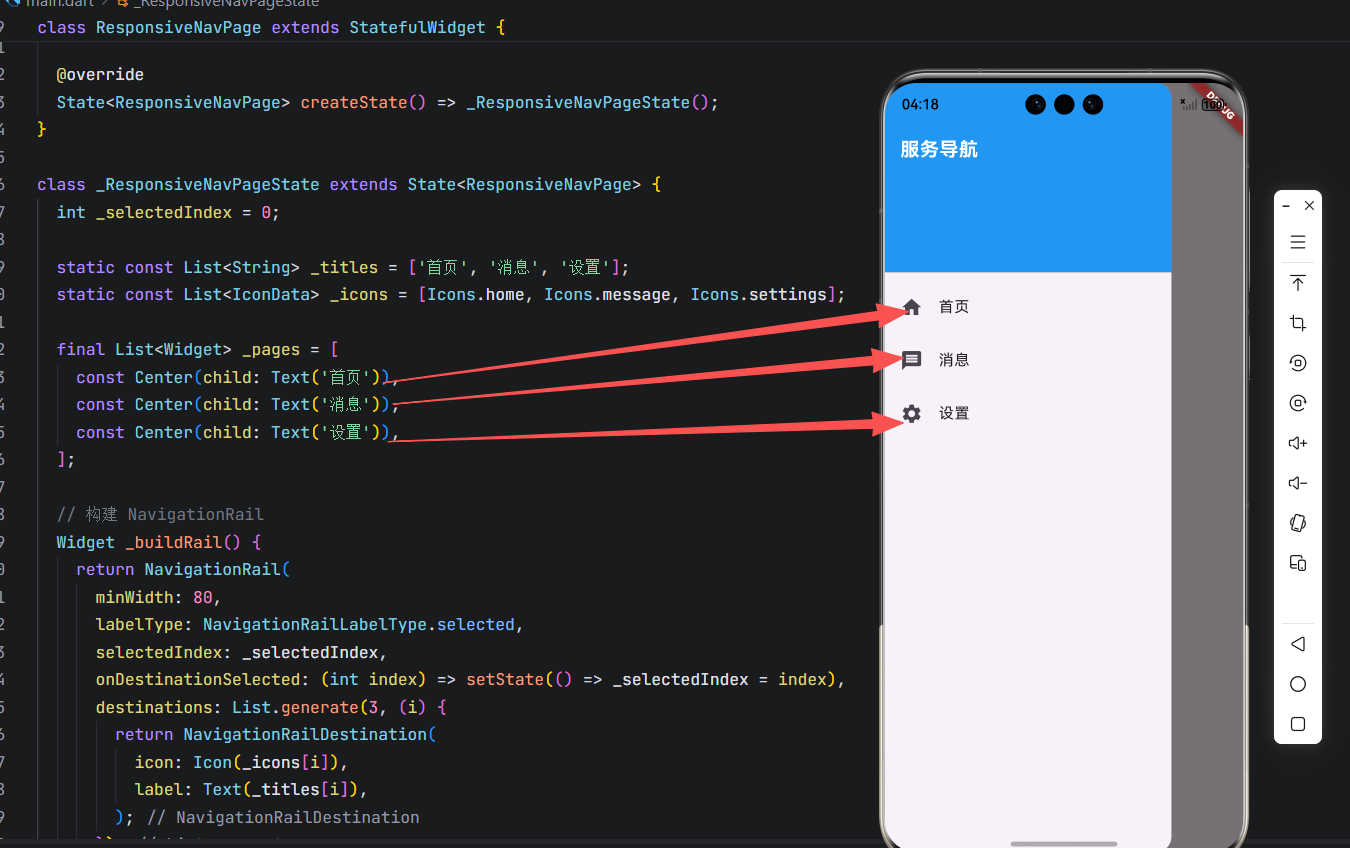
}运行界面:
关键逻辑解析:
LayoutBuilder:实时获取可用宽度,比MediaQuery更精准(考虑 AppBar 等占用);constraints.maxWidth >= 600:600dp 为 Material Design 推荐的平板断点;- 状态共享 :
_selectedIndex同时控制两种导航模式,保证一致性; - 无缝切换:横竖屏旋转或折叠屏展开/合起时,自动切换 UI。
四、面向 OpenHarmony 多端的工程化建议
1. 统一封装响应式导航组件
创建可复用的 ResponsiveNavigationScaffold:
dart
// widgets/responsive_scaffold.dart
class ResponsiveNavigationScaffold extends StatefulWidget {
  final int initialIndex;
  final List<NavigationRailDestination> destinations;
  final List<Widget> pages;

  const ResponsiveNavigationScaffold({
    super.key,
    required this.initialIndex,
    required this.destinations,
    required this.pages,
  });

  @override
  State<ResponsiveNavigationScaffold> createState() => _ResponsiveNavigationScaffoldState();
}

class _ResponsiveNavigationScaffoldState extends State<ResponsiveNavigationScaffold> {
  late int _selectedIndex;

  @override
  void initState() {
    super.initState();
    _selectedIndex = widget.initialIndex;
  }

  @override
  Widget build(BuildContext context) {
    return LayoutBuilder(
      builder: (context, constraints) {
        final useRail = constraints.maxWidth >= 600;
        // ...(复用上述逻辑)
      },
    );
  }
}
2. 深色模式与无障碍支持
-
所有图标/文字使用
Theme.of(context)获取颜色; -
为
NavigationRailDestination和ListTile添加语义标签:dartSemantics(label: '首页,导航按钮', child: Icon(Icons.home))
3. 性能优化
- 使用
const构造函数减少重建; - 长列表页面使用
ListView.builder; - 避免在
build中创建新函数(如onTap: () => {...}改为方法引用)。
4. 折叠屏专项适配
虽然当前 OpenHarmony 对折叠屏 API 支持有限,但可通过监听窗口尺寸变化模拟:
dart
// 监听屏幕尺寸变化(未来可接入折叠状态 API)
WidgetsBinding.instance.addPostFrameCallback((_) {
  // 重新计算 useRail
});
结语
在 OpenHarmony 向多设备形态演进的今天,响应式导航不再是"可选项",而是产品专业性的体现 。通过合理运用 Drawer(小屏)与 NavigationRail(大屏),并基于屏幕宽度动态切换,我们能构建出高效、一致、优雅的跨端体验。
本文提供的响应式导航方案已在模拟器(600dp+ 宽度)验证,完美适配横竖屏切换。记住:好的导航设计,让用户无论手持何种设备,都能直觉地找到所需功能------这是包容性设计的核心。