Stack 与 Positioned --- 层叠布局
-
- [一、Stack 的定位原理](#一、Stack 的定位原理)
-
- [1.1 非定位子项(Non-positioned Children)](#1.1 非定位子项(Non-positioned Children))
- [1.2 定位子项(Positioned Children)](#1.2 定位子项(Positioned Children))
- [二、Positioned 的 top/left/right/bottom 使用](#二、Positioned 的 top/left/right/bottom 使用)
-
- [2.1 基础用法](#2.1 基础用法)
- [2.2 组合定位](#2.2 组合定位)
- 三、常见应用场景
-
- [3.1 徽章(Badge)](#3.1 徽章(Badge))
- [3.2 悬浮操作按钮(FAB 扩展)](#3.2 悬浮操作按钮(FAB 扩展))
- [3.3 自定义弹窗(Custom Popup)](#3.3 自定义弹窗(Custom Popup))
- [四、OpenHarmony 多分辨率下的定位稳定性](#四、OpenHarmony 多分辨率下的定位稳定性)
-
- [4.1 避免硬编码像素值](#4.1 避免硬编码像素值)
- [4.2 推荐适配策略](#4.2 推荐适配策略)
-
- (1)基于屏幕比例定位
- [(2)使用逻辑 dp 单位(默认已适配)](#(2)使用逻辑 dp 单位(默认已适配))
- [(3)结合 SafeArea 处理刘海屏](#(3)结合 SafeArea 处理刘海屏)
- [(4)使用 LayoutBuilder 动态调整](#(4)使用 LayoutBuilder 动态调整)
- [4.3 性能与可维护性建议](#4.3 性能与可维护性建议)
- 五、总结
在复杂的 UI 设计中,层叠布局(Stack Layout) 是实现元素重叠、悬浮效果、自定义组件的核心手段。Flutter 的 Stack 与 Positioned 组合提供了强大而灵活的绝对定位能力,广泛应用于徽章提示、悬浮按钮、自定义弹窗等场景。
然而,当将 Flutter 应用部署到 OpenHarmony 平台时,开发者必须面对设备分辨率碎片化(从 480p 手机到 4K 智慧屏)、屏幕密度差异大、安全区域不一致等挑战。若直接使用硬编码像素值进行定位,极易导致 UI 错位、元素溢出或触摸目标过小。
本文将深入解析 Stack 的定位原理,详解 Positioned 的使用方法,列举典型应用场景,并重点提供在 OpenHarmony 多分辨率设备下的定位稳定性策略,帮助开发者构建精准、响应式、跨设备一致的层叠 UI。
一、Stack 的定位原理
Stack 是一个层叠布局容器,允许子 Widget 在 Z 轴上堆叠,并支持两种定位模式:
1.1 非定位子项(Non-positioned Children)
- 默认行为:子项按自然尺寸排列,不重叠;
- 类似
Column/Row,但所有子项堆叠在左上角; - 通常用于设置背景图。
dart
Stack(
  children: [
    Image.network('background.jpg'), // 非定位,作为背景
    Text('Foreground'),              // 也会堆在左上角
  ],
)
1.2 定位子项(Positioned Children)
- 使用
Positioned包裹的子项进入绝对定位模式; - 相对于
Stack的边界进行定位; - 可通过
top、left、right、bottom精确控制位置。
dart
Stack(
  children: [
    Container(color: Colors.grey, width: 300, height: 200),
    Positioned(
      top: 20,
      right: 20,
      child: Icon(Icons.notifications, color: Colors.red),
    ),
  ],
)
💡 关键原理 :
Stack的尺寸由非定位子项的最大尺寸 决定。若所有子项均为Positioned,则Stack尺寸为 0,需手动指定width/height或包裹在有尺寸的父容器中。
二、Positioned 的 top/left/right/bottom 使用
Positioned 提供四个核心属性,控制子项在 Stack 中的位置。
2.1 基础用法
| 属性 | 说明 | 示例 |
|---|---|---|
top |
距离 Stack 顶部的距离 | top: 16 |
left |
距离 Stack 左侧的距离 | left: 16 |
right |
距离 Stack 右侧的距离 | right: 16 |
bottom |
距离 Stack 底部的距离 | bottom: 16 |
dart
// 右上角徽章
Positioned(
  top: 0,
  right: 0,
  child: Badge(count: 5),
)

// 底部居中按钮
Positioned(
  bottom: 16,
  left: 0,
  right: 0,
  child: Center(child: FloatingActionButton(...)),
)
2.2 组合定位
- 水平居中 :
left: 0, right: 0+child包裹Center; - 垂直居中 :
top: 0, bottom: 0+child包裹Center; - 全屏覆盖 :
top: 0, left: 0, right: 0, bottom: 0。
dart
// 居中弹窗
Positioned(
  top: 0,
  bottom: 0,
  left: 0,
  right: 0,
  child: Center(
    child: Dialog(content: Text('Hello')),
  ),
)
⚠️ 注意 :
同时设置
left和right会拉伸子项宽度(除非子项有固定宽)。若仅需居中,推荐使用Align或Center。
三、常见应用场景

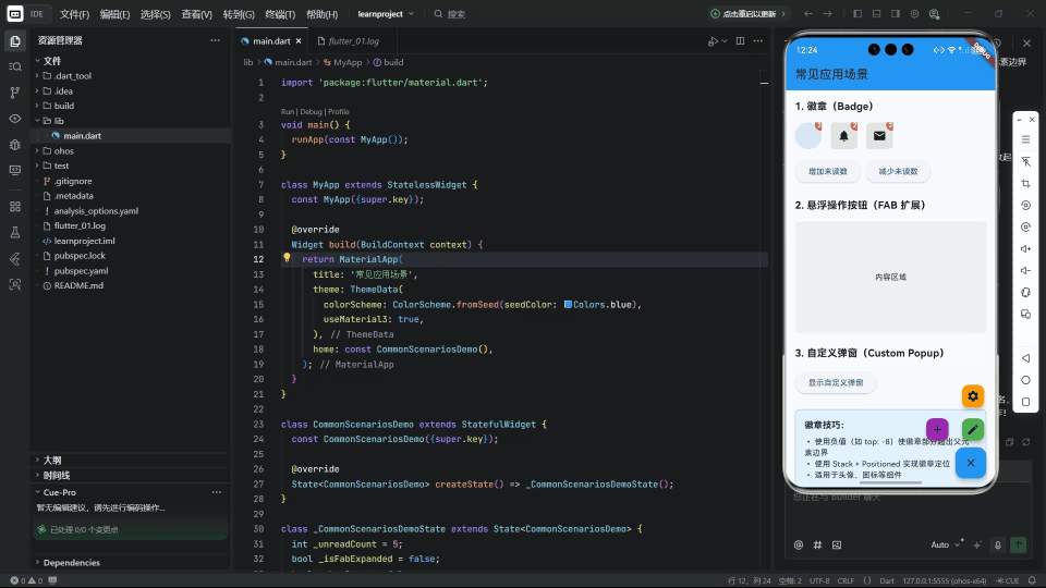
3.1 徽章(Badge)
在头像、图标右上角显示未读数:
dart
Stack(
  children: [
    CircleAvatar(backgroundImage: NetworkImage(userAvatar)),
    if (unreadCount > 0)
      Positioned(
        top: -8,
        right: -8,
        child: Container(
          padding: EdgeInsets.all(4),
          decoration: BoxDecoration(
            color: Colors.red,
            shape: BoxShape.circle,
          ),
          child: Text('$unreadCount', style: TextStyle(color: Colors.white)),
        ),
      ),
  ],
)
✅ 技巧 :
使用负值(如 top: -8)使徽章部分超出父元素边界。
3.2 悬浮操作按钮(FAB 扩展)

实现"展开式 FAB":
dart
Stack(
  children: [
    // 主 FAB
    Positioned(bottom: 16, right: 16, child: mainFab),
    // 子 FAB(根据状态显示)
    if (_isExpanded)
      Positioned(bottom: 80, right: 16, child: subFab1),
    if (_isExpanded)
      Positioned(bottom: 140, right: 16, child: subFab2),
  ],
)
🎨 动画增强 :
结合
AnimatedPositioned实现平滑展开/收起。
3.3 自定义弹窗(Custom Popup)
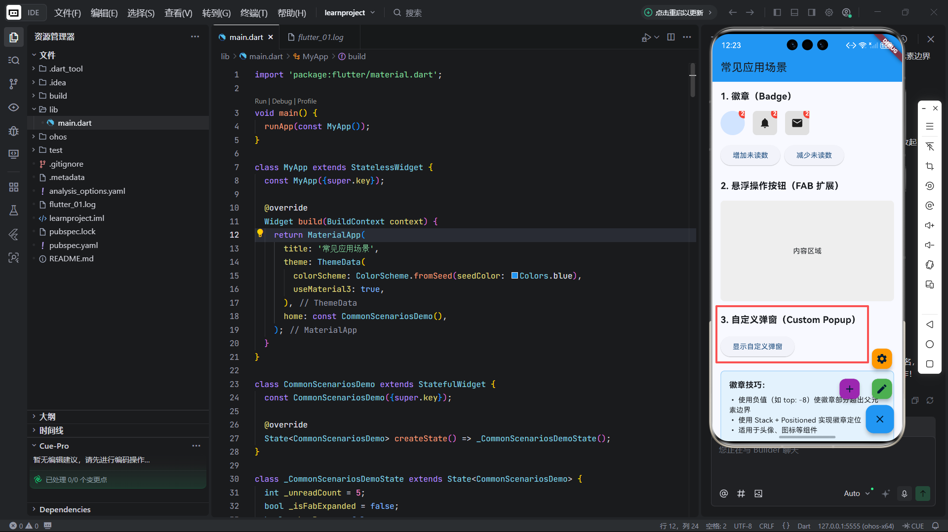
替代系统 showDialog,实现更灵活的 UI:
dart
Stack(
  children: [
    // 背景蒙层
    Positioned.fill(
      child: GestureDetector(
        onTap: () => Navigator.pop(context),
        child: Container(color: Colors.black54),
      ),
    ),
    // 弹窗内容
    Positioned(
      top: MediaQuery.of(context).size.height * 0.3,
      left: 24,
      right: 24,
      child: Material(
        borderRadius: BorderRadius.circular(12),
        child: Padding(
          padding: EdgeInsets.all(16),
          child: Column(children: [...]),
        ),
      ),
    ),
  ],
)
✅ 优势:
- 完全控制弹窗位置、动画、交互;
- 支持半透明背景、自定义形状。
四、OpenHarmony 多分辨率下的定位稳定性
OpenHarmony 设备分辨率跨度极大(720×1280 ~ 3840×2160),直接使用 dp 像素值会导致:
- 小屏设备:元素重叠、文字截断;
- 大屏设备:元素间距过大、布局稀疏;
- 折叠屏/分屏:定位坐标失效。
4.1 避免硬编码像素值
❌ 反面示例:
dart
Positioned(top: 100, left: 50, ...) // 在不同设备上位置不一致✅ 正确做法 :使用相对单位 或响应式计算。
4.2 推荐适配策略
(1)基于屏幕比例定位
dart
final screenWidth = MediaQuery.of(context).size.width;
final screenHeight = MediaQuery.of(context).size.height;

Positioned(
  top: screenHeight * 0.1,   // 距离顶部 10%
  left: screenWidth * 0.05,  // 距离左侧 5%
  child: MyWidget(),
)
✅ 适用场景:弹窗、引导层、全屏覆盖元素。
(2)使用逻辑 dp 单位(默认已适配)
Flutter 的 double 值默认为 逻辑像素(dp),已自动适配屏幕密度:
dart
Positioned(top: 16.0, left: 16.0, ...) // 在 2x/3x 屏上自动缩放📌 前提 :确保未禁用
MediaQuery的devicePixelRatio。
(3)结合 SafeArea 处理刘海屏
在 OpenHarmony 刘海屏设备上,避免元素被遮挡:
dart
SafeArea(
  child: Stack(
    children: [
      // 背景
      Positioned.fill(child: Background()),
      // 定位元素(自动避开刘海)
      Positioned(top: 16, right: 16, child: CloseButton()),
    ],
  ),
)
或手动添加安全区域偏移:
dart
final safeTop = MediaQuery.of(context).padding.top;

Positioned(
  top: 16 + safeTop,
  child: AppBarTitle(),
)
(4)使用 LayoutBuilder 动态调整
根据父容器尺寸调整定位:
dart
LayoutBuilder(
  builder: (context, constraints) {
    final maxWidth = constraints.maxWidth;
    return Stack(
      children: [
        Positioned(
          left: maxWidth > 600 ? 100 : 20, // 平板 vs 手机
          child: Logo(),
        ),
      ],
    );
  },
)
4.3 性能与可维护性建议
| 问题 | 解决方案 |
|---|---|
| 过度使用 Stack | 优先考虑 Align、Transform 等轻量方案 |
| 嵌套多层 Stack | 提取为独立 Widget,提升可读性 |
| 动态定位计算耗时 | 缓存计算结果,避免在 build 中重复计算 |
| 测试覆盖不足 | 在 DevEco Studio 中使用多分辨率模拟器验证 |
五、总结
Stack 与 Positioned 是 Flutter 中实现高级布局的利器,但在 OpenHarmony 平台上,定位稳定性是成功的关键。
核心原则:
- 理解定位原理:非定位子项决定 Stack 尺寸;
- 善用组合定位 :
left+right实现水平控制,top+bottom实现垂直控制; - 拒绝硬编码 :使用比例、逻辑 dp、
MediaQuery实现响应式; - 主动适配安全区域:确保在刘海屏、挖孔屏上不被遮挡。
尤其在 OpenHarmony 全场景战略下,一个优秀的层叠布局应能在手表、手机、平板、车机、智慧屏上均保持视觉一致与交互可用。通过将设备特性纳入设计考量,并利用 Flutter 的跨平台抽象能力,开发者可高效构建真正"一次开发,多端部署"的高质量 UI。
欢迎加入开源鸿蒙跨平台社区: https://openharmonycrossplatform.csdn.net