CSS又叫层叠样式表,是用于控制网页在浏览器中的显示外观的标记语言,核心作用是实现内容与样式的分离,让网页结构更清晰、样式维护更高效。通过CSS可以实现样式美化、布局定位、动画交互。
CSS分类
根据CSS书写位置的不同,可以分为三大类:
1.内联样式表(行内样式表),样式写在标签内部,可以控制当前标签的样式,特殊情况使用
2.内部样式表,写在<head>标签中,可以控制当前页面的所有标签,较为常用
html
<!DOCTYPE html>
<html lang="en">

<head>
    <meta charset="UTF-8">
    <meta name="viewport" content="width=device-width, initial-scale=1.0">
    <title>Hello Page</title>
    <!-- 2.内部样式表 -->
    <style>
        div {
            color: blue;
        }

        strong {
            color: red;
        }
    </style>
</head>

<body>
    <!-- 1.内联样式表 -->
    <h1 style="color:aquamarine;">Hello, World!</h1>
    <p>Welcome to the Hello Page.</p>
    <div>This text is blue.</div>
    <strong>This text is red.</strong>
</body>

</html>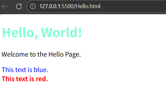
3.外部样式表,单独新建一个CSS文件,完全脱离结构,可以控制整个网站的所有标签,最常用
CSS文件可能很多,所以一般是新建一个CSS文件夹(按下图结构构建文件夹)
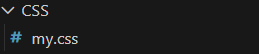
my.css
css
div {
    color: blueviolet;
}
hello.html
css
<!DOCTYPE html>
<html lang="en">

<head>
    <meta charset="UTF-8">
    <meta name="viewport" content="width=device-width, initial-scale=1.0">
    <title>Hello Page</title>
    <!-- 外部样式表,通过link标签引入 -->
    <link rel="stylesheet" href="CSS/my.css">
</head>

<body>
    <div>Hello, World!</div>
</body>

</html>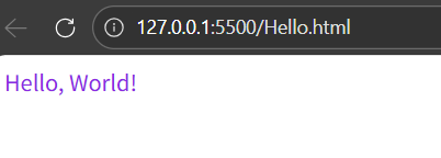
CSS选择器
CSS选择器是选择HTML元素的方式。根据使用场景的不同,分为以下几种类型:
基础选择器
基础选择器是由单个选择器组成的,常见的有:类型选择器、类选择器、id选择器、通配符选择器
类型选择器
也称为标签选择器,选择某个类型的元素,如
css
div {
  color: gold;
}
CSS层叠性
如果给同一类标签加了两个不同的样式,后者覆盖前者,是"层叠性"的体现
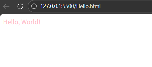
类选择器(最常用,优先使用)
类选择器可以选择1个或多个元素,可使用多次
html
<!DOCTYPE html>
<html lang="en">

<head>
    <meta charset="UTF-8">
    <meta name="viewport" content="width=device-width, initial-scale=1.0">
    <title>Hello Page</title>
    <style>
        /* CSS通过".类名",进行样式声明 */
        .pink {
            color: pink;
        }
    </style>
</head>

<body>
    <!-- html通过class属性引用CSS样式类 -->
    <div class="pink">Hello, World!</div>
</body>

</html>
聪明的小朋友又发现了,CSS语言的注释是/* */,也可以通过ctrl+/快速注释
引用多类名,使用空格分隔
html
<!DOCTYPE html>
<html lang="en">

<head>
    <meta charset="UTF-8">
    <meta name="viewport" content="width=device-width, initial-scale=1.0">
    <title>Hello Page</title>
    <style>
        .pink {
            color: pink;
        }

        .sub-nav {
            font-size: 20px;
        }
    </style>
</head>

<body>
    <!-- html通过class属性引用CSS样式类 -->
    <div class="pink sub-nav">Hello, World!</div>
</body>

</html>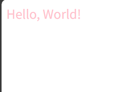
id选择器
选择HTML中具有特定id属性的唯一元素,只能使用一次(后期主要用于配合JavaScript添加交互效果)
html
<!DOCTYPE html>
<html lang="en">

<head>
    <meta charset="UTF-8">
    <meta name="viewport" content="width=device-width, initial-scale=1.0">
    <title>Hello Page</title>
    <style>
        /* 使用#id名进行样式声明 */
        #pink {
            color: pink;
        }
    </style>
</head>

<body>
    <!-- html通过id属性调用 -->
    <div id="pink">Hello, World!</div>
</body>

</html>
通配符选择器
可以选择HTML中所有的标签进行样式修改
html
<!DOCTYPE html>
<html lang="en">

<head>
    <meta charset="UTF-8">
    <meta name="viewport" content="width=device-width, initial-scale=1.0">
    <title>Hello Page</title>
    <style>
        /* *代表所有的意思 */
        * {
            color: red;
        }
    </style>
</head>

<body>
    <div>Hello, World!</div>
    <p>This is a sample paragraph.</p>
</body>

</html>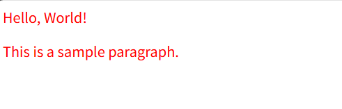
关系选择器
关系选择器通过位置关系来选择目标元素,可以精准选择某些元素
由两个/两个以上的标签组成
后代选择器(最重要)
选择某个元素的所有后代元素(子元素、孙元素......)
html
<!DOCTYPE html>
<html lang="en">

<head>
    <meta charset="UTF-8">
    <meta name="viewport" content="width=device-width, initial-scale=1.0">
    <title>Hello Page</title>
    <style>
        /* 选择div标签里的p元素修改样式 */
        div p {
            color: red;
        }

        /* 父级和子集可以是任意选择器 */
        .footer a {
            color: green;
        }
    </style>
</head>

<body>
    <div>
        <p>Hello, World!</p>
        <p>Welcome to the Hello Page.</p>
    </div>
    <p>This is a sample paragraph outside the div.</p>
    <div class="footer">
        <a href="#">Footer Link</a>
        <a href="#">Another Footer Link</a>
    </div>
</body>

</html>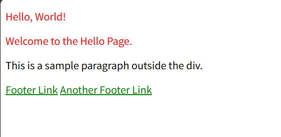
子代选择器
选择某个元素的直接子元素
html
<!DOCTYPE html>
<html lang="en">

<head>
    <meta charset="UTF-8">
    <meta name="viewport" content="width=device-width, initial-scale=1.0">
    <title>Hello Page</title>
    <style>
        /* 通过>分隔 */
        div>span {
            color: red;
        }
    </style>
</head>

<body>
    <div>
        <span>我是儿子</span>
        <p>
            <span>我是孙子</span>
        </p>
    </div>
</body>

</html>
兄弟选择器
邻接兄弟选择器:如h2+p,选择紧跟在h2后面的第一个p元素(同级元素)
通用兄弟选择器:如h2~p,选择紧跟在h2后面的所有p元素
某些特殊渲染场景下会用
html
<!DOCTYPE html>
<html lang="en">

<head>
    <meta charset="UTF-8">
    <meta name="viewport" content="width=device-width, initial-scale=1.0">
    <title>Hello Page</title>
    <style>
        div+p {
            color: red;
        }

        h2~p {
            color: green;
        }
    </style>
</head>

<body>
    <div>
        <p>Hello, World!</p>
        <p>Welcome to the Hello Page.</p>
        <h2>
            <p>This is a heading inside a paragraph tag.</p>
        </h2>
        <p>Final paragraph outside the heading.</p>
        <p>One more paragraph inside the div.</p>
    </div>
    <p>Paragraph outside the div.</p>
    <p>Another paragraph outside the div.</p>

</body>

</html>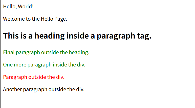
分组选择器
又叫并集选择器,可以将不同的选择器组合在一起,使用逗号分隔
html
<!DOCTYPE html>
<html lang="en">

<head>
    <meta charset="UTF-8">
    <meta name="viewport" content="width=device-width, initial-scale=1.0">
    <title>Hello Page</title>
    <style>
        p,
        div {
            color: brown;
        }
    </style>
</head>

<body>
    <div>这是一个文本</div>
    <p>这也是一个文本</p>
</body>

</html>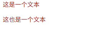
伪类选择器
选择元素的特定状态或结构位置,用冒号分隔
状态伪类
链接伪类
用于根据链接的不同状态(未访问、悬停、点击等)为其添加样式,从而提升用户体验和界面交互性(顺序必须按照link,visted,hover,active,否则失效)
html
<!DOCTYPE html>
<html lang="en">

<head>
    <meta charset="UTF-8">
    <meta name="viewport" content="width=device-width, initial-scale=1.0">
    <title>Hello Page</title>
    <style>
        /* 未访问链接 */
        a:link {
            color: red;
            text-decoration: none;
        }

        /* 已访问链接 */
        a:visited {
            color: aquamarine;
        }

        /* 鼠标悬停链接 */
        a:hover {
            color: brown;
            text-decoration: underline;
        }

        /* 点击链接 */
        a:active {
            color: blue;
        }
    </style>
</head>

<body>
    <a href="#">deepseek一下</a>
    <a href="#">产品介绍</a>
    <a href="#">联系方式</a>

</body>

</html>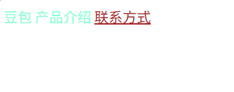
用户行为伪类
用户以某种方式和网页交互的时候应用
html
<!DOCTYPE html>
<html lang="en">

<head>
    <meta charset="UTF-8">
    <meta name="viewport" content="width=device-width, initial-scale=1.0">
    <title>Hello Page</title>
    <style>
        .box {
            width: 100px;
            height: 100px;
            background-color: pink;
            text-align: center;
        }

        /* 鼠标经过元素时,修改样式 */
        .box:hover {
            background-color: aquamarine;
            color: blue;
        }

        /* 表单获得焦点时 */
        .search:focus {
            background-color: antiquewhite;
        }
    </style>
</head>

<body>
    <div class="box">文字</div>
    <input type="text" class="search">
</body>

</html>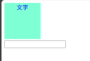
结构伪类
根据元素的位置选择目标元素,可以是关键字也可以是公式
html
<!DOCTYPE html>
<html lang="en">

<head>
    <meta charset="UTF-8">
    <meta name="viewport" content="width=device-width, initial-scale=1.0">
    <title>Hello Page</title>
    <style>
        /* 选择第一个 */
        ul li:first-child {
            color: brown;
        }
        /* 选择第二个 */
        ul li:nth-child(2) {
            color: aquamarine;
        }
    </style>
</head>

<body>
    <ul>
        <li>第一个</li>
        <li>第二个</li>
        <li>第三个</li>
    </ul>
</body>

</html>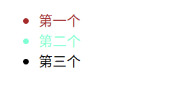
表单伪类
针对表单元素的状态
html
<!DOCTYPE html>
<html lang="en">

<head>
    <meta charset="UTF-8">
    <meta name="viewport" content="width=device-width, initial-scale=1.0">
    <title>Hello Page</title>
    <style>
        button {
            width: 250px;
            height: 80px;
            background: #ff6900;
            color: aliceblue;
            font-size: 18px;
        }

        /* 1.表单按钮禁用时调整颜色 */
        button:disabled {
            background: #ccc;
        }

        /* 2.复选框选中修改样式 */
        /* 单选框被选中,修改紧跟的label的颜色 */
        input:checked+label {
            color: #ff6900;
        }
    </style>
</head>

<body>
    <button disabled>注册</button>
    <br>
    <input type="checkbox" id="agree">
    <label for="agree">同意注册协议</label>
</body>

</html>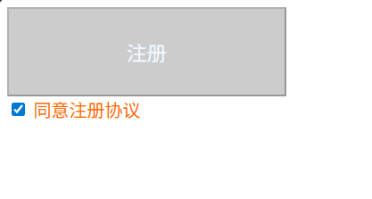
伪元素选择器
选择元素的特定部分,使用双冒号
html
<!DOCTYPE html>
<html lang="en">

<head>
    <meta charset="UTF-8">
    <meta name="viewport" content="width=device-width, initial-scale=1.0">
    <title>Hello Page</title>
    <style>
        /* 选择首行 */
        p::first-line {
            color: brown;
        }

        /* 选择首字母 */
        P::first-letter {
            color: red;
            font-size: 28px;
        }

        /* 让表单里面的placehoder文字变颜色 */
        textarea::placeholder {
            color: brown;
            font-size: 12px;
        }

        /* 元素内插入伪元素,作为第一个元素 */
        div::before {
            content: '我是';
            color: aquamarine;
        }

        /* 元素内插入伪元素,作为最后一个元素 */
        div::after {
            content: "人";
            color: aquamarine;
        }
    </style>
</head>

<body>
    <p>《绿皮书》讲得是一个黑人钢琴家和他的白人司机在美国南部巡演的故事。故事发生在20世纪60年代,当时美国南部的种族隔离政策依然存在。黑人钢琴家唐·雪利(Don Shirley)雇佣了意大利裔美国人托尼·利普(Tony
        Lip)作为他的司机和保镖。两人在旅途中经历了许多挑战和困难,但也逐渐建立了深厚的友谊。</p>
    <textarea name="" placeholder="请您留言"></textarea>
    <div class="box">一个</div>
</body>

</html>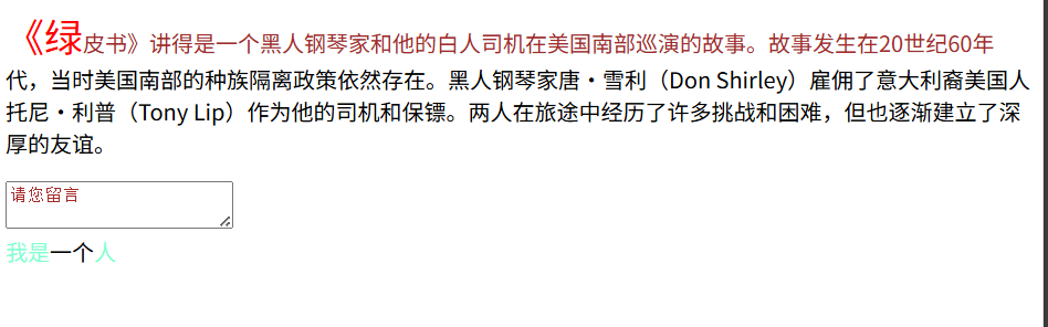
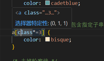
属性选择器
根据元素的属性特征来精准定位元素
html
<!DOCTYPE html>
<html lang="en">

<head>
    <meta charset="UTF-8">
    <meta name="viewport" content="width=device-width, initial-scale=1.0">
    <title>Hello Page</title>
    <style>
        /* 选择包含指定属性的元素(选择有class属性的a标签) */
        a[class] {
            color: brown;
        }

        /* 选择属性等于指定值的元素 */
        a[class="font"] {
            color: aqua;
        }

        /* 匹配属性值以指定字符串开头的元素 */
        a[class^="font1"] {
            color: blueviolet;
        }

        /* 匹配属性值以指定字符串结尾的元素 */
        a[class$="2"] {
            color: cadetblue;
        }

        /* 匹配属性值任意位置包含指定子串的元素 */
        a[class*=3] {
            color: bisque;
        }

        /* 去掉轮廓线 */
        input[type="text"],
        input[type="password"] {
            outline: none;
        }
    </style>
</head>

<body>
    <a href="#">文字</a><br>
    <a href="#" class="font">文字</a><br>
    <a href="#" class="font1">文字</a><br>
    <a href="#" class="font11">文字</a><br>
    <a href="#" class="font2">文字</a><br>
    <a href="#" class="font3">文字</a><br>
    <input type="text">
    <input type="password">
    <input type="checkbox">
    <input type="radio">
</body>

</html>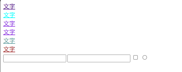
CSS文本样式
CSS文本样式用于控制网页中文字的外观,包括字体、颜色、对齐、间距等
字体样式
字体颜色
通过color属性进行设置,它的值可为关键字(如"red")、十六进制(如"#FF0000")、rgb格式(rgb(255,0,0),另有rgb(255,0,0,0.3)最后一个值为0则是完全透明,1则是完全不透明)
html
<!DOCTYPE html>
<html lang="en">

<head>
    <meta charset="UTF-8">
    <meta name="viewport" content="width=device-width, initial-scale=1.0">
    <title>Hello Page</title>
    <style>
        .pink {
            color: pink;
        }

        .color16 {
            color: #FF69B4;
        }

        .rgb {
            color: rgb(255, 105, 180);
        }

        .rgba {
            color: rgba(255, 105, 180, 0.5);
        }
    </style>
</head>

<body>
    <p class="pink">关键字粉色</p>
    <p class="color16">十六进制粉色</p>
    <p class="rgb">rgb粉色</p>
    <p class="rgba">rgb半透明粉色</p>
</body>

</html>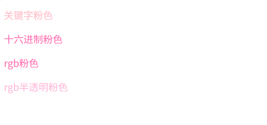
字体族
给定一个有先后顺序的,由字体名或字体族名组成的列表来为选定的元素设置字体
浏览器会选择列表中第一个计算机有安装的字体展示
html
<!DOCTYPE html>
<html lang="en">

<head>
    <meta charset="UTF-8">
    <meta name="viewport" content="width=device-width, initial-scale=1.0">
    <title>Hello Page</title>
    <style>
        .font {
            font-family: 黑体, 宋体, Arial, sans-serif;
        }
    </style>
</head>

<body>
    <p class="font">你好</p>
    <div>这是一个测试文本。</div>
</body>

</html>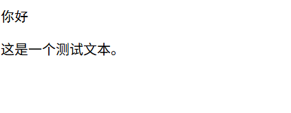
字体大小
通过font-size可以设置字体大小,px是CSS像素(CSS中用于定义长度、尺寸的单位)
html
<!DOCTYPE html>
<html lang="en">

<head>
    <meta charset="UTF-8">
    <meta name="viewport" content="width=device-width, initial-scale=1.0">
    <title>Hello Page</title>
    <style>
        body {
            font-size: 50px;
        }
    </style>
</head>

<body>
    <p>你好</p>
    <div>这是一个测试文本。</div>
</body>

</html>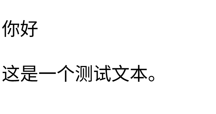
字体风格
通过font-style用来打开和关闭文本斜体
html
<!DOCTYPE html>
<html lang="en">

<head>
    <meta charset="UTF-8">
    <meta name="viewport" content="width=device-width, initial-scale=1.0">
    <title>Hello Page</title>
    <style>
        .i {
            font-style: italic;
        }

        .n {
            font-style: normal;
        }
    </style>
</head>

<body>
    <p class="i">你好</p>
    <em class="n">Hello</em>
</body>

</html>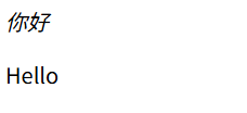
字体粗体
通过font-weight设置文字的粗细
html
<!DOCTYPE html>
<html lang="en">

<head>
    <meta charset="UTF-8">
    <meta name="viewport" content="width=device-width, initial-scale=1.0">
    <title>Hello Page</title>
    <style>
        .normal {
            font-weight: normal;
        }

        .bold {
            font-weight: bold;
        }

        .my {
            font-weight: 5;
        }
    </style>
</head>

<body>
    <h2 class="normal">不加粗标题</h2>
    <p class="bold">粗体</p>
    <div class="bold">这是一个div元素</div>
    <p class="my">我子集设置</p>
</body>

</html>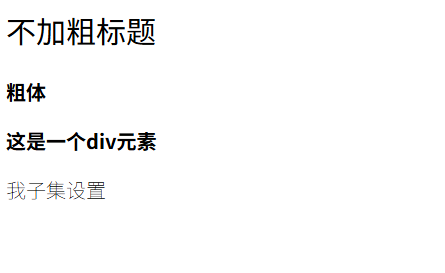
字体装饰
设置/取消字体上的文本装饰
html
<!DOCTYPE html>
<html lang="en">

<head>
    <meta charset="UTF-8">
    <meta name="viewport" content="width=device-width, initial-scale=1.0">
    <title>Hello Page</title>
    <style>
        a {
            text-decoration: none;
        }

        .uline {
            text-decoration: underline;
        }

        .oline {
            text-decoration: overline;
        }

        .linet {
            text-decoration: line-through;
        }
    </style>
</head>

<body>
    <a href="#">链接可以使用none取消下划线</a>
    <p class="uline">可以使用underline添加下划线</p>
    <p class="oline">可以使用overline添加上划线</p>
    <p class="linet">可以使用line-through删除线</p>
</body>

</html>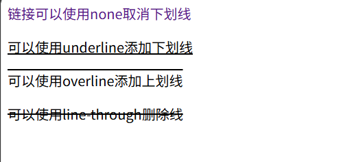
文本布局
文本布局text-align
控制文本在它所在的块级盒子内如何水平对齐
html
<!DOCTYPE html>
<html lang="en">

<head>
    <meta charset="UTF-8">
    <meta name="viewport" content="width=device-width, initial-scale=1.0">
    <title>Hello Page</title>
    <style>
        .box {
            width: 200px;
            height: 200px;
            background-color: lightgray;
            text-align: center;
        }

        p {
            /* 两端对齐 */
            text-align: justify;
        }
    </style>
</head>

<body>
    <div class="box">电影</div>
    <p>《绿皮书》讲得是一个黑人钢琴家和他的白人司机在美国南部巡演的故事。故事发生在20世纪60年代,当时美国南部的种族隔离政策依然存在。黑人钢琴家唐·雪利(Don Shirley)雇佣了意大利裔美国人托尼·利普(Tony
        Lip)作为他的司机和保镖。两人在旅途中经历了许多挑战和困难,但也逐渐建立了深厚的友谊。</p>
</body>

</html>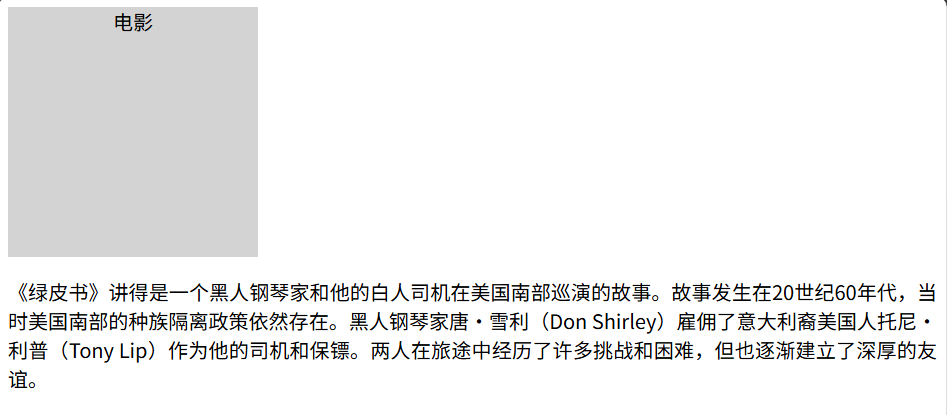
首行缩进text-indent
设置块级元素内文本行前面空格的长度
em是相对单位,1em扽与当前元素的字体大小,如果当前元素没有大小,则按照父元素文字大小
也可以用px像素大小
html
<!DOCTYPE html>
<html lang="en">

<head>
    <meta charset="UTF-8">
    <meta name="viewport" content="width=device-width, initial-scale=1.0">
    <title>Hello Page</title>
    <style>
        p {
            text-indent: 2em;
        }
    </style>
</head>

<body>
    <p>《绿皮书》讲得是一个黑人钢琴家和他的白人司机在美国南部巡演的故事。故事发生在20世纪60年代,当时美国南部的种族隔离政策依然存在。黑人钢琴家唐·雪利(Don Shirley)雇佣了意大利裔美国人托尼·利普(Tony
        Lip)作为他的司机和保镖。两人在旅途中经历了许多挑战和困难,但也逐渐建立了深厚的友谊。</p>
</body>

</html>
字间距letter-spacing
用于设置文本字符的间距
html
<!DOCTYPE html>
<html lang="en">

<head>
    <meta charset="UTF-8">
    <meta name="viewport" content="width=device-width, initial-scale=1.0">
    <title>Hello Page</title>
    <style>
        p {
            letter-spacing: 5px;
        }
    </style>
</head>

<body>
    <p>《绿皮书》</p>
</body>

</html>
行高line-height
设置文本每行之间的高,属性值可为数字px,或数字(当前字体大小的倍数)
html
<!DOCTYPE html>
<html lang="en">

<head>
    <meta charset="UTF-8">
    <meta name="viewport" content="width=device-width, initial-scale=1.0">
    <title>Hello Page</title>
    <style>
        p {
            text-indent: 2em;
            line-height: 30px;
        }
    </style>
</head>

<body>
    <p>《绿皮书》讲得是一个黑人钢琴家和他的白人司机在美国南部巡演的故事。故事发生在20世纪60年代,当时美国南部的种族隔离政策依然存在。黑人钢琴家唐·雪利(Don Shirley)雇佣了意大利裔美国人托尼·利普(Tony
        Lip)作为他的司机和保镖。两人在旅途中经历了许多挑战和困难,但也逐渐建立了深厚的友谊。</p>
</body>

</html>
我们也可以直接在网页中调试,右键"检查",找到p元素
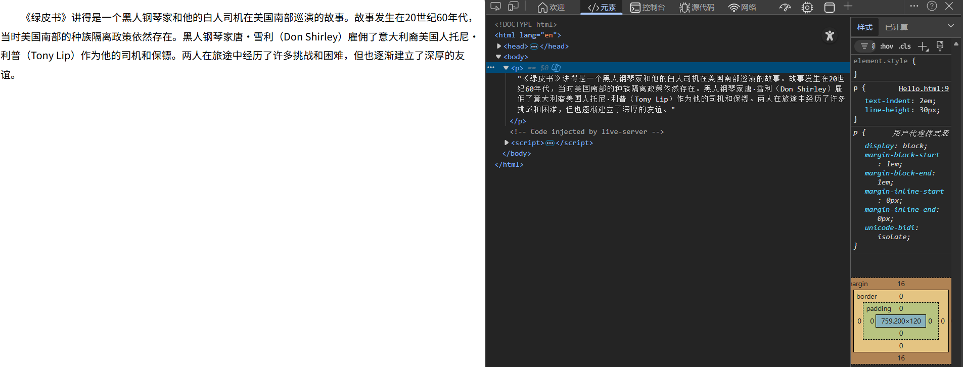
双击直接修改属性值
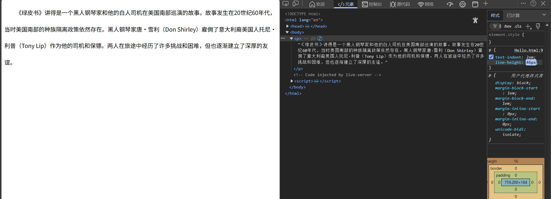
当行高等于盒子高度时,文字垂直居中
html
<!DOCTYPE html>
<html lang="en">

<head>
    <meta charset="UTF-8">
    <meta name="viewport" content="width=device-width, initial-scale=1.0">
    <title>Hello Page</title>
    <style>
        .box {
            width: 120px;
            height: 100px;
            background-color: antiquewhite;
            text-align: center;
            line-height: 100px;
        }
    </style>
</head>

<body>
    <div class="box">电影</div>
</body>

</html>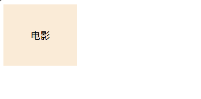
font简写
font简写属性可以在一个声明中设置多个字体属性
语法为"font:font-style font-weight font-size/line-height font-family;",其中font-size和font-family必须写,其它可省略
html
<!DOCTYPE html>
<html lang="en">

<head>
    <meta charset="UTF-8">
    <meta name="viewport" content="width=device-width, initial-scale=1.0">
    <title>Hello Page</title>
    <style>
        body {
            font: 14px/1.5 "宋体";
        }
    </style>
</head>

<body>
    <div>电影</div>
    <p>This is a text.</p>
</body>

</html>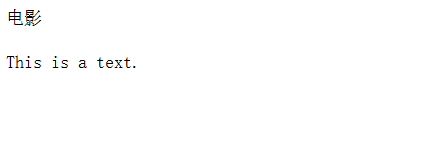
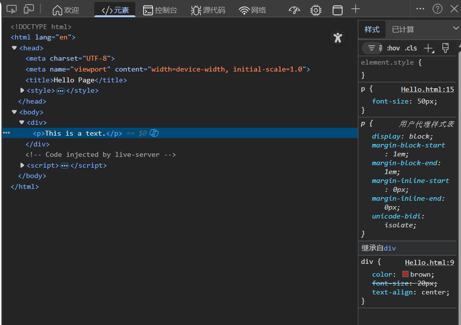
CSS继承性
子属性自动集成父元素的某些CSS样式属性,主要是跟文字相关的样式属性,如字体、颜色、文本对齐等
html
<!DOCTYPE html>
<html lang="en">

<head>
    <meta charset="UTF-8">
    <meta name="viewport" content="width=device-width, initial-scale=1.0">
    <title>Hello Page</title>
    <style>
        div {
            color: brown;
            font-size: 20px;
        }

        p {
            font-size: 50px;
        }
    </style>
</head>

<body>
    <div>
        <p>This is a text.</p>
    </div>
</body>

</html>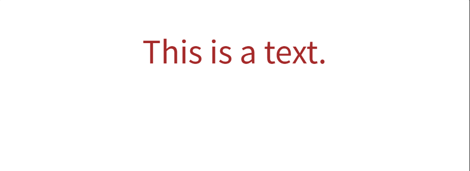
也可以在页面中直接查看(右侧)
CSS优先级
优先级是基于基于不同选择器组成的匹配规则(优先级相等时,遵循层叠性;不同时,执行权重更高的那个样式)
优先级从高到低排序
|------------|-----------|
| 选择器类型 | 权重值 |
| !important | 无限大 |
| 内联样式 | (1,0,0,0) |
| ID选择器 | (0,1,0,0) |
| 类/属性/伪类 | (0,0,1,0) |
| 类型/伪元素 | (0,0,0,1) |
| 通配符/继承 | (0,0,0,0) |
权重是叠加的,最终权重为每个选择器的层级权重相加(不会进位)。如"#nav .item a"的权重为(ID选择器+类选择器+类型选择器)=(0,1,1,1)
不需要计算,鼠标放在选择器上,能自动显示权重,这就是(0,0,1,1)
盒子模型
所有元素都被一个个"盒子"包围着,学会盒子模型可以实现准确布局
在CSS中一般分为区块盒子(块级元素)和行内盒子(行内元素),主要讨论区块盒子
区块盒子包含盒子内容(显示内容的区域)、内边距(内容距离边框的距离)、外边距(该盒子和其它元素之间的距离)、边框四部分
边框
用border属性设置盒子边框,border:边框粗细 边框样式 边框颜色(没有先后顺序)
html
<!DOCTYPE html>
<html lang="en">

<head>
    <meta charset="UTF-8">
    <meta name="viewport" content="width=device-width, initial-scale=1.0">
    <title>Hello Page</title>
    <style>
        div[class*="box"] {
            width: 100px;
            height: 60px;
            /* 外边距 */
            margin: 20px;
        }

        .box1 {
            border: 1px solid red;
        }

        .box2 {
            border: 1px dashed red;
        }

        .box3 {
            border: 1px dotted red;
        }

        .box4 {
            border-top: 2px solid red;
            border-bottom: 2px dotted green;
            border-left: 2px dashed blue;
            border-right: 3px solid yellow;
        }

        .box5 {
            border: 1px solid orange;
            border-top: red;
        }
    </style>
</head>

<body>
    <div class="box1">实现边框</div>
    <div class="box2">虚线边框</div>
    <div class="box3">点线边框</div>
    <div class="box4">不同边框1</div>
    <div class="box5">不同边框2</div>
</body>

</html>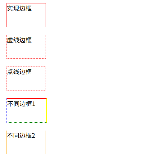
圆角边框
使用border-radius属性设置元素的外边框圆角
html
<!DOCTYPE html>
<html lang="en">

<head>
    <meta charset="UTF-8">
    <meta name="viewport" content="width=device-width, initial-scale=1.0">
    <title>Hello Page</title>
    <style>
        div {
            width: 100px;
            height: 100px;
            margin: 20px;
        }

        .box1 {
            background-color: pink;
            border-radius: 10px;
        }

        /* 圆 */
        .box2 {
            background-color: aquamarine;
            border-radius: 50px;
        }

        /* 圆 值也可以为百分比 */
        .box3 {
            background-color: blanchedalmond;
            border-radius: 50%;
        }

        /* 胶囊按钮 圆角设置为高度的一半 */
        .box4 {
            width: 100px;
            height: 40px;
            background-color: blueviolet;
            border-radius: 20px;
        }
    </style>
</head>

<body>
    <div class="box1">边框1</div>
    <div class="box2">边框2</div>
    <div class="box3">边框3</div>
    <div class="box4">边框4</div>
</body>

</html>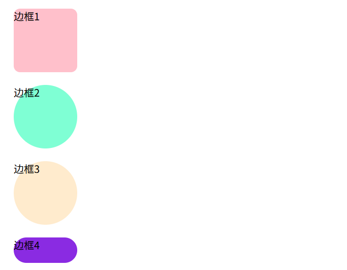
也可以给图片添加圆角效果
html
<!DOCTYPE html>
<html lang="en">

<head>
    <meta charset="UTF-8">
    <meta name="viewport" content="width=device-width, initial-scale=1.0">
    <title>Hello Page</title>
    <style>
        .tu {
            border-radius: 50%;
        }
    </style>
</head>

<body>
    <img src="https://img95.699pic.com/photo/50148/7083.jpg_wh860.jpg" alt="" class="tu">
</body>

</html>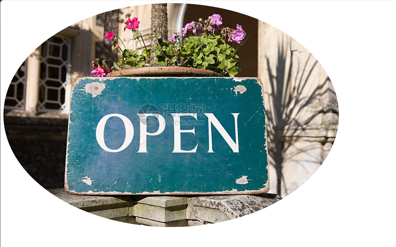
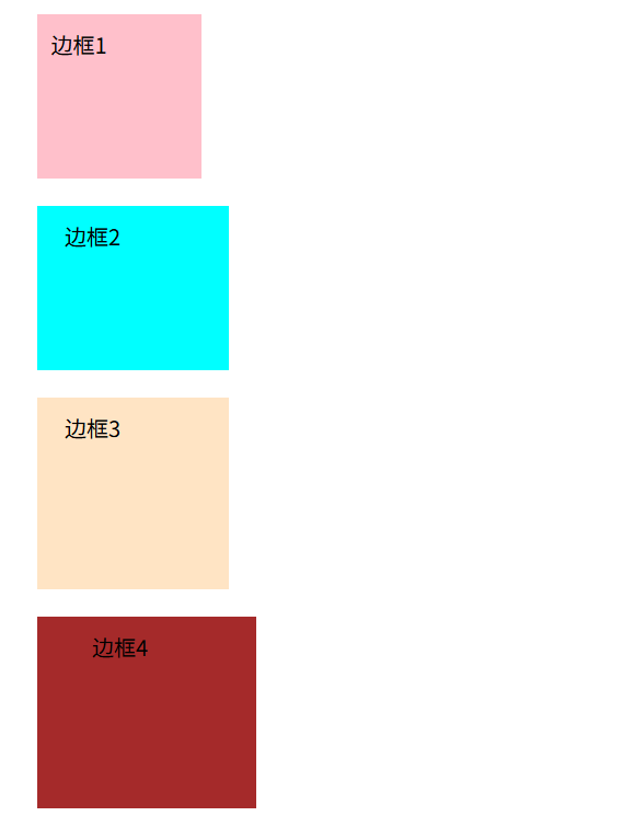
也可以给四个角设置不同的圆角效果
html
<!DOCTYPE html>
<html lang="en">

<head>
    <meta charset="UTF-8">
    <meta name="viewport" content="width=device-width, initial-scale=1.0">
    <title>Hello Page</title>
    <style>
        div {
            width: 100px;
            height: 100px;
            margin: 20px;
        }

        .box1 {
            background-color: pink;
            border-radius: 10px;
        }

        /* 左上右下是10px 右上左下是20px */
        .box2 {
            background-color: aqua;
            border-radius: 10px 30px;
        }

        /* 左上是10px 右上左下20px 右下30px  */
        .box3 {
            background-color: aquamarine;
            border-radius: 10px 30px 50px;
        }

        .box4 {
            background-color: blue;
            border-radius: 0 10px 30px 50px;
        }
    </style>
</head>

<body>
    <div class="box1">边框1</div>
    <div class="box2">边框2</div>
    <div class="box3">边框3</div>
    <div class="box4">边框4</div>
</body>

</html>
内边距
html
<!DOCTYPE html>
<html lang="en">

<head>
    <meta charset="UTF-8">
    <meta name="viewport" content="width=device-width, initial-scale=1.0">
    <title>Hello Page</title>
    <style>
        div {
            width: 100px;
            height: 100px;
            margin: 20px;
        }

        /* 一个值,上下左右都是10px */
        .box1 {
            background-color: pink;
            padding: 10px;
        }

        /* 上下10px,左右20px */
        .box2 {
            background-color: aqua;
            padding: 10px 20px;
        }

        /* 上 左右 下 */
        .box3 {
            background-color: bisque;
            padding: 10px 20px 30px;
        }

        /* 上 右 下 左 */
        .box4 {
            background-color: brown;
            padding: 10px 20px 30px 40px;
        }
    </style>
</head>

<body>
    <div class="box1">边框1</div>
    <div class="box2">边框2</div>
    <div class="box3">边框3</div>
    <div class="box4">边框4</div>
</body>

</html>
元素的实际宽 / 高 = CSS 中设置的 width/height + 内边距(padding) + 边框(border)
在通用 div 样式中添加box-sizing: border-box;开启怪异盒模型,padding就不会撑大元素了
外边距
也可以设置4个方向,不一一展示
html
<!DOCTYPE html>
<html lang="en">

<head>
    <meta charset="UTF-8">
    <meta name="viewport" content="width=device-width, initial-scale=1.0">
    <title>Hello Page</title>
    <style>
        div {
            width: 100px;
            height: 100px;
            background-color: aqua;
        }

        .box1 {
            margin: 10px;
        }
    </style>
</head>

<body>
    <div class="box1">边框1</div>
    <div class="box2">边框2</div>
</body>

</html>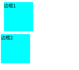
还可以用来实现水平居中(盒子必须要有宽度,只要左右外边距设为auto就可以了)
html
<!DOCTYPE html>
<html lang="en">

<head>
    <meta charset="UTF-8">
    <meta name="viewport" content="width=device-width, initial-scale=1.0">
    <title>Hello Page</title>
    <style>
        div {
            width: 100px;
            height: 100px;
            background-color: aqua;
        }

        .box1 {
            margin: auto;
        }
    </style>
</head>

<body>
    <div class="box1">边框1</div>
</body>

</html>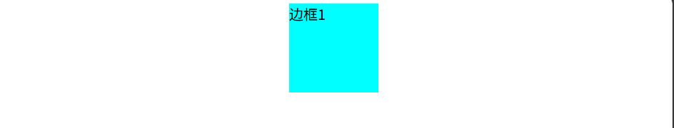
外边距折叠
两个并列的区块元素,会讲两个元素的上下外边距合并为一个外边距,其大小等于较大的那个外边距
外边距塌陷
嵌套关系的区块元素,给自黑设置上下外边距会让父盒子塌陷移动
解决方案:给父盒子添加上边框/上内边距,或者添加overflow:hidden;属性
盒子背景
background可以设置元素背景相关属性,包括背景颜色、背景图片、背景图片位置、背景图片重复方式等(下方只展示语法,大家逐个尝试)
html
<!DOCTYPE html>
<html lang="en">

<head>
    <meta charset="UTF-8">
    <meta name="viewport" content="width=device-width, initial-scale=1.0">
    <title>Hello Page</title>
    <style>
        div {
            width: 800px;
            height: 800px;
            background-color: pink;
            /* 设置背景图片(不是插入,文字能看到) */
            background-image: url(https://img95.699pic.com/photo/50148/7083.jpg_wh860.jpg);
            /* 控制背景是否重复(图片与颜色可共存) */
            background-repeat: no-repeat;
            /* 设置背景图片位置(原点在左上角) */
            background-position: 100px 100px;
            /* 背景尺寸 */
            background-size: cover;
            /* 背景是否随着页面滚动 */
            background-attachment: fixed;
        }

        .box1 {
            margin: auto;
        }
    </style>
</head>

<body>
    <div class="box1">边框1</div>
</body>

</html>
背景渐变
通过linear-gradient属性添加线性渐变(还有径向渐变,自行了解)
html
<!DOCTYPE html>
<html lang="en">

<head>
    <meta charset="UTF-8">
    <meta name="viewport" content="width=device-width, initial-scale=1.0">
    <title>Hello Page</title>
    <style>
        .box {
            width: 200px;
            height: 150px;
            /* 从下往上线性渐变 */
            background: linear-gradient(to top, pink, red);
            /* 角度90度(即向右) */
            background: linear-gradient(90deg, pink, red);
            /* 色标位置 */
            background: linear-gradient(45deg, pink 20%, red 90%);
        }

        .text {
            font-size: 30px;
            font-weight: 700;
            background-image: linear-gradient(97deg, #0096FF, #BB64FF 42%, red);
            /* 以文字的形式进行背景裁剪 */
            -webkit-background-clip: text;
            background-clip: text;
            /* 文本填充颜色为透明 */
            -webkit-text-fill-color: transparent;
            /* 添加行内块属性,让渐变裁剪生效 */
            display: inline-block;
        }
    </style>
</head>

<body>
    <div class="box"></div>
    <div class="text">我是一段渐变的文字</div>
</body>

</html>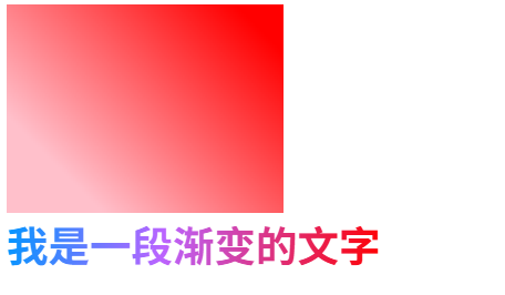
综合-视差滚动效果
这个很好看啊,大家自己学习代码尝试(我就用我本地图片了)
html
<!DOCTYPE html>
<html lang="en">

<head>
    <meta charset="UTF-8">
    <meta name="viewport" content="width=device-width, initial-scale=1.0">
    <title>Hello Page</title>
    <style>
        /* 全局样式重置,清除浏览器自带的默认边距,box-sizing设置元素的内边距、边框不撑开元素的宽高 */
        * {
            margin: 0;
            padding: 0;
            box-sizing: border-box;
        }

        /* 让html,body,section和整个屏幕一样大 */
        html,
        body,
        section[class^="s"] {
            width: 100%;
            height: 100%;
        }

        .s1 {
            /* 复合型写法(背景图片 不重复 背景固定 水平居中 垂直居中 背景覆盖)顺序没关系*/
            background: url(spring.jpg) no-repeat fixed center center/cover;
        }

        .s2 {
            background: url(summer.jpeg) no-repeat fixed center center/cover;
        }

        .s3 {
            background: url(antumn.jpg) no-repeat fixed center center/cover;
        }

        .s4 {
            background: url(winter.jpg) no-repeat fixed center center/cover;
        }

        /* 统一文字排版 */
        .content {
            width: 100%;
            height: 25%;
            background-color: rgba(0, 0, 0, 0.85);
            color: white;
            line-height: 30px;
            font-size: 16px;
            padding: 20px;
        }

        /* 居中对齐 + 常规字重 + 字号60px + 上边距200px + 字间距10px */
        h2 {
            text-align: center;
            font-weight: 400;
            font-size: 60px;
            margin-top: 200px;
            letter-spacing: 10px;
            color: white;
        }
    </style>
</head>

<body>
    <section class="s1">
        <div class="content">
            <p>春风拂过大地,抖落了冬日残留的寒意。</p>
            <p>嫩芽悄悄顶破泥土,花苞缓缓舒展身姿,溪流解冻后叮咚作响,像是大自然奏响的开篇乐章。</p>
            <p> 漫步在初醒的天地间,目之所及皆是温柔的绿意与烂漫的花色,每一缕风、每一寸阳光,都藏着生生不息的希望,将世间的美好,温柔地铺陈开来。</p>
        </div>
        <h2>春野拾光</h2>
    </section>
    <section class="s2">
        <div class="content">
            <p>盛夏的阳光热烈而坦荡,泼洒在葱郁的枝叶间,投下斑驳的光影。</p>
            <p>聒噪的蝉鸣是夏日最标志性的序曲,池塘里的荷花亭亭玉立,粉白的花瓣映衬着碧绿的荷叶,清风拂过,送来阵阵荷香。</p>
            <p>傍晚的晚霞晕染天际,晚风驱散了白日的燥热,坐在树荫下,听着蝉鸣,感受着夏日独有的热烈与浪漫,时光都变得慵懒而悠长。</p>
        </div>
        <h2>盛夏蝉鸣</h2>
    </section>
    <section class="s3">
        <div class="content">
            <p>秋意渐浓,天地换上了暖色调的盛装。</p>
            <p>枫叶被秋霜染成炽烈的红,银杏叶飘落成满地金黄,风一吹,落叶打着旋儿飞舞,像是一场温柔的告别。</p>
            <p>稻田里翻涌着金色的麦浪,果实挂满枝头,空气中弥漫着丰收的甜香。</p>
            <p>秋日没有盛夏的燥热,也无寒冬的凛冽,唯有沉稳与诗意,每一片飘落的秋叶,都在诉说着岁月的丰盈与静好。</p>

        </div>
        <h2>枫染秋韵</h2>
    </section>
    <section class="s4">
        <div class="content">
            <p>寒冬悄然而至,雪花慢悠悠地从天际飘落,给山峦、树木、屋檐都裹上了一层洁白的绒毯。</p>
            <p>世界褪去了喧嚣,变得静谧而纯粹。枝头凝结着晶莹的雾凇,阳光洒落时,折射出细碎的光芒。</p>
            <p>围炉而坐,煮一壶热茶,看窗外雪落无声,感受着冬日独有的安宁。</p>
            <p>这沉寂的季节,并非终点,而是万物休养生息,默默积蓄力量,等待下一个春天的到来。</p>

        </div>
        <h2>雪落安冬</h2>
    </section>
</body>

</html>
盒子阴影
通过box-shadow属性给盒子添加阴影
html
<!DOCTYPE html>
<html lang="en">

<head>
    <meta charset="UTF-8">
    <meta name="viewport" content="width=device-width, initial-scale=1.0">
    <title>Hello Page</title>
    <style>
        .box {
            width: 200px;
            height: 200px;
            background-color: pink;
            margin: 100px auto;
            /* 添加过渡 */
            transition: all 0.3s;
        }

        .box:hover {
            /* x、y轴偏移量,模糊半径,扩散半径,颜色  */
            box-shadow: 0 0 10px 10px rgba(0, 0, 0, 0.5);
        }
    </style>
</head>

<body>
    <div class="box"></div>
</body>

</html>
综合练习
小米卡片
多了一个单行文本溢出显示省略号的写法(当然还有多行的,自行了解)
html
<!DOCTYPE html>
<html lang="en">

<head>
    <meta charset="UTF-8">
    <meta name="viewport" content="width=device-width, initial-scale=1.0">
    <title>Hello Page</title>
    <style>
        /* css初始化 */
        * {
            margin: 0;
            padding: 0;
            box-sizing: border-box;
        }

        body {
            background-color: aliceblue;
        }

        .cart {
            width: 300px;
            height: 400px;
            background-color: white;
            margin: 100px auto;
            /* 有继承性(里面的图片也居中) */
            text-align: center;
            transition: all .3s;
        }

        .cart:hover {
            box-shadow: 0 15px 30px rgba(0, 0, 0, .5);
        }

        .cart img {
            width: 200px;
            margin-top: 15px;
        }

        .cart .title {
            font-size: 20px;
            font-weight: 400;
            color: black;
            margin-top: 18px;
        }

        p {
            font-size: 12px;
            color: #b0b0b0;
            padding: 0 10px;
            /* 单行文本溢出使用省略号 */
            /* 溢出隐藏 */
            overflow: hidden;
            /* 文本溢出显示省略号 */
            text-overflow: ellipsis;
            /* 强制文字一行显示,不换行 */
            white-space: nowrap;
        }

        .price {
            font-size: 14px;
            color: #b0b0b0;
            margin-top: 15px;
        }

        .price span {
            color: rgb(240, 108, 14);
        }
    </style>
</head>

<body>
    <div class="cart">
        <img src="https://cdn.cnbj0.fds.api.mi-img.com/b2c-shopapi-pms/pms_1553764670.0369286.jpg" alt="小米电饭煲">
        <h3 class="title">小米电饭煲</h3>
        <p>好吃好香好米饭 | 全路畅通 | 今天吃什么 | 我来帮你决定</p>
        <p class="price">
            <span>659元</span>
            <del>699元</del>
        </p>
    </div>
</body>

</html>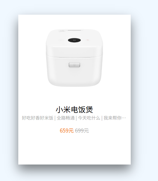
字体图标
字体图标是一种将图标以字体形式嵌入网页的技术,可以像调整文字一样通过CSS控制控制图标样式
iconfont阿里妈妈图标库是免费的
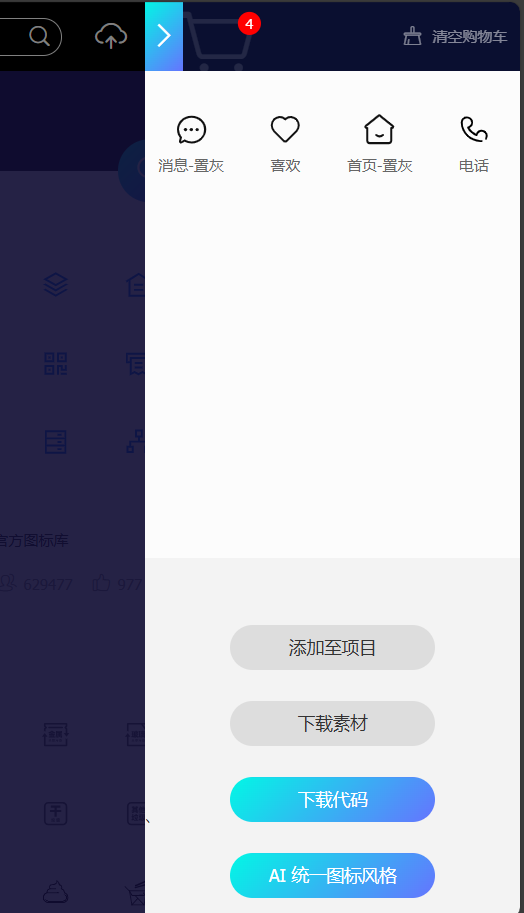
先去各个官方图标库挑选,有喜欢的就添加购物车
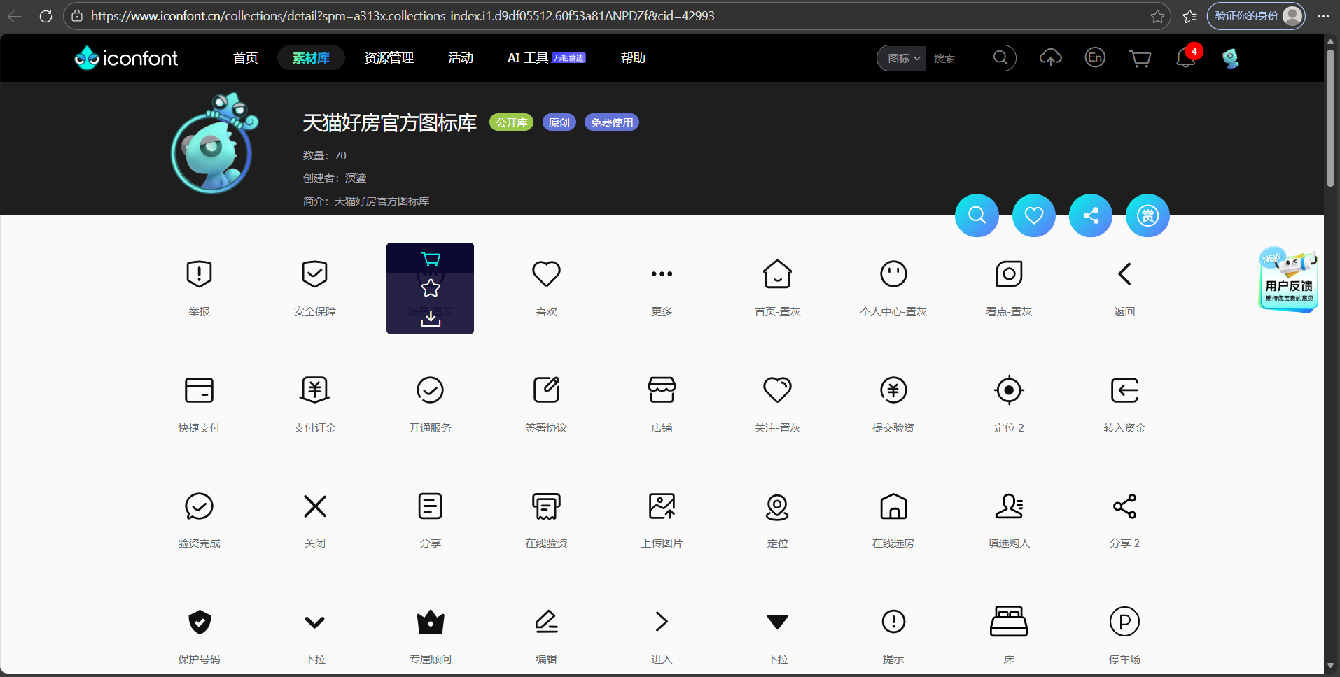
选完后点击右上角购物车
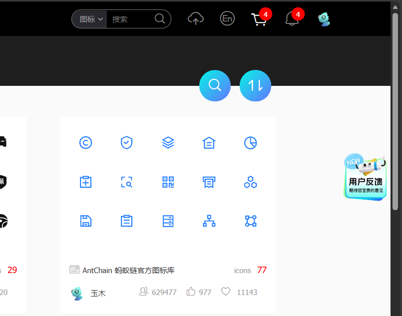
可以把不要的删除,然后"下载代码"
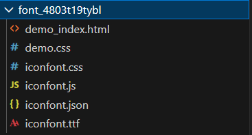
将Download.zip文件夹解压,解压后的文件夹可以得到以下文件()
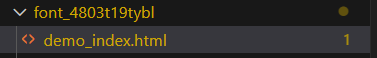
将iconfont.css引入到html文件中(在head标签下)
html
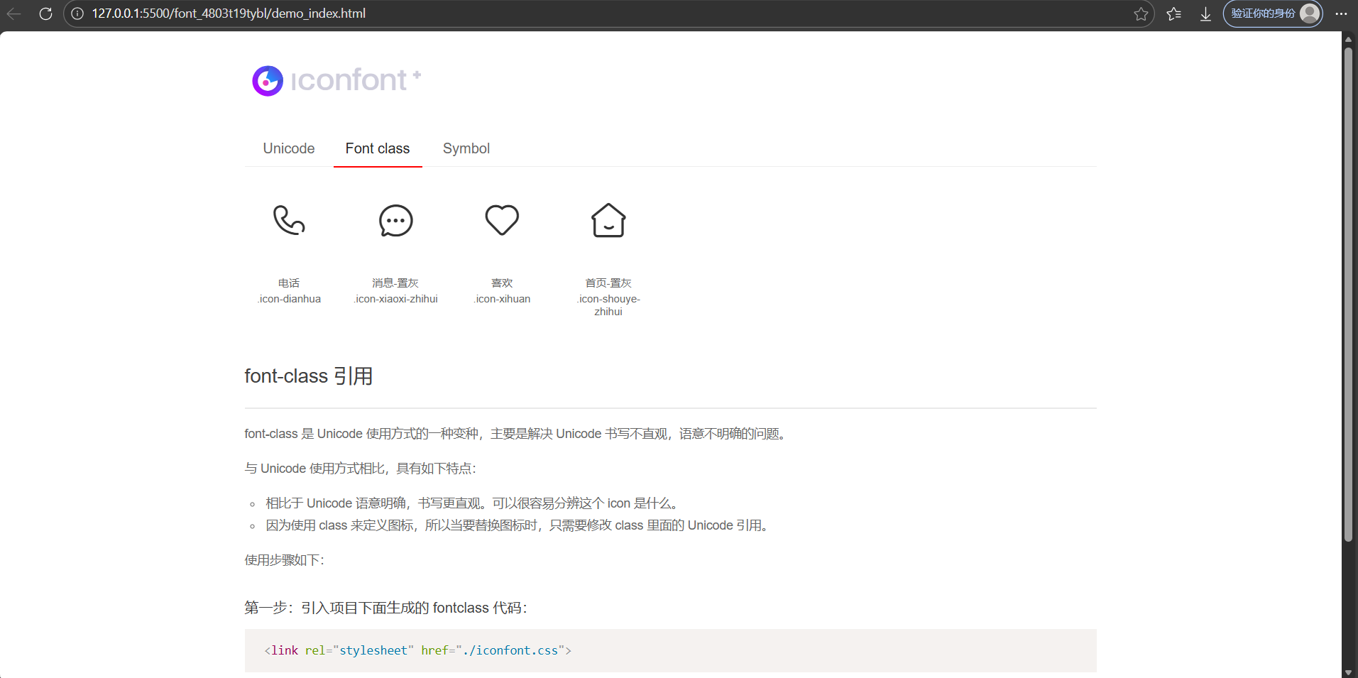
<link rel="stylesheet" href="font_4803t19tybl/iconfont.css">打开该文件,然后在浏览器中查看,可以查看字体图标的使用方式
推荐使用Font class,通过类名来引入(下滑有使用步骤)
我来引入一个电话和消息图标(标签不一定就是用span,其它也可以)
html
<!DOCTYPE html>
<html lang="en">

<head>
    <meta charset="UTF-8">
    <meta name="viewport" content="width=device-width, initial-scale=1.0">
    <title>Hello Page</title>
    <link rel="stylesheet" href="font_4803t19tybl/iconfont.css">
    <style>
        .icon-dianhua {
            font-size: 60px;
            color: aquamarine;
        }
    </style>
</head>

<body>
    <span class="iconfont icon-dianhua"></span>
    <i class="icon icon-xiaoxi-zhihui"></i>
</body>

</html>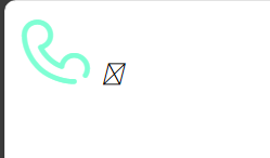
CSS精灵图
将多个小图标或图像合并到一张大图中,通过调整background-position属性(也可以直接用复合型写法)来显示特定部分的图像技术。可以减少http请求次数(原一张图片需要请求一次),减小网络开销。