一、线性渐变的核心原理
线性渐变(Linear Gradient)是最常用的渐变类型,它沿着直线方向进行颜色过渡。在 React Native for Harmony 中,通过 react-native-linear-gradient 库提供的 LinearGradient 组件实现高质量的线性渐变效果。
1.1 线性渐变的数学原理
线性渐变的本质是在两个颜色之间进行插值计算:
颜色 = 颜色1 × (1 - t) + 颜色2 × t其中:
t是渐变位置参数(0 到 1)颜色1是起始颜色颜色2是结束颜色
为什么这样计算?
- 线性插值:确保颜色过渡平滑自然
- 数学精确:计算机图形学中的标准算法
- 性能高效:简单的数学运算,渲染速度快
1.2 线性渐变的方向
线性渐变的方向由两个参数决定:
- 起始点(start):渐变的起始位置
- 结束点(end):渐变的结束位置
这两个点定义了渐变的方向向量:
方向向量 = (end.x - start.x, end.y - start.y)1.3 坐标系统
LinearGradient 使用相对坐标系统:
- 原点 (0, 0):左上角
- x 轴:从左到右(0 → 1)
- y 轴:从上到下(0 → 1)
为什么使用相对坐标?
- 适应不同尺寸的容器
- 响应式设计更灵活
- 避免计算具体的像素值
二、线性渐变的方向详解
2.1 垂直渐变(从上到下)
垂直渐变是最常见的线性渐变类型:
javascript
import React, { memo } from 'react';
import { View, Text, StyleSheet } from 'react-native';
import LinearGradient from "react-native-linear-gradient";

const VerticalGradient = memo(() => {
  return (
    <LinearGradient
      colors={['#667eea', '#764ba2']}
      start={{ x: 0, y: 0 }}
      end={{ x: 0, y: 1 }}
      style={styles.gradientBox}
    >
      <Text style={styles.text}>垂直渐变</Text>
    </LinearGradient>
  );
});
坐标说明:
start={``{ x: 0, y: 0 }}:左上角end={``{ x: 0, y: 1 }}:左下角- x 坐标相同,y 坐标变化
视觉效果:
- 颜色从上到下逐渐变化
- 适合作为页面背景或卡片背景
- 符合视觉从上到下的阅读习惯
2.2 水平渐变(从左到右)
javascript
const HorizontalGradient = memo(() => {
  return (
    <LinearGradient
      colors={['#f093fb', '#f5576c']}
      start={{ x: 0, y: 0 }}
      end={{ x: 1, y: 0 }}
      style={styles.gradientBox}
    >
      <Text style={styles.text}>水平渐变</Text>
    </LinearGradient>
  );
});
坐标说明:
start={``{ x: 0, y: 0 }}:左上角end={``{ x: 1, y: 0 }}:右上角- y 坐标相同,x 坐标变化
使用场景:
- 按钮背景
- 分割线装饰
- 横向滚动指示器
2.3 对角线渐变
对角线渐变分为四种主要方向:
2.3.1 从左上到右下
javascript
const Diagonal1Gradient = memo(() => {
  return (
    <LinearGradient
      colors={['#4facfe', '#00f2fe']}
      start={{ x: 0, y: 0 }}
      end={{ x: 1, y: 1 }}
      style={styles.gradientBox}
    >
      <Text style={styles.text}>左上→右下</Text>
    </LinearGradient>
  );
});
2.3.2 从右上到左下
javascript
const Diagonal2Gradient = memo(() => {
  return (
    <LinearGradient
      colors={['#fa709a', '#fee140']}
      start={{ x: 1, y: 0 }}
      end={{ x: 0, y: 1 }}
      style={styles.gradientBox}
    >
      <Text style={styles.text}>右上→左下</Text>
    </LinearGradient>
  );
});
2.3.3 从左下到右上
javascript
const Diagonal3Gradient = memo(() => {
  return (
    <LinearGradient
      colors={['#a8edea', '#fed6e3']}
      start={{ x: 0, y: 1 }}
      end={{ x: 1, y: 0 }}
      style={styles.gradientBox}
    >
      <Text style={styles.text}>左下→右上</Text>
    </LinearGradient>
  );
});
2.3.4 从右下到左上
javascript
const Diagonal4Gradient = memo(() => {
  return (
    <LinearGradient
      colors={['#ff9a9e', '#fecfef']}
      start={{ x: 1, y: 1 }}
      end={{ x: 0, y: 0 }}
      style={styles.gradientBox}
    >
      <Text style={styles.text}>右下→左上</Text>
    </LinearGradient>
  );
});
对角线渐变的特点:
- x 和 y 坐标同时变化
- 创建动态的视觉效果
- 适合作为卡片或横幅背景
2.4 自定义方向渐变
通过自定义 start 和 end 实现任意方向的渐变:
javascript
const CustomDirectionGradient = memo(() => {
  return (
    <LinearGradient
      colors={['#89f7fe', '#66a6ff']}
      start={{ x: 0.2, y: 0.3 }}
      end={{ x: 0.8, y: 0.7 }}
      style={styles.gradientBox}
    >
      <Text style={styles.text}>自定义方向</Text>
    </LinearGradient>
  );
});
自定义方向的应用:
- 创建不对称的渐变效果
- 实现特定的视觉设计需求
- 增强界面的独特性
三、线性渐变的角度控制
3.1 角度渐变基础
使用 angle 属性通过角度控制渐变方向:
javascript
const AngleGradient = memo(({ angle }) => {
  return (
    <LinearGradient
      colors={['#4facfe', '#00f2fe']}
      useAngle={true}
      angle={angle}
      style={styles.gradientBox}
    >
      <Text style={styles.text}>{angle}° 渐变</Text>
    </LinearGradient>
  );
});
角度渐变参数:
useAngle: true:启用角度模式(必需)angle:渐变角度,范围 0-360 度
注意: angleCenter 属性在鸿蒙平台上暂不支持。
3.2 角度对照表
| 角度 | 方向 | 对应的 start/end |
|---|---|---|
| 0° | 从下到上 | (0.5, 1) → (0.5, 0) |
| 45° | 从左下到右上 | (0, 1) → (1, 0) |
| 90° | 从左到右 | (0, 0.5) → (1, 0.5) |
| 135° | 从左上到右下 | (0, 0) → (1, 1) |
| 180° | 从上到下 | (0.5, 0) → (0.5, 1) |
| 225° | 从右上到左下 | (1, 0) → (0, 1) |
| 270° | 从右到左 | (1, 0.5) → (0, 0.5) |
| 315° | 从右下到左上 | (1, 1) → (0, 0) |
角度说明:
- 0° 表示从下到上(与默认方向相反)
- 90° 表示从左到右
- 180° 表示从上到下(默认垂直渐变)
- 270° 表示从右到左
- 角度顺时针增加
3.3 常用角度示例
3.3.1 45度角渐变
javascript
const Angle45Gradient = memo(() => {
  return (
    <LinearGradient
      colors={['#fa709a', '#fee140']}
      useAngle={true}
      angle={45}
      style={styles.gradientBox}
    >
      <Text style={styles.text}>45° 渐变</Text>
    </LinearGradient>
  );
});
3.3.2 135度角渐变
javascript
const Angle135Gradient = memo(() => {
  return (
    <LinearGradient
      colors={['#a8edea', '#fed6e3']}
      useAngle={true}
      angle={135}
      style={styles.gradientBox}
    >
      <Text style={styles.text}>135° 渐变</Text>
    </LinearGradient>
  );
});
3.4 angleCenter 不支持的替代方案
由于 angleCenter 在鸿蒙平台不支持,可以使用 start 和 end 来模拟偏移中心的效果:
javascript
// ❌ 不支持
<LinearGradient
  colors={['#a', '#b']}
  useAngle={true}
  angle={90}
  angleCenter={{ x: 0.2, y: 0.5 }}
/>

// ✅ 替代方案
<LinearGradient
  colors={['#a', '#b']}
  start={{ x: 0.2, y: 0.5 }}
  end={{ x: 0.8, y: 0.5 }}
/>
四、多色线性渐变
4.1 三色线性渐变
使用三个颜色创建更丰富的渐变效果:
javascript
const ThreeColorLinearGradient = memo(() => {
  return (
    <LinearGradient
      colors={['#667eea', '#764ba2', '#f093fb']}
      start={{ x: 0, y: 0 }}
      end={{ x: 1, y: 1 }}
      style={styles.gradientBox}
    >
      <Text style={styles.text}>三色渐变</Text>
    </LinearGradient>
  );
});
三色渐变的特点:
- 颜色均匀分布在渐变路径上
- 第一个颜色在起点,最后一个颜色在终点
- 中间颜色在中间位置
4.2 四色线性渐变
javascript
const FourColorLinearGradient = memo(() => {
  return (
    <LinearGradient
      colors={['#4facfe', '#00f2fe', '#43e97b', '#38f9d7']}
      start={{ x: 0, y: 0 }}
      end={{ x: 1, y: 0 }}
      style={styles.gradientBox}
    >
      <Text style={styles.text}>四色渐变</Text>
    </LinearGradient>
  );
});
多色渐变的应用:
- 创建彩虹效果
- 实现品牌渐变
- 增强视觉层次
4.3 自定义颜色位置
使用 locations 属性精确控制每个颜色的位置:
javascript
const CustomLocationsGradient = memo(() => {
  return (
    <LinearGradient
      colors={['#f093fb', '#f5576c', '#4facfe']}
      locations={[0, 0.7, 1]}
      start={{ x: 0, y: 0 }}
      end={{ x: 1, y: 0 }}
      style={styles.gradientBox}
    >
      <Text style={styles.text}>自定义位置</Text>
    </LinearGradient>
  );
});
locations 的规则:
- 数组长度必须与 colors 数组相同
- 每个值的范围是 0-1
- 值必须递增(从小到大)
- 0 表示渐变起点,1 表示渐变终点
应用场景:
- 强调某个颜色区域
- 创建不对称的渐变
- 实现特定的视觉设计
五、线性渐变的高级应用
5.1 文字渐变效果
通过在文字上叠加渐变实现文字渐变效果:
javascript
const TextGradientEffect = memo(() => {
  return (
    <View style={styles.textGradientContainer}>
      <LinearGradient
        colors={['#667eea', '#764ba2']}
        start={{ x: 0, y: 0 }}
        end={{ x: 1, y: 0 }}
        style={styles.textGradientMask}
      >
        <Text style={styles.textGradientText}>渐变文字</Text>
      </LinearGradient>
    </View>
  );
});
样式实现:
javascript
const styles = StyleSheet.create({
  textGradientContainer: {
    padding: 20,
    backgroundColor: '#FFFFFF',
    borderRadius: 12,
    margin: 16,
  },
  textGradientMask: {
    borderRadius: 8,
  },
  textGradientText: {
    fontSize: 32,
    fontWeight: '700',
    color: '#FFFFFF',
    textAlign: 'center',
  },
});
5.2 渐变卡片
创建带有渐变背景的卡片组件:
javascript
const GradientCard = memo(({ title, subtitle, colors }) => {
  return (
    <LinearGradient
      colors={colors}
      start={{ x: 0, y: 0 }}
      end={{ x: 1, y: 1 }}
      style={styles.card}
    >
      <Text style={styles.cardTitle}>{title}</Text>
      <Text style={styles.cardSubtitle}>{subtitle}</Text>
    </LinearGradient>
  );
});
TypeScript 类型定义:
javascript
interface GradientCardProps {
  title: string;
  subtitle: string;
  colors: (string | number)[];
}
样式实现:
javascript
const styles = StyleSheet.create({
  card: {
    borderRadius: 16,
    padding: 20,
    margin: 16,
    shadowColor: '#000000',
    shadowOffset: { width: 0, height: 4 },
    shadowOpacity: 0.1,
    shadowRadius: 12,
    elevation: 8,
  },
  cardTitle: {
    fontSize: 20,
    fontWeight: '600',
    color: '#FFFFFF',
    marginBottom: 8,
  },
  cardSubtitle: {
    fontSize: 14,
    color: 'rgba(255, 255, 255, 0.9)',
  },
});
5.3 渐变进度条
使用线性渐变创建进度条效果:
javascript
const GradientProgressBar = memo(({ progress, colors }) => {
  const progressWidth = `${progress}%`;

  return (
    <View style={styles.progressBarContainer}>
      <View style={styles.progressBarBackground}>
        <LinearGradient
          colors={colors}
          start={{ x: 0, y: 0 }}
          end={{ x: 1, y: 0 }}
          style={[styles.progressBar, { width: progressWidth }]}
        />
      </View>
      <Text style={styles.progressText}>{progress}%</Text>
    </View>
  );
});
TypeScript 类型定义:
javascript
interface GradientProgressBarProps {
  progress: number;
  colors: (string | number)[];
}
样式实现:
javascript
const styles = StyleSheet.create({
  progressBarContainer: {
    padding: 20,
    backgroundColor: '#FFFFFF',
    borderRadius: 12,
    margin: 16,
  },
  progressBarBackground: {
    height: 8,
    backgroundColor: '#EBEEF5',
    borderRadius: 4,
    overflow: 'hidden',
    marginBottom: 12,
  },
  progressBar: {
    height: '100%',
    borderRadius: 4,
  },
  progressText: {
    fontSize: 14,
    fontWeight: '600',
    color: '#606266',
    textAlign: 'center',
  },
});
5.4 渐变分割线
创建带有渐变效果的分割线:
javascript
const GradientDivider = memo(({ colors }) => {
  return (
    <LinearGradient
      colors={colors}
      start={{ x: 0, y: 0 }}
      end={{ x: 1, y: 0 }}
      style={styles.divider}
    />
  );
});
样式实现:
javascript
const styles = StyleSheet.create({
  divider: {
    height: 1,
    width: '100%',
    marginVertical: 16,
  },
});
六、性能优化与最佳实践
6.1 避免过度嵌套
尽量减少渐变组件的嵌套层级:
javascript
// 不推荐:多层嵌套
<LinearGradient colors={['#a', '#b']}>
  <LinearGradient colors={['#c', '#d']}>
    <LinearGradient colors={['#e', '#f']}>
      <Text>内容</Text>
    </LinearGradient>
  </LinearGradient>
</LinearGradient>

// 推荐:单一渐变
<LinearGradient colors={['#a', '#b']}>
  <Text>内容</Text>
</LinearGradient>
6.2 使用预定义的渐变配置
创建预定义的渐变配置,提高代码复用性:
javascript
const gradientPresets = {
  blue: {
    colors: ['#4facfe', '#00f2fe'],
    start: { x: 0, y: 0 },
    end: { x: 1, y: 0 },
  },
  purple: {
    colors: ['#667eea', '#764ba2'],
    start: { x: 0, y: 0 },
    end: { x: 1, y: 1 },
  },
  orange: {
    colors: ['#fa709a', '#fee140'],
    start: { x: 0, y: 0 },
    end: { x: 1, y: 0 },
  },
};

const PresetGradient = memo(({ preset, children }) => {
  const config = gradientPresets[preset];
  return (
    <LinearGradient {...config} style={styles.gradientBox}>
      {children}
    </LinearGradient>
  );
});
6.3 使用 memo 优化
对渐变组件使用 memo 避免不必要的重新渲染:
javascript
const OptimizedGradientCard = memo<GradientCardProps>(({ title, subtitle, colors }) => {
  return (
    <LinearGradient colors={colors} style={styles.card}>
      <Text style={styles.cardTitle}>{title}</Text>
      <Text style={styles.cardSubtitle}>{subtitle}</Text>
    </LinearGradient>
  );
});

OptimizedGradientCard.displayName = 'OptimizedGradientCard';
七、常见问题与解决方案
7.1 渐变方向不对
问题现象: 渐变方向与预期不符
解决方案:
javascript
// 确保使用正确的坐标
<LinearGradient
  colors={['#a', '#b']}
  start={{ x: 0, y: 0 }}  // 左上角
  end={{ x: 1, y: 1 }}    // 右下角
/>

// 或使用角度
<LinearGradient
  colors={['#a', '#b']}
  useAngle={true}
  angle={135}
/>
7.2 角度渐变不生效
问题现象: 设置了 angle 但渐变方向没有变化
解决方案:
javascript
// 确保设置 useAngle={true}
<LinearGradient
  colors={['#a', '#b']}
  useAngle={true}  // 必需
  angle={45}
/>
7.3 颜色位置不生效
问题现象: locations 设置后没有效果
解决方案:
javascript
// 确保数组长度匹配且递增
<LinearGradient
  colors={['#a', '#b', '#c']}
  locations={[0, 0.5, 1]}  // ✅ 长度相同且递增
/>
7.4 angleCenter 不支持
问题现象: 使用 angleCenter 在鸿蒙平台没有效果
解决方案:
根据官方文档,angleCenter 在鸿蒙平台暂不支持。使用 start 和 end 替代:
javascript
// ❌ 不支持
<LinearGradient
  colors={['#a', '#b']}
  useAngle={true}
  angle={90}
  angleCenter={{ x: 0.3, y: 0.7 }}
/>

// ✅ 替代方案
<LinearGradient
  colors={['#a', '#b']}
  start={{ x: 0.3, y: 0.7 }}
  end={{ x: 0.7, y: 0.3 }}
/>
八、完整实战代码
javascript
import React, { memo, useState } from 'react';
import {
View,
Text,
StyleSheet,
ScrollView,
} from 'react-native';
import LinearGradient from "react-native-linear-gradient";
// 垂直渐变组件
const VerticalGradient = memo(() => {
return (
<LinearGradient
colors={['#667eea', '#764ba2']}
start={{ x: 0, y: 0 }}
end={{ x: 0, y: 1 }}
style={styles.gradientBox}
>
<Text style={styles.text}>垂直渐变</Text>
</LinearGradient>
);
});
VerticalGradient.displayName = 'VerticalGradient';
// 水平渐变组件
const HorizontalGradient = memo(() => {
return (
<LinearGradient
colors={['#f093fb', '#f5576c']}
start={{ x: 0, y: 0 }}
end={{ x: 1, y: 0 }}
style={styles.gradientBox}
>
<Text style={styles.text}>水平渐变</Text>
</LinearGradient>
);
});
HorizontalGradient.displayName = 'HorizontalGradient';
// 对角线渐变组件
const DiagonalGradient = memo(() => {
return (
<LinearGradient
colors={['#4facfe', '#00f2fe']}
start={{ x: 0, y: 0 }}
end={{ x: 1, y: 1 }}
style={styles.gradientBox}
>
<Text style={styles.text}>对角线渐变</Text>
</LinearGradient>
);
});
DiagonalGradient.displayName = 'DiagonalGradient';
// 角度渐变组件
interface AngleGradientProps {
angle: number;
}
const AngleGradient = memo<AngleGradientProps>(({ angle }) => {
return (
<LinearGradient
colors={['#fa709a', '#fee140']}
useAngle={true}
angle={angle}
style={styles.gradientBox}
>
<Text style={styles.text}>{angle}° 渐变</Text>
</LinearGradient>
);
});
AngleGradient.displayName = 'AngleGradient';
// 三色渐变组件
const ThreeColorGradient = memo(() => {
return (
<LinearGradient
colors={['#667eea', '#764ba2', '#f093fb']}
start={{ x: 0, y: 0 }}
end={{ x: 1, y: 1 }}
style={styles.gradientBox}
>
<Text style={styles.text}>三色渐变</Text>
</LinearGradient>
);
});
ThreeColorGradient.displayName = 'ThreeColorGradient';
// 自定义位置渐变组件
const CustomLocationGradient = memo(() => {
return (
<LinearGradient
colors={['#f093fb', '#f5576c', '#4facfe']}
locations={[0, 0.7, 1]}
start={{ x: 0, y: 0 }}
end={{ x: 1, y: 0 }}
style={styles.gradientBox}
>
<Text style={styles.text}>自定义位置</Text>
</LinearGradient>
);
});
CustomLocationGradient.displayName = 'CustomLocationGradient';
// 渐变卡片组件
interface GradientCardProps {
title: string;
subtitle: string;
colors: (string | number)[];
}
const GradientCard = memo<GradientCardProps>(({ title, subtitle, colors }) => {
return (
<LinearGradient
colors={colors}
start={{ x: 0, y: 0 }}
end={{ x: 1, y: 1 }}
style={styles.card}
>
<Text style={styles.cardTitle}>{title}</Text>
<Text style={styles.cardSubtitle}>{subtitle}</Text>
</LinearGradient>
);
});
GradientCard.displayName = 'GradientCard';
// 渐变进度条组件
interface GradientProgressBarProps {
progress: number;
colors: (string | number)[];
}
const GradientProgressBar = memo<GradientProgressBarProps>(({ progress, colors }) => {
return (
<View style={styles.progressBarContainer}>
<View style={styles.progressBarBackground}>
<LinearGradient
colors={colors}
start={{ x: 0, y: 0 }}
end={{ x: 1, y: 0 }}
style={[styles.progressBar, { width: `${progress}%` } as any]}
/>
</View>
<Text style={styles.progressText}>{progress}%</Text>
</View>
);
});
GradientProgressBar.displayName = 'GradientProgressBar';
const App = () => {
const [progress, setProgress] = useState(65);
return (
<View style={styles.container}>
<ScrollView style={styles.scrollView} showsVerticalScrollIndicator={false}>
{/* 标题区域 */}
<View style={styles.header}>
<Text style={styles.pageTitle}>React Native for Harmony</Text>
<Text style={styles.subtitle}>LinearGradient 线性渐变详解</Text>
</View>
{/* 垂直渐变 */}
<View style={styles.section}>
<Text style={styles.sectionTitle}>垂直渐变</Text>
<VerticalGradient />
</View>
{/* 水平渐变 */}
<View style={styles.section}>
<Text style={styles.sectionTitle}>水平渐变</Text>
<HorizontalGradient />
</View>
{/* 对角线渐变 */}
<View style={styles.section}>
<Text style={styles.sectionTitle}>对角线渐变</Text>
<DiagonalGradient />
</View>
{/* 角度渐变 */}
<View style={styles.section}>
<Text style={styles.sectionTitle}>角度渐变</Text>
<AngleGradient angle={45} />
<AngleGradient angle={135} />
</View>
{/* 三色渐变 */}
<View style={styles.section}>
<Text style={styles.sectionTitle}>三色渐变</Text>
<ThreeColorGradient />
</View>
{/* 自定义位置 */}
<View style={styles.section}>
<Text style={styles.sectionTitle}>自定义位置</Text>
<CustomLocationGradient />
</View>
{/* 渐变卡片 */}
<View style={styles.section}>
<Text style={styles.sectionTitle}>渐变卡片</Text>
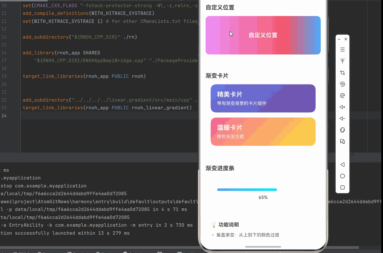
<GradientCard
title="精美卡片"
subtitle="带有渐变背景的卡片组件"
colors={['#667eea', '#764ba2']}
/>
<GradientCard
title="温暖卡片"
subtitle="橙色渐变主题"
colors={['#fa709a', '#fee140']}
/>
</View>
{/* 渐变进度条 */}
<View style={styles.section}>
<Text style={styles.sectionTitle}>渐变进度条</Text>
<GradientProgressBar
progress={progress}
colors={['#4facfe', '#00f2fe']}
/>
</View>
{/* 说明区域 */}
<View style={styles.infoCard}>
<Text style={styles.infoTitle}>💡 功能说明</Text>
<Text style={styles.infoText}>• 垂直渐变:从上到下的颜色过渡</Text>
<Text style={styles.infoText}>• 水平渐变:从左到右的颜色过渡</Text>
<Text style={styles.infoText}>• 对角线渐变:沿对角线的颜色过渡</Text>
<Text style={styles.infoText}>• 角度渐变:通过角度控制渐变方向</Text>
<Text style={styles.infoText}>• 三色渐变:使用三个颜色创建丰富效果</Text>
<Text style={styles.infoText}>• 自定义位置:精确控制颜色位置</Text>
<Text style={styles.infoText}>• 渐变卡片:带有渐变背景的卡片</Text>
<Text style={styles.infoText}>• 渐变进度条:使用渐变显示进度</Text>
<Text style={styles.infoText}>• 鸿蒙端完美兼容,angleCenter 不支持</Text>
</View>
</ScrollView>
</View>
);
};
const styles = StyleSheet.create({
container: {
flex: 1,
backgroundColor: '#F5F7FA',
},
scrollView: {
flex: 1,
},
// ======== 标题区域 ========
header: {
padding: 20,
backgroundColor: '#FFFFFF',
borderBottomWidth: 1,
borderBottomColor: '#EBEEF5',
},
pageTitle: {
fontSize: 24,
fontWeight: '700',
color: '#303133',
textAlign: 'center',
marginBottom: 8,
},
subtitle: {
fontSize: 16,
fontWeight: '500',
color: '#909399',
textAlign: 'center',
},
// ======== 区域 ========
section: {
marginTop: 12,
backgroundColor: '#FFFFFF',
padding: 16,
},
sectionTitle: {
fontSize: 18,
fontWeight: '600',
color: '#303133',
marginBottom: 16,
},
// ======== 渐变框 ========
gradientBox: {
padding: 20,
borderRadius: 12,
minHeight: 120,
justifyContent: 'center',
alignItems: 'center',
marginBottom: 12,
},
text: {
color: '#FFFFFF',
fontSize: 18,
fontWeight: '600',
},
// ======== 卡片 ========
card: {
borderRadius: 16,
padding: 20,
margin: 16,
marginTop: 0,
shadowColor: '#000000',
shadowOffset: { width: 0, height: 4 },
shadowOpacity: 0.1,
shadowRadius: 12,
elevation: 8,
},
cardTitle: {
fontSize: 20,
fontWeight: '600',
color: '#FFFFFF',
marginBottom: 8,
},
cardSubtitle: {
fontSize: 14,
color: 'rgba(255, 255, 255, 0.9)',
},
// ======== 进度条 ========
progressBarContainer: {
padding: 20,
backgroundColor: '#FFFFFF',
borderRadius: 12,
margin: 16,
},
progressBarBackground: {
height: 8,
backgroundColor: '#EBEEF5',
borderRadius: 4,
overflow: 'hidden',
marginBottom: 12,
},
progressBar: {
height: '100%',
borderRadius: 4,
},
progressText: {
fontSize: 14,
fontWeight: '600',
color: '#606266',
textAlign: 'center',
},
// ======== 信息卡片 ========
infoCard: {
backgroundColor: '#FFFFFF',
borderRadius: 12,
padding: 16,
margin: 16,
marginTop: 0,
shadowColor: '#000000',
shadowOffset: { width: 0, height: 2 },
shadowOpacity: 0.08,
shadowRadius: 8,
elevation: 4,
},
infoTitle: {
fontSize: 16,
fontWeight: '600',
color: '#303133',
marginBottom: 12,
},
infoText: {
fontSize: 14,
color: '#606266',
lineHeight: 22,
marginBottom: 6,
},
});
export default App;欢迎加入开源鸿蒙跨平台社区:https://openharmonycrossplatform.csdn.net