一、实战案例概述
本文将展示多个使用 react-native-linear-gradient 的实际应用案例,这些案例涵盖了常见的移动应用场景,帮助开发者快速掌握渐变效果的实际应用。
1.1 案例列表
- 登录页面:使用渐变背景创建吸引人的登录界面
- 用户卡片:为用户信息卡片添加渐变背景
- 标签系统:使用渐变创建美观的标签
- 数据统计卡片:为统计卡片添加视觉层次
- 音乐播放器:使用渐变创建动态的播放器界面
1.2 技术要点
- 正确导入:
import LinearGradient from "react-native-linear-gradient" - TypeScript 类型定义
- 组件封装和复用
- 性能优化
二、登录页面案例
2.1 完整实现
javascript
import React, { memo, useState } from 'react';
import {
  View,
  Text,
  StyleSheet,
  TextInput,
  TouchableOpacity,
  KeyboardAvoidingView,
  Platform,
  ScrollView,
} from 'react-native';
import LinearGradient from "react-native-linear-gradient";

interface LoginButtonProps {
  title: string;
  onPress: () => void;
  colors: (string | number)[];
}

const LoginButton = memo<LoginButtonProps>(({ title, onPress, colors }) => {
  return (
    <TouchableOpacity onPress={onPress} activeOpacity={0.8}>
      <LinearGradient
        colors={colors}
        start={{ x: 0, y: 0 }}
        end={{ x: 1, y: 0 }}
        style={styles.loginButton}
      >
        <Text style={styles.loginButtonText}>{title}</Text>
      </LinearGradient>
    </TouchableOpacity>
  );
});

LoginButton.displayName = 'LoginButton';

const LoginPage = memo(() => {
  const [username, setUsername] = useState('');
  const [password, setPassword] = useState('');

  const handleLogin = () => {
    console.log('登录:', { username, password });
  };

  return (
    <KeyboardAvoidingView
      behavior={Platform.OS === 'ios' ? 'padding' : 'height'}
      style={styles.container}
    >
      <LinearGradient
        colors={['#667eea', '#764ba2']}
        style={styles.background}
      >
        <ScrollView contentContainerStyle={styles.scrollContent}>
          <View style={styles.logoContainer}>
            <LinearGradient
              colors={['#ffffff', '#e0e0e0']}
              start={{ x: 0, y: 0 }}
              end={{ x: 1, y: 1 }}
              style={styles.logo}
            >
              <Text style={styles.logoText}>App</Text>
            </LinearGradient>
          </View>

          <View style={styles.formContainer}>
            <Text style={styles.title}>欢迎登录</Text>
            <Text style={styles.subtitle}>请输入您的账号和密码</Text>

            <TextInput
              style={styles.input}
              placeholder="用户名"
              placeholderTextColor="#999"
              value={username}
              onChangeText={setUsername}
            />

            <TextInput
              style={styles.input}
              placeholder="密码"
              placeholderTextColor="#999"
              secureTextEntry
              value={password}
              onChangeText={setPassword}
            />

            <LoginButton
              title="登录"
              onPress={handleLogin}
              colors={['#4facfe', '#00f2fe']}
            />

            <TouchableOpacity style={styles.forgotPassword}>
              <Text style={styles.forgotPasswordText}>忘记密码?</Text>
            </TouchableOpacity>

            <TouchableOpacity style={styles.register}>
              <Text style={styles.registerText}>注册新账号</Text>
            </TouchableOpacity>
          </View>
        </ScrollView>
      </LinearGradient>
    </KeyboardAvoidingView>
  );
});

const styles = StyleSheet.create({
  container: {
    flex: 1,
  },
  background: {
    flex: 1,
  },
  scrollContent: {
    flexGrow: 1,
    justifyContent: 'center',
    padding: 20,
  },
  logoContainer: {
    alignItems: 'center',
    marginBottom: 40,
  },
  logo: {
    width: 100,
    height: 100,
    borderRadius: 20,
    justifyContent: 'center',
    alignItems: 'center',
    shadowColor: '#000',
    shadowOffset: { width: 0, height: 4 },
    shadowOpacity: 0.3,
    shadowRadius: 8,
    elevation: 8,
  },
  logoText: {
    fontSize: 32,
    fontWeight: '700',
    color: '#667eea',
  },
  formContainer: {
    backgroundColor: '#FFFFFF',
    borderRadius: 20,
    padding: 30,
    shadowColor: '#000',
    shadowOffset: { width: 0, height: 4 },
    shadowOpacity: 0.1,
    shadowRadius: 12,
    elevation: 4,
  },
  title: {
    fontSize: 28,
    fontWeight: '700',
    color: '#333',
    marginBottom: 8,
    textAlign: 'center',
  },
  subtitle: {
    fontSize: 14,
    color: '#999',
    marginBottom: 30,
    textAlign: 'center',
  },
  input: {
    backgroundColor: '#F5F7FA',
    borderRadius: 12,
    padding: 16,
    marginBottom: 16,
    fontSize: 16,
    color: '#333',
  },
  loginButton: {
    borderRadius: 12,
    paddingVertical: 16,
    marginTop: 8,
    shadowColor: '#4facfe',
    shadowOffset: { width: 0, height: 4 },
    shadowOpacity: 0.3,
    shadowRadius: 8,
    elevation: 4,
  },
  loginButtonText: {
    color: '#FFFFFF',
    fontSize: 18,
    fontWeight: '600',
    textAlign: 'center',
  },
  forgotPassword: {
    marginTop: 16,
    alignItems: 'center',
  },
  forgotPasswordText: {
    color: '#667eea',
    fontSize: 14,
  },
  register: {
    marginTop: 12,
    alignItems: 'center',
  },
  registerText: {
    color: '#999',
    fontSize: 14,
  },
});

export default LoginPage;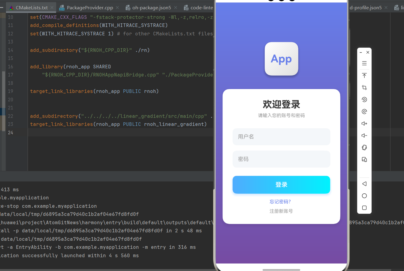
三、用户卡片案例
3.1 完整实现
javascript
import React, { memo } from 'react';
import { View, Text, StyleSheet, Image } from 'react-native';
import LinearGradient from "react-native-linear-gradient";

interface UserCardProps {
  name: string;
  role: string;
  avatar?: string;
  colors: (string | number)[];
}

const UserCard = memo<UserCardProps>(({ name, role, avatar, colors }) => {
  return (
    <LinearGradient
      colors={colors}
      start={{ x: 0, y: 0 }}
      end={{ x: 1, y: 1 }}
      style={styles.card}
    >
      <View style={styles.avatarContainer}>
        {avatar ? (
          <Image source={{ uri: avatar }} style={styles.avatar} />
        ) : (
          <LinearGradient
            colors={['#ffffff', '#e0e0e0']}
            style={styles.avatarPlaceholder}
          >
            <Text style={styles.avatarText}>
              {name.split(' ').map(n => n[0]).join('').substring(0, 2)}
            </Text>
          </LinearGradient>
        )}
      </View>
      <Text style={styles.name}>{name}</Text>
      <Text style={styles.role}>{role}</Text>
    </LinearGradient>
  );
});

UserCard.displayName = 'UserCard';

const UserCardDemo = memo(() => {
  return (
    <View style={styles.container}>
      <UserCard
        name="张三"
        role="前端工程师"
        colors={['#667eea', '#764ba2']}
      />
      <UserCard
        name="李四"
        role="产品经理"
        colors={['#fa709a', '#fee140']}
      />
      <UserCard
        name="王五"
        role="UI设计师"
        colors={['#4facfe', '#00f2fe']}
      />
    </View>
  );
});

const styles = StyleSheet.create({
  container: {
    flex: 1,
    backgroundColor: '#F5F7FA',
    padding: 16,
  },
  card: {
    borderRadius: 16,
    padding: 20,
    marginBottom: 16,
    shadowColor: '#000',
    shadowOffset: { width: 0, height: 4 },
    shadowOpacity: 0.1,
    shadowRadius: 12,
    elevation: 4,
  },
  avatarContainer: {
    alignItems: 'center',
    marginBottom: 16,
  },
  avatar: {
    width: 80,
    height: 80,
    borderRadius: 40,
  },
  avatarPlaceholder: {
    width: 80,
    height: 80,
    borderRadius: 40,
    justifyContent: 'center',
    alignItems: 'center',
  },
  avatarText: {
    fontSize: 28,
    fontWeight: '700',
    color: '#667eea',
  },
  name: {
    fontSize: 20,
    fontWeight: '700',
    color: '#FFFFFF',
    textAlign: 'center',
    marginBottom: 4,
  },
  role: {
    fontSize: 14,
    color: 'rgba(255, 255, 255, 0.9)',
    textAlign: 'center',
  },
});

export default UserCardDemo;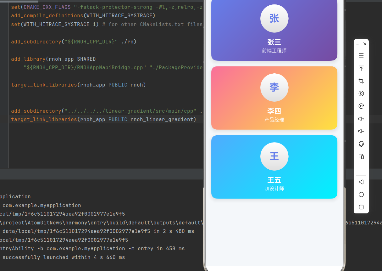
四、标签系统案例
4.1 完整实现
javascript
import React, { memo } from 'react';
import { View, Text, StyleSheet, ScrollView } from 'react-native';
import LinearGradient from "react-native-linear-gradient";

interface TagProps {
  text: string;
  colors: (string | number)[];
  onRemove?: () => void;
}

const Tag = memo<TagProps>(({ text, colors, onRemove }) => {
  return (
    <LinearGradient
      colors={colors}
      start={{ x: 0, y: 0 }}
      end={{ x: 1, y: 0 }}
      style={styles.tag}
    >
      <Text style={styles.tagText}>{text}</Text>
      {onRemove && (
        <Text style={styles.removeButton} onPress={onRemove}>
          ×
        </Text>
      )}
    </LinearGradient>
  );
});

Tag.displayName = 'Tag';

const TagSystemDemo = memo(() => {
  const tags = [
    { text: 'React Native', colors: ['#667eea', '#764ba2'] },
    { text: 'TypeScript', colors: ['#4facfe', '#00f2fe'] },
    { text: 'HarmonyOS', colors: ['#fa709a', '#fee140'] },
    { text: 'JavaScript', colors: ['#43e97b', '#38f9d7'] },
    { text: 'CSS', colors: ['#f093fb', '#f5576c'] },
  ];

  return (
    <View style={styles.container}>
      <Text style={styles.title}>标签系统</Text>
      <ScrollView horizontal showsHorizontalScrollIndicator={false}>
        <View style={styles.tagContainer}>
          {tags.map((tag, index) => (
            <Tag
              key={index}
              text={tag.text}
              colors={tag.colors}
            />
          ))}
        </View>
      </ScrollView>
    </View>
  );
});

const styles = StyleSheet.create({
  container: {
    flex: 1,
    backgroundColor: '#F5F7FA',
    padding: 16,
  },
  title: {
    fontSize: 20,
    fontWeight: '700',
    color: '#333',
    marginBottom: 16,
  },
  tagContainer: {
    flexDirection: 'row',
    flexWrap: 'wrap',
  },
  tag: {
    flexDirection: 'row',
    alignItems: 'center',
    borderRadius: 20,
    paddingHorizontal: 16,
    paddingVertical: 8,
    marginRight: 8,
    marginBottom: 8,
    shadowColor: '#000',
    shadowOffset: { width: 0, height: 2 },
    shadowOpacity: 0.1,
    shadowRadius: 4,
    elevation: 2,
  },
  tagText: {
    color: '#FFFFFF',
    fontSize: 14,
    fontWeight: '500',
    marginRight: 4,
  },
  removeButton: {
    color: '#FFFFFF',
    fontSize: 18,
    fontWeight: '600',
    marginLeft: 4,
  },
});

export default TagSystemDemo;
五、数据统计卡片案例
5.1 完整实现
javascript
import React, { memo } from 'react';
import { View, Text, StyleSheet, ScrollView } from 'react-native';
import LinearGradient from "react-native-linear-gradient";

interface StatCardProps {
  title: string;
  value: string;
  trend: string;
  trendUp: boolean;
  colors: (string | number)[];
}

const StatCard = memo<StatCardProps>(({ title, value, trend, trendUp, colors }) => {
  return (
    <LinearGradient
      colors={colors}
      start={{ x: 0, y: 0 }}
      end={{ x: 1, y: 1 }}
      style={styles.card}
    >
      <Text style={styles.title}>{title}</Text>
      <Text style={styles.value}>{value}</Text>
      <View style={styles.trendContainer}>
        <Text style={[
          styles.trend,
          { color: trendUp ? '#67C23A' : '#F56C6C' }
        ]}>
          {trendUp ? '↑' : '↓'} {trend}
        </Text>
      </View>
    </LinearGradient>
  );
});

StatCard.displayName = 'StatCard';

const StatCardDemo = memo(() => {
  const stats = [
    { title: '总用户数', value: '12,345', trend: '+12%', trendUp: true, colors: ['#667eea', '#764ba2'] },
    { title: '活跃用户', value: '8,765', trend: '+8%', trendUp: true, colors: ['#4facfe', '#00f2fe'] },
    { title: '转化率', value: '3.2%', trend: '-2%', trendUp: false, colors: ['#fa709a', '#fee140'] },
    { title: '收入', value: '¥98,765', trend: '+15%', trendUp: true, colors: ['#43e97b', '#38f9d7'] },
  ];

  return (
    <View style={styles.container}>
      <Text style={styles.pageTitle}>数据统计</Text>
      <ScrollView>
        <View style={styles.cardContainer}>
          {stats.map((stat, index) => (
            <StatCard
              key={index}
              title={stat.title}
              value={stat.value}
              trend={stat.trend}
              trendUp={stat.trendUp}
              colors={stat.colors}
            />
          ))}
        </View>
      </ScrollView>
    </View>
  );
});

const styles = StyleSheet.create({
  container: {
    flex: 1,
    backgroundColor: '#F5F7FA',
  },
  pageTitle: {
    fontSize: 24,
    fontWeight: '700',
    color: '#333',
    padding: 20,
  },
  cardContainer: {
    padding: 16,
    flexDirection: 'row',
    flexWrap: 'wrap',
  },
  card: {
    width: '48%',
    borderRadius: 16,
    padding: 20,
    marginRight: '2%',
    marginBottom: 16,
    shadowColor: '#000',
    shadowOffset: { width: 0, height: 4 },
    shadowOpacity: 0.1,
    shadowRadius: 12,
    elevation: 4,
  },
  title: {
    fontSize: 14,
    color: 'rgba(255, 255, 255, 0.9)',
    marginBottom: 8,
  },
  value: {
    fontSize: 28,
    fontWeight: '700',
    color: '#FFFFFF',
    marginBottom: 8,
  },
  trendContainer: {
    alignItems: 'flex-start',
  },
  trend: {
    fontSize: 12,
    fontWeight: '600',
  },
});

export default StatCardDemo;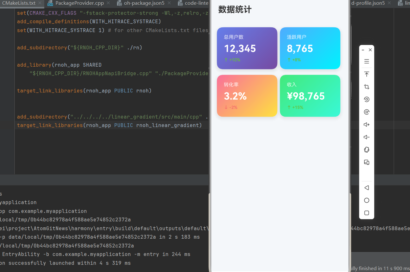
六、音乐播放器案例
6.1 完整实现
javascript
import React, { memo, useState } from 'react';
import {
  View,
  Text,
  StyleSheet,
  TouchableOpacity,
  Image,
} from 'react-native';
import LinearGradient from "react-native-linear-gradient";

interface PlayButtonProps {
  onPress: () => void;
  colors: (string | number)[];
}

const PlayButton = memo<PlayButtonProps>(({ onPress, colors }) => {
  return (
    <TouchableOpacity onPress={onPress} activeOpacity={0.8}>
      <LinearGradient
        colors={colors}
        start={{ x: 0, y: 0 }}
        end={{ x: 1, y: 1 }}
        style={styles.playButton}
      >
        <Text style={styles.playButtonText}>▶</Text>
      </LinearGradient>
    </TouchableOpacity>
  );
});

PlayButton.displayName = 'PlayButton';

const MusicPlayer = memo(() => {
  const [isPlaying, setIsPlaying] = useState(false);
  const [progress, setProgress] = useState(0.3);

  const togglePlay = () => {
    setIsPlaying(!isPlaying);
  };

  return (
    <View style={styles.container}>
      <LinearGradient
        colors={['#667eea', '#764ba2', '#f093fb']}
        start={{ x: 0, y: 0 }}
        end={{ x: 1, y: 1 }}
        style={styles.background}
      >
        <View style={styles.content}>
          <LinearGradient
            colors={['#ffffff', '#e0e0e0']}
            style={styles.albumArt}
          >
            <Text style={styles.albumText}>🎵</Text>
          </LinearGradient>

          <Text style={styles.songTitle}>歌曲名称</Text>
          <Text style={styles.artistName}>歌手名称</Text>

          <View style={styles.progressContainer}>
            <Text style={styles.currentTime}>1:23</Text>
            <View style={styles.progressBar}>
              <View style={[styles.progressFill, { width: `${progress * 100}%` }]} />
            </View>
            <Text style={styles.totalTime}>3:45</Text>
          </View>

          <View style={styles.controls}>
            <TouchableOpacity style={styles.controlButton}>
              <Text style={styles.controlText}>⏮</Text>
            </TouchableOpacity>

            <PlayButton
              onPress={togglePlay}
              colors={['#4facfe', '#00f2fe']}
            />

            <TouchableOpacity style={styles.controlButton}>
              <Text style={styles.controlText}>⏭</Text>
            </TouchableOpacity>
          </View>
        </View>
      </LinearGradient>
    </View>
  );
});

const styles = StyleSheet.create({
  container: {
    flex: 1,
  },
  background: {
    flex: 1,
  },
  content: {
    flex: 1,
    justifyContent: 'center',
    alignItems: 'center',
    padding: 40,
  },
  albumArt: {
    width: 280,
    height: 280,
    borderRadius: 20,
    justifyContent: 'center',
    alignItems: 'center',
    marginBottom: 30,
    shadowColor: '#000',
    shadowOffset: { width: 0, height: 8 },
    shadowOpacity: 0.3,
    shadowRadius: 16,
    elevation: 8,
  },
  albumText: {
    fontSize: 80,
  },
  songTitle: {
    fontSize: 24,
    fontWeight: '700',
    color: '#FFFFFF',
    marginBottom: 8,
  },
  artistName: {
    fontSize: 16,
    color: 'rgba(255, 255, 255, 0.8)',
    marginBottom: 40,
  },
  progressContainer: {
    width: '100%',
    marginBottom: 40,
  },
  currentTime: {
    color: 'rgba(255, 255, 255, 0.8)',
    fontSize: 12,
    marginBottom: 8,
  },
  progressBar: {
    flex: 1,
    height: 4,
    backgroundColor: 'rgba(255, 255, 255, 0.3)',
    borderRadius: 2,
    marginHorizontal: 12,
  },
  progressFill: {
    height: '100%',
    backgroundColor: '#FFFFFF',
    borderRadius: 2,
  },
  totalTime: {
    color: 'rgba(255, 255, 255, 0.8)',
    fontSize: 12,
    textAlign: 'right',
    marginTop: -48,
  },
  controls: {
    flexDirection: 'row',
    alignItems: 'center',
    gap: 40,
  },
  controlButton: {
    width: 60,
    height: 60,
    justifyContent: 'center',
    alignItems: 'center',
  },
  controlText: {
    fontSize: 32,
    color: '#FFFFFF',
  },
  playButton: {
    width: 80,
    height: 80,
    borderRadius: 40,
    justifyContent: 'center',
    alignItems: 'center',
    shadowColor: '#000',
    shadowOffset: { width: 0, height: 4 },
    shadowOpacity: 0.3,
    shadowRadius: 8,
    elevation: 4,
  },
  playButtonText: {
    fontSize: 32,
    color: '#FFFFFF',
  },
});

export default MusicPlayer;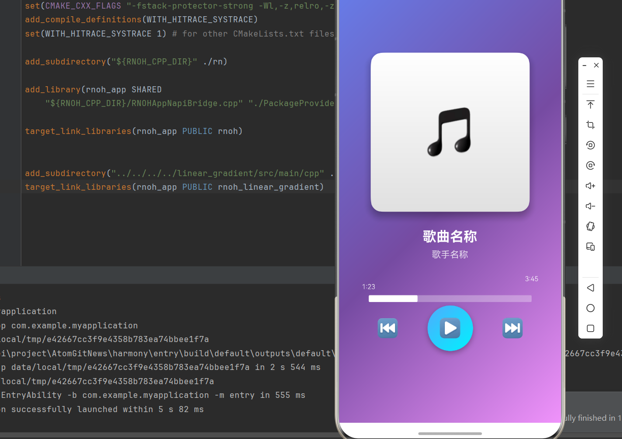
七、性能优化建议
7.1 使用 memo 优化组件
所有自定义组件都应使用 memo 包装:
javascript
const CustomComponent = memo<PropsType>(({ prop1, prop2 }) => {
  // 组件实现
});

CustomComponent.displayName = 'CustomComponent';
7.2 使用 StyleSheet 创建样式
避免内联样式,使用 StyleSheet.create:
javascript
const styles = StyleSheet.create({
  container: {
    flex: 1,
  },
});
7.3 避免过度嵌套
尽量减少组件嵌套层级:
javascript
// 不推荐
<View>
  <View>
    <LinearGradient />
  </View>
</View>

// 推荐
<LinearGradient />欢迎加入开源鸿蒙跨平台社区:https://openharmonycrossplatform.csdn.net