文章目录
- 一、默认插槽
-
- [1. 需求](#1. 需求)
- [2. 默认插槽的语法](#2. 默认插槽的语法)
- [3. 代码示例](#3. 代码示例)
- 二、具名插槽
-
- [1. 需求](#1. 需求)
- [2. 具名插槽的语法](#2. 具名插槽的语法)
- [3. 代码示例](#3. 代码示例)
- [三、作用域插槽(scoped slot)](#三、作用域插槽(scoped slot))
-
- [1. 作用](#1. 作用)
- [2. 场景](#2. 场景)
- [3. 使用方式](#3. 使用方式)
- [4. 代码示例](#4. 代码示例)
- 综合案例

一、默认插槽
1. 需求
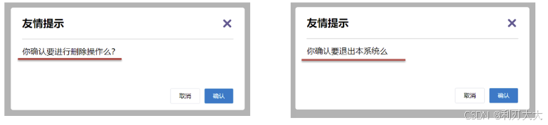
让组件内部的一些结构支持自定义,比如下面提示框中只有提示内容不同,而标题跟按钮都是不变的,要提高复用性的话,就可以使用插槽!
2. 默认插槽的语法
- 组件内需要定制的结构部分,改用
<slot></slot>占位 - 使用组件时, 将
<MyDialog></MyDialog>写成双标签,里面包裹要替换的结构
此外,在封装组件时,可以为 <slot></slot> 提供默认内容。
- 使用组件时,不传,则会显示
slot的默认内容 - 使用组件时,传了,则
slot整体会被换掉,从而显示传入的
3. 代码示例
MyDialog.vue文件:
javascript
<script setup>
</script>

<template>
  <div class="dialog">
    <div class="dialog-header">
      <h3>友情提示</h3>
      <span class="close">✖</span>
    </div>
    <div class="dialog-content">
        <slot>我是默认内容!</slot>
    </div>
    <div class="dialog-footer">
      <button>取消</button>
      <button>确认</button>
    </div>
  </div>
</template>

<style scoped>
* {
  margin: 0;
  padding: 0;
}

.dialog {
  width: 470px;
  height: 230px;
  padding: 0 25px;
  background-color: #ffffff;
  margin: 40px auto;
  border-radius: 5px;
}

.dialog-header {
  height: 70px;
  line-height: 70px;
  font-size: 20px;
  border-bottom: 1px solid #ccc;
  position: relative;
}

.dialog-header .close {
  position: absolute;
  right: 0px;
  top: 0px;
  cursor: pointer;
}

.dialog-content {
  height: 80px;
  font-size: 18px;
  padding: 15px 0;
}

.dialog-footer {
  display: flex;
  justify-content: flex-end;
}

.dialog-footer button {
  width: 65px;
  height: 35px;
  background-color: #ffffff;
  border: 1px solid #e1e3e9;
  cursor: pointer;
  outline: none;
  margin-left: 10px;
  border-radius: 3px;
}

.dialog-footer button:last-child {
  background-color: #007acc;
  color: #fff;
}
</style>App.vue文件:
javascript
<template>
    <my-dialog></my-dialog>

    <my-dialog>你确认要进行删除操作么?</my-dialog>
</template>

<script setup>
    import MyDialog from './components3/MyDialog.vue';
</script>
二、具名插槽
1. 需求
一个组件内有多处结构,需要外部传入标签,进行定制
比如上面的弹框中有三处不同之处,但是默认插槽只能定制一处内容,此时就需要用到具名插槽!
2. 具名插槽的语法
- 多个
slot使用name属性区分 - 使用
<template>配合v-slot:名字来匹配对应插槽- 简写: 由于
v-slot写起来太长,vue 给我们提供一个简单写法,将v-slot:名字直接简写为#名字
- 简写: 由于
3. 代码示例
MyDialog.vue文件:
javascript
<script setup>
</script>

<template>
  <div class="dialog">
    <div class="dialog-header">
      <slot name="header"><h3>默认标题</h3></slot>
      <span class="close">✖</span>
    </div>
    <div class="dialog-content">
        <slot name="content">我是默认内容!</slot>
    </div>
    <div class="dialog-footer">
      <button>取消</button>
      <button>确认</button>
    </div>
  </div>
</template>

<style scoped>
* {
  margin: 0;
  padding: 0;
}

.dialog {
  width: 470px;
  height: 230px;
  padding: 0 25px;
  background-color: #ffffff;
  margin: 40px auto;
  border-radius: 5px;
}

.dialog-header {
  height: 70px;
  line-height: 70px;
  font-size: 20px;
  border-bottom: 1px solid #ccc;
  position: relative;
}

.dialog-header .close {
  position: absolute;
  right: 0px;
  top: 0px;
  cursor: pointer;
}

.dialog-content {
  height: 80px;
  font-size: 18px;
  padding: 15px 0;
}

.dialog-footer {
  display: flex;
  justify-content: flex-end;
}

.dialog-footer button {
  width: 65px;
  height: 35px;
  background-color: #ffffff;
  border: 1px solid #e1e3e9;
  cursor: pointer;
  outline: none;
  margin-left: 10px;
  border-radius: 3px;
}

.dialog-footer button:last-child {
  background-color: #007acc;
  color: #fff;
}
</style>App.vue文件:
javascript
<template>
    <my-dialog></my-dialog>

    <my-dialog>
        <template v-slot:header>
            <h3>友情提示</h3>
        </template>

        <template #content>
            <p>请输入正确的手机号</p>
        </template>
    </my-dialog>
</template>

<script setup>
    import MyDialog from './components4/MyDialog.vue';
</script>

<style>
body {
  background-color: #b3b3b3;
}
</style>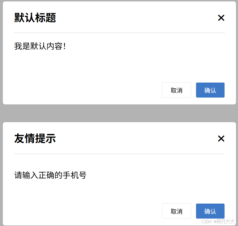
三、作用域插槽(scoped slot)
1. 作用
所谓 "作用域",指的是 子组件的数据可以暴露出来,让父组件在插槽里用。
带数据的插槽,可以让组件功能更强大、更灵活、复用性更高;用 slot 占位的同时,还可以给 slot 绑定数据,将来使用组件时,不仅可以传内容,还能使用 slot 带来的数据。
2. 场景
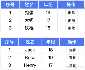
以 "表格 + 作用域插槽" 这个经典应用为例:
- 如果 没有作用域插槽,则子组件在循环代码的时候,相当于写死了,如果有的表格需要在 "操作" 中显示删除功能,而有的需要显示查看功能,则该情况是做不到的!
- 但是 有作用域插槽 的话,则 子组件只需要负责循环列表 ,而具体每个元素渲染什么工作,可以通过作用域插槽将数据传给父组件,让父组件是控制元素输出的内容,这样子父组件需要输出什么,就用输出什么,提高了组件的灵活性!
3. 使用方式
-
在 子组件 中,给
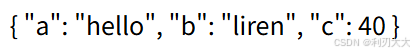
slot标签添加属性,用这种方式暴露数据给外部javascript<slot a="hello" b="liren" :c=40></slot>-
所有上述添加的属性,都会被收集到一个对象中,该对象如下所示:
javascript{ a: 'hello', b: 666 }
-
-
然后 父组件 在
<template>中,通过#插槽名= "obj"接收(默认插槽名为default)javascript<!-- obj会收集 slot 上绑定的所有自定义属性 --> <template #default="obj"> {{ obj }} </template>
4. 代码示例
MyTable.vue文件:
javascript
<script setup>
    // 接收父组件的数据
    const props = defineProps({
        data: {
            type: Array,
            default: () => []
        }
    })
</script>

<template>
  <table class="my-table">
    <thead>
      <tr>
        <th>序号</th>
        <th>姓名</th>
        <th>年纪</th>
        <th>操作</th>
      </tr>
    </thead>
    <tbody>
      <tr v-for="(item, index) in props.data" :key="item.id">
        <td>{{ index + 1 }}</td>
        <td>{{ item.name }}</td>
        <td>{{ item.age }}</td>
        <td>
          <slot :index="index"></slot>
        </td>
      </tr>
    </tbody>
  </table>
</template>

<style>
.my-table {
  width: 450px;
  text-align: center;
  border: 1px solid #ccc;
  font-size: 24px;
  margin: 30px auto;
}

.my-table thead {
  background-color: #1f74ff;
  color: #fff;
}

.my-table thead th {
  font-weight: normal;
}

.my-table thead tr {
  line-height: 40px;
}

.my-table th,
.my-table td {
  border-bottom: 1px solid #ccc;
  border-right: 1px solid #ccc;
}

.my-table td:last-child {
  border-right: none;
}

.my-table tr:last-child td {
  border-bottom: none;
}

.my-table button {
  width: 65px;
  height: 35px;
  font-size: 18px;
  border: 1px solid #ccc;
  outline: none;
  border-radius: 3px;
  cursor: pointer;
  background-color: #ffffff;
  margin-left: 5px;
}
</style>App.vue文件:
javascript
<script setup>
    import { ref } from 'vue'
    import MyTable from './components6/MyTable.vue'

    const tableData1 = ref([
        { id: 11, name: '狗蛋', age: 18 },
        { id: 22, name: '大锤', age: 19 },
        { id: 33, name: '铁棍', age: 17 }
    ])

    const tableData2 = ref([
        { id: 21, name: 'Jack', age: 18 },
        { id: 32, name: 'Rose', age: 19 },
        { id: 43, name: 'Henry', age: 17 }
    ])

    const del = (index) => {
        if(window.confirm("确认删除吗?")) {
            tableData1.value.splice(index, 1)
        }
    }

    const check = (index) => {
        alert(JSON.stringify(tableData2.value[index]))
    }
</script>

<template>
    <MyTable :data="tableData1">
        <template #default="obj">
            <button @click="del(obj.index)">删除</button>
        </template>
    </MyTable>

    <MyTable :data="tableData2">
        <template #default="obj">
            <button @click="check(obj.index)">查看</button>
        </template>
    </MyTable>
</template>

<style>
body {
  background-color: #fff;
}
</style>
综合案例
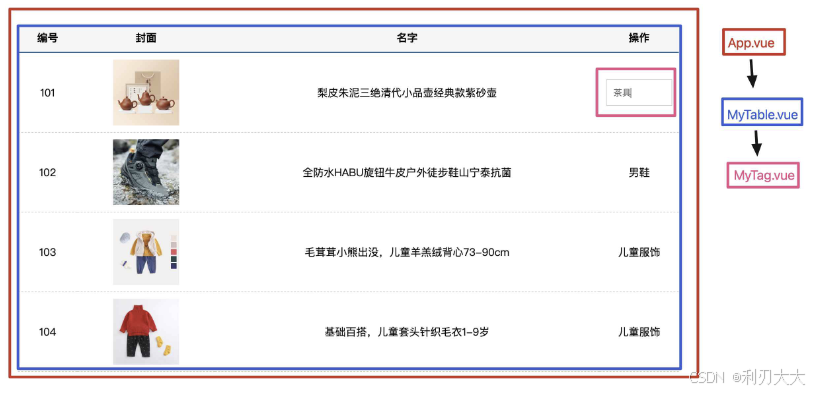
需求说明:
- my-table表格组件封装
- 动态传递表格数据渲染
- 表头支持用户自定义
- 主体支持用户自定义
- my-tag标签组件封装
- 双击显示输入框,输入框获取焦点
- 失去焦点,隐藏输入框
- 回显标签信息
- 内容修改,回车修改标签信息
App.vue文件:
javascript
<template>
    <my-table :data="goodsList">
        <template #header>
            <th>序号</th>
            <th>封面</th>
            <th>名称</th>
            <th>操作</th>
        </template>

        <template #default="{ item, index }">
            <td>{{ index + 1 }}</td>
            <td><img :src="item.picture" /></td>
            <td>{{ item.name }}</td>
            <td>
                <my-tag v-model="item.tag"></my-tag>
            </td>
        </template>
    </my-table>
</template>

<script setup>
    import MyTable from './components7/MyTable.vue';
    import MyTag from './components7/MyTag.vue';
    import {ref} from 'vue'

    // 商品列表
    const goodsList = ref([
        {
            id: 101,
            picture: 'https://yanxuan-item.nosdn.127.net/f8c37ffa41ab1eb84bff499e1f6acfc7.jpg',
            name: '梨皮朱泥三绝清代小品壶经典款紫砂壶',
            tag: '茶具'
        },
        {
            id: 102,
            picture: 'https://yanxuan-item.nosdn.127.net/221317c85274a188174352474b859d7b.jpg',
            name: '全防水HABU旋钮牛皮户外徒步鞋山宁泰抗菌',
            tag: '男鞋'
        },
        {
            id: 103,
            picture: 'https://yanxuan-item.nosdn.127.net/cd4b840751ef4f7505c85004f0bebcb5.png',
            name: '毛茸茸小熊出没,儿童羊羔绒背心73-90cm',
            tag: '儿童服饰'
        },
        {
            id: 104,
            picture: 'https://yanxuan-item.nosdn.127.net/56eb25a38d7a630e76a608a9360eec6b.jpg',
            name: '基础百搭,儿童套头针织毛衣1-9岁',
            tag: '儿童服饰'
        }
    ])
</script>

<style lang="scss">
#app {
  width: 1000px;
  margin: 50px auto;

  img {
    width: 100px;
    height: 100px;
    object-fit: contain;
    vertical-align: middle;
  }

  td:last-child {
    width: 150px;
  }
}
</style>MyTable文件:
javascript
<script setup>
    // 接收父组件的商品数据
    const props = defineProps({
        data: {
            type: Array,
            default: () => []
        }
    })
</script>

<template>
    <table class="my-table">
        <thead>
            <tr>
                <!-- 表头使用具名插槽 -->
                <slot name="header"></slot>
            </tr>
        </thead>
        <tbody>
            <tr v-for="(item, index) in props.data" :key="item.id">
                <!-- 表体使用默认插槽 -->
                <slot :item="item" :index="index"></slot>
            </tr>
        </tbody>
    </table>
</template>

<style lang="scss">
.my-table {
    width: 100%;
    border-spacing: 0;

    img {
        width: 100px;
        height: 100px;
        object-fit: contain;
        vertical-align: middle;
    }

    th {
        background: #f5f5f5;
        border-bottom: 2px solid #069;
    }

    td {
        border-bottom: 1px dashed #ccc;
    }

    td,
    th {
        text-align: center;
        padding: 10px;
        transition: all .5s;

        &.red {
            color: red;
        }
    }

    .none {
        height: 100px;
        line-height: 100px;
        color: #999;
    }
}
</style>MyTag.vue文件:
javascript
<script setup>
    import { nextTick, ref } from 'vue';

    // 与父组件的双向绑定数据,可读可写
    const tag = defineModel()

    const isEdit = ref(false)   // false表示显示模式,true表示编辑模式
    const input_ref = ref(null) // 输入框的引用
    const inputText = ref('')   // 输入框的内容

    // 双击标签后,修改输入框状态,生成输入框焦点
    const changeStatus = () => {
        isEdit.value = true
        if(isEdit.value === true) {
            nextTick(() => {
                input_ref.value.focus()
            })
        }
    }

    // 输入框回车后逆转状态
    const updateTag = () => {
        if(inputText.value) {
            tag.value = inputText.value
            inputText.value = ''
        }
        isEdit.value = false
    }
</script>

<template>
    <div class="my-tag">
        <input class="input" type="text" placeholder="输入标签"
            ref="input_ref"
            v-if="isEdit"
            v-model.trim="inputText"
            @keyup.enter="updateTag"
        />
        <div class="text" @dblclick="changeStatus" v-else>
            {{ tag }}
        </div>
    </div>
</template>

<style lang="scss" scoped>
.my-tag {
    cursor: pointer;
    .input {
        appearance: none;
        outline: none;
        border: 1px solid #ccc;
        width: 100px;
        height: 40px;
        box-sizing: border-box;
        padding: 10px;
        color: #666;

        &::placeholder {
            color: #666;
        }
    }
}
</style>