最近在做一个衣橱管理类的App,其中有个功能我觉得挺有意思的,就是根据用户选择的场合和天气,智能推荐今天应该穿什么。
这篇文章就来聊聊这个智能推荐功能是怎么实现的。
需求分析
做这个功能之前,我先想了想用户的使用场景。
早上起床,打开衣柜不知道穿啥,这时候如果App能根据今天要去的场合和天气情况,给出一套搭配建议,那就太方便了。
所以这个页面需要做的事情就三件:
-
让用户选场合
-
让用户选天气
-
生成推荐结果
页面结构搭建
先把页面的基本框架搭起来。
用StatefulWidget是因为页面上有好几个状态需要管理。
dart
class _OutfitRecommendScreenState extends State<OutfitRecommendScreen> {
  String _selectedOccasion = '日常';
  String _selectedWeather = '晴天';
  List<ClothingItem> _recommendedItems = [];
这里定义了三个状态变量。
_selectedOccasion存用户选中的场合,_selectedWeather存天气。
默认值给的是"日常"和"晴天",毕竟大多数情况下就是这样。
接下来是选项数据的定义:
dart
  final List<String> _occasions = [
    '日常',
    '工作',
    '约会',
    '运动',
    '聚会'
  ];

  final List<String> _weathers = [
    '晴天',
    '阴天',
    '雨天',
    '寒冷',
    '炎热'
  ];
场合有5种,天气也是5种,基本覆盖了日常使用场景。
用final修饰是因为这些数据初始化后不会再变。
后续如果要扩展,直接往数组里加就行。
页面整体布局
页面分上下两部分,上面是筛选条件,下面是推荐结果。
dart
@override
Widget build(BuildContext context) {
  return Scaffold(
    appBar: AppBar(
      title: const Text('智能推荐')
    ),
    body: Column(
      children: [
        _buildFilterSection(),
        Expanded(
          child: _buildRecommendation()
        ),
      ],
    ),
  );
}用Column把两部分垂直排列。
Expanded让推荐结果区域占满剩余空间。
这样不管筛选区域多高,下面的内容都能自适应。
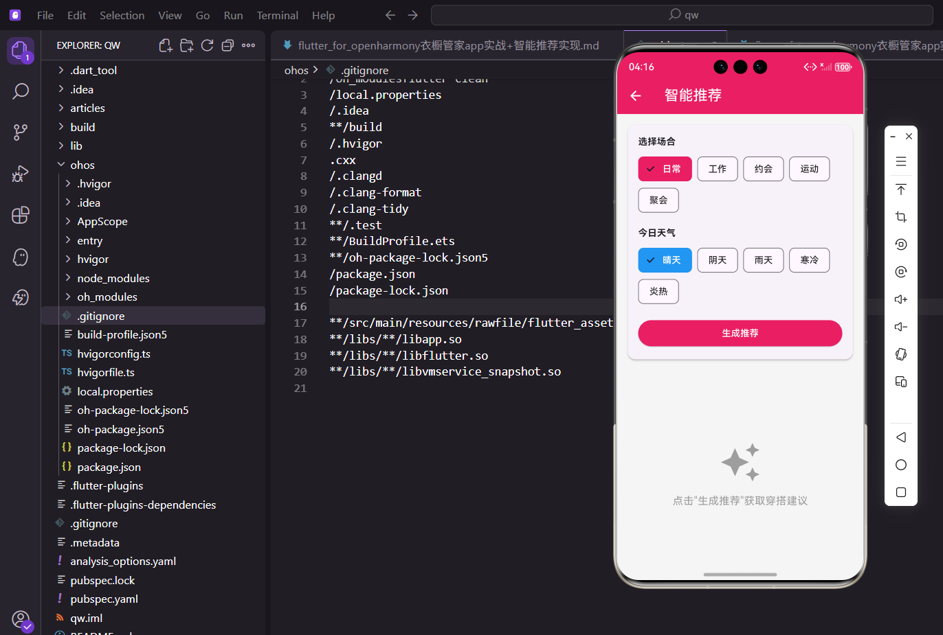
筛选条件区域
页面上半部分是让用户选条件的区域。
我把它封装成了_buildFilterSection方法。
dart
Widget _buildFilterSection() {
  return Card(
    margin: EdgeInsets.all(16.w),
    child: Padding(
      padding: EdgeInsets.all(16.w),
      child: Column(
        crossAxisAlignment: CrossAxisAlignment.start,
        children: [
          // 内容
        ],
      ),
    ),
  );
}外层用Card包裹,加点阴影效果看起来更有层次感。
crossAxisAlignment设成start让内容左对齐。
内边距用16.w,这是用了flutter_screenutil做的适配。
场合选择的标题部分:
dart
Text(
  '选择场合',
  style: TextStyle(
    fontSize: 14.sp,
    fontWeight: FontWeight.bold
  )
),

SizedBox(height: 8.h),
标题用粗体显示,让用户一眼就能看到这是干嘛的。
下面加个间距,让布局不那么拥挤。
sp和h都是屏幕适配的单位。
场合选择用ChoiceChip来实现:
dart
Wrap(
  spacing: 8.w,
  children: _occasions.map((o) {
    return ChoiceChip(
      label: Text(o),
      selected: _selectedOccasion == o,
      selectedColor: const Color(0xFFE91E63),
      labelStyle: TextStyle(
        color: _selectedOccasion == o
          ? Colors.white
          : Colors.black87
      ),
      onSelected: (s) => setState(() => _selectedOccasion = o),
    );
  }).toList(),
),ChoiceChip自带选中效果,用起来很方便。
Wrap组件可以让这些Chip自动换行,不用担心屏幕宽度不够。
点击的时候调用setState更新状态,界面就会自动刷新。
天气选择的实现方式差不多:
dart
Text(
  '今日天气',
  style: TextStyle(
    fontSize: 14.sp,
    fontWeight: FontWeight.bold
  )
),

SizedBox(height: 8.h),

Wrap(
  spacing: 8.w,
  children: _weathers.map((w) {
    return ChoiceChip(
      label: Text(w),
      selected: _selectedWeather == w,
      selectedColor: Colors.blue,
      labelStyle: TextStyle(
        color: _selectedWeather == w
          ? Colors.white
          : Colors.black87
      ),
      onSelected: (s) => setState(() => _selectedWeather = w),
    );
  }).toList(),
),
和场合选择的区别就是换了个颜色,用蓝色来区分。
场合用粉色,天气用蓝色,视觉上能一眼区分开。
这种小细节能提升用户体验,不容易搞混。
最后是生成推荐的按钮:
dart
SizedBox(height: 16.h),

SizedBox(
  width: double.infinity,
  child: ElevatedButton(
    onPressed: _generateRecommendation,
    style: ElevatedButton.styleFrom(
      backgroundColor: const Color(0xFFE91E63)
    ),
    child: const Text(
      '生成推荐',
      style: TextStyle(color: Colors.white)
    ),
  ),
),
按钮设成全宽,点击区域大一些用户操作更方便。
颜色用主题色保持统一,和场合选中的颜色一致。
点击后会调用_generateRecommendation方法生成推荐。
推荐结果展示
下半部分展示推荐结果。
要处理两种情况:空状态和有数据。
dart
Widget _buildRecommendation() {
  if (_recommendedItems.isEmpty) {
    return Center(
      child: Column(
        mainAxisAlignment: MainAxisAlignment.center,
        children: [
          Icon(
            Icons.auto_awesome,
            size: 64.sp,
            color: Colors.grey
          ),
          SizedBox(height: 16.h),
          Text(
            '点击"生成推荐"获取穿搭建议',
            style: TextStyle(
              fontSize: 16.sp,
              color: Colors.grey
            )
          ),
        ],
      ),
    );
  }

  // 有数据时的展示...
}
空状态的处理很重要,不能让用户看到一片空白。
这里放了个图标加文字提示,告诉用户下一步该做什么。
用灰色表示这是个引导状态,不是主要内容。
有推荐结果时,先搭建外层结构:
dart
return SingleChildScrollView(
  padding: EdgeInsets.all(16.w),
  child: Column(
    crossAxisAlignment: CrossAxisAlignment.start,
    children: [
      Text(
        '为您推荐',
        style: TextStyle(
          fontSize: 18.sp,
          fontWeight: FontWeight.bold
        )
      ),
      SizedBox(height: 16.h),
      // 推荐内容...
    ],
  ),
);用SingleChildScrollView包裹,内容多的时候可以滚动。
标题"为您推荐"用大号粗体,突出显示。
整体左对齐,符合阅读习惯。
推荐结果的容器用渐变背景:
dart
Container(
  padding: EdgeInsets.all(16.w),
  decoration: BoxDecoration(
    gradient: LinearGradient(
      colors: [
        const Color(0xFFE91E63).withOpacity(0.1),
        Colors.blue.withOpacity(0.1)
      ],
    ),
    borderRadius: BorderRadius.circular(12.r),
  ),
  child: Row(
    mainAxisAlignment: MainAxisAlignment.spaceEvenly,
    children: [
      // 衣物卡片...
    ],
  ),
),
渐变从粉色到蓝色,和上面的选项颜色呼应。
整体视觉效果比较统一,不会显得突兀。
圆角设成12让卡片看起来更柔和。
单个衣物卡片的展示:
dart
Column(
  children: [
    Container(
      width: 80.w,
      height: 100.h,
      decoration: BoxDecoration(
        color: ClothingItem
          .getColorFromName(item.color)
          .withOpacity(0.3),
        borderRadius: BorderRadius.circular(8.r),
      ),
      child: Center(
        child: Icon(
          Icons.checkroom,
          size: 40.sp,
          color: ClothingItem.getColorFromName(item.color)
        ),
      ),
    ),
    SizedBox(height: 8.h),
    Text(
      item.name,
      style: TextStyle(fontSize: 12.sp),
      textAlign: TextAlign.center
    ),
    Text(
      item.category,
      style: TextStyle(
        fontSize: 10.sp,
        color: Colors.grey
      )
    ),
  ],
),
每件衣物显示一个色块加图标,下面是名称和分类。
色块的颜色取的是衣物本身的颜色属性。
用户一眼就能知道推荐的是什么颜色的衣服。
推荐理由展示
光给推荐结果还不够,得告诉用户为什么推荐这套。
dart
SizedBox(height: 24.h),

Text(
  '推荐理由',
  style: TextStyle(
    fontSize: 16.sp,
    fontWeight: FontWeight.bold
  )
),

SizedBox(height: 8.h),
和推荐结果之间留点间距,视觉上分开两个区块。
标题同样用粗体,保持风格统一。
这部分内容放在Card里面展示。
理由项的通用组件:
dart
Widget _buildReasonItem(
  IconData icon,
  String title,
  String desc
) {
  return Padding(
    padding: EdgeInsets.only(bottom: 12.h),
    child: Row(
      children: [
        Icon(
          icon,
          color: const Color(0xFFE91E63),
          size: 20.sp
        ),
        SizedBox(width: 12.w),
        Column(
          crossAxisAlignment: CrossAxisAlignment.start,
          children: [
            Text(
              title,
              style: TextStyle(
                fontSize: 14.sp,
                fontWeight: FontWeight.bold
              )
            ),
            Text(
              desc,
              style: TextStyle(
                fontSize: 12.sp,
                color: Colors.grey
              )
            ),
          ],
        ),
      ],
    ),
  );
}
这是个通用的理由项组件,左边图标右边文字。
封装成方法后可以复用,传入不同参数就能显示不同内容。
图标用主题色,和整体风格保持一致。
调用的时候这样写:
dart
Card(
  child: Padding(
    padding: EdgeInsets.all(16.w),
    child: Column(
      crossAxisAlignment: CrossAxisAlignment.start,
      children: [
        _buildReasonItem(
          Icons.event,
          '场合适配',
          '适合$_selectedOccasion场合穿着'
        ),
        _buildReasonItem(
          Icons.wb_sunny,
          '天气适宜',
          '适合$_selectedWeather天气'
        ),
        _buildReasonItem(
          Icons.palette,
          '色彩搭配',
          '颜色协调,整体和谐'
        ),
      ],
    ),
  ),
),
用字符串插值把用户选的场合和天气动态显示出来。
让推荐理由更有针对性,不是千篇一律的文案。
三个理由分别从场合、天气、色彩三个维度说明。
核心推荐算法
最后是推荐算法的实现。
目前的逻辑比较简单,先把框架搭好。
dart
void _generateRecommendation() {
  final provider = Provider.of<WardrobeProvider>(
    context,
    listen: false
  );
  final clothes = provider.clothes;
  final random = Random();

List<ClothingItem> recommended = [];通过Provider获取衣橱数据。
listen: false表示不需要监听变化,只是取一次数据。
创建一个空列表来存放推荐结果。
筛选上衣:
dart
  final tops = clothes
    .where((c) => c.category == '上衣')
    .toList();

  if (tops.isNotEmpty) {
    recommended.add(
      tops[random.nextInt(tops.length)]
    );
}用where方法筛选出所有上衣。
如果有上衣,就随机选一件加到推荐列表。
random.nextInt生成一个随机索引。
筛选下装:
dart
  final bottoms = clothes
    .where((c) => c.category == '裤子' || c.category == '裙子')
    .toList();

  if (bottoms.isNotEmpty) {
    recommended.add(
      bottoms[random.nextInt(bottoms.length)]
    );
  }
下装包括裤子和裙子两种类型。
同样是随机选一件加到推荐列表。
这样就组成了一套上下搭配。
更新状态:
dart
  setState(() {
    _recommendedItems = recommended;
  });
}调用setState更新推荐列表。
界面会自动刷新显示新的推荐结果。
这个算法后续可以优化,比如根据天气筛选季节、根据场合筛选标签等。
底部操作按钮
页面底部有两个按钮,让用户可以换一套或者保存。
dart
SizedBox(height: 16.h),

Row(
  children: [
    Expanded(
      child: OutlinedButton(
        onPressed: _generateRecommendation,
        child: const Text('换一套'),
      ),
    ),
    SizedBox(width: 12.w),
    Expanded(
      child: ElevatedButton(
        onPressed: () {
          ScaffoldMessenger.of(context).showSnackBar(
            const SnackBar(
              content: Text('已保存为搭配')
            )
          );
        },
        style: ElevatedButton.styleFrom(
          backgroundColor: const Color(0xFFE91E63)
        ),
        child: const Text(
          '保存搭配',
          style: TextStyle(color: Colors.white)
        ),
      ),
    ),
  ],
),
"换一套"重新调用推荐算法,用户不满意可以一直换。
"保存搭配"目前只是弹个提示,后续可以接入真正的保存逻辑。
两个按钮用Expanded平分宽度,一个描边一个实心,视觉上有主次之分。
小结
这个智能推荐功能的实现不复杂,核心就是状态管理和数据筛选。
ChoiceChip做多选一很合适,Provider跨组件共享数据也很方便。
目前的推荐算法比较简单,但框架搭好了,后续想加更复杂的逻辑只需要改_generateRecommendation方法就行,其他地方不用动。
欢迎加入开源鸿蒙跨平台社区:https://openharmonycrossplatform.csdn.net