边框
border 是简写属性,包含 border-width(宽度)、border-style(样式)、border-color(颜色)三个子属性,必须指定 border-style(默认 none,无边框)才会显示边框。
css
/* 完整简写:宽度 + 样式 + 颜色(顺序可灵活调整,但样式必填) */
border: 1px solid #000;

/* 省略颜色(继承父元素 text-color) */
border: 2px dashed;

/* 省略宽度(默认 medium,约 3px) */
border: solid #f00;

/* 单方向边框简写(top/right/bottom/left) */
border-top: 3px double #666;
border-left: 1px dotted #ccc;
border-style
none(默认,无)
solid(实线)
dashed(虚线)
dotted(点线)
double(双线)
groove(凹槽)
ridge(凸槽)
border-color
颜色值(#fff/rgb()/rgba())
transparent(透明)
inherit(继承父元素)
背景
background-origin 从哪开始铺背景
背景图默认下从padding左上角开始铺
background-origin:padding-box;内边框左顶点
background-origin:border-box;边框左顶点,盒子最左侧
background-origin:content-box;内容区左顶点
background-clip 如何修剪背景
对背景图进行修剪
background-clip:border-box; border以外的背景图被剪掉,默认值
background-clip:padding-box;内边缘外的背景图被修剪
background-clip:content-box;内容外的内容被剪切
-webkit-background-clip:text;背景只呈现在有文字的地方(文字需要调成透明)
background-size
background-content;完整的呈现背景图,等比例缩放,不变形,图案会重复,取消重复会留白边
background-cover;放弃一部分背景图
background-复合属性
background:背景颜色 背景url 是否重复 位置/大小 原点 裁剪方式
多背景图
css
background: url('../images/bg-lt.png') no-repeat left top,
            url('../images/bg-rt.png') no-repeat right top;
圆角
border-radius
指定角 :border-top-left-radius
椭圆 :border-top-left-radius:100px 50px(x轴,Y轴半径)
依次表示四个角 :border-radius:100px 50px 100px 50px/100px 50px 100px 50px
(分别表示 左上x 右上x 右下x 左下x/左上y 右上y 右下y 左下y)
边框外轮廓
border外添加外轮廓,不计入盒子大小,不占位
outline-width
outline-color
outline-style
outline-offset
复合属性:outline(offset不能写在里面)
文本属性
阴影
text-shadow:3px 3px;(阴影位置)
text-shadow:3px 3px red;(阴影位置 颜色)
text-shadow:3px 3px 10px red;(阴影位置 模糊 颜色)
换行
white-space:pre按原文显示
white-space:pre-wrap在rap的基础上超出边界换行
white-space:pre-line在rap的基础上,文字始末空格忽略,只认换行
white-space:norap全都一行
文本溢出
text-overflow:clip 超出部分直接截掉
搭配overflow-hidden white-space:norap使用
text-overflow:elliepsis溢出部分有省略号
css
text-overflow:elliepsis;
overflow-hidden;
white-space:norap;
文本修饰
划线
text-dicoraction-line:
可选值:
none无效果
underline下划线
overline上划线
line-through中间一条线
text-dicoraction-style:dashed划线为点状
text-dicoraction-color:调整颜色
复合属性:text-decoration:overline dashed blue;
文本描边
-webkit-text-stroke-color:
-webkit-text-stroke-width:
*color:transparent文本颜色透明,可以实现空心文字
复合属性:
-webkit-text-stroke:3px red;
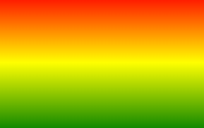
渐变
线性渐变linear-gradient
默认:从上到下
css
.box{
	background-image:linear-gradient(red,yellow,green);
	height: 100px;
	width: 150px;
}
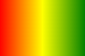
to right:从左往右
css
.box{
	background-image:linear-gradient(to right,red,yellow,green);
	height: 100px;
	width: 150px;
}
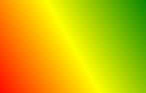
to right top左下到右上
css
.box{
	background-image:linear-gradient(to right top,red,yellow,green);
	height: 100px;
	width: 150px;
}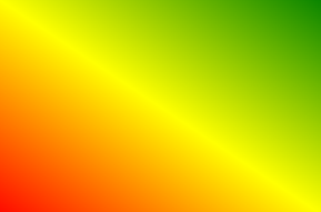
deg:调整渐变角度
角度指的是指渐变方向和水平线的夹角
css
.box{
	background-image:linear-gradient(60deg,red,yellow,green);
	height: 100px;
	width: 150px;
}
渐变位置
css
.box{
	background-image:linear-gradient(30deg,red 20px,yellow 40px,green 60px);
	height: 100px;
	width: 150px;
}
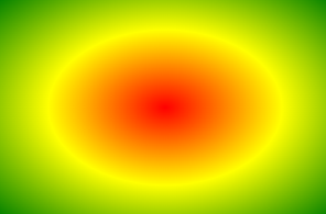
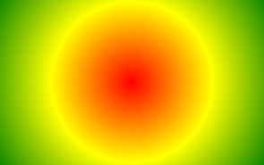
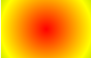
径向渐变radial-gradient
圆的样式默认跟随盒子变动
css
.box{
  background-image:radial-gradient(red,yellow,green);
  height: 100px;
	width: 150px;
}
改变圆心:
css
box{
	background-image:radial-gradient(at left top,red,yellow,green);
	height: 100px;
	width: 150px;
}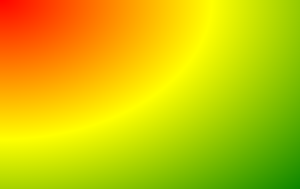
css
.box{
	 background-image:radial-gradient(at 100px 100px,red,yellow,green);
	height: 100px;
	width: 150px;
}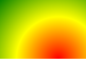
正圆:circle
在颜色前加circle让园无视盒子大小,变成正圆
控制圆的半径
css
.box{
	 background-image:radial-gradient(150px 150px,red,yellow,green);
	height: 100px;
	width: 150px;
}
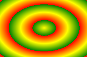
重复渐变
在liner或者radial前面加repeating-
只对标出颜色位置的渐变生效
**背景默认填充padding区域,利用background-clip进行裁剪
css
.box{
	background-image:repeating-radial-gradient(red 20px,yellow 40px,green 60px);
	height: 100px;
	width: 150px;
}
2D变换
位移
transform:translateX(10px);x方向位移
transform:translateY(10px);y方向位移
transform:translate(50%,50%);
若为百分比,则为自己宽度或长度的百分比和相对定位相似
实现水平垂直居中:
位移对行内元素无效
css
.box{
	transform:translate(50%,50%);
	top:50%;
	left:50%;
}
缩放
transform:scaleX(1.2);x方向放大1.2倍
transform:scaleY(1.2);y方向放大1.2倍
transform:scale(1.2);x,y方向都放大1.2倍
括号里为负数时图像翻转
可以让文字小于12像素
旋转
transform:rotateZ(30deg);绕Z轴旋转30度(顺时针旋转)
扭曲
transform:skewX(30deg);在x方向发生扭曲
transform:skew(30deg,30deg);写一个值时默认是x方向
 deg=90时消失
多重变换(复合属性)
css
transform: translate(-50%, -50%) rotate(45deg);变换原点
对旋转,缩放有影响
transform-origin:50px 50px;
transform-origin:left 绕左边中间旋转
3D变换
3D空间与景深
css
/*给父元素开启3D空间*/
transform-style: preserve-3d;
/* 设置景深(有了透视效果) */
perspective: 500px;
透视点位置
透视点默认位置在父元素的中间
css
perspective-origin: 102px 102px;位移
transform:translateZ(500px);
transform:translate3d(100px,100px,100px);
x.y可以写像素或者百分比,z只能写像素,不能写百分比
旋转
从坐标轴正方向看,顺时针旋转
css
transform: rotate3d(0,0,30deg);缩放
scale整体缩放
scaleXscaleYscaleZ分别对xyz轴缩放
css
transform: scaleZ(4);背部
背部默认可见,调整成不可见:
css
backface-visibility: hidden;过渡
基本使用
长,宽,颜色,盒子阴影,透明度都可以过渡
transition-property设置哪个属性需要过渡效果 :
css
transition-property: width,height,background-color; 想让所有属性过渡时: transition-property:all
transition-duration设置过渡时间
css
transition-duration: 1s;高级使用
过渡延迟transition-delay :2s;
过渡方式transition-timing-function:
可选值:
ease 慢快慢(默认值平滑过渡)
linear 线性匀速
ease-in慢快
ease-out 快慢
ease-in-out 慢快慢 比ease更慢
step-start 直接到终点
step-end 过渡时间到了瞬间到达终点
steps (20,start)咔咔咔咔的动20次,开始时快跑
steps (20,end)咔咔咔咔的动20次,开始时慢跑
复合属性
过渡时间,参与属性,延迟时间,过渡方式
只需要注意两个时间的顺序即可,如果设置了两个时间则默认是duration
css
transition: 3s all 0.5s linear;动画
基本使用
第一步:定义关键帧 (定义动画)
1.简单方式定义:
css
/*写法一*/
@keyframes 动画名 {
    from {
        /*property1:value1*/
        /*property2:value2*/
    }
    to {
        /*property1:value1*/
    }
}
2.完整方式定义:
css
@keyframes 动画名 {
  0% {
    /*property1:value1*/
  }
  20% {
    /*property1:value1*/
  }
  40% {
    /*property1:value1*/
  }
  60% {
    /*property1:value1*/
  }
  80% {
    /*property1:value1*/
  }
  100% {
    /*property1:value1*/
  }
}
・第二步:给元素应用动画,用到的属性如下:
- animation-name: 给元素指定具体的动画 (具体的关键帧)
- animation-duration: 设置动画所需时间
- animation-delay: 设置动画延迟
css
.box {
  /* 指定动画 */
  animation-name: testKey;
  /* 设置动画所需时间 */
  animation-duration: 5s;
  /* 设置动画延迟 */
  animation-delay: 0.5s;
}
其他属性
animation-timing-function 可选值和过渡一样
animation-iteration-count : 运动次数
1:动画播放1次
infinite时持续播放
animation-direction : 运动状态
reverse相反运动
alternate往复运动
alternate-reverse反向往复运动
animation-fill-mode
forwards最后一帧在哪停哪
backforwards回到第一帧
animation-play-state : 动画播放状态
paused :停止播放
running:继续播放
复合属性
顺序:只需要注意两个时间的顺序
媒体查询
媒体类型
css
@media print{
只有在打印机或者打印预览时显示
}
可选值:
all 用于所有多媒体类型设备
print 用于打印机
screen 用于电脑屏幕,平板,智能手机等。
speech 用于屏幕阅读器
媒体特征
检测到视口的宽度大于等于900px时,应用如下样式
css
@media (min-width:900px) {
  h1 {
    background-color: deepskyblue;
  }
}
device-width设备宽度
min-width视口最小宽度
运算符
and 且运算符
, or或运算符
not否定运算符
css
@media not screen {
  h1 {
    background-color: orange;
  }
}
only肯定运算符
css
@media only screen {
  h1 {
    background-color: orange;
  }
}
only可以处理IE的兼容性问题
网格布局
给父元素添加grid或者inline-grid
css
.grid-container {
  display: grid;
}
定义列和行
grid-template-columns
grid-template-rows
定义四列:
css
.grid-container {
  display: grid;
  grid-template-columns: auto auto auto auto;
}
定义两行并设置宽度
css
.grid-container {
  display: grid;
  grid-template-rows: 100px 300px;
}
fr表示等分,定义等分的四列:
css
.grid-container {
  display: grid;
  grid-template-columns: 1fr 1fr 1fr;
}
简写形式:
1fr 1fr 1fr可以简写成(3,1fr)
gap 网格间距
● grid-column-gap 列间距
● grid-row-gap 行间距
● grid-gap 间距
网格区域合并
注意要把被合并的网格删除
css
.one{
  /* grid-column 跨的列数 */
  /* 这个单元格跨越2列 */
  grid-column: span 2;
}
.two{
  /* grid-row 跨的行数 */
  /* 注意:删掉的格子应该是对应的 */
  grid-row: span 3;
}
.three{
  /* grid-area 网格区域 span 行数/ span 列数 */
  grid-area: span 2 / span 2;
}