Window
window 是什么
:::color1
Window是WPF程序的主窗口容器,所有界面元素都放在里面。
作用:托管使数据可视化并使**用户能够与数据交互的内容。**
WPF 应用程序使用Window类**<font style="color:#7E45E8;">提供自己的窗口</font>**窗口分为两个区域 :非工作区和工作区。
**非工作区:**边框、标题栏、图标、"最小化"、"最大化"和"还原"按钮。"关闭"按钮、"系统"菜单
**工作区:**窗口非工作区内的区域,开发人员使用它来添加特定于应用程序的内容,例如菜单栏、工具栏和控件。
:::
在 WPF 中,窗口可用于:
- 显示窗口
- 配置窗口的大小、位置和外观。
- 托管特定于应用程序的内容。
- 管理窗口的生存期
在 WPF 中,可以**使用代码或 XAML标记实现控制窗口的外观和行为**。
但一般情况下,
外观-------------xaml标记实现
行为-------------代码实现window如何实现标记与代码协同工作
:::color1
需要满足以下要求:
1.在标记中 **, Window元素必须包含x:Class属性 。** 生成应用程序后x:Class ,标记文件中存在会导致 Microsoft 生成引擎(MSBuild)创建一个**partial派生自Window的类**,并具有由x:Class属性指定的名称。 这要求为XAML架构( xmlns:x="http://schemas.microsoft.com/winfx/2006/xaml" )添加 XML 命名空间声明。 生成partial的类实现**InitializeComponent方**法,该方法用于注册事件并设置标记中实现的属性。
2.在代码隐藏中 ,类 必须是由标记partial中 的**x:Class属性指定的 同名类**,并且** 必须派生自Window**。 这允许在生成应用程序时将** 代码隐藏文件与partial为标记文件生成的类****相关联**
3.在代码隐藏中 , Window该类必须实 现**调用InitializeComponent方法的构造函数。 InitializeComponent由 标记文件的生成partial类实现,用于注册事件和设置在标记中定义的属性。**
:::
window生命周期
:::color1
- 窗口也有**生存期**,开始于** 首次实例化窗口,在这之后将打开、激活、停用**直至最终关闭窗口。
- 在实例化窗口时,对它的引用会**自动添加到由该Application对象管理的窗口的 列表中**。 此外,默认情况下,第一个要实例化的窗口是由**Application设置为主应用程序窗口**
:::
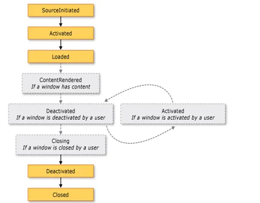
窗口从创建到关闭有一系列过程,关键事件:
Loaded:窗口加载完成时触发(可以在这里初始化数据)Closing:窗口关闭前触发(可以询问"是否保存")Closed:窗口关闭后触发
3 打开和关闭窗口
- 非模式窗口(可以同时操作其他窗口):
window.Show() - 模式窗口(必须关闭才能操作其他窗口,如弹窗):
window.ShowDialog() - 关闭窗口:
window.Close()
window常用属性
| 属性 | 作用 |
|---|---|
| Title | 窗口标题栏文字 |
| Width/Height | 窗口宽/高 |
| WindowStartupLocation | 窗口首次显示的位置(如屏幕中央) |
| WindowState | 窗口状态(正常、最大化、最小化) |
| Topmost | 是否总在最上层显示 |
| Icon | 窗口图标 |
| ResizeMode | 窗口的调整模式 |
| ShowActivated | d 首次显示式激活窗口 true |
:::color1
事件:Loaded Closing ContentRendered Activated Deactivated Closed
:::
csharp
<Window x:Class="Zhaoxi.LayoutStudy.MainWindow"
        xmlns="http://schemas.microsoft.com/winfx/2006/xaml/presentation"
        xmlns:x="http://schemas.microsoft.com/winfx/2006/xaml"
        xmlns:d="http://schemas.microsoft.com/expression/blend/2008"
        xmlns:mc="http://schemas.openxmlformats.org/markup-compatibility/2006"
        xmlns:local="clr-namespace:Zhaoxi.LayoutStudy"
        mc:Ignorable="d"
        Title="MainWindow"
        Width="400"
        FontSize="16"
        SizeToContent="Height"
        WindowStartupLocation="CenterScreen"
        WindowStyle="None"
        AllowsTransparency="True"
        Background="Transparent">

</window>
<font style="color:rgb(0, 0, 0);background-color:rgba(0, 0, 0, 0);">WindowStyle="None"</font>:移除系统默认的标题栏和边框,实现无边框效果。<font style="color:rgb(0, 0, 0);background-color:rgba(0, 0, 0, 0);">AllowsTransparency="True"</font>:开启窗口透明(必须配合<font style="color:rgb(0, 0, 0);background-color:rgba(0, 0, 0, 0);">Background="Transparent"</font>)。<font style="color:rgb(0, 0, 0);background-color:rgba(0, 0, 0, 0);">SizeToContent="Height"</font>:窗口高度自适应内部内容,宽度固定为 400。<font style="color:rgb(0, 0, 0);background-color:rgba(0, 0, 0, 0);">WindowStartupLocation="CenterScreen"</font>:窗口启动时居中显示。
window控件派生
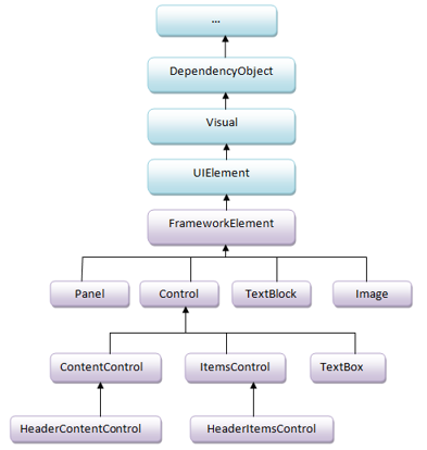
window 控件分类
- 布局控件:容器控件,排列和组织其他控件,其父类是Panel
- 内容控件:只能容纳一个控件或布局控件作为他的内容,父类是ContentControl.
- 带标题内容控件:同上,可以加一个标题,父类是HeaderedContentControl
- 条目控件:可以显示一列数据,一般数据类型相同 ItemsControl
- 带标题条目控件 同带标题条目控件类同,父类是HeaderedItemsControl
- 特殊内容控件 这类控件比较独立,但也比较常用,如TextBox,TextBlock,Image等
常用控件
| 控件 | 说明 | 父类继承关系 | 核心属性/特点 |
|---|---|---|---|
| Label | 文本标签(不可编辑) | ContentControl | Content(显示的文本内容) |
| TextBox | 文本框(可编辑显示) | TextBoxBase → Control(特殊内容控件) | Text(输入/显示的文本) |
| PasswordBox | 密码框(显示为掩码) | Control | Password(输入的密码内容) |
| Button | 按钮(触发操作) | ContentControl | Content(按钮文本/内容)、Click事件 |
| Border | 边框容器 | Decorator | BorderBrush(边框颜色)、CornerRadius(圆角) |
| RadioButton | 单选按钮(同组互斥) | ToggleButton → ContentControl | GroupName(分组名)、IsChecked(是否选中) |
| CheckBox | 复选框(可多选) | ToggleButton → ContentControl | IsChecked(是否选中) |
| ComboBox | 下拉框(单选列表) | Selector → ItemsControl(条目控件) | ItemsSource(选项集合)、SelectedItem(选中项) |
| ListBox | 列表框(可单选/多选) | Selector → ItemsControl(条目控件) | ItemsSource(选项集合)、SelectionMode(选择模式) |
| Image | 图像控件 | FrameworkElement → UIElement | Source(图片路径)、Stretch(拉伸方式) |
Label控件
新建项目
- 在项目中新建一个文件夹:Controls
- 在 Controls 文件夹中添加窗口:WindowLabel
- 选中窗口,在左边的工具箱中找到 Label 控件,拖拽到窗口中
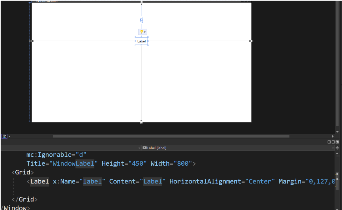
手写XAML文件
:::tips
刚开始学习的时候不建议大家使用拖拽的方式创建控件,因为使用拖拽的话很多属性我们并不知道它意味着什么,所以刚开始建议大家使用手写的方式来使用控件。
:::
把刚才拖拽的 Lable 注释掉:
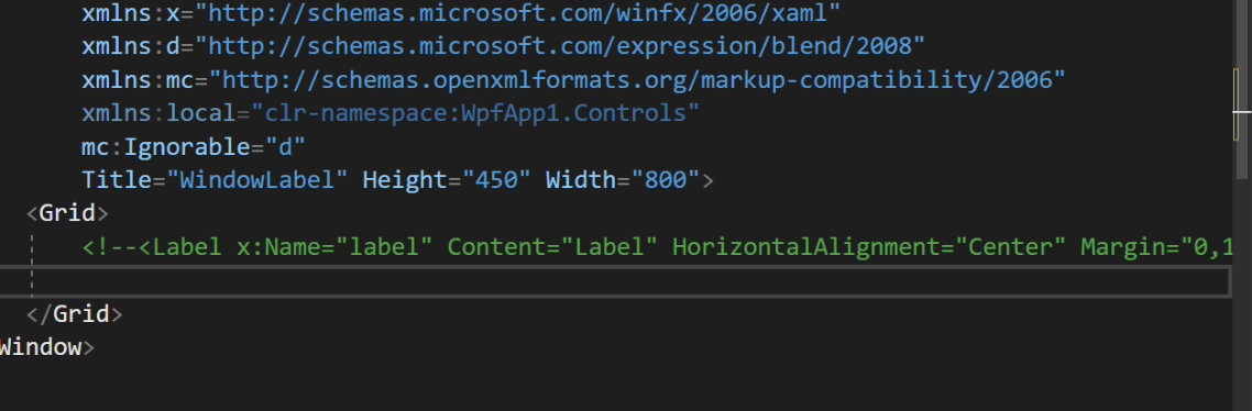
xml
<Grid>
  <!--<Label x:Name="label" Content="Label" HorizontalAlignment="Center" Margin="0,127,0,0" VerticalAlignment="Top"/>-->

  <!--可以写成双标签,也可以写成但标签-->
  <!--选中 Label,按 F12,可以查看 Label 的定义-->
  <!--百度搜索:wpf Microsoft,可以查看官方文档:https://learn.microsoft.com/zh-cn/dotnet/desktop/wpf/introduction-to-wpf?view=netframeworkdesktop-4.8-->
  <!--继承关系:Label : ContentControl : Control : FrameworkElement : UIElement : Visual: DependencyObject : DispatcherObject : Object -->
  <!--Margin顺序:左上右下,修改HorizontalAlignment为Right测试;一个值表示所有方向;两个值表示左右和上下-->
  <!--拖拽控件,修改位置时,修改的是 Margin 属性-->
  <Label Width="200" Height="30"
    Content="我是个Label控件"
    HorizontalAlignment="Left"
    VerticalAlignment="top"
    Margin="10,20,30,40"
    FontSize="18"
    Foreground="Blue"/>
</Grid>
案例 1:基础文本显示
xml
<Label Content="欢迎使用WPF应用程序!"
       FontSize="16"
       FontWeight="Bold"
       Foreground="Blue"
       HorizontalAlignment="Center"
       VerticalAlignment="Center"/>
案例 2:自定义样式(圆形标签)
xml
<Style x:Key="CircleLabel" TargetType="Label">
    <Setter Property="Template">
        <Setter.Value>
            <ControlTemplate TargetType="Label">
                <Ellipse Width="80" Height="80" Fill="LightBlue">
                    <TextBlock Text="{TemplateBinding Content}"
                               TextAlignment="Center"
                               VerticalAlignment="Center"
                               FontSize="14"/>
                </Ellipse>
            </ControlTemplate>
        </Setter.Value>
    </Setter>
</Style>

<Label Style="{StaticResource CircleLabel}" Content="状态"/>
案例三:作为工具提示(Tooltip)
xml
<Button Content="提交" Width="100" Height="30">
    <Button.ToolTip>
        <Label Content="点击此按钮将保存所有更改"
               Background="LightYellow"
               Padding="5"
               BorderBrush="Gray"
               BorderThickness="1"/>
    </Button.ToolTip>
</Button>效果:鼠标悬停在按钮上时,显示带边框的提示文本。
label
label
基础用法
Label 控件是 WPF 中最基础的文本显示控件,用于显示简单的文本内容。
xml
<Label Content="基础标签" />属性列表
基本属性
| 属性 | 说明 | 类型 | 默认值 | 可选值 |
|---|---|---|---|---|
| Content | 标签显示的内容 | object | null | 任意对象 |
| ContentStringFormat | 内容字符串格式化 | string | null | 标准格式字符串 |
| ContentTemplate | 内容的数据模板 | DataTemplate | null | 自定义模板 |
| Target | 标签关联的目标控件 | UIElement | null | 其他控件 |
外观属性
| 属性 | 说明 | 类型 | 默认值 | 可选值 |
|---|---|---|---|---|
| Foreground | 文本颜色 | Brush | SystemColors.ControlTextBrush | 任意颜色笔刷 |
| Background | 背景颜色 | Brush | Transparent | 任意颜色笔刷 |
| BorderBrush | 边框颜色 | Brush | Transparent | 任意颜色笔刷 |
| BorderThickness | 边框粗细 | Thickness | 0 | 数字值 |
| Padding | 内边距 | Thickness | 0 | 数字值 |
| FontFamily | 字体 | FontFamily | SystemFonts.MessageFontFamily | 系统或自定义字体 |
| FontSize | 字体大小 | double | SystemFonts.MessageFontSize | 数字值 |
| FontWeight | 字体粗细 | FontWeight | SystemFonts.MessageFontWeight | Normal, Bold 等 |
| FontStyle | 字体样式 | FontStyle | SystemFonts.MessageFontStyle | Normal, Italic 等 |
布局属性
| 属性 | 说明 | 类型 | 默认值 | 可选值 |
|---|---|---|---|---|
| HorizontalAlignment | 水平对齐方式 | HorizontalAlignment | Left | Left, Center, Right, Stretch |
| VerticalAlignment | 垂直对齐方式 | VerticalAlignment | Top | Top, Center, Bottom, Stretch |
| HorizontalContentAlignment | 内容水平对齐 | HorizontalAlignment | Left | Left, Center, Right, Stretch |
| VerticalContentAlignment | 内容垂直对齐 | VerticalAlignment | Top | Top, Center, Bottom, Stretch |
使用示例
基础标签
xml
<Label Content="这是一个普通标签" />带样式的标签
xml
<!-- 文本内容:欢迎使用系统:字体大小 23 字体 Segoe UI
字体粗细:SemBlod 字体颜色 #333333 外边距20 -->
<Label Content="欢迎使用系统"
       FontSize="24"
       FontFamily="Segoe UI"
       FontWeight="SemiBold"
       Foreground="#333333"
       Margin="20" />
xml
<Label Content="带样式的标签"
  Foreground="White"
  Background="#409EFF"
  Padding="10 5"
  FontWeight="Bold"
  BorderBrush="#DCDFE6"
  BorderThickness="1"
  HorizontalAlignment="Center"/>
带加变色
xml
<Label Content="数据统计"
       FontSize="20"
       FontWeight="Bold"
       HorizontalAlignment="Center"
       VerticalAlignment="Center"
       Height="40"
       Padding="10">
  <!-- 设置背景颜色 -->
    <Label.Background>
      <!-- 设置演示线性渐变  -->
        <LinearGradientBrush StartPoint="0,0" EndPoint="1,0">
            <GradientStop Color="#4a6fa5" Offset="0" />
            <GradientStop Color="#166088" Offset="1" />
        </LinearGradientBrush>
    </Label.Background>
    <Label.Foreground>
        <SolidColorBrush Color="White" />
    </Label.Foreground>
</Label>
带阴影
xml
<Label Content="用户信息"
       FontSize="18"
       FontWeight="Bold"
       Margin="10">
    <Label.Effect>
        <DropShadowEffect BlurRadius="5"
                          Color="#88000000"
                          Direction="315"
                          ShadowDepth="3" />
    </Label.Effect>
</Label>
鼠标悬停
xml
<Label Content="悬停查看详情"
       FontSize="16"
       Foreground="#333333"
       Padding="5">
    <Label.Style>
        <Style TargetType="Label">
            <Setter Property="Cursor" Value="Hand" />
            <Style.Triggers>
                <Trigger Property="IsMouseOver" Value="True">
                    <Setter Property="Foreground" Value="#166088" />
                    <Setter Property="FontWeight" Value="Bold" />
                    <Setter Property="RenderTransform">
                        <Setter.Value>
                            <ScaleTransform ScaleX="1.05" ScaleY="1.05" />
                        </Setter.Value>
                    </Setter>
                </Trigger>
            </Style.Triggers>
        </Style>
    </Label.Style>
</Label>
这是一个带有悬停效果的标签,当用户将鼠标移到 "悬停查看详情" 文本上时,会触发以下变化:
- 文本颜色从深灰色(#333333)变为蓝色(#166088)
- 文本加粗显示
- 文本轻微放大(1.05 倍)
- 鼠标指针变为手形(表示可点击)
代码详细解释
Content:标签显示的文本内容FontSize:字体大小(16 点)Foreground:文本颜色(深灰色,使用十六进制 RGB 值)Padding:内边距(5 像素,使文本周围有空间)
样式部分
xml
<Label.Style>
    <Style TargetType="Label">
<Setter Property="Cursor" Value="Hand" />**Cursor="Hand"**:当鼠标悬停时,指针变为手形,增强交互感
触发器(Triggers)
xml
<Style.Triggers>
<Trigger Property="IsMouseOver" Value="True">**IsMouseOver**:这是一个布尔属性,当鼠标悬停在标签上时为**True**
悬停时的属性变化
xml
<Setter Property="Foreground" Value="#166088" />
<Setter Property="FontWeight" Value="Bold" />Foreground="#166088":文本颜色变为蓝色FontWeight="Bold":文本加粗
缩放变换(ScaleTransform)
xml
<Setter Property="RenderTransform">
    <Setter.Value>
        <ScaleTransform ScaleX="1.05" ScaleY="1.05" />
    </Setter.Value>
</Setter>RenderTransform:应用视觉变换效果ScaleTransform:按比例缩放ScaleX="1.05"和ScaleY="1.05":在 X 和 Y 方向各放大 5%
为什么这样设计?
这种交互效果常用于提示用户此处有隐藏信息或可点击操作,通过颜色、粗细和大小的变化提供视觉反馈,增强用户体验。在实际应用中,你可能会将此标签与工具提示(Tooltip)或点击事件结合使用,实现完整的 "悬停查看详情" 功能。
图标加上文本组合
xml
<Label FontSize="16" Margin="10">
<Label.Content>
<StackPanel Orientation="Horizontal" VerticalAlignment="Center">
<TextBlock Text="" FontFamily="Segoe MDL2 Assets" Margin="0,0,5,0" />
<TextBlock Text="个人中心" />
</StackPanel>
</Label.Content>
</Label>为什么这样设计?
这种设计常用于界面导航菜单,通过图标 + 文本的组合提供直观的功能入口。StackPanel确保图标和文本水平排列且垂直居中,整体靠右对齐,适合放置在页面顶部导航栏的右侧(如用户信息区)。
注意事项
- 图标字体依赖 :
Segoe MDL2 Assets是 Windows 系统内置的图标字体,在非 Windows 系统上可能显示为方块。若需跨平台兼容性,可考虑使用 Font Awesome 等第三方图标库。 - 图标编码 :
对应 MDL2 字体中的用户图标,不同字体的图标编码不同。 - 交互性 :当前标签没有绑定点击事件,如需实现点击跳转到个人中心的功能,还需添加
MouseLeftButtonDown事件处理。
使用资源字典统一管理样式
xml
<Window x:Class="YourNamespace.MainWindow"
        xmlns="http://schemas.microsoft.com/winfx/2006/xaml/presentation"
        xmlns:x="http://schemas.microsoft.com/winfx/2006/xaml"
        Title="样式示例" Height="300" Width="400">

    <!-- 1. 定义样式(放在Window.Resources中) -->
    <Window.Resources>
        <Style x:Key="TitleLabel" TargetType="Label">
            <Setter Property="FontSize" Value="20" />
            <Setter Property="FontWeight" Value="Bold" />
            <Setter Property="Foreground" Value="#333333" />
            <Setter Property="Margin" Value="0,10,0,5" />
        </Style>

        <Style x:Key="EmphasizeLabel" TargetType="Label">
            <Setter Property="FontSize" Value="16" />
            <Setter Property="Foreground" Value="#166088" />
            <Setter Property="FontStyle" Value="Italic" />
        </Style>
    </Window.Resources>

    <!-- 2. 使用样式(放在窗口内容区域,例如Grid中) -->
    <Grid>
        <Label Content="主标题" Style="{StaticResource TitleLabel}" />
        <Label Content="重要提示" Style="{StaticResource EmphasizeLabel}"
               Margin="0,40,0,0" />
    </Grid>
</Window>- x:Key:样式的唯一标识符,用于后续引用。
- TargetType :指定该样式作用于哪种控件(这里是
Label)。 - Setter:设置控件的具体属性(如字体大小、颜色等
- Style="{StaticResource ...}" :通过
x:Key引用之前定义的样式。
登录
xml
<Window x:Class="_03登录页面.MainWindow"
        xmlns="http://schemas.microsoft.com/winfx/2006/xaml/presentation"
        xmlns:x="http://schemas.microsoft.com/winfx/2006/xaml"
        xmlns:d="http://schemas.microsoft.com/expression/blend/2008"
        xmlns:mc="http://schemas.openxmlformats.org/markup-compatibility/2006"
        xmlns:local="clr-namespace:_03登录页面"
        mc:Ignorable="d"
        Title="MainWindow" Height="450" Width="800">
    <Grid Margin="20">
        <!--行定义:2行,高度自动适应内-->
        <Grid.RowDefinitions>
            <RowDefinition Height="Auto" />
            <RowDefinition Height="Auto" />
        </Grid.RowDefinitions>

        <!-- 列定义:2列,第一列自动宽度,第二列填充剩余空间 -->
        <Grid.ColumnDefinitions>
            <ColumnDefinition Width="Auto" />
            <ColumnDefinition Width="*" />
        </Grid.ColumnDefinitions>

        <!--Grid.Row 和 Grid.Column:指定控件所在的行列位置(从 0 开始)
           VerticalAlignment="Center":标签垂直居中对齐,与输入框高度匹配。
        -->
        <Label Content="用户名:" Grid.Row="0" Grid.Column="0" VerticalAlignment="Center" Margin="0,5" />
        <TextBox Grid.Row="0" Grid.Column="1" Margin="5" />

        <Label Content="密码:" Grid.Row="1" Grid.Column="0" VerticalAlignment="Center" Margin="0,5" />
        <PasswordBox Grid.Row="1" Grid.Column="1" Margin="5" />
    </Grid>
</Window>
为什么这样设计?
- 自动宽度适配 :
- 标签列自动适应内容宽度,确保所有标签右对齐。
- 输入框列自适应剩余空间,在不同窗口宽度下都能合理布局。
- 垂直对齐 :
VerticalAlignment="Center"让标签与输入框在垂直方向上居中对齐,避免视觉偏差。
- 灵活性 :
- 使用
Auto和*单位,使布局在不同分辨率下都能保持一致的比例和间距。
- 使用
指示灯
xml
<Window x:Class="WpfApp1.MainWindow"
        xmlns="http://schemas.microsoft.com/winfx/2006/xaml/presentation"
        xmlns:x="http://schemas.microsoft.com/winfx/2006/xaml"
        Title="在线状态示例" Height="300" Width="300">
    <Grid>
        <Label Content="在线" FontSize="14" HorizontalAlignment="Center" VerticalAlignment="Center">
            <Label.Style>
                <Style TargetType="Label">
                    <Setter Property="Foreground" Value="Gray" />
                    <Style.Triggers>
                        <DataTrigger Binding="{Binding IsOnline}" Value="True">
                            <Setter Property="Foreground" Value="Green" />
                        </DataTrigger>
                    </Style.Triggers>
                </Style>
            </Label.Style>
        </Label>

        <!-- 测试按钮:切换在线状态 -->
        <Button Content="切换状态" HorizontalAlignment="Center" VerticalAlignment="Bottom"
                Margin="0,0,0,50" Click="Button_Click"/>
    </Grid>
</Window>
csharp
using System.ComponentModel;
using System.Windows;

namespace WpfApp1
{
    public partial class MainWindow : Window, INotifyPropertyChanged
    {
        private ViewModel _viewModel;

        public MainWindow()
        {
            InitializeComponent();
            _viewModel = new ViewModel { IsOnline = true };
            DataContext = _viewModel;
        }

        private void Button_Click(object sender, RoutedEventArgs e)
        {
            _viewModel.IsOnline = !_viewModel.IsOnline;
        }

        public event PropertyChangedEventHandler? PropertyChanged;
    }

    public class ViewModel : INotifyPropertyChanged
    {
        private bool _isOnline;
        public bool IsOnline
        {
            get => _isOnline;
            set
            {
                _isOnline = value;
                OnPropertyChanged(nameof(IsOnline));
            }
        }

        public event PropertyChangedEventHandler? PropertyChanged;
        protected virtual void OnPropertyChanged(string propertyName)
        {
            PropertyChanged?.Invoke(this, new PropertyChangedEventArgs(propertyName));
        }
    }
}- DataContext :
- 必须设置
DataContext,否则绑定无法找到IsOnline属性。 - 通常在窗口构造函数中设置为 ViewModel 实例。
- 必须设置
- INotifyPropertyChanged 接口 :
- ViewModel 类必须实现此接口,才能在属性值变化时通知 UI 更新。
- 每个可绑定的属性在值变更时必须调用
OnPropertyChanged方法。
- DataTrigger 工作原理 :
- 当
IsOnline的值为True时,触发绿色字体;否则使用默认的灰色。
- 当
问题
- Label 是单标签还是双标签
- Label 如何设置文本信息
- 如何给Label 设置标签样式,常见的标签样式有哪些?
- Label绑定样式还有哪些
- Label 如何绑定事件
、基础概念与创建
- WPF 中的 Label 控件是什么?它的主要作用是什么?
- 创建 Label 控件有哪两种方式(拖拽 vs 手写 XAML)?为什么初学者推荐手写 XAML?
- Label 控件支持单标签和双标签两种形式,分别适用于什么场景?举例说明。
- Label 的继承关系是怎样的?为什么说它属于 ContentControl 家族?
二、核心属性与使用
- Label 的
Content属性能放哪些内容?除了文本,能否放其他控件(如 Button、Image)?如何实现? Foreground和Background属性的区别是什么?如何设置十六进制颜色(如 #166088)或渐变颜色?Margin属性的取值格式是什么(如 "10,20,30,40" 代表什么)?和Padding属性有什么本质区别?HorizontalAlignment和VerticalAlignment的可选值有哪些?设置为Stretch时,Label 会如何表现?Target属性的作用是什么?如何通过点击 Label 让焦点自动跳转到对应的 TextBox?
三、样式设计与复用
- 如何定义一个可复用的 Label 样式(如标题样式)?
x:Key和TargetType在样式中分别起什么作用? - 什么是样式继承?如何通过
BasedOn让一个样式继承另一个样式的属性?举例说明。 - 如何通过
Trigger实现鼠标悬停时 Label 的样式变化(如颜色、字体粗细)?IsMouseOver属性的作用是什么? - 全局样式和局部样式有什么区别?如何让一个样式在整个应用程序中生效(而非单个窗口)?
四、交互与动态效果
- 如何给 Label 添加鼠标点击事件?点击事件和
MouseDown事件有什么区别? - 如何实现 Label 的缩放、阴影等视觉效果?
RenderTransform和Effect属性分别适用于什么场景? - 举例说明如何通过
DropShadowEffect给 Label 添加阴影,BlurRadius和ShadowDepth属性的含义是什么?
五、数据绑定与动态样式
- 如何通过
DataTrigger让 Label 根据绑定的数据动态改变样式(如在线状态为绿色,离线为灰色)? - 实现数据绑定时,为什么 ViewModel 需要实现
INotifyPropertyChanged接口?OnPropertyChanged方法的作用是什么? DataContext在数据绑定中扮演什么角色?如果 Label 的DataContext未设置,绑定会出现什么问题?- 如何通过绑定让 Label 的
Content属性显示动态数据(如实时时间、用户信息)?
六、布局与组合使用
- 在 Grid 布局中,如何让 Label 和输入框(TextBox)水平对齐,且 Label 列自适应宽度、输入框列占满剩余空间?
- 如何在 Label 中组合图标和文本(如用户图标 +"个人中心")?
StackPanel在其中的作用是什么? - 为什么 Segoe MDL2 Assets 字体可以用来显示图标?如何通过 Unicode 编码(如)设置 Label 中的图标?
七、实战场景与问题排查
- 设计登录表单时,如何让 "用户名:""密码:" 等 Label 与对应的输入框垂直居中对齐?
- 如果 Label 的动态样式(如 DataTrigger)不生效,可能的原因有哪些(至少列举 3 点)?如何排查?
- 如何将 Label 作为按钮的工具提示(Tooltip)?相比普通文本 Tooltip,Label 的优势是什么?
- Label 和 TextBlock 的核心区别是什么?在显示纯文本时,为什么有时优先选择 TextBlock?
2.FrameworkElement
其中 FrameworkElement 类比较重要,它实现了 UIElement 定义里面的 WPF 核心级别 API:
属性
| 属性名 | 对象类型 | 作用 |
|---|---|---|
| Width | double | 获取或设置元素的宽度。【(元素的⾼度(以 与设备⽆关的单位(每个单位 1/96 英⼨) 为单位)。 )】 |
| Height | double | 获取或设置元素的⾼度。【元素的⾼度(以 与设备⽆关的单位(每个单位 1/96 英⼨) 为单位)。 】 |
| ActualWidth | double | 获取此元素的呈现的宽度。 |
| ActualHeight | double | 获取此元素的呈现的⾼度。 |
| Name | string | 获取或设置元素的标识名称。 该名称提供引⽤,以便代码隐藏(如事件处理程序代码)可以引⽤标记元素(在 XAML 处理器的处理过程中构造该元素之后)。 |
| Style | Style | 获取或设置此元素呈现时所使⽤的样式。 |
| Margin | Thickness | 获取或设置元素的外边距。 |
| HorizontalAlignment | HorizontalAlignment | 获取或设置在⽗元素(如 Panel 或项控件)中组合此元素时所应⽤的⽔平对⻬特征。【⽔平对⻬设置,它是⼀个枚举值。】 |
| VerticalAlignment | VerticalAlignment | 获取或设置在⽗元素(如⾯板或项控件)中组合此元素时所应⽤的垂直对⻬特征。 |
| FocusVisualStyle | Style | 获取或设置⼀个属性,该属性允许⾃定义此元素在捕获到键盘焦点时要应⽤于此元素的外观、效果或其他样式特征。 |
| FlowDirection | FlowDirection | 获取或设置⽅向,⽂本和其他 ⽤户界⾯ (UI) 元素在任何控制其布局的⽗元素中都按此⽅向流动。 |
| DataContext | object | 获取或设置元素参与数据绑定时的数据上下⽂。 |
| Resources | ResourceDictionary | 获取或设置本地定义的资源字典。 |
方法
| 方法名 | 参数 | 作用 |
|---|---|---|
| BringIntoView | 尝试将此元素放⼊视图,它包含在任何可滚动区域内。 | |
| BringIntoView(RecttargetRectangle) | 指定也放⼊视图的元素的⼤⼩。(targetRectangle) | 尝试将放⼊视图,它包含在任何可滚动区域内的此元素提供的区域⼤⼩。 |
| FindName(stringname) | 所请求元素的名称(name) | 查找具有提供的标识符名的元素。 |
| FindResource(objectresourceKey) | 所请求的资源键标识符(resourceKey) | 搜索具有指定键的资源并在引发异常,如果找不到所请求的资源。 |
事件
| 事件名称 | 作用 |
|---|---|
| Loaded | 当对元素进⾏布局、呈现,且可将其⽤于交互时发⽣。 |
| KeyDown | 当焦点在该元素上时按下某个键后发生。 |
| GotFocus | 在此元素获得逻辑焦点时发⽣ |
| MouseDown | 在指针位于此元素上并且按下任意⿏标按钮时发⽣。 |
| MouseMove | 在⿏标指针位于此元素上并且移动⿏标指针时发⽣。 |
| Click | 控件的点击事件 |
表单控件
什么是表单控件
:::color1
表单控件的主要功能是收集用户信息(如文本、选择、日期等),并将这些信息传递给后端服务器进行处理(如登录验证、数据存储、信息提交等)
:::
表单控件哪些
| 控件名称 | 作用 | 常用属性 | 注意事项 |
|---|---|---|---|
| TextBox | 单行文本输入框 | Text(文本内容)、Width/Height(尺寸)、IsReadOnly(只读)、HorizontalAlignment(水平对齐) |
- 需注意TextWrapping属性,默认不换行 - 可通过MaxLength限制输入长度 - 绑定模式通常用TwoWay |
| PasswordBox | 密码输入框(文本掩码显示) | Password(密码内容)、Width/Height、HorizontalAlignment |
- 不支持直接数据绑定,需通过附加属性实现 - 密码不会在XAML中显示,安全性较高 |
| ComboBox | 下拉选择框(单选) | ItemsSource(数据源)、SelectedItem/SelectedValue(选中项)、IsEditable(可编辑) |
- 需设置DisplayMemberPath指定显示字段 - 可通过ItemTemplate自定义项样式 |
| RadioButton | 单选按钮(一组中选一个) | Content(显示文本)、GroupName(分组名)、IsChecked(是否选中) |
- 同一GroupName下的按钮互斥 - 绑定IsChecked到布尔属性 |
| CheckBox | 复选框(支持多选) | Content、IsChecked、IsThreeState(三态模式) |
- IsThreeState支持null状态(未确定) - 绑定多个复选框到不同属性 |
| Button | 通用按钮(触发事件) | Content、Width/Height、Click(点击事件)、IsEnabled(是否启用) |
- 可通过Command绑定MVVM命令 - 可自定义Template改变外观 |
| ToggleButton | 切换按钮(有选中/未选中状态) | Content、IsChecked、Checked/Unchecked(状态变更事件) |
- 适用于开关类功能(如静音、全屏) - 与CheckBox的区别在于视觉样式 |
| ContentControl | 内容控件(只能放一个控件或者布局控件作为他的内容) | Content 内容对象 ContentTemplate 用来显示的内容的数据模板 DataTemplate | 用于文本显示 |
使用注意事项补充说明
- 数据绑定 :
- 大多数控件通过
**<font style="color:#DF2A3F;">{Binding}</font>**实现**数据绑定,注意设置**<font style="color:#4861E0;">Mode=TwoWay</font>**实现双向绑定。** PasswordBox需通过附加属性绑定(如PasswordHelper),避免直接绑定Password属性。
- 大多数控件通过
- 验证机制 :
- 通过
IDataErrorInfo或ValidationRules实现输入验证,如:
- 通过
xml
<TextBox Text="{Binding Age, ValidatesOnDataErrors=True}" />- 样式与模板 :
- 所有控件均可通过
Style和Template自定义外观,如修改Button的ControlTemplate。 - 推荐使用资源字典管理样式,提高复用性。
- 所有控件均可通过
- 性能优化 :
- 大量数据的
ListBox/ComboBox建议使用VirtualizingStackPanel.IsVirtualizing="True"。 - 复杂布局时避免过多嵌套,使用
Grid而非多层StackPanel。
- 大量数据的
- 事件处理 :
- 优先使用MVVM模式的
Command替代事件处理(如Button.Click)。 - 避免在代码-behind中直接操作UI控件。
- 优先使用MVVM模式的
- 国际化支持 :
- 文本内容建议使用资源文件(
.resx)管理,方便多语言切换。 - 日期、数字格式需考虑区域性(
CultureInfo)。
- 文本内容建议使用资源文件(
- 第三方控件 :
- 复杂场景可使用第三方库(如
MahApps.Metro、Telerik)提供的增强控件。 - 安装后需在XAML中添加命名空间引用。
- 复杂场景可使用第三方库(如
Label
基础用法
Label 控件是 WPF 中最基础的文本显示控件,用于显示简单的文本内容。
xml
<Label Content="基础标签" />属性列表
基本属性
| 属性 | 说明 | 类型 | 默认值 | 可选值 |
|---|---|---|---|---|
| Content | 标签显示的内容 | object | null | 任意对象 |
| ContentStringFormat | 内容字符串格式化 | string | null | 标准格式字符串 |
| ContentTemplate | 内容的数据模板 | DataTemplate | null | 自定义模板 |
| Target | 标签关联的目标控件 | UIElement | null | 其他控件 |
外观属性
| 属性 | 说明 | 类型 | 默认值 | 可选值 |
|---|---|---|---|---|
| Foreground | 文本颜色 | Brush | SystemColors.ControlTextBrush | 任意颜色笔刷 |
| Background | 背景颜色 | Brush | Transparent | 任意颜色笔刷 |
| BorderBrush | 边框颜色 | Brush | Transparent | 任意颜色笔刷 |
| BorderThickness | 边框粗细 | Thickness | 0 | 数字值 |
| Padding | 内边距 | Thickness | 0 | 数字值 |
| FontFamily | 字体 | FontFamily | SystemFonts.MessageFontFamily | 系统或自定义字体 |
| FontSize | 字体大小 | double | SystemFonts.MessageFontSize | 数字值 |
| FontWeight | 字体粗细 | FontWeight | SystemFonts.MessageFontWeight | Normal, Bold 等 |
| FontStyle | 字体样式 | FontStyle | SystemFonts.MessageFontStyle | Normal, Italic 等 |
布局属性
| 属性 | 说明 | 类型 | 默认值 | 可选值 |
|---|---|---|---|---|
| HorizontalAlignment | 水平对齐方式 | HorizontalAlignment | Left | Left, Center, Right, Stretch |
| VerticalAlignment | 垂直对齐方式 | VerticalAlignment | Top | Top, Center, Bottom, Stretch |
| HorizontalContentAlignment | 内容水平对齐 | HorizontalAlignment | Left | Left, Center, Right, Stretch |
| VerticalContentAlignment | 内容垂直对齐 | VerticalAlignment | Top | Top, Center, Bottom, Stretch |
使用示例
基础标签
xml
<Label Content="这是一个普通标签" />带样式的标签
xml
<!-- 文本内容:欢迎使用系统:字体大小 23 字体 Segoe UI
字体粗细:SemBlod 字体颜色 #333333 外边距20 -->
<Label Content="欢迎使用系统"
       FontSize="24"
       FontFamily="Segoe UI"
       FontWeight="SemiBold"
       Foreground="#333333"
       Margin="20" />
xml
<Label Content="带样式的标签"
  Foreground="White"
  Background="#409EFF"
  Padding="10 5"
  FontWeight="Bold"
  BorderBrush="#DCDFE6"
  BorderThickness="1"
  HorizontalAlignment="Center"/>
带加变色
xml
<Label Content="数据统计"
       FontSize="20"
       FontWeight="Bold"
       HorizontalAlignment="Center"
       VerticalAlignment="Center"
       Height="40"
       Padding="10">
  <!-- 设置背景颜色 -->
    <Label.Background>
      <!-- 设置演示线性渐变  -->
        <LinearGradientBrush StartPoint="0,0" EndPoint="1,0">
            <GradientStop Color="#4a6fa5" Offset="0" />
            <GradientStop Color="#166088" Offset="1" />
        </LinearGradientBrush>
    </Label.Background>
    <Label.Foreground>
        <SolidColorBrush Color="White" />
    </Label.Foreground>
</Label>
带阴影
xml
<Label Content="用户信息"
       FontSize="18"
       FontWeight="Bold"
       Margin="10">
    <Label.Effect>
        <DropShadowEffect BlurRadius="5"
                          Color="#88000000"
                          Direction="315"
                          ShadowDepth="3" />
    </Label.Effect>
</Label>
鼠标悬停
xml
<Label Content="悬停查看详情"
       FontSize="16"
       Foreground="#333333"
       Padding="5">
    <Label.Style>
        <Style TargetType="Label">
            <Setter Property="Cursor" Value="Hand" />
            <Style.Triggers>
                <Trigger Property="IsMouseOver" Value="True">
                    <Setter Property="Foreground" Value="#166088" />
                    <Setter Property="FontWeight" Value="Bold" />
                    <Setter Property="RenderTransform">
                        <Setter.Value>
                            <ScaleTransform ScaleX="1.05" ScaleY="1.05" />
                        </Setter.Value>
                    </Setter>
                </Trigger>
            </Style.Triggers>
        </Style>
    </Label.Style>
</Label>
这是一个带有悬停效果的标签,当用户将鼠标移到 "悬停查看详情" 文本上时,会触发以下变化:
- 文本颜色从深灰色(#333333)变为蓝色(#166088)
- 文本加粗显示
- 文本轻微放大(1.05 倍)
- 鼠标指针变为手形(表示可点击)
代码详细解释
Content:标签显示的文本内容FontSize:字体大小(16 点)Foreground:文本颜色(深灰色,使用十六进制 RGB 值)Padding:内边距(5 像素,使文本周围有空间)
样式部分
xml
<Label.Style>
    <Style TargetType="Label">
<Setter Property="Cursor" Value="Hand" />**Cursor="Hand"**:当鼠标悬停时,指针变为手形,增强交互感
触发器(Triggers)
xml
<Style.Triggers>
<Trigger Property="IsMouseOver" Value="True">**IsMouseOver**:这是一个布尔属性,当鼠标悬停在标签上时为**True**
悬停时的属性变化
xml
<Setter Property="Foreground" Value="#166088" />
<Setter Property="FontWeight" Value="Bold" />Foreground="#166088":文本颜色变为蓝色FontWeight="Bold":文本加粗
缩放变换(ScaleTransform)
xml
<Setter Property="RenderTransform">
    <Setter.Value>
        <ScaleTransform ScaleX="1.05" ScaleY="1.05" />
    </Setter.Value>
</Setter>RenderTransform:应用视觉变换效果ScaleTransform:按比例缩放ScaleX="1.05"和ScaleY="1.05":在 X 和 Y 方向各放大 5%
为什么这样设计?
这种交互效果常用于提示用户此处有隐藏信息或可点击操作,通过颜色、粗细和大小的变化提供视觉反馈,增强用户体验。在实际应用中,你可能会将此标签与工具提示(Tooltip)或点击事件结合使用,实现完整的 "悬停查看详情" 功能。
图标加上文本组合
xml
<Label FontSize="16" Margin="10">
<Label.Content>
<StackPanel Orientation="Horizontal" VerticalAlignment="Center">
<TextBlock Text="" FontFamily="Segoe MDL2 Assets" Margin="0,0,5,0" />
<TextBlock Text="个人中心" />
</StackPanel>
</Label.Content>
</Label>为什么这样设计?
这种设计常用于界面导航菜单,通过图标 + 文本的组合提供直观的功能入口。StackPanel确保图标和文本水平排列且垂直居中,整体靠右对齐,适合放置在页面顶部导航栏的右侧(如用户信息区)。
注意事项
- 图标字体依赖 :
Segoe MDL2 Assets是 Windows 系统内置的图标字体,在非 Windows 系统上可能显示为方块。若需跨平台兼容性,可考虑使用 Font Awesome 等第三方图标库。 - 图标编码 :
对应 MDL2 字体中的用户图标,不同字体的图标编码不同。 - 交互性 :当前标签没有绑定点击事件,如需实现点击跳转到个人中心的功能,还需添加
MouseLeftButtonDown事件处理。
使用资源字典统一管理样式
xml
<Window x:Class="YourNamespace.MainWindow"
        xmlns="http://schemas.microsoft.com/winfx/2006/xaml/presentation"
        xmlns:x="http://schemas.microsoft.com/winfx/2006/xaml"
        Title="样式示例" Height="300" Width="400">

    <!-- 1. 定义样式(放在Window.Resources中) -->
    <Window.Resources>
        <Style x:Key="TitleLabel" TargetType="Label">
            <Setter Property="FontSize" Value="20" />
            <Setter Property="FontWeight" Value="Bold" />
            <Setter Property="Foreground" Value="#333333" />
            <Setter Property="Margin" Value="0,10,0,5" />
        </Style>

        <Style x:Key="EmphasizeLabel" TargetType="Label">
            <Setter Property="FontSize" Value="16" />
            <Setter Property="Foreground" Value="#166088" />
            <Setter Property="FontStyle" Value="Italic" />
        </Style>
    </Window.Resources>

    <!-- 2. 使用样式(放在窗口内容区域,例如Grid中) -->
    <Grid>
        <Label Content="主标题" Style="{StaticResource TitleLabel}" />
        <Label Content="重要提示" Style="{StaticResource EmphasizeLabel}"
               Margin="0,40,0,0" />
    </Grid>
</Window>- x:Key:样式的唯一标识符,用于后续引用。
- TargetType :指定该样式作用于哪种控件(这里是
Label)。 - Setter:设置控件的具体属性(如字体大小、颜色等
- Style="{StaticResource ...}" :通过
x:Key引用之前定义的样式。
问题
- Label 是单标签还是双标签
- Label 如何设置文本信息
- 如何给Label 设置标签样式,常见的标签样式有哪些?
- Label绑定样式还有哪些
- Label 如何绑定事件
ContentControl
:::color1
内容控件 只能**容纳一个控件或布局控件作为他的内容**
许多常用控件的父类(如 Label、Button、Window、TabItem 等),提供了统一的内容管理机制。
:::
- 继承关系 :
ContentControl : Control : FrameworkElement : UIElement : Visual : DependencyObject : DispatcherObject : Object - 核心特点 :
- 只能包含一个直接子元素(若需多个元素,需通过容器控件如 StackPanel、Grid 包裹);
- 支持内容模板(ContentTemplate)自定义内容展示方式;
- 支持数据绑定,动态更新内容。
ContentControl 的用途
- 基础容器 :作为简单的内容容器,显示文本、图片或单个控件(如
Label显示文本)。 - 派生控件基类 :许多常用控件继承自
ContentControl,例如:Button:内容为按钮上的文本或图标。Label:内容为标签文本。Window:内容为窗口的主要内容区域。UserControl:内容为自定义控件的布局。
- 数据展示 :结合
DataTemplate显示业务对象(如绑定到一个Person对象,通过模板展示其属性)。
基本使用
xml
<!-- 直接声明 ContentControl,内容为文本 -->
<ContentControl Content="这是一个简单的内容控件" />

<!-- 内容为复杂控件(需通过容器包裹多个元素) -->
<ContentControl>
  <!-- 要求内部容器水平排列  -->
  <StackPanel Orientation="Horizontal">
    <TextBlock Text="用户名:" />
    <TextBox Width="150" />
  </StackPanel>
</ContentControl>
:::danger
注意:若内容包含多个控件,必须用容器(如 StackPanel、Grid)包裹,否则会报错(ContentControl 仅支持单个直接子元素)。
:::
三、核心属性
ContentControl 的属性围绕 "内容管理" 和 "外观布局" 设计,核心属性如下
| 类别 | 属性 | 说明 | 类型 | 默认值 |
|---|---|---|---|---|
| 内容属性 | Content |
控件的内容(文本、控件、数据对象等) | object |
null |
ContentTemplate |
内容的数据模板(自定义内容的展示方式,适用于数据绑定场景) | DataTemplate |
null |
|
ContentStringFormat |
内容的格式化字符串(仅当 Content 为字符串或可格式化对象时生效) | string |
null |
|
HasContent |
只读属性,判断是否有内容(Content != null 时为 True ) |
bool |
False |
|
| 外观属性 | Background |
背景色 | Brush |
Transparent |
BorderBrush |
边框颜色 | Brush |
Transparent |
|
BorderThickness |
边框粗细 | Thickness |
0 |
|
Padding |
内边距(内容与边框的间距) | Thickness |
0 |
|
| 布局属性 | Width/Height |
宽度 / 高度(Auto 为自适应内容) |
double |
Double.NaN (等效于 Auto) |
HorizontalAlignment |
水平对齐方式(Left/Center/Right/Stretch) | HorizontalAlignment |
Stretch |
|
VerticalAlignment |
垂直对齐方式(Top/Center/Bottom/Stretch) | VerticalAlignment |
Stretch |
|
Margin |
外边距(与其他控件的间距) | Thickness |
语法案例
xml中直接写并设置内容
xml
<!-- 显示文本 -->
<ContentControl Content="Hello, ContentControl!" />

<!-- 显示 UI 元素(如按钮) -->
<ContentControl>
    <Button Content="Click Me" />
</ContentControl>

<!-- 显示复杂内容(如 StackPanel 包含多个元素) -->
<ContentControl>
    <StackPanel>
        <TextBlock Text="Name: John" />
        <TextBlock Text="Age: 30" />
    </StackPanel>
</ContentControl>
内容假如布局样
:::color1
布局**我的子元素怎么排列,我在如容器中怎么排列**
:::
xml
<!-- 内容在容器中居中对齐 -->
<ContentControl
    Content="Centered"
    Width="200" Height="100"
    Background="LightGray"
    HorizontalContentAlignment="Center"
    VerticalContentAlignment="Center" />
绑定数据并使用模板【了解】
1.****假设存在一个业务对象 **<font style="color:rgba(0, 0, 0, 0.85);">Person</font>**:
csharp
public class Person {
    public string Name { get; set; }
    public int Age { get; set; }
}
2.****在 XAML 中绑定并通过模板显示
xml
<!-- 后台代码中可以通过 personControl 获取控件实例    -->
<ContentControl x:Name="personControl">
  <ContentControl.ContentTemplate>
    <DataTemplate>
      <StackPanel>
        <TextBlock Text="{Binding Name}" />
        <TextBlock Text="{Binding Age}" />
      </StackPanel>
    </DataTemplate>
  </ContentControl.ContentTemplate>
</ContentControl>
3.后台代码绑定数据
csharp
// 给 Content 赋值业务对象
personControl.Content = new Person { Name = "Alice", Age = 25 };
TextBox
TextBox 是什么?
:::info
**TextBox** 是** 文本框 支持单行 / 多行**文本输入、
应用:是表单、搜索框、编辑器等交互场景的基础组件。
:::
核心作用
- 接收用户输入的文本信息(如用户名、邮箱、备注等);
- 支持文本编辑、复制粘贴、撤销重做等基础文本操作;
- 可通过样式和模板实现多样化的视觉效果,适配不同 UI 风格;
- 结合数据绑定和验证机制,确保输入内容符合业务规则。
核心属性
| 类别 | 属性名 | 说明 | 常用值 / 类型 |
|---|---|---|---|
| 内容属性 | Text |
文本框中的内容(绑定数据源时核心属性) | string |
TextAlignment |
文本对齐方式 | Left /Center /Right /Justify |
|
TextWrapping |
文本换行方式(仅多行模式有效) | NoWrap /Wrap /WrapWithOverflow |
|
| 行为属性 | IsReadOnly |
是否只读(禁止编辑,允许复制) | bool (默认 false ) |
IsEnabled |
是否启用(禁用时灰显,无法交互) | bool (默认 true ) |
|
MaxLength |
最大输入长度(限制字符数) | int (默认 0 ,不限制) |
|
AcceptsReturn |
是否允许换行(开启后变为多行文本框) | bool (默认 false ,单行) |
|
PlaceholderText |
提示文本(输入为空时显示,如 "请输入用户名") | string (WPF 4.5+ 支持) |
|
| 外观属性 | FontSize /FontFamily |
字体大小 / 字体类型 | double /FontFamily |
Foreground |
文本颜色 | Brush (默认黑色) |
|
Background |
背景色 | Brush (默认白色) |
|
BorderBrush /BorderThickness |
边框颜色 / 粗细 | Brush /Thickness |
|
Padding |
文本与边框的内边距(避免文本紧贴边框) | Thickness (推荐 5,3 ) |
|
CornerRadius |
边框圆角(需通过模板自定义,默认直角) | CornerRadius (如 4 为圆角) |
基本用法(基础样式)
xml
<!-- 单行文本框(默认) -->
<TextBox
    Text="基础文本框"
    Margin="10"
    FontSize="14"
    Padding="8"
    BorderThickness="1"
    BorderBrush="#DCDFE6"
    Foreground="#303133"
    Background="White" />
xml
<!-- 多行文本框(允许换行) -->
<TextBox
    AcceptsReturn="True"  <!-- 允许换行 -->
    TextWrapping="Wrap"   <!-- 自动换行 -->
    Height="100"
    Margin="10"
    Padding="8"
    PlaceholderText="请输入备注信息(支持多行)" />
单独属性方式展开样式。
xml
<Window x:Class="TextBoxPropertiesDemo.MainWindow"
	xmlns="http://schemas.microsoft.com/winfx/2006/xaml/presentation"
	xmlns:x="http://schemas.microsoft.com/winfx/2006/xaml"
	Title="TextBox属性演示" Height="600" Width="500">
	<Grid Margin="10">
		<ScrollViewer VerticalScrollBarVisibility="Auto">
			<StackPanel Orientation="Vertical" Spacing="15">
				<!-- Text属性 -->
				<GroupBox Header="Text属性" Margin="0,10,0,0">
					<StackPanel Orientation="Vertical" Margin="5">
						<TextBlock Text="设置文本内容:" Margin="0,5,0,0"/>
						<TextBox Text="这是设置的文本内容" Width="200"/>
					</StackPanel>
				</GroupBox>

				<!-- PlaceholderText属性 -->
				<GroupBox Header="PlaceholderText属性" Margin="0,10,0,0">
					<StackPanel Orientation="Vertical" Margin="5">
						<TextBlock Text="空文本时显示的提示:" Margin="0,5,0,0"/>
						<TextBox PlaceholderText="请输入文本" Width="200"/>
					</StackPanel>
				</GroupBox>

				<!-- IsReadOnly属性 -->
				<GroupBox Header="IsReadOnly属性" Margin="0,10,0,0">
					<StackPanel Orientation="Vertical" Margin="5">
						<TextBlock Text="只读文本框:" Margin="0,5,0,0"/>
						<TextBox Text="此文本框为只读" IsReadOnly="True" Width="200"/>
					</StackPanel>
				</GroupBox>

				<!-- IsEnabled属性 -->
				<GroupBox Header="IsEnabled属性" Margin="0,10,0,0">
					<StackPanel Orientation="Vertical" Margin="5">
						<TextBlock Text="禁用的文本框:" Margin="0,5,0,0"/>
						<TextBox Text="此文本框已禁用" IsEnabled="False" Width="200"/>
					</StackPanel>
				</GroupBox>

				<!-- TextWrapping属性 -->
				<GroupBox Header="TextWrapping属性" Margin="0,10,0,0">
					<StackPanel Orientation="Vertical" Margin="5">
						<TextBlock Text="自动换行的文本框:" Margin="0,5,0,0"/>
						<TextBox Text="这是一段很长的文本,设置了TextWrapping=Wrap属性后,它会在到达文本框边缘时自动换行显示。"
							TextWrapping="Wrap" Width="200" Height="100"/>
					</StackPanel>
				</GroupBox>

				<!-- AcceptsReturn属性 -->
				<GroupBox Header="AcceptsReturn属性" Margin="0,10,0,0">
					<StackPanel Orientation="Vertical" Margin="5">
						<TextBlock Text="允许多行输入的文本框(按Enter换行):" Margin="0,5,0,0"/>
						<TextBox Text="第一行文本"
							AcceptsReturn="True"
							TextWrapping="Wrap"
							Width="200" Height="100"/>
					</StackPanel>
				</GroupBox>

				<!-- MaxLength属性 -->
				<GroupBox Header="MaxLength属性" Margin="0,10,0,0">
					<StackPanel Orientation="Vertical" Margin="5">
						<TextBlock Text="限制最大输入长度为10个字符的文本框:" Margin="0,5,0,0"/>
						<TextBox MaxLength="10" Width="200"/>
					</StackPanel>
				</GroupBox>

				<!-- HorizontalContentAlignment属性 -->
				<GroupBox Header="HorizontalContentAlignment属性" Margin="0,10,0,0">
					<StackPanel Orientation="Vertical" Margin="5">
						<TextBlock Text="文本水平居中对齐的文本框:" Margin="0,5,0,0"/>
						<TextBox Text="居中对齐" HorizontalContentAlignment="Center" Width="200"/>
					</StackPanel>
				</GroupBox>

				<!-- VerticalContentAlignment属性 -->
				<GroupBox Header="VerticalContentAlignment属性" Margin="0,10,0,0">
					<StackPanel Orientation="Vertical" Margin="5">
						<TextBlock Text="文本垂直居中对齐的文本框:" Margin="0,5,0,0"/>
						<TextBox Text="垂直居中" VerticalContentAlignment="Center" Height="50" Width="200"/>
					</StackPanel>
				</GroupBox>

				<!-- BorderBrush和BorderThickness属性 -->
				<GroupBox Header="BorderBrush和BorderThickness属性" Margin="0,10,0,0">
					<StackPanel Orientation="Vertical" Margin="5">
						<TextBlock Text="自定义边框的文本框:" Margin="0,5,0,0"/>
						<TextBox Text="自定义边框" BorderBrush="Red" BorderThickness="2" Width="200"/>
					</StackPanel>
				</GroupBox>

				<!-- Font属性 -->
				<GroupBox Header="Font相关属性" Margin="0,10,0,0">
					<StackPanel Orientation="Vertical" Margin="5">
						<TextBlock Text="自定义字体的文本框:" Margin="0,5,0,0"/>
						<TextBox Text="大号粗体斜体文本" FontSize="16" FontStyle="Italic" FontWeight="Bold" Width="200"/>
					</StackPanel>
				</GroupBox>

				<!-- Background和Foreground属性 -->
				<GroupBox Header="Background和Foreground属性" Margin="0,10,0,0">
					<StackPanel Orientation="Vertical" Margin="5">
						<TextBlock Text="自定义背景和前景色的文本框:" Margin="0,5,0,0"/>
						<TextBox Text="黑底黄字" Background="Black" Foreground="Yellow" Width="200"/>
					</StackPanel>
				</GroupBox>

				<!-- CharacterCasing属性 -->
				<GroupBox Header="CharacterCasing属性" Margin="0,10,0,0">
					<StackPanel Orientation="Vertical" Margin="5">
						<TextBlock Text="自动转换为大写的文本框:" Margin="0,5,0,0"/>
						<TextBox CharacterCasing="Upper" Width="200"/>
					</StackPanel>
				</GroupBox>

				<!-- InputScope属性 -->
				<GroupBox Header="InputScope属性" Margin="0,10,0,0">
					<StackPanel Orientation="Vertical" Margin="5">
						<TextBlock Text="只允许输入数字的文本框:" Margin="0,5,0,0"/>
						<TextBox InputScope="Number" Width="200"/>
					</StackPanel>
				</GroupBox>
			</StackPanel>
		</ScrollViewer>
	</Grid>
</Window>
PasswordBox
是什么
:::info
PasswordBox控件主要用于**输入密码和其他敏感信息**。它会把用户输入的字符显示为占位符(默认是星号),以此保证信息安全。下面为你详细介绍其属性、基本用法以及一个登录案例。
:::
主要属性
| 属性名 | 类型 | 描述 |
|---|---|---|
Password |
string |
获取或设置密码框中的文本内容。 |
PasswordChar |
char |
自定义用于隐藏密码的占位符字符(默认值为 *)。 |
MaxLength |
int |
限制用户可输入的最大字符数。 |
IsReadOnly |
bool |
设置为 true 时,用户无法修改密码框内容。 |
HorizontalContentAlignment |
HorizontalAlignment |
设置密码文本的水平对齐方式。 |
VerticalContentAlignment |
VerticalAlignment |
设置密码文本的垂直对齐方式。 |
PasswordChanged |
RoutedEventHandler |
密码框内容发生变化时触发的事件。 |
附加常用属性了解即可
| 属性名 | 类型 | 描述 |
|---|---|---|
IsEnabled |
bool |
控制控件是否可用(变灰且无法交互)。 |
Visibility |
Visibility |
控制控件的可见性(Visible、Hidden、Collapsed)。 |
Width/Height |
double |
设置控件的宽度和高度。 |
Margin |
Thickness |
设置控件的外边距。 |
BorderBrush |
Brush |
设置控件边框的颜色。 |
BorderThickness |
Thickness |
设置控件边框的粗细。 |
Background |
Brush |
设置控件的背景色。 |
Foreground |
Brush |
设置文本的前景色(字体颜色)。 |
FontSize |
double |
设置文本的字体大小。 |
FontFamily |
FontFamily |
设置文本的字体族。 |
基本使用方法
下面是一个简单的PasswordBox使用示例:
xml
<Window x:Class="WpfApp1.MainWindow"
        xmlns="http://schemas.microsoft.com/winfx/2006/xaml/presentation"
        xmlns:x="http://schemas.microsoft.com/winfx/2006/xaml"
        Title="PasswordBox示例" Height="200" Width="300">
    <Grid>
        <Label Content="用户名:" HorizontalAlignment="Left" Margin="50,30,0,0" VerticalAlignment="Top"/>
        <TextBox x:Name="txtUsername" HorizontalAlignment="Left" Height="23" Margin="120,30,0,0" TextWrapping="Wrap" VerticalAlignment="Top" Width="120"/>

        <Label Content="密码:" HorizontalAlignment="Left" Margin="50,60,0,0" VerticalAlignment="Top"/>
        <PasswordBox x:Name="txtPassword" HorizontalAlignment="Left" Height="23" Margin="120,60,0,0" VerticalAlignment="Top" Width="120"/>

        <Button Content="登录" HorizontalAlignment="Left" Margin="120,100,0,0" VerticalAlignment="Top" Width="75" Click="Button_Click"/>
        <TextBlock x:Name="lblStatus" HorizontalAlignment="Left" Margin="50,140,0,0" TextWrapping="Wrap" VerticalAlignment="Top" Width="200"/>
    </Grid>
</Window>
在后台代码中处理登录逻辑:
csharp
using System.Windows;

namespace WpfApp1
{
    public partial class MainWindow : Window
    {
        public MainWindow()
        {
            InitializeComponent();
        }

        private void Button_Click(object sender, RoutedEventArgs e)
        {
            // 获取用户名和密码
            string username = txtUsername.Text;
            string password = txtPassword.Password;

            // 简单验证(实际应用中应连接数据库或调用API)
            if (username == "admin" && password == "123456")
            {
                lblStatus.Text = "登录成功!";
                lblStatus.Foreground = System.Windows.Media.Brushes.Green;
            }
            else
            {
                lblStatus.Text = "用户名或密码错误!";
                lblStatus.Foreground = System.Windows.Media.Brushes.Red;
            }
        }
    }
}
登录案例
下面是一个更完整的登录窗口示例,包含记住密码和清除密码等功能:
xml
<Window x:Class="WpfApp1.LoginWindow"
        xmlns="http://schemas.microsoft.com/winfx/2006/xaml/presentation"
        xmlns:x="http://schemas.microsoft.com/winfx/2006/xaml"
        Title="系统登录" Height="300" Width="400" WindowStartupLocation="CenterScreen">
    <Grid Background="#F0F0F0">
        <Border BorderBrush="#CCCCCC" BorderThickness="1" CornerRadius="5" Background="White"
                HorizontalAlignment="Center" VerticalAlignment="Center" Width="320" Height="220"
                Margin="0,20,0,0">
            <Grid Margin="20">
                <TextBlock Text="系统登录" FontSize="18" FontWeight="Bold" HorizontalAlignment="Center" Margin="0,10,0,0"/>

                <Label Content="用户名:" HorizontalAlignment="Left" Margin="0,50,0,0" VerticalAlignment="Top"/>
                <TextBox x:Name="txtUsername" HorizontalAlignment="Left" Height="25" Margin="70,50,0,0"
                         TextWrapping="Wrap" VerticalAlignment="Top" Width="200" Text="admin"/>

                <Label Content="密码:" HorizontalAlignment="Left" Margin="0,85,0,0" VerticalAlignment="Top"/>
                <PasswordBox x:Name="txtPassword" HorizontalAlignment="Left" Height="25" Margin="70,85,0,0"
                             VerticalAlignment="Top" Width="200" Password="123456"/>

                <CheckBox x:Name="chkRemember" Content="记住密码" HorizontalAlignment="Left" Margin="70,120,0,0"
                          VerticalAlignment="Top" FontSize="12"/>

                <Button Content="登录" HorizontalAlignment="Left" Margin="70,150,0,0" VerticalAlignment="Top"
                        Width="75" Height="30" Background="#4CAF50" Foreground="White" Click="LoginButton_Click"/>

                <Button Content="清除" HorizontalAlignment="Left" Margin="195,150,0,0" VerticalAlignment="Top"
                        Width="75" Height="30" Background="#F44336" Foreground="White" Click="ClearButton_Click"/>
            </Grid>
        </Border>

        <TextBlock x:Name="lblMessage" HorizontalAlignment="Center" Margin="0,240,0,0" TextWrapping="Wrap"
                   VerticalAlignment="Top" Foreground="Red"/>
    </Grid>
</Window>
后台代码实现:
csharp
using System.Windows;

namespace WpfApp1
{
    public partial class LoginWindow : Window
    {
        public LoginWindow()
        {
            InitializeComponent();
        }

        private void LoginButton_Click(object sender, RoutedEventArgs e)
        {
            string username = txtUsername.Text.Trim();
            string password = txtPassword.Password;

            if (string.IsNullOrEmpty(username))
            {
                lblMessage.Text = "请输入用户名!";
                txtUsername.Focus();
                return;
            }

            if (string.IsNullOrEmpty(password))
            {
                lblMessage.Text = "请输入密码!";
                txtPassword.Focus();
                return;
            }

            // 模拟登录验证(实际应用中应调用数据库或API)
            if (username == "admin" && password == "123456")
            {
                lblMessage.Text = "登录成功,正在进入系统...";
                lblMessage.Foreground = System.Windows.Media.Brushes.Green;

                // 保存"记住密码"选项
                Properties.Settings.Default.RememberPassword = chkRemember.IsChecked ?? false;
                if (chkRemember.IsChecked ?? false)
                {
                    Properties.Settings.Default.Username = username;
                    Properties.Settings.Default.Password = password;
                }
                else
                {
                    Properties.Settings.Default.Username = "";
                    Properties.Settings.Default.Password = "";
                }
                Properties.Settings.Default.Save();

                // 模拟加载过程
                System.Threading.Thread.Sleep(1000);

                MessageBox.Show("欢迎回来," + username, "登录成功", MessageBoxButton.OK, MessageBoxImage.Information);
                this.Close();
            }
            else
            {
                lblMessage.Text = "用户名或密码错误!";
                txtPassword.Password = "";
                txtPassword.Focus();
            }
        }

        private void ClearButton_Click(object sender, RoutedEventArgs e)
        {
            txtUsername.Text = "";
            txtPassword.Password = "";
            lblMessage.Text = "";
            txtUsername.Focus();
        }

        private void Window_Loaded(object sender, RoutedEventArgs e)
        {
            // 加载保存的设置
            if (Properties.Settings.Default.RememberPassword)
            {
                txtUsername.Text = Properties.Settings.Default.Username;
                txtPassword.Password = Properties.Settings.Default.Password;
                chkRemember.IsChecked = true;
            }
            txtUsername.Focus();
        }
    }
}
ComboBox
在WPF(Windows Presentation Foundation)中,ComboBox是一种常用的选择控件,允许用户从预定义的选项列表中选择一个值。它结合了文本框和下拉列表的功能,既可以直接输入值,也可以从下拉菜单中选择。
主要作用
- 提供选项列表:适用于需要用户从有限选项中做出选择的场景(如性别、国家、日期格式等)。
- 节省空间:相较于RadioButton或ListBox,ComboBox在不展开时只占用单行空间。
- 支持输入 :通过设置
IsEditable=True,用户可以输入自定义值。
常用属性
| 属性名 | 类型 | 描述 |
|---|---|---|
Items |
ItemCollection |
获取ComboBox中的所有项。 |
SelectedItem |
object |
获取或设置当前选中的项(对象)。 |
SelectedIndex |
int |
获取或设置当前选中项的索引(从0开始,-1表示未选中)。 |
SelectedValue |
object |
获取或设置由SelectedValuePath指定的选中值。 |
SelectedValuePath |
string |
指定用于生成SelectedValue的路径(例如数据绑定中的属性名)。 |
DisplayMemberPath |
string |
指定用于显示的属性路径(例如数据绑定中的属性名)。 |
IsEditable |
bool |
设置为true时允许用户直接输入文本(而非仅选择预定义项)。 |
IsDropDownOpen |
bool |
获取或设置下拉列表是否展开。 |
DropDownHeight |
double |
设置下拉列表的最大高度。 |
DropDownWidth |
double |
设置下拉列表的宽度(默认与ComboBox相同)。 |
Text |
string |
获取或设置ComboBox中文本框部分的文本(仅在IsEditable=True时可用)。 |
ItemsSource |
IEnumerable |
设置ComboBox的数据源(用于数据绑定)。 |
HorizontalContentAlignment |
HorizontalAlignment |
设置内容的水平对齐方式。 |
VerticalContentAlignment |
VerticalAlignment |
设置内容的垂直对齐方式。 |
常用事件
| 事件名 | 描述 |
|---|---|
SelectionChanged |
当用户选择的项发生变化时触发。 |
DropDownOpened |
当下拉列表展开时触发。 |
DropDownClosed |
当下拉列表关闭时触发。 |
TextChanged |
当文本内容发生变化时触发(仅在IsEditable=True时有效)。 |
基础使用案例
xml
<Window x:Class="WpfApp1.MainWindow"
        xmlns="http://schemas.microsoft.com/winfx/2006/xaml/presentation"
        xmlns:x="http://schemas.microsoft.com/winfx/2006/xaml"
        Title="ComboBox示例" Height="200" Width="300">
    <Grid>
        <Label Content="请选择颜色:" HorizontalAlignment="Left" Margin="20,20,0,0" VerticalAlignment="Top"/>
        <ComboBox x:Name="ColorComboBox" HorizontalAlignment="Left" Margin="120,20,0,0" VerticalAlignment="Top" Width="120">
            <ComboBoxItem Content="红色"/>
            <ComboBoxItem Content="绿色"/>
            <ComboBoxItem Content="蓝色"/>
            <ComboBoxItem Content="黄色"/>
        </ComboBox>

        <Button Content="显示选择" HorizontalAlignment="Left" Margin="120,60,0,0" VerticalAlignment="Top" Width="75" Click="Button_Click"/>

        <TextBlock x:Name="ResultTextBlock" HorizontalAlignment="Left" Margin="20,100,0,0" TextWrapping="Wrap" VerticalAlignment="Top" Width="250"/>
    </Grid>
</Window>
后台代码处理选择事件:
csharp
using System.Windows;

namespace WpfApp1
{
    public partial class MainWindow : Window
    {
        public MainWindow()
        {
            InitializeComponent();
        }

        private void Button_Click(object sender, RoutedEventArgs e)
        {
            if (ColorComboBox.SelectedItem != null)
            {
                ComboBoxItem selectedItem = (ComboBoxItem)ColorComboBox.SelectedItem;
                ResultTextBlock.Text = "你选择的颜色是:" + selectedItem.Content.ToString();
            }
            else
            {
                ResultTextBlock.Text = "请先选择一个颜色!";
            }
        }
    }
}
3可编辑的ComboBox
xml
<ComboBox x:Name="EditableComboBox" HorizontalAlignment="Left" Margin="120,20,0,0" VerticalAlignment="Top" Width="120"
          IsEditable="True" IsTextSearchEnabled="True">
    <ComboBoxItem Content="苹果"/>
    <ComboBoxItem Content="香蕉"/>
    <ComboBoxItem Content="橙子"/>
    <ComboBoxItem Content="葡萄"/>
</ComboBox>
RadioButton
什么是RadioButton?
:::info
RadioButton 是WPF中的一种选择控件,允许用户在多个互斥选项中选择一个。与 CheckBox 不同,单选按钮在同一组中只能有一个被选中,选中新的选项会自动取消之前的选择。
:::
什么时候使用RadioButton?
- 互斥选择场景:当需要用户从多个选项中选择唯一一项时(如性别选择、优先级级别等)。
- 固定选项列表:选项数量较少且明确(通常不超过5-7个)。
- 简化决策:相比下拉列表,单选按钮更直观地展示所有选项。
常用属性
| 属性 | 作用 |
|---|---|
IsChecked |
获取或设置是否选中(true/false)。 |
GroupName |
定义单选按钮的分组(同一组内的按钮互斥)。 |
Content |
显示在按钮旁边的文本或内容。 |
Command |
绑定选中时执行的命令(MVVM模式)。 |
CommandParameter |
传递给命令的参数。 |
IsEnabled |
控制是否禁用按钮。 |
HorizontalAlignment / VerticalAlignment |
控制按钮的对齐方式。 |
基础使用方式
示例1:隐式分组(同一父容器内的按钮自动分组)
xml
<StackPanel>
    <RadioButton Content="选项A" IsChecked="True" />
    <RadioButton Content="选项B" />
    <RadioButton Content="选项C" />
</StackPanel>
示例2:显式分组(通过GroupName指定分组,即使不在同一容器)
xml
<Grid>
    <RadioButton Content="分组1-选项1" GroupName="Group1" />
    <RadioButton Content="分组1-选项2" GroupName="Group1" />
</Grid>
<StackPanel>
    <RadioButton Content="分组2-选项1" GroupName="Group2" />
    <RadioButton Content="分组2-选项2" GroupName="Group2" />
</StackPanel>
常见静态使用场景
场景1:性别选择
xml
<StackPanel Orientation="Horizontal">
    <RadioButton Content="男" GroupName="Gender" IsChecked="True" />
    <RadioButton Content="女" GroupName="Gender" Margin="10,0,0,0" />
</StackPanel>
场景2:主题切换
xml
<StackPanel Orientation="Horizontal">
    <RadioButton Content="浅色主题" GroupName="Theme" IsChecked="{Binding IsLightTheme, Mode=TwoWay}" />
    <RadioButton Content="深色主题" GroupName="Theme" IsChecked="{Binding IsDarkTheme, Mode=TwoWay}" />
</StackPanel>
场景3:结合数据绑定(MVVM模式)
xml
<StackPanel>
    <RadioButton Content="小" GroupName="Size" IsChecked="{Binding SelectedSize, Converter={StaticResource SizeToBoolConverter}, ConverterParameter=Small}" />
    <RadioButton Content="中" GroupName="Size" IsChecked="{Binding SelectedSize, Converter={StaticResource SizeToBoolConverter}, ConverterParameter=Medium}" />
    <RadioButton Content="大" GroupName="Size" IsChecked="{Binding SelectedSize, Converter={StaticResource SizeToBoolConverter}, ConverterParameter=Large}" />
</StackPanel>
注意事项
- 分组机制 :
GroupName相同的按钮才会互斥,不同组的按钮互不影响。 - 默认值 :通过
IsChecked="True"设置初始选中项。 - 事件处理 :通常不直接处理事件,而是通过绑定
Command或监听IsChecked属性变化。
Checkbox
:::info
Checkbox 是一种用户界面控件,属于**选择控件的一种,允许用户在 "选中"( Checked**)和"**未选中"(Unchecked)**状态之间切换,也可以设置为"不确定"(Indeterminate)状态。它常用于让用户选择一个或多个选项的场景,比如设置偏好、筛选条件等。
:::
CheckBox** 常用属性**
| 属性名 | 类型 | 说明 | 示例值 |
|---|---|---|---|
IsChecked |
bool? |
获取或设置复选框的状态(true=选中,false=未选中,null=不确定)。 |
IsChecked="True" |
Content |
object |
设置复选框旁边显示的文本或其他内容。 | Content="记住我" |
IsEnabled |
bool |
控制复选框是否可交互(禁用时显示灰色)。 | IsEnabled="False" |
ThreeState |
bool |
是否支持三种状态(默认仅支持两种状态)。 | ThreeState="True" |
HorizontalAlignment |
HorizontalAlignment |
控制复选框在容器中的水平对齐方式。 | HorizontalAlignment="Left" |
VerticalAlignment |
VerticalAlignment |
控制复选框在容器中的垂直对齐方式。 | VerticalAlignment="Center" |
Margin |
Thickness |
设置复选框的外边距。 | Margin="5,10" |
ToolTip |
object |
鼠标悬停时显示的提示信息。 | ToolTip="启用此功能" |
Foreground |
Brush |
设置文本的前景色(颜色)。 | Foreground="Red" |
FontSize |
double |
设置文本的字体大小。 | FontSize="16" |
FontWeight |
FontWeight |
设置文本的字体粗细。 | FontWeight="Bold" |
事件属性
| 事件名 | 说明 | 示例绑定方式 |
|---|---|---|
Checked |
复选框被选中时触发。 | Checked="CheckBox_Checked" |
Unchecked |
复选框被取消选中时触发。 | Unchecked="CheckBox_Unchecked" |
Indeterminate |
复选框状态变为不确定时触发。 | Indeterminate="CheckBox_Indeterminate" |
Click |
复选框被点击时触发(无论状态如何)。 | Click="CheckBox_Click" |
样式与模板属性
| 属性名 | 类型 | 说明 |
|---|---|---|
Style |
Style |
应用自定义样式。 |
Template |
ControlTemplate |
自定义控件的视觉结构。 |
IsChecked |
bool? |
可通过数据绑定实现 MVVM 模式下的状态管理。 |
基础使用一
xml
<!-- 基本复选框 -->
<CheckBox Content="保存设置" IsChecked="True" />

<!-- 三态复选框 -->
<CheckBox Content="未知状态" ThreeState="True" IsChecked="{x:Null}" />

<!-- 带事件处理的复选框 -->
<CheckBox Content="接收通知" Checked="OnChecked" Unchecked="OnUnchecked" />

<!-- 自定义样式的复选框 -->
<CheckBox Content="高级选项"
          FontSize="14"
          Foreground="Blue"
          Margin="10" />
基础例子二
xml
<Window x:Class="WpfApp1.MainWindow"
        xmlns="http://schemas.microsoft.com/winfx/2006/xaml/presentation"
        xmlns:x="http://schemas.microsoft.com/winfx/2006/xaml"
        Title="Checkbox示例" Height="300" Width="300">
    <StackPanel Margin="20">
        <!-- 普通复选框 -->
        <CheckBox Content="选项1" IsChecked="True" />

        <!-- 禁用的复选框 -->
        <CheckBox Content="选项2(禁用)" IsChecked="False" IsEnabled="False" />

        <!-- 三态复选框 -->
        <CheckBox Content="选项3(三态)" ThreeState="True" IsChecked="{x:Null}" />

        <!-- 带事件处理的复选框 -->
        <CheckBox Content="选项4(点击我)" Checked="CheckBox_Checked" Unchecked="CheckBox_Unchecked" />
    </StackPanel>
</Window>对应的C#代码(处理事件):
csharp
using System.Windows;

namespace WpfApp1
{
    public partial class MainWindow : Window
    {
        public MainWindow()
        {
            InitializeComponent();
        }

        private void CheckBox_Checked(object sender, RoutedEventArgs e)
        {
            MessageBox.Show("选项4被选中!");
        }

        private void CheckBox_Unchecked(object sender, RoutedEventArgs e)
        {
            MessageBox.Show("选项4被取消选中!");
        }
    }
}
静态效果案例:主题选择器
下面是一个更完整的案例,展示如何使用复选框创建一个主题选择器:
xml
<Window x:Class="WpfApp1.ThemeSelectorWindow"
        xmlns="http://schemas.microsoft.com/winfx/2006/xaml/presentation"
        xmlns:x="http://schemas.microsoft.com/winfx/2006/xaml"
        Title="主题选择器" Height="350" Width="400">
    <Grid Background="#F0F0F0" Margin="10">
        <TextBlock Text="选择主题选项:" FontSize="16" FontWeight="Bold" Margin="20,20,0,0" />

        <StackPanel Margin="20,60,0,0" Orientation="Vertical" Spacing="15">
            <!-- 常规主题选项 -->
            <CheckBox Content="深色模式" FontSize="14" Margin="5" />
            <CheckBox Content="高对比度" FontSize="14" Margin="5" />
            <CheckBox Content="自动调整亮度" FontSize="14" Margin="5" />

            <!-- 自定义颜色选项 -->
            <CheckBox Content="自定义颜色" FontSize="14" Margin="5" IsChecked="True">
                <CheckBox.ToolTip>启用自定义主题颜色</CheckBox.ToolTip>
            </CheckBox>

            <!-- 三态:字体大小 -->
            <CheckBox Content="字体大小" FontSize="14" Margin="5" ThreeState="True" IsChecked="{x:Null}">
                <CheckBox.ToolTip>默认/大/超大</CheckBox.ToolTip>
            </CheckBox>
        </StackPanel>

        <!-- 预览区域 -->
        <Border BorderBrush="Gray" BorderThickness="1" CornerRadius="5"
                Background="White" Margin="20,220,20,20">
            <TextBlock Text="主题预览区域" HorizontalAlignment="Center"
                       VerticalAlignment="Center" FontSize="14" />
        </Border>

        <!-- 应用按钮 -->
        <Button Content="应用主题" HorizontalAlignment="Right" VerticalAlignment="Bottom"
                Margin="0,0,20,20" Width="100" Height="30"
                Background="#4CAF50" Foreground="White" FontWeight="Bold" />
    </Grid>
</Window>
特性总结
- 状态管理 :通过
**<font style="color:#7E45E8;">IsChecked</font>**属性获取或**设置状态**,支持三态模式(ThreeState=True)。 - 内容灵活性 :
**<font style="color:#7E45E8;">Content</font>**可包含**文本、图片**或其他控件。 - 事件绑定 :通过
**<font style="color:#7E45E8;">Checked</font>**/**<font style="color:#7E45E8;">Unchecked</font>**事件处理状态变化。 - 样式定制 :可通过
**<font style="color:#7E45E8;">Style</font>**** **和**<font style="color:#7E45E8;">Templat</font>**e自定义外观(如更改勾选图标、颜色等)。
Button
:::info
WPF中的Button控件继承自ButtonBase类,具有以下常用属性:
:::
常用属性
以下是 WPF 中 Button 控件的常用属性表格说明:
| 属性分类 | 属性名 | 类型 | 说明 |
|---|---|---|---|
| 内容 | Content |
object |
按钮显示的内容(文本、图像或其他控件) |
ContentTemplate |
DataTemplate |
定义内容的显示方式(如自定义布局) | |
| 外观 | Background |
Brush |
按钮背景色(如 "LightBlue" 或 "#FFDDDDDD") |
Foreground |
Brush |
前景色(文本颜色) | |
BorderBrush |
Brush |
边框颜色 | |
BorderThickness |
Thickness |
边框粗细(如 "1" 或 "2,3,2,3") |
|
Padding |
Thickness |
内容与边框的内边距(如 "5" 或 "10,5") |
|
FontFamily |
FontFamily |
字体(如 "Arial") |
|
FontSize |
double |
字体大小(如 "14") |
|
FontWeight |
FontWeight |
字体粗细(如 "Bold") |
|
| 行为 | IsEnabled |
bool |
是否启用按钮(True/False) |
ClickMode |
ClickMode |
触发点击的方式(Press、Release、Hover) |
|
Command |
ICommand |
绑定的命令(如 MVVM 中的 RelayCommand) |
|
CommandParameter |
object |
传递给命令的参数 | |
| 布局 | Width |
double |
按钮宽度(如 "100") |
Height |
double |
按钮高度(如 "30") |
|
HorizontalAlignment |
HorizontalAlignment |
水平对齐方式(Left、Center、Right、Stretch) |
|
VerticalAlignment |
VerticalAlignment |
垂直对齐方式(Top、Center、Bottom、Stretch) |
|
| 视觉效果 | Opacity |
double |
透明度(0.0~1.0) |
Effect |
Effect |
视觉效果(如 DropShadowEffect) |
|
| 事件 | Click |
RoutedEventHandler |
点击事件(<Button Click="Button_Click"/>) |
基础使用
xml中代码
xml
<Button Content="点击我" Width="100" Height="30" Click="Button_Click"/>后台代码
csharp
private void Button_Click(object sender, RoutedEventArgs e)
{
    MessageBox.Show("按钮被点击了!");
}
定义按钮样式
在资源管理器中定义样式
基本样式定义
xml
<Window.Resources>
    <Style x:Key="BasicButtonStyle" TargetType="Button">
        <Setter Property="Background" Value="LightBlue"/>
        <Setter Property="Foreground" Value="Black"/>
        <Setter Property="FontWeight" Value="Bold"/>
        <Setter Property="Padding" Value="10,5"/>
        <Setter Property="Margin" Value="5"/>
        <Setter Property="BorderThickness" Value="1"/>
        <Setter Property="BorderBrush" Value="DarkBlue"/>
    </Style>
</Window.Resources>
<Button Style="{StaticResource BasicButtonStyle}" Content="样式按钮"/>
xml
<Button Content="基本按钮" Style="{StaticResource BasicButtonStyle}"/>包含触发器(Triggers)的样式
xml
<!--
1: x:Key="HoverButtonStyle":为样式指定唯一标识符,
使用时通过 Style="{StaticResource HoverButtonStyle}" 引用
  如果没有,表示用于素所有ButTON

-->
<Style x:Key="HoverButtonStyle" TargetType="Button">
    <Setter Property="Background" Value="LightGray"/>
    <Setter Property="Foreground" Value="Black"/>
   <!--  样式触发器 -->
    <Style.Triggers>
      <!-- 鼠标悬停在按钮上 为下面样式  -->
        <Trigger Property="IsMouseOver" Value="True">
            <Setter Property="Background" Value="LightBlue"/>
            <Setter Property="Foreground" Value="White"/>
        </Trigger>
      <!-- 按钮被按下时(IsPressed=True  -->
        <Trigger Property="IsPressed" Value="True">
            <Setter Property="Background" Value="DarkBlue"/>
        </Trigger>
      <!-- 按钮被禁止时候样式 -->
        <Trigger Property="IsEnabled" Value="False">
            <Setter Property="Opacity" Value="0.5"/>
        </Trigger>
    </Style.Triggers>
</Style>
xml
<Button Content="悬停效果按钮" Style="{StaticResource HoverButtonStyle}"/>圆角按钮样式
xml
<!--

-->
<Style x:Key="RoundCornerButton" TargetType="Button">
    <Setter Property="Background" Value="#FFDDDDDD"/>
    <Setter Property="Foreground" Value="Black"/>
    <!-- 模板重写 通过重写 Template 完全自定义了按钮的外观 -->
    <Setter Property="Template">
        <Setter.Value>
          <!-- 重绘制Button  -->
            <ControlTemplate TargetType="Button">
               <!-- 重绘Button边框 -->
                <Border x:Name="border"
                        CornerRadius="10"
                        Background="{TemplateBinding Background}"
                        BorderBrush="Gray"
                        BorderThickness="1">
                  <!--  重回Button的内容 -->
                    <ContentPresenter HorizontalAlignment="Center" VerticalAlignment="Center"/>
                </Border>

              <!-- 重回Button触发器 -->
                <ControlTemplate.Triggers>
                  <!-- 鼠标悬停触发样式:边框背景颜色修改  -->
                    <Trigger Property="IsMouseOver" Value="True">
                        <Setter TargetName="border" Property="Background" Value="#FFBEE6FD"/>
                    </Trigger>
                  <!-- 按钮按下触发样式 -->
                    <Trigger Property="IsPressed" Value="True">
                        <Setter TargetName="border" Property="Background" Value="#FFC4E5F6"/>
                        <Setter TargetName="border" Property="BorderBrush" Value="#FF2C628B"/>
                    </Trigger>
                </ControlTemplate.Triggers>
            </ControlTemplate>
        </Setter.Value>
    </Setter>
</Style>
xml
<Button Content="圆角按钮" Style="{StaticResource RoundCornerButton}"/>综上使用:
xml
<StackPanel>
    <Button Content="基本按钮" Style="{StaticResource BasicButtonStyle}"/>
    <Button Content="悬停效果按钮" Style="{StaticResource HoverButtonStyle}"/>
    <Button Content="圆角按钮" Style="{StaticResource RoundCornerButton}"/>
</StackPanel>
ToggleButton
ToggleButton 的用途
:::info
ToggleButton(切换按钮)是 WPF 中的一种特殊按钮控件,它可以在两种状态之间切换(类似开关),主要用途包括:
:::
- 表示开/关、启用/禁用等二元状态
- 作为复选框(CheckBox)或单选按钮(RadioButton)的基类
- 创建自定义的切换控件(如开关按钮、模式选择器等)
常用属性表格
| 属性分类 | 属性名 | 类型 | 说明 |
|---|---|---|---|
| 状态 | IsChecked |
bool? |
是否选中(True/False/null表示不确定状态) |
IsThreeState |
bool |
是否支持三种状态(True/False/null) |
|
| 外观 | Content |
object |
显示的内容(文本、图像等) |
ContentTemplate |
DataTemplate |
定义内容的显示方式 | |
CheckedContent |
object |
选中状态下显示的内容 | |
UncheckedContent |
object |
未选中状态下显示的内容 | |
| 行为 | ClickMode |
ClickMode |
触发方式(Press/Release/Hover) |
Command |
ICommand |
绑定的命令 | |
CommandParameter |
object |
命令参数 | |
| 事件 | Checked |
RoutedEventHandler |
选中时触发的事件 |
Unchecked |
RoutedEventHandler |
取消选中时触发的事件 | |
Indeterminate |
RoutedEventHandler |
进入不确定状态时触发的事件 |
基础使用案例
XAML 定义
xml
<ToggleButton
    x:Name="myToggle"
    Content="开关"
    IsThreeState="False"
    Checked="ToggleButton_Checked"
    Unchecked="ToggleButton_Unchecked"
    Margin="10"
    Width="80"
    Height="30"/>
事件处理
csharp
private void ToggleButton_Checked(object sender, RoutedEventArgs e)
{
    MessageBox.Show("开关已打开");
    // 可以访问具体状态:myToggle.IsChecked
}

private void ToggleButton_Unchecked(object sender, RoutedEventArgs e)
{
    MessageBox.Show("开关已关闭");
}
数据绑定
xml
<ToggleButton
    IsChecked="{Binding IsFeatureEnabled}"
    Content="{Binding ToggleButtonText}"
    Command="{Binding ToggleCommand}"/>
静态样式案例
基本开关样式
xml
<Style x:Key="SwitchToggleStyle" TargetType="ToggleButton">
    <Setter Property="Background" Value="#FFE0E0E0"/>
    <Setter Property="Foreground" Value="Black"/>
    <Setter Property="BorderBrush" Value="#FFB0B0B0"/>
    <Setter Property="BorderThickness" Value="1"/>
    <Setter Property="Template">
        <Setter.Value>
            <ControlTemplate TargetType="ToggleButton">
                <Border x:Name="border"
                        Background="{TemplateBinding Background}"
                        BorderBrush="{TemplateBinding BorderBrush}"
                        BorderThickness="{TemplateBinding BorderThickness}"
                        CornerRadius="15">
                    <Grid>
                        <Ellipse x:Name="thumb"
                                 HorizontalAlignment="Left"
                                 Width="28" Height="28"
                                 Margin="2"
                                 Fill="White"/>
                    </Grid>
                </Border>
                <ControlTemplate.Triggers>
                    <Trigger Property="IsChecked" Value="True">
                        <Setter TargetName="border" Property="Background" Value="#FF4CAF50"/>
                        <Setter TargetName="thumb" Property="HorizontalAlignment" Value="Right"/>
                    </Trigger>
                </ControlTemplate.Triggers>
            </ControlTemplate>
        </Setter.Value>
    </Setter>
</Style>
带不同状态内容的样式
xml
<Style x:Key="TextToggleStyle" TargetType="ToggleButton">
    <Setter Property="Content" Value="关闭"/>
    <Setter Property="CheckedContent" Value="开启"/>
    <Setter Property="IndeterminateContent" Value="未知"/>
    <Setter Property="Background" Value="#FFEEEEEE"/>
    <Style.Triggers>
        <Trigger Property="IsChecked" Value="True">
            <Setter Property="Background" Value="#FF2196F3"/>
            <Setter Property="Foreground" Value="White"/>
        </Trigger>
        <Trigger Property="IsChecked" Value="{x:Null}">
            <Setter Property="Background" Value="#FFFFC107"/>
            <Setter Property="Foreground" Value="Black"/>
        </Trigger>
    </Style.Triggers>
</Style>
使用示例
xml
<StackPanel>
    <ToggleButton Style="{StaticResource SwitchToggleStyle}"
                  Width="60" Height="30"
                  Margin="10"/>

    <ToggleButton Style="{StaticResource TextToggleStyle}"
                  IsThreeState="True"
                  Width="80" Height="30"
                  Margin="10"/>
</StackPanel>
布局类控件
WPF布局处理
wonform 是基于坐标进行布局的
wpf 是流式布局
布局原则
- 不适用显示布局;:例如;固定宽度,固定高度,
- 不适用坐标定位布局 : 例如 Canvas margin
- 容器的子元素共享可用控件
- 可嵌套布局
布局过程
不是说开发过程,说的是布局容器对子元素的布局处理,不同的布局容器,对子项的处理了是不一样。为了实现在合适的位置放置子项,怎么放,放多大控件
:::info
Panel 是一个抽象类,所有的布局容器都是**继承Panel. , 注意与winform 的panel 区别;在wpf中基类**
布局步骤
1:测量: 遍历子元素,获取子元素的尺寸
2:排列:通过测量后;可以得到期望控件,在合适位置放置子元素
难点:自定义Panel.
:::
布局常用属性
- 对齐方式:水平/ 垂直
- 盒子大小
- width
- height
- padding
- margin
- 边框宽度
- 父容器的附加属性:
布局控件分类-常用
| 控件名称 | 核心作用 | 常用属性 | 适用场景 |
|---|---|---|---|
| Border | 装饰控件 继承与:Decorator | 适合给控件添加装饰,例如添加圆角,阴影...,一般结合其他控件一起使用 | |
| ViewBox | 多所有子项,等i比例缩放 | ||
| Grid | 表格布局(行列结构) | RowDefinitions/ColumnDefinitions Grid.Row/Grid.Column Grid.RowSpan/Grid.ColumnSpan |
表单、仪表盘、复杂分区布局 |
| StackPanel | 最简单的布局 单行,单列 布局 子元素,按照最小呈现的方式显示: 横向:最小宽度 纵向:最小高度 线性堆叠布局 | Orientation(Vertical/Horizontal) Margin Padding |
工具栏、 列表项、 简单垂直/水平排列 菜单栏目 |
| Canvas | 绝对坐标定位 | Canvas.Left/Canvas.Top Canvas.Right/Canvas.Bottom |
绘图工具、自由拖拽元素 |
| DockPanel | 边缘停靠布局 | DockPanel.Dock(Top/Bottom/Left/Right) LastChildFill(true/false) |
窗口框架(菜单栏+状态栏+主内容) |
| WrapPanel | 自动换行/换列布局 唯一一个不能被Grid代替的布局 | Orientation ItemWidth/ItemHeight |
图片墙、标签云、动态工具栏 |
| UniformGrid | 均等单元格网格 另一种的行列布局 | Rows/Columns FirstColumn |
九宫格、按钮矩阵 |
各控件详细说明与使用示例
1. Grid(网格布局)
核心功能:通过行列定义创建灵活网格区域
说明:
- wpf中最强大的布局,除了Wraper 其他布局都可以用Grid 代替
- 原理:将页面中所有元素划分为网格中每个元素
- 通过行 列 定义方式布局网格
- 默认子元素,不指定行和列,放在 第一行第一列
- 行设置高度,列设置宽度。
- 宽度:
- 固定宽度:
- 自动宽度 auto
- 遍历尺寸: 一个 * 表示一份。划分的剩余部分。
基础用法:
xml
<Grid ShowGridLines="True"> <!-- 调试时显示网格线 -->
    <Grid.RowDefinitions>
        <RowDefinition Height="Auto"/>  <!-- 自适应高度 -->
        <RowDefinition Height="*"/>     <!-- 填充剩余空间 -->
        <RowDefinition Height="100"/>   <!-- 固定高度 -->
    </Grid.RowDefinitions>
    <Grid.ColumnDefinitions>
        <ColumnDefinition Width="Auto"/>
        <ColumnDefinition Width="*"/>
    </Grid.ColumnDefinitions>
    <TextBlock Text="Header" Grid.Row="0" Grid.ColumnSpan="2"/>
    <Button Content="OK" Grid.Row="1" Grid.Column="0"/>
    <TextBox Grid.Row="1" Grid.Column="1"/>
</Grid>
布局效果 :
┌───────────────┐
│ Header │
├───────┬───────┤
│ OK │ 文本框│
└───────┴───────┘
列分割
csharp
<Window x:Class="Chuanding.LayoutStudy.GridWin"
        xmlns="http://schemas.microsoft.com/winfx/2006/xaml/presentation"
        xmlns:x="http://schemas.microsoft.com/winfx/2006/xaml"
        xmlns:d="http://schemas.microsoft.com/expression/blend/2008"
        xmlns:mc="http://schemas.openxmlformats.org/markup-compatibility/2006"
        xmlns:local="clr-namespace:Zhaoxi.LayoutStudy"
        mc:Ignorable="d" FontSize="20"
        Title="GridWin" Height="450" Width="800">
		<!--
		  IsSharedSizeScope  关联其他 Grid 列宽度动态变化:
		  SharedSizeGroup="A" 列宽共享,需要同步修改宽度的列ColumnDefinition,绑定
		 -->
    <Grid IsSharedSizeScope="True">
        <!--<Grid.ColumnDefinitions>
            <ColumnDefinition Width="50"/>
            <ColumnDefinition Width="50"/>
            <ColumnDefinition Width="2.5*"/>
        </Grid.ColumnDefinitions>
        <Grid.RowDefinitions>
            <RowDefinition Height="50"/>
            <RowDefinition Height="*"/>
            <RowDefinition Height="*"/>
        </Grid.RowDefinitions>
        <Button Content="button1" Grid.ColumnSpan="3" Grid.Column="1"/>
        <Button Content="button2" Grid.Column="0" Grid.Row="1" Grid.RowSpan="2"/>-->

        <Grid Height="50" VerticalAlignment="Top" ShowGridLines="True">
            <Grid.ColumnDefinitions>
                <ColumnDefinition Width="150" SharedSizeGroup="A"/>
                <ColumnDefinition/>
                <ColumnDefinition/>
                <ColumnDefinition/>
                <ColumnDefinition/>
            </Grid.ColumnDefinitions>
            <GridSplitter VerticalAlignment="Stretch" HorizontalAlignment="Right" Width="5" Background="Orange"/>
        </Grid>
        <Grid Height="50" VerticalAlignment="Top" ShowGridLines="True" Margin="0,50,0,0" Background="LightGray">
            <Grid.ColumnDefinitions>
                <ColumnDefinition SharedSizeGroup="A"/>
                <ColumnDefinition/>
                <ColumnDefinition/>
                <ColumnDefinition/>
                <ColumnDefinition/>
            </Grid.ColumnDefinitions>
        </Grid>
    </Grid>
</Window>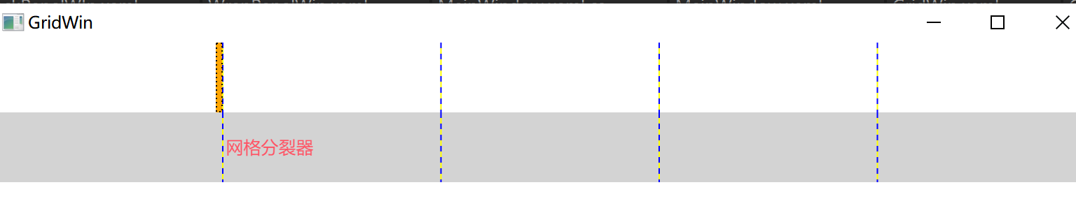
属性总结
1. Grid 自身的核心属性
| 属性名 | 作用 |
|---|---|
<font style="color:rgb(0, 0, 0);background-color:rgba(0, 0, 0, 0);">RowDefinitions</font> |
定义 Grid 的所有行 |
<font style="color:rgb(0, 0, 0);background-color:rgba(0, 0, 0, 0);">ColumnDefinitions</font> |
定义 Grid 的所有列 |
<font style="color:rgb(0, 0, 0);background-color:rgba(0, 0, 0, 0);">ShowGridLines</font> |
是否显示网格线(仅调试用,默认 false) |
<font style="color:rgb(0, 0, 0);background-color:rgba(0, 0, 0, 0);">HorizontalAlignment</font> |
Grid 自身在父容器中的水平对齐方式 |
<font style="color:rgb(0, 0, 0);background-color:rgba(0, 0, 0, 0);">VerticalAlignment</font> |
Grid 自身在父容器中的垂直对齐方式 |
<font style="color:rgb(0, 0, 0);background-color:rgba(0, 0, 0, 0);">Margin</font> |
Grid 的外边距 |
<font style="color:rgb(0, 0, 0);background-color:rgba(0, 0, 0, 0);">Padding</font> |
Grid 内部控件与 Grid 边界的内边距 |
2. 子控件附加属性(最重要!)
Grid 的子控件需要通过附加属性指定自己所在的行 / 列,以及是否跨行列:
| 附加属性 | 作用 |
|---|---|
<font style="color:rgb(0, 0, 0);background-color:rgba(0, 0, 0, 0);">Grid.Row</font> |
指定子控件所在的行(索引从 0 开始) |
<font style="color:rgb(0, 0, 0);background-color:rgba(0, 0, 0, 0);">Grid.Column</font> |
指定子控件所在的列(索引从 0 开始) |
<font style="color:rgb(0, 0, 0);background-color:rgba(0, 0, 0, 0);">Grid.RowSpan</font> |
子控件跨多少行(默认 1) |
**<font style="color:#DF2A3F;background-color:rgba(0, 0, 0, 0);">Grid.ColumnSpan</font>** |
子控件(默认 1) |
3.行 / 列的关键属性(RowDefinition/ColumnDefinition)
定义行和列时,核心是设置<font style="color:rgb(0, 0, 0);background-color:rgba(0, 0, 0, 0);">Height</font>(行高)/<font style="color:rgb(0, 0, 0);background-color:rgba(0, 0, 0, 0);">Width</font>(列宽),有三种取值方式:
- 固定值 :直接指定像素(如
<font style="color:rgb(0, 0, 0);background-color:rgba(0, 0, 0, 0);">Height="50"</font>),适用于固定大小的区域(如标题栏)。 - 自动(Auto) :自适应内容大小(如
<font style="color:rgb(0, 0, 0);background-color:rgba(0, 0, 0, 0);">Width="Auto"</font>),适用于内容长度不确定的区域(如文本框)。 - 星号(*) :按比例分配剩余空间 (如
<font style="color:rgb(0, 0, 0);background-color:rgba(0, 0, 0, 0);">Width="2*"</font>),<font style="color:rgb(0, 0, 0);background-color:rgba(0, 0, 0, 0);">1*</font>可简写为<font style="color:rgb(0, 0, 0);background-color:rgba(0, 0, 0, 0);">*</font>,适用于需要自适应窗口的区域(如内容区)。
2. StackPanel(堆叠面板)
核心功能 :单行、单列布局。最简单布局,适合简单布局
基础用法:
xml
<StackPanel Orientation="Vertical">
    <Button Content="按钮1" Margin="5"/>
    <Button Content="按钮2" Margin="5"/>
    <Button Content="按钮3" Margin="5"/>
</StackPanel>
布局效果 (垂直排列):
按钮1
按钮2
按钮3
水平排列 (Orientation="Horizontal"):
按钮1 \] \[ 按钮2 \] \[ 按钮3
:::info
Orientation 表示的子元素在我这里怎么排列
HorizontalAlignment 我在父元素中怎么摆放位置,靠左侧,靠右侧 剧中
:::
3. Canvas(画布)
核心功能:通过坐标绝对定位,应用:元素在窗口上固定位置。
说明:
- 通过精准的位置布局的。
- 注意子元素重叠概率比较大:可以通过** z-index **设置显示层级
- Canvas.Left 距离画布左边距离
- Canvas.Top 距离画布顶部距离
- Canvas.Right 距离画布右边的距离
- Canvas.Bottom 距离画布底部的距离
基础用法:
xml
<Canvas Background="LightGray">
    <Rectangle Canvas.Left="30" Canvas.Top="40"
               Width="100" Height="50" Fill="Blue"/>
    <TextBlock Canvas.Right="10" Canvas.Bottom="10"
               Text="右下角文字"/>
</Canvas>
布局效果 :
█████ (位置:X=30, Y=40)
文字 (右下角固定偏移)
:::info
相对定位:相对于画布左上角坐标定位
:::
4. DockPanel(停靠面板)
核心功能:元素停靠在指定边缘
**说明:**默认水平布局,最后一个子元素填满整个容器,可以通过,子元素的附加属性:DockPanel.Dock="Top/Bottom/Left/Right" 设置停靠方式
基础用法:
xml
<DockPanel LastChildFill="True">
    <Menu DockPanel.Dock="Top" Height="30">顶部菜单</Menu>
    <StatusBar DockPanel.Dock="Bottom">状态栏</StatusBar>
    <ListBox DockPanel.Dock="Left" Width="150">导航</ListBox>
    <TextBox>主内容区(自动填充剩余空间)</TextBox>
</DockPanel>
布局效果 :
─────────菜单────────
│ 导航 │ 主内容区 │
───────状态栏────────
csharp
<Window x:Class="Chuanding.LayoutStudy.DockPanelWin"
        xmlns="http://schemas.microsoft.com/winfx/2006/xaml/presentation"
        xmlns:x="http://schemas.microsoft.com/winfx/2006/xaml"
        xmlns:d="http://schemas.microsoft.com/expression/blend/2008"
        xmlns:mc="http://schemas.openxmlformats.org/markup-compatibility/2006"
        xmlns:local="clr-namespace:Zhaoxi.LayoutStudy"
        mc:Ignorable="d" FontSize="20"
        Title="DockPanelWin" Height="450" Width="800">
    <DockPanel>
        <Button Content="Button3" DockPanel.Dock="Left"/>
        <Button Content="Button1" DockPanel.Dock="Top"/>
        <Button Content="Button1-2" DockPanel.Dock="Top"/>
        <Button Content="Button2" DockPanel.Dock="Bottom"/>
        <Button Content="Button4" DockPanel.Dock="Right"/>
        <Button Content="Button5"/>
    </DockPanel>
</Window>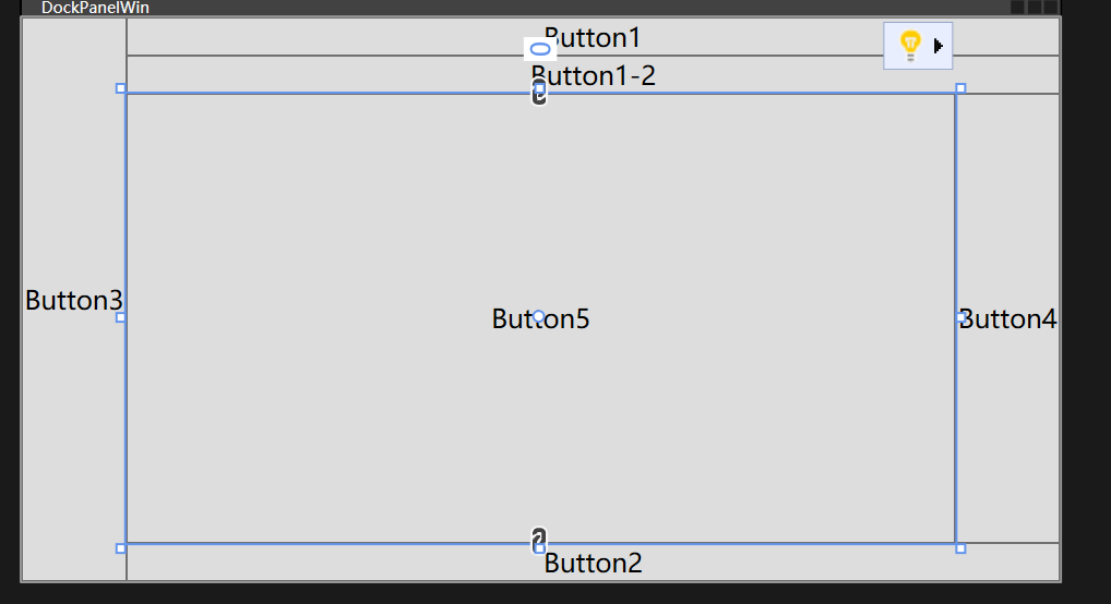
5. WrapPanel(环绕面板)
核心功能:空间不足时自动换行/列
说明:
- 默认:水平布局,从左往右,满行自动换行,默认行高度为子元素中最高高度
- 子元素大小默认为内容的大小
- 可以通过** Orientation **修改为纵向布局;**列满后,自动换列**,列宽 = 最宽子元素的宽度
- 例如:windowss桌面的布局。
基础用法:
xml
<WrapPanel>
    <Button Content="Item1" Width="80" Margin="5"/>
    <Button Content="Item2" Width="80" Margin="5"/>
    <Button Content="LongItem3" Width="120" Margin="5"/>
    <!-- 宽度不足时自动换行 -->
</WrapPanel>
布局效果 (容器宽度=250px时):
Item1 \] \[ Item2
LongItem3
纵向布局
csharp
<!--Orientation 设置wrap在如容器怎么布局-->
<WrapPanel Orientation="Vertical">
        <Button Content="Button1" Height="40" Width="120" VerticalAlignment="Top"/>
        <Button Content="Button2" Height="40" Width="120" VerticalAlignment="Bottom"/>
        <Button Content="Button3" Height="60" Width="120"/>
        <Button Content="Button4" Height="40" Width="120"/>
        <Button Content="Button4" Height="80" Width="120"/>
        <Button Content="Button4" Height="40" Width="220"/>
        <Button Content="Button4" Height="40" Width="120"/>
        <Button Content="Button4" Height="40" Width="120"/>
        <Button Content="Button4" Height="40" Width="120"/>
        <Button Content="Button4" Height="40" Width="120"/>
        <Button Content="Button4" Height="40" Width="120"/>
    </WrapPanel>
效果
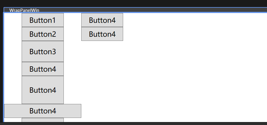
6. UniformGrid(均等网格)
核心功能:所有单元格尺寸相同
说明:
- 没有附加属性,不能指定几行解列 通过Row Colum 设置行数和列数
- 自定处理行列内容,如果没有指定行列数量时候。
- 子元素。填满整个单元格
- 所有单元格的宽度和高度都一样。
- 单元格中子元素,margin padding都失效了。
基础用法:
xml
<UniformGrid Rows="2" Columns="3">
    <Button>1</Button>
    <Button>2</Button>
    <Button>3</Button>
    <Button>4</Button>
    <!-- 自动生成 2x3 网格 -->
</UniformGrid>
布局效果 :
┌───┬───┬───┐
│ 1 │ 2 │ 3 │
├───┼───┼───┤
│ 4 │ │ │
└───┴───┴───┘
csharp
<Window x:Class="Chuanding.LayoutStudy.UniformGrid"
        xmlns="http://schemas.microsoft.com/winfx/2006/xaml/presentation"
        xmlns:x="http://schemas.microsoft.com/winfx/2006/xaml"
        xmlns:d="http://schemas.microsoft.com/expression/blend/2008"
        xmlns:mc="http://schemas.openxmlformats.org/markup-compatibility/2006"
        xmlns:local="clr-namespace:Zhaoxi.LayoutStudy"
        mc:Ignorable="d" FontSize="20"
        Title="UniformGrid" Height="450" Width="800">
    <UniformGrid Rows="10" Columns="4">
        <Button Content="Button1"/>
        <Button Content="Button4"/>
        <Button Content="Button2"/>
        <Button Content="Button2" Height="100"/>
        <Button Content="Button2"/>
        <Button Content="Button2"/>
        <Button Content="Button2"/>
        <Button Content="Button2"/>
        <Button Content="Button2"/>
        <Button Content="Button3" />
    </UniformGrid>
</Window>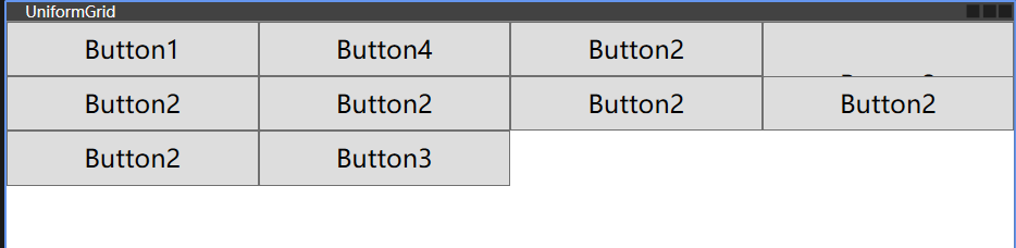
7.InkCanvas
功能:支持手写笔。继承:FramworkElement,
说明:
- inkCanvas 对象 有两个子集,Children Stoke
- Children 保存画布上的添加的子元素,和普通容器一样
- Stoke 保存画出来的内容, 专门存放用户用手写笔 / 鼠标在画布上绘制的**笔迹数据**(类型是
<font style="color:rgb(0, 0, 0);background-color:rgba(0, 0, 0, 0);">StrokeCollection</font>),每个笔迹包含坐标、压力、粗细、颜色等信息,是手写识别的原始数据源
- 可以用于手写识别
基础代码
csharp
<Window x:Class="Chuanding.LayoutStudy.InkCanvasWin"
        xmlns="http://schemas.microsoft.com/winfx/2006/xaml/presentation"
        xmlns:x="http://schemas.microsoft.com/winfx/2006/xaml"
        xmlns:d="http://schemas.microsoft.com/expression/blend/2008"
        xmlns:mc="http://schemas.openxmlformats.org/markup-compatibility/2006"
        xmlns:local="clr-namespace:Zhaoxi.LayoutStudy"
        mc:Ignorable="d" FontSize="20"
        Title="InkCanvasWin" Height="450" Width="800">
    <InkCanvas EditingMode="Ink"  Gesture="InkCanvas_Gesture_1">
        <Button Content="Button" InkCanvas.Left="100" InkCanvas.Top="50"/>
    </InkCanvas>
</Window>
手写识别案例
布局
csharp
<Window x:Class="InkCanvasHandwriting.MainWindow"
        xmlns="http://schemas.microsoft.com/winfx/2006/xaml/presentation"
        xmlns:x="http://schemas.microsoft.com/winfx/2006/xaml"
        Title="手写识别演示" Height="450" Width="800">
    <Grid>
        <!-- 手写画布:默认支持手写笔/鼠标绘制 -->
        <InkCanvas x:Name="myInkCanvas" Background="White">
            <!-- Children 示例:添加一个文本框到画布(和手写无关) -->
            <TextBox Width="100" Height="30" Canvas.Left="10" Canvas.Top="10" Text="备注"/>
        </InkCanvas>

        <!-- 按钮:触发手写识别 -->
        <Button Content="识别手写内容" Width="120" Height="40"
                HorizontalAlignment="Right" VerticalAlignment="Bottom"
                Margin="20" Click="BtnRecognize_Click"/>

        <!-- 显示识别结果 -->
        <TextBlock x:Name="tbResult" HorizontalAlignment="Left" VerticalAlignment="Bottom"
                   Margin="20" FontSize="16" Foreground="Blue"/>
    </Grid>
</Window>
后台代码
csharp
using System.Windows;
using System.Windows.Ink;

namespace InkCanvasHandwriting
{
    public partial class MainWindow : Window
    {
        public MainWindow()
        {
            InitializeComponent();
            // 配置手写笔参数:颜色、粗细
            myInkCanvas.DefaultDrawingAttributes.Color = System.Windows.Media.Colors.Black;
            myInkCanvas.DefaultDrawingAttributes.Width = 2;
            myInkCanvas.DefaultDrawingAttributes.Height = 2;
        }

        // 识别按钮点击事件
        private void BtnRecognize_Click(object sender, RoutedEventArgs e)
        {
            // 1. 获取 Strokes 集合(手写笔迹数据)
            StrokeCollection strokes = myInkCanvas.Strokes;

            if (strokes.Count == 0)
            {
                tbResult.Text = "请先在画布上书写内容!";
                return;
            }

            // 2. 调用手写识别逻辑(核心:将 Strokes 转成文字)
            string recognizedText = RecognizeHandwriting(strokes);

            // 3. 显示结果
            tbResult.Text = $"识别结果:{recognizedText}";

            // 可选:清空画布
            // myInkCanvas.Strokes.Clear();
        }

        // 手写识别核心方法(需对接识别库)
        private string RecognizeHandwriting(StrokeCollection strokes)
        {
            // --------------------------
            // 关键说明:
            // WPF 本身没有内置手写识别引擎,需要对接第三方/系统识别库:
            // 1. 系统自带:Windows 手写识别(需引用 System.Speech 或 Windows.Data.Ink)
            // 2. 第三方:百度AI、阿里云OCR、腾讯云手写识别 API
            // --------------------------

            // 这里先模拟识别(实际需替换为真实识别逻辑)
            // 示例:假设识别出"测试"
            return "测试";

            // 【真实场景示例】对接 Windows 内置识别(需 Windows 10+)
            // 需添加 NuGet 包:Windows.Data.Ink
            // var inkRecognizer = new InkRecognizer();
            // var recognitionResult = await inkRecognizer.RecognizeAsync(strokes);
            // return recognitionResult.GetTextCandidates()[0];
        }
    }
}
<font style="color:rgb(0, 0, 0);background-color:rgba(0, 0, 0, 0);">InkCanvas</font> 只负责采集笔迹(<font style="color:rgb(0, 0, 0);background-color:rgba(0, 0, 0, 0);">Strokes</font>),真正的 "识别文字" 需要对接识别引擎,这里以**百度 AI 手写识别 API**为例(新手易上手),补充核心代码:
准备工作
-
去百度智能云申请手写识别 API 密钥(AppID、API Key、Secret Key);
-
添加 NuGet 包:
<font style="color:rgb(0, 0, 0);background-color:rgba(0, 0, 0, 0);">Newtonsoft.Json</font>(处理 JSON)、<font style="color:rgb(0, 0, 0);background-color:rgba(0, 0, 0, 0);">System.Net.Http</font>(发送 HTTP 请求)。- 替换
<font style="color:rgb(0, 0, 0);background-color:rgba(0, 0, 0, 0);">RecognizeHandwriting</font>方法为真实逻辑
- 替换
csharp
using System;
using System.Collections.Generic;
using System.Net.Http;
using System.Text;
using System.Windows.Ink; // StrokeCollection、Stroke 相关命名空间
using Newtonsoft.Json;   // JsonConvert 所需命名空间

/// <summary>
/// 调用百度手写识别API,将手写笔迹(StrokeCollection)转换为文字
/// </summary>
/// <param name="strokes">WPF手写笔迹集合(包含所有手写笔画的坐标信息)</param>
/// <returns>识别后的文字结果,失败时返回错误信息</returns>
private async Task<string> RecognizeHandwriting(StrokeCollection strokes)
{
    try
    {
        // 步骤1:将WPF的StrokeCollection转换为百度API要求的坐标格式
        // 百度手写识别API要求的坐标格式:笔画1坐标;笔画1坐标;,...,;笔画2坐标;笔画2坐标;,...,;
        // 单笔画内坐标用分号分隔,笔画结束用英文逗号+分号(,;)标记
        List<string> pointList = new List<string>();
        // 遍历每一笔画(Stroke是单根手写笔画)
        foreach (Stroke stroke in strokes)
        {
            // 遍历当前笔画的所有坐标点(StylusPoint包含X/Y坐标)
            foreach (StylusPoint point in stroke.StylusPoints)
            {
                // 格式化坐标为 "X,Y" 字符串(百度API要求的单坐标格式)
                pointList.Add($"{point.X},{point.Y}");
            }
            // 每根笔画结束后添加逗号作为分隔标记(百度API规范)
            pointList.Add(",");
        }
        // 将所有坐标点拼接成API要求的完整字符串(分号分隔所有元素)
        string points = string.Join(";", pointList);

        // 步骤2:构造百度手写识别API请求参数并调用接口
        // 百度手写识别API的基础地址
        string apiUrl = "https://aip.baidubce.com/rest/2.0/ocr/v1/handwriting";
        // 获取百度API的AccessToken(需自行实现GetBaiduAccessToken方法)
        string accessToken = GetBaiduAccessToken();
        // 构造POST请求参数:
        // image:图片base64(本示例仅传坐标,故为空)
        // points:手写坐标字符串(需URL编码避免特殊字符问题)
        string postData = $"image=&points={Uri.EscapeDataString(points)}";

        // 创建HttpClient实例(推荐复用,此处为示例简化创建)
        using (HttpClient client = new HttpClient())
        {
            // 设置请求头:指定内容类型为表单格式
            client.DefaultRequestHeaders.Add("Content-Type", "application/x-www-form-urlencoded");

            // 发送POST请求:URL拼接access_token参数,请求体为构造的表单数据
            var response = await client.PostAsync(
                $"{apiUrl}?access_token={accessToken}",
                new StringContent(postData, Encoding.UTF8, "application/x-www-form-urlencoded")
            );

            // 检查响应是否成功(HTTP状态码200-299)
            if (response.IsSuccessStatusCode)
            {
                // 读取响应的JSON字符串
                string result = await response.Content.ReadAsStringAsync();
                // 反序列化JSON(使用dynamic简化解析,实际项目建议创建实体类)
                dynamic json = JsonConvert.DeserializeObject(result);
                // 提取识别结果:words_result数组第一个元素的words字段(百度API返回格式)
                return json.words_result[0].words;
            }
            // 响应失败时返回状态码信息
            return $"识别失败:{response.StatusCode}";
        }
    }
    catch (Exception ex)
    {
        // 捕获异常并返回异常信息
        return $"识别异常:{ex.Message}";
    }
}

/// <summary>
/// 获取百度AI开放平台的AccessToken(核心:需替换为你的应用信息)
/// 文档参考:https://ai.baidu.com/ai-doc/REFERENCE/Ck3dwjhhu
/// </summary>
/// <returns>有效的AccessToken字符串</returns>
private string GetBaiduAccessToken()
{
    // 【必须替换】此处需实现真实的AccessToken获取逻辑:
    // 1. 前往百度AI开放平台创建应用(https://console.bce.baidu.com/ai/)
    // 2. 获取你的AppID、API Key、Secret Key
    // 3. 调用https://aip.baidubce.com/oauth/2.0/token接口获取AccessToken
    // 示例逻辑(需补充):
    // string apiKey = "你的API Key";
    // string secretKey = "你的Secret Key";
    // 调用token接口,返回有效的access_token

    // 临时返回占位符,需替换为真实实现
    return "你的AccessToken";
}
8.Border
功能:是一个修饰,可以用于布局
说明;
- border下只能偶一个子元素
csharp
<Window x:Class="_01布局类控件.NoBorderGrid"
        xmlns="http://schemas.microsoft.com/winfx/2006/xaml/presentation"
        xmlns:x="http://schemas.microsoft.com/winfx/2006/xaml"
        xmlns:d="http://schemas.microsoft.com/expression/blend/2008"
        xmlns:mc="http://schemas.openxmlformats.org/markup-compatibility/2006"
        xmlns:local="clr-namespace:_01布局类控件"
        mc:Ignorable="d"
        Title="NoBorderGrid" Height="450" Width="800"
        WindowStyle="None"
        Background="{x:Null}"
        AllowsTransparency="True"
        >
    <Border Background="#EEE" Margin="5" CornerRadius="10">
	 <!--边框阴影-->
        <Border.Effect>
            <DropShadowEffect ShadowDepth="0" Color="Gray"
                              Direction="0" Opacity="0.3"
                              BlurRadius="10"></DropShadowEffect>
        </Border.Effect>
        <Grid>

        </Grid>
    </Border>
</Window>
如何通过后台方式设置Border样式 注意:有一个Border 的Name 为 myBorder
csharp
// 假设XAML中给Border命名为"myBorder"
private void ChangeBorderStyle()
{
    // 修改边框颜色
    myBorder.BorderBrush = Brushes.Orange;
    // 修改圆角
    myBorder.CornerRadius = new CornerRadius(8);
    // 修改背景
    myBorder.Background = new SolidColorBrush(Color.FromArgb(255, 255, 248, 220));
    // 修改边框厚度
    myBorder.BorderThickness = new Thickness(3);
}
常用属性
| 属性名 | 作用 |
|---|---|
<font style="color:rgb(0, 0, 0);background-color:rgba(0, 0, 0, 0);">Child</font> |
Border 只能包含一个子元素(核心) |
<font style="color:rgb(0, 0, 0);background-color:rgba(0, 0, 0, 0);">BorderBrush</font> |
边框颜色 |
<font style="color:rgb(0, 0, 0);background-color:rgba(0, 0, 0, 0);">BorderThickness</font> |
边框厚度(可分别设置上下左右) |
<font style="color:rgb(0, 0, 0);background-color:rgba(0, 0, 0, 0);">CornerRadius</font> |
圆角半径(可分别设置四个角) |
<font style="color:rgb(0, 0, 0);background-color:rgba(0, 0, 0, 0);">Background</font> |
背景色 / 背景画刷 |
<font style="color:rgb(0, 0, 0);background-color:rgba(0, 0, 0, 0);">Padding</font> |
边框内部,子元素与边框的间距 |
<font style="color:rgb(0, 0, 0);background-color:rgba(0, 0, 0, 0);">Margin</font> |
边框外部,与其他控件的间距 |
WPF 常用布局策略总结
- Grid - 复杂结构化布局(90%场景首选)
- StackPanel - 线性列表/工具栏
- DockPanel - 窗口框架布局
- Canvas - 精确坐标定位(慎用,破坏响应式)
- WrapPanel - 流式动态布局
- UniformGrid - 等分网格系统
静态布局原则 :优先使用
Grid+StackPanel组合,避免绝对坐标(Canvas),通过Margin/Padding微调间距,利用Auto和*实现自适应尺寸。
扩展布局控件
TabControl
说明:
<font style="color:rgb(0, 0, 0);background-color:rgba(0, 0, 0, 0);">TabControl</font>和<font style="color:rgb(0, 0, 0);background-color:rgba(0, 0, 0, 0);">TabItem</font>是**容器 - 子项**的关系- 在设计器中看不到具体的样式,可以通过:窗体右键--->编辑模板/编辑副本。 可以看到样式代码
- T
<font style="color:rgb(0, 0, 0);background-color:rgba(0, 0, 0, 0);">TabControl</font>和<font style="color:rgb(0, 0, 0);background-color:rgba(0, 0, 0, 0);">TabItem</font>是**容器 - 子项**的关系<font style="color:rgb(0, 0, 0);background-color:rgba(0, 0, 0, 0);">TabControl</font>是「整个标签页容器」 比如浏览器的标签栏整体<font style="color:rgb(0, 0, 0);background-color:rgba(0, 0, 0, 0);">TabItem</font>是「单个标签页项 比如浏览器里的 "首页""设置" 标签)
- 一个TabControl 可以有多个TabItem.TabItem不可以脱离容器单独存在
- TabItem.Header/ TabItem.Content 的本质:属性(不是控件) 都是
<font style="color:rgb(0, 0, 0);background-color:rgba(0, 0, 0, 0);">TabItem</font>的**依赖属性** - 注意:3-5个导航,每一个标签内容属于同一个大类别可以使用
核心适用场景:
- 客 户详情页(基本信息、订单记录、联系日志、备注)
- 管理系统(如 CRM、ERP)中,一个实体(客户、订单、商品)的信息往往包含多个维度
- 记事本 / 浏览器的设置界面、自定义软件的系统配置页。
语法
csharp
<TabControl> <!-- 容器 -->
    <TabItem/> <!-- 子项1 -->
    <TabItem/> <!-- 子项2 -->
</TabControl>
基础案例demo
csharp
   <Grid>
       <!--` Visibility="Collapsed" 控件完全隐藏-->
       <TabControl  Background="Red" Width="200" Height="200">
	      <!--
		    特殊简写
			<TabItem Header="首页">
		  -->
           <TabItem>
               <TabItem.Header>
                   <StackPanel>
                       <Border Width="50" Height="50" Background="Orange"/>
                       <TextBlock Text="首页"/>
                   </StackPanel>
               </TabItem.Header>
               <TabItem.Content>
                   <TextBlock Text="你好"></TextBlock>
               </TabItem.Content>

           </TabItem>
           <TabItem>
               <TabItem.Header>
                   <StackPanel>
                       <Border Width="50" Height="50" Background="Orange"/>
                       <TextBlock Text="首页"/>
                   </StackPanel>
               </TabItem.Header>
               <TabItem.Content>
                   <TextBlock Text="我好
                              "></TextBlock>
               </TabItem.Content>
           </TabItem>
       </TabControl>
   </Grid>
demo2
csharp
<TabControl Width="800" Height="400">
    <!-- 日报表 -->
    <TabItem Header="日报表">
        <Grid Margin="15">
            <TextBlock Text="日销售额:¥12,500" FontSize="18" HorizontalAlignment="Center" VerticalAlignment="Center"/>
            <!-- 实际开发中绑定Chart控件展示图表 -->
        </Grid>
    </TabItem>

    <!-- 周报表 -->
    <TabItem Header="周报表">
        <Grid Margin="15">
            <TextBlock Text="周销售额:¥85,600" FontSize="18" HorizontalAlignment="Center" VerticalAlignment="Center"/>
        </Grid>
    </TabItem>

    <!-- 月报表 -->
    <TabItem Header="月报表">
        <Grid Margin="15">
            <TextBlock Text="月销售额:¥368,900" FontSize="18" HorizontalAlignment="Center" VerticalAlignment="Center"/>
        </Grid>
    </TabItem>
</TabControl>
ToolBarPanel
<font style="color:rgb(0, 0, 0);background-color:rgba(0, 0, 0, 0);">ToolBarPanel</font> 是 WPF 专门为 <font style="color:rgb(0, 0, 0);background-color:rgba(0, 0, 0, 0);">ToolBar</font> 控件设计的**布局面板**
说明:
- 天生适配工具栏场景,支持水平自动排列(默认)或垂直排列,当内容超出面板宽度 / 高度时,会自动配合
<font style="color:rgb(0, 0, 0);background-color:rgba(0, 0, 0, 0);">ToolBar</font>显示溢出按钮(⋮),把放不下的控件收纳到下拉菜单中; - 它是
<font style="color:rgb(0, 0, 0);background-color:rgba(0, 0, 0, 0);">ToolBar</font>的默认面板(无需手动指定) - 相比普通的
<font style="color:rgb(0, 0, 0);background-color:rgba(0, 0, 0, 0);">StackPanel</font>,<font style="color:rgb(0, 0, 0);background-color:rgba(0, 0, 0, 0);">ToolBarPanel</font>最大的优势是支持溢出处理,这是工具栏场景的核心需求。
csharp
<Window x:Class="ToolBarPanelDemo.MainWindow"
        xmlns="http://schemas.microsoft.com/winfx/2006/xaml/presentation"
        xmlns:x="http://schemas.microsoft.com/winfx/2006/xaml"
        Title="ToolBarPanel示例" Height="300" Width="400">
    <Grid>
        <!-- 工具栏容器(通常放在Window的ToolBarTray中,也可直接用) -->
        <ToolBarTray VerticalAlignment="Top">
            <!-- ToolBar默认使用ToolBarPanel布局 -->
            <ToolBar Width="300"> <!-- 限制宽度,方便演示溢出效果 -->
                <!-- 工具栏按钮 -->
                <Button Content="新建" Width="60"/>
                <Button Content="打开" Width="60"/>
                <Button Content="保存" Width="60"/>
                <Button Content="另存为" Width="60"/>
                <Button Content="撤销" Width="60"/>
                <Button Content="重做" Width="60"/>
            </ToolBar>
        </ToolBarTray>
    </Grid>
</Window>
常用属性
这些是<font style="color:rgb(0, 0, 0);background-color:rgba(0, 0, 0, 0);">ToolBarPanel</font>区别于其他面板(如 StackPanel)的核心属性,也是实际开发中最常配置的:
| 属性名 | 作用 | 取值 | 示例 & 说明 |
|---|---|---|---|
<font style="color:rgb(0, 0, 0);background-color:rgba(0, 0, 0, 0);">Orientation</font> |
控制子元素的排列方向 | <font style="color:rgb(0, 0, 0);background-color:rgba(0, 0, 0, 0);">Horizontal</font> (默认)/ <font style="color:rgb(0, 0, 0);background-color:rgba(0, 0, 0, 0);">Vertical</font> |
<font style="color:rgb(0, 0, 0);background-color:rgba(0, 0, 0, 0);"><ToolBarPanel Orientation="Vertical"/></font> - 水平:工具栏按钮从左到右排列(常规工具栏) - 垂直:工具栏按钮从上到下排列(侧边工具栏) |
<font style="color:rgb(0, 0, 0);background-color:rgba(0, 0, 0, 0);">WrapWidth</font> |
仅水平布局时生效,指定 "换行宽度"(超出该宽度自动换行) | 数值(如 100、200) | <font style="color:rgb(0, 0, 0);background-color:rgba(0, 0, 0, 0);"><ToolBarPanel WrapWidth="200"/></font> 当按钮总宽度超过 200 时,自动换行显示(需配合<font style="color:rgb(0, 0, 0);background-color:rgba(0, 0, 0, 0);">ToolBar</font> 的溢出逻辑) |
<font style="color:rgb(0, 0, 0);background-color:rgba(0, 0, 0, 0);">IsItemsHost</font> |
标记面板是否为<font style="color:rgb(0, 0, 0);background-color:rgba(0, 0, 0, 0);">ToolBar</font> 的子项容器(内部属性,一般无需手动改) |
<font style="color:rgb(0, 0, 0);background-color:rgba(0, 0, 0, 0);">true</font> /<font style="color:rgb(0, 0, 0);background-color:rgba(0, 0, 0, 0);">false</font> |
默认为<font style="color:rgb(0, 0, 0);background-color:rgba(0, 0, 0, 0);">true</font> ,<font style="color:rgb(0, 0, 0);background-color:rgba(0, 0, 0, 0);">ToolBar</font> 会自动把子元素交给<font style="color:rgb(0, 0, 0);background-color:rgba(0, 0, 0, 0);">ToolBarPanel</font> 布局,无需手动设置 |
二、继承自 Panel 的常用属性(通用布局)
<font style="color:rgb(0, 0, 0);background-color:rgba(0, 0, 0, 0);">ToolBarPanel</font>继承自<font style="color:rgb(0, 0, 0);background-color:rgba(0, 0, 0, 0);">Panel</font>,这些通用属性在布局调整时经常用到:
| 属性名 | 作用 | 示例 & 说明 |
|---|---|---|
<font style="color:rgb(0, 0, 0);background-color:rgba(0, 0, 0, 0);">Background</font> |
设置面板背景色 | <font style="color:rgb(0, 0, 0);background-color:rgba(0, 0, 0, 0);"><ToolBarPanel Background="#F5F5F5"/></font> 给工具栏面板设置浅灰色背景,区分其他区域 |
<font style="color:rgb(0, 0, 0);background-color:rgba(0, 0, 0, 0);">Margin</font> |
面板外部间距(与父容器的距离) | <font style="color:rgb(0, 0, 0);background-color:rgba(0, 0, 0, 0);"><ToolBarPanel Margin="5,0,5,0"/></font> 上下无间距,左右各 5 像素,避免工具栏贴边 |
<font style="color:rgb(0, 0, 0);background-color:rgba(0, 0, 0, 0);">Padding</font> |
面板内部间距(子元素与面板边缘的距离) | <font style="color:rgb(0, 0, 0);background-color:rgba(0, 0, 0, 0);"><ToolBarPanel Padding="3"/></font> 按钮与工具栏边缘保留 3 像素间距,视觉更舒适 |
<font style="color:rgb(0, 0, 0);background-color:rgba(0, 0, 0, 0);">Width</font> /<font style="color:rgb(0, 0, 0);background-color:rgba(0, 0, 0, 0);">Height</font> |
面板的固定宽 / 高 | <font style="color:rgb(0, 0, 0);background-color:rgba(0, 0, 0, 0);"><ToolBarPanel Width="300" Height="40"/></font> 固定工具栏宽度 300、高度 40(也可绑定父容器自适应) |
<font style="color:rgb(0, 0, 0);background-color:rgba(0, 0, 0, 0);">HorizontalAlignment</font> /<font style="color:rgb(0, 0, 0);background-color:rgba(0, 0, 0, 0);">VerticalAlignment</font> |
面板在父容器中的对齐方式 | <font style="color:rgb(0, 0, 0);background-color:rgba(0, 0, 0, 0);"><ToolBarPanel HorizontalAlignment="Stretch"/></font> 水平拉伸填满父容器(自适应窗口宽度) |
三、溢出相关的间接配置(关键!)
<font style="color:rgb(0, 0, 0);background-color:rgba(0, 0, 0, 0);">ToolBarPanel</font>的溢出效果由<font style="color:rgb(0, 0, 0);background-color:rgba(0, 0, 0, 0);">ToolBar</font>的属性控制(因为溢出是<font style="color:rgb(0, 0, 0);background-color:rgba(0, 0, 0, 0);">ToolBar</font>+<font style="color:rgb(0, 0, 0);background-color:rgba(0, 0, 0, 0);">ToolBarPanel</font>的组合能力),这些属性虽不属于<font style="color:rgb(0, 0, 0);background-color:rgba(0, 0, 0, 0);">ToolBarPanel</font>,但实际开发中必须掌握:
| 所属控件 | 属性名 | 作用 | 示例 & 说明 |
|---|---|---|---|
<font style="color:rgb(0, 0, 0);background-color:rgba(0, 0, 0, 0);">ToolBar</font> |
<font style="color:rgb(0, 0, 0);background-color:rgba(0, 0, 0, 0);">OverflowMode</font> |
控制单个控件的溢出规则(需给子元素设置) | <font style="color:rgb(0, 0, 0);background-color:rgba(0, 0, 0, 0);"><Button Content="保存" ToolBar.OverflowMode="AsNeeded"/></font> 取值: - <font style="color:rgb(0, 0, 0);background-color:rgba(0, 0, 0, 0);">AsNeeded</font> (默认):空间不足时溢出 - <font style="color:rgb(0, 0, 0);background-color:rgba(0, 0, 0, 0);">Always</font> :始终放入溢出菜单 - <font style="color:rgb(0, 0, 0);background-color:rgba(0, 0, 0, 0);">Never</font> :永不溢出(空间不足时截断) |
<font style="color:rgb(0, 0, 0);background-color:rgba(0, 0, 0, 0);">ToolBar</font> |
<font style="color:rgb(0, 0, 0);background-color:rgba(0, 0, 0, 0);">IsOverflowOpen</font> |
控制溢出菜单是否展开(代码后台用) | <font style="color:rgb(0, 0, 0);background-color:rgba(0, 0, 0, 0);">myToolBar.IsOverflowOpen = true;</font> 手动打开 / 关闭溢出下拉菜单 |
<font style="color:rgb(0, 0, 0);background-color:rgba(0, 0, 0, 0);">ToolBar</font> |
<font style="color:rgb(0, 0, 0);background-color:rgba(0, 0, 0, 0);">OverflowButtonStyle</font> |
自定义溢出按钮 |
ToolbarOverflowPanel
核心功能:<font style="color:rgb(0, 0, 0);background-color:rgba(0, 0, 0, 0);">ToolBarOverflowPanel</font> 是 WPF 中**专门用于承载 ToolBar 溢出内容**的布局面板
说明:
- 仅在
<font style="color:rgb(0, 0, 0);background-color:rgba(0, 0, 0, 0);">ToolBar</font>内容溢出时生效,平时不可见; - 默认垂直排列溢出内容(下拉菜单样式),也可改为水平;
- 继承自
<font style="color:rgb(0, 0, 0);background-color:rgba(0, 0, 0, 0);">Panel</font>,但专为溢出菜单定制,不适合普通布局。
VirtualizingStackPanel
改善数据库可视化列表的性能
有虚拟列表
没有
使用Snope 对不查看
ScrollView可滚动容器
<font style="color:rgb(0, 0, 0);background-color:rgba(0, 0, 0, 0);">ScrollViewer</font> 是 WPF 中用于为**超出显示区域的内容**提供滚动功能的容器控件,你可以把它理解成 "带滚动条的相框":
说明:
<font style="color:rgb(0, 0, 0);background-color:rgba(0, 0, 0, 0);">ScrollViewer</font>仅能有一个直接子元素,多元素需先嵌套容器(如<font style="color:rgb(0, 0, 0);background-color:rgba(0, 0, 0, 0);">StackPanel</font>/<font style="color:rgb(0, 0, 0);background-color:rgba(0, 0, 0, 0);">Grid</font>)。- 继承 ContentControl与窗体继承的是同一个基
核心作用:当内部内容的尺寸超过 <font style="color:rgb(0, 0, 0);background-color:rgba(0, 0, 0, 0);">ScrollViewer</font> 自身尺寸时,自动显示水平 / 垂直滚动条,让用户通过滚动查看全部内容;
核心属性:
<font style="color:rgb(0, 0, 0);background-color:rgba(0, 0, 0, 0);">HorizontalScrollBarVisibility</font>:控制水平滚动条的显示(<font style="color:rgb(0, 0, 0);background-color:rgba(0, 0, 0, 0);">Visible</font>/<font style="color:rgb(0, 0, 0);background-color:rgba(0, 0, 0, 0);">Hidden</font>/<font style="color:rgb(0, 0, 0);background-color:rgba(0, 0, 0, 0);">Auto</font>/<font style="color:rgb(0, 0, 0);background-color:rgba(0, 0, 0, 0);">Disabled</font>);<font style="color:rgb(0, 0, 0);background-color:rgba(0, 0, 0, 0);">VerticalScrollBarVisibility</font>:控制垂直滚动条的显示(最常用<font style="color:rgb(0, 0, 0);background-color:rgba(0, 0, 0, 0);">Auto</font>,即内容超出时显示);<font style="color:rgb(0, 0, 0);background-color:rgba(0, 0, 0, 0);">Content</font>:包裹需要滚动的内容(只能有一个直接子元素
csharp
  <ScrollViewer VerticalScrollBarVisibility="Auto" Visibility="Visible"
                HorizontalScrollBarVisibility="Visible">
      <StackPanel Orientation="Horizontal">
          <Button Height="40" Width="120"/>
          <Button Height="40" Width="120"/>
          <Button Height="40" Width="120"/>
          <Button Height="40" Width="120"/>
          <Button Height="40" Width="120"/>
          <Button Height="40" Width="120"/>
          <Button Height="40" Width="120"/>
          <Button Height="40" Width="120"/>
          <Button Height="40" Width="120"/>
          <Button Height="40" Width="120"/>
          <Button Height="40" Width="120"/>
          <Button Height="40" Width="120"/>
          <Button Height="40" Width="120"/>
          <Button Height="40" Width="120"/>
      </StackPanel>
  </ScrollViewer>
1. 核心属性说明
| 属性 | 取值 | 作用 |
|---|---|---|
<font style="color:rgb(0, 0, 0);background-color:rgba(0, 0, 0, 0);">VerticalScrollBarVisibility</font> |
<font style="color:rgb(0, 0, 0);background-color:rgba(0, 0, 0, 0);">Auto</font> |
内容垂直方向超出时显示滚动条,否则隐藏(最常用) |
<font style="color:rgb(0, 0, 0);background-color:rgba(0, 0, 0, 0);">HorizontalScrollBarVisibility</font> |
同上 | 控制水平滚动条 |
| VerticalOffset | 从0开始 | 滚动条总偏移量, |
| ViewportHeight | ScrollViewwe 可视化区域高度 工作区域高度 | |
| ExtentHeight | ScrollViewer 页面的高度 | |
| VerticalChange | 不重要,容易出错 | 每次滚动的高度 |
事件
- ScrollChanged 实时监听滚动条位置变化
:::info
触底条件:
滚动条滚动的高度  + 可是区域的高度  >= 页面高度 - 预取触底值

 VerticalOffset +  ViewportHeight >= ExtentHeight -10
:::