欢迎加入开源鸿蒙跨平台社区:https://openharmonycrossplatform.csdn.net
📋 前言
Button 按钮是移动应用中最常见的交互组件之一,用于触发用户的操作行为。react-native-button 是一个简单易用的按钮组件库,提供丰富的样式配置和交互效果,完全支持鸿蒙系统。使用 react-native-button 可以快速构建美观的按钮,大大提升开发效率。
🎯 库简介
基本信息
- 库名称: react-native-button
- 当前版本: 3.1.0
- 官方仓库: https://github.com/react-native-community/react-native-button
- 主要功能 :
- 提供简洁易用的按钮组件
- 支持自定义样式和禁用状态
- 支持加载状态和嵌套子组件
- 完全兼容 Android、iOS 和 HarmonyOS
为什么需要这个库?
- 零配置: 纯 JavaScript 实现,无需原生配置
- 轻量级: 代码简洁,体积小
- 易用性: API 简单直观,开箱即用
- 跨平台: 在三端提供一致的体验
- 灵活性: 支持自定义样式和布局
📦 安装步骤
1. 使用 npm 安装
在项目根目录执行以下命令:
bash
npm install react-native-button@3.1.02. 验证安装
安装完成后,检查 package.json 文件,应该能看到新增的依赖:
json
{
  "dependencies": {
    "react-native-button": "^3.1.0",
    // ... 其他依赖
  }
}
🔧 HarmonyOS 平台配置
react-native-button 是纯 JavaScript 组件,无需任何原生配置。
配置说明
- ✅ 无需 Manual Link: 不需要手动链接原生代码
- ✅ 无需 CMakeLists 配置: 不需要修改 CMakeLists.txt
- ✅ 无需 PackageProvider 配置: 不需要修改 PackageProvider.cpp
- ✅ 无需 ArkTs 配置: 不需要修改任何 ArkTs 文件
- ✅ 即装即用: 安装后直接 import 使用
TypeScript 类型声明(可选)
如果使用 TypeScript,可能会遇到类型声明缺失的问题。解决方法:
方法1:创建类型声明文件(推荐)
在项目根目录创建 react-native-button.d.ts 文件:
typescript
// react-native-button.d.ts
declare module 'react-native-button' {
  import { Component, ReactNode } from 'react';
  import { StyleProp, ViewStyle } from 'react-native';

  export interface ButtonProps {
    children?: ReactNode;
    style?: StyleProp<ViewStyle>;
    styleDisabled?: StyleProp<ViewStyle>;
    disabled?: boolean;
    onPress?: () => void;
    onLongPress?: () => void;
    onPressIn?: () => void;
    onPressOut?: () => void;
  }

  export default class Button extends Component<ButtonProps> {}
}
在 tsconfig.json 中添加类型根目录配置:
json
{"extends": "@tsconfig/react-native/tsconfig.json", "include": ["**/*.ts", "**/*.tsx", "**/*.d.ts"]}这样 TypeScript 就能自动识别项目根目录下的所有 .d.ts 类型声明文件。
💻 完整代码示例
下面是一个完整的示例,展示了 react-native-button 的各种使用场景:
typescript
import React, { useState } from 'react';
import {
View,
Text,
StyleSheet,
ScrollView,
Alert,
} from 'react-native';
import Button from 'react-native-button';
function ButtonLibraryScreen() {
const [loading, setLoading] = useState(false);
const [disabled, setDisabled] = useState(false);
const [selectedCount, setSelectedCount] = useState(0);
const handleAsyncOperation = async () => {
setLoading(true);
await new Promise(resolve => setTimeout(resolve, 2000));
setLoading(false);
Alert.alert('成功', '异步操作完成!');
};
const handleToggleDisabled = () => {
setDisabled(!disabled);
};
const handleIncrement = () => {
setSelectedCount(prev => prev + 1);
};
const handleDecrement = () => {
setSelectedCount(prev => Math.max(0, prev - 1));
};
return (
<ScrollView style={styles.container}>
<Text style={styles.pageTitle}>按钮组件库</Text>
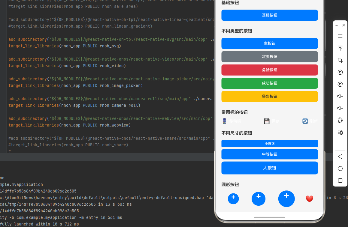
{/* 基础按钮 */}
<View style={styles.section}>
<Text style={styles.sectionTitle}>基础按钮</Text>
<Button style={styles.basicButton} onPress={() => Alert.alert('提示', '基础按钮被点击')}>
基础按钮
</Button>
</View>
{/* 不同类型的按钮 */}
<View style={styles.section}>
<Text style={styles.sectionTitle}>不同类型的按钮</Text>
<Button style={styles.primaryButton}>主按钮</Button>
<Button style={styles.secondaryButton}>次要按钮</Button>
<Button style={styles.dangerButton}>危险按钮</Button>
<Button style={styles.successButton}>成功按钮</Button>
<Button style={styles.warningButton}>警告按钮</Button>
</View>
{/* 带图标的按钮 */}
<View style={styles.section}>
<Text style={styles.sectionTitle}>带图标的按钮</Text>
<View style={styles.iconButtonsRow}>
<Button style={styles.iconButton}>
<Text style={styles.iconEmoji}>📱</Text>
<Text style={styles.iconButtonText}>移动端</Text>
</Button>
<Button style={styles.iconButton}>
<Text style={styles.iconEmoji}>💾</Text>
<Text style={styles.iconButtonText}>保存</Text>
</Button>
<Button style={styles.iconButton}>
<Text style={styles.iconEmoji}>🔄</Text>
<Text style={styles.iconButtonText}>刷新</Text>
</Button>
</View>
</View>
{/* 不同尺寸的按钮 */}
<View style={styles.section}>
<Text style={styles.sectionTitle}>不同尺寸的按钮</Text>
<Button style={styles.smallButton}>小按钮</Button>
<Button style={styles.mediumButton}>中等按钮</Button>
<Button style={styles.largeButton}>大按钮</Button>
</View>
{/* 圆形按钮 */}
<View style={styles.section}>
<Text style={styles.sectionTitle}>圆形按钮</Text>
<View style={styles.roundButtonsRow}>
<Button style={styles.smallRoundButton}>+</Button>
<Button style={styles.mediumRoundButton}>+</Button>
<Button style={styles.largeRoundButton}>+</Button>
<Button style={styles.roundButtonWithIcon}>
<Text style={styles.roundIcon}>❤️</Text>
</Button>
</View>
</View>
{/* 加载状态按钮 */}
<View style={styles.section}>
<Text style={styles.sectionTitle}>加载状态按钮</Text>
<Button
style={styles.loadingButton}
disabled={loading}
onPress={handleAsyncOperation}
>
{loading ? '提交中...' : '提交'}
</Button>
<Button
style={styles.loadingButton}
disabled={loading}
onPress={handleAsyncOperation}
>
{loading ? '保存中...' : '保存'}
</Button>
</View>
{/* 禁用状态按钮 */}
<View style={styles.section}>
<Text style={styles.sectionTitle}>禁用状态按钮</Text>
<View style={styles.disabledButtonRow}>
<Button
style={styles.disabledButton}
styleDisabled={styles.disabledButton}
disabled={disabled}
>
{disabled ? '已禁用' : '可点击'}
</Button>
<Button
style={styles.toggleButton}
onPress={handleToggleDisabled}
>
{disabled ? '启用按钮' : '禁用按钮'}
</Button>
</View>
</View>
{/* 计数器按钮 */}
<View style={styles.section}>
<Text style={styles.sectionTitle}>计数器按钮</Text>
<View style={styles.counterContainer}>
<Button style={styles.counterButton} onPress={handleDecrement}>
-
</Button>
<Text style={styles.counterText}>{selectedCount}</Text>
<Button style={styles.counterButton} onPress={handleIncrement}>
+
</Button>
</View>
</View>
{/* 自定义样式按钮 */}
<View style={styles.section}>
<Text style={styles.sectionTitle}>自定义样式按钮</Text>
<Button style={styles.gradientButton}>渐变按钮</Button>
<Button style={styles.outlineButton}>边框按钮</Button>
<Button style={styles.textButton}>文本按钮</Button>
</View>
{/* 使用说明 */}
<View style={styles.section}>
<Text style={styles.sectionTitle}>使用说明</Text>
<Text style={styles.instructionText}>
1. react-native-button 是纯 JavaScript 组件,无需原生配置
</Text>
<Text style={styles.instructionText}>
2. 支持 style 和 styleDisabled 属性自定义样式
</Text>
<Text style={styles.instructionText}>
3. 支持 disabled 属性控制按钮禁用状态
</Text>
<Text style={styles.instructionText}>
4. 可以嵌套子组件实现复杂的按钮布局
</Text>
<Text style={styles.instructionText}>
5. 完全兼容鸿蒙系统,跨平台可用
</Text>
</View>
</ScrollView>
);
}
const styles = StyleSheet.create({
container: {
flex: 1,
backgroundColor: '#f5f5f5',
padding: 20,
},
pageTitle: {
fontSize: 24,
fontWeight: 'bold',
marginBottom: 20,
textAlign: 'center',
color: '#333',
},
section: {
marginBottom: 24,
},
sectionTitle: {
fontSize: 16,
fontWeight: '600',
marginBottom: 12,
color: '#333',
},
basicButton: {
backgroundColor: '#007AFF',
borderRadius: 8,
paddingVertical: 12,
paddingHorizontal: 24,
marginVertical: 4,
color: '#fff',
fontSize: 14,
fontWeight: '500',
},
primaryButton: {
backgroundColor: '#007AFF',
borderRadius: 8,
paddingVertical: 12,
paddingHorizontal: 24,
marginVertical: 4,
color: '#fff',
fontSize: 14,
fontWeight: '500',
},
secondaryButton: {
backgroundColor: '#6c757d',
borderRadius: 8,
paddingVertical: 12,
paddingHorizontal: 24,
marginVertical: 4,
color: '#fff',
fontSize: 14,
fontWeight: '500',
},
dangerButton: {
backgroundColor: '#dc3545',
borderRadius: 8,
paddingVertical: 12,
paddingHorizontal: 24,
marginVertical: 4,
color: '#fff',
fontSize: 14,
fontWeight: '500',
},
successButton: {
backgroundColor: '#28a745',
borderRadius: 8,
paddingVertical: 12,
paddingHorizontal: 24,
marginVertical: 4,
color: '#fff',
fontSize: 14,
fontWeight: '500',
},
warningButton: {
backgroundColor: '#ffc107',
borderRadius: 8,
paddingVertical: 12,
paddingHorizontal: 24,
marginVertical: 4,
color: '#333',
fontSize: 14,
fontWeight: '500',
},
iconButtonsRow: {
flexDirection: 'row',
justifyContent: 'space-between',
},
iconButton: {
flex: 1,
backgroundColor: '#007AFF',
borderRadius: 8,
paddingVertical: 12,
marginHorizontal: 4,
flexDirection: 'row',
alignItems: 'center',
justifyContent: 'center',
},
iconEmoji: {
fontSize: 18,
marginRight: 6,
},
iconButtonText: {
color: '#fff',
fontSize: 14,
fontWeight: '500',
},
smallButton: {
backgroundColor: '#007AFF',
borderRadius: 4,
paddingVertical: 6,
paddingHorizontal: 12,
marginVertical: 4,
color: '#fff',
fontSize: 12,
fontWeight: '500',
},
mediumButton: {
backgroundColor: '#007AFF',
borderRadius: 6,
paddingVertical: 10,
paddingHorizontal: 20,
marginVertical: 4,
color: '#fff',
fontSize: 14,
fontWeight: '500',
},
largeButton: {
backgroundColor: '#007AFF',
borderRadius: 8,
paddingVertical: 14,
paddingHorizontal: 28,
marginVertical: 4,
color: '#fff',
fontSize: 16,
fontWeight: '500',
},
roundButtonsRow: {
flexDirection: 'row',
alignItems: 'center',
justifyContent: 'space-around',
},
smallRoundButton: {
width: 40,
height: 40,
borderRadius: 20,
backgroundColor: '#007AFF',
marginHorizontal: 8,
color: '#fff',
fontSize: 24,
fontWeight: 'bold',
},
mediumRoundButton: {
width: 50,
height: 50,
borderRadius: 25,
backgroundColor: '#007AFF',
marginHorizontal: 8,
color: '#fff',
fontSize: 28,
fontWeight: 'bold',
},
largeRoundButton: {
width: 60,
height: 60,
borderRadius: 30,
backgroundColor: '#007AFF',
marginHorizontal: 8,
color: '#fff',
fontSize: 32,
fontWeight: 'bold',
},
roundButtonWithIcon: {
width: 60,
height: 60,
borderRadius: 30,
backgroundColor: '#dc3545',
marginHorizontal: 8,
},
roundIcon: {
fontSize: 24,
},
loadingButton: {
backgroundColor: '#28a745',
borderRadius: 8,
paddingVertical: 12,
paddingHorizontal: 24,
marginVertical: 4,
color: '#fff',
fontSize: 14,
fontWeight: '500',
},
disabledButton: {
backgroundColor: '#6c757d',
borderRadius: 8,
paddingVertical: 12,
paddingHorizontal: 24,
marginVertical: 4,
opacity: 0.6,
color: '#fff',
fontSize: 14,
fontWeight: '500',
},
disabledButtonRow: {
flexDirection: 'row',
justifyContent: 'space-between',
},
toggleButton: {
backgroundColor: '#007AFF',
borderRadius: 8,
paddingVertical: 12,
paddingHorizontal: 16,
marginVertical: 4,
flex: 1,
marginLeft: 8,
color: '#fff',
fontSize: 14,
fontWeight: '500',
},
counterContainer: {
flexDirection: 'row',
alignItems: 'center',
justifyContent: 'center',
backgroundColor: '#fff',
borderRadius: 8,
padding: 8,
},
counterButton: {
backgroundColor: '#007AFF',
width: 40,
height: 40,
borderRadius: 20,
marginHorizontal: 8,
color: '#fff',
fontSize: 20,
fontWeight: 'bold',
},
counterText: {
fontSize: 20,
fontWeight: 'bold',
color: '#333',
minWidth: 40,
textAlign: 'center',
},
gradientButton: {
backgroundColor: '#007AFF',
borderRadius: 8,
paddingVertical: 12,
paddingHorizontal: 24,
marginVertical: 4,
color: '#fff',
fontSize: 14,
fontWeight: '500',
},
outlineButton: {
backgroundColor: 'transparent',
borderRadius: 8,
paddingVertical: 12,
paddingHorizontal: 24,
marginVertical: 4,
borderWidth: 2,
borderColor: '#007AFF',
color: '#007AFF',
fontSize: 14,
fontWeight: '500',
},
textButton: {
backgroundColor: 'transparent',
paddingVertical: 8,
paddingHorizontal: 16,
marginVertical: 4,
color: '#007AFF',
fontSize: 14,
fontWeight: '500',
},
instructionText: {
fontSize: 14,
lineHeight: 22,
marginBottom: 6,
color: '#666',
},
});
export default ButtonLibraryScreen;💻 代码讲解
1. 基础按钮
typescript
<Button style={styles.basicButton} onPress={() => Alert.alert('提示', '基础按钮被点击')}>
  基础按钮
</Button>
最简单的按钮使用方式,通过 style 属性设置样式,onPress 处理点击事件。
2. 不同类型的按钮
typescript
<Button style={styles.primaryButton}>主按钮</Button>
<Button style={styles.secondaryButton}>次要按钮</Button>
<Button style={styles.dangerButton}>危险按钮</Button>
通过不同的样式对象实现不同类型的按钮(主按钮、次要按钮、危险按钮等)。
3. 带图标的按钮
typescript
<Button style={styles.iconButton}>
  <Text style={styles.iconEmoji}>📱</Text>
  <Text style={styles.iconButtonText}>移动端</Text>
</Button>
可以在按钮内部嵌套子组件,实现带图标、图片等复杂布局。
4. 加载状态按钮
typescript
<Button
  style={styles.loadingButton}
  disabled={loading}
  onPress={handleAsyncOperation}
>
  {loading ? '提交中...' : '提交'}
</Button>
通过 disabled 属性控制按钮禁用状态,根据状态显示不同的文字。
5. 禁用状态按钮
typescript
<Button
  style={styles.disabledButton}
  styleDisabled={styles.disabledButton}
  disabled={disabled}
>
  {disabled ? '已禁用' : '可点击'}
</Button>
使用 styleDisabled 属性设置禁用状态下的样式。
6. 圆形按钮
typescript
<Button style={styles.smallRoundButton}>+</Button>通过设置 borderRadius 为宽度的一半实现圆形按钮。
⚠️ 注意事项与最佳实践
1. 样式配置
- 使用
StyleSheet.create创建样式对象 - 支持动态样式(根据条件应用不同样式)
- 使用
styleDisabled设置禁用样式
2. 事件处理
typescript
onPress={() => {
  // 处理点击事件
}}
确保 onPress 回调函数不为空。
3. 禁用状态
typescript
<Button
  disabled={true}
  styleDisabled={styles.disabledStyle}
>
  禁用按钮
</Button>
禁用状态下按钮不会响应点击事件。
4. 嵌套子组件
typescript
<Button style={styles.button}>
  <Icon name="home" />
  <Text>带图标的按钮</Text>
</Button>
可以嵌套任意子组件实现复杂的按钮布局。
5. HarmonyOS 兼容性
react-native-button 是纯 JavaScript 组件,在 HarmonyOS 上完全兼容,无需任何额外配置。
🧪 测试验证
1. Android 平台测试
bash
npm run android测试要点:
- 检查按钮点击响应
- 验证禁用状态
- 测试加载状态
- 验证样式显示
2. iOS 平台测试
bash
npm run ios测试要点:
- 检查按钮样式一致性
- 测试触摸反馈
- 验证不同尺寸按钮
3. HarmonyOS 平台测试
bash
npm run harmony测试要点:
- 验证按钮渲染
- 测试点击响应
- 检查样式应用
4. 常见问题排查
问题 1: 按钮无响应
- 确保
onPress属性已设置 - 检查
disabled属性是否为 false
问题 2: 样式不生效
- 确保使用
StyleSheet.create创建样式 - 检查样式对象格式是否正确
问题 3: 禁用样式不显示
- 确保设置了
styleDisabled属性 - 检查禁用样式对象是否正确
📊 对比:TouchableOpacity vs react-native-button
| 特性 | TouchableOpacity | react-native-button |
|---|---|---|
| 开箱即用 | ⚠️ 需要自定义样式 | ✅ 开箱即用 |
| 禁用状态 | ⚠️ 需要手动实现 | ✅ 内置支持 |
| 样式配置 | ✅ 完全自定义 | ✅ 灵活配置 |
| 代码简洁性 | ⚠️ 需要更多代码 | ✅ 简洁明了 |
| 学习成本 | ⚠️ 需要了解 RN API | ✅ 简单易用 |
📝 总结
通过集成 react-native-button,我们为项目添加了一个简单易用的按钮组件库。这个库提供了丰富的样式配置、禁用状态支持和跨平台的一致性,可以大大提升开发效率。
关键要点回顾
- ✅ 安装依赖 :
npm install react-native-button@3.1.0 - ✅ 配置平台: 纯 JavaScript 库,无需手动配置
- ✅ 集成代码: 使用 Button 组件和相关属性
- ✅ 样式定制: 使用 style 和 styleDisabled 属性
- ✅ 测试验证: 确保三端表现一致
实际效果
- Android: 显示 Material Design 风格的按钮
- iOS: 显示 iOS 风格的按钮
- HarmonyOS: 显示 HarmonyOS 风格的按钮
希望这篇教程能帮助你顺利集成 react-native-button,提升应用的用户体验!