欢迎加入开源鸿蒙跨平台社区:https://openharmonycrossplatform.csdn.net
一、核心知识点
数据可视化是将抽象的数据转换为视觉表现形式的过程,让用户能够直观地理解和分析数据。在鸿蒙端,使用 react-native-svg(CAPI) 可以创建各种精美的数据可视化图表,包括折线图、柱状图、饼图、雷达图等。
1.1 数据可视化的核心价值
- 直观展示:将复杂的数据转换为易于理解的图形
- 趋势分析:通过图表识别数据的变化趋势
- 对比分析:比较不同数据集之间的差异
- 决策支持:基于数据可视化做出更明智的决策
- 交互性:通过交互增强用户的探索体验
1.2 SVG 图表的技术优势
typescript
import Svg, { Path, Rect, Circle, Line, G, Text as SvgText, TSpan } from 'react-native-svg';

// 基础折线图示例
const BasicLineChart = ({ data }: { data: number[] }) => {
  const width = 300;
  const height = 200;
  const padding = 20;

  // 计算每个点的坐标
  const points = data.map((value, index) => {
    const x = padding + (index / (data.length - 1)) * (width - 2 * padding);
    const y = height - padding - (value / Math.max(...data)) * (height - 2 * padding);
    return `${x},${y}`;
  }).join(' ');

  return (
    <Svg width={width} height={height}>
      {/* 坐标轴 */}
      <Line x1={padding} y1={padding} x2={padding} y2={height - padding} stroke="#E5E6EB" strokeWidth={1} />
      <Line x1={padding} y1={height - padding} x2={width - padding} y2={height - padding} stroke="#E5E6EB" strokeWidth={1} />

      {/* 折线 */}
      <Polyline
        points={points}
        fill="none"
        stroke="#409EFF"
        strokeWidth={2}
        strokeLinejoin="round"
      />
    </Svg>
  );
};
SVG 图表的优势:
- 矢量渲染:在任何分辨率下保持清晰
- 高度定制:完全控制每个元素的样式
- 性能优异:GPU 加速渲染,流畅的交互
- 响应式设计:自动适应不同屏幕尺寸
- 跨平台兼容:iOS、Android、鸿蒙三端统一
二、实战核心代码深度解析
2.1 折线图深度解析
typescript
import React, { useState, useEffect } from 'react';
import { View, Text, StyleSheet, ScrollView, SafeAreaView } from 'react-native';
import Svg, { Path, Circle, Line, G, Defs, LinearGradient, Stop } from 'react-native-svg';

interface DataPoint {
  label: string;
  value: number;
}

const LineChartDemo = () => {
  const [selectedPoint, setSelectedPoint] = useState<number | null>(null);

  const data: DataPoint[] = [
    { label: '1月', value: 65 },
    { label: '2月', value: 59 },
    { label: '3月', value: 80 },
    { label: '4月', value: 81 },
    { label: '5月', value: 56 },
    { label: '6月', value: 55 },
    { label: '7月', value: 40 },
  ];

  const chartWidth = 320;
  const chartHeight = 200;
  const padding = { top: 20, right: 20, bottom: 40, left: 50 };

  // 计算 Y 轴范围
  const maxValue = Math.max(...data.map(d => d.value));
  const minValue = Math.min(...data.map(d => d.value));
  const yRange = maxValue - minValue || 1;

  // 计算数据点坐标
  const dataPoints = data.map((point, index) => {
    const x = padding.left + (index / (data.length - 1)) * (chartWidth - padding.left - padding.right);
    const y = padding.top + (1 - (point.value - minValue) / yRange) * (chartHeight - padding.top - padding.bottom);
    return { x, y, ...point };
  });

  // 生成平滑曲线(贝塞尔曲线)
  const generateSmoothPath = (points: typeof dataPoints) => {
    if (points.length < 2) return '';

    let path = `M ${points[0].x} ${points[0].y}`;

    for (let i = 1; i < points.length - 1; i++) {
      const p0 = points[i - 1];
      const p1 = points[i];
      const p2 = points[i + 1];

      const cp1x = p0.x + (p1.x - p0.x) / 2;
      const cp1y = p0.y;
      const cp2x = p1.x - (p2.x - p1.x) / 2;
      const cp2y = p1.y;

      path += ` C ${cp1x} ${cp1y}, ${cp2x} ${cp2y}, ${p1.x} ${p1.y}`;
    }

    const lastPoint = points[points.length - 1];
    const secondLastPoint = points[points.length - 2];
    const cp1x = secondLastPoint.x + (lastPoint.x - secondLastPoint.x) / 2;
    const cp1y = secondLastPoint.y;

    path += ` C ${cp1x} ${cp1y}, ${lastPoint.x} ${lastPoint.y}, ${lastPoint.x} ${lastPoint.y}`;

    return path;
  };

  // 生成渐变填充路径
  const generateAreaPath = (points: typeof dataPoints) => {
    const linePath = generateSmoothPath(points);
    const bottomRightX = points[points.length - 1].x;
    const bottomRightY = chartHeight - padding.bottom;
    const bottomLeftX = points[0].x;
    const bottomLeftY = chartHeight - padding.bottom;

    return `${linePath} L ${bottomRightX} ${bottomRightY} L ${bottomLeftX} ${bottomLeftY} Z`;
  };

  return (
    <View style={styles.container}>
      <Text style={styles.title}>折线图示例</Text>

      <View style={styles.chartContainer}>
        <Svg width={chartWidth} height={chartHeight}>
          <Defs>
            <LinearGradient id="lineGradient" x1="0%" y1="0%" x2="0%" y2="100%">
              <Stop offset="0%" stopColor="#409EFF" stopOpacity={0.3} />
              <Stop offset="100%" stopColor="#409EFF" stopOpacity={0.05} />
            </LinearGradient>
          </Defs>

          {/* 网格线 */}
          {Array.from({ length: 5 }).map((_, index) => {
            const y = padding.top + (index / 4) * (chartHeight - padding.top - padding.bottom);
            return (
              <Line
                key={index}
                x1={padding.left}
                y1={y}
                x2={chartWidth - padding.right}
                y2={y}
                stroke="#E5E6EB"
                strokeWidth={1}
                strokeDasharray={[5, 5]}
              />
            );
          })}

          {/* Y 轴标签 */}
          {Array.from({ length: 5 }).map((_, index) => {
            const value = Math.round(maxValue - (index / 4) * yRange);
            const y = padding.top + (index / 4) * (chartHeight - padding.top - padding.bottom);
            return (
              <SvgText
                key={index}
                x={padding.left - 10}
                y={y + 5}
                fontSize={12}
                fill="#909399"
                textAnchor="end"
              >
                {value}
              </SvgText>
            );
          })}

          {/* 渐变填充区域 */}
          <Path
            d={generateAreaPath(dataPoints)}
            fill="url(#lineGradient)"
          />

          {/* 折线 */}
          <Path
            d={generateSmoothPath(dataPoints)}
            fill="none"
            stroke="#409EFF"
            strokeWidth={2}
            strokeLinecap="round"
            strokeLinejoin="round"
          />

          {/* 数据点 */}
          {dataPoints.map((point, index) => (
            <Circle
              key={index}
              cx={point.x}
              cy={point.y}
              r={selectedPoint === index ? 6 : 4}
              fill="#FFFFFF"
              stroke={selectedPoint === index ? '#409EFF' : '#E5E6EB'}
              strokeWidth={2}
            />
          ))}

          {/* X 轴标签 */}
          {dataPoints.map((point, index) => (
            <SvgText
              key={index}
              x={point.x}
              y={chartHeight - padding.bottom + 20}
              fontSize={12}
              fill="#606266"
              textAnchor="middle"
            >
              {point.label}
            </SvgText>
          ))}
        </Svg>
      </View>

      {/* 数据点信息 */}
      {selectedPoint !== null && (
        <View style={styles.tooltip}>
          <Text style={styles.tooltipLabel}>{dataPoints[selectedPoint].label}</Text>
          <Text style={styles.tooltipValue}>{dataPoints[selectedPoint].value}</Text>
        </View>
      )}
    </View>
  );
};技术深度解析:
-
坐标系统的转换:
typescriptconst dataPoints = data.map((point, index) => { const x = padding.left + (index / (data.length - 1)) * (chartWidth - padding.left - padding.right); const y = padding.top + (1 - (point.value - minValue) / yRange) * (chartHeight - padding.top - padding.bottom); return { x, y, ...point }; });- X 轴计算:均匀分布,基于索引位置
- Y 轴计算:线性映射数据值到图表高度
- padding 的作用:为标签和边距预留空间
- 坐标归一化:将数据值映射到 0-1 范围,再映射到实际像素
-
贝塞尔曲线的平滑算法:
typescriptconst generateSmoothPath = (points: typeof dataPoints) => { // ... 使用三次贝塞尔曲线 (C 命令) // cp1x = p0.x + (p1.x - p0.x) / 2 // 第一个控制点 // cp1y = p0.y // 保持 Y 坐标不变 // cp2x = p1.x - (p2.x - p1.x) / 2 // 第二个控制点 // cp2y = p1.y // 保持 Y 坐标不变 // path += ` C ${cp1x} ${cp1y}, ${cp2x} ${cp2y}, ${p1.x} ${p1.y}`; };- 控制点计算:使用相邻点的中点作为控制点
- 曲线平滑度:控制点距离端点越远,曲线越平滑
- C 命令:三次贝塞尔曲线,需要两个控制点
- 连续性:确保相邻曲线段在连接点处平滑
-
渐变填充的实现:
typescriptconst generateAreaPath = (points: typeof dataPoints) => { const linePath = generateSmoothPath(points); const bottomRightX = points[points.length - 1].x; const bottomRightY = chartHeight - padding.bottom; const bottomLeftX = points[0].x; const bottomLeftY = chartHeight - padding.bottom; return `${linePath} L ${bottomRightX} ${bottomRightY} L ${bottomLeftX} ${bottomLeftY} Z`; };- 闭合路径:使用 L 命令连接到底边,Z 命令闭合
- 渐变应用:从上到下,透明度从 0.3 到 0.05
- 视觉效果:增强图表的立体感和层次感
-
交互式数据点:
typescript<Circle r={selectedPoint === index ? 6 : 4} fill="#FFFFFF" stroke={selectedPoint === index ? '#409EFF' : '#E5E6EB'} strokeWidth={2} />- 选中状态:增大半径,改变描边颜色
- 视觉反馈:清晰标识当前选中的数据点
- 用户体验:点击数据点显示详细信息
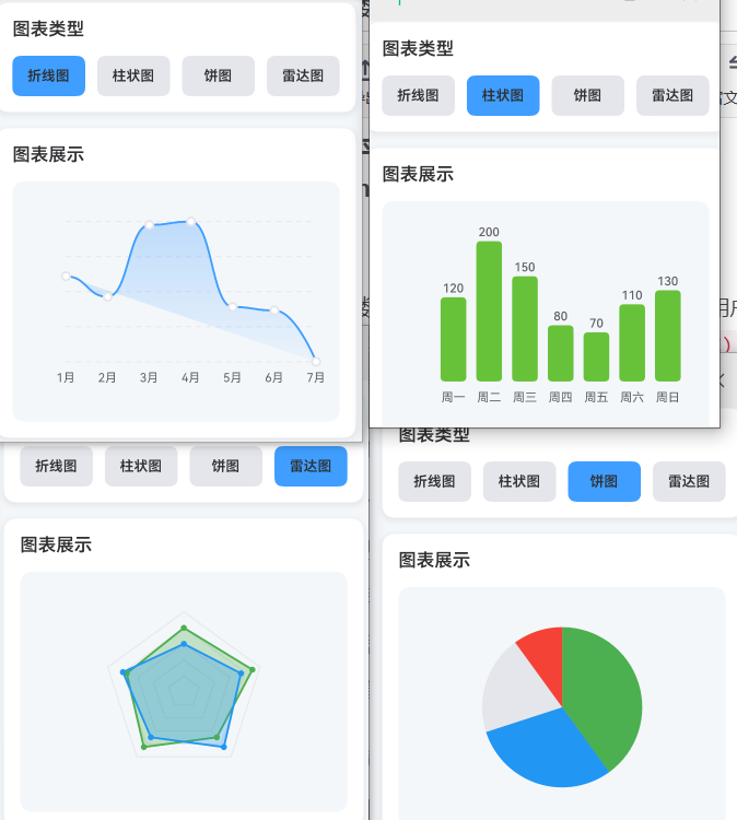
2.2 柱状图深度解析
typescript
const BarChartDemo = () => {
  const [selectedBar, setSelectedBar] = useState<number | null>(null);

  const data: DataPoint[] = [
    { label: '周一', value: 120 },
    { label: '周二', value: 200 },
    { label: '周三', value: 150 },
    { label: '周四', value: 80 },
    { label: '周五', value: 70 },
    { label: '周六', value: 110 },
    { label: '周日', value: 130 },
  ];

  const chartWidth = 320;
  const chartHeight = 200;
  const padding = { top: 20, right: 20, bottom: 40, left: 50 };

  const maxValue = Math.max(...data.map(d => d.value));
  const barWidth = (chartWidth - padding.left - padding.right) / data.length - 10;

  return (
    <View style={styles.container}>
      <Text style={styles.title}>柱状图示例</Text>

      <View style={styles.chartContainer}>
        <Svg width={chartWidth} height={chartHeight}>
          {/* Y 轴网格线 */}
          {Array.from({ length: 5 }).map((_, index) => {
            const y = padding.top + (index / 4) * (chartHeight - padding.top - padding.bottom);
            const value = Math.round(maxValue * (1 - index / 4));
            return (
              <G key={index}>
                <Line
                  x1={padding.left}
                  y1={y}
                  x2={chartWidth - padding.right}
                  y2={y}
                  stroke="#E5E6EB"
                  strokeWidth={1}
                  strokeDasharray={[5, 5]}
                />
                <SvgText
                  x={padding.left - 10}
                  y={y + 5}
                  fontSize={12}
                  fill="#909399"
                  textAnchor="end"
                >
                  {value}
                </SvgText>
              </G>
            );
          })}

          {/* 柱状图 */}
          {data.map((item, index) => {
            const x = padding.left + index * ((chartWidth - padding.left - padding.right) / data.length) + 5;
            const barHeight = (item.value / maxValue) * (chartHeight - padding.top - padding.bottom);
            const y = chartHeight - padding.bottom - barHeight;

            return (
              <G key={index}>
                <Rect
                  x={x}
                  y={y}
                  width={barWidth}
                  height={barHeight}
                  fill={selectedBar === index ? '#409EFF' : '#67C23A'}
                  rx={4}
                  ry={4}
                />

                {/* 柱状图数值 */}
                <SvgText
                  x={x + barWidth / 2}
                  y={y - 5}
                  fontSize={12}
                  fill={selectedBar === index ? '#409EFF' : '#606266'}
                  fontWeight={selectedBar === index ? '600' : '400'}
                  textAnchor="middle"
                >
                  {item.value}
                </SvgText>

                {/* X 轴标签 */}
                <SvgText
                  x={x + barWidth / 2}
                  y={chartHeight - padding.bottom + 20}
                  fontSize={12}
                  fill="#606266"
                  textAnchor="middle"
                >
                  {item.label}
                </SvgText>
              </G>
            );
          })}
        </Svg>
      </View>
    </View>
  );
};技术深度解析:
-
柱状图的布局计算:
typescriptconst barWidth = (chartWidth - padding.left - padding.right) / data.length - 10; const x = padding.left + index * ((chartWidth - padding.left - padding.right) / data.length) + 5; const barHeight = (item.value / maxValue) * (chartHeight - padding.top - padding.bottom); const y = chartHeight - padding.bottom - barHeight;- 柱子宽度:总宽度除以数据量,减去间距
- X 轴位置:均匀分布,每个柱子占一个"槽位"
- 柱子高度:基于数据值与最大值的比例
- Y 轴位置:从底部向上,所以需要用总高度减去柱子高度
-
圆角柱状图的实现:
typescript<Rect rx={4} ry={4} />- rx 和 ry:分别设置 X 和 Y 方向的圆角半径
- 视觉效果:让柱状图更加现代和柔和
- 兼容性:鸿蒙端完美支持 SVG 的圆角属性
-
数值标签的动态位置:
typescript<SvgText x={x + barWidth / 2} y={y - 5} textAnchor="middle" > {item.value} </SvgText>- 水平居中 :
x + barWidth / 2确保文本在柱子中心 - 垂直对齐 :
y - 5让文本显示在柱子顶部上方 - textAnchor :
middle让文本水平居中对齐
- 水平居中 :
2.3 饼图深度解析
typescript
const PieChartDemo = () => {
  const [selectedSlice, setSelectedSlice] = useState<number | null>(null);

  const data: { label: string; value: number; color: string }[] = [
    { label: '完成', value: 40, color: '#4CAF50' },
    { label: '进行中', value: 30, color: '#2196F3' },
    { label: '未开始', value: 20, color: '#E5E6EB' },
    { label: '取消', value: 10, color: '#F44336' },
  ];

  const total = data.reduce((sum, item) => sum + item.value, 0);
  const chartSize = 200;
  const radius = 80;
  const centerX = chartSize / 2;
  const centerY = chartSize / 2;

  // 计算每个扇形的路径
  const calculateSlicePath = (startAngle: number, endAngle: number, isSelected: boolean) => {
    const offset = isSelected ? 5 : 0;
    const r = radius + offset;

    const x1 = centerX + r * Math.cos((startAngle - 90) * Math.PI / 180);
    const y1 = centerY + r * Math.sin((startAngle - 90) * Math.PI / 180);
    const x2 = centerX + r * Math.cos((endAngle - 90) * Math.PI / 180);
    const y2 = centerY + r * Math.sin((endAngle - 90) * Math.PI / 180);

    const largeArc = endAngle - startAngle > 180 ? 1 : 0;

    return `M ${centerX} ${centerY} L ${x1} ${y1} A ${r} ${r} 0 ${largeArc} 1 ${x2} ${y2} Z`;
  };

  let startAngle = 0;

  return (
    <View style={styles.container}>
      <Text style={styles.title}>饼图示例</Text>

      <View style={styles.chartContainer}>
        <Svg width={chartSize} height={chartSize}>
          {data.map((item, index) => {
            const angle = (item.value / total) * 360;
            const endAngle = startAngle + angle;
            const isSelected = selectedSlice === index;

            const path = calculateSlicePath(startAngle, endAngle, isSelected);

            startAngle = endAngle;

            return (
              <G key={index}>
                <Path
                  d={path}
                  fill={item.color}
                  onPress={() => setSelectedSlice(selectedSlice === index ? null : index)}
                />

                {/* 标签(仅在扇形足够大时显示) */}
                {angle > 30 && (
                  <SvgText
                    x={centerX + (radius / 2) * Math.cos((startAngle - angle / 2 - 90) * Math.PI / 180)}
                    y={centerY + (radius / 2) * Math.sin((startAngle - angle / 2 - 90) * Math.PI / 180)}
                    fontSize={12}
                    fill="#FFFFFF"
                    fontWeight="600"
                    textAnchor="middle"
                  >
                    {item.label}
                  </SvgText>
                )}
              </G>
            );
          })}
        </Svg>
      </View>

      {/* 图例 */}
      <View style={styles.legend}>
        {data.map((item, index) => (
          <View key={index} style={styles.legendItem}>
            <View style={[styles.legendColor, { backgroundColor: item.color }]} />
            <Text style={styles.legendLabel}>{item.label}</Text>
            <Text style={styles.legendValue}>{item.value}%</Text>
          </View>
        ))}
      </View>
    </View>
  );
};技术深度解析:
-
扇形路径的数学计算:
typescriptconst calculateSlicePath = (startAngle: number, endAngle: number, isSelected: boolean) => { const x1 = centerX + r * Math.cos((startAngle - 90) * Math.PI / 180); const y1 = centerY + r * Math.sin((startAngle - 90) * Math.PI / 180); const x2 = centerX + r * Math.cos((endAngle - 90) * Math.PI / 180); const y2 = centerY + r * Math.sin((endAngle - 90) * Math.PI / 180); const largeArc = endAngle - startAngle > 180 ? 1 : 0; return `M ${centerX} ${centerY} L ${x1} ${y1} A ${r} ${r} 0 ${largeArc} 1 ${x2} ${y2} Z`; };- 角度转弧度 :
(angle - 90) * Math.PI / 180,-90 度从 12 点钟方向开始 - 极坐标转换 :
x = cx + r * cos(θ),y = cy + r * sin(θ) - A 命令 :圆弧命令,格式为
A rx ry x-axis-rotation large-arc-flag sweep-flag x ylarge-arc-flag:1 表示大于 180 度,0 表示小于 180 度sweep-flag:1 表示顺时针,0 表示逆时针
- 角度转弧度 :
-
选中状态的视觉反馈:
typescriptconst offset = isSelected ? 5 : 0; const r = radius + offset;- 偏移量:选中时扇形半径增加 5 像素
- 视觉分离:使选中的扇形从饼图中"弹出"
- 用户体验:清晰的选中状态反馈
-
标签位置的智能计算:
typescript{angle > 30 && ( <SvgText x={centerX + (radius / 2) * Math.cos((startAngle - angle / 2 - 90) * Math.PI / 180)} y={centerY + (radius / 2) * Math.sin((startAngle - angle / 2 - 90) * Math.PI / 180)} > {item.label} </SvgText> )}- 条件渲染:只在扇形角度大于 30 度时显示标签
- 标签位置 :扇形中心点的位置(
startAngle - angle / 2) - 距离控制 :
radius / 2确保标签在扇形中心
2.4 雷达图深度解析
typescript
const RadarChartDemo = () => {
const data: { label: string; values: number[]; color: string }[] = [
{ label: '能力A', values: [80, 90, 70, 85, 75], color: '#4CAF50' },
{ label: '能力B', values: [60, 75, 85, 70, 80], color: '#2196F3' },
];
const dimensions = ['速度', '力量', '耐力', '技巧', '战术'];
const chartSize = 200;
const radius = 80;
const centerX = chartSize / 2;
const centerY = chartSize / 2;
// 计算顶点坐标
const getVertexPosition = (index: number, total: number, r: number) => {
const angle = (index / total) * 360 - 90;
const x = centerX + r * Math.cos(angle * Math.PI / 180);
const y = centerY + r * Math.sin(angle * Math.PI / 180);
return { x, y };
};
// 生成数据多边形路径
const generateDataPath = (values: number[], maxValue: number) => {
const points = values.map((value, index) => {
const position = getVertexPosition(index, values.length, radius * (value / maxValue));
return `${position.x},${position.y}`;
}).join(' ');
return `M ${points.replace(/,/g, ' ')} Z`;
};
const maxValue = 100;
return (
<View style={styles.container}>
<Text style={styles.title}>雷达图示例</Text>
<View style={styles.chartContainer}>
<Svg width={chartSize} height={chartSize}>
{/* 背景网格(多边形) */}
{[0.2, 0.4, 0.6, 0.8, 1].map((scale, index) => (
<Path
key={index}
d={Array.from({ length: dimensions.length }).map((_, i) => {
const pos = getVertexPosition(i, dimensions.length, radius * scale);
return i === 0 ? `M ${pos.x} ${pos.y}` : `L ${pos.x} ${pos.y}`;
}).join(' ') + ' Z'}
fill="none"
stroke="#E5E6EB"
strokeWidth={1}
/>
))}
{/* 轴线 */}
{dimensions.map((_, index) => {
const pos = getVertexPosition(index, dimensions.length, radius);
return (
<Line
key={index}
x1={centerX}
y1={centerY}
x2={pos.x}
y2={pos.y}
stroke="#E5E6EB"
strokeWidth={1}
/>
);
})}
{/* 数据多边形 */}
{data.map((item, index) => (
<Path
key={index}
d={generateDataPath(item.values, maxValue)}
fill={item.color}
fillOpacity={0.3}
stroke={item.color}
strokeWidth={2}
/>
))}
{/* 数据点 */}
{data.map((item, itemIndex) => (
item.values.map((value, valueIndex) => {
const pos = getVertexPosition(valueIndex, dimensions.length, radius * (value / maxValue));
return (
<Circle
key={`${itemIndex}-${valueIndex}`}
cx={pos.x}
cy={pos.y}
r={3}
fill={item.color}
/>
);
})
))}
{/* 维度标签 */}
{dimensions.map((label, index) => {
const pos = getVertexPosition(index, dimensions.length, radius + 20);
return (
<SvgText
key={index}
x={pos.x}
y={pos.y}
fontSize={12}
fill="#606266"
textAnchor="middle"
>
{label}
</SvgText>
);
})}
</Svg>
</View>
{/* 图例 */}
<View style={styles.legend}>
{data.map((item, index) => (
<View key={index} style={styles.legendItem}>
<View style={[styles.legendColor, { backgroundColor: item.color }]} />
<Text style={styles.legendLabel}>{item.label}</Text>
</View>
))}
</View>
</View>
);
};技术深度解析:
-
雷达图的几何结构:
typescriptconst getVertexPosition = (index: number, total: number, r: number) => { const angle = (index / total) * 360 - 90; const x = centerX + r * Math.cos(angle * Math.PI / 180); const y = centerY + r * Math.sin(angle * Math.PI / 180); return { x, y }; };- 等边多边形:顶点均匀分布在圆周上
- 角度计算 :
(index / total) * 360 - 90,确保第一个顶点在顶部 - 可扩展性:支持任意数量的维度
-
背景网格的层次结构:
typescript{[0.2, 0.4, 0.6, 0.8, 1].map((scale, index) => ( <Path d={Array.from({ length: dimensions.length }).map((_, i) => { const pos = getVertexPosition(i, dimensions.length, radius * scale); return i === 0 ? `M ${pos.x} ${pos.y}` : `L ${pos.x} ${pos.y}`; }).join(' ') + ' Z'} fill="none" stroke="#E5E6EB" strokeWidth={1} /> ))}- 多层级网格:使用不同比例的同心多边形
- 视觉引导:帮助用户理解数据的相对大小
- 可读性:从外到内,清晰展示数据层级
-
数据多边形的生成:
typescriptconst generateDataPath = (values: number[], maxValue: number) => { const points = values.map((value, index) => { const position = getVertexPosition(index, values.length, radius * (value / maxValue)); return `${position.x},${position.y}`; }).join(' '); return `M ${points.replace(/,/g, ' ')} Z`; };- 数据归一化:将数据值映射到半径范围
- 路径构建:依次连接所有顶点,最后闭合
- 透明度填充 :使用
fillOpacity让重叠区域可见
三、实战完整版:综合数据可视化系统
typescript
import React, { useState } from 'react';
import {
StyleSheet,
View,
Text,
SafeAreaView,
ScrollView,
TouchableOpacity,
StatusBar,
} from 'react-native';
import Svg, { Path, Circle, Rect, Line, G, Defs, LinearGradient, Stop } from 'react-native-svg';
const DataVisualizationScreen = () => {
const [chartType, setChartType] = useState<'line' | 'bar' | 'pie' | 'radar'>('line');
const [selectedDataPoint, setSelectedDataPoint] = useState<number | null>(null);
// 折线图数据
const lineChartData = [
{ label: '1月', value: 65 },
{ label: '2月', value: 59 },
{ label: '3月', value: 80 },
{ label: '4月', value: 81 },
{ label: '5月', value: 56 },
{ label: '6月', value: 55 },
{ label: '7月', value: 40 },
];
// 柱状图数据
const barChartData = [
{ label: '周一', value: 120 },
{ label: '周二', value: 200 },
{ label: '周三', value: 150 },
{ label: '周四', value: 80 },
{ label: '周五', value: 70 },
{ label: '周六', value: 110 },
{ label: '周日', value: 130 },
];
// 饼图数据
const pieChartData = [
{ label: '完成', value: 40, color: '#4CAF50' },
{ label: '进行中', value: 30, color: '#2196F3' },
{ label: '未开始', value: 20, color: '#E5E6EB' },
{ label: '取消', value: 10, color: '#F44336' },
];
// 雷达图数据
const radarChartData = [
{ label: '能力A', values: [80, 90, 70, 85, 75], color: '#4CAF50' },
{ label: '能力B', values: [60, 75, 85, 70, 80], color: '#2196F3' },
];
const radarDimensions = ['速度', '力量', '耐力', '技巧', '战术'];
const renderLineChart = () => {
const chartWidth = 320;
const chartHeight = 200;
const padding = { top: 20, right: 20, bottom: 40, left: 50 };
const maxValue = Math.max(...lineChartData.map(d => d.value));
const minValue = Math.min(...lineChartData.map(d => d.value));
const yRange = maxValue - minValue || 1;
const dataPoints = lineChartData.map((point, index) => {
const x = padding.left + (index / (lineChartData.length - 1)) * (chartWidth - padding.left - padding.right);
const y = padding.top + (1 - (point.value - minValue) / yRange) * (chartHeight - padding.top - padding.bottom);
return { x, y, ...point };
});
const generateSmoothPath = (points: typeof dataPoints) => {
if (points.length < 2) return '';
let path = `M ${points[0].x} ${points[0].y}`;
for (let i = 1; i < points.length - 1; i++) {
const p0 = points[i - 1];
const p1 = points[i];
const p2 = points[i + 1];
const cp1x = p0.x + (p1.x - p0.x) / 2;
const cp1y = p0.y;
const cp2x = p1.x - (p2.x - p1.x) / 2;
const cp2y = p1.y;
path += ` C ${cp1x} ${cp1y}, ${cp2x} ${cp2y}, ${p1.x} ${p1.y}`;
}
const lastPoint = points[points.length - 1];
const secondLastPoint = points[points.length - 2];
const cp1x = secondLastPoint.x + (lastPoint.x - secondLastPoint.x) / 2;
const cp1y = secondLastPoint.y;
path += ` C ${cp1x} ${cp1y}, ${lastPoint.x} ${lastPoint.y}, ${lastPoint.x} ${lastPoint.y}`;
return path;
};
return (
<Svg width={chartWidth} height={chartHeight}>
<Defs>
<LinearGradient id="lineGradient" x1="0%" y1="0%" x2="0%" y2="100%">
<Stop offset="0%" stopColor="#409EFF" stopOpacity={0.3} />
<Stop offset="100%" stopColor="#409EFF" stopOpacity={0.05} />
</LinearGradient>
</Defs>
{Array.from({ length: 5 }).map((_, index) => {
const y = padding.top + (index / 4) * (chartHeight - padding.top - padding.bottom);
return (
<Line
key={index}
x1={padding.left}
y1={y}
x2={chartWidth - padding.right}
y2={y}
stroke="#E5E6EB"
strokeWidth={1}
strokeDasharray={[5, 5]}
/>
);
})}
<Path
d={generateSmoothPath(dataPoints)}
fill="url(#lineGradient)"
/>
<Path
d={generateSmoothPath(dataPoints)}
fill="none"
stroke="#409EFF"
strokeWidth={2}
strokeLinecap="round"
strokeLinejoin="round"
/>
{dataPoints.map((point, index) => (
<Circle
key={index}
cx={point.x}
cy={point.y}
r={selectedDataPoint === index ? 6 : 4}
fill="#FFFFFF"
stroke={selectedDataPoint === index ? '#409EFF' : '#E5E6EB'}
strokeWidth={2}
/>
))}
{dataPoints.map((point, index) => (
<Text
key={`label-${index}`}
x={point.x}
y={chartHeight - padding.bottom + 20}
fontSize={12}
fill="#606266"
textAnchor="middle"
>
{point.label}
</Text>
))}
</Svg>
);
};
const renderBarChart = () => {
const chartWidth = 320;
const chartHeight = 200;
const padding = { top: 20, right: 20, bottom: 40, left: 50 };
const maxValue = Math.max(...barChartData.map(d => d.value));
const barWidth = (chartWidth - padding.left - padding.right) / barChartData.length - 10;
return (
<Svg width={chartWidth} height={chartHeight}>
{barChartData.map((item, index) => {
const x = padding.left + index * ((chartWidth - padding.left - padding.right) / barChartData.length) + 5;
const barHeight = (item.value / maxValue) * (chartHeight - padding.top - padding.bottom);
const y = chartHeight - padding.bottom - barHeight;
return (
<G key={index}>
<Rect
x={x}
y={y}
width={barWidth}
height={barHeight}
fill={selectedDataPoint === index ? '#409EFF' : '#67C23A'}
rx={4}
ry={4}
/>
<Text
x={x + barWidth / 2}
y={y - 5}
fontSize={12}
fill={selectedDataPoint === index ? '#409EFF' : '#606266'}
fontWeight={selectedDataPoint === index ? '600' : '400'}
textAnchor="middle"
>
{item.value}
</Text>
<Text
x={x + barWidth / 2}
y={chartHeight - padding.bottom + 20}
fontSize={12}
fill="#606266"
textAnchor="middle"
>
{item.label}
</Text>
</G>
);
})}
</Svg>
);
};
const renderPieChart = () => {
const chartSize = 200;
const radius = 80;
const centerX = chartSize / 2;
const centerY = chartSize / 2;
const total = pieChartData.reduce((sum, item) => sum + item.value, 0);
const calculateSlicePath = (startAngle: number, endAngle: number, isSelected: boolean) => {
const offset = isSelected ? 5 : 0;
const r = radius + offset;
const x1 = centerX + r * Math.cos((startAngle - 90) * Math.PI / 180);
const y1 = centerY + r * Math.sin((startAngle - 90) * Math.PI / 180);
const x2 = centerX + r * Math.cos((endAngle - 90) * Math.PI / 180);
const y2 = centerY + r * Math.sin((endAngle - 90) * Math.PI / 180);
const largeArc = endAngle - startAngle > 180 ? 1 : 0;
return `M ${centerX} ${centerY} L ${x1} ${y1} A ${r} ${r} 0 ${largeArc} 1 ${x2} ${y2} Z`;
};
let startAngle = 0;
return (
<Svg width={chartSize} height={chartSize}>
{pieChartData.map((item, index) => {
const angle = (item.value / total) * 360;
const endAngle = startAngle + angle;
const isSelected = selectedDataPoint === index;
const path = calculateSlicePath(startAngle, endAngle, isSelected);
startAngle = endAngle;
return (
<Path
key={index}
d={path}
fill={item.color}
onPress={() => setSelectedDataPoint(selectedDataPoint === index ? null : index)}
/>
);
})}
</Svg>
);
};
const renderRadarChart = () => {
const chartSize = 200;
const radius = 80;
const centerX = chartSize / 2;
const centerY = chartSize / 2;
const getVertexPosition = (index: number, total: number, r: number) => {
  const angle = (index / total) * 360 - 90;
  const x = centerX + r * Math.cos(angle * Math.PI / 180);
  const y = centerY + r * Math.sin(angle * Math.PI / 180);
  return { x, y };
};
const generateDataPath = (values: number[], maxValue: number) => {
  const points = values.map((value, index) => {
    const position = getVertexPosition(index, values.length, radius * (value / maxValue));
    return `${position.x},${position.y}`;
  }).join(' ');

  return `M ${points.replace(/,/g, ' ')} Z`;
};
return (
<Svg width={chartSize} height={chartSize}>
{[0.2, 0.4, 0.6, 0.8, 1].map((scale, index) => (
<Path
key={index}
d={Array.from({ length: radarDimensions.length }).map((_, i) => {
const pos = getVertexPosition(i, radarDimensions.length, radius * scale);
return i === 0 ? `M ${pos.x} ${pos.y}` : `L ${pos.x} ${pos.y}`;
}).join(' ') + ' Z'}
fill="none"
stroke="#E5E6EB"
strokeWidth={1}
/>
))}
{radarChartData.map((item, index) => (
<Path
key={index}
d={generateDataPath(item.values, 100)}
fill={item.color}
fillOpacity={0.3}
stroke={item.color}
strokeWidth={2}
/>
))}
{radarChartData.map((item, itemIndex) => (
item.values.map((value, valueIndex) => {
const pos = getVertexPosition(valueIndex, radarDimensions.length, radius * (value / 100));
return (
<Circle
key={`${itemIndex}-${valueIndex}`}
cx={pos.x}
cy={pos.y}
r={3}
fill={item.color}
/>
);
})
))}
</Svg>
);
};
return (
<SafeAreaView style={styles.container}>
<StatusBar barStyle="dark-content" />
<View style={styles.header}>
<Text style={styles.headerTitle}>📊 数据可视化</Text>
<Text style={styles.headerSubtitle}>react-native-svg(CAPI)</Text>
</View>
<ScrollView style={styles.content}>
{/* 图表类型选择 */}
<View style={styles.card}>
<Text style={styles.cardTitle}>图表类型</Text>
<View style={styles.chartTypeButtons}>
<TouchableOpacity
style={[styles.chartTypeButton, chartType === 'line' && styles.chartTypeButtonActive]}
onPress={() => setChartType('line')}
>
<Text style={styles.chartTypeButtonText}>折线图</Text>
</TouchableOpacity>
<TouchableOpacity
style={[styles.chartTypeButton, chartType === 'bar' && styles.chartTypeButtonActive]}
onPress={() => setChartType('bar')}
>
<Text style={styles.chartTypeButtonText}>柱状图</Text>
</TouchableOpacity>
<TouchableOpacity
style={[styles.chartTypeButton, chartType === 'pie' && styles.chartTypeButtonActive]}
onPress={() => setChartType('pie')}
>
<Text style={styles.chartTypeButtonText}>饼图</Text>
</TouchableOpacity>
<TouchableOpacity
style={[styles.chartTypeButton, chartType === 'radar' && styles.chartTypeButtonActive]}
onPress={() => setChartType('radar')}
>
<Text style={styles.chartTypeButtonText}>雷达图</Text>
</TouchableOpacity>
</View>
</View>
{/* 图表展示 */}
<View style={styles.card}>
<Text style={styles.cardTitle}>图表展示</Text>
<View style={styles.chartDisplay}>
{chartType === 'line' && renderLineChart()}
{chartType === 'bar' && renderBarChart()}
{chartType === 'pie' && renderPieChart()}
{chartType === 'radar' && renderRadarChart()}
</View>
</View>
{/* 使用说明 */}
<View style={styles.card}>
<Text style={styles.cardTitle}>💡 使用说明</Text>
<Text style={styles.instructionText}>
• 选择不同的图表类型查看对应的数据可视化效果
</Text>
<Text style={styles.instructionText}>
• 折线图:展示数据的变化趋势
</Text>
<Text style={styles.instructionText}>
• 柱状图:比较不同类别的数据大小
</Text>
<Text style={styles.instructionText}>
• 饼图:展示各部分占总体的比例
</Text>
<Text style={styles.instructionText}>
• 雷达图:比较多个维度的数据特征
</Text>
<Text style={[styles.instructionText, { color: '#F44336', fontWeight: '600' }]}>
⚠️ 注意: 鸿蒙端使用 CAPI 版本,性能更优
</Text>
<Text style={[styles.instructionText, { color: '#4CAF50', fontWeight: '600' }]}>
💡 提示: 所有图表都支持交互点击
</Text>
<Text style={[styles.instructionText, { color: '#2196F3', fontWeight: '600' }]}>
💡 提示: 坐标系统自动适配不同屏幕尺寸
</Text>
</View>
</ScrollView>
</SafeAreaView>
);
};
const styles = StyleSheet.create({
container: {
flex: 1,
backgroundColor: '#F5F7FA',
},
header: {
padding: 20,
backgroundColor: '#FFFFFF',
borderBottomWidth: 1,
borderBottomColor: '#EBEEF5',
},
headerTitle: {
fontSize: 24,
fontWeight: '700',
color: '#303133',
marginBottom: 8,
},
headerSubtitle: {
fontSize: 16,
fontWeight: '500',
color: '#909399',
},
content: {
flex: 1,
padding: 16,
},
card: {
backgroundColor: '#FFFFFF',
borderRadius: 12,
marginBottom: 16,
padding: 16,
shadowColor: '#000000',
shadowOffset: { width: 0, height: 2 },
shadowOpacity: 0.08,
shadowRadius: 8,
elevation: 4,
},
cardTitle: {
fontSize: 18,
fontWeight: '600',
color: '#303133',
marginBottom: 16,
},
chartTypeButtons: {
flexDirection: 'row',
flexWrap: 'wrap',
gap: 12,
},
chartTypeButton: {
flex: 1,
minWidth: 70,
backgroundColor: '#E5E6EB',
borderRadius: 8,
padding: 12,
alignItems: 'center',
},
chartTypeButtonActive: {
backgroundColor: '#409EFF',
},
chartTypeButtonText: {
fontSize: 14,
color: '#303133',
fontWeight: '600',
},
chartDisplay: {
alignItems: 'center',
padding: 20,
backgroundColor: '#F5F7FA',
borderRadius: 12,
},
instructionText: {
fontSize: 14,
lineHeight: 22,
marginBottom: 8,
color: '#606266',
},
});
export default DataVisualizationScreen;四、技术深度解析:数据可视化最佳实践
1. 颜色方案的选择
typescript
// ✅ 好的做法:使用语义化的颜色方案
const colorSchemes = {
  primary: '#409EFF',
  success: '#4CAF50',
  warning: '#FF9800',
  danger: '#F44336',
  neutral: '#909399',
};

// ✅ 好的做法:使用对比度高的颜色组合
const chartColors = [
  '#4CAF50', // 绿色 - 成功
  '#2196F3', // 蓝色 - 信息
  '#FF9800', // 橙色 - 警告
  '#F44336', // 红色 - 危险
  '#9C27B0', // 紫色 - 特殊
];

// ❌ 不好的做法:使用颜色过于相似
const badColors = [
  '#4CAF50', // 绿色
  '#45A049', // 深绿色(太相似)
  '#3E8E41', // 更深绿色(太相似)
];
2. 响应式图表设计
typescript
const ResponsiveChart = ({ data }: { data: DataPoint[] }) => {
  const [dimensions, setDimensions] = useState({ width: 320, height: 200 });

  const handleLayout = (event: LayoutChangeEvent) => {
    const { width } = event.nativeEvent.layout;
    setDimensions({
      width: Math.min(width, 600), // 限制最大宽度
      height: width * 0.625, // 保持 16:10 比例
    });
  };

  return (
    <View onLayout={handleLayout}>
      <Svg width={dimensions.width} height={dimensions.height}>
        {/* 图表内容 */}
      </Svg>
    </View>
  );
};