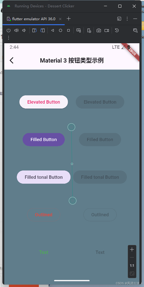
Button
- 核心代码
js
import 'package:flutter/material.dart';

/// Flutter code sample for [ElevatedButton].

void main() {
  runApp(const ButtonApp());
}

class ButtonApp extends StatelessWidget {
  const ButtonApp({super.key});

  @override
  Widget build(BuildContext context) {
    return MaterialApp(
      theme: ThemeData(colorSchemeSeed: const Color(0xff6750a4)),
      title: 'Button Types',
      home: const Scaffold(body: ButtonTypesExample()),
    );
  }
}

class ButtonTypesExample extends StatelessWidget {
  const ButtonTypesExample({super.key});

  @override
  Widget build(BuildContext context) {
    return const Padding(
      padding: EdgeInsets.all(4.0),
      child: Row(
        children: <Widget>[
          Spacer(),
          ButtonTypesGroup(enabled: true),
          ButtonTypesGroup(enabled: false),
          Spacer(),
        ],
      ),
    );
  }
}

class ButtonTypesGroup extends StatelessWidget {
  const ButtonTypesGroup({super.key, required this.enabled});

  final bool enabled;

  @override
  Widget build(BuildContext context) {
    final VoidCallback? onPressed = enabled ? () {} : null;
    return Padding(
      padding: const EdgeInsets.all(4.0),
      child: Column(
        mainAxisAlignment: MainAxisAlignment.spaceEvenly,
        children: <Widget>[
          ElevatedButton(onPressed: onPressed, child: const Text('Elevated')),
          FilledButton(onPressed: onPressed, child: const Text('Filled')),
          FilledButton.tonal(onPressed: onPressed, child: const Text('Filled Tonal')),
          OutlinedButton(onPressed: onPressed, child: const Text('Outlined')),
          TextButton(onPressed: onPressed, child: const Text('Text')),
        ],
      ),
    );
  }
}- 效果展示
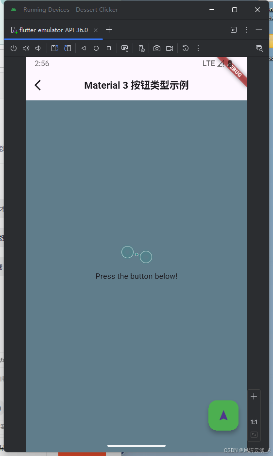
FloatingActionButton
- 核心代码
js
import 'package:flutter/material.dart';

class FloatingActionButtonExample extends StatefulWidget {
  const FloatingActionButtonExample({super.key});

  @override
  State<FloatingActionButtonExample> createState() =>
      _FloatingActionButtonExampleState();
}

class _FloatingActionButtonExampleState
    extends State<FloatingActionButtonExample> {
  // The FAB's foregroundColor, backgroundColor, and shape
  static const List<(Color?, Color? background, ShapeBorder?)> customizations =
      <(Color?, Color?, ShapeBorder?)>[
        (null, null, null), // The FAB uses its default for null parameters.
        (null, Colors.green, null),
        (Colors.white, Colors.green, null),
        (Colors.white, Colors.green, CircleBorder()),
      ];
  int index = 0; // Selects the customization.

  @override
  Widget build(BuildContext context) {
    return Scaffold(
      // appBar: AppBar(title: const Text('FloatingActionButton Sample')),
      body: const Center(child: Text('Press the button below!')),
      floatingActionButton: FloatingActionButton(
        onPressed: () {
          setState(() {
            index = (index + 1) % customizations.length;
          });
        },
        foregroundColor: customizations[index].$1,
        backgroundColor: customizations[index].$2,
        shape: customizations[index].$3,
        child: const Icon(Icons.navigation),
      ),
    );
  }
}- 显示效果
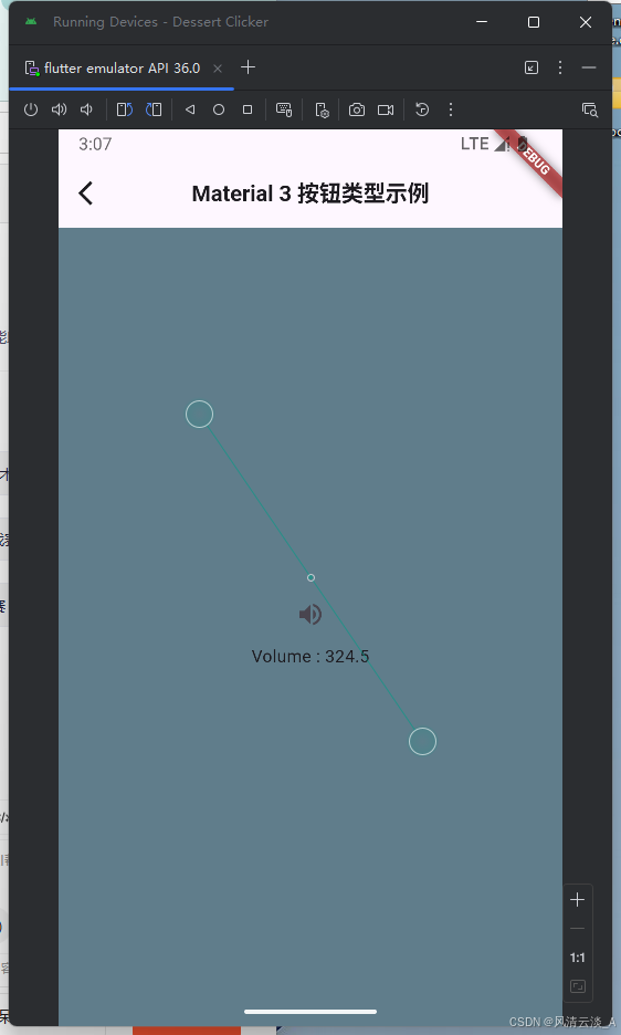
IconButton
js
import 'package:flutter/material.dart';

class IconButtonExample extends StatefulWidget {
  const IconButtonExample({super.key});

  @override
  State<IconButtonExample> createState() => _IconButtonExampleState();
}

double _volume = 4.5;

class _IconButtonExampleState extends State<IconButtonExample> {
  @override
  Widget build(BuildContext context) {
    return Center(
      child: Column(
        mainAxisSize: MainAxisSize.min,
        children: <Widget>[
          IconButton(
            icon: const Icon(Icons.volume_up),
            tooltip: 'Increase volume by 10',
            onPressed: () {
              setState(() {
                _volume += 10;
              });
            },
          ),
          Text('Volume : $_volume'),
        ],
      ),
    );
  }
}
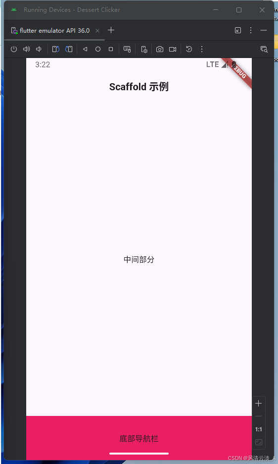
Scaffold
- 核心代码
js
import 'package:flutter/material.dart';

void main() => runApp(const MyWidget());

class MyWidget extends StatefulWidget {
  const MyWidget({Key? key}) : super(key: key);

  State<MyWidget> createState() => _MyWidgetState();
}

class _MyWidgetState extends State<MyWidget> {
  @override
  Widget build(BuildContext context) {
    return MaterialApp(
      title: "我的第一个商城app",
      home: Scaffold(
        appBar: AppBar(
          title: Text(
            'Scaffold 示例',
            style: TextStyle(fontSize: 18, fontWeight: FontWeight.bold),
          ),
          centerTitle: true,
          // backgroundColor: Colors.pink,
        ),
        body: Container(child: const Center(child: Text("中间部分"))),
        bottomNavigationBar: Container(
          height: 80,
          color: Colors.pink,
          child: Center(child: Text("底部导航栏")),
        ),
      ),
    );
  }
}- 效果展示
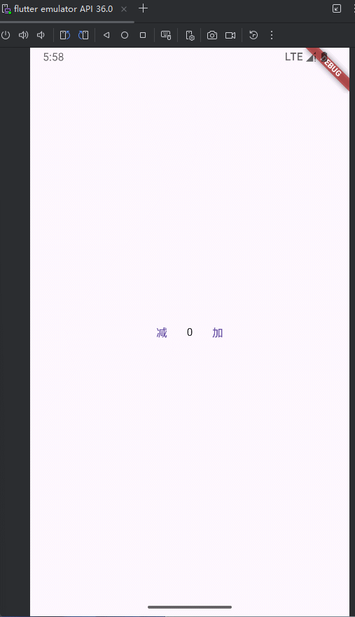
setState状态更新
js
import 'package:flutter/material.dart';

void main() => runApp(const MyWidgetHello());

class MyWidgetHello extends StatefulWidget {
  const MyWidgetHello({super.key});

  @override
  State<MyWidgetHello> createState() {
    return _MyWidgetHelloState();
  }
}

class _MyWidgetHelloState extends State<MyWidgetHello> {
  int count = 0;

  _decrementCount() {
    setState(() {
      count--;
    });
  }

  _incrementCount() {
    setState(() {
      count++;
    });
  }

  @override
  Widget build(BuildContext context) {
    return MaterialApp(
      home: Scaffold(
        body: Container(
          // color: Colors.pink,
          width: MediaQuery.of(context).size.width,
          child: Column(
            mainAxisAlignment: MainAxisAlignment.center,
            children: [
              Row(
                mainAxisAlignment: MainAxisAlignment.center,
                children: [
                  TextButton(
                    onPressed: _decrementCount,
                    child: const Text("减"),
                  ),
                  Text("$count"),
                  TextButton(
                    onPressed: _incrementCount,
                    child: const Text("加"),
                  ),
                ],
              ),
            ],
          ),
        ),
      ),
    );
  }
}
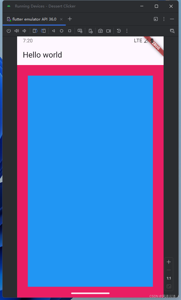
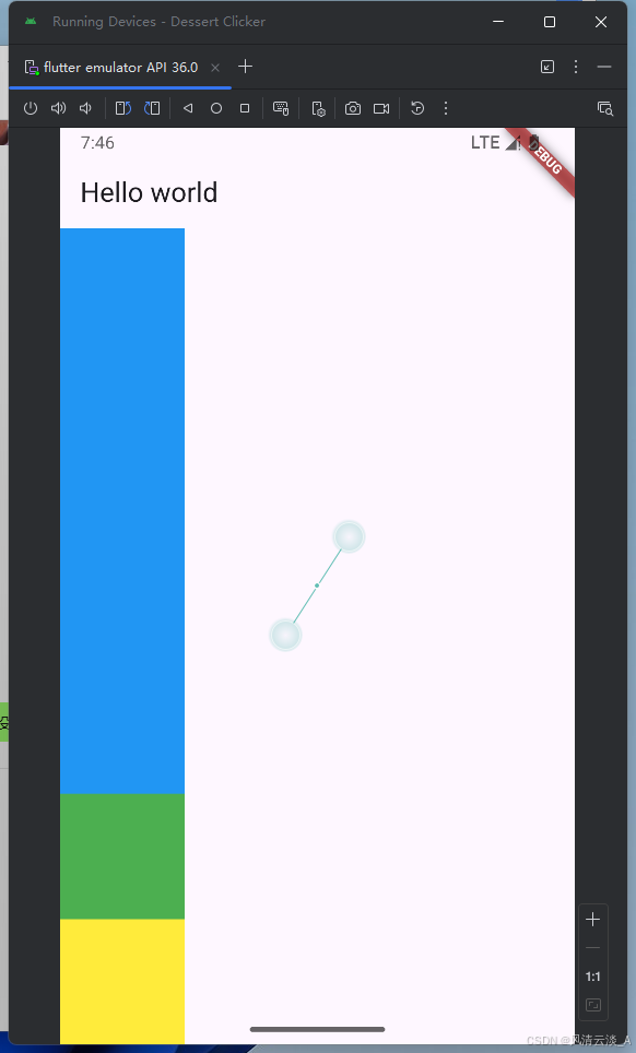
Padding
js
import 'package:flutter/material.dart';
void main() => runApp(const MyWidgetHello());
class MyWidgetHello extends StatefulWidget {
const MyWidgetHello({super.key});
@override
State<MyWidgetHello> createState() {
return _MyWidgetHelloState();
}
}
class _MyWidgetHelloState extends State<MyWidgetHello> {
@override
Widget build(BuildContext context) {
return MaterialApp(
home: Scaffold(
appBar: AppBar(title: Text('Hello world')),
body: Container(
color: Colors.pink,
child: Padding(
padding: EdgeInsets.only(top: 30, left: 30, right: 30, bottom: 30),
child: Container(
decoration: BoxDecoration(
color: Colors.blue,
// borderRadius: BorderRadius.circular(10),
boxShadow: [
BoxShadow(
color: Colors.yellow,
offset: Offset(0, 0),
// blurRadius: 10,
),
],
),
),
),
),
),
);
}
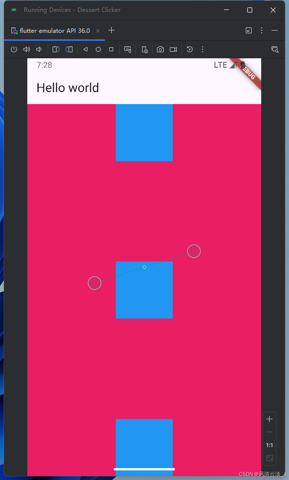
}显示效果
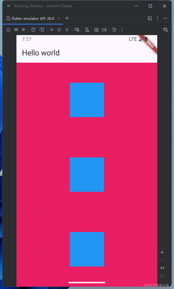
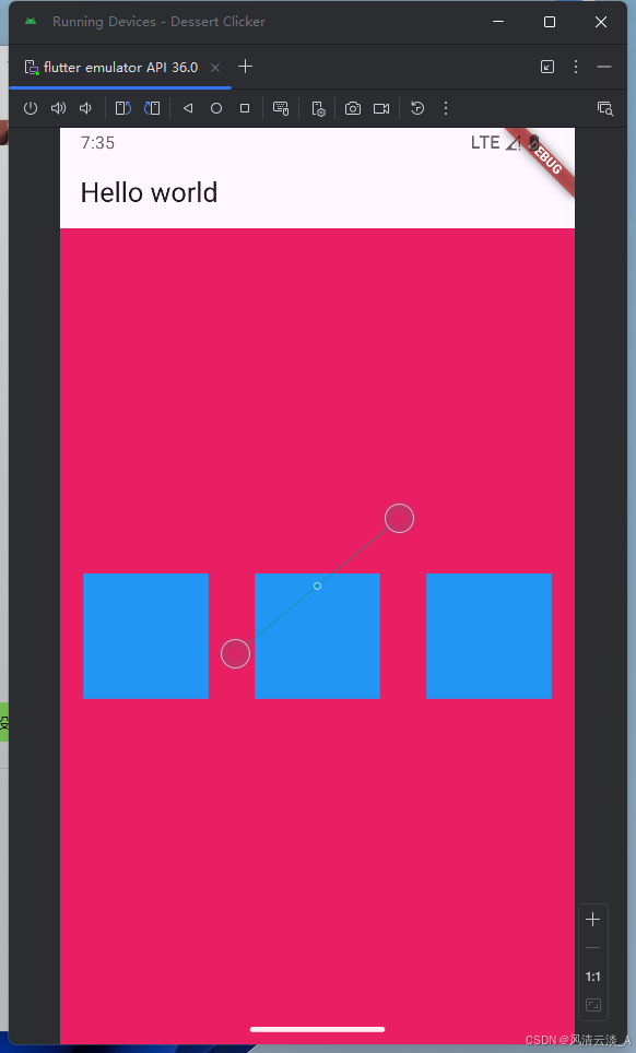
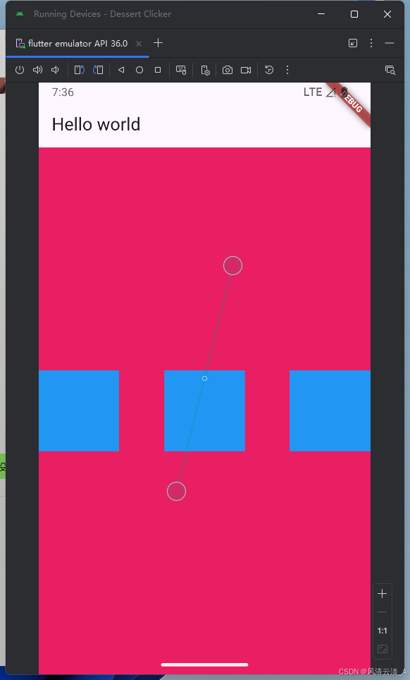
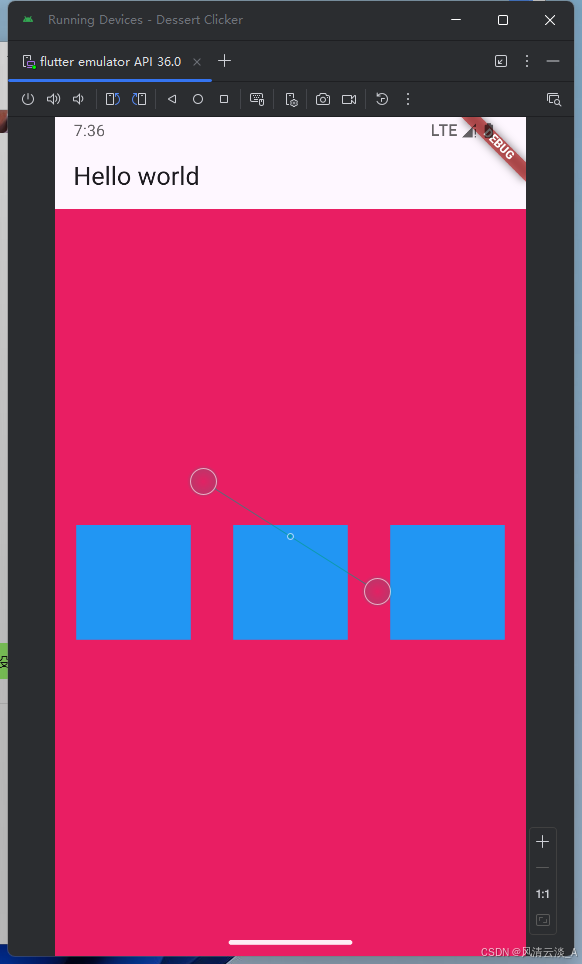
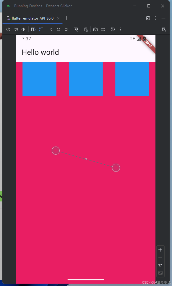
Column
对齐方式的几种展示效果
mainAxisAlignment: MainAxisAlignment.spaceAround
js
class _MyWidgetHelloState extends State<MyWidgetHello> {
  @override
  Widget build(BuildContext context) {
    return MaterialApp(
      home: Scaffold(
        appBar: AppBar(title: Text('Hello world')),
        body: Container(
          width: double.infinity,
          color: Colors.pink,
          child: Column(
            mainAxisAlignment: MainAxisAlignment.spaceAround,
            children: [
              Container(width: 100, height: 100, color: Colors.blue),
              Container(width: 100, height: 100, color: Colors.blue),
              Container(width: 100, height: 100, color: Colors.blue),
            ],
          ),
        ),
      ),
    );
  }
}
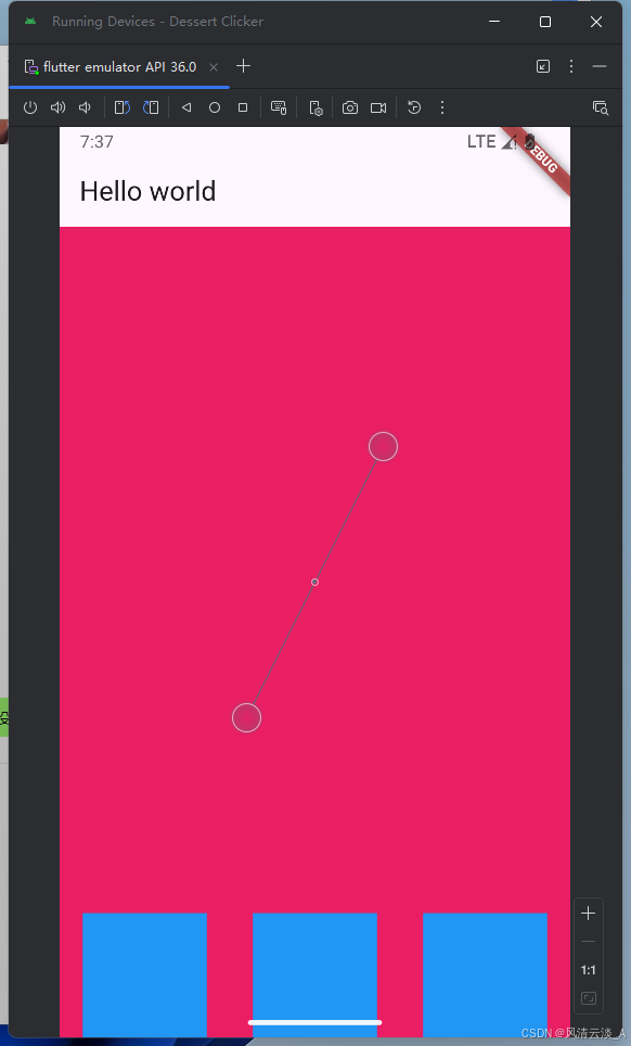
mainAxisAlignment: MainAxisAlignment.spaceBetween
mainAxisAlignment: MainAxisAlignment.spaceAround

Row
效果跟Column的相反,主轴和交叉轴刚好反过来
mainAxisAlignment: MainAxisAlignment.spaceAround,
mainAxisAlignment: MainAxisAlignment.spaceBetween,
mainAxisAlignment: MainAxisAlignment.spaceAround,
mainAxisAlignment: MainAxisAlignment.spaceAround, crossAxisAlignment: CrossAxisAlignment.start,
mainAxisAlignment: MainAxisAlignment.spaceAround, crossAxisAlignment: CrossAxisAlignment.end,
这里可以尝试主轴和交叉轴的多种组合情况效果
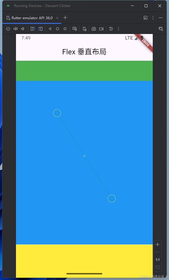
Flex布局
js
body: Container(
          height: double.infinity,
          color: Colors.pink,
          child: Flex(
            direction: Axis.horizontal,
            children: [
              Container(width: 100, height: 100, color: Colors.blue),
              Container(width: 100, height: 100, color: Colors.green),
              Container(width: 100, height: 100, color: Colors.yellow),
            ],
          ),
        ),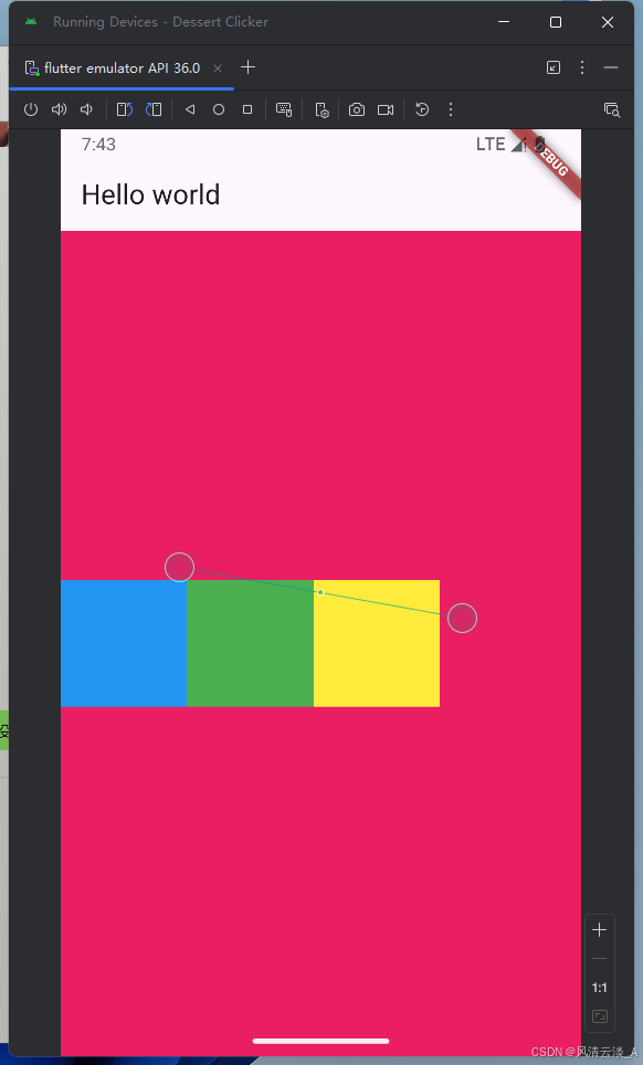
初始效果,三个container没有实现弹性布局
添加Expanded组件
js
body: Container(
          height: double.infinity,
          color: Colors.pink,
          child: Flex(
            direction: Axis.horizontal,
            children: [
              Expanded(
                child: Container(width: 100, height: 100, color: Colors.blue),
              ),
              Container(width: 100, height: 100, color: Colors.green),
              Container(width: 100, height: 100, color: Colors.yellow),
            ],
          ),
        )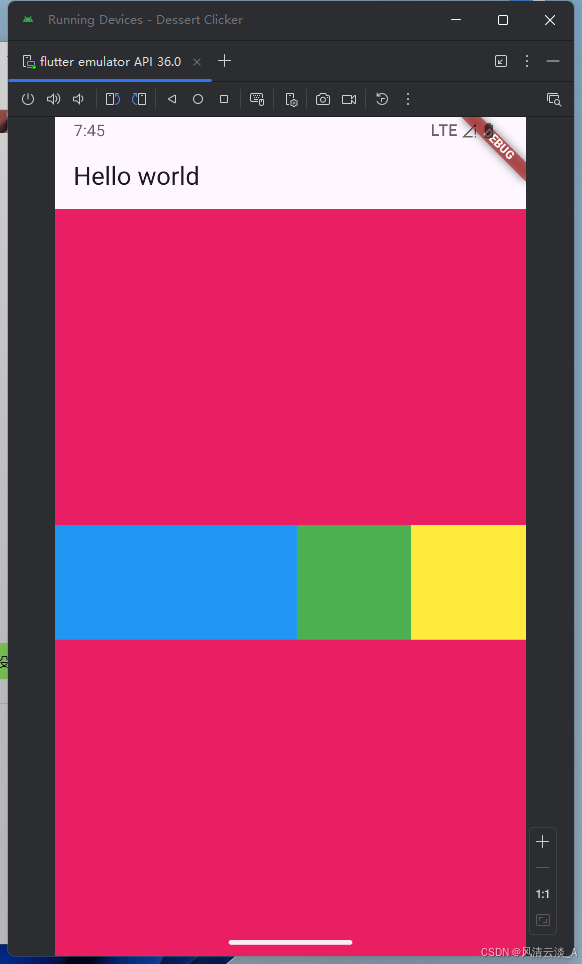
direction: Axis.vertical,垂直方向的效果
- 项目中的需求
上下固定高度,中间填充剩余空间
js
body: Container(
 height: double.infinity,
  width: double.infinity,
  color: Colors.pink,
  child: Flex(
    direction: Axis.vertical,
    children: [
      Container(
        width: double.infinity,
        height: 60,
        color: Colors.green,
      ),
      Expanded(
        child: Container(
          width: double.infinity,
          height: 100,
          color: Colors.blue,
        ),
      ),

      Container(
        width: double.infinity,
        height: 100,
        color: Colors.yellow,
      ),
    ],
  ),
),
Wrap
子组件宽度大于父组件,自动换行或列
js
body: Container(
          height: double.infinity,
          width: double.infinity,
          color: Colors.pink,
          child: Wrap(
            direction: Axis.horizontal,
            // alignment: WrapAlignment.center,
            children: [
              Container(width: 100, height: 100, color: Colors.amber),
              Container(width: 100, height: 100, color: Colors.blue),
              Container(width: 100, height: 100, color: Colors.indigo),
              Container(width: 100, height: 100, color: Colors.blue),
              Container(width: 100, height: 100, color: Colors.blue),
            ],
          ),
        ),
- 子元素的排列对齐方式
js
child: Wrap(
            direction: Axis.horizontal,
            alignment: WrapAlignment.center,
            children: [
              Container(width: 100, height: 100, color: Colors.amber),
              Container(width: 100, height: 100, color: Colors.blue),
              Container(width: 100, height: 100, color: Colors.indigo),
              Container(width: 100, height: 100, color: Colors.blue),
              Container(width: 100, height: 100, color: Colors.blue),
            ],
          ),
js
child: Wrap(
            direction: Axis.horizontal,
            spacing: 2,
            alignment: WrapAlignment.spaceBetween,
            children: [
              Container(width: 100, height: 100, color: Colors.amber),
              Container(width: 100, height: 100, color: Colors.blue),
              Container(width: 100, height: 100, color: Colors.indigo),
              Container(width: 100, height: 100, color: Colors.blue),
              Container(width: 100, height: 100, color: Colors.blue),
            ],
          ),
这里有很多组合效果,可以自己去环境里面跑下代码,测试下
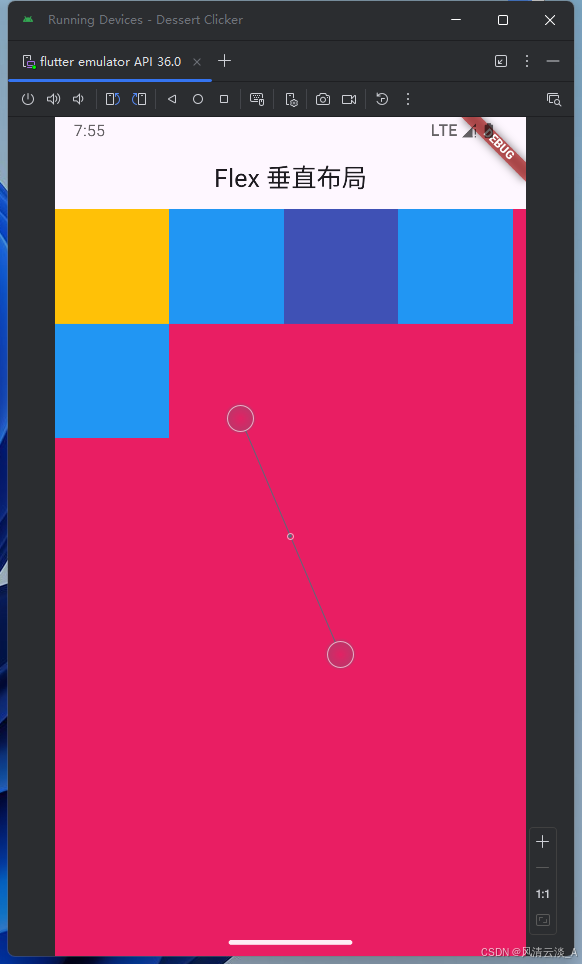
Stack
必须搭配Positioned组件使用
js
import 'package:flutter/material.dart';

void main() => runApp(const MyWidgetHello());

class MyWidgetHello extends StatefulWidget {
  const MyWidgetHello({super.key});

  @override
  State<MyWidgetHello> createState() {
    return _MyWidgetHelloState();
  }
}

class _MyWidgetHelloState extends State<MyWidgetHello> {
  @override
  Widget build(BuildContext context) {
    return MaterialApp(
      home: Scaffold(
        appBar: AppBar(title: Text('Flex 垂直布局'), centerTitle: true),
        body: Container(
          color: Colors.pink,
          child: Container(
            width: double.infinity,
            child: Flex(
              direction: Axis.vertical,
              children: [
                Text('Stack 垂直布局'),
                Expanded(
                  child: Container(
                    color: Colors.purple,
                    width: double.infinity,
                    child: Stack(
                      children: [
                        Positioned(
                          right: 0,
                          top: 0,
                          child: Container(
                            width: 100,
                            height: 100,
                            color: Colors.amber,
                          ),
                        ),
                        Positioned(
                          left: 0,
                          bottom: 0,
                          child: Container(
                            width: 100,
                            height: 100,
                            color: Colors.red,
                          ),
                        ),
                        Container(
                          width: 100,
                          height: 100,
                          color: Colors.indigo,
                        ),
                        Container(width: 100, height: 100, color: Colors.blue),
                        Positioned(
                          right: 0,
                          bottom: 0,
                          child: Container(
                            width: 100,
                            height: 100,
                            color: const Color.fromARGB(255, 33, 243, 96),
                          ),
                        ),
                      ],
                    ),
                  ),
                ),
                Text('Stack 垂直布局2222'),
              ],
            ),
          ),
        ),
      ),
    );
  }
}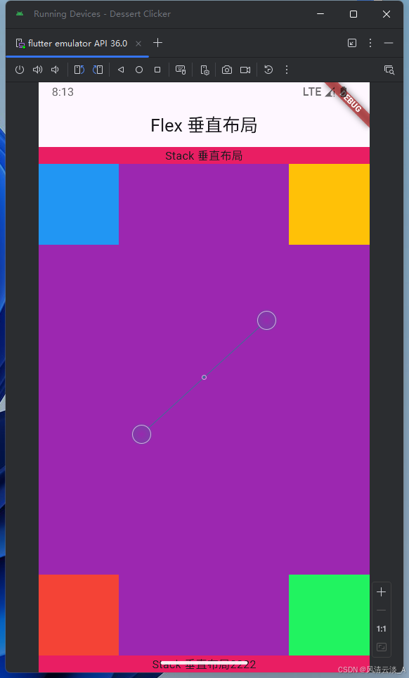
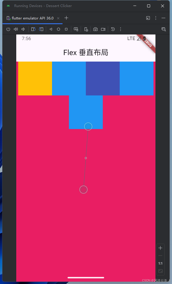
这里我们的底部组件很明显被白色空间挡住了,这是引文我们没有考虑安全区域SafeArea,
在最外层上面加上即可
js
body: Container(
          color: Colors.pink,
          child: SafeArea(
            child: Container(
              width: double.infinity,
              child: Flex(
                direction: Axis.vertical,
                children: [
                  Text('Stack 垂直布局'),
                  Expanded(
                    child: Container(
                      color: Colors.purple,
                      width: double.infinity,
                      child: Stack(
                        children: [
                          Positioned(
                            right: 0,
                            top: 0,
                            child: Container(
                              width: 100,
                              height: 100,
                              color: Colors.amber,
                            ),
                          ),
                          Positioned(
                            left: 0,
                            bottom: 0,
                            child: Container(
                              width: 100,
                              height: 100,
                              color: Colors.red,
                            ),
                          ),
                          Container(
                            width: 100,
                            height: 100,
                            color: Colors.indigo,
                          ),
                          Container(
                            width: 100,
                            height: 100,
                            color: Colors.blue,
                          ),
                          Positioned(
                            right: 0,
                            bottom: 0,
                            child: Container(
                              width: 100,
                              height: 100,
                              color: const Color.fromARGB(255, 33, 243, 96),
                            ),
                          ),
                        ],
                      ),
                    ),
                  ),
                  Text('Stack 垂直布局2222'),
                ],
              ),
            ),
          ),
        ),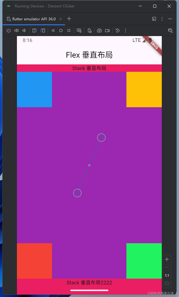
这样就不会出现内容被遮挡的情况了。
Image
js
class _MyWidgetHelloState extends State<MyWidgetHello> {
  @override
  Widget build(BuildContext context) {
    return MaterialApp(
      home: Scaffold(
        appBar: AppBar(title: Text('Images 组件'), centerTitle: true),
        body: Container(
          height: double.infinity,
          width: double.infinity,
          color: const Color.fromARGB(255, 196, 173, 181),
          child: SafeArea(
            child: Container(
              width: 200,
              height: 200,
              child: Image.network(
                "https://q6.itc.cn/images01/20250910/8a96ce24a3374572abc56a281520165f.jpeg",
                width: 200,
                height: 200,
                // fit: BoxFit.fill,
              ),
            ),
          ),
        ),
      ),
    );
  }
}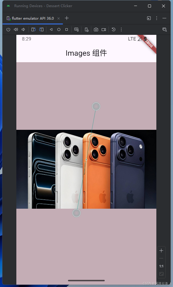
这里是网络图片,如果是本地图片就需要配置pubspec.yaml文件里面进行文件目录的配置
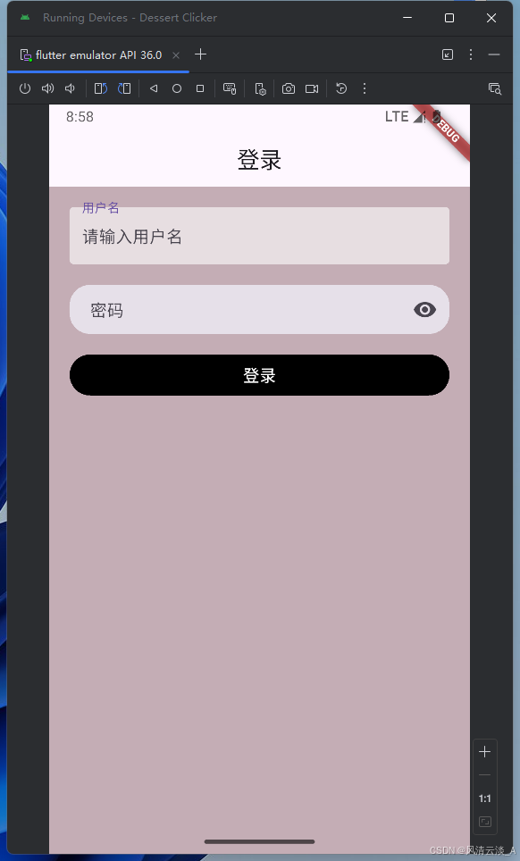
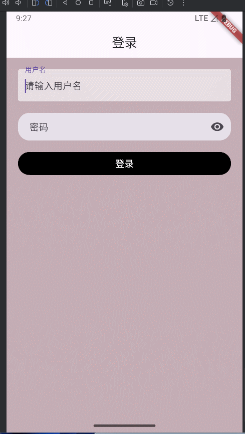
TextField
实现一个登录页面
js
import 'package:flutter/material.dart';

void main() => runApp(const MyWidgetHello());

class MyWidgetHello extends StatefulWidget {
  const MyWidgetHello({super.key});

  @override
  State<MyWidgetHello> createState() {
    return _MyWidgetHelloState();
  }
}

class _MyWidgetHelloState extends State<MyWidgetHello> {
  bool _visible = false;
  bool _obscureText = true;
  void _changeVisible() {
    setState(() {
      _visible = !_visible;
      _obscureText = !_obscureText;
    });
  }

  @override
  Widget build(BuildContext context) {
    return MaterialApp(
      home: Scaffold(
        appBar: AppBar(title: Text('登录'), centerTitle: true),
        body: Container(
          height: double.infinity,
          width: double.infinity,
          color: const Color.fromARGB(255, 196, 173, 181),
          child: SafeArea(
            child: Container(
              padding: EdgeInsets.all(20),
              child: Column(
                children: [
                  TextField(
                    decoration: InputDecoration(
                      hintText: '请输入用户名',
                      filled: true,
                      fillColor: Colors.white60,
                      label: Text('用户名'),
                      border: OutlineInputBorder(borderSide: BorderSide.none),
                    ),
                  ),
                  SizedBox(height: 20),
                  TextField(
                    obscureText: _obscureText,
                    decoration: InputDecoration(
                      hintText: '请输入密码',
                      filled: true,
                      contentPadding: EdgeInsets.only(left: 20),
                      border: OutlineInputBorder(
                        borderSide: BorderSide.none,
                        borderRadius: BorderRadius.circular(20),
                      ),
                      label: Text('密码'),
                      suffixIcon: IconButton(
                        icon: Icon(
                          _visible ? Icons.visibility_off : Icons.visibility,
                        ),
                        onPressed: _changeVisible,
                      ),
                    ),
                  ),
                  SizedBox(height: 20),
                  Container(
                    width: double.infinity,
                    height: 40,
                    decoration: BoxDecoration(
                      color: Colors.black,
                      borderRadius: BorderRadius.circular(20),
                    ),
                    child: TextButton(
                      onPressed: () {},
                      child: Text(
                        '登录',
                        style: TextStyle(color: Colors.white, fontSize: 16),
                      ),
                    ),
                  ),
                ],
              ),
            ),
          ),
        ),
      ),
    );
  }
}
展示效果
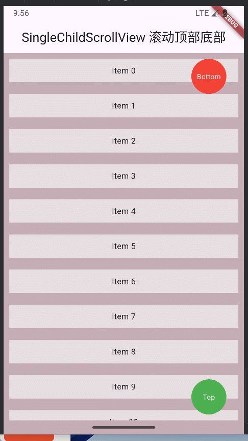
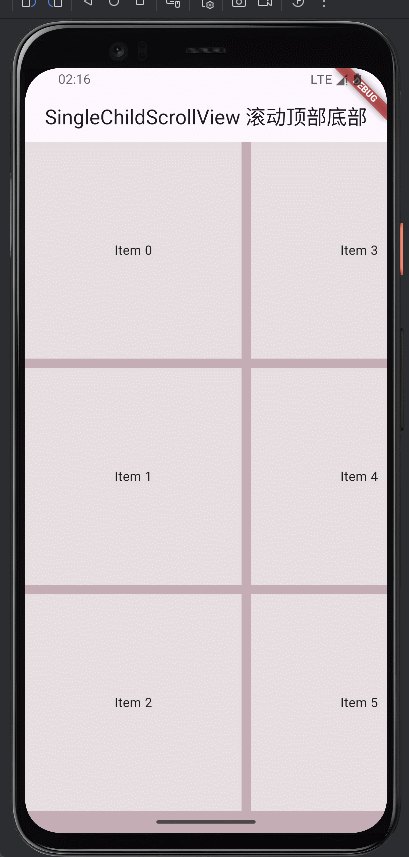
SingleChildScrollView
滚动到顶部和底部的实现
js
@override
  Widget build(BuildContext context) {
    return MaterialApp(
      home: Scaffold(
        appBar: AppBar(
          title: Text('SingleChildScrollView 滚动顶部底部'),
          centerTitle: true,
        ),
        body: Container(
          height: double.infinity,
          width: double.infinity,
          color: const Color.fromARGB(255, 196, 173, 181),
          child: SafeArea(
            child: Stack(
              children: [
                SingleChildScrollView(
                  controller: _scrollController,
                  child: Container(
                    child: Column(
                      children: List.generate(30, (index) {
                        return Container(
                          height: 40,
                          width: double.infinity,
                          color: Colors.white60,
                          margin: EdgeInsets.all(10),
                          child: Center(
                            child: GestureDetector(
                              onTap: () {
                                print('Item $index tapped');
                              },
                              child: Text('Item $index'),
                            ),
                          ),
                        );
                      }),
                    ),
                  ),
                ),
                Positioned(
                  right: 20,
                  top: 0,
                  child: GestureDetector(
                    onTap: () {
                      _scrollController.animateTo(
                        _scrollController.position.maxScrollExtent,
                        duration: Duration(milliseconds: 300),
                        curve: Curves.ease,
                      );
                    },
                    child: Container(
                      height: 60,
                      width: 60,
                      margin: EdgeInsets.all(10),
                      decoration: BoxDecoration(
                        borderRadius: BorderRadius.circular(40),
                        color: Colors.red,
                      ),
                      child: Center(
                        child: Text(
                          'Bottom',
                          style: TextStyle(color: Colors.white, fontSize: 12),
                        ),
                      ),
                    ),
                  ),
                ),
                Positioned(
                  right: 20,
                  bottom: 0,
                  child: GestureDetector(
                    onTap: () {
                      _scrollController.animateTo(
                        _scrollController.position.minScrollExtent,
                        duration: Duration(milliseconds: 300),
                        curve: Curves.ease,
                      );
                    },
                    child: Container(
                      height: 60,
                      width: 60,
                      margin: EdgeInsets.all(10),
                      decoration: BoxDecoration(
                        borderRadius: BorderRadius.circular(40),
                        color: Colors.green,
                      ),
                      child: Center(
                        child: Text(
                          'Top',
                          style: TextStyle(color: Colors.white, fontSize: 12),
                        ),
                      ),
                    ),
                  ),
                ),
              ],
            ),
          ),
        ),
      ),
    );
  }
ListView
- 默认构造模式跟上面的
SingleChildScrollView一样,都是一次加载全部数据,数据多了,会有性能问题
js
@override
  Widget build(BuildContext context) {
    return MaterialApp(
      home: Scaffold(
        appBar: AppBar(
          title: Text('SingleChildScrollView 滚动顶部底部'),
          centerTitle: true,
        ),
        body: Container(
          height: double.infinity,
          width: double.infinity,
          color: const Color.fromARGB(255, 196, 173, 181),
          child: SafeArea(
            child: ListView(
              children: List.generate(
                100,
                (index) => Container(
                  height: 40,
                  width: double.infinity,
                  color: Colors.white60,
                  margin: EdgeInsets.all(10),
                  child: Center(child: Text('Item $index')),
                ),
              ),
            ),
          ),
        ),
      ),
    );
}- builder模式实现按需加载
js
@override
  Widget build(BuildContext context) {
    return MaterialApp(
      home: Scaffold(
        appBar: AppBar(
          title: Text('SingleChildScrollView 滚动顶部底部'),
          centerTitle: true,
        ),
        body: Container(
          height: double.infinity,
          width: double.infinity,
          color: const Color.fromARGB(255, 196, 173, 181),
          child: SafeArea(
            child: ListView.builder(
              itemCount: 50,
              itemBuilder: (context, index) => Container(
                height: 40,
                width: double.infinity,
                color: Colors.white60,
                margin: EdgeInsets.all(10),
                child: Center(child: Text('Item $index')),
              ),
            ),
          ),
        ),
      ),
    );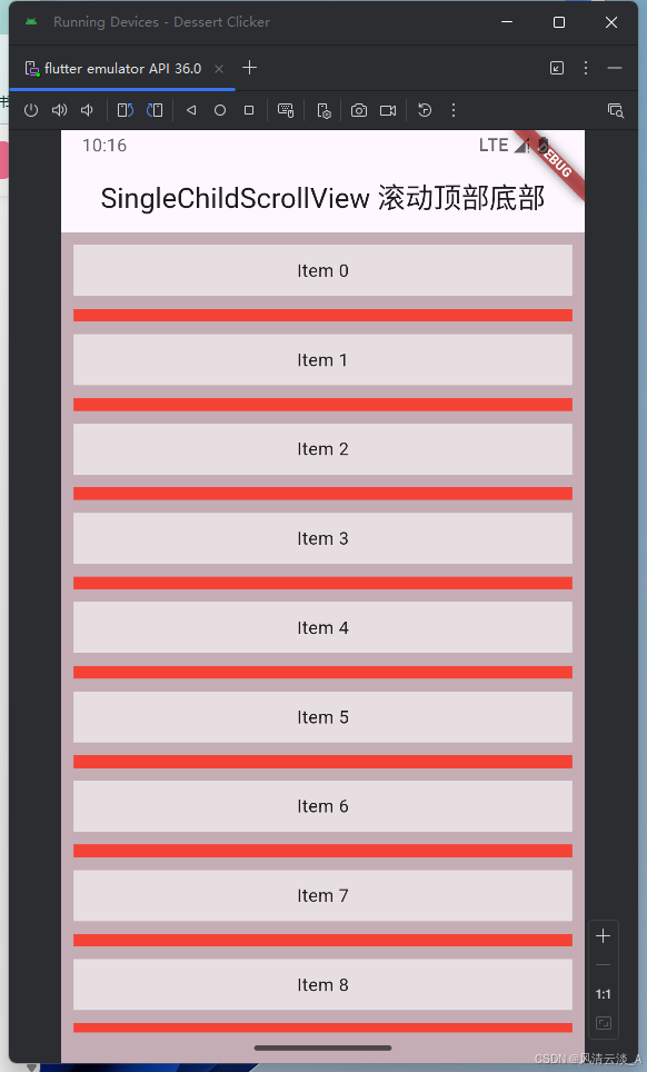
}- separated模式
js
@override
  Widget build(BuildContext context) {
    return MaterialApp(
      home: Scaffold(
        appBar: AppBar(
          title: Text('SingleChildScrollView 滚动顶部底部'),
          centerTitle: true,
        ),
        body: Container(
          height: double.infinity,
          width: double.infinity,
          color: const Color.fromARGB(255, 196, 173, 181),
          child: SafeArea(
            child: ListView.separated(
              itemBuilder: (context, index) => Container(
                height: 40,
                width: double.infinity,
                color: Colors.white60,
                margin: EdgeInsets.all(10),
                child: Center(child: Text('Item $index')),
              ),
              separatorBuilder: (context, index) => Container(
                height: 10,
                width: double.infinity,
                color: Colors.red,
                margin: EdgeInsets.symmetric(horizontal: 10),
              ),
              itemCount: 100,
            ),
          ),
        ),
      ),
    );
  }
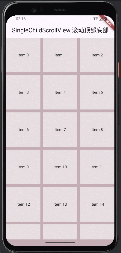
GridView
- GridView.count的实现
js
@override
  Widget build(BuildContext context) {
    return MaterialApp(
      home: Scaffold(
        appBar: AppBar(
          title: Text('SingleChildScrollView 滚动顶部底部'),
          centerTitle: true,
        ),
        body: Container(
          height: double.infinity,
          width: double.infinity,
          color: const Color.fromARGB(255, 196, 173, 181),
          child: SafeArea(
            child: GridView.count(
              crossAxisCount: 3,
              children: List.generate(
                100,
                (index) => Container(
                  height: 40,
                  width: double.infinity,
                  color: Colors.white60,
                  margin: EdgeInsets.all(10),
                  child: Center(child: Text('Item $index')),
                ),
              ),
            ),
          ),
        ),
      ),
    );
  }
默认是垂直方向滚动
scrollDirection: Axis.horizontal,水平方向滚动
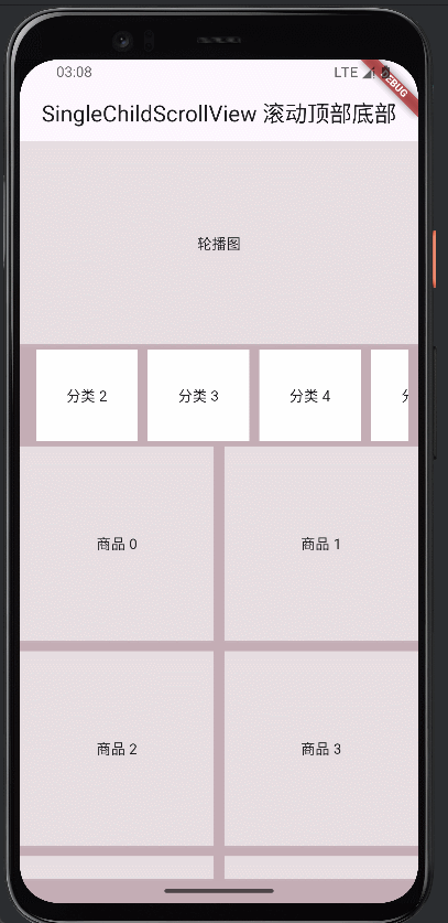
CustomScrollView
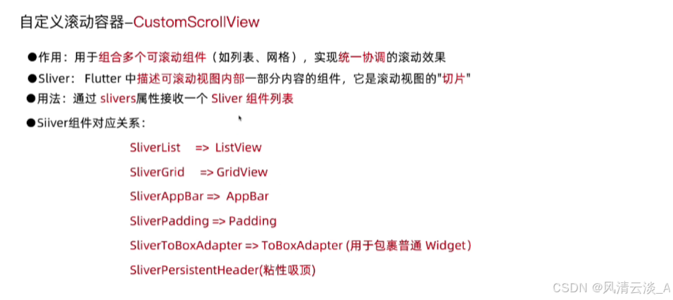
js
import 'package:flutter/material.dart';

void main() => runApp(const MyWidgetHello());

class MyWidgetHello extends StatefulWidget {
  const MyWidgetHello({super.key});

  @override
  State<MyWidgetHello> createState() {
    return _MyWidgetHelloState();
  }
}

class _MyWidgetHelloState extends State<MyWidgetHello> {
  bool _visible = false;
  bool _obscureText = true;
  void _changeVisible() {
    setState(() {
      _visible = !_visible;
      _obscureText = !_obscureText;
    });
  }

  ScrollController _scrollController = ScrollController(); // 滚动控制器

  @override
  Widget build(BuildContext context) {
    return MaterialApp(
      home: Scaffold(
        appBar: AppBar(
          title: Text('SingleChildScrollView 滚动顶部底部'),
          centerTitle: true,
        ),
        body: Container(
          height: double.infinity,
          width: double.infinity,
          color: const Color.fromARGB(255, 196, 173, 181),
          child: SafeArea(
            child: CustomScrollView(
              controller: _scrollController,
              slivers: [
                SliverToBoxAdapter(
                  child: Container(
                    height: 200,
                    width: double.infinity,
                    color: Colors.white60,
                    child: Center(child: Text('轮播图')),
                  ),
                ),
                SliverPersistentHeader(
                  delegate: _SliverPersistentHeaderDelegate(),
                  pinned: true,
                ),
                SliverGrid.builder(
                  gridDelegate: SliverGridDelegateWithFixedCrossAxisCount(
                    crossAxisCount: 2,
                    mainAxisSpacing: 10,
                    crossAxisSpacing: 10,
                  ),
                  itemBuilder: (context, index) => Container(
                    height: 40,
                    width: double.infinity,
                    color: Colors.white60,
                    child: Center(child: Text('商品 $index')),
                  ),
                  itemCount: 30,
                ),
              ],
            ),
          ),
        ),
      ),
    );
  }
}

class _SliverPersistentHeaderDelegate extends SliverPersistentHeaderDelegate {
  @override
  Widget build(
    BuildContext context,
    double shrinkOffset,
    bool overlapsContent,
  ) {
    return Container(
      margin: EdgeInsets.symmetric(horizontal: 10, vertical: 5),
      width: double.infinity,
      // color: Colors.white60,
      child: ListView.builder(
        scrollDirection: Axis.horizontal,
        itemCount: 10,
        itemBuilder: (context, index) => Container(
          height: 100,
          width: 100,
          margin: EdgeInsets.symmetric(horizontal: 5),
          // width: double.infinity,
          color: Colors.white,
          child: Center(child: Text('分类 $index')),
        ),
      ),
    );
  }

  @override
  double get maxExtent => 100;

  @override
  double get minExtent => 60;

  @override
  bool shouldRebuild(covariant SliverPersistentHeaderDelegate oldDelegate) {
    return false;
  }
}
效果演示