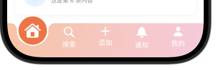
一、凹陷背景效果
-
TabBar背景在凸出按钮处呈现凹陷
-
凹陷曲线平滑自然,使用贝塞尔曲线实现
-
顶部暗色渐变模拟凹陷的深度
Path绘制
| 方法 | 参数 | 类型 | 说明 |
|---|---|---|---|
| move(to:) | point | CGPoint | 将绘制起点移动到指定位置 |
| addLine(to:) | point | CGPoint | 从当前位置到目标点添加直线 |
| addQuadCurve(to:control:) | to | CGPoint | 二次贝塞尔曲线终点 |
| control | CGPoint | 控制点(影响曲线弯曲程度) | |
| addCurve(to:control1:control2:) | to | CGPoint | 三次贝塞尔曲线终点 |
| control1 | CGPoint | 第一个控制点 | |
| control2 | CGPoint | 第二个控制点 | |
| addArc(center:radius:startAngle:endAngle:clockwise:) | center | CGPoint | 圆弧中心点 |
| radius | CGFloat | 圆弧半径 | |
| startAngle | Angle | 起始角度 | |
| endAngle | Angle | 结束角度 | |
| clockwise | Bool | true=顺时针,false=逆时针 | |
| addEllipse(in:) | rect | CGRect | 椭圆的外接矩形 |
| addRoundedRect(in:cornerSize:style:) | rect | CGRect | 矩形区域 |
| cornerSize | CGSize | 圆角大小 | |
| style | RoundedCornerStyle | 圆角样式(continuous/circular) | |
| closeSubpath() | - | - | 闭合当前子路径 |
| addPath(_:transform:) | path | Path | 添加另一个路径 |
| transform | CGAffineTransform | 变换矩阵 |
Swift
// MARK: - TabBar背景形状(带凹陷效果)
struct TabBarBackgroundShape: Shape {
    let selectedIndex: Int
    let tabCount: Int

    func path(in rect: CGRect) -> Path {
        var path = Path()

        let cornerRadius: CGFloat = 0
        let buttonWidth = (rect.width - 30) / CGFloat(tabCount)
        let selectedButtonLX = buttonWidth * CGFloat(selectedIndex) + 20  //button的start X
        let selectedButtonRX = buttonWidth * CGFloat(selectedIndex + 1) + 10 //button的end X
        let selectedButtonX = buttonWidth * CGFloat(selectedIndex) + buttonWidth / 2 + 15
        let Depth: CGFloat = 15

        // 从左上角开始
        path.move(to: CGPoint(x: 0, y: cornerRadius))

        // 左上角圆角
        path.addQuadCurve(
            to: CGPoint(x: cornerRadius, y: 0),
            control: CGPoint(x: 0, y: 0)
        )

        // 上边线,直到凹陷开始
        path.addLine(to: CGPoint(x: selectedButtonLX - Depth, y: 0))

        // 凹陷左侧曲线 - 平滑过渡
        path.addQuadCurve(
            to: CGPoint(x: selectedButtonLX , y:Depth),
            control: CGPoint(x: selectedButtonLX , y: 0)
        )

        // 凹陷底部 - 左侧到中间
        path.addQuadCurve(
            to: CGPoint(x: selectedButtonX, y: 10 + buttonWidth / 2),
            control: CGPoint(x: selectedButtonLX, y: 4 + buttonWidth / 2)
        )

        // 凹陷底部 - 中间到右侧
        path.addQuadCurve(
            to: CGPoint(x: selectedButtonRX, y:Depth),
            control: CGPoint(x: selectedButtonRX, y: 4 + buttonWidth / 2)
        )

        // 凹陷右侧曲线
        path.addQuadCurve(
            to: CGPoint(x: selectedButtonRX + Depth, y: 0),
            control: CGPoint(x: selectedButtonRX , y: 0)
        )

        // 继续上边线到右上角
        path.addLine(to: CGPoint(x: rect.width - cornerRadius, y: 0))

        // 右上角圆角
        path.addQuadCurve(
            to: CGPoint(x: rect.width, y: cornerRadius),
            control: CGPoint(x: rect.width, y: 0)
        )

        // 右边线
        path.addLine(to: CGPoint(x: rect.width, y: rect.height - cornerRadius))

        // 右下角圆角
        path.addQuadCurve(
            to: CGPoint(x: rect.width - cornerRadius, y: rect.height),
            control: CGPoint(x: rect.width, y: rect.height)
        )

        // 底边线
        path.addLine(to: CGPoint(x: cornerRadius, y: rect.height))

        // 左下角圆角
        path.addQuadCurve(
            to: CGPoint(x: 0, y: rect.height - cornerRadius),
            control: CGPoint(x: 0, y: rect.height)
        )

        // 左边线
        path.addLine(to: CGPoint(x: 0, y: cornerRadius))

        return path
    }
}二、凸出圆形按钮
-
当前选中页面的按钮显示为凸出的圆形
-
圆形按钮带有渐变和阴影,增强立体感
-
白色高光线增加光泽效果
Swift
// MARK: - TabBar按钮
struct AdTabBarButton: View {
    let tabItem: TabItem
    let isSelected: Bool
    let action: () -> Void

    @State private var scale: CGFloat = 1.0
    @State private var offset: CGFloat = 0
    @State private var rotation: Double = 0

    var body: some View {
        Button(action: {
            // 触觉反馈
            let generator = UIImpactFeedbackGenerator(style: .soft)
            generator.impactOccurred()

            // 动画序列
            withAnimation(.spring(response: 0.3, dampingFraction: 0.5)) {
                scale = 1.3
                offset = -15
                rotation = 10
            }

            // 恢复
            DispatchQueue.main.asyncAfter(deadline: .now() + 0.15) {
                withAnimation(.spring(response: 0.3, dampingFraction: 0.6)) {
                    scale = 1.0
                    offset = isSelected ? -20 : 0
                    rotation = 0
                }
            }

            action()
        }) {
            VStack(spacing: 4) {
                ZStack {
                    if isSelected {
                        // 选中状态的凸出圆形背景
                        Circle()
                            .fill(
                                AppTheme.current.buttonPrimaryBackground
                            )
                            .stroke(Color.white, lineWidth: 2)
                            .frame(width: 60, height: 60)
                            .offset(y: -20)
                            .scaleEffect(scale)
                    }

                    Image(systemName: tabItem.icon)
                        .font(.system(size: isSelected ? 28 : 22, weight: .medium))
                        .foregroundColor( .white)
                        .scaleEffect(isSelected ? scale : 1.0)
                        .offset(y: isSelected ? -20 + offset : 0)
                        .rotationEffect(.degrees(isSelected ? rotation : 0))
                }

                if !isSelected {
                    Text(tabItem.title)
                        .font(.system(size: 14))
                        .foregroundColor(Color.app.buttonPrimaryText)
                }
            }
        }
    }
}
三、自定义tabbar
Swift
// MARK: - 自定义TabBar
struct AdvancedTabBar: View {
    @Binding var selectedTab: Int

    let tabItems: [TabItem]

    var body: some View {
        ZStack {
            // 背景形状 - 带凹陷效果的TabBar
            TabBarBackgroundShape(selectedIndex: selectedTab, tabCount: tabItems.count)
                .fill(
                    LinearGradient(
                        colors: Color.app.brandGradient,
                        startPoint: .topLeading,
                        endPoint: .bottomTrailing
                    )
                )
                .frame(height: 70)


            // 按钮容器
            HStack(alignment:.top, spacing: 0) {
                ForEach(0..<tabItems.count, id: \.self) { index in
                    AdTabBarButton(
                        tabItem: tabItems[index],
                        isSelected: selectedTab == index
                    ) {
                        withAnimation(.spring(response: 0.3, dampingFraction: 0.7)) {
                            selectedTab = index
                        }
                    }
                    .frame(maxWidth: .infinity)
                }
            }
            .padding(.horizontal, 15)
        }
    }
}
四、使用Demo
- TabView
| 参数 | 类型 | 说明 | 默认值 | 可用版本 |
|---|---|---|---|---|
| selection | Binding<SelectionValue> |
当前选中的标签页 | nil | iOS 13+ |
| content | () -> Content |
TabView的内容构建器 | 必填 | iOS 13+ |
| tabViewStyle | TabViewStyle |
TabView的样式 | automatic |
iOS 13+ |
| indexViewStyle | IndexViewStyle |
索引视图样式 | automatic |
iOS 14+ |
Swift
// MARK: - Tab 数据模型
struct TabItem: Identifiable {
    let id = UUID()
    let icon: String
    let title: String
    var badgeCount: Int = 0
    var isSpecial: Bool = false
}

// MARK: - 主视图
struct AdvancedTabBarView: View {
    @State private var selectedTab = 0
    let tabItems: [TabItem] = [
        TabItem(icon: "house.fill", title: "首页"),
        TabItem(icon: "magnifyingglass", title: "搜索"),
        TabItem(icon: "plus", title: "添加"),
        TabItem(icon: "bell.fill", title: "通知"),
        TabItem(icon: "person.fill", title: "我的")
    ]
    var body: some View {
        VStack {
            // 内容区域
            TabView(selection: $selectedTab) {
                HomeView()
                    .tag(0)

                SearchView()
                    .tag(1)

                AddView()
                    .tag(2)

                NotificationsView()
                    .tag(3)

                ProfileView()
                    .tag(4)
            }
            .tabViewStyle(.page(indexDisplayMode: .never))
            // 自定义TabBar
            AdvancedTabBar(selectedTab: $selectedTab, tabItems: tabItems)
        }
        .edgesIgnoringSafeArea(.bottom)
    }
}