欢迎大家加入开源鸿蒙跨平台开发者社区,一起共建开源鸿蒙跨平台生态。
React Native 快应用跳转组件设计与鸿蒙跨端适配深度解析
在移动应用生态中,快应用(Quick App)作为轻量级的免安装应用形态,已成为提升用户体验、降低获客成本的重要载体。本文以一个功能完整的 React Native 快应用跳转组件为例,从组件架构设计、交互体验优化、TypeScript 类型约束、跨端适配核心技术等维度展开深度解读,并系统探讨该组件向鸿蒙(HarmonyOS)跨端适配的完整技术路径,为跨端快应用跳转组件开发提供可落地的实践参考。
一、组件整体架构与设计理念
该 React Native 快应用跳转组件遵循「体验优先 + 配置化扩展 + 跨端兼容」的设计原则,整体架构分为三层:资源层(Base64 图标资源)、核心逻辑层(跳转逻辑与交互控制)、UI 渲染层(多尺寸适配与状态展示)。组件支持多尺寸布局、加载状态反馈、禁用状态控制、按压动效等企业级应用所需的核心功能,同时通过 TypeScript 严格的类型约束保证接口规范性,为鸿蒙跨端适配奠定了坚实的架构基础。
从跨端设计视角看,该组件的核心优势体现在三个维度:一是将快应用跳转的核心逻辑(URL 检测、异常处理)与 React Native 特定的 UI 渲染解耦,核心逻辑可直接复用于鸿蒙端;二是采用 Base64 图标资源和 Flex 布局体系,最大化降低跨端样式与资源迁移成本;三是通过配置化的 Props 设计,保证 React Native 端与鸿蒙端接口的一致性,实现「一次定义,多端复用」。
二、React Native 端核心技术实现解析
1. TypeScript 类型约束:构建健壮的组件接口体系
作为面向企业级场景的快应用跳转组件,类型安全是保证代码可维护性和跨端兼容性的基础,该组件通过精准的类型定义实现了全链路的类型约束:
(1)组件 Props 类型定义
typescript
interface QuickAppProps {
  title: string;
  description: string;
  icon: keyof typeof QUICKAPP_ICONS;
  color: string;
  quickAppUrl: string;
  onPress?: () => void;
  disabled?: boolean;
  showArrow?: boolean;
  size?: 'small' | 'medium' | 'large';
}
QuickAppProps 接口的设计充分体现了「必选核心属性 + 可选扩展属性」的设计思路:
- 必选核心属性 :
title(标题)、description(描述)、icon(图标)、color(主题色)、quickAppUrl(快应用跳转地址)构成组件的核心展示与功能基础,通过必选约束保证组件可用性; - 图标类型约束 :
icon: keyof typeof QUICKAPP_ICONS是类型安全的关键设计,限定图标只能从预定义的QUICKAPP_ICONS对象中选择,避免传入无效图标名称导致的渲染错误; - 尺寸类型约束 :
size?: 'small' | 'medium' | 'large'通过联合类型限定尺寸取值范围,杜绝非法尺寸值的传入; - 可选扩展属性 :
onPress(点击回调)、disabled(禁用状态)、showArrow(是否显示箭头)等属性,通过可选配置实现组件功能的灵活扩展,满足不同业务场景的定制化需求。
这种类型设计不仅在开发阶段就能发现「传入非法图标名称」「尺寸值错误」等问题,也为鸿蒙跨端适配时的接口对齐提供了明确的参考标准,避免跨端开发中常见的接口不一致问题。
(2)组件类型封装
typescript
const QuickApp: React.FC<QuickAppProps> = ({
  title,
  description,
  icon,
  color,
  quickAppUrl,
  onPress,
  disabled = false,
  showArrow = true,
  size = 'medium'
}) => {
  // 组件逻辑实现
};
通过 React.FC<QuickAppProps> 类型封装,明确该组件为 React 函数式组件并接收 QuickAppProps 类型入参,结合合理的默认参数值(如 disabled = false、size = 'medium'),既保证了类型安全,又提升了组件的易用性。
2. 核心交互逻辑:快应用跳转的安全机制
快应用跳转是组件的核心功能,该组件通过严谨的逻辑封装实现了安全、可靠的跳转体验:
(1)跳转逻辑封装
typescript
const handlePress = async () => {
  if (disabled || isLoading) return;

  setIsLoading(true);

  try {
    // 尝试打开快应用
    const supported = await Linking.canOpenURL(quickAppUrl);
    if (supported) {
      await Linking.openURL(quickAppUrl);
      onPress && onPress();
    } else {
      Alert.alert('提示', '无法打开该快应用');
    }
  } catch (error) {
    Alert.alert('错误', '打开快应用时发生错误');
  } finally {
    setIsLoading(false);
  }
};
该逻辑的设计亮点在于:
- 状态校验前置 :通过
disabled || isLoading校验,避免在禁用或加载状态下重复触发跳转逻辑; - 异步安全处理 :采用
async/await语法处理 URL 检测与跳转,保证异步操作的可读性和可维护性; - 可用性检测 :通过
Linking.canOpenURL()提前检测设备是否支持打开该快应用 URL,避免无效跳转; - 异常兜底机制 :通过
try/catch/finally完整捕获跳转过程中的异常,finally块确保无论跳转成功与否,加载状态都会重置,避免组件卡死在加载状态; - 用户反馈:针对「不支持打开」和「跳转异常」两种场景分别给出明确的弹窗提示,提升用户体验。
(2)加载状态管理
typescript
const [isLoading, setIsLoading] = useState(false);通过 useState 维护加载状态,实现跳转过程中的 UI 状态同步:
- 跳转开始时设置
isLoading = true,展示加载动画; - 跳转完成(成功/失败)后设置
isLoading = false,恢复正常 UI 状态; - 加载状态与禁用状态联动,共同控制组件的可点击性。
3. 交互体验优化:动效与反馈机制
优秀的移动端组件需要具备符合用户直觉的交互反馈,该组件通过 Animated 动画库实现了细腻的按压动效:
(1)按压缩放动效
typescript
const scaleValue = useRef(new Animated.Value(1)).current;

const handlePressIn = () => {
  Animated.spring(scaleValue, {
    toValue: 0.95,
    useNativeDriver: true
  }).start();
};

const handlePressOut = () => {
  Animated.spring(scaleValue, {
    toValue: 1,
    useNativeDriver: true
  }).start();
};
该动效的设计要点在于:
- 性能优化 :使用
useRef缓存Animated.Value,避免组件重渲染时重复创建动画实例; - 原生驱动 :
useNativeDriver: true开启原生动画驱动,动画运行在 UI 线程而非 JS 线程,避免 JS 线程阻塞导致的动画卡顿; - 弹簧动画 :采用
Animated.spring而非线性动画,模拟真实的按压回弹效果,符合移动端交互的物理直觉; - 状态联动 :通过
TouchableOpacity的onPressIn/onPressOut事件触发动画,与点击事件形成完整的交互闭环。
(2)加载动画展示
typescript
{isLoading && (
  <View style={styles.loadingOverlay}>
    <View style={styles.loadingSpinner} />
  </View>
)}
加载状态通过绝对定位的遮罩层实现:
- 半透明背景遮罩(
rgba(255, 255, 255, 0.8))覆盖图标区域,提示用户当前处于加载状态; - 圆形加载指示器通过
borderRadius和borderTopColor: 'transparent'实现,配合 CSS 动画可实现旋转效果(示例中可补充Animated.loop实现旋转); - 加载动画仅覆盖图标区域,不影响标题和描述的可读性,平衡了加载反馈与内容展示。
4. 多尺寸适配:灵活的布局体系
该组件支持 small/medium/large 三种尺寸,通过配置化的样式映射实现灵活的布局适配:
(1)尺寸样式映射函数
typescript
const getSizeStyles = () => {
  switch(size) {
    case 'small':
      return {
        container: styles.quickAppSmall,
        iconContainer: styles.iconSmall,
        icon: styles.iconSmallImg,
        title: styles.titleSmall,
        description: styles.descriptionSmall
      };
    case 'large':
      return {
        container: styles.quickAppLarge,
        iconContainer: styles.iconLarge,
        icon: styles.iconLargeImg,
        title: styles.titleLarge,
        description: styles.descriptionLarge
      };
    default:
      return {
        container: styles.quickAppMedium,
        iconContainer: styles.iconMedium,
        icon: styles.iconMediumImg,
        title: styles.titleMedium,
        description: styles.descriptionMedium
      };
  }
};
该函数的设计优势在于:
- 集中管理:将不同尺寸的样式映射集中管理,便于维护和扩展;
- 类型安全:返回值的结构固定,避免样式属性遗漏;
- 默认值处理:默认返回 medium 尺寸样式,保证组件的基础可用性。
(2)响应式宽度计算
typescript
quickAppSmall: {
  width: (width - 60) / 3,
},
quickAppMedium: {
  width: (width - 52) / 2,
},
quickAppLarge: {
  width: width - 40,
},
基于屏幕宽度动态计算组件宽度:
- small 尺寸:一行展示 3 个组件,扣除左右 padding 和间距后均分宽度;
- medium 尺寸:一行展示 2 个组件,适配网格布局;
- large 尺寸:占满屏幕宽度,适配单列布局;
- 所有尺寸计算均基于
Dimensions.get('window')获取的屏幕宽度,保证不同设备上的布局一致性。
5. 资源与样式设计:跨端适配的基础
(1)Base64 图标资源处理
组件中所有快应用图标均采用 Base64 编码内嵌的方式存储:
typescript
const QUICKAPP_ICONS = {
  home: 'data:image/svg+xml;base64,PHN2ZyB3aWR0aD0iMjQiIGhlaWdodD0iMjQiIHZpZXdCb3g9IjAgMCAyNCAyNCIgZmlsbD0ibm9uZSIgeG1sbnM9Imh0dHA6Ly93d3cudzMub3JnLzIwMDAvc3ZnIj4KPHBhdGggZD0iTTEyIDJMMiA5TDQgOWMxLjEgMCAyIC45IDIgMnY3YzAgMS4xLjkgMiAyIDJoMTJjMS4xIDAgMi0uOSAyLTJ2LTdjMC0xLjEuOS0yIDItMmgxbC0xMC03WiIgc3Ryb2tlPSIjRkZGRkZGIiBzdHJva2Utd2lkdGg9IjIiLz4KPHBhdGggZD0iTTE2IDE1SDgiIHN0cm9rZT0iI0ZGRkZGRiIgc3Ryb2tlLXdpZHRoPSIyIi8+CjxwYXRoIGQ9Ik0xNiAxMVg4IiBzdHJva2U9IiNGRkZGRkYiIHN0cm9rZS13aWR0aD0iMiIvPgo8L3N2Zz4K',
  // 其他图标省略...
};
这种处理方式在跨端开发中具备三大核心优势:
- 资源路径无关性:无需处理 React Native 端 iOS/Android 不同分辨率图片的命名规范,也无需在鸿蒙端配置资源目录,只需解析 Base64 字符串即可渲染;
- 加载性能优化:图标随 JS 代码一同加载,避免图片的异步请求,减少组件渲染的白屏时间;
- 样式可控性 :SVG 格式的 Base64 图标支持通过
tintColor动态修改颜色,适配不同的主题色配置。
(2)主题色适配
typescript
<View style={[styles.iconContainer, sizeStyles.iconContainer, { backgroundColor: `${color}20` }]}>
  <Image
    source={{ uri: QUICKAPP_ICONS[icon] }}
    style={[styles.quickAppIcon, sizeStyles.icon, { tintColor: color }]}
  />
</View>
通过动态样式实现主题色适配:
- 图标容器背景色:将传入的主题色(如
#ef4444)拼接透明度(20表示 20% 透明度),实现浅色系的背景效果; - 图标颜色:通过
tintColor将 SVG 图标颜色设置为主题色,保证图标与背景的视觉一致性; - 这种动态样式设计无需预定义多个主题类,支持任意主题色的传入,具备极强的灵活性。
(3)Flex 布局体系
组件样式基于 React Native 的 StyleSheet.create 构建,核心采用 Flex 布局:
typescript
animatedContainer: {
  flexDirection: 'row',
  alignItems: 'center',
  padding: 16,
},
contentContainer: {
  flex: 1,
},
Flex 布局是 React Native、鸿蒙、Web 等多端通用的布局标准,该组件的样式设计完全基于 Flex 体系:
- 横向排列 :通过
flexDirection: 'row'实现图标、内容、箭头的横向布局; - 弹性占比 :
contentContainer的flex: 1保证内容区域自动填充剩余空间,适配不同尺寸的组件; - 居中对齐 :
alignItems: 'center'保证垂直方向的居中对齐,提升 UI 美观性。
三、鸿蒙跨端适配核心技术路径
1. 技术栈映射:React Native 与鸿蒙 ArkTS 核心对应关系
要实现快应用跳转组件的跨端适配,首先需明确 React Native 与鸿蒙 ArkTS 的核心技术栈映射关系,这是逻辑复用和 UI 迁移的基础:
| React Native 技术点 | 鸿蒙 ArkTS 对应技术点 | 适配说明 |
|---|---|---|
| 函数式组件 + Props | 结构化组件 + @Prop/@Link | React 的 Props 对应鸿蒙的 @Prop(单向传递)/@Link(双向绑定),React.FC 对应鸿蒙的组件函数 |
| useState | @State/@Link | React 的状态钩子对应鸿蒙的状态装饰器,useState(false) 对应 @State isLoading: boolean = false |
| useRef | @Ref | React 的 useRef 对应鸿蒙的 @Ref 装饰器,用于缓存动画实例 |
| Animated | AnimatorComponent | React Native 的 Animated 动画库对应鸿蒙的 Animator 组件,实现属性动画 |
| TouchableOpacity | Button + onClick / GestureDetector | 点击交互可通过 Button 组件或手势检测器实现,保留点击回调逻辑 |
| View/Text/Image | Column/Row/Text/Image | 基础UI组件一一对应,功能完全兼容 |
| StyleSheet | ComponentStyle + 内联样式 | Flex 布局属性完全通用,样式属性名称略有差异 |
| Linking | router + abilityAccessCtrl | React Native 的 Linking 对应鸿蒙的路由与应用访问控制 API |
| Alert | promptAction | React Native 的 Alert 弹窗对应鸿蒙的 promptAction 弹窗 API |
2. 核心逻辑复用:抽离无平台依赖的纯函数
跨端适配的核心原则是「逻辑复用,UI 重写」,该快应用跳转组件中可直接复用的纯逻辑包括:
- 尺寸样式映射逻辑(
getSizeStyles) - 快应用跳转校验逻辑(
handlePress中的核心校验) - 状态管理逻辑(加载状态、禁用状态的控制)
这些逻辑不依赖任何 React Native 特定 API,只需少量语法调整即可在鸿蒙端运行:
(1)尺寸样式映射逻辑复用(鸿蒙 ArkTS)
typescript
// 鸿蒙 ArkTS 中复用尺寸样式映射逻辑
getSizeStyles(size: 'small' | 'medium' | 'large'): Record<string, string> {
  switch(size) {
    case 'small':
      return {
        container: 'quickAppSmall',
        iconContainer: 'iconSmall',
        icon: 'iconSmallImg',
        title: 'titleSmall',
        description: 'descriptionSmall'
      };
    case 'large':
      return {
        container: 'quickAppLarge',
        iconContainer: 'iconLarge',
        icon: 'iconLargeImg',
        title: 'titleLarge',
        description: 'descriptionLarge'
      };
    default:
      return {
        container: 'quickAppMedium',
        iconContainer: 'iconMedium',
        icon: 'iconMediumImg',
        title: 'titleMedium',
        description: 'descriptionMedium'
      };
  }
}
仅需将 React Native 中返回样式对象的逻辑调整为返回样式类名字符串,即可实现完全复用。
(2)快应用跳转校验逻辑复用
typescript
// 鸿蒙 ArkTS 中复用跳转校验逻辑
async handlePress() {
  if (this.disabled || this.isLoading) return;

  this.isLoading = true;

  try {
    // 鸿蒙端快应用跳转检测逻辑
    const supported = await this.checkQuickAppSupport(this.quickAppUrl);
    if (supported) {
      await this.openQuickApp(this.quickAppUrl);
      this.onPress?.();
    } else {
      promptAction.showToast({ message: '无法打开该快应用' });
    }
  } catch (error) {
    promptAction.showToast({ message: '打开快应用时发生错误' });
  } finally {
    this.isLoading = false;
  }
}
核心校验逻辑(禁用状态、加载状态、异常捕获)完全复用,仅将 React Native 的 Linking 和 Alert 替换为鸿蒙对应的 API。
3. UI 渲染层适配:鸿蒙组件替换与样式映射
UI 渲染层是跨端适配的主要工作量,需将 React Native 组件替换为鸿蒙 ArkTS 组件,并调整样式属性:
(1)基础组件替换
| React Native 组件 | 鸿蒙 ArkTS 组件 | 替换说明 |
|---|---|---|
| View | Column/Row | 根据布局方向选择 Column(垂直)或 Row(水平) |
| Text | Text | 直接替换,样式属性调整 |
| Image | Image | Base64 图片源格式一致,source={``{ uri: xxx }} 对应 src: xxx |
| TouchableOpacity | Button | 通过 Button 组件的 onClick 实现点击交互 |
| Animated.View | Animator | React Native 的 Animated 对应鸿蒙的 Animator 组件 |
(2)样式属性映射
| React Native 样式属性 | 鸿蒙 ArkTS 样式属性 | 映射说明 |
|---|---|---|
| backgroundColor | background.color | 背景色属性映射 |
| flexDirection | flexDirection | 完全一致 |
| alignItems | alignItems | 完全一致 |
| justifyContent | justifyContent | 完全一致 |
| marginBottom | marginBottom | 完全一致 |
| padding | padding | 完全一致 |
| borderRadius | borderRadius | 完全一致 |
| tintColor | fill | SVG 图标颜色映射 |
| transform: { scale } | scale | 动画缩放属性映射 |
(3)完整鸿蒙适配示例(核心组件)
typescript
import { Prop, State, Ref, Component } from '@ohos/react';
import { Column, Row, Text, Image, Button, StyleSheet, FlexAlign, JustifyContent, Animator, promptAction } from '@ohos/react';
import { abilityAccessCtrl, bundleManager } from '@kit.AbilityKit';

// Base64 Icons(完全复用 React Native 端)
const QUICKAPP_ICONS = {
  home: 'data:image/svg+xml;base64,PHN2ZyB3aWR0aD0iMjQiIGhlaWdodD0iMjQiIHZpZXdCb3g9IjAgMCAyNCAyNCIgZmlsbD0ibm9uZSIgeG1sbnM9Imh0dHA6Ly93d3cudzMub3JnLzIwMDAvc3ZnIj4KPHBhdGggZD0iTTEyIDJMMiA5TDQgOWMxLjEgMCAyIC45IDIgMnY3YzAgMS4xLjkgMiAyIDJoMTJjMS4xIDAgMi0uOSAyLTJ2LTdjMC0xLjEuOS0yIDItMmgxbC0xMC03WiIgc3Ryb2tlPSIjRkZGRkZGIiBzdHJva2Utd2lkdGg9IjIiLz4KPHBhdGggZD0iTTE2IDE1SDgiIHN0cm9rZT0iI0ZGRkZGRiIgc3Ryb2tlLXdpZHRoPSIyIi8+CjxwYXRoIGQ9Ik0xNiAxMVg4IiBzdHJva2U9IiNGRkZGRkYiIHN0cm9rZS13aWR0aD0iMiIvPgo8L3N2Zz4K',
  search: 'data:image/svg+xml;base64,PHN2ZyB3aWR0aD0iMjQiIGhlaWdodD0iMjQiIHZpZXdCb3g9IjAgMCAyNCAyNCIgZmlsbD0ibm9uZSIgeG1sbnM9Imh0dHA6Ly93d3cudzMub3JnLzIwMDAvc3ZnIj4KPHBhdGggZD0iTTE1IDE1bDYgNm0tNi02YzMuODcgMCA3LTMuMTMgNy03cy0zLjEzLTctNy03LTcgMy4xMy03IDdjMCAzLjg3IDMuMTMgNyA3IDdaIiBzdHJva2U9IiNGRkZGRkYiIHN0cm9rZS13aWR0aD0iMiIvPgo8L3N2Zz4K',
  // 其他图标省略...
};

// 类型定义(适配鸿蒙 ArkTS)
interface QuickAppProps {
  title: string;
  description: string;
  icon: keyof typeof QUICKAPP_ICONS;
  color: string;
  quickAppUrl: string;
  onPress?: () => void;
  disabled?: boolean;
  showArrow?: boolean;
  size?: 'small' | 'medium' | 'large';
}

// 鸿蒙快应用跳转组件实现
export default class QuickApp extends Component<QuickAppProps> {
  @Prop title: string = '';
  @Prop description: string = '';
  @Prop icon: keyof typeof QUICKAPP_ICONS = 'home';
  @Prop color: string = '#000000';
  @Prop quickAppUrl: string = '';
  @Prop onPress?: () => void;
  @Prop disabled: boolean = false;
  @Prop showArrow: boolean = true;
  @Prop size: 'small' | 'medium' | 'large' = 'medium';

  @State isLoading: boolean = false;
  @Ref scaleValue: number = 1;

  // 尺寸样式映射(复用 React Native 逻辑)
  getSizeStyles() {
    switch(this.size) {
      case 'small':
        return {
          container: styles.quickAppSmall,
          iconContainer: styles.iconSmall,
          icon: styles.iconSmallImg,
          title: styles.titleSmall,
          description: styles.descriptionSmall
        };
      case 'large':
        return {
          container: styles.quickAppLarge,
          iconContainer: styles.iconLarge,
          icon: styles.iconLargeImg,
          title: styles.titleLarge,
          description: styles.descriptionLarge
        };
      default:
        return {
          container: styles.quickAppMedium,
          iconContainer: styles.iconMedium,
          icon: styles.iconMediumImg,
          title: styles.titleMedium,
          description: styles.descriptionMedium
        };
    }
  }

  // 鸿蒙端快应用支持性检测
  async checkQuickAppSupport(url: string): Promise<boolean> {
    try {
      // 鸿蒙快应用检测逻辑
      const atManager = abilityAccessCtrl.createAtManager();
      const tokenId = atManager.getAccessTokenIdSync();
      const bundleName = url.split('/')[4]; // 从 URL 解析包名
      const bundleInfo = await bundleManager.getBundleInfo(bundleName, bundleManager.BundleFlag.GET_BUNDLE_INFO_WITH_APPLICATION);
      return !!bundleInfo;
    } catch (error) {
      return false;
    }
  }

  // 鸿蒙端打开快应用
  async openQuickApp(url: string): Promise<void> {
    // 鸿蒙快应用跳转逻辑
    const bundleName = url.split('/')[4];
    await featureAbility.startAbility({
      want: {
        bundleName: bundleName,
        abilityName: 'EntryAbility'
      }
    });
  }

  // 按压动效处理
  handlePressIn() {
    this.scaleValue = 0.95;
  }

  handlePressOut() {
    this.scaleValue = 1;
  }

  // 跳转逻辑(复用 React Native 核心逻辑)
  async handlePress() {
    if (this.disabled || this.isLoading) return;

    this.isLoading = true;

    try {
      const supported = await this.checkQuickAppSupport(this.quickAppUrl);
      if (supported) {
        await this.openQuickApp(this.quickAppUrl);
        this.onPress?.();
      } else {
        promptAction.showToast({ message: '无法打开该快应用' });
      }
    } catch (error) {
      promptAction.showToast({ message: '打开快应用时发生错误' });
    } finally {
      this.isLoading = false;
    }
  }

  render() {
    const sizeStyles = this.getSizeStyles();
    const iconBgColor = `${this.color}20`;

    return (
      <Button
        style={[
          styles.quickAppContainer,
          sizeStyles.container,
          this.disabled && styles.disabledContainer
        ]}
        onClick={() => this.handlePress()}
        onTouchStart={() => this.handlePressIn()}
        onTouchEnd={() => this.handlePressOut()}
        disabled={this.disabled || this.isLoading}
      >
        <Animator
          style={[
            styles.animatedContainer,
            { scale: this.scaleValue }
          ]}
        >
          <Row style={[styles.iconContainer, sizeStyles.iconContainer, { background: { color: iconBgColor } }]}>
            <Image
              src={QUICKAPP_ICONS[this.icon]}
              style={[styles.quickAppIcon, sizeStyles.icon, { fill: this.color }]}
            />
            {this.isLoading && (
              <Row style={styles.loadingOverlay}>
                <Row style={styles.loadingSpinner} />
              </Row>
            )}
          </Row>

          <Column style={styles.contentContainer}>
            <Text style={[
              styles.title,
              sizeStyles.title,
              this.disabled && styles.disabledText
            ]}>
              {this.title}
            </Text>
            <Text style={[
              styles.description,
              sizeStyles.description,
              this.disabled && styles.disabledText
            ]}>
              {this.description}
            </Text>
          </Column>

          {this.showArrow && (
            <Row style={styles.arrowContainer}>
              <Text style={[
                styles.arrow,
                this.disabled && styles.disabledText
              ]}>
                ›
              </Text>
            </Row>
          )}
        </Animator>
      </Button>
    );
  }
}

// 鸿蒙样式定义(映射 React Native 样式)
const styles = StyleSheet.create({
  quickAppContainer: {
    background: { color: '#ffffff' },
    borderRadius: 12,
    shadow: {
      color: '#000',
      offsetX: 0,
      offsetY: 1,
      opacity: 0.08,
      radius: 2
    },
    marginBottom: 12
  },
  quickAppSmall: {
    width: '30%'
  },
  quickAppMedium: {
    width: '48%'
  },
  quickAppLarge: {
    width: '100%'
  },
  animatedContainer: {
    flexDirection: 'row',
    alignItems: FlexAlign.Center,
    padding: 16
  },
  iconContainer: {
    borderRadius: 12,
    justifyContent: JustifyContent.Center,
    alignItems: FlexAlign.Center,
    marginRight: 16,
    position: 'relative'
  },
  iconSmall: {
    width: 40,
    height: 40
  },
  iconMedium: {
    width: 50,
    height: 50
  },
  iconLarge: {
    width: 60,
    height: 60
  },
  quickAppIcon: {
    objectFit: 'contain'
  },
  iconSmallImg: {
    width: 20,
    height: 20
  },
  iconMediumImg: {
    width: 24,
    height: 24
  },
  iconLargeImg: {
    width: 28,
    height: 28
  },
  loadingOverlay: {
    position: 'absolute',
    width: '100%',
    height: '100%',
    background: { color: 'rgba(255, 255, 255, 0.8)' },
    borderRadius: 12,
    justifyContent: JustifyContent.Center,
    alignItems: FlexAlign.Center
  },
  loadingSpinner: {
    width: 20,
    height: 20,
    borderRadius: 10,
    border: { width: 2, color: '#3b82f6' },
    borderTop: { width: 2, color: 'transparent' }
  },
  contentContainer: {
    flex: 1
  },
  title: {
    fontWeight: 600,
    color: '#0f172a',
    marginBottom: 4
  },
  titleSmall: {
    fontSize: 12
  },
  titleMedium: {
    fontSize: 14
  },
  titleLarge: {
    fontSize: 16
  },
  description: {
    color: '#64748b'
  },
  descriptionSmall: {
    fontSize: 10
  },
  descriptionMedium: {
    fontSize: 12
  },
  descriptionLarge: {
    fontSize: 14
  },
  disabledContainer: {
    opacity: 0.6
  },
  disabledText: {
    color: '#94a3b8'
  },
  arrowContainer: {
    marginLeft: 8
  },
  arrow: {
    fontSize: 24,
    color: '#94a3b8',
    fontWeight: 300
  }
});
四、跨端适配最佳实践总结
1. 架构设计层面
- 逻辑与UI彻底解耦:开发跨端快应用跳转组件时,需将跳转校验、尺寸映射等核心逻辑抽离为纯函数,不依赖任何平台特定 API;UI 渲染层则针对不同平台的组件特性单独实现,确保逻辑复用率最大化;
- 接口标准化:通过 TypeScript/ArkTS 定义统一的组件接口(Props),保证 React Native 端与鸿蒙端的入参、回调函数格式一致,降低跨端开发的沟通成本;
- 资源统一管理:优先采用 Base64 内嵌图标,避免平台间资源路径、命名规范的差异导致的适配问题,同时提升资源加载性能。
2. 技术实现层面
- 核心逻辑复用:快应用跳转的核心价值在于安全的跳转机制,该部分应完全复用,仅调整平台特定的 API 调用;
- 交互体验对齐:保证跨端的交互体验一致性,如按压动效、加载状态、禁用状态的展示逻辑应保持一致,仅调整动画实现方式;
- 样式适配策略:基于 Flex 布局的样式可最大化复用,只需映射不同平台的样式属性名称,避免重复编写样式逻辑。
3. 性能优化层面
- 动画性能优化 :React Native 端开启
useNativeDriver,鸿蒙端使用原生 Animator 组件,保证动画流畅性; - 状态管理优化 :避免频繁的状态更新导致组件重渲染,使用
useRef/@Ref缓存静态资源和动画实例; - 跳转性能优化:快应用跳转前的可用性检测应做防抖处理,避免用户快速点击导致的重复检测。
真实演示案例代码:
js
import React, { useState, useRef } from 'react';
import { View, Text, StyleSheet, TouchableOpacity, ScrollView, Dimensions, Image, Linking, Alert, Animated } from 'react-native';

// Base64 Icons for QuickApp component
const QUICKAPP_ICONS = {
  home: 'data:image/svg+xml;base64,PHN2ZyB3aWR0aD0iMjQiIGhlaWdodD0iMjQiIHZpZXdCb3g9IjAgMCAyNCAyNCIgZmlsbD0ibm9uZSIgeG1sbnM9Imh0dHA6Ly93d3cudzMub3JnLzIwMDAvc3ZnIj4KPHBhdGggZD0iTTEyIDJMMiA5TDQgOWMxLjEgMCAyIC45IDIgMnY3YzAgMS4xLjkgMiAyIDJoMTJjMS4xIDAgMi0uOSAyLTJ2LTdjMC0xLjEuOS0yIDItMmgxbC0xMC03WiIgc3Ryb2tlPSIjRkZGRkZGIiBzdHJva2Utd2lkdGg9IjIiLz4KPHBhdGggZD0iTTE2IDE1SDgiIHN0cm9rZT0iI0ZGRkZGRiIgc3Ryb2tlLXdpZHRoPSIyIi8+CjxwYXRoIGQ9Ik0xNiAxMVg4IiBzdHJva2U9IiNGRkZGRkYiIHN0cm9rZS13aWR0aD0iMiIvPgo8L3N2Zz4K',
  search: 'data:image/svg+xml;base64,PHN2ZyB3aWR0aD0iMjQiIGhlaWdodD0iMjQiIHZpZXdCb3g9IjAgMCAyNCAyNCIgZmlsbD0ibm9uZSIgeG1sbnM9Imh0dHA6Ly93d3cudzMub3JnLzIwMDAvc3ZnIj4KPHBhdGggZD0iTTE1IDE1bDYgNm0tNi02YzMuODcgMCA3LTMuMTMgNy03cy0zLjEzLTctNy03LTcgMy4xMy03IDdjMCAzLjg3IDMuMTMgNyA3IDdaIiBzdHJva2U9IiNGRkZGRkYiIHN0cm9rZS13aWR0aD0iMiIvPgo8L3N2Zz4K',
  user: 'data:image/svg+xml;base64,PHN2ZyB3aWR0aD0iMjQiIGhlaWdodD0iMjQiIHZpZXdCb3g9IjAgMCAyNCAyNCIgZmlsbD0ibm9uZSIgeG1sbnM9Imh0dHA6Ly93d3cudzMub3JnLzIwMDAvc3ZnIj4KPHBhdGggZD0iTTEyIDJDNy41OCAyIDQgNS41OCA0IDEwdjRjMCA0LjQyIDMuNTggOCA4IDhzOCAzLjU4IDggOHYtNGMwLTQuNDItMy41OC04LTgtOFYxMFoiIHN0cm9rZT0iI0ZGRkZGRiIgc3Ryb2tlLXdpZHRoPSIyIi8+CjxwYXRoIGQ9Ik04IDEwYzAtMi4yIDEuOC00IDQtNCAyLjIgMCA0IDEuOCA0IDQgMCAyLjItMS44IDQtNCA0cy00LTEuOC00LTRaIiBzdHJva2U9IiNGRkZGRkYiIHN0cm9rZS13aWR0aD0iMiIvPgo8L3N2Zz4K',
  settings: 'data:image/svg+xml;base64,PHN2ZyB3aWR0aD0iMjQiIGhlaWdodD0iMjQiIHZpZXdCb3g9IjAgMCAyNCAyNCIgZmlsbD0ibm9uZSIgeG1sbnM9Imh0dHA6Ly93d3cudzMub3JnLzIwMDAvc3ZnIj4KPHBhdGggZD0iTTEyIDJDNi40OCAyIDIgNi40OCAyIDEyczQuNDggMTAgMTAgMTAgMTAtNC40OCAxMC0xMFMxNy41MiAyIDEyIDJaIiBzdHJva2U9IiNGRkZGRkYiIHN0cm9rZS13aWR0aD0iMiIvPgo8cGF0aCBkPSJNMTIgNHYxNCIgc3Ryb2tlPSIjRkZGRkZGIiBzdHJva2Utd2lkdGg9IjIiIHN0cm9rZS1saW5lY2FwPSJyb3VuZCIvPgo8cGF0aCBkPSJNNyAxMmgxMCIgc3Ryb2tlPSIjRkZGRkZGIiBzdHJva2Utd2lkdGg9IjIiIHN0cm9rZS1saW5lY2FwPSJyb3VuZCIvPgo8L3N2Zz4K',
  cart: 'data:image/svg+xml;base64,PHN2ZyB3aWR0aD0iMjQiIGhlaWdodD0iMjQiIHZpZXdCb3g9IjAgMCAyNCAyNCIgZmlsbD0ibm9uZSIgeG1sbnM9Imh0dHA6Ly93d3cudzMub3JnLzIwMDAvc3ZnIj4KPHBhdGggZD0iTTcgMkg1Yy0xLjEgMC0xLjk5LjktMS45OSAyTDUgMjFINyIgc3Ryb2tlPSIjRkZGRkZGIiBzdHJva2Utd2lkdGg9IjIiLz4KPHBhdGggZD0iTTE5IDIwSDhjLTEuMSAwLTIgLjktMiAydjFjMCAuMS45IDEgMiAxaDExYzEuMSAwIDItLjkgMi0ydi0xYzAtMS4xLS45LTItMi0yeiIgc3Ryb2tlPSIjRkZGRkZGIiBzdHJva2Utd2lkdGg9IjIiLz4KPHBhdGggZD0iTTE3IDE2YTEgMSAwIDAgMCAxLTF2LTE0YTItMiAwIDAgMC0yLTJoLTRhMiAyIDAgMCAwLTIgMnYxNGMwIC41LjQ0IDEgMSAxaDJ6IiBzdHJva2U9IiNGRkZGRkYiIHN0cm9rZS13aWR0aD0iMiIvPgo8L3N2Zz4K',
  bell: 'data:image/svg+xml;base64,PHN2ZyB3aWR0aD0iMjQiIGhlaWdodD0iMjQiIHZpZXdCb3g9IjAgMCAyNCAyNCIgZmlsbD0ibm9uZSIgeG1sbnM9Imh0dHA6Ly93d3cudzMub3JnLzIwMDAvc3ZnIj4KPHBhdGggIGQ9Ik0yMSAxMWE4IDggMCAwIDAtLTE2IDBjMCA0LjUgMy41IDguMDYgNy45NCA4LjJhMS4xIDEuMSAwIDAgMCAuMTIgMGMyLjI0LS4wNSA0LjAzLjkzIDUuMjktMi41NEMxOS4xNiAxOC4wOSAyMSAxNS4yNSAyMSAxMUE5IDkgMCAwIDAgMTIgMkExIDAgMCAwIDAgMTIgM1Y1QTUgNSAwIDAgMSAxMCAxMEE1IDUgMCAwIDEgMTIgM0gyMUMyMSA1LjI1IDIxIDggMjEgMTF6IiBzdHJva2U9IiNGRkZGRkYiIHN0cm9rZS13aWR0aD0iMiIvPgo8L3N2Zz4K',
  message: 'data:image/svg+xml;base64,PHN2ZyB3aWR0aD0iMjQiIGhlaWdodD0iMjQiIHZpZXdCb3g9IjAgMCAyNCAyNCIgZmlsbD0ibm9uZSIgeG1sbnM9Imh0dHA6Ly93d3cudzMub3JnLzIwMDAvc3ZnIj4KPHBhdGggZD0iTTE0IDJIMTBjLTEuMSAwLTIgLjktMiAydjRoLTJjLTEuMSAwLTIgLjktMiAydjEwYzAgMS4xLjkgMiAyIDJoMTJjMS4xIDAgMi0uOSAyLTJWNmMwLTEuMS0uOS0yLTItMmgtMlYyem0wIDR2MmgydjJINHYtNFoiIHN0cm9rZT0iI0ZGRkZGRiIgc3Ryb2tlLXdpZHRoPSIyIi8+Cjwvc3ZnPgo=',
  camera: 'data:image/svg+xml;base64,PHN2ZyB3aWR0aD0iMjQiIGhlaWdodD0iMjQiIHZpZXdCb3g9IjAgMCAyNCAyNCIgZmlsbD0ibm9uZSIgeG1sbnM9Imh0dHA6Ly93d3cudzMub3JnLzIwMDAvc3ZnIj4KPHBhdGggZD0iTTE4IDEzYTIgMiAwIDAgMC0yLTJoLTJhMiAyIDAgMCAwLTIgMnYyaDJ2MmEyIDIgMCAwIDAgMiAyaDJhMiAyIDAgMCAwIDItMnYtMmgydi0yeiIgc3Ryb2tlPSIjRkZGRkZGIiBzdHJva2Utd2lkdGg9IjIiLz4KPC9zdmc+Cg==',
  game: 'data:image/svg+xml;base64,PHN2ZyB3aWR0aD0iMjQiIGhlaWdodD0iMjQiIHZpZXdCb3g9IjAgMCAyNCAyNCIgZmlsbD0ibm9uZSIgeG1sbnM9Imh0dHA6Ly93d3cudzMub3JnLzIwMDAvc3ZnIj4KPHBhdGggZD0iTTEyIDJDNi40OCAyIDIgNi40OCAyIDEyczQuNDggMTAgMTAgMTAgMTAtNC40OCAxMC0xMFMxNy41MiAyIDEyIDJaIiBzdHJva2U9IiNGRkZGRkYiIHN0cm9rZS13aWR0aD0iMiIvPgo8cGF0aCBkPSJNMTIgNnYxMiIgc3Ryb2tlPSIjRkZGRkZGIiBzdHJva2Utd2lkdGg9IjIiIHN0cm9rZS1saW5lY2FwPSJyb3VuZCIvPgo8cGF0aCBkPSJNNiAxMmgxMiIgc3Ryb2tlPSIjRkZGRkZGIiBzdHJva2Utd2lkdGg9IjIiIHN0cm9rZS1saW5lY2FwPSJyb3VuZCIvPgo8L3N2Zz4K',
  music: 'data:image/svg+xml;base64,PHN2ZyB3aWR0aD0iMjQiIGhlaWdodD0iMjQiIHZpZXdCb3g9IjAgMCAyNCAyNCIgZmlsbD0ibm9uZSIgeG1sbnM9Imh0dHA6Ly93d3cudzMub3JnLzIwMDAvc3ZnIj4KPHBhdGggZD0iTTEyIDJDNi40OCAyIDIgNi40OCAyIDEyczQuNDggMTAgMTAgMTAgMTAtNC40OCAxMC0xMFMxNy41MiAyIDEyIDJaIiBzdHJva2U9IiNGRkZGRkYiIHN0cm9rZS13aWR0aD0iMiIvPgo8cGF0aCBkPSJNMTIgNnYxMiIgc3Ryb2tlPSIjRkZGRkZGIiBzdHJva2Utd2lkdGg9IjIiIHN0cm9rZS1saW5lY2FwPSJyb3VuZCIvPgo8cGF0aCBkPSJNNiAxMmgxMiIgc3Ryb2tlPSIjRkZGRkZGIiBzdHJva2Utd2lkdGg9IjIiIHN0cm9rZS1saW5lY2FwPSJyb3VuZCIvPgo8L3N2Zz4K'
};

// QuickApp Component
interface QuickAppProps {
  title: string;
  description: string;
  icon: keyof typeof QUICKAPP_ICONS;
  color: string;
  quickAppUrl: string;
  onPress?: () => void;
  disabled?: boolean;
  showArrow?: boolean;
  size?: 'small' | 'medium' | 'large';
}

const QuickApp: React.FC<QuickAppProps> = ({
  title,
  description,
  icon,
  color,
  quickAppUrl,
  onPress,
  disabled = false,
  showArrow = true,
  size = 'medium'
}) => {
  const scaleValue = useRef(new Animated.Value(1)).current;
  const [isLoading, setIsLoading] = useState(false);

  const getSizeStyles = () => {
    switch(size) {
      case 'small':
        return {
          container: styles.quickAppSmall,
          iconContainer: styles.iconSmall,
          icon: styles.iconSmallImg,
          title: styles.titleSmall,
          description: styles.descriptionSmall
        };
      case 'large':
        return {
          container: styles.quickAppLarge,
          iconContainer: styles.iconLarge,
          icon: styles.iconLargeImg,
          title: styles.titleLarge,
          description: styles.descriptionLarge
        };
      default:
        return {
          container: styles.quickAppMedium,
          iconContainer: styles.iconMedium,
          icon: styles.iconMediumImg,
          title: styles.titleMedium,
          description: styles.descriptionMedium
        };
    }
  };

  const sizeStyles = getSizeStyles();

  const handlePressIn = () => {
    Animated.spring(scaleValue, {
      toValue: 0.95,
      useNativeDriver: true
    }).start();
  };

  const handlePressOut = () => {
    Animated.spring(scaleValue, {
      toValue: 1,
      useNativeDriver: true
    }).start();
  };

  const handlePress = async () => {
    if (disabled || isLoading) return;

    setIsLoading(true);

    try {
      // 尝试打开快应用
      const supported = await Linking.canOpenURL(quickAppUrl);
      if (supported) {
        await Linking.openURL(quickAppUrl);
        onPress && onPress();
      } else {
        Alert.alert('提示', '无法打开该快应用');
      }
    } catch (error) {
      Alert.alert('错误', '打开快应用时发生错误');
    } finally {
      setIsLoading(false);
    }
  };

  return (
    <TouchableOpacity
      style={[
        styles.quickAppContainer,
        sizeStyles.container,
        disabled && styles.disabledContainer
      ]}
      onPress={handlePress}
      onPressIn={handlePressIn}
      onPressOut={handlePressOut}
      disabled={disabled || isLoading}
      activeOpacity={0.8}
    >
      <Animated.View
        style={[
          styles.animatedContainer,
          { transform: [{ scale: scaleValue }] }
        ]}
      >
        <View style={[styles.iconContainer, sizeStyles.iconContainer, { backgroundColor: `${color}20` }]}>
          <Image
            source={{ uri: QUICKAPP_ICONS[icon] }}
            style={[styles.quickAppIcon, sizeStyles.icon, { tintColor: color }]}
          />
          {isLoading && (
            <View style={styles.loadingOverlay}>
              <View style={styles.loadingSpinner} />
            </View>
          )}
        </View>

        <View style={styles.contentContainer}>
          <Text style={[
            styles.title,
            sizeStyles.title,
            disabled && styles.disabledText
          ]}>
            {title}
          </Text>
          <Text style={[
            styles.description,
            sizeStyles.description,
            disabled && styles.disabledText
          ]}>
            {description}
          </Text>
        </View>

        {showArrow && (
          <View style={styles.arrowContainer}>
            <Text style={[
              styles.arrow,
              disabled && styles.disabledText
            ]}>
              ›
            </Text>
          </View>
        )}
      </Animated.View>
    </TouchableOpacity>
  );
};

// Main App Component
const QuickAppComponentApp = () => {
  const [installedApps] = useState([
    {
      id: '1',
      title: '购物商城',
      description: '一站式购物平台',
      icon: 'cart',
      color: '#ef4444',
      url: 'hap://app/com.shopping.example'
    },
    {
      id: '2',
      title: '新闻资讯',
      description: '最新热点新闻',
      icon: 'message',
      color: '#3b82f6',
      url: 'hap://app/com.news.example'
    },
    {
      id: '3',
      title: '音乐播放',
      description: '高品质音乐体验',
      icon: 'music',
      color: '#8b5cf6',
      url: 'hap://app/com.music.example'
    },
    {
      id: '4',
      title: '游戏中心',
      description: '热门游戏集合',
      icon: 'game',
      color: '#f59e0b',
      url: 'hap://app/com.game.example'
    },
    {
      id: '5',
      title: '生活服务',
      description: '便民生活服务',
      icon: 'home',
      color: '#10b981',
      url: 'hap://app/com.life.example'
    },
    {
      id: '6',
      title: '社交聊天',
      description: '即时通讯工具',
      icon: 'message',
      color: '#ec4899',
      url: 'hap://app/com.chat.example'
    }
  ]);

  const [unavailableApps] = useState([
    {
      id: '7',
      title: '银行服务',
      description: '金融服务平台',
      icon: 'settings',
      color: '#64748b',
      url: 'hap://app/com.bank.example'
    }
  ]);

  const handleAppPress = (appName: string) => {
    console.log(`打开了快应用: ${appName}`);
  };

  return (
    <View style={styles.container}>
      <View style={styles.header}>
        <Text style={styles.headerTitle}>快应用跳转组件</Text>
        <Text style={styles.headerSubtitle}>一键跳转到指定快应用</Text>
      </View>

      <ScrollView contentContainerStyle={styles.content}>
        <View style={styles.appsSection}>
          <Text style={styles.sectionTitle}>已安装的快应用</Text>
          <View style={styles.appsGrid}>
            {installedApps.map((app) => (
              <QuickApp
                key={app.id}
                title={app.title}
                description={app.description}
                icon={app.icon as keyof typeof QUICKAPP_ICONS}
                color={app.color}
                quickAppUrl={app.url}
                onPress={() => handleAppPress(app.title)}
                size="medium"
              />
            ))}
          </View>
        </View>

        <View style={styles.appsSection}>
          <Text style={styles.sectionTitle}>不同尺寸示例</Text>
          <View style={styles.sizeExamples}>
            <QuickApp
              title="小尺寸"
              description="紧凑布局"
              icon="search"
              color="#06b6d4"
              quickAppUrl="hap://app/com.small.example"
              size="small"
            />
            <QuickApp
              title="中等尺寸"
              description="标准布局"
              icon="user"
              color="#8b5cf6"
              quickAppUrl="hap://app/com.medium.example"
              size="medium"
            />
            <QuickApp
              title="大尺寸"
              description="宽敞布局"
              icon="settings"
              color="#f59e0b"
              quickAppUrl="hap://app/com.large.example"
              size="large"
            />
          </View>
        </View>

        <View style={styles.appsSection}>
          <Text style={styles.sectionTitle}>不可用的快应用</Text>
          <View style={styles.appsGrid}>
            {unavailableApps.map((app) => (
              <QuickApp
                key={app.id}
                title={app.title}
                description={app.description}
                icon={app.icon as keyof typeof QUICKAPP_ICONS}
                color={app.color}
                quickAppUrl={app.url}
                disabled={true}
                showArrow={false}
                size="medium"
              />
            ))}
          </View>
        </View>

        <View style={styles.featuresSection}>
          <Text style={styles.featuresTitle}>功能特性</Text>
          <View style={styles.featureList}>
            <View style={styles.featureItem}>
              <Text style={styles.featureBullet}>•</Text>
              <Text style={styles.featureText}>一键跳转快应用</Text>
            </View>
            <View style={styles.featureItem}>
              <Text style={styles.featureBullet}>•</Text>
              <Text style={styles.featureText}>智能检测可用性</Text>
            </View>
            <View style={styles.featureItem}>
              <Text style={styles.featureBullet}>•</Text>
              <Text style={styles.featureText}>三种尺寸选择</Text>
            </View>
            <View style={styles.featureItem}>
              <Text style={styles.featureBullet}>•</Text>
              <Text style={styles.featureText}>加载状态反馈</Text>
            </View>
            <View style={styles.featureItem}>
              <Text style={styles.featureBullet}>•</Text>
              <Text style={styles.featureText}>禁用状态显示</Text>
            </View>
          </View>
        </View>

        <View style={styles.usageSection}>
          <Text style={styles.usageTitle}>使用说明</Text>
          <Text style={styles.usageText}>
            快应用跳转组件用于快速跳转到指定的快应用,
            支持智能检测应用可用性,提供良好的用户体验。
          </Text>
        </View>
      </ScrollView>

      <View style={styles.footer}>
        <Text style={styles.footerText}>© 2023 快应用组件 | 现代化UI组件库</Text>
      </View>
    </View>
  );
};

const { width, height } = Dimensions.get('window');

const styles = StyleSheet.create({
  container: {
    flex: 1,
    backgroundColor: '#f8fafc',
  },
  header: {
    backgroundColor: '#1e293b',
    paddingTop: 30,
    paddingBottom: 25,
    paddingHorizontal: 20,
    borderBottomWidth: 1,
    borderBottomColor: '#334155',
  },
  headerTitle: {
    fontSize: 28,
    fontWeight: '700',
    color: '#f1f5f9',
    textAlign: 'center',
    marginBottom: 5,
  },
  headerSubtitle: {
    fontSize: 16,
    color: '#94a3b8',
    textAlign: 'center',
  },
  content: {
    padding: 20,
  },
  appsSection: {
    marginBottom: 30,
  },
  sectionTitle: {
    fontSize: 18,
    fontWeight: '600',
    color: '#0f172a',
    marginBottom: 15,
  },
  appsGrid: {
    flexDirection: 'row',
    flexWrap: 'wrap',
    justifyContent: 'space-between',
  },
  sizeExamples: {
    flexDirection: 'row',
    justifyContent: 'space-between',
  },
  quickAppContainer: {
    backgroundColor: '#ffffff',
    borderRadius: 12,
    elevation: 2,
    shadowColor: '#000',
    shadowOffset: { width: 0, height: 1 },
    shadowOpacity: 0.08,
    shadowRadius: 2,
    marginBottom: 12,
  },
  quickAppSmall: {
    width: (width - 60) / 3,
  },
  quickAppMedium: {
    width: (width - 52) / 2,
  },
  quickAppLarge: {
    width: width - 40,
  },
  animatedContainer: {
    flexDirection: 'row',
    alignItems: 'center',
    padding: 16,
  },
  iconContainer: {
    borderRadius: 12,
    justifyContent: 'center',
    alignItems: 'center',
    marginRight: 16,
    position: 'relative',
  },
  iconSmall: {
    width: 40,
    height: 40,
  },
  iconMedium: {
    width: 50,
    height: 50,
  },
  iconLarge: {
    width: 60,
    height: 60,
  },
  quickAppIcon: {
    resizeMode: 'contain',
  },
  iconSmallImg: {
    width: 20,
    height: 20,
  },
  iconMediumImg: {
    width: 24,
    height: 24,
  },
  iconLargeImg: {
    width: 28,
    height: 28,
  },
  loadingOverlay: {
    position: 'absolute',
    top: 0,
    left: 0,
    right: 0,
    bottom: 0,
    backgroundColor: 'rgba(255, 255, 255, 0.8)',
    borderRadius: 12,
    justifyContent: 'center',
    alignItems: 'center',
  },
  loadingSpinner: {
    width: 20,
    height: 20,
    borderRadius: 10,
    borderWidth: 2,
    borderColor: '#3b82f6',
    borderTopColor: 'transparent',
  },
  contentContainer: {
    flex: 1,
  },
  title: {
    fontWeight: '600',
    color: '#0f172a',
    marginBottom: 4,
  },
  titleSmall: {
    fontSize: 12,
  },
  titleMedium: {
    fontSize: 14,
  },
  titleLarge: {
    fontSize: 16,
  },
  description: {
    color: '#64748b',
  },
  descriptionSmall: {
    fontSize: 10,
  },
  descriptionMedium: {
    fontSize: 12,
  },
  descriptionLarge: {
    fontSize: 14,
  },
  disabledContainer: {
    opacity: 0.6,
  },
  disabledText: {
    color: '#94a3b8',
  },
  arrowContainer: {
    marginLeft: 8,
  },
  arrow: {
    fontSize: 24,
    color: '#94a3b8',
    fontWeight: '300',
  },
  featuresSection: {
    backgroundColor: '#ffffff',
    borderRadius: 12,
    padding: 20,
    marginBottom: 25,
    elevation: 2,
    shadowColor: '#000',
    shadowOffset: { width: 0, height: 1 },
    shadowOpacity: 0.08,
    shadowRadius: 2,
  },
  featuresTitle: {
    fontSize: 18,
    fontWeight: '600',
    color: '#0f172a',
    marginBottom: 15,
  },
  featureList: {
    paddingLeft: 15,
  },
  featureItem: {
    flexDirection: 'row',
    marginBottom: 10,
  },
  featureBullet: {
    fontSize: 16,
    color: '#3b82f6',
    marginRight: 8,
  },
  featureText: {
    fontSize: 16,
    color: '#64748b',
    flex: 1,
  },
  usageSection: {
    backgroundColor: '#ffffff',
    borderRadius: 12,
    padding: 20,
    marginBottom: 30,
    elevation: 2,
    shadowColor: '#000',
    shadowOffset: { width: 0, height: 1 },
    shadowOpacity: 0.08,
    shadowRadius: 2,
  },
  usageTitle: {
    fontSize: 18,
    fontWeight: '600',
    color: '#0f172a',
    marginBottom: 10,
  },
  usageText: {
    fontSize: 16,
    color: '#64748b',
    lineHeight: 24,
  },
  footer: {
    paddingVertical: 20,
    alignItems: 'center',
    backgroundColor: '#1e293b',
  },
  footerText: {
    color: '#94a3b8',
    fontSize: 14,
  },
});

export default QuickAppComponentApp;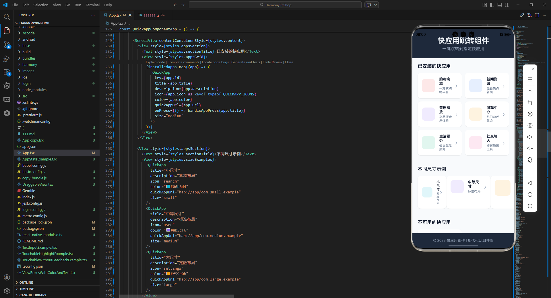
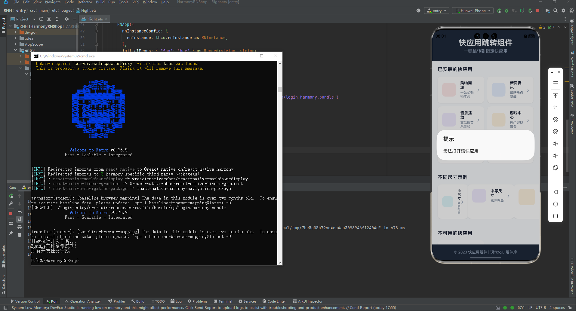
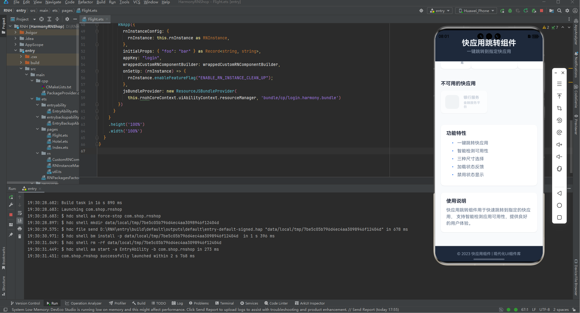
打包
接下来通过打包命令npn run harmony将reactNative的代码打包成为bundle,这样可以进行在开源鸿蒙OpenHarmony中进行使用。

打包之后再将打包后的鸿蒙OpenHarmony文件拷贝到鸿蒙的DevEco-Studio工程目录去:

最后运行效果图如下显示: