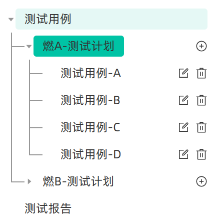
1. 效果图
2. 代码实现
html
<el-tree
  ref="treeRef"
  class="tree-box"
  :data="treeData"
  node-key="nodeId"
  :props="defaultProps"
  :current-node-key="currNodeId"
  highlight-current
  lazy
  :load="loadNode"
  :filter-node-method="filterNode"
  @node-click="handleNodeClick"
>
  <template #default="{ node, data }">
    <div class="custom-tree-node">
      <div class="tree-node-text">{{ node.label }}</div>
      <div class="tree-node-icons">
        <el-icon @click.stop="handleAddNode(data)" v-if="node.level === 2"><CirclePlus /></el-icon>
        <el-icon @click.stop="handleEditNode(data)" v-if="node.level === 3"><Edit /></el-icon>
        <el-icon @click.stop="handleDeleteNode(data)" v-if="node.level === 3"><Delete /></el-icon>
      </div>
    </div>
  </template>
</el-tree>
css
// 重置el-tree默认样式
.tree-box {
	padding: 0 12px 12px;
  overflow: auto;
  border-radius: 0 0 4px 4px;

  .el-button {
    font-size: 16px;
  }
  .el-button + .el-button {
    margin-left: 8px;
  }
  // 树节点内容样式
  .el-tree-node__content {
    height: 100%;
    font-size: 16px;
    line-height: 28px; // 行高变化竖线位置也要相应调整
    color: #333;
    position: relative;
    padding-left: 0 !important;

    &:hover {
      background-color: transparent;
    }
  }
  .el-tree-node__children {
    padding-left: 24px;
  }
  // 树节点展开/折叠图标
  .el-tree-node__expand-icon {
    padding: 0;
    color: #979797;
  }

  // 添加转折线样式
  .el-tree-node {
    position: relative;
    background-color: transparent;

    // "非根节点" "非最后一个子节点" "整体" 前面加竖线,高度为整体的100%
    .el-tree-node__children > .el-tree-node:not(:last-child)::after {
      content: '';
      position: absolute;
      left: -18px;
      top: 0;
      width: 1px;
      height: 100%;
      background-color: #979797;
      z-index: 0;
    }
    // "非根节点" "最后一个子节点" "名称" 前面加竖线,高度为名称的50%
    .el-tree-node__children > .el-tree-node:last-child > .el-tree-node__content::after {
      content: '';
      position: absolute;
      left: -18px;
      top: 0;
      width: 1px;
      height: 50%;
      background-color: #979797;
      z-index: 0;
    }

    // 每个子节点左侧的横线 - 连接到父节点的竖线
    &.is-expanded .el-tree-node__children .el-tree-node__content::before {
      content: '';
      position: absolute;
      left: -18px; // 连接到竖线位置
      top: 50%; // 子节点中间
      width: 18px; // 横线长度
      height: 1px;
      background-color: #979797;
      z-index: 0;
    }

    // 叶子节点没有下箭头,横线宽度加一点
    &.is-leaf > .el-tree-node__content::before {
      width: 26px !important;
    }
  }

  // 当前选中节点高亮样式优化
  .el-tree-node.is-current > .el-tree-node__content {
    background-color: transparent;
    .tree-node-text {
      background-color: #00c3a5;
    }
  }

  .custom-tree-node {
    display: flex;
    align-items: center;
    justify-content: space-between;
    font-size: 16px;
    width: 100%;
    border-radius: 4px;
    margin: 4px 0;

    &:hover {
      background-color: #e5f8f5;
    }

    .tree-node-text {
      white-space: pre-wrap;
      word-break: break-all;
      border-radius: 4px;
      padding: 0 12px !important;
    }
    .tree-node-icons {
      margin-left: 8px;
      display: flex;
      align-items: center;
      font-size: 14px;

      .el-icon {
        font-size: 16px;
      }
      .el-icon + .el-icon {
        margin-left: 8px;
      }
      .el-button {
        font-size: 14px;
      }
    }
  }
}