欢迎加入开源鸿蒙跨平台社区 :https://openharmonycrossplatform.csdn.net
📋 前言
渐变文字效果是提升 UI 视觉吸引力的重要手段。无论是启动页标题、营销活动页面的口号,还是个人主页的个性化签名,渐变文字都能为应用增添独特的视觉魅力。react-native-linear-gradient-text 是一个专门用于实现渐变文字效果的 React Native 组件,支持自定义渐变颜色、方向和文字样式,是实现精美渐变文字效果的首选方案。
🎯 库简介
基本信息
- 库名称 :
react-native-linear-gradient-text - 版本信息 :
1.2.8: 支持 RN 0.72 版本1.2.12: 支持 RN 0.77 版本
- 官方仓库: https://github.com/HMDarkFir3/react-native-linear-gradient-text
- 主要功能 :
- ✨ 渐变文字效果
- 🎨 支持多颜色渐变
- 📐 支持自定义渐变方向
- 📝 支持自定义文字样式
- 📱 跨平台一致性表现
为什么需要 Linear Gradient Text?
| 特性 | 手动实现 | Linear Gradient Text |
|---|---|---|
| 渐变文字 | ⚠️ 需原生代码 | ✅ 组件化实现 |
| 跨平台一致性 | ❌ 表现差异 | ✅ 统一效果 |
| 动态控制 | ⚠️ 复杂实现 | ✅ Props 控制 |
| 文字样式 | ⚠️ 需额外处理 | ✅ 完整支持 |
| HarmonyOS支持 | ❌ 不支持 | ✅ 完整支持 |
🤔 Linear Gradient Text vs MaskedView + LinearGradient
之前我已经适配过MaskedView + LinearGradient 组合了
https://blog.csdn.net/2402_83107102/article/details/159168216
https://blog.csdn.net/2402_83107102/article/details/159163022
Linear Gradient Text是一种新的应用方式,使用起来比较简单,不需要进行很麻烦的组装使用。
方式一:使用 Linear Gradient Text(推荐)
typescript
import { LinearGradientText } from 'react-native-linear-gradient-text';

// 简洁:一行代码实现渐变文字
<LinearGradientText
  text="渐变文字"
  colors={['#667eea', '#764ba2']}
  textStyle={{ fontSize: 32, fontWeight: 'bold' }}
/>
方式二:使用 MaskedView + LinearGradient 组合
typescript
import MaskedView from '@react-native-oh-tpl/masked-view';
import LinearGradient from '@react-native-oh-tpl/react-native-linear-gradient';

// 复杂:需要嵌套多层组件
<MaskedView
  style={{ height: 50 }}
  maskElement={
    <View style={{ backgroundColor: 'transparent', alignItems: 'center' }}>
      <Text style={{ fontSize: 32, fontWeight: 'bold', color: 'black' }}>
        渐变文字
      </Text>
    </View>
  }
>
  <LinearGradient
    colors={['#667eea', '#764ba2']}
    start={{ x: 0, y: 0.5 }}
    end={{ x: 1, y: 0.5 }}
    style={{ flex: 1 }}
  />
</MaskedView>
对比总结
| 特性 | Linear Gradient Text | MaskedView + LinearGradient |
|---|---|---|
| 代码量 | ✅ 少(1个组件) | ⚠️ 多(3个组件嵌套) |
| 学习成本 | ✅ 低 | ⚠️ 需理解遮罩原理 |
| 使用便捷性 | ✅ 开箱即用 | ⚠️ 需手动配置 |
| 灵活性 | ⚠️ 仅限文字渐变 | ✅ 可实现任意形状遮罩 |
| 自定义程度 | ⚠️ 受限于组件属性 | ✅ 完全自由控制 |
| 包体积 | ⚠️ 需额外安装 | ✅ 如已安装依赖则无需额外安装 |
选择建议
- 使用 Linear Gradient Text:只需要简单的渐变文字效果,追求开发效率
- 使用 MaskedView + LinearGradient:需要更复杂的遮罩效果(如形状遮罩、图片遮罩等),或项目已安装相关依赖
兼容性验证
在以下环境验证通过:
- RNOH : 0.72.20; SDK : HarmonyOS NEXT Developer Beta1; IDE : DevEco Studio 5.0.3.200; ROM: 3.0.0.21
⚠️ 依赖说明
本库 HarmonyOS 侧实现依赖以下两个库:
@react-native-oh-tpl/masked-view- 遮罩视图组件@react-native-oh-tpl/react-native-linear-gradient- 线性渐变组件
💡 提示:如已在 HarmonyOS 工程中引入过上述库,则无需再次引入。
📦 安装步骤
虽然这个库使用起来比较容易一些,但是需要依赖之前适配的库,适配的过程在这两篇文章https://blog.csdn.net/2402_83107102/article/details/159168216
https://blog.csdn.net/2402_83107102/article/details/159163022
1. 安装依赖库
首先需要安装本库及其依赖。在项目根目录执行以下命令,本文基于 RN 0.72.90 版本开发:
bash
# 安装 linear-gradient-text
npm install react-native-linear-gradient-text@1.2.8
或者使用 yarn:
bash
yarn add react-native-linear-gradient-text@1.2.82. 验证安装
安装完成后,检查 package.json 文件,应该能看到新增的依赖:
json
{
  "dependencies": {
    "react-native-linear-gradient-text": "1.2.8",
    // ... 其他依赖
  }
}
🔧 HarmonyOS 平台配置 ⭐
由于本库依赖 masked-view 和 linear-gradient,需要先配置这两个依赖库的原生端代码。
1. 在工程根目录的 oh-package.json5 添加 overrides 字段
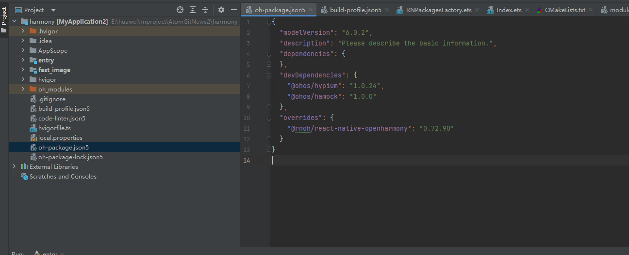
打开 harmony/oh-package.json5,添加以下配置:
json5
{
  // ... 其他配置
  "overrides": {
    "@rnoh/react-native-openharmony": "0.72.90"
  }
}
配置依赖库:masked-view 📦
2.1 在 entry/oh-package.json5 添加依赖
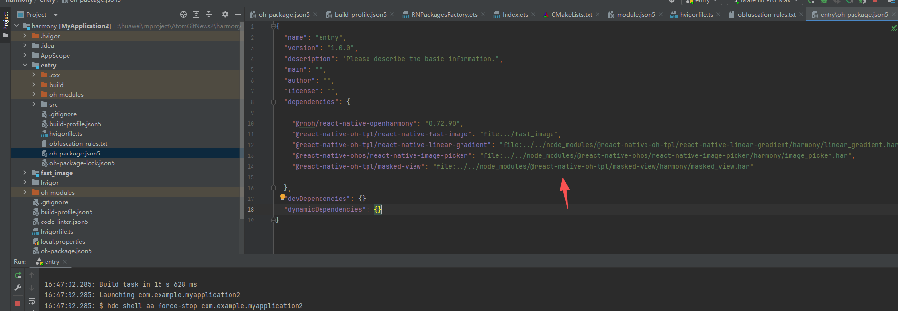
打开 harmony/entry/oh-package.json5,添加以下依赖:
json5
"dependencies": {
  "@rnoh/react-native-openharmony": "0.72.90",
  + "@react-native-oh-tpl/masked-view": "file:../../node_modules/@react-native-oh-tpl/masked-view/harmony/masked_view.har"
}
2.2 配置 CMakeLists.txt(只需要添加带+号的就可以了)
打开 harmony/entry/src/main/cpp/CMakeLists.txt,添加以下配置:
cmake
project(rnapp)
cmake_minimum_required(VERSION 3.4.1)
set(CMAKE_SKIP_BUILD_RPATH TRUE)
set(RNOH_APP_DIR "${CMAKE_CURRENT_SOURCE_DIR}")
set(NODE_MODULES "${CMAKE_CURRENT_SOURCE_DIR}/../../../../../node_modules")
+ set(OH_MODULES "${CMAKE_CURRENT_SOURCE_DIR}/../../../oh_modules")
set(RNOH_CPP_DIR "${CMAKE_CURRENT_SOURCE_DIR}/../../../../../../react-native-harmony/harmony/cpp")
set(LOG_VERBOSITY_LEVEL 1)
set(CMAKE_ASM_FLAGS "-Wno-error- unused-command-line-argument -Qunused-arguments")
set(CMAKE_CXX_FLAGS "-fstack-protector-strong -Wl,-z,relro,-z,now,-z,noexecstack -s -fPIE -pie")
set(WITH_HITRACE_SYSTRACE 1)
add_compile_definitions(WITH_HITRACE_SYSTRACE)

add_subdirectory("${RNOH_CPP_DIR}" ./rn)

# 添加 MaskedView 模块
+ add_subdirectory("${OH_MODULES}/@react-native-oh-tpl/masked-view/src/main/cpp" ./masked-view)

file(GLOB GENERATED_CPP_FILES "./generated/*.cpp")

add_library(rnoh_app SHARED
    ${GENERATED_CPP_FILES}
    "./PackageProvider.cpp"
    "${RNOH_CPP_DIR}/RNOHAppNapiBridge.cpp"
)
target_link_libraries(rnoh_app PUBLIC rnoh)

# 链接 MaskedView 库
+ target_link_libraries(rnoh_app PUBLIC rnoh_masked_view)
2.3 修改 PackageProvider.cpp
打开 harmony/entry/src/main/cpp/PackageProvider.cpp,添加:
cpp
#include "RNOH/PackageProvider.h"
#include "generated/RNOHGeneratedPackage.h"
+ #include "MaskedViewPackage.h"

using namespace rnoh;

std::vector<std::shared_ptr<Package>> PackageProvider::getPackages(Package::Context ctx) {
    return {
        std::make_shared<RNOHGeneratedPackage>(ctx),
        + std::make_shared<MaskedViewPackage>(ctx),
    };
}
同步并运行 🚀
4. 同步依赖
点击 DevEco Studio 右上角的 sync 按钮,或者在终端执行:
bash
cd harmony/entry
ohpm install
然后编译、运行即可。
📖 API 详解
🔷 核心属性(Props)
LinearGradientText 组件提供了简洁而强大的属性配置,以下是详细的 API 说明:
1. text - 文字内容 ⭐
text 是 LinearGradientText 最核心的属性,用于设置要显示的渐变文字内容。
typescript
text: string;| 类型 | 必填 | 说明 |
|---|---|---|
string |
✅ | 要显示的文字内容 |
使用示例:
typescript
<LinearGradientText
  text="Hello World"
  colors={['#E76F00', '#EA374E']}
/>
2. colors - 渐变颜色数组 🎨
colors 用于定义渐变的颜色序列,至少需要两个颜色值。
typescript
colors: string[];| 类型 | 必填 | 说明 |
|---|---|---|
string[] |
✅ | 渐变颜色数组,至少两个颜色 |
使用示例:
typescript
// 双色渐变
<LinearGradientText
  text="渐变文字"
  colors={['#FF6B6B', '#4ECDC4']}
/>

// 多色渐变
<LinearGradientText
  text="多彩渐变"
  colors={['#FF6B6B', '#FFE66D', '#4ECDC4', '#45B7D1']}
/>

// 使用不同颜色格式
<LinearGradientText
  text="颜色格式"
  colors={['rgb(255,107,107)', 'rgba(78,205,196,0.8)']}
/>
3. start - 渐变起点 📍
start 用于定义渐变的起始位置,坐标值为 0-1 之间的比例值。
typescript
start?: { x: number; y: number };| 属性 | 类型 | 默认值 | 说明 |
|---|---|---|---|
x |
number | 0.5 | 水平位置(0=左,1=右) |
y |
number | 0 | 垂直位置(0=上,1=下) |
常用渐变方向配置:
| 效果 | start | end |
|---|---|---|
| 从上到下 | { x: 0.5, y: 0 } |
{ x: 0.5, y: 1 } |
| 从下到上 | { x: 0.5, y: 1 } |
{ x: 0.5, y: 0 } |
| 从左到右 | { x: 0, y: 0.5 } |
{ x: 1, y: 0.5 } |
| 从右到左 | { x: 1, y: 0.5 } |
{ x: 0, y: 0.5 } |
| 左上到右下 | { x: 0, y: 0 } |
{ x: 1, y: 1 } |
| 右上到左下 | { x: 1, y: 0 } |
{ x: 0, y: 1 } |
使用示例:
typescript
// 水平渐变(从左到右)
<LinearGradientText
  text="水平渐变"
  colors={['#667eea', '#764ba2']}
  start={{ x: 0, y: 0.5 }}
  end={{ x: 1, y: 0.5 }}
/>

// 对角渐变
<LinearGradientText
  text="对角渐变"
  colors={['#f093fb', '#f5576c']}
  start={{ x: 0, y: 0 }}
  end={{ x: 1, y: 1 }}
/>
4. end - 渐变终点 📍
end 用于定义渐变的结束位置,与 start 配合使用控制渐变方向。
typescript
end?: { x: number; y: number };| 属性 | 类型 | 默认值 | 说明 |
|---|---|---|---|
x |
number | 1 | 水平位置(0=左,1=右) |
y |
number | 1 | 垂直位置(0=上,1=下) |
使用示例:
typescript
<LinearGradientText
  text="渐变文字"
  colors={['#E76F00', '#EA374E']}
  start={{ x: 0.5, y: 0 }}
  end={{ x: 1, y: 1 }}
/>
5. textStyle - 文字样式 📝
textStyle 用于自定义文字的样式,支持 React Native Text 组件的所有样式属性。
typescript
textStyle?: TextStyle;常用样式属性:
| 属性 | 类型 | 说明 |
|---|---|---|
fontSize |
number | 字体大小 |
fontWeight |
string | 字体粗细 |
fontFamily |
string | 字体名称 |
letterSpacing |
number | 字母间距 |
textAlign |
string | 文字对齐 |
lineHeight |
number | 行高 |
使用示例:
typescript
<LinearGradientText
  text="精美标题"
  colors={['#667eea', '#764ba2']}
  textStyle={{
    fontSize: 40,
    fontWeight: 'bold',
    letterSpacing: 2,
  }}
/>

// 不同字体样式
<LinearGradientText
  text="优雅文字"
  colors={['#f093fb', '#f5576c']}
  textStyle={{
    fontSize: 32,
    fontFamily: 'PingFang SC',
    fontWeight: '600',
    letterSpacing: 4,
  }}
/>
6. textProps - 文字属性 🔧
textProps 用于传递 React Native Text 组件的原生属性。
typescript
textProps?: TextProps;常用属性:
| 属性 | 类型 | 说明 |
|---|---|---|
allowFontScaling |
boolean | 是否允许字体缩放 |
numberOfLines |
number | 最大行数 |
ellipsizeMode |
string | 省略模式 |
adjustsFontSizeToFit |
boolean | 自动调整字体大小 |
selectable |
boolean | 是否可选择 |
使用示例:
typescript
<LinearGradientText
  text="可缩放的渐变文字"
  colors={['#4facfe', '#00f2fe']}
  textStyle={{ fontSize: 36 }}
  textProps={{
    allowFontScaling: true,
    numberOfLines: 1,
    adjustsFontSizeToFit: true,
  }}
/>
💻 完整代码示例

下面是一个完整的示例,展示了 LinearGradientText 的所有 API 应用场景:
typescript
import React, { useState } from 'react';
import {
  View,
  Text,
  StyleSheet,
  ScrollView,
  TouchableOpacity,
  SafeAreaView,
} from 'react-native';
import { LinearGradientText } from 'react-native-linear-gradient-text';

function LinearGradientTextDemo() {
  const [currentDirection, setCurrentDirection] = useState('horizontal');

  const directions = [
    { name: '水平', value: 'horizontal', start: { x: 0, y: 0.5 }, end: { x: 1, y: 0.5 } },
    { name: '垂直', value: 'vertical', start: { x: 0.5, y: 0 }, end: { x: 0.5, y: 1 } },
    { name: '对角', value: 'diagonal', start: { x: 0, y: 0 }, end: { x: 1, y: 1 } },
  ];

  const currentDir = directions.find(d => d.value === currentDirection) || directions[0];

  return (
    <SafeAreaView style={styles.container}>
      <ScrollView style={styles.scrollView} contentContainerStyle={styles.scrollContent}>
        <Text style={styles.title}>✨ LinearGradientText 演示</Text>

        {/* 1. 基础用法 */}
        <View style={styles.section}>
          <Text style={styles.sectionTitle}>1️⃣ 基础用法</Text>
          <Text style={styles.description}>最简单的渐变文字实现</Text>
          <LinearGradientText
            text="Hello World"
            colors={['#E76F00', '#EA374E']}
            textStyle={styles.basicText}
          />
        </View>

        {/* 2. 多色渐变 */}
        <View style={styles.section}>
          <Text style={styles.sectionTitle}>2️⃣ 多色渐变</Text>
          <Text style={styles.description}>使用多个颜色创建丰富的渐变效果</Text>
          <LinearGradientText
            text="彩虹渐变文字"
            colors={['#FF6B6B', '#FFE66D', '#4ECDC4', '#45B7D1', '#A78BFA']}
            textStyle={styles.multiColorText}
          />
        </View>

        {/* 3. 渐变方向 */}
        <View style={styles.section}>
          <Text style={styles.sectionTitle}>3️⃣ 渐变方向控制</Text>
          <Text style={styles.description}>点击按钮切换渐变方向</Text>
          <LinearGradientText
            text="渐变方向"
            colors={['#667eea', '#764ba2']}
            start={currentDir.start}
            end={currentDir.end}
            textStyle={styles.directionText}
          />
          <View style={styles.buttonContainer}>
            {directions.map((dir) => (
              <TouchableOpacity
                key={dir.value}
                style={[
                  styles.directionButton,
                  currentDirection === dir.value && styles.directionButtonActive,
                ]}
                onPress={() => setCurrentDirection(dir.value)}
              >
                <Text style={styles.directionButtonText}>{dir.name}</Text>
              </TouchableOpacity>
            ))}
          </View>
        </View>

        {/* 4. 文字样式 */}
        <View style={styles.section}>
          <Text style={styles.sectionTitle}>4️⃣ 文字样式</Text>
          <Text style={styles.description}>自定义字体大小、粗细、间距等</Text>
          <LinearGradientText
            text="粗体大字"
            colors={['#f093fb', '#f5576c']}
            textStyle={{
              fontSize: 48,
              fontWeight: 'bold',
              letterSpacing: 4,
            }}
          />
          <View style={styles.spacing} />
          <LinearGradientText
            text="优雅细字"
            colors={['#4facfe', '#00f2fe']}
            textStyle={{
              fontSize: 36,
              fontWeight: '300',
              letterSpacing: 8,
            }}
          />
        </View>

        {/* 5. 实际应用场景 */}
        <View style={styles.section}>
          <Text style={styles.sectionTitle}>5️⃣ 实际应用场景</Text>

          {/* 启动页标题 */}
          <View style={styles.applicationCard}>
            <LinearGradientText
              text="欢迎使用"
              colors={['#667eea', '#764ba2']}
              textStyle={{
                fontSize: 42,
                fontWeight: 'bold',
              }}
            />
            <Text style={styles.applicationLabel}>启动页标题</Text>
          </View>

          {/* 营销活动 */}
          <View style={styles.applicationCard}>
            <LinearGradientText
              text="限时特惠"
              colors={['#FF6B6B', '#FFE66D']}
              textStyle={{
                fontSize: 38,
                fontWeight: '800',
              }}
            />
            <Text style={styles.applicationLabel}>营销活动标题</Text>
          </View>

          {/* 个性化签名 */}
          <View style={styles.applicationCard}>
            <LinearGradientText
              text="追逐梦想,永不止步"
              colors={['#4ECDC4', '#45B7D1']}
              textStyle={{
                fontSize: 24,
                fontWeight: '500',
                letterSpacing: 2,
              }}
            />
            <Text style={styles.applicationLabel}>个性化签名</Text>
          </View>
        </View>

        {/* 6. textProps 应用 */}
        <View style={styles.section}>
          <Text style={styles.sectionTitle}>6️⃣ textProps 属性</Text>
          <Text style={styles.description}>传递 Text 组件的原生属性</Text>
          <LinearGradientText
            text="自动调整字体大小"
            colors={['#A78BFA', '#EC4899']}
            textStyle={{ fontSize: 32 }}
            textProps={{
              allowFontScaling: true,
              numberOfLines: 1,
              adjustsFontSizeToFit: true,
            }}
          />
        </View>
      </ScrollView>
    </SafeAreaView>
  );
}

const styles = StyleSheet.create({
  container: {
    flex: 1,
    backgroundColor: '#f5f5f5',
  },
  scrollView: {
    flex: 1,
  },
  scrollContent: {
    padding: 20,
  },
  title: {
    fontSize: 24,
    fontWeight: 'bold',
    color: '#333',
    textAlign: 'center',
    marginBottom: 30,
  },
  section: {
    backgroundColor: '#fff',
    borderRadius: 12,
    padding: 16,
    marginBottom: 16,
    shadowColor: '#000',
    shadowOffset: { width: 0, height: 2 },
    shadowOpacity: 0.1,
    shadowRadius: 4,
    elevation: 3,
  },
  sectionTitle: {
    fontSize: 18,
    fontWeight: 'bold',
    color: '#333',
    marginBottom: 8,
  },
  description: {
    fontSize: 14,
    color: '#666',
    marginBottom: 16,
  },
  basicText: {
    fontSize: 40,
    fontWeight: 'bold',
  },
  multiColorText: {
    fontSize: 36,
    fontWeight: 'bold',
  },
  directionText: {
    fontSize: 44,
    fontWeight: 'bold',
  },
  buttonContainer: {
    flexDirection: 'row',
    justifyContent: 'center',
    marginTop: 16,
    gap: 10,
  },
  directionButton: {
    paddingHorizontal: 20,
    paddingVertical: 10,
    borderRadius: 8,
    backgroundColor: '#f0f0f0',
  },
  directionButtonActive: {
    backgroundColor: '#667eea',
  },
  directionButtonText: {
    fontSize: 14,
    fontWeight: '600',
    color: '#333',
  },
  spacing: {
    height: 16,
  },
  applicationCard: {
    alignItems: 'center',
    paddingVertical: 16,
    marginBottom: 12,
    backgroundColor: '#fafafa',
    borderRadius: 8,
  },
  applicationLabel: {
    fontSize: 12,
    color: '#999',
    marginTop: 8,
  },
});

export default LinearGradientTextDemo;
⚠️ 注意事项与最佳实践
1. 依赖库配置
本库依赖 masked-view 和 linear-gradient,必须先完成这两个依赖库的配置:
typescript
// 确保已安装并配置以下依赖
import { MaskedView } from '@react-native-oh-tpl/masked-view';
import LinearGradient from '@react-native-oh-tpl/react-native-linear-gradient';
2. 最佳实践
typescript
// ✅ 推荐:完整的属性配置
<LinearGradientText
  text="渐变文字"
  colors={['#667eea', '#764ba2']}
  start={{ x: 0, y: 0.5 }}
  end={{ x: 1, y: 0.5 }}
  textStyle={{
    fontSize: 32,
    fontWeight: 'bold',
  }}
/>

// ❌ 不推荐:缺少必要属性
<LinearGradientText
  text="渐变文字"
  colors={['#667eea']}  // 颜色数组至少需要两个颜色
/>
3. 性能优化建议
- 避免过多颜色: 渐变颜色建议 2-4 个,过多会影响渲染性能
- 合理使用字体大小: 过大的字体会增加内存占用
- 复用样式对象: 避免在渲染函数中创建新的样式对象
4. 常见问题排查
问题 1: 文字不显示
- 检查
text属性是否正确设置 - 确认
colors数组至少有两个颜色值 - 检查依赖库是否正确配置
问题 2: 渐变方向不对
- 检查
start和end坐标值 - 确认坐标值在 0-1 范围内
问题 3: 样式不生效
- 确认
textStyle属性格式正确 - 检查是否有样式冲突
📊 API 支持情况总览
属性支持
| 属性 | 说明 | HarmonyOS 支持 |
|---|---|---|
text |
文字内容 | ✅ |
colors |
渐变颜色数组 | ✅ |
start |
渐变起点 | ✅ |
end |
渐变终点 | ✅ |
textStyle |
文字样式 | ✅ |
textProps |
文字属性 | ✅ |