欢迎加入开源鸿蒙跨平台社区 :https://openharmonycrossplatform.csdn.net
📋 前言
SVG(可缩放矢量图形)已经成为不可或缺的技术。无论是图标、图表、还是复杂的矢量插画,SVG 都能提供清晰锐利的显示效果,且不会因缩放而失真。react-native-svg 是 React Native 生态中最流行的 SVG 渲染库,提供了丰富的 SVG 组件支持,让开发者能够在移动端轻松绘制各种矢量图形。
🎯 库简介
基本信息
- 库名称 :
react-native-svg(CAPI版本) - 版本信息 :
15.0.0+@react-native-ohos/react-native-svg: 支持 RN 0.72 版本15.12.0+@react-native-ohos/react-native-svg: 支持 RN 0.77 版本
- 官方仓库: https://github.com/react-native-oh-library/react-native-harmony-svg
- 主要功能 :
- 🎨 完整的 SVG 组件支持
- 📐 支持路径、矩形、圆形、多边形等基础图形
- 🌈 支持线性渐变和径向渐变
- 🖼️ 支持图像嵌入
- 🎭 支持遮罩效果
- 📱 跨平台一致性表现
为什么需要 SVG?
| 特性 | PNG/WebP 图片 | SVG 矢量图形 |
|---|---|---|
| 缩放清晰度 | ⚠️ 放大模糊 | ✅ 任意缩放不失真 |
| 文件大小 | ⚠️ 多倍图体积大 | ✅ 体积小 |
| 动态修改 | ❌ 需替换资源 | ✅ 可动态修改颜色/形状 |
| 动画支持 | ⚠️ 需帧动画 | ✅ 支持属性动画 |
| HarmonyOS支持 | ✅ 原生支持 | ✅ react-native-svg |
支持的 SVG 组件
| 组件 | 说明 | HarmonyOS 支持 |
|---|---|---|
Svg |
SVG 容器组件 | ✅ |
G |
分组容器 | ✅ |
Path |
路径绘制 | ✅ |
Rect |
矩形 | ✅ |
Circle |
圆形 | ✅ |
Ellipse |
椭圆 | ✅ |
Line |
直线 | ✅ |
Polygon |
多边形 | ✅ |
Polyline |
多段线 | ✅ |
Image |
图像 | ✅ (需 Canary3 Sp2+) |
Defs |
定义容器 | ✅ |
LinearGradient |
线性渐变 | ✅ |
RadialGradient |
径向渐变 | ✅ (需 Canary3 Sp2+) |
Stop |
渐变停止点 | ✅ |
Mask |
遮罩 | ✅ |
Symbol |
图形模板 | ✅ |
ClipPath |
剪切路径 | ✅ |
Marker |
标记 | ✅ |
Pattern |
图案 | ✅ |
Text |
文本 | ✅ |
TSpan |
文本片段 | ✅ |
TextPath |
路径文本 | ⚠️ 部分支持 |
SvgAst |
AST 渲染 | ✅ |
兼容性验证
在以下环境验证通过:
- RNOH : 0.72.90; SDK : HarmonyOS 6.0.0 Release SDK; IDE : DevEco Studio 6.0.0.858; ROM: 6.0.0.112
📦 安装步骤
1. 安装依赖
在项目根目录执行以下命令,本文基于 RN 0.72.90 版本开发:
bash
# RN 0.72 版本
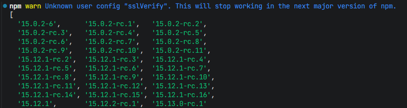
npm install react-native-svg@15.0.0
npm install @react-native-ohos/react-native-svg@15.0.2-rc.1
# 或者使用 yarn
yarn add react-native-svg@15.0.0
yarn add @react-native-ohos/react-native-svg@15.0.2-rc.12. 验证安装
安装完成后,检查 package.json 文件,应该能看到新增的依赖:
json
{
  "dependencies": {
    "react-native-svg": "15.0.0",
    "@react-native-ohos/react-native-svg": "15.0.2-rc.1",
    // ... 其他依赖
  }
}
🔧 HarmonyOS 平台配置 ⭐
由于 HarmonyOS 暂不支持 AutoLink,需要手动配置原生端代码。本文提供 HAR 包引入 和 源码引入 两种方式,可根据实际需求选择。
1. 在工程根目录的 oh-package.json5 添加 overrides 字段
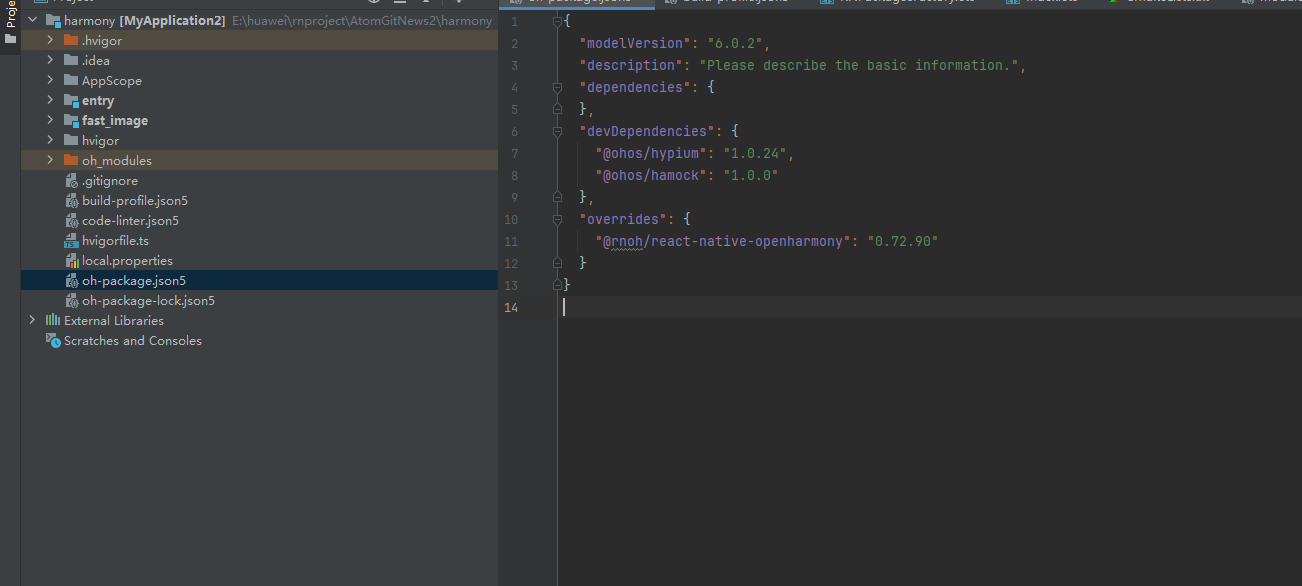
打开 harmony/oh-package.json5,添加以下配置:
json5
{
  // ... 其他配置
  "overrides": {
    "@rnoh/react-native-openharmony": "0.72.90"
  }
}
方式一:HAR 包引入(推荐)📦
HAR 包引入方式简单快捷,适合大多数场景。
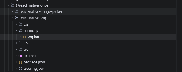
💡 提示 :HAR 包位于三方库安装路径的
harmony文件夹下。
2.1 在 entry/oh-package.json5 添加依赖
打开 harmony/entry/oh-package.json5,添加以下依赖:
json5
"dependencies": {
  "@rnoh/react-native-openharmony": "0.72.90",
  + "@react-native-ohos/react-native-svg": "file:../../node_modules/@react-native-ohos/react-native-svg/harmony/svg.har"
}
2.2 同步依赖
点击 DevEco Studio 右上角的 sync 按钮,或者在终端执行:
bash
cd harmony/entry
ohpm install
2.3 配置 CMakeLists.txt
打开 harmony/entry/src/main/cpp/CMakeLists.txt,添加以下配置:
cmake
project(rnapp)
cmake_minimum_required(VERSION 3.4.1)
set(CMAKE_SKIP_BUILD_RPATH TRUE)
set(RNOH_APP_DIR "${CMAKE_CURRENT_SOURCE_DIR}")
set(NODE_MODULES "${CMAKE_CURRENT_SOURCE_DIR}/../../../../../node_modules")
+ set(OH_MODULES "${CMAKE_CURRENT_SOURCE_DIR}/../../../oh_modules")
set(RNOH_CPP_DIR "${CMAKE_CURRENT_SOURCE_DIR}/../../../../../../react-native-harmony/harmony/cpp")
set(LOG_VERBOSITY_LEVEL 1)
set(CMAKE_ASM_FLAGS "-Wno-error- unused-command-line-argument -Qunused-arguments")
set(CMAKE_CXX_FLAGS "-fstack-protector-strong -Wl,-z,relro,-z,now,-z,noexecstack -s -fPIE -pie")
set(WITH_HITRACE_SYSTRACE 1)
add_compile_definitions(WITH_HITRACE_SYSTRACE)

add_subdirectory("${RNOH_CPP_DIR}" ./rn)

# 添加 SVG 模块(HAR方式)
+ add_subdirectory("${OH_MODULES}/@react-native-ohos/react-native-svg/src/main/cpp" ./svg)

file(GLOB GENERATED_CPP_FILES "./generated/*.cpp")

add_library(rnoh_app SHARED
    ${GENERATED_CPP_FILES}
    "./PackageProvider.cpp"
    "${RNOH_CPP_DIR}/RNOHAppNapiBridge.cpp"
)
target_link_libraries(rnoh_app PUBLIC rnoh)

# 链接 SVG 库
+ target_link_libraries(rnoh_app PUBLIC rnoh_svg)
2.4 修改 PackageProvider.cpp
打开 harmony/entry/src/main/cpp/PackageProvider.cpp,添加:
cpp
#include "RNOH/PackageProvider.h"
#include "generated/RNOHGeneratedPackage.h"
+ #include "SVGPackage.h"

using namespace rnoh;

std::vector<std::shared_ptr<Package>> PackageProvider::getPackages(Package::Context ctx) {
    return {
        std::make_shared<RNOHGeneratedPackage>(ctx),
        + std::make_shared<SVGPackage>(ctx),
    };
}
2.5 在 ArkTs 侧引入 SvgPackage
打开 harmony/entry/src/main/ets/RNPackagesFactory.ts,添加:
typescript
import type { RNPackageContext, RNPackage } from 'rnoh/ts';
+ import { SvgPackage } from '@react-native-ohos/react-native-svg/ts';

export function createRNPackages(ctx: RNPackageContext): RNPackage[] {
  return [
    // ... 其他包
    + new SvgPackage(ctx),
  ];
}
方式二:源码引入 (15.0.2-rc.1没有源码包,只有har)
🔤 字体配置(可选)
💡 提示:本项为可选配置,当使用 Text 组件的 fontFamily 属性指定字体时才需配置。
1. 复制字体文件
复制字体文件到 entry/src/main/resources/rawfile/assets/fonts 目录下:
harmony/entry/src/main/resources/rawfile/assets/fonts/
├── NotoSansVai-Regular.ttf
├── HarmonyOS_Sans_Condensed_Regular_Italic.ttf
└── ...
2. 在 Index.ets 注册字体
打开 harmony/entry/src/main/ets/pages/Index.ets,添加以下代码:
typescript
const fonts: Record<string, Resource> = {
  "Noto Sans Pau Cin Hau": $rawfile("assets/fonts/Noto Sans Pau Cin Hau.ttf"),
  "NotoSansVai-Regular": $rawfile("assets/fonts/NotoSansVai-Regular.ttf"),
  "HarmonyOS_Sans_Condensed_Regular_Italic": $rawfile("assets/fonts/HarmonyOS_Sans_Condensed_Regular_Italic.ttf"),
};

@Entry
@Component
struct Index {
  build() {
    Column() {
      RNApp({
        rnInstanceConfig: {
          // ...
          fontResourceByFontFamily: fonts
        },
        // ...
      })
    }
  }
}
同步并运行 🚀
3. 同步依赖
点击 DevEco Studio 右上角的 sync 按钮,或者在终端执行:
bash
cd harmony/entry
ohpm install
然后编译、运行即可。
📖 API 详解
🔷 基础组件
1. Svg - SVG 容器 ⭐
Svg 是所有 SVG 组件的根容器,用于定义 SVG 画布的尺寸和视区。
typescript
import { Svg } from 'react-native-svg';

<Svg width="100" height="100" viewBox="0 0 100 100">
  {/* 子组件 */}
</Svg>| 属性 | 类型 | 必填 | 说明 |
|---|---|---|---|
width |
number| string | ✅ | SVG 宽度 |
height |
number| string | ✅ | SVG 高度 |
viewBox |
string | ❌ | 视区定义(如 "0 0 100 100") |
color |
string | ❌ | 默认填充颜色 |
preserveAspectRatio |
string | ❌ | 缩放对齐方式 |
使用示例:
typescript
// 基础用法
<Svg width="100" height="100">
  <Rect width="100" height="100" fill="red" />
</Svg>

// 使用 viewBox 缩放
<Svg width="200" height="200" viewBox="0 0 100 100">
  <Circle cx="50" cy="50" r="40" fill="blue" />
</Svg>
2. G - 分组容器 📦
G 元素用于对其他 SVG 元素进行分组,可以统一设置组内元素的属性。
typescript
import { G } from 'react-native-svg';

<G opacity="0.5">
  {/* 组内的所有元素都会继承 opacity */}
  <Rect width="50" height="50" fill="red" />
  <Circle cx="75" cy="25" r="25" fill="blue" />
</G>| 属性 | 类型 | 必填 | 说明 |
|---|---|---|---|
opacity |
number| string | ❌ | 透明度 |
使用示例:
typescript
// 统一设置透明度
<G opacity="0.8">
  <Rect x="10" y="10" width="30" height="30" fill="red" />
  <Rect x="50" y="10" width="30" height="30" fill="blue" />
</G>
🔷 基础图形组件
3. Rect - 矩形 ⬜
Rect 用于绘制矩形,支持圆角。
typescript
import { Rect } from 'react-native-svg';

<Rect x="10" y="10" width="80" height="60" fill="blue" rx="10" ry="10" />| 属性 | 类型 | 必填 | 说明 |
|---|---|---|---|
x |
number| string | ❌ | x 轴偏移 |
y |
number| string | ❌ | y 轴偏移 |
width |
number| string | ✅ | 宽度 |
height |
number| string | ✅ | 高度 |
rx |
number| string | ❌ | x 轴圆角半径 |
ry |
number| string | ❌ | y 轴圆角半径 |
opacity |
number| string | ❌ | 透明度 |
使用示例:
typescript
// 普通矩形
<Rect x="10" y="10" width="80" height="60" fill="#667eea" />

// 圆角矩形
<Rect x="10" y="10" width="80" height="60" fill="#764ba2" rx="15" ry="15" />
4. Circle - 圆形 ⭕
Circle 用于绘制圆形。
typescript
import { Circle } from 'react-native-svg';

<Circle cx="50" cy="50" r="40" fill="red" />| 属性 | 类型 | 必填 | 说明 |
|---|---|---|---|
r |
number| string | ✅ | 半径 |
cx |
number| string | ❌ | 圆心 x 坐标 |
cy |
number| string | ❌ | 圆心 y 坐标 |
opacity |
number | ❌ | 透明度 |
使用示例:
typescript
// 基础圆形
<Circle cx="50" cy="50" r="40" fill="#FF6B6B" />

// 带边框的圆形
<Circle cx="50" cy="50" r="40" fill="none" stroke="#4ECDC4" strokeWidth="3" />
5. Path - 路径 🔀
Path 是最强大的 SVG 组件,可以绘制任意形状。
typescript
import { Path } from 'react-native-svg';

<Path d="M10 10 L90 10 L90 90 Z" fill="blue" />| 属性 | 类型 | 必填 | 说明 |
|---|---|---|---|
d |
string | ✅ | 路径命令字符串 |
opacity |
number | ❌ | 透明度 |
路径命令说明:
| 命令 | 说明 | 示例 |
|---|---|---|
M |
移动到 | M 10 10 |
L |
直线到 | L 90 90 |
H |
水平线 | H 90 |
V |
垂直线 | V 90 |
C |
三次贝塞尔曲线 | C 20 20 40 20 50 10 |
Q |
二次贝塞尔曲线 | Q 95 10 95 80 |
Z |
闭合路径 | Z |
使用示例:
typescript
// 三角形
<Path d="M50 10 L90 90 L10 90 Z" fill="#667eea" />

// 心形
<Path
  d="M50 30 C20 0 0 20 50 60 C100 20 80 0 50 30"
  fill="#FF6B6B"
/>

// 箭头
<Path
  d="M10 50 L50 10 L90 50 L70 50 L70 90 L30 90 L30 50 Z"
  fill="#4ECDC4"
/>
6. Polygon - 多边形 🔷
Polygon 用于创建至少包含三条边的封闭图形。
typescript
import { Polygon } from 'react-native-svg';

<Polygon points="50,10 90,90 10,90" fill="red" />| 属性 | 类型 | 必填 | 说明 |
|---|---|---|---|
points |
string| array | ✅ | 顶点坐标 |
opacity |
number | ❌ | 透明度 |
使用示例:
typescript
// 三角形
<Polygon points="50,10 90,90 10,90" fill="#667eea" />

// 五边形
<Polygon points="50,10 90,35 75,90 25,90 10,35" fill="#764ba2" />

// 星形
<Polygon
  points="50,5 61,40 98,40 68,62 79,97 50,75 21,97 32,62 2,40 39,40"
  fill="#FFE66D"
/>
7. Polyline - 多段线 〰️
Polyline 用于创建一条由多条线段组成的开放路径。
typescript
import { Polyline } from 'react-native-svg';

<Polyline points="10,90 30,50 50,70 70,30 90,50" fill="none" stroke="blue" />| 属性 | 类型 | 必填 | 说明 |
|---|---|---|---|
points |
string| array | ✅ | 端点坐标 |
opacity |
number | ❌ | 透明度 |
使用示例:
typescript
// 折线图
<Polyline
  points="10,90 30,50 50,70 70,30 90,50"
  fill="none"
  stroke="#667eea"
  strokeWidth="2"
/>
🔷 渐变组件
8. LinearGradient - 线性渐变 🌈
LinearGradient 用于定义线性渐变效果。
typescript
import { Defs, LinearGradient, Stop, Rect } from 'react-native-svg';

<Svg width="100" height="100">
  <Defs>
    <LinearGradient id="gradient" x1="0" y1="0" x2="1" y2="0">
      <Stop offset="0%" stopColor="#667eea" />
      <Stop offset="100%" stopColor="#764ba2" />
    </LinearGradient>
  </Defs>
  <Rect width="100" height="100" fill="url(#gradient)" />
</Svg>| 属性 | 类型 | 必填 | 说明 |
|---|---|---|---|
x1 |
number| string | ❌ | 起点 x 坐标 |
y1 |
number| string | ❌ | 起点 y 坐标 |
x2 |
number| string | ❌ | 终点 x 坐标 |
y2 |
number| string | ❌ | 终点 y 坐标 |
gradientUnits |
string | ❌ | 坐标系类型 |
使用示例:
typescript
// 水平渐变
<Defs>
  <LinearGradient id="horizontal" x1="0" y1="0" x2="1" y2="0">
    <Stop offset="0%" stopColor="#FF6B6B" />
    <Stop offset="100%" stopColor="#4ECDC4" />
  </LinearGradient>
</Defs>

// 垂直渐变
<Defs>
  <LinearGradient id="vertical" x1="0" y1="0" x2="0" y2="1">
    <Stop offset="0%" stopColor="#667eea" />
    <Stop offset="100%" stopColor="#764ba2" />
  </LinearGradient>
</Defs>
9. RadialGradient - 径向渐变 🎯
RadialGradient 用于定义径向渐变效果。
typescript
import { Defs, RadialGradient, Stop, Circle } from 'react-native-svg';

<Svg width="100" height="100">
  <Defs>
    <RadialGradient id="radial" cx="50%" cy="50%" r="50%">
      <Stop offset="0%" stopColor="#fff" />
      <Stop offset="100%" stopColor="#000" />
    </RadialGradient>
  </Defs>
  <Circle cx="50" cy="50" r="50" fill="url(#radial)" />
</Svg>| 属性 | 类型 | 必填 | 说明 |
|---|---|---|---|
cx |
number| string | ❌ | 圆心 x 坐标 |
cy |
number| string | ❌ | 圆心 y 坐标 |
r |
number| string | ❌ | 半径 |
fx |
number| string | ❌ | 焦点 x 坐标 |
fy |
number| string | ❌ | 焦点 y 坐标 |
⚠️ 注意: RadialGradient 依赖 Canary3 Sp2 以上版本的 SDK 和 ROM。
10. Stop - 渐变停止点 🛑
Stop 用于定义渐变上的颜色坡度。
typescript
<Stop offset="0%" stopColor="#667eea" stopOpacity="1" />| 属性 | 类型 | 必填 | 说明 |
|---|---|---|---|
offset |
string | ❌ | 渐变位置 |
stopColor |
string | ❌ | 颜色值 |
stopOpacity |
string | ❌ | 透明度 |
🔷 其他组件
11. Image - 图像 🖼️
Image 用于在 SVG 中嵌入图像。
typescript
import { Image } from 'react-native-svg';

<Image
  x="10"
  y="10"
  width="80"
  height="80"
  href="https://example.com/image.png"
/>| 属性 | 类型 | 必填 | 说明 |
|---|---|---|---|
x |
number| string | ❌ | x 坐标 |
y |
number| string | ❌ | y 坐标 |
width |
number| string | ✅ | 宽度 |
height |
number| string | ✅ | 高度 |
href |
source| string | ✅ | 图像源 |
preserveAspectRatio |
string | ❌ | 缩放方式 |
⚠️ 注意: Image 依赖 Canary3 Sp2 以上版本的 SDK 和 ROM。
12. Defs - 定义容器 📋
Defs 用于定义可重用的元素,如渐变、遮罩等。
typescript
import { Defs, LinearGradient, Stop } from 'react-native-svg';

<Defs>
  <LinearGradient id="myGradient">
    <Stop offset="0%" stopColor="red" />
    <Stop offset="100%" stopColor="blue" />
  </LinearGradient>
</Defs>
13. Mask - 遮罩 🎭
Mask 用于定义 alpha 蒙版。
typescript
import { Defs, Mask, Rect, Circle } from 'react-native-svg';

<Svg width="100" height="100">
  <Defs>
    <Mask id="mask">
      <Rect width="100" height="100" fill="white" />
      <Circle cx="50" cy="50" r="30" fill="black" />
    </Mask>
  </Defs>
  <Rect width="100" height="100" fill="blue" mask="url(#mask)" />
</Svg>| 属性 | 类型 | 必填 | 说明 |
|---|---|---|---|
id |
string | ❌ | 唯一标识 |
x |
number | ❌ | x 坐标 |
y |
number | ❌ | y 坐标 |
width |
number | ❌ | 宽度 |
height |
number | ❌ | 高度 |
💻 完整代码示例
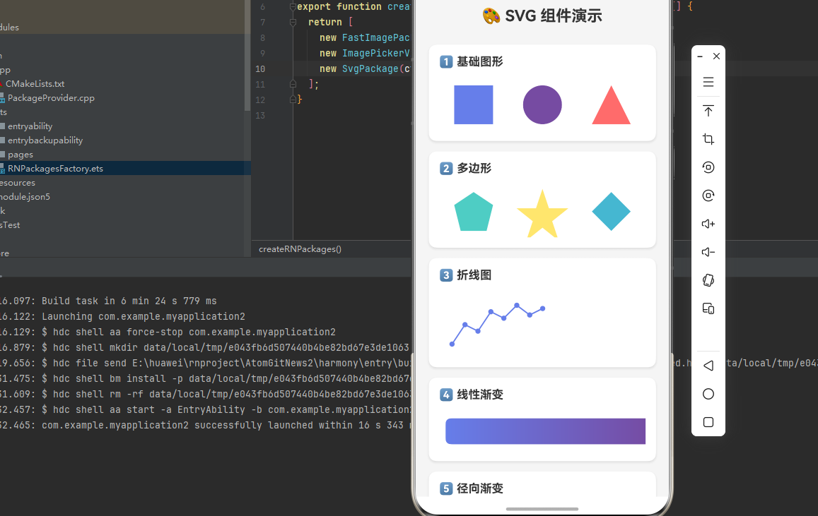
下面是一个完整的示例,展示了 react-native-svg 的各种组件应用:
typescript
import React from 'react';
import { View, Text, StyleSheet, ScrollView, SafeAreaView } from 'react-native';
import Svg, {
  G,
  Rect,
  Circle,
  Path,
  Polygon,
  Polyline,
  Defs,
  LinearGradient,
  RadialGradient,
  Stop,
} from 'react-native-svg';

function SvgDemo() {
  return (
    <SafeAreaView style={styles.container}>
      <ScrollView style={styles.scrollView} contentContainerStyle={styles.scrollContent}>
        <Text style={styles.title}>🎨 SVG 组件演示</Text>

        {/* 1. 基础图形 */}
        <View style={styles.section}>
          <Text style={styles.sectionTitle}>1️⃣ 基础图形</Text>
          <View style={styles.row}>
            <Svg width="80" height="80" style={styles.svgItem}>
              <Rect x="10" y="10" width="60" height="60" fill="#667eea" />
            </Svg>
            <Svg width="80" height="80" style={styles.svgItem}>
              <Circle cx="40" cy="40" r="30" fill="#764ba2" />
            </Svg>
            <Svg width="80" height="80" style={styles.svgItem}>
              <Path d="M40 10 L70 70 L10 70 Z" fill="#FF6B6B" />
            </Svg>
          </View>
        </View>

        {/* 2. 多边形 */}
        <View style={styles.section}>
          <Text style={styles.sectionTitle}>2️⃣ 多边形</Text>
          <View style={styles.row}>
            <Svg width="80" height="80" style={styles.svgItem}>
              <Polygon points="40,10 70,30 60,70 20,70 10,30" fill="#4ECDC4" />
            </Svg>
            <Svg width="80" height="80" style={styles.svgItem}>
              <Polygon
                points="40,5 50,35 80,35 55,55 65,85 40,65 15,85 25,55 0,35 30,35"
                fill="#FFE66D"
              />
            </Svg>
            <Svg width="80" height="80" style={styles.svgItem}>
              <Polygon points="40,10 70,40 40,70 10,40" fill="#45B7D1" />
            </Svg>
          </View>
        </View>

        {/* 3. 折线图 */}
        <View style={styles.section}>
          <Text style={styles.sectionTitle}>3️⃣ 折线图</Text>
          <Svg width="100%" height="100">
            <Polyline
              points="20,80 40,50 60,60 80,30 100,40 120,20 140,35 160,25"
              fill="none"
              stroke="#667eea"
              strokeWidth="2"
            />
            {/* 数据点 */}
            <Circle cx="20" cy="80" r="4" fill="#667eea" />
            <Circle cx="40" cy="50" r="4" fill="#667eea" />
            <Circle cx="60" cy="60" r="4" fill="#667eea" />
            <Circle cx="80" cy="30" r="4" fill="#667eea" />
            <Circle cx="100" cy="40" r="4" fill="#667eea" />
            <Circle cx="120" cy="20" r="4" fill="#667eea" />
            <Circle cx="140" cy="35" r="4" fill="#667eea" />
            <Circle cx="160" cy="25" r="4" fill="#667eea" />
          </Svg>
        </View>

        {/* 4. 线性渐变 */}
        <View style={styles.section}>
          <Text style={styles.sectionTitle}>4️⃣ 线性渐变</Text>
          <Svg width="100%" height="60">
            <Defs>
              <LinearGradient id="grad1" x1="0" y1="0" x2="1" y2="0">
                <Stop offset="0%" stopColor="#667eea" />
                <Stop offset="100%" stopColor="#764ba2" />
              </LinearGradient>
            </Defs>
            <Rect x="10" y="10" width="100%" height="40" rx="8" fill="url(#grad1)" />
          </Svg>
        </View>

        {/* 5. 径向渐变 */}
        <View style={styles.section}>
          <Text style={styles.sectionTitle}>5️⃣ 径向渐变</Text>
          <Svg width="100%" height="100">
            <Defs>
              <RadialGradient id="radial1" cx="50%" cy="50%" r="50%">
                <Stop offset="0%" stopColor="#fff" />
                <Stop offset="100%" stopColor="#667eea" />
              </RadialGradient>
            </Defs>
            <Circle cx="50%" cy="50" r="45" fill="url(#radial1)" />
          </Svg>
        </View>

        {/* 6. 分组与透明度 */}
        <View style={styles.section}>
          <Text style={styles.sectionTitle}>6️⃣ 分组与透明度</Text>
          <Svg width="100%" height="80">
            <G opacity="0.8">
              <Rect x="10" y="10" width="50" height="50" fill="#FF6B6B" />
              <Rect x="40" y="10" width="50" height="50" fill="#4ECDC4" />
              <Rect x="70" y="10" width="50" height="50" fill="#FFE66D" />
            </G>
          </Svg>
        </View>

        {/* 7. 复杂图形 */}
        <View style={styles.section}>
          <Text style={styles.sectionTitle}>7️⃣ 复杂图形 - 心形</Text>
          <Svg width="100" height="100">
            <Defs>
              <LinearGradient id="heartGrad" x1="0" y1="0" x2="1" y2="1">
                <Stop offset="0%" stopColor="#FF6B6B" />
                <Stop offset="100%" stopColor="#EE5A5A" />
              </LinearGradient>
            </Defs>
            <Path
              d="M50 30 C20 0 0 25 50 70 C100 25 80 0 50 30"
              fill="url(#heartGrad)"
            />
          </Svg>
        </View>

        {/* 8. 图标示例 */}
        <View style={styles.section}>
          <Text style={styles.sectionTitle}>8️⃣ 图标示例</Text>
          <View style={styles.row}>
            {/* 首页图标 */}
            <Svg width="40" height="40" style={styles.svgItem}>
              <Path
                d="M20 5 L35 15 L35 35 L25 35 L25 25 L15 25 L15 35 L5 35 L5 15 Z"
                fill="#667eea"
              />
            </Svg>
            {/* 搜索图标 */}
            <Svg width="40" height="40" style={styles.svgItem}>
              <Circle cx="16" cy="16" r="10" fill="none" stroke="#764ba2" strokeWidth="3" />
              <Path d="M24 24 L35 35" stroke="#764ba2" strokeWidth="3" strokeLinecap="round" />
            </Svg>
            {/* 设置图标 */}
            <Svg width="40" height="40" style={styles.svgItem}>
              <Path
                d="M20 14 A6 6 0 1 0 20 26 A6 6 0 1 0 20 14 M20 5 L22 10 L27 10 L23 14 L25 19 L30 17 L28 22 L33 22 L28 24 L30 29 L25 27 L23 32 L20 28 L17 32 L15 27 L10 29 L12 24 L7 22 L12 22 L10 17 L15 19 L17 14 L13 10 L18 10 Z"
                fill="#FF6B6B"
              />
            </Svg>
          </View>
        </View>
      </ScrollView>
    </SafeAreaView>
  );
}

const styles = StyleSheet.create({
  container: {
    flex: 1,
    backgroundColor: '#f5f5f5',
  },
  scrollView: {
    flex: 1,
  },
  scrollContent: {
    padding: 20,
  },
  title: {
    fontSize: 24,
    fontWeight: 'bold',
    color: '#333',
    textAlign: 'center',
    marginBottom: 30,
  },
  section: {
    backgroundColor: '#fff',
    borderRadius: 12,
    padding: 16,
    marginBottom: 16,
    shadowColor: '#000',
    shadowOffset: { width: 0, height: 2 },
    shadowOpacity: 0.1,
    shadowRadius: 4,
    elevation: 3,
  },
  sectionTitle: {
    fontSize: 18,
    fontWeight: 'bold',
    color: '#333',
    marginBottom: 16,
  },
  row: {
    flexDirection: 'row',
    justifyContent: 'space-around',
    alignItems: 'center',
  },
  svgItem: {
    marginHorizontal: 8,
  },
});

export default SvgDemo;
⚠️ 注意事项与最佳实践
1. 性能优化
typescript
// ✅ 推荐:使用 viewBox 进行缩放
<Svg width="200" height="200" viewBox="0 0 100 100">
  <Circle cx="50" cy="50" r="40" fill="blue" />
</Svg>

// ⚠️ 避免:复杂的嵌套结构
// 尽量减少 G 组件的嵌套层级
2. 渐变使用
typescript
// ✅ 推荐:在 Defs 中定义渐变,通过 id 引用
<Svg>
  <Defs>
    <LinearGradient id="myGradient">
      <Stop offset="0%" stopColor="red" />
      <Stop offset="100%" stopColor="blue" />
    </LinearGradient>
  </Defs>
  <Rect fill="url(#myGradient)" />
</Svg>
3. 常见问题排查
问题 1: SVG 不显示
- 检查 Svg 组件是否设置了 width 和 height
- 确认子组件是否正确嵌套在 Svg 内
- 检查原生配置是否正确
问题 2: 渐变不生效
- 确认 LinearGradient 定义在 Defs 内
- 检查 fill 属性是否正确引用 id(如
url(#gradientId)) - 确保 id 唯一
问题 3: 图像不显示
- 检查 href 路径是否正确
- 确认 SDK 版本是否满足要求(Canary3 Sp2 以上)
📊 API 支持情况总览
组件支持
| 组件 | 说明 | HarmonyOS 支持 |
|---|---|---|
Svg |
SVG 容器 | ✅ |
G |
分组容器 | ✅ |
Path |
路径 | ✅ |
Rect |
矩形 | ✅ |
Circle |
圆形 | ✅ |
Ellipse |
椭圆 | ✅ |
Line |
直线 | ✅ |
Polygon |
多边形 | ✅ |
Polyline |
多段线 | ✅ |
Image |
图像 | ✅ (需 Canary3 Sp2+) |
Defs |
定义容器 | ✅ |
LinearGradient |
线性渐变 | ✅ |
RadialGradient |
径向渐变 | ✅ (需 Canary3 Sp2+) |
Stop |
渐变停止点 | ✅ |
Mask |
遮罩 | ✅ |
Symbol |
图形模板 | ✅ |
ClipPath |
剪切路径 | ✅ |
Marker |
标记 | ✅ |
Pattern |
图案 | ✅ |
Text |
文本 | ✅ |
TSpan |
文本片段 | ✅ |
TextPath |
路径文本 | ⚠️ 部分支持 |
SvgAst |
AST 渲染 | ✅ |
大佬们有问题在评论区留言呀,或者到官方仓库提issue