欢迎加入开源鸿蒙跨平台社区 :https://openharmonycrossplatform.csdn.net
📋 前言
验证码输入场景非常常见,如短信验证码登录、邮箱验证、支付密码输入等。一个优秀的验证码输入组件需要提供良好的用户体验,包括自动聚焦、输入完成自动跳转、粘贴支持等功能。react-native-confirmation-code-field 是 React Native 生态中最流行的验证码输入组件库,提供了灵活的 API 和丰富的自定义选项。
🎯 库简介
基本信息
- 库名称 :
react-native-confirmation-code-field - 版本信息 :
7.3.2: 支持 RN 0.72 版本8.0.0: 支持 RN 0.77 版本
- 官方仓库: https://github.com/retyui/react-native-confirmation-code-field
- 主要功能 :
- 🔢 灵活的验证码输入组件
- 📱 支持自定义单元格样式
- ⌨️ 自动键盘管理
- 📋 支持粘贴验证码
- 🎯 输入完成自动失焦
- 🔧 丰富的 Hooks 支持
为什么选择这个库?
| 特性 | 自定义实现 | react-native-confirmation-code-field |
|---|---|---|
| 开发效率 | ⚠️ 需要大量代码 | ✅ 开箱即用 |
| 粘贴支持 | ⚠️ 需额外处理 | ✅ 原生支持 |
| 键盘管理 | ⚠️ 需手动处理 | ✅ 自动管理 |
| 自定义样式 | ✅ 完全自由 | ✅ 完全自由 |
| 维护成本 | ⚠️ 需持续维护 | ✅ 社区维护 |
| HarmonyOS支持 | ⚠️ 需自行适配 | ✅ 完美支持 |
核心组件
| 组件 | 说明 | HarmonyOS 支持 |
|---|---|---|
CodeField |
验证码输入容器组件 | ✅ |
Cursor |
光标闪烁动画组件 | ✅ |
MaskSymbol |
密码遮罩符号组件 | ✅ |
核心 Hooks
| Hook | 说明 | HarmonyOS 支持 |
|---|---|---|
useBlurOnFulfill |
输入完成自动失焦 | ✅ |
useClearByFocusCell |
点击单元格清除后续内容 | ✅ |
兼容性验证
在以下环境验证通过:
- RNOH : 0.72.90; SDK : OpenHarmony 6.0.0; IDE : DevEco Studio 6.0.2; ROM: 6.0.0
📦 安装步骤
1. 安装依赖
在项目根目录执行以下命令:
bash
# RN 0.72 版本
npm install react-native-confirmation-code-field@7.3.2

# RN 0.77 版本
npm install react-native-confirmation-code-field@8.0.0

# 或者使用 yarn
yarn add react-native-confirmation-code-field@7.3.2
2. 验证安装
安装完成后,检查 package.json 文件,应该能看到新增的依赖:
json
{
  "dependencies": {
    "react-native-confirmation-code-field": "7.3.2",
    // ... 其他依赖
  }
}
🔧 HarmonyOS 平台配置
💡 特别说明 :
react-native-confirmation-code-field是纯 JavaScript 库,无需任何原生代码配置,安装后即可直接使用!
这意味着:
- ✅ 不需要修改 CMakeLists.txt
- ✅ 不需要修改 PackageProvider.cpp
- ✅ 不需要修改 RNPackagesFactory.ts
- ✅ 不需要同步 ohpm 依赖
📖 API 详解
🔷 组件
1. CodeField - 验证码输入容器 ⭐
CodeField 是核心组件,用于渲染验证码输入区域。
| 属性 | 类型 | 必填 | 说明 |
|---|---|---|---|
cellCount |
number | ✅ | 验证码位数,默认为 4 |
value |
string | ✅ | 输入值 |
onChangeText |
function | ✅ | 文本变化回调 |
renderCell |
function | ❌ | 渲染单元格函数 |
RootComponent |
ComponentType | ❌ | 自定义根组件,默认为 View |
rootStyle |
StyleProp | ❌ | 根组件样式 |
textInputStyle |
StyleProp<TextStyle> | ❌ | 隐藏 TextInput 的样式(用于调试) |
renderCell 函数参数:
| 参数 | 类型 | 说明 |
|---|---|---|
index |
number | 单元格索引 |
symbol |
string | 当前单元格的字符 |
isFocused |
boolean | 当前单元格是否聚焦 |
2. Cursor - 光标组件 📍
Cursor 用于在聚焦的单元格中显示闪烁的光标动画。
| 属性 | 类型 | 必填 | 说明 |
|---|---|---|---|
delay |
number | ❌ | 闪烁间隔(ms) |
style |
object | ❌ | 自定义样式 |
3. MaskSymbol - 密码遮罩组件 🔒
MaskSymbol 用于将验证码显示为密码遮罩(如圆点或星号)。
| 属性 | 类型 | 必填 | 说明 |
|---|---|---|---|
maskSymbol |
string | ✅ | 遮罩符号(如 ● 或 *) |
isLastFilledCell |
boolean | ❌ | 是否为最后一个已填格 |
🔷 Hooks
1. useBlurOnFulfill - 自动失焦 ⭐
当验证码输入完成时,自动让 TextInput 失去焦点。
| 参数 | 类型 | 必填 | 说明 |
|---|---|---|---|
value |
string | ✅ | 当前输入值 |
cellCount |
number | ✅ | 验证码位数 |
返回值:TextInput 的 ref 对象
2. useClearByFocusCell - 点击清除 🎯
点击某个单元格时,清除该位置及之后的所有字符。
| 参数 | 类型 | 必填 | 说明 |
|---|---|---|---|
value |
string | ✅ | 当前输入值 |
setValue |
function | ✅ | 设置值的函数 |
返回值:
| 返回值 | 类型 | 说明 |
|---|---|---|
props |
object | 需要展开到 CodeField 的 props |
getCellOnLayoutHandler |
function | 返回 onLayout 处理函数 |
💡 完整示例
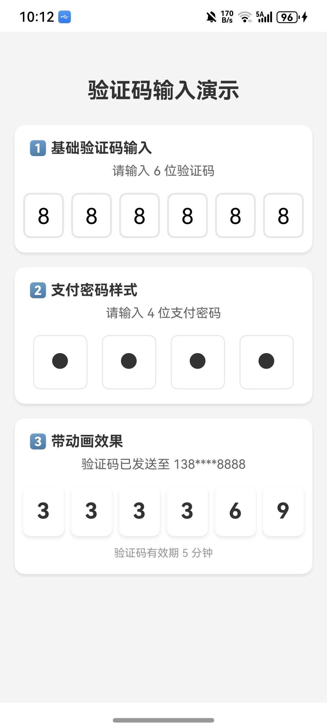
以下示例整合了验证码输入的多种场景:基础验证码、密码输入样式、带动画效果。
typescript
import React, { useState } from 'react';
import { SafeAreaView, Text, StyleSheet, View, ScrollView, Animated } from 'react-native';
import {
  CodeField,
  Cursor,
  MaskSymbol,
  useBlurOnFulfill,
  useClearByFocusCell,
} from 'react-native-confirmation-code-field';

const CELL_COUNT = 6;

const ConfirmationCodeFieldDemo = () => {
  const [code, setCode] = useState('');
  const [password, setPassword] = useState('');
  const codeRef = useBlurOnFulfill({ value: code, cellCount: CELL_COUNT });
  const [codeProps, getCodeOnLayoutHandler] = useClearByFocusCell({ value: code, setValue: setCode });
  const passwordRef = useBlurOnFulfill({ value: password, cellCount: 4 });
  const [passwordProps, getPasswordOnLayoutHandler] = useClearByFocusCell({ value: password, setValue: setPassword });

  return (
    <SafeAreaView style={styles.container}>
      <ScrollView contentContainerStyle={styles.content}>
        <Text style={styles.pageTitle}>验证码输入演示</Text>

        <View style={styles.section}>
          <Text style={styles.sectionTitle}>1️⃣ 基础验证码输入</Text>
          <CodeField
            ref={codeRef}
            {...codeProps}
            value={code}
            onChangeText={setCode}
            cellCount={CELL_COUNT}
            rootStyle={styles.codeFieldRoot}
            keyboardType="number-pad"
            textContentType="oneTimeCode"
            renderCell={({ index, symbol, isFocused }) => (
              <Text key={index} style={[styles.cell, isFocused && styles.focusCell]} onLayout={getCodeOnLayoutHandler(index)}>
                {symbol || (isFocused ? <Cursor /> : null)}
              </Text>
            )}
          />
        </View>

        <View style={styles.section}>
          <Text style={styles.sectionTitle}>2️⃣ 支付密码样式</Text>
          <CodeField
            ref={passwordRef}
            {...passwordProps}
            value={password}
            onChangeText={setPassword}
            cellCount={4}
            rootStyle={styles.codeFieldRoot}
            keyboardType="number-pad"
            renderCell={({ index, symbol, isFocused }) => (
              <View key={index} style={[styles.passwordCell, isFocused && styles.focusCell]} onLayout={getPasswordOnLayoutHandler(index)}>
                <Text style={styles.cellText}>
                  {symbol ? <MaskSymbol maskSymbol="●" isLastFilledCell={index === password.length - 1}>{symbol}</MaskSymbol> : isFocused && <Cursor />}
                </Text>
              </View>
            )}
          />
        </View>
      </ScrollView>
    </SafeAreaView>
  );
};

const styles = StyleSheet.create({
  container: { flex: 1, backgroundColor: '#F5F5F5' },
  content: { padding: 16 },
  pageTitle: { fontSize: 24, fontWeight: 'bold', textAlign: 'center', color: '#333', marginBottom: 24 },
  section: { backgroundColor: '#FFF', borderRadius: 12, padding: 16, marginBottom: 16 },
  sectionTitle: { fontSize: 16, fontWeight: 'bold', color: '#333', marginBottom: 16 },
  codeFieldRoot: { justifyContent: 'center' },
  cell: { width: 45, height: 50, lineHeight: 48, fontSize: 24, borderWidth: 2, borderColor: '#E5E5EA', borderRadius: 8, textAlign: 'center', marginHorizontal: 4 },
  focusCell: { borderColor: '#007AFF', backgroundColor: '#F0F8FF' },
  passwordCell: { width: 60, height: 60, borderWidth: 1, borderColor: '#E5E5EA', borderRadius: 8, marginHorizontal: 8, justifyContent: 'center', alignItems: 'center' },
  cellText: { fontSize: 24, fontWeight: 'bold', color: '#333' },
});

export default ConfirmationCodeFieldDemo;
⚠️ 注意事项
1. 键盘类型
建议使用 keyboardType="number-pad" 以显示数字键盘:
typescript
<CodeField keyboardType="number-pad" />2. iOS 自动填充
在 iOS 上,设置 textContentType="oneTimeCode" 可以支持短信验证码自动填充:
typescript
<CodeField textContentType="oneTimeCode" />3. Android 自动填充
Android 上需要设置 autoComplete="smsOtpCode":
typescript
<CodeField autoComplete="smsOtpCode" />4. 样式注意事项
- 单元格宽度需要固定,不要使用
flex: 1 - 使用
lineHeight确保文本垂直居中 - 边框样式建议使用
borderWidth而非borderBottomWidth(iOS 兼容性)
📚 开源协议
本项目基于 MIT License,请自由地享受和参与开源。