目录
- [echarts 引用](#echarts 引用)
- tooltip: (提示框组件)
- legend: (图例)
- toolbox: (工具栏)
- grid: (配置项:图标离容器的距离)
- yAxis:
- 创建/清除/重绘/销毁echarts实例
- 标签重叠
- echarts例子(最大值和最小值)
echarts 引用
js
<script>
import * as echarts from "echarts5";
export default {
     mounted() {
        // 窗口自适应,关键代码
        window.onresize = () => {
            echarts.init(this.$refs.ruler_eChart).resize();
        };
     },
      //注销window.onresize事件
     beforeDestroy() {
        window.onresize = null;
     },
}
</script>
tooltip: (提示框组件)
js
tooltip: {                                      	            // 提示框组件:可以设置在全局(tooltip),可以设置在坐标系中(grid.tooltip、polar.tooltip、single.tooltip),可以设置在系列中(series.tooltip),可以设置在系列的每个数据项中(series.data.tooltip)
	show: true,										            // 是否显示提示框组件。包括提示框浮层和 axisPointer。
    trigger: 'item',                            	            // 触发类型,'item'数据项图形触发,主要在散点图,饼图等无类目轴的图表中使用。 'axis'坐标轴触发,主要在柱状图,折线图等会使用类目轴的图表中使用。'none' 什么都不触发
    triggerOn: 'mousemove',                     	            // 提示框触发的条件,'mousemove'鼠标移动时触发。'click'鼠标点击时触发。'mousemove|click'同时鼠标移动和点击时触发。'none'不在 'mousemove' 或 'click' 时触发
	showContent: true,                          	            // 是否显示提示框浮层,默认显示。只需tooltip触发事件或显示axisPointer而不需要显示内容时可配置该项为false
    alwaysShowContent: true,                    	            // 是否永远显示提示框内容,默认情况下在移出可触发提示框区域后一定时间(见下方hideDelay睡醒)后隐藏,设置为true可以保证一直显示提示框内容
    showDelay: 0,                               	            // 浮层显示的延迟,单位为 ms,默认没有延迟,也不建议设置。在triggerOn(提示框触发的条件)为 'mousemove' 时有效
    hideDelay: 100,                             	            // 浮层隐藏的延迟,单位为 ms,在alwaysShowContent为true的时候无效
    enterable: false,                           	            // 鼠标是否可进入提示框浮层中,默认为false,如需详情内交互,如添加链接,按钮,可设置为true
    renderMode: 'html',                         	            // 浮层的渲染模式,默认以'html'即额外的DOM节点展示tooltip;此外还可以设置为'richText'表示以富文本的形式渲染,渲染的结果在图表对应的Canvas中(目前SVG尚未支持富文本),这对于一些没有DOM的环境(如微信小程序)有更好的支持。
	confine: false,                             	            // 是否将tooltip框限制在图表的区域内。当图表外层的dom被设置为'overflow:hidden',或者移动端窄屏,导致tooltip超出外界被截断时,此配置比较有用
    appendToBody: false,                        	            // (从v4.7.0开始支持)是否将tooltip的DOM节点添加为HTML的<body>的子节点。只有当renderMode为'html'是有意义的
	className: 'echarts-tooltip echarts-tooltip-dark'           // (从v5.0.0开始支持)指定 tooltip 的 DOM 节点的 CSS 类。(只在 html 模式下生效)
	transitionDuration: 0.4,                                    // 提示框浮层的移动动画过渡时间,单位是s,设置为0的时候会紧跟着鼠标移动。
    position: ['50%', '50%'],                                   // (这里是相对位置,放置在容器正中间)提示框浮层的位置,默认不设置时位置会跟随鼠标的位置,[10, 10],回掉函数,inside鼠标所在图形的内部中心位置,top、left、bottom、right鼠标所在图形上侧,左侧,下侧,右侧,
    formatter: '{b0}: {c0}<br />{b1}: {c1}',                    // 提示框浮层内容格式器,支持字符串模板和回调函数两种形式,模板变量有 {a}, {b},{c},{d},{e},分别表示系列名,数据名,数据值等,具体见下图
    backgroundColor: 'rgba(50,50,50,0.7)',                      // 提示框浮层的背景颜色
    borderColor: '#333',                                        // 提示框浮层的边框颜色
    borderWidth: 0,                                             // 提示框浮层的边框宽
    padding: [
        5,  // 上
        10, // 右
        5,  // 下
        10, // 左
    ],                                                          // 提示框浮层内边距,单位px,默认各方向内边距为5,接受数组分别设定上右下左边距
    textStyle: {                                                // 提示框浮层的文本样式
        color: '#fff',                                          // 文字的颜色
        fontStyle: 'normal',                                    // 文字字体的风格 可选:'normal'(常规) 'italic'(斜体) 'oblique'(倾斜)
        fontWeight: 'normal',                                   // 文字字体的粗细 可选:'normal'(常规) 'bold'(粗体) 'bolder'(加粗) 'lighter'(细体) 100 | 200 | 300 | 400...(像素)
		fontFamily: 'sans-serif',                               // 文字的字体系列 'serif' , 'monospace', 'Arial', 'Courier New', 'Microsoft YaHei', ...
		fontSize: 14,                                           // 文字的字体大小
		lineHeight: 56,                                         // 行高
		width: 15,                                              // 文本显示宽度
		height: 15,                                             // 文本显示高度
		textBorderColor: '#333',                                // 文字本身的描边颜色
		textBorderWidth: 2,                                     // 文字本身的描边宽度
		textBorderType: 'solid',                                // 文字本身的描边类型  可选:'solid'(实线) 'dashed'(虚线) 'dotted' 自v5.0.0开始,也可以是number或者number数组 如:textBorderType: [5, 10],用以指定线条的 dash array,配合textBorderDashOffset可实现更灵活的虚线效果
		textBorderDashOffset: 5,                                // (从v5.0.0开始支持)用于设置虚线的偏移量,可搭配 textBorderType 指定 dash array 实现灵活的虚线效果
		textShadowColor: 'transparent',                         // 文字本身的阴影颜色
		textShadowBlur: 0,                                      // 文字本身的阴影长度
		textShadowOffsetX: 0,                                   // 文字本身的阴影X偏移
		textShadowOffsetY: 0,                                   // 文字本身的阴影Y偏移
		overflow: 'none',                                       // 文字超出宽度是否截断或者换行。配置width时有效'truncate'截断,并在末尾显示ellipsis配置的文本,默认为... 'break' 换行'breakAll'换行,跟'break'不同的是,在英语等拉丁文中,'breakAll'还会强制单词内换行
		textShadowBlur: 0,                                      // 文字本身的阴影长度
		ellipsis: '这里是末尾显示的文本',                        // 在overflow配置为'truncate'的时候,可以通过该属性配置末尾显示的文本
		extraCssText: 'box-shadow: 0 0 3px rgba(0, 0, 0, 0.3);',// 额外附加到浮层的css样式。如左面为浮层添加阴影的示例
		order: 'seriesAsc',                                     // (从v5.0.0开始支持)多系列提示框浮层排列顺序。默认值为 'seriesAsc' 提示框排列顺序可选值:'seriesAsc'根据系列声明, 升序排列。 'seriesDesc'根据系列声明, 降序排列。 'valueAsc'根据数据值, 升序排列。 'valueDesc'根据数据值, 降序排列。
    },
	extraCssText: 'box-shadow: 0 0 3px rgba(0, 0, 0, 0.3);' ,   // 额外附加到浮层的css样式。如左面为浮层添加阴影的示例
	order:'seriesAsc',                                        // (从v5.0.0开始支持)多系列提示框浮层排列顺序。默认值为 'seriesAsc'
	// 注意版本支持
};
legend: (图例)
js
legend: {
     show:true,
     type: 'plain', // 'plain':普通图例,适用于数据较少时;'scroll':滚动图例,适用于大量数据的展示;'paging':翻页图例,适用于大量数据的展示。
     orient: 'horizontal', //布局方式:  horizontal/vertical
     x: 'center', // 水平安放位置,默认为全图居中,可选: 'center' ¦ 'left' ¦ 'right'  或 {number}(x坐标,单位px)
     y: 'top', //垂直安放位置,默认为全图顶端,可选: 'top' ¦ 'bottom' ¦ 'center' 或 {number}(y坐标,单位px)
     textStyle: {
       color: '#D4E2FF',
       fontStyle:"normal", // 图例文本的字体风格,如'normal'、'italic'、'oblique'。
       fontWeight:'normal', // 图例文本的字体粗细,如'normal'、'bold'、'bolder'、'lighter'。
       fontSize:12,
     },
     top: '8%',
     data: [{
	       name: '昨日',
	       icon: 'rect', //'circle', 'rect', 'roundRect', 'triangle', 'diamond', 'pin', 'arrow', 'none'
	       textStyle: {
	         //color: colors[2] // 图例文字颜色
	       }
	     }
     ],
     backgroundColor: 'none',
     borderColor: 'none',
     borderWidth: 0,
     // padding: 5,
     itemGap: 10,
     itemWidth: 12, //图例宽
     itemHeight: 8, //图例高
  },
toolbox: (工具栏)
js
toolbox:{
  show : true,                                 //是否显示工具栏组件
  orient:"horizontal",                        //工具栏 icon 的布局朝向'horizontal' 'vertical'
  itemSize:15,                                 //工具栏 icon 的大小
  itemGap:10,                                  //工具栏 icon 每项之间的间隔
  showTitle:true,                             //是否在鼠标 hover 的时候显示每个工具 icon 的标题
  feature : {
      mark : {                                 // '辅助线开关'
          show: true
      },
      dataView : {                            //数据视图工具,可以展现当前图表所用的数据,编辑后可以动态更新
          show: true,                         //是否显示该工具。
          title:"数据视图",
          readOnly: false,                    //是否不可编辑(只读)
          lang: ['数据视图', '关闭', '刷新'],  //数据视图上有三个话术,默认是['数据视图', '关闭', '刷新']
          backgroundColor:"#fff",             //数据视图浮层背景色。
          textareaColor:"#fff",               //数据视图浮层文本输入区背景色
          textareaBorderColor:"#333",         //数据视图浮层文本输入区边框颜色
          textColor:"#000",                    //文本颜色。
          buttonColor:"#c23531",              //按钮颜色。
          buttonTextColor:"#fff",             //按钮文本颜色。
      },
      magicType: {                            //动态类型切换
          show: true,
          title:"切换",                       //各个类型的标题文本,可以分别配置。
          type: ['line', 'bar'],              //启用的动态类型,包括'line'(切换为折线图), 'bar'(切换为柱状图), 'stack'(切换为堆叠模式), 'tiled'(切换为平铺模式)
      },
      restore : {                             //配置项还原。
          show: true,                         //是否显示该工具。
          title:"还原",
      },
      saveAsImage : {                         //保存为图片。
          show: true,                         //是否显示该工具。
          type:"png",                         //保存的图片格式。支持 'png' 和 'jpeg'。
          name:"pic1",                        //保存的文件名称,默认使用 title.text 作为名称
          backgroundColor:"#ffffff",        //保存的图片背景色,默认使用 backgroundColor,如果backgroundColor不存在的话会取白色
          title:"保存为图片",
          pixelRatio:1                        //保存图片的分辨率比例,默认跟容器相同大小,如果需要保存更高分辨率的,可以设置为大于 1 的值,例如 2
      },
      dataZoom :{                             //数据区域缩放。目前只支持直角坐标系的缩放
          show: true,                         //是否显示该工具。
          title:"缩放",                       //缩放和还原的标题文本
          xAxisIndex:0,                       //指定哪些 xAxis 被控制。如果缺省则控制所有的x轴。如果设置为 false 则不控制任何x轴。如果设置成 3 则控制 axisIndex 为 3 的x轴。如果设置为 [0, 3] 则控制 axisIndex 为 0 和 3 的x轴
          yAxisIndex:false,                   //指定哪些 yAxis 被控制。如果缺省则控制所有的y轴。如果设置为 false 则不控制任何y轴。如果设置成 3 则控制 axisIndex 为 3 的y轴。如果设置为 [0, 3] 则控制 axisIndex 为 0 和 3 的y轴
      },
  },
  zlevel:0,                                   //所属图形的Canvas分层,zlevel 大的 Canvas 会放在 zlevel 小的 Canvas 的上面
  z:2,                                         //所属组件的z分层,z值小的图形会被z值大的图形覆盖
  left:"center",                              //组件离容器左侧的距离,'left', 'center', 'right','20%'
  top:"top",                                   //组件离容器上侧的距离,'top', 'middle', 'bottom','20%'
  right:"auto",                               //组件离容器右侧的距离,'20%'
  bottom:"auto",                              //组件离容器下侧的距离,'20%'
  width:"auto",                               //图例宽度
  height:"auto",                              //图例高度
},
grid: (配置项:图标离容器的距离)
js
grid:{
      show:true,       //是否显示坐标系网格
      left:'10%',      //网格距离容器左侧的距离
      right:'10%',     //网格距离容器右侧的距离
      top:'10%',       //网格距离容器顶部的距离
      bottom:'10%',     //网格距离容器底部的距离
      width:'auto',    //网格宽度
      height:'auto',   //网格高度
      containLabel:true,                       //网格区域是否将坐标轴的刻度标签容纳在内,并一起定位,防止标签溢出
   // backgroundColor: "rgba(156, 29, 29, 1)", //网格的背景颜色
   // borderWidth:2,                           //网格边框线宽
   // borderColor:"rgba(156, 29, 29, 1)",      //网格的边框颜色
   // shadowColor:"rgba(156, 29, 29, 1)",      //网格的阴影颜色
   // shadowBlur: 7,                           //网格的阴影程度
   // shadowOffsetX:10,                        //阴影在水平方向上的偏移量
   // shadowOffsetY:10,                        //阴影在竖直方向上的偏移量
      tooltip:{}, // 本坐标系特定的 tooltip 设定。(可以有多个grid)
  }
yAxis:
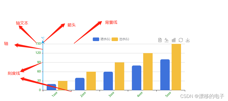
js
yAxis: {
 nameGap: 5, // 增加与轴线的距离
  type: 'value',
  name: '°C',
  position: 'left',
  alignTicks: true,
  boundaryGap: true,
  axisTick: { // 刻度线
    show: true,
    length: 4,
    lineStyle: {
      color: 'red',
      type: 'solid',
      width: 1
    },
    alignWithLabel: true
  },
  axisLine: { // 轴线样式
    show: true,
    lineStyle: {
      color: '#21a6e6',
      width: 2,
    },
    // 箭头
    symbol: ['none', 'arrow'],
    symbolSize: [10, 15],
    symbolOffset: 15,
  },
  axisLabel: { //坐标轴文本字体样式
    show: true,
    textStyle: {
      color: 'green',
      fontSize: 12
    },
    formatter: '{value}' // 带单位的话 formatter: '{value} °C'
  },
  splitLine: { //背景线条样式
    show: true,
    lineStyle: {
      color: '#ccc',
      type: "solid" //默认实线,dashed是虚线
    }
  },
 //以下设置y轴刻度为整数代码  valueDataAll是数组源,从里面找最大值用的
 minInterval: 1, //最小刻度是1
 // splitNumber: 5, //段数是5
 // min: 0, //最小是0
 // interval: Math.ceil(Math.max.apply(null, valueDataAll) / 5) || 1,
 // max: Math.ceil(Math.max.apply(null, valueDataAll) / 5) * 5 || 5,

},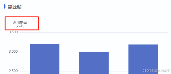
js
   yAxis: [
       {
         name: '总用电量\n(kwh)',
         type: "value"
       }
     ],
创建/清除/重绘/销毁echarts实例
js
  var chartDom = document.getElementById(id);
  var myChart = echarts.init(chartDom);
  myChart.clear()
  var option;
  window.onresize = myChart.resize;  //防止越界,重绘canvas
  option && myChart.setOption(option);


  this.bottomEchart = echarts.init(this.$refs.bottomEchart);
  const that = this;
  window.onresize = () => {
    that.bottomEchart.resize();
 };
js
// 创建echarts实例
var myChart = echarts.init(document.getElementById('main'));
或者
var myChart = echarts.init(this.$refs.bottomEchart);

// 清除echarts实例中所有图表的内容
myChart.clear();

// 销毁echarts实例
myChart.dispose();
标签重叠
avoidLabelOverlap:是否启用防止标签重叠策略,默认开启,改为true之后就不会重叠

js
   series: [
     {
       avoidLabelOverlap: true,//对,就是这里avoidLabelOverlap
     }
   ]
echarts例子(最大值和最小值)
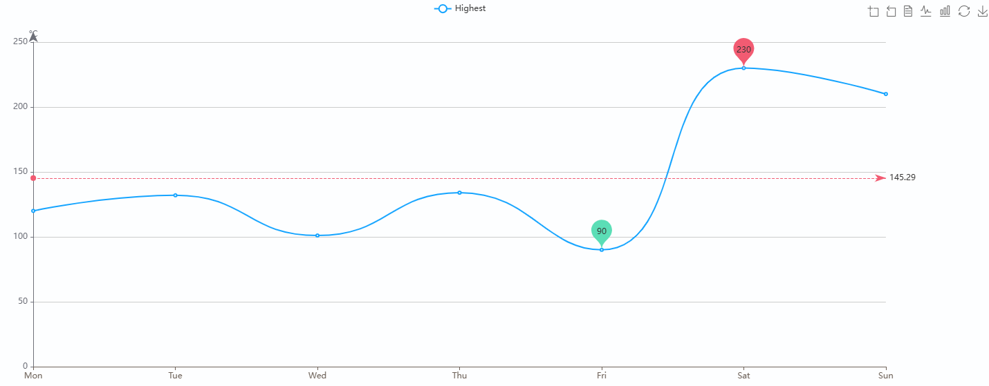
js
let labelColor = "#6E6259";
var option;
option = {
    color:["#15A4FF"],
    title: {
        text: ''
    },
    tooltip: {
        trigger: "axis",
        axisPointer: {
            type: "shadow",
        },
        show: true,
        formatter: function (params) {
            let tar = params[0];
            let showHtml = tar.axisValue + "<br/>";

            params.forEach(function (o, i) {
                if (o.value > 0) {
                    showHtml += o.seriesName + ":  " + o.value + "<br/>";
                }
            });

            return showHtml;
        },
    },
    legend: {},
    toolbox: {
        show: true,
        feature: {
            dataZoom: {
                yAxisIndex: 'none'
            },
            dataView: { readOnly: false },
            magicType: { type: ['line', 'bar'] },
            restore: {},
            saveAsImage: {}
        }
    },
    xAxis:[
        {
            show: "true",
            type: "category",
            boundaryGap: false,
            axisLabel: {
                color: labelColor, //刻度线标签颜色
            },
            axisLine: {
                lineStyle: {
                    color: labelColor,
                },
            },
            data: ['Mon', 'Tue', 'Wed', 'Thu', 'Fri', 'Sat', 'Sun']
        }
    ],
    yAxis: [
        {
            nameGap: 5, // 增加与轴线的距离
            type: 'value',
            name: '°C',
            position: 'left',
            alignTicks: true,
            boundaryGap: true,
            axisTick: { // 刻度线
                show: true,
                length: 4,
                lineStyle: {
                    // color: 'red',
                    type: 'solid',
                    width: 1
                },
                alignWithLabel: true
            },
            axisLine: { // 轴线样式
                show: true,
                // lineStyle: {
                //     color: '#21a6e6',
                //     width: 2,
                // },
                // 箭头
                symbol: ['none', 'arrow'],
                symbolSize: [10, 15],
                symbolOffset: 15,
            },
            axisLabel: { //坐标轴文本字体样式
                show: true,
                textStyle: {
                    // color: 'green',
                    fontSize: 12
                },
                formatter: '{value}'
            },
            splitLine: { //背景线条样式
                show: true,
                lineStyle: {
                    color: '#ccc',
                    type: "solid"
                }
            },
            //以下设置y轴刻度为整数代码  valueDataAll是数组源,从里面找最大值用的
            minInterval: 1, //最小刻度是1
        }
    ],
    series: [
        {
            name: 'Highest',
            type: 'line',
            data: [120, 132, 101, 134, 90, 230, 210,220, 182, 191, 234, 290, 330, 310],
            markPoint: {
                data: [
                    {
                        type: "max",
                        name: "最大值",
                        itemStyle: {
                            color: "#F25B72",
                        },
                        textStyle: {
                            color: "#F25B72",
                        },
                    },
                    {
                        type: "min",
                        name: "最小值",
                        itemStyle: {
                            color: "#5BDEB6",
                        },
                        textStyle: {
                            color: "#F25B72",
                        },
                    },
                ]
            },
            markLine: {
                data: [
                    {
                        type: "average",
                        name: "平均值",
                        itemStyle: {
                            color: "#F25B72",
                        },
                    },
                ],
            },
            smooth: true,

        }
    ]
};

let chartDom = this.$refs.echart1;
let myChart = echarts.init(chartDom);
myChart.clear();
window.onresize = myChart.resize;  //防止越界,重绘canvas
option && myChart.setOption(option);