欢迎加入开源鸿蒙跨平台社区 :https://openharmonycrossplatform.csdn.net
项目基于 RN 0.72.90 开发
📋 前言
在移动应用开发中,轻量级的消息提示是提升用户体验的重要手段。Snackbar 作为一种底部弹出的提示组件,相比 Toast 提供了更丰富的交互能力,支持自定义持续时间、操作按钮等功能。react-native-snackbar 是一个跨平台的 Snackbar 组件库,能够方便地在应用中展示各种提示信息,是替代 Toast 的理想选择。
🎯 库简介
基本信息
- 库名称 :
react-native-snackbar - 版本信息 :
2.7.1-0.0.2+@react-native-oh-tpl/react-native-snackbar: 支持 RN 0.72 版本(已废弃)2.7.2+@react-native-ohos/react-native-snackbar: 支持 RN 0.72 版本2.9.1+@react-native-ohos/react-native-snackbar: 支持 RN 0.77 版本
- 官方仓库: https://github.com/cooperka/react-native-snackbar
- 鸿蒙仓库: https://atomgit.com/openharmony-sig/rntpc_react-native-snackbar
- 主要功能 :
- 📢 底部弹出提示
- ⏱️ 自定义持续时间
- 🎯 操作按钮支持
- 📍 自定义位置
- 📱 跨平台支持(iOS、Android、HarmonyOS)
为什么需要 Snackbar?
| 特性 | Toast | Snackbar |
|---|---|---|
| 显示位置 | ⚠️ 固定位置 | ✅ 可自定义位置 |
| 操作按钮 | ❌ 不支持 | ✅ 支持 |
| 持续时间 | ⚠️ 固定时长 | ✅ 可自定义 |
| 滑动关闭 | ❌ 不支持 | ✅ 支持 |
| 样式定制 | ⚠️ 受限 | ✅ 更灵活 |
| HarmonyOS 支持 | ⚠️ 需适配 | ✅ 完善适配 |
核心功能
| 功能 | 说明 | HarmonyOS 支持 |
|---|---|---|
| show | 显示 Snackbar | ✅ |
| dismiss | 隐藏 Snackbar | ❌ |
| text | 提示文本 | ✅ |
| textAlignCenter | 文本居中 | ✅ |
| marginBottom | 底部边距 | ✅ |
| duration | 持续时间 | ❌ |
| action | 操作按钮 | ❌ |
| textColor | 文本颜色 | ❌ |
| backgroundColor | 背景颜色 | ❌ |
兼容性验证
在以下环境验证通过:
- RNOH : 0.72.90; SDK : HarmonyOS 6.0.0 Release SDK; IDE : DevEco Studio 6.0.2; ROM: 6.0.0
📦 安装步骤
1. 安装依赖
bash
# RN 0.72 版本(本项目使用)
npm install @react-native-ohos/react-native-snackbar@2.7.2-rc.1

# RN 0.77 版本
npm install @react-native-ohos/react-native-snackbar@2.9.1

# 或者使用 yarn
yarn add @react-native-ohos/react-native-snackbar
2. 验证安装
安装完成后,检查 package.json 文件:
json
{
  "dependencies": {
    "@react-native-ohos/react-native-snackbar": "^2.7.2-rc.1"
  }
}
3. 配置类型定义(TypeScript 项目)
如果遇到类型错误,需要在项目中添加类型定义文件。在 src/types 目录下创建 @react-native-ohos__react-native-snackbar.d.ts 文件:
typescript
declare module "@react-native-ohos/react-native-snackbar" {
  export interface SnackBarOptions {
    text: string;
    marginBottom?: number;
    textAlignCenter?: boolean;
    duration?: number;
    textColor?: string;
    backgroundColor?: string;
    action?: {
      text: string;
      textColor?: string;
      onPress?: () => void;
    };
  }

  export interface SnackbarStatic {
    show: (options: SnackBarOptions) => void;
    dismiss: () => void;
  }

  const Snackbar: SnackbarStatic;
  export default Snackbar;
}
🔧 HarmonyOS 平台配置 ⭐
Link 配置
| 版本 | 是否支持 autolink | RN 框架版本 |
|---|---|---|
| ~2.9.1 | No | 0.77 |
| ~2.7.2 | Yes | 0.72 |
| <= 2.7.1-0.0.2@deprecated | No | 0.72 |
1. 在工程根目录的 oh-package.json5 添加 overrides 字段
打开 harmony/oh-package.json5,添加以下配置:
json5
{
  // ... 其他配置
  "overrides": {
    "@rnoh/react-native-openharmony": "0.72.90"
  }
}
2. 引入原生端代码
打开 harmony/entry/oh-package.json5,添加以下依赖(har包安装使用oh-tpl):
json5
"dependencies": {
  "@react-native-oh-tpl/react-native-snackbar": "file:../../node_modules/@react-native-ohos/react-native-snackbar/harmony/snackbar.har"
}
点击右上角的 sync 按钮,或者在终端执行:
bash
cd entry
ohpm install
3. 配置 CMakeLists
打开 entry/src/main/cpp/CMakeLists.txt,添加:
c
project(rnapp)
cmake_minimum_required(VERSION 3.4.1)
set(RNOH_APP_DIR "${CMAKE_CURRENT_SOURCE_DIR}")
+ set(OH_MODULES "${CMAKE_CURRENT_SOURCE_DIR}/../../../oh_modules")
set(RNOH_CPP_DIR "${CMAKE_CURRENT_SOURCE_DIR}/../../../../../../react-native-harmony/harmony/cpp")

add_subdirectory("${RNOH_CPP_DIR}" ./rn)

# RNOH_BEGIN: manual_package_linking_1
+ add_subdirectory("${OH_MODULES}/@react-native-oh-tpl/react-native-snackbar/src/main/cpp" ./react-native-snackbar)
# RNOH_END: manual_package_linking_1

add_library(rnoh_app SHARED
    "./PackageProvider.cpp"
    "${RNOH_CPP_DIR}/RNOHAppNapiBridge.cpp"
)

target_link_libraries(rnoh_app PUBLIC rnoh)

# RNOH_BEGIN: manual_package_linking_2
+ target_link_libraries(rnoh_app PUBLIC rnoh_snackbar)
# RNOH_END: manual_package_linking_2
4. 引入 SnackbarPackage
打开 entry/src/main/cpp/PackageProvider.cpp,添加:
cpp
#include "RNOH/PackageProvider.h"
+ #include "RNSnackbarPackage.h"

using namespace rnoh;

std::vector<std::shared_ptr<Package>> PackageProvider::getPackages(Package::Context ctx) {
    return {
       +  std::make_shared<RNSnackbarPackage>(ctx)
    };
}
5. 在 ArkTS 侧引入 RNSnackbarPackage
打开 entry/src/main/ets/RNPackagesFactory.ts,添加:
typescript
import { RNSnackbarPackage } from '@react-native-ohos/react-native-snackbar/ts';

export function createRNPackages(ctx: RNPackageContext): RNPackage[] {
  return [
    new RNSnackbarPackage(ctx)
  ];
}
📖 API 详解
Snackbar.show() - 显示 Snackbar
显示一个 Snackbar 提示。
类型 :(options: SnackbarOptions) => void
SnackbarOptions 参数说明:
| 参数 | 类型 | 必填 | 说明 | HarmonyOS 支持 |
|---|---|---|---|---|
| text | string | 是 | 提示文本内容 | ✅ |
| textAlignCenter | boolean | 否 | 文本是否居中 | ✅ |
| marginBottom | number | 否 | 底部边距 | ✅ |
| duration | number | 否 | 持续时间 | ❌ |
| numberOfLines | number | 否 | 文本最大行数 | ❌ |
| textColor | string | 否 | 文本颜色 | ❌ |
| backgroundColor | string | 否 | 背景颜色 | ❌ |
| action | object | 否 | 操作按钮配置 | ❌ |
使用场景:
- 操作成功提示
- 错误信息展示
- 网络状态提示
tsx
Snackbar.show({
  text: "操作成功完成!",
  marginBottom: 100,
});
text - 提示文本
设置 Snackbar 显示的文本内容。
类型 :string
必填:是
tsx
Snackbar.show({
  text: "这是一条提示消息",
});

Snackbar.show({
  text: "这是一条较长的提示消息,用于展示更多内容信息。",
  marginBottom: 50,
});
textAlignCenter - 文本居中
设置文本是否居中显示。
类型 :boolean
默认值 :false
tsx
Snackbar.show({
  text: "左对齐文本",
  textAlignCenter: false,
});

Snackbar.show({
  text: "居中对齐文本",
  textAlignCenter: true,
});
marginBottom - 底部边距
设置 Snackbar 距离屏幕底部的距离。
类型 :number
使用场景:
- 避免遮挡底部导航栏
- 适配不同屏幕尺寸
- 自定义显示位置
tsx
Snackbar.show({
  text: "底部边距 50px",
  marginBottom: 50,
});

Snackbar.show({
  text: "底部边距 100px",
  marginBottom: 100,
});
Snackbar.dismiss() - 隐藏 Snackbar
手动隐藏当前显示的 Snackbar。
类型 :() => void
HarmonyOS 支持:❌ 不支持
注意 :HarmonyOS 版本暂不支持
dismiss()方法。
tsx
Snackbar.dismiss();duration - 持续时间
设置 Snackbar 显示的持续时间。
类型 :number
可选值:
| 常量 | 值 | 说明 |
|---|---|---|
| Snackbar.LENGTH_SHORT | -1 | 短时间显示 |
| Snackbar.LENGTH_LONG | 0 | 长时间显示 |
| Snackbar.LENGTH_INDEFINITE | -2 | 无限显示 |
HarmonyOS 支持:❌ 不支持
注意:HarmonyOS 版本暂不支持自定义持续时间。
action - 操作按钮
为 Snackbar 添加操作按钮。
类型 :object
action 对象结构:
| 属性 | 类型 | 说明 |
|---|---|---|
| text | string | 按钮文本 |
| textColor | string | 按钮文本颜色 |
| onPress | () => void | 点击回调函数 |
HarmonyOS 支持:❌ 不支持
注意:HarmonyOS 版本暂不支持操作按钮。
📋 完整示例
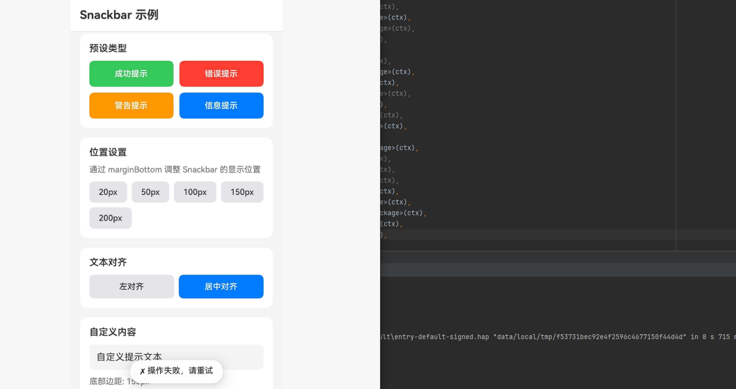
ts
import React, { useState } from "react";
import {
  View,
  Text,
  StyleSheet,
  ScrollView,
  TouchableOpacity,
  SafeAreaView,
  StatusBar,
  TextInput,
  Alert,
} from "react-native";
import Snackbar from "@react-native-ohos/react-native-snackbar";

type SnackbarType = "success" | "error" | "warning" | "info";

type SnackbarConfig = {
  text: string;
  type: SnackbarType;
  marginBottom?: number;
  textAlignCenter?: boolean;
};

const App: React.FC = () => {
  const [customText, setCustomText] = useState("自定义提示文本");
  const [marginValue, setMarginValue] = useState(50);
  const [centerText, setCenterText] = useState(false);

  const showSnackbar = (config: SnackbarConfig) => {
    const { text, type, marginBottom = 50, textAlignCenter = false } = config;

    let displayText = text;

    switch (type) {
      case "success":
        displayText = `✓ ${text}`;
        break;
      case "error":
        displayText = `✗ ${text}`;
        break;
      case "warning":
        displayText = `⚠ ${text}`;
        break;
      case "info":
        displayText = `ℹ ${text}`;
        break;
    }

    Snackbar.show({
      text: displayText,
      marginBottom,
      textAlignCenter,
    });
  };

  const showCustomSnackbar = () => {
    if (!customText.trim()) {
      Alert.alert("提示", "请输入提示文本");
      return;
    }

    Snackbar.show({
      text: customText,
      marginBottom: marginValue,
      textAlignCenter: centerText,
    });
  };

  const SnackbarButton = ({
    title,
    type,
    text,
  }: {
    title: string;
    type: SnackbarType;
    text: string;
  }) => {
    const getBackgroundColor = () => {
      switch (type) {
        case "success":
          return "#34C759";
        case "error":
          return "#FF3B30";
        case "warning":
          return "#FF9500";
        case "info":
          return "#007AFF";
      }
    };

    return (
      <TouchableOpacity
        style={[styles.snackbarButton, { backgroundColor: getBackgroundColor() }]}
        onPress={() => showSnackbar({ text, type })}
      >
        <Text style={styles.snackbarButtonText}>{title}</Text>
      </TouchableOpacity>
    );
  };

  return (
    <SafeAreaView style={styles.container}>
      <StatusBar barStyle="dark-content" backgroundColor="#FFFFFF" />
      <View style={styles.header}>
        <Text style={styles.headerTitle}>Snackbar 示例</Text>
      </View>

      <ScrollView style={styles.scrollView}>
        <View style={styles.section}>
          <Text style={styles.sectionTitle}>预设类型</Text>
          <View style={styles.buttonGrid}>
            <SnackbarButton
              title="成功提示"
              type="success"
              text="操作成功完成"
            />
            <SnackbarButton
              title="错误提示"
              type="error"
              text="操作失败,请重试"
            />
            <SnackbarButton
              title="警告提示"
              type="warning"
              text="请注意网络连接"
            />
            <SnackbarButton
              title="信息提示"
              type="info"
              text="这是一条提示信息"
            />
          </View>
        </View>

        <View style={styles.section}>
          <Text style={styles.sectionTitle}>位置设置</Text>
          <Text style={styles.sectionDescription}>
            通过 marginBottom 调整 Snackbar 的显示位置
          </Text>
          <View style={styles.buttonRow}>
            {[20, 50, 100, 150, 200].map((margin) => (
              <TouchableOpacity
                key={margin}
                style={styles.marginButton}
                onPress={() =>
                  showSnackbar({
                    text: `底部边距: ${margin}px`,
                    type: "info",
                    marginBottom: margin,
                  })
                }
              >
                <Text style={styles.marginButtonText}>{margin}px</Text>
              </TouchableOpacity>
            ))}
          </View>
        </View>

        <View style={styles.section}>
          <Text style={styles.sectionTitle}>文本对齐</Text>
          <View style={styles.buttonRow}>
            <TouchableOpacity
              style={styles.alignButton}
              onPress={() =>
                showSnackbar({
                  text: "左对齐文本示例",
                  type: "info",
                  textAlignCenter: false,
                })
              }
            >
              <Text style={styles.alignButtonText}>左对齐</Text>
            </TouchableOpacity>
            <TouchableOpacity
              style={[styles.alignButton, styles.alignButtonActive]}
              onPress={() =>
                showSnackbar({
                  text: "居中对齐文本示例",
                  type: "info",
                  textAlignCenter: true,
                })
              }
            >
              <Text style={[styles.alignButtonText, styles.alignButtonTextActive]}>
                居中对齐
              </Text>
            </TouchableOpacity>
          </View>
        </View>

        <View style={styles.section}>
          <Text style={styles.sectionTitle}>自定义内容</Text>
          <TextInput
            style={styles.textInput}
            value={customText}
            onChangeText={setCustomText}
            placeholder="输入自定义提示文本"
            placeholderTextColor="#999999"
          />
          <View style={styles.marginSlider}>
            <Text style={styles.marginLabel}>底部边距: {marginValue}px</Text>
            <View style={styles.marginButtons}>
              {[20, 50, 100, 150].map((val) => (
                <TouchableOpacity
                  key={val}
                  style={[
                    styles.marginValueButton,
                    marginValue === val && styles.marginValueButtonActive,
                  ]}
                  onPress={() => setMarginValue(val)}
                >
                  <Text
                    style={[
                      styles.marginValueText,
                      marginValue === val && styles.marginValueTextActive,
                    ]}
                  >
                    {val}
                  </Text>
                </TouchableOpacity>
              ))}
            </View>
          </View>
          <TouchableOpacity
            style={styles.customButton}
            onPress={showCustomSnackbar}
          >
            <Text style={styles.customButtonText}>显示自定义 Snackbar</Text>
          </TouchableOpacity>
        </View>

        <View style={styles.section}>
          <Text style={styles.sectionTitle}>使用场景示例</Text>
          <View style={styles.scenarioGrid}>
            <TouchableOpacity
              style={styles.scenarioButton}
              onPress={() =>
                showSnackbar({
                  text: "数据已保存到本地",
                  type: "success",
                  marginBottom: 80,
                })
              }
            >
              <Text style={styles.scenarioIcon}>💾</Text>
              <Text style={styles.scenarioText}>保存成功</Text>
            </TouchableOpacity>
            <TouchableOpacity
              style={styles.scenarioButton}
              onPress={() =>
                showSnackbar({
                  text: "网络连接已断开",
                  type: "error",
                  marginBottom: 80,
                })
              }
            >
              <Text style={styles.scenarioIcon}>📡</Text>
              <Text style={styles.scenarioText}>网络断开</Text>
            </TouchableOpacity>
            <TouchableOpacity
              style={styles.scenarioButton}
              onPress={() =>
                showSnackbar({
                  text: "存储空间不足,请清理",
                  type: "warning",
                  marginBottom: 80,
                })
              }
            >
              <Text style={styles.scenarioIcon}>📱</Text>
              <Text style={styles.scenarioText}>空间不足</Text>
            </TouchableOpacity>
            <TouchableOpacity
              style={styles.scenarioButton}
              onPress={() =>
                showSnackbar({
                  text: "新版本已发布,请更新",
                  type: "info",
                  marginBottom: 80,
                })
              }
            >
              <Text style={styles.scenarioIcon}>🔄</Text>
              <Text style={styles.scenarioText}>版本更新</Text>
            </TouchableOpacity>
          </View>
        </View>

        <View style={styles.section}>
          <Text style={styles.sectionTitle}>不支持的功能</Text>
          <View style={styles.unsupportedList}>
            <View style={styles.unsupportedItem}>
              <Text style={styles.unsupportedIcon}>❌</Text>
              <Text style={styles.unsupportedText}>dismiss() - 手动隐藏</Text>
            </View>
            <View style={styles.unsupportedItem}>
              <Text style={styles.unsupportedIcon}>❌</Text>
              <Text style={styles.unsupportedText}>duration - 自定义持续时间</Text>
            </View>
            <View style={styles.unsupportedItem}>
              <Text style={styles.unsupportedIcon}>❌</Text>
              <Text style={styles.unsupportedText}>action - 操作按钮</Text>
            </View>
            <View style={styles.unsupportedItem}>
              <Text style={styles.unsupportedIcon}>❌</Text>
              <Text style={styles.unsupportedText}>textColor - 文本颜色</Text>
            </View>
            <View style={styles.unsupportedItem}>
              <Text style={styles.unsupportedIcon}>❌</Text>
              <Text style={styles.unsupportedText}>backgroundColor - 背景颜色</Text>
            </View>
          </View>
        </View>
      </ScrollView>
    </SafeAreaView>
  );
};

const styles = StyleSheet.create({
  container: {
    flex: 1,
    backgroundColor: "#F5F5F5",
  },
  header: {
    padding: 16,
    backgroundColor: "#FFFFFF",
    borderBottomWidth: 1,
    borderBottomColor: "#E5E5EA",
  },
  headerTitle: {
    fontSize: 20,
    fontWeight: "700",
    color: "#333333",
  },
  scrollView: {
    flex: 1,
  },
  section: {
    backgroundColor: "#FFFFFF",
    margin: 16,
    marginBottom: 0,
    marginTop: 16,
    padding: 16,
    borderRadius: 12,
  },
  sectionTitle: {
    fontSize: 16,
    fontWeight: "600",
    color: "#333333",
    marginBottom: 12,
  },
  sectionDescription: {
    fontSize: 14,
    color: "#666666",
    marginBottom: 12,
  },
  buttonGrid: {
    flexDirection: "row",
    flexWrap: "wrap",
    gap: 10,
  },
  snackbarButton: {
    flex: 1,
    minWidth: "45%",
    paddingVertical: 14,
    borderRadius: 8,
    alignItems: "center",
  },
  snackbarButtonText: {
    color: "#FFFFFF",
    fontSize: 14,
    fontWeight: "600",
  },
  buttonRow: {
    flexDirection: "row",
    flexWrap: "wrap",
    gap: 8,
  },
  marginButton: {
    paddingHorizontal: 16,
    paddingVertical: 10,
    backgroundColor: "#E5E5EA",
    borderRadius: 8,
  },
  marginButtonText: {
    fontSize: 14,
    color: "#333333",
    fontWeight: "500",
  },
  alignButton: {
    flex: 1,
    paddingVertical: 12,
    backgroundColor: "#E5E5EA",
    borderRadius: 8,
    alignItems: "center",
  },
  alignButtonActive: {
    backgroundColor: "#007AFF",
  },
  alignButtonText: {
    fontSize: 14,
    color: "#333333",
    fontWeight: "500",
  },
  alignButtonTextActive: {
    color: "#FFFFFF",
  },
  textInput: {
    backgroundColor: "#F5F5F5",
    borderRadius: 8,
    padding: 12,
    fontSize: 16,
    color: "#333333",
    marginBottom: 12,
  },
  marginSlider: {
    marginBottom: 16,
  },
  marginLabel: {
    fontSize: 14,
    color: "#666666",
    marginBottom: 8,
  },
  marginButtons: {
    flexDirection: "row",
    gap: 8,
  },
  marginValueButton: {
    paddingHorizontal: 16,
    paddingVertical: 8,
    backgroundColor: "#E5E5EA",
    borderRadius: 8,
  },
  marginValueButtonActive: {
    backgroundColor: "#007AFF",
  },
  marginValueText: {
    fontSize: 14,
    color: "#333333",
  },
  marginValueTextActive: {
    color: "#FFFFFF",
    fontWeight: "600",
  },
  customButton: {
    backgroundColor: "#007AFF",
    paddingVertical: 14,
    borderRadius: 8,
    alignItems: "center",
  },
  customButtonText: {
    color: "#FFFFFF",
    fontSize: 16,
    fontWeight: "600",
  },
  scenarioGrid: {
    flexDirection: "row",
    flexWrap: "wrap",
    gap: 12,
  },
  scenarioButton: {
    flex: 1,
    minWidth: "45%",
    backgroundColor: "#F5F5F5",
    padding: 16,
    borderRadius: 12,
    alignItems: "center",
  },
  scenarioIcon: {
    fontSize: 24,
    marginBottom: 8,
  },
  scenarioText: {
    fontSize: 14,
    color: "#333333",
    fontWeight: "500",
  },
  unsupportedList: {
    gap: 8,
  },
  unsupportedItem: {
    flexDirection: "row",
    alignItems: "center",
    backgroundColor: "#FFF5F5",
    padding: 12,
    borderRadius: 8,
  },
  unsupportedIcon: {
    fontSize: 16,
    marginRight: 10,
  },
  unsupportedText: {
    fontSize: 14,
    color: "#666666",
  },
});

export default App;
⚠️ 注意事项
遗留问题
| 问题 | 说明 | Issue |
|---|---|---|
| 不支持部分参数 | duration、numberOfLines、textColor、backgroundColor、fontFamily、rtl、action 等参数不支持 | issue#1 |
| 样式差异 | 与 Android 和 iOS 的样式有一定差异 | issue#2 |
| 事件不支持 | 无法实现 Snackbar events | issue#3 |
HarmonyOS 支持情况
| 功能 | 支持 |
|---|---|
| show() | ✅ |
| text | ✅ |
| textAlignCenter | ✅ |
| marginBottom | ✅ |
| dismiss() | ❌ |
| duration | ❌ |
| action | ❌ |
| textColor | ❌ |
| backgroundColor | ❌ |
| events | ❌ |
使用建议
- 简化使用: HarmonyOS 版本功能有限,建议仅使用基本功能
- 避免依赖 : 不要依赖
dismiss()或事件回调 - 样式适配: 接受默认样式,避免自定义颜色配置