页面概述
时光重塑页面(SimulationPage)是一个典型的多功能交互页面,布局特点:
- 三层条件渲染:加载态 / 错误态 / 主内容
- 双视图切换:原始数据 ↔ 重塑后
- 固定底部按钮栏:与滚动内容分离
- 嵌套对话框:CustomDialog 承载表单编辑
整体采用 Column 垂直布局,通过 layoutWeight 控制滚动区域自适应。
一、页面整体结构
typescript
build() {
  Column() {
    // 1. 标题栏(固定高度 56)
    Row() { ... }
      .height(56)

    // 2. 条件渲染区域(三选一)
    if (this.isLoading) {
      // 加载态
    } else if (this.errorMessage) {
      // 错误态
    } else if (this.simulation !== null) {
      // 主内容
    }
  }
  .width('100%')
  .height('100%')
  .backgroundColor($r('app.color.background_color'))
}
二、标题栏布局
typescript
Row() {
  // 返回按钮
  Button() {
    Text('<')
      .fontSize(this.fs(20))
      .fontColor($r('app.color.text_primary'))
  }
  .backgroundColor('rgba(0,0,0,0)')
  .width(40)
  .height(40)
  .onClick(() => { this.goBack() })

  // 标题 + 日期(垂直排列)
  Column() {
    Text('🌟 时光重塑模式')
      .fontSize(this.fs(18))
      .fontWeight(FontWeight.Bold)
      .fontColor('#FFA500')

    Text(DateUtils.formatDate(this.targetDate))
      .fontSize(this.fs(13))
      .fontColor($r('app.color.text_secondary'))
      .margin({ top: 2 })
  }
  .layoutWeight(1)
  .alignItems(HorizontalAlign.Start)
  .margin({ left: 8 })
}
.width('100%')
.height(56)
.padding({ left: 16, right: 16 })
.backgroundColor($r('app.color.card_background'))布局技巧:
- 返回按钮固定宽度 40,保证点击区域一致
- 标题 Column 使用
layoutWeight(1)占据剩余宽度 alignItems(HorizontalAlign.Start)让标题左对齐
三、主内容区三层结构
主内容区是一个嵌套的 Column,结构如下:
Column (主内容容器)
 ├── Text (引导语,固定高度)
 ├── Row  (视图切换,固定高度 40)
 ├── Scroll (时间块列表 + 影响预览,layoutWeight:1)
 └── Row  (底部按钮,固定高度 + shadow)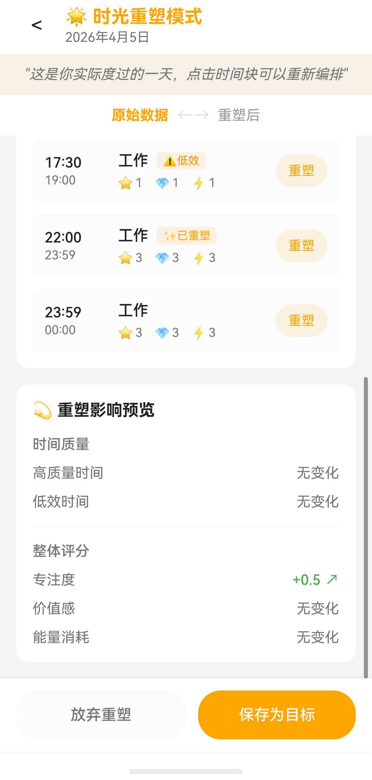
3.1 引导语
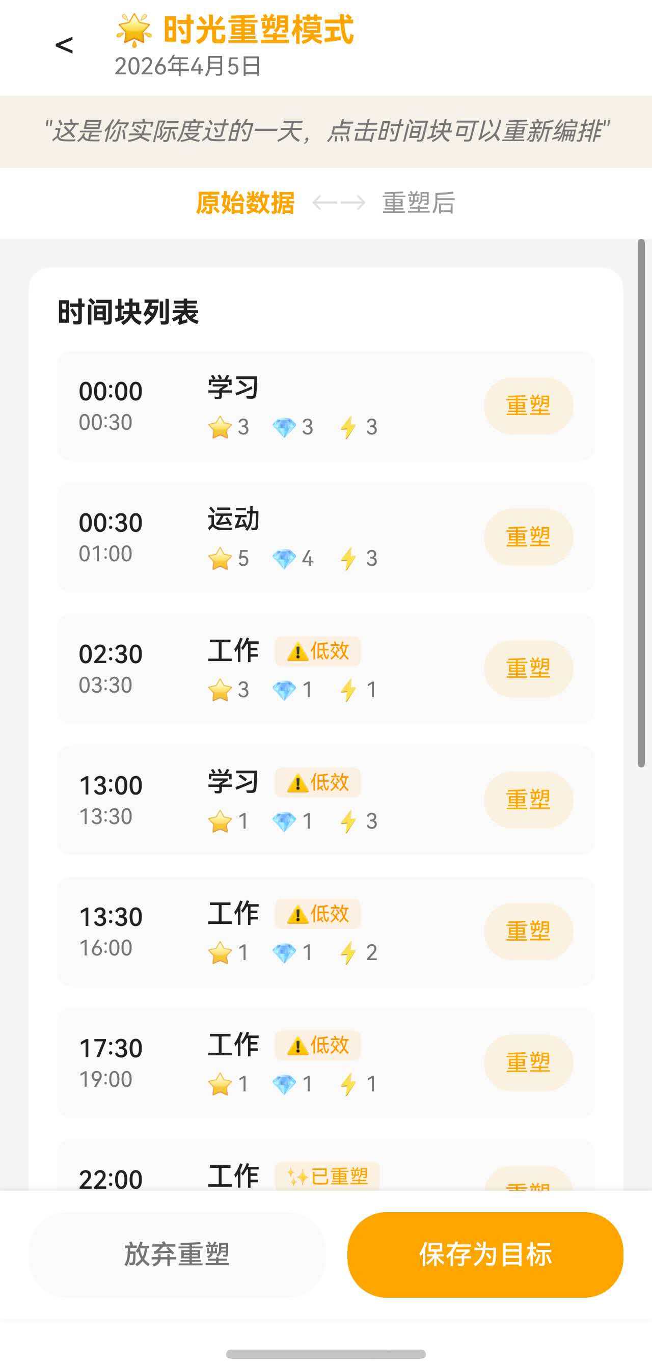
typescript
Text(this.showOriginal ?
  '"这是你实际度过的一天,点击时间块可以重新编排"' :
  '"这是重塑后的时光,对比一下有什么不同"')
  .fontSize(this.fs(14))
  .fontColor($r('app.color.text_secondary'))
  .fontStyle(FontStyle.Italic)
  .width('100%')
  .textAlign(TextAlign.Center)
  .padding({ top: 12, bottom: 12 })
.backgroundColor('rgba(255, 165, 0, 0.05)')设计细节:
- 引导语根据
showOriginal状态动态切换内容 - 斜体 + 浅橙色背景营造"引用"感
3.2 视图切换按钮组
typescript
Row() {
  Button() {
    Text('原始数据')
      .fontSize(this.fs(14))
      .fontColor(this.showOriginal ? '#FFA500' : '#999999')
      .fontWeight(this.showOriginal ? FontWeight.Bold : FontWeight.Normal)
  }
  .backgroundColor('rgba(0,0,0,0)')
  .onClick(() => { this.showOriginal = true })

  Text('←→')
    .fontSize(this.fs(16))
    .fontColor($r('app.color.divider_color'))
    .margin({ left: 8, right: 8 })

  Button() {
    Text('重塑后')
      .fontSize(this.fs(14))
      .fontColor(this.showOriginal ? '#999999' : '#FFA500')
      .fontWeight(this.showOriginal ? FontWeight.Normal : FontWeight.Bold)
  }
  .backgroundColor('rgba(0,0,0,0)')
  .onClick(() => { this.showOriginal = false })
}
.width('100%')
.height(40)
.justifyContent(FlexAlign.Center)
.backgroundColor($r('app.color.card_background'))联动设计:
- 颜色(
#FFA500激活色 /#999999未激活色) - 字重(Bold / Normal)
- 两个按钮共用一套三元表达式,逻辑对称
3.3 可滚动内容区
typescript
Scroll() {
  Column({ space: 16 }) {
    // 时间块列表
    this.TimeBlockList()

    // 影响预览
    if (this.impact !== null) {
      this.ImpactPreview()
    }
  }
  .width('100%')
  .padding(16)
}
.layoutWeight(1)
.scrollBar(BarState.Auto)
.edgeEffect(EdgeEffect.Spring)关键属性:
space: 16--- Column 内部子元素间距layoutWeight(1)--- 自动填充父容器剩余高度edgeEffect(EdgeEffect.Spring)--- 滚动到边界时的回弹效果
3.4 底部按钮栏
typescript
Row() {
  Button('放弃重塑')
    .fontSize(this.fs(15))
    .fontColor($r('app.color.text_secondary'))
    .backgroundColor($r('app.color.secondary_background'))
    .borderRadius(22)
    .layoutWeight(1)
    .height(48)

  Button('保存为目标')
    .fontSize(this.fs(15))
    .fontColor('#FFFFFF')
    .backgroundColor(this.simulation !== null && this.simulation.modifications.size > 0
      ? '#FFA500'
      : $r('app.color.divider_color'))
    .borderRadius(22)
    .layoutWeight(1)
    .height(48)
    .margin({ left: 12 })
    .enabled(this.simulation !== null && this.simulation.modifications.size > 0)
}
.width('100%')
.padding({ left: 16, right: 16, top: 12, bottom: 12 })
.backgroundColor($r('app.color.card_background'))
.shadow({
  radius: 8,
  color: 'rgba(0, 0, 0, 0.1)',
  offsetX: 0,
  offsetY: -2
})设计要点:
- 两个按钮各占
layoutWeight(1),平分宽度 - "保存为目标"按钮根据是否有修改动态切换启用状态和背景色
shadow属性设置向上投射的阴影,营造"浮起"效果
四、时间块列表卡片
typescript
@Builder
TimeBlockList() {
  Column({ space: 12 }) {
    Text('时间块列表')
      .fontSize(this.fs(16))
      .fontWeight(FontWeight.Bold)
      .fontColor($r('app.color.text_primary'))
      .width('100%')

    if (this.simulation !== null) {
      ForEach(this.showOriginal ? this.simulation.originalBlocks : this.simulation.modifiedBlocks,
        (block: TimeBlock) => {
          this.TimeBlockItem(block)
        })
    }
  }
  .width('100%')
  .padding(16)
  .backgroundColor($r('app.color.card_background'))
  .borderRadius(12)
}
数据源切换 :通过三元表达式动态选择 originalBlocks 或 modifiedBlocks。
五、时间块项布局
每个时间块项是一个复杂的 Row + Column 组合:
typescript
@Builder
TimeBlockItem(block: TimeBlock) {
  Column() {
    Row() {
      // 左侧:时间范围(固定宽度 60)
      Column({ space: 2 }) {
        Text(this.formatTime(block.startTime))
          .fontSize(this.fs(14))
          .fontWeight(FontWeight.Medium)
        Text(this.formatTime(block.endTime))
          .fontSize(this.fs(12))
      }
      .width(60)
      .alignItems(HorizontalAlign.Start)

      // 中间:活动信息(layoutWeight:1 自适应)
      Column({ space: 6 }) {
        // 活动名称 + 标记
        Row({ space: 8 }) {
          Text(this.getActivityTagName(block.activityTagId))

          // 条件渲染标记
          if (block.focusLevel <= 2 || block.valueLevel <= 2) {
            Text('⚠️低效')...
          }
          if (this.simulation !== null && this.simulation.modifications.has(block.id)) {
            Text('✨已重塑')...
          }
        }

        // 评分行
        Row({ space: 12 }) {
          Row({ space: 2 }) { Text('⭐'); Text(`${block.focusLevel}`) }
          Row({ space: 2 }) { Text('💎'); Text(`${block.valueLevel}`) }
          Row({ space: 2 }) { Text('⚡'); Text(`${block.energyCost}`) }
        }
      }
      .layoutWeight(1)
      .alignItems(HorizontalAlign.Start)
      .margin({ left: 12 })

      // 右侧:编辑按钮
      Button() {
        Text(this.showOriginal ? '重塑' : '调整')
          .fontSize(this.fs(13))
          .fontColor('#FFA500')
      }
      .backgroundColor('rgba(255, 165, 0, 0.1)')
      .borderRadius(16)
      .height(32)
      .padding({ left: 12, right: 12 })
    }
    .width('100%')

    // 备注和重塑笔记(条件渲染)
    if (block.note !== null && block.note !== '') {
      Text(block.note)
        .margin({ top: 8, left: 72 })
    }

    if (!this.showOriginal && this.simulation !== null && this.simulation.modifications.has(block.id)) {
      Row({ space: 4 }) {
        Text('💭')
        Text(this.simulation.modifications.get(block.id)!.reason)...
      }
      .margin({ top: 6, left: 72 })
    }
  }
  .width('100%')
  .padding(12)
  .backgroundColor($r('app.color.secondary_background'))
  .borderRadius(8)
}布局分解:
| 区域 | 宽度控制 | 内容 |
|---|---|---|
| 时间列 | 固定 60 | 开始/结束时间 |
| 信息区 | layoutWeight(1) |
活动名、标记、评分 |
| 按钮 | 内容自适应 | "重塑"/"调整" |
| 备注行 | margin-left: 72 |
与时间列对齐(60 + 12) |
条件标记:
- 低效标记:
focusLevel <= 2 || valueLevel <= 2 - 已重塑标记:
modifications.has(block.id)
六、影响预览卡片
影响预览展示重塑前后的对比数据,布局采用分组 Column:
typescript
@Builder
ImpactPreview() {
  Column({ space: 16 }) {
    Text('💫 重塑影响预览')
      .fontSize(this.fs(16))
      .fontWeight(FontWeight.Bold)
      .width('100%')

    // 时间质量组
    Column({ space: 12 }) {
      Text('时间质量')
        .fontSize(this.fs(14))
        .fontWeight(FontWeight.Medium)
        .width('100%')

      // 高质量时间
      Row() {
        Text('高质量时间')
          .layoutWeight(1)
        // 变化值 + 箭头
        Row({ space: 4 }) {
          Text(diff > 0 ? `+${duration}` : duration)
          Text(diff > 0 ? '↗' : '↘')
        }
      }
      .width('100%')

      // 低效时间(结构相同)
    }
    .width('100%')

    Divider().color('#F0F0F0')

    // 整体评分组
    Column({ space: 12 }) {
      Text('整体评分')...
      // 专注度、价值感、能量消耗(结构相同)
    }
    .width('100%')
  }
  .width('100%')
  .padding(16)
  .backgroundColor($r('app.color.card_background'))
  .borderRadius(12)
}变化指示器设计:
typescript
Row({ space: 4 }) {
  Text(this.impact.highQualityTimeDiff > 0 ?
    `+${this.formatDuration(this.impact.highQualityTimeDiff)}` :
    this.formatDuration(Math.abs(this.impact.highQualityTimeDiff)))
    .fontColor(this.impact.highQualityTimeDiff > 0
      ? $r('app.color.high_quality_color')   // 绿色
      : $r('app.color.warning_color'))       // 橙色

  Text(this.impact.highQualityTimeDiff > 0 ? '↗' : '↘')
    .fontColor(同上)
}设计要点:
- 正向变化用绿色 +
↗ - 负向变化用橙色 +
↘ - 零变化显示"无变化"
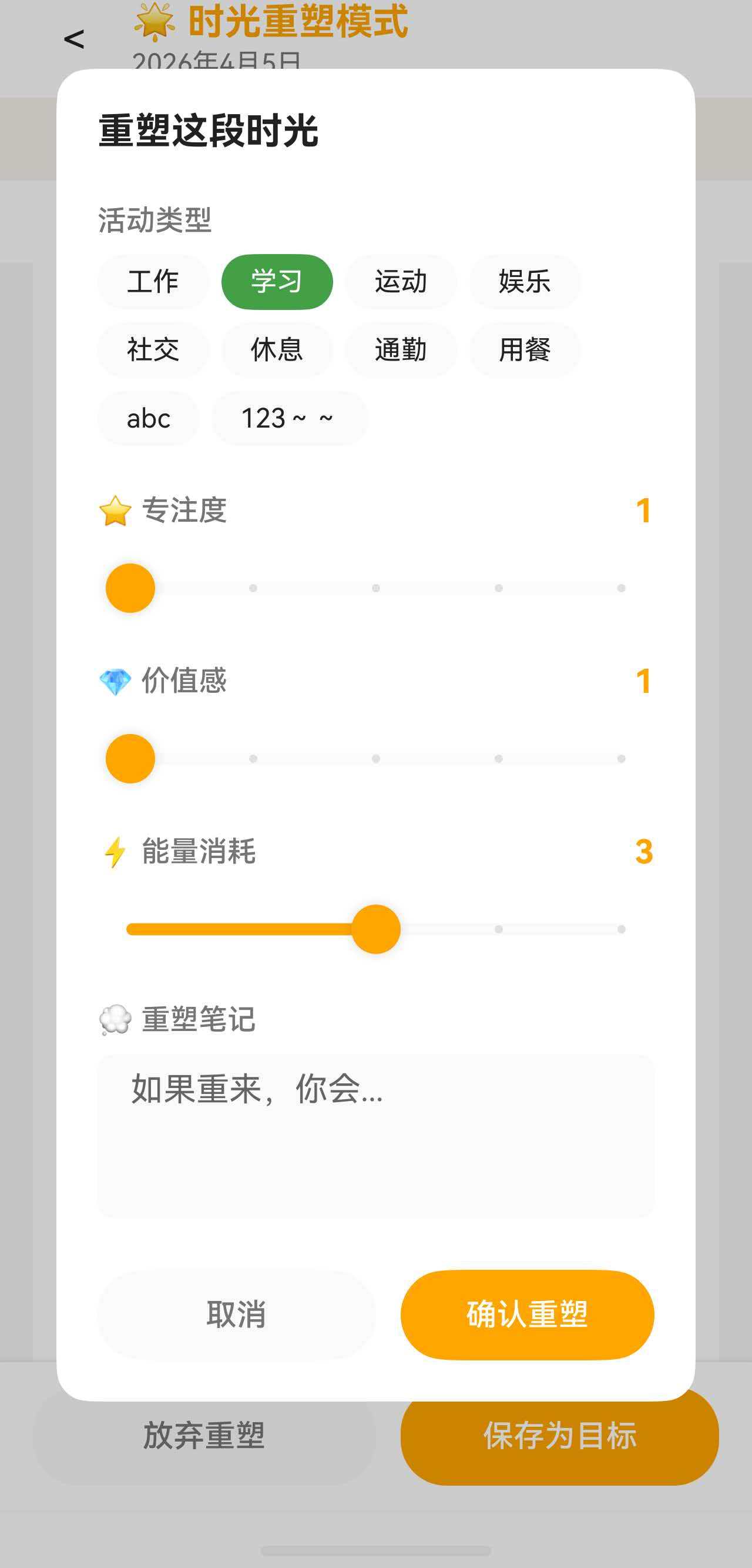
七、编辑对话框布局
对话框是一个独立的 @CustomDialog 组件,使用 constraintSize 限制最大高度:
typescript
@CustomDialog
struct SimulationEditDialog {
  build() {
    Column() {
      Text('重塑这段时光')
        .fontSize(this.fs(18))
        .fontWeight(FontWeight.Bold)
        .margin({ bottom: 16 })

      Scroll() {
        Column({ space: 16 }) {
          // 活动类型选择(Flex 布局)
          Column({ space: 8 }) {
            Text('活动类型')...
            Flex({ wrap: FlexWrap.Wrap, justifyContent: FlexAlign.Start }) {
              ForEach(this.activityTags, (tag: ActivityTag) => {
                Button() { Text(tag.name) }
                  .backgroundColor(this.selectedTagId === tag.id ? tag.color : ...)
                  .borderRadius(16)
                  .margin({ right: 6, bottom: 6 })
              })
            }
          }

          // 三个 Slider(结构相同)
          Column({ space: 8 }) {
            Row() {
              Text('⭐ 专注度').layoutWeight(1)
              Text(`${this.focusLevel}`)
            }
            Slider({ value: this.focusLevel, min: 1, max: 5, step: 1 })
              .blockColor('#FFA500')
              .showSteps(true)
          }

          // 重塑笔记
          Column({ space: 8 }) {
            Text('💭 重塑笔记')...
            TextArea({ placeholder: '如果重来,你会...' })
              .height(80)
          }
        }
      }
      .layoutWeight(1)

      // 底部按钮
      Row() {
        Button('取消')...
        Button('确认重塑')...
      }
      .margin({ top: 16 })
    }
    .width('85%')
    .constraintSize({ maxHeight: '80%' })
    .padding(20)
    .borderRadius(16)
  }
}