大家好,我是锋哥。最近连载更新《Matplotlib3 Python 数据可视化》技术专题。
本课程讲解利用python进行数据可视化 科研绘图-Matplotlib,学习Matplotlib图形参数基本设置,绘图参数及主要函数,以及Matplotlib基础绘图,和Matplotlib高级绘图。同时也配套视频教程 《2026版 Matplotlib3 Python 数据可视化 视频教程》
Matplotlib 的条形图是展示分类数据最常用的图表之一,特别适合比较不同类别的数值大小。以下是条形图的全面介绍及示例代码:
一、核心功能与适用场景
条形图类型:
- 垂直条形图 :
plt.bar() - 水平条形图 :
plt.barh() - 分组条形图:多组数据并列比较
- 堆叠条形图:显示部分与整体关系
适用场景:
- 不同类别数据的比较(产品销量、地区收入)
- 时间序列数据对比(月度销售额)
- 部分与整体关系可视化(堆叠条形图)
plt.bar() 是 Matplotlib 中用于绘制垂直条形图的核心函数。以下是详细解析及示例:
基本语法:
css
plt.bar(x, height, width=0.8, bottom=None, align='center', **kwargs)| 参数 | 说明 |
|---|---|
x |
条形的横坐标位置(标量或数组) |
height |
条形的高度(y 轴值,标量或数组) |
width |
条形的宽度(默认 0.8) |
bottom |
条形的起始基线高度 (用于堆叠条形图,默认从 0 开始) |
align |
对齐方式:'center'(居中,默认)或 'edge'(左对齐) |
**kwargs |
其他样式参数(颜色、边框等) |
常用 kwargs 参数
| 参数 | 说明 |
|---|---|
color / c |
条形填充颜色 |
edgecolor/ec |
边框颜色 |
linewidth/lw |
边框宽度 |
alpha |
透明度 |
label |
图例标签 |
hatch |
填充图案(如 '///') |
我们先看一个垂直条形图示例:
ini
import matplotlib
import matplotlib.pyplot as plt
# 设置matplotlib使用黑体显示中文
matplotlib.rcParams['font.family'] = 'Microsoft YaHei'
# 数据准备
categories = ['苹果', '橙子', '香蕉', '葡萄', '芒果']
sales = [45, 32, 28, 51, 39]
# 创建图形
plt.figure(figsize=(10, 6))
# 绘制条形图
bars = plt.bar(
categories,
sales,
color=['#FF6B6B', '#4ECDC4', '#FFD166', '#A06CD5', '#6CA6CD'],
edgecolor='black',
linewidth=1.2
)
# 添加数据标签
for bar in bars:
height = bar.get_height()
plt.text(bar.get_x() + bar.get_width() / 2.,
height + 0.5,
f'{height}',
ha='center',
va='bottom',
fontsize=10)
# 设置标题和标签
plt.title('水果销售对比', fontsize=14, pad=20)
plt.xlabel('水果类型', fontsize=12)
plt.ylabel('销售量(千克)', fontsize=12)
plt.grid(axis='y', linestyle='--', alpha=0.7)
# 调整布局
plt.tight_layout()
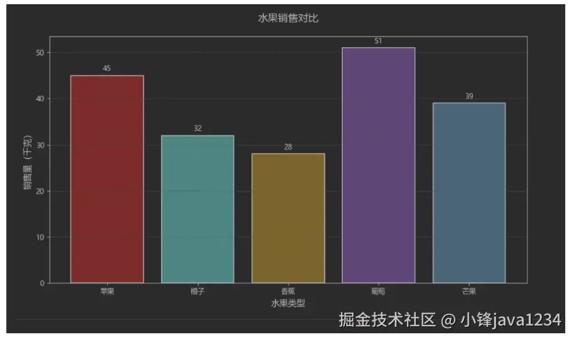
plt.show()运行效果:
我们再看一个水平条形图示例:
ini
import matplotlib
import matplotlib.pyplot as plt
# 设置matplotlib使用黑体显示中文
matplotlib.rcParams['font.family'] = 'Microsoft YaHei'
# 数据准备
categories = ['苹果', '橙子', '香蕉', '葡萄', '芒果']
sales = [45, 32, 28, 51, 39]
plt.figure(figsize=(10, 6))
# 绘制水平条形图
bars = plt.barh(
categories,
sales,
color='#5F9EA0',
height=0.7
)
# 添加数据标签
for bar in bars:
width = bar.get_width()
plt.text(width + 0.8,
bar.get_y() + bar.get_height() / 2,
f'{width}',
va='center',
fontsize=10)
plt.title('水果销售对比', fontsize=14)
plt.xlabel('销售量(千克)', fontsize=12)
plt.ylabel('水果类型', fontsize=12)
plt.grid(axis='x', linestyle='--', alpha=0.7)
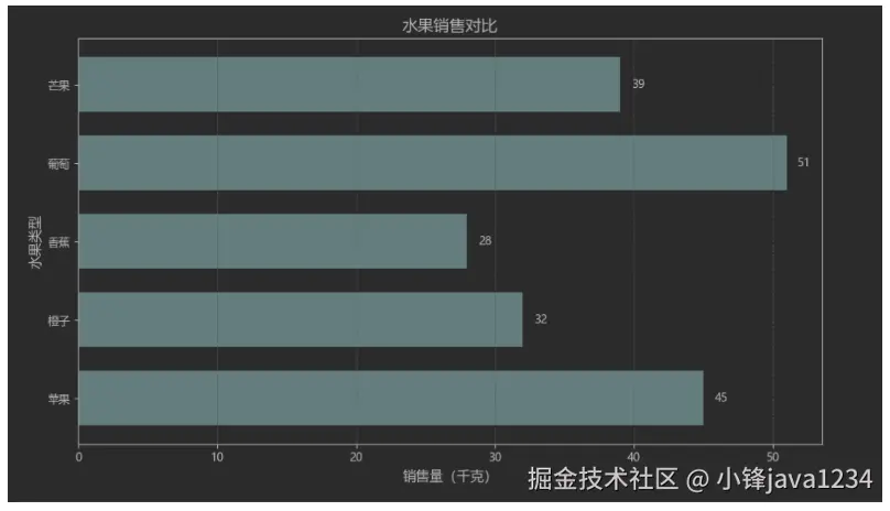
plt.tight_layout()
plt.show()运行效果: