如果你想在 Compose 中让你的进度条或者加载动画带上条纹效果:
来吧,各位 Compose 吴彦祖,跟我一起来看看如何实现这个效果吧!
颜色停止点
借助 Compose 的 Brush.linearGradient API,我们可以绘制带颜色渐变的图形。
而实现条纹效果的关键在于将颜色停止点(Color Stops)紧贴在一起,这样产生的就不再是平滑渐变,而是清晰的硬边缘。
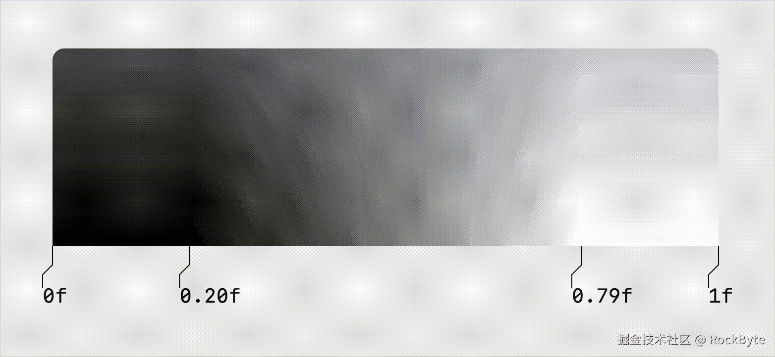
从这张示意图可以看到,中间两个停止点不断靠近,最终形成一条硬边。
在代码中实现这种硬边,只需将中间两个颜色停止点设在同一位置,并分别赋予不同的颜色:
Kotlin
Modifier.drawBehind {
drawRect(
brush = Brush.linearGradient(
0f to Color.Black,
.5f to Color.Black,
.5f to Color.White,
1f to Color.White,
)
)
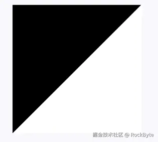
}0f to Color.Black 和 .5f to Color.Black 定义了前半段为黑色。
随后,.5f to Color.White 和 1f to Color.White 定义了后半段为白色。
在 .5f 处发生的颜色突变,正是形成条纹边界的原因。
效果如下:
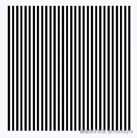
为什么这个条纹是斜的?
因为默认的
linearGradient的起点在左上角,终点在右下角,所以绘制出来是斜的。后续我们将通过主动设置start和end参数来纠正这个问题。
接下来,我们来看看如何自动定义每一条条纹的颜色停止点。
绘制条纹
目前我们得到的还只是黑白两个半区,并非重复出现的条纹。要真正画出条纹,需要让这些颜色在整个区域内重复排列:
Kotlin
Modifier.drawBehind {
    drawRect(
        brush = Brush.linearGradient(
            0f to Color.Black,
            .5f to Color.Black,
            .5f to Color.White,
            1f to Color.White,
            start = Offset(0f, 0f),
            end = Offset(20f, 0f),
            tileMode = TileMode.Repeated,
        )
    )
}
做法是通过设置 start 和 end 偏移来控制单次渐变的角度与尺寸,再将 tileMode 设为 TileMode.Repeated,图案就会重复铺满整个区域。
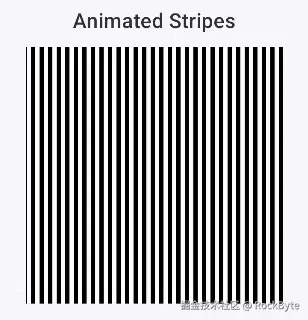
为条纹添加动画
既然已经能画出条纹,接下来看看怎么让它动起来。
方法很简单,只需对起点和终点做偏移即可。
Kotlin
start = animatedOffset + Offset(0f, 0f),
end = animatedOffset + Offset(20f, 0f),
这样,我们就可以通过动画改变 animatedOffset 的值,从而让条纹看起来在移动。
Kotlin
Column(horizontalAlignment = Alignment.CenterHorizontally) {
    Text(
        text = "Animated Stripes",
        style = MaterialTheme.typography.titleMedium,
        modifier = Modifier.padding(bottom = 8.dp)
    )
    val infiniteTransition = rememberInfiniteTransition(label = "stripe")
    val animatedOffset by infiniteTransition.animateFloat(
        initialValue = 0f,
        targetValue = 20f,
        animationSpec = infiniteRepeatable(
            animation = tween(
                durationMillis = 300,
                easing = LinearEasing,
            )
        ),
        label = "offset"
    )
    Box(
        modifier = Modifier
            .size(200.dp)
            .drawBehind {
                drawRect(
                    brush = Brush.linearGradient(
                        0f to Color.Black,
                        .5f to Color.Black,
                        .5f to Color.White,
                        1f to Color.White,
                        start = Offset(animatedOffset, 0f),
                        end = Offset(animatedOffset + 20f, 0f),
                        tileMode = TileMode.Repeated,
                    )
                )
            }
    )
}
辅助函数
到这里,我们已经掌握了用渐变创建和制作动画条纹的基础方法。
不过,一旦需要构建更复杂的图案,手动计算就会变得相当繁琐。
为了让这类设计的实现更简单,我们来写一个辅助函数。
Kotlin
fun Brush.Companion.stripes(
    vararg stripes: Pair<Color, Float>,
    width: Float = 20f,
    angle: Float = 45f,
    phase: Float = 0f,
): Brush {
    val totalWeight = stripes.sumOf {
        it.second.toDouble()
    }.toFloat()

    val colorStops = mutableListOf<Pair<Float, Color>>()
    var currentPosition = 0f

    stripes.forEach { (color, weight) ->
        val proportion = weight / totalWeight
        colorStops.add(currentPosition to color)
        currentPosition += proportion
        colorStops.add(currentPosition to color)
    }

    val angleInRadians = angle * (PI / 180)
    val endX = (width * cos(angleInRadians)).toFloat()
    val endY = (width * sin(angleInRadians)).toFloat()

    val phaseOffsetX = endX * phase
    val phaseOffsetY = endY * phase

    return linearGradient(
        colorStops = colorStops.toTypedArray(),
        start = Offset(-phaseOffsetX, -phaseOffsetY),
        end = Offset(endX - phaseOffsetX, endY - phaseOffsetY),
        tileMode = TileMode.Repeated,
    )
}
这个辅助函数首先要解决的核心问题就是颜色停止点,手动设置它们既容易出错,又非常繁琐。
如果颜色停止点只有 0、0.5 和 1,那还不算难。
但如果我们需要多种比例不同的颜色呢?手动处理需要精确的计算。与其如此,不如直接传入一个由"颜色-权重"键值对组成的列表。
权重决定了各条纹所占的比例。
如果所有权重都相同,那么所有条纹的宽度也都相同。
例如,一条条纹的权重是 2f,另一条是 1f,那么前者就会占据 2/3 的宽度空间。
Kotlin
// Equal stripes
Brush.stripes(
Pink400 to 1f,
Transparent to 1f,
)
// Pink twice as wide
Brush.stripes(
Pink400 to 2f,
Transparent to 1f,
)
// Multiple colors
Brush.stripes(
Red to 1f,
Blue to 2f,
Green to 1f,
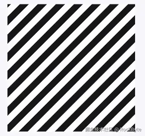
)接下来,我们不再直接计算 start 和 end 的偏移量,而是用宽度和角度来定义条纹的尺寸及方向:
width参数决定单次条纹图案的尺寸(宽度)。angle表示旋转角度,单位为度。0度代表水平,90度代表垂直,45度代表对角线方向。
最后是 phase,我们用它来控制图案的起始偏移量,这也是实现条纹动画的关键参数。
我们将通过它来驱动动画,而不是依赖之前的 animatedOffset。phase 与前面传入的 width 是成比例的,也就是说,phase 为 1f 时,正好对应一个完整图案的偏移长度。
有了这个辅助函数之后,就可以像下面这样创建动画条纹:
Kotlin
val phase by rememberInfiniteTransition(label = "phase")
    .animateFloat(
        initialValue = 0f,
        targetValue = 1f,
        animationSpec = infiniteRepeatable(
            animation = tween(
                durationMillis = 1000,
                easing = LinearEasing,
            )
        ),
        label = "phase"
    )
Box(
    modifier = Modifier
        .size(200.dp)
        .drawBehind {
            drawRect(
                brush = Brush.stripes(
                    Color.White to 1f,
                    Color(0xFF18181B) to 1f,
                    width = 60f,
                    angle = 45f,
                    phase = -phase
                )
            )
        }
)
你没看错,这就是一个生动的条纹动画!
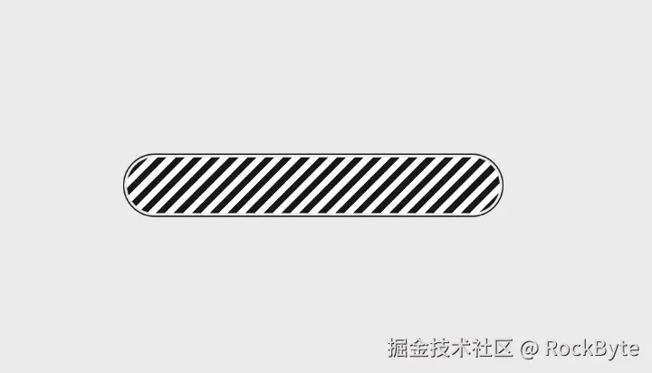
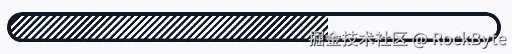
进度条
现在,我们来解决文章开头提到的需求,绘制一个美观的条纹进度条:
Kotlin
@Composable
fun AnimatedStripeProgressBar(
    modifier: Modifier = Modifier,
    progress: Float = 0f,
    height: Float = 24f,
    strokeWidth: Float = 3f,
    stripeColor: Color = Color(0xFF111827),
    bgColor: Color = Color.White,
    stripeWidth: Float = 12f,
    angle: Float = 45f,
    animationSpeed: Int = 300,
) {
    val phase by rememberInfiniteTransition(label = "progress_phase")
        .animateFloat(
            initialValue = 0f,
            targetValue = 1f,
            animationSpec = infiniteRepeatable(
                animation = tween(
                    durationMillis = animationSpeed,
                    easing = LinearEasing,
                )
            ),
            label = "progress_phase"
        )

    Box(
        modifier = modifier
            .clip(CircleShape)
            .border(
                width = strokeWidth.dp,
                color = stripeColor,
                shape = CircleShape
            )
            .height(height.dp)
            .fillMaxWidth()
            .drawBehind {
                val barWidth = size.width
                val filledWidth = barWidth * progress

                if (filledWidth > 0) {
                    drawRect(
                        brush = Brush.stripes(
                            stripeColor to 1f,
                            bgColor to 1f,
                            width = stripeWidth,
                            angle = angle,
                            phase = -phase
                        ),
                        size = Size(filledWidth, size.height)
                    )
                }
            }
    )
}
大部分代码一目了然。在 drawBehind 中,我们使用了刚刚编写的辅助函数 stripes。
使用起来也非常简单:
Kotlin
AnimatedStripeProgressBar(
    modifier = Modifier.padding(horizontal = 16.dp),
    progress = 0.65f
)
效果如下:
一点想法
通过巧妙利用 Brush.linearGradient 的颜色停止点(Color Stops)和 TileMode.Repeated,我们可以轻松在 Compose 中实现硬边缘的条纹效果。
在此基础上,通过封装辅助函数,不仅让多颜色、多宽度的条纹构建变得简单,还利用 phase 参数为实现流畅的条纹动画提供了便利。
这种基于底层绘制(Draw)的动画实现方式性能优秀,非常适合用来制作高频更新的自定义进度条或加载动画。