一、概述
- 总结进度条的使用的几种排版和样式风格,包括:拖动(空心或实心样式)、进度条粗细、进度条的排版...
二、完整代码实现
bash
Page({
	data: {
		// 可拖动进度条数据
		progress1: 30,
		progress2: 60,
		customColor: "#f28e16",

		// 听力维度进度条数据
		socialProgress: 45,
		emotionProgress: 30,
		noiseProgress: 20,

		// 30天康复计划进度条数据
		rehabTotalDays: 30,
		rehabCurrentDay: 12,
		rehabStage: "第2周 · 适应生活",
		get rehabPercent() {
			return Math.round((this.rehabCurrentDay / this.rehabTotalDays) * 100);
		}
	},

	// 拖动事件
	onProgress1Change(e) {
		this.setData({
			progress1: e.detail.value
		});
	},

	onProgress2Change(e) {
		this.setData({
			progress2: e.detail.value
		});
	}
})
bash
<view class="page-container">
	<!-- 30天康复计划进度条 -->
	<view class="rehab-plan-card">
		<view class="rehab-header">
			<text class="rehab-title">30天康复计划</text>
			<text class="rehab-stage">{{rehabStage}}</text>
		</view>
		<view class="rehab-progress-bar-bg">
			<view class="rehab-progress-bar-fill" style="width: {{rehabPercent}}%"></view>
		</view>
		<view class="rehab-footer">
			<text class="rehab-day">第{{rehabCurrentDay}} / {{rehabTotalDays}}天</text>
			<text class="rehab-percent">已完成 {{rehabPercent}}%</text>
		</view>
	</view>

	<!-- 听力维度粗进度条区域 -->
	<view class="static-progress-card">
		<text class="card-title">听力维度改善分析</text>

		<view class="static-progress-item">
			<text class="item-label">社交/环境适应</text>
			<view class="progress-row">
				<view class="progress-bar-bg">
					<view class="progress-bar-fill" style="width: {{socialProgress}}%"></view>
				</view>
				<text class="progress-percent">+{{socialProgress}}%</text>
			</view>
		</view>
		<view class="static-progress-item">
			<text class="item-label">情感/心理状态</text>
			<view class="progress-row">
				<view class="progress-bar-bg">
					<view class="progress-bar-fill" style="width: {{emotionProgress}}%"></view>
				</view>
				<text class="progress-percent">+{{emotionProgress}}%</text>
			</view>
		</view>
		<view class="static-progress-item">
			<text class="item-label">噪声环境下辨析</text>
			<view class="progress-row">
				<view class="progress-bar-bg">
					<view class="progress-bar-fill" style="width: {{noiseProgress}}%"></view>
				</view>
				<text class="progress-percent">+{{noiseProgress}}%</text>
			</view>
		</view>
	</view>

	<!-- 可拖动进度条卡片 -->
	<view class="slider-card">
		<view class="slider-item">
			<!-- 关键:标题和百分比在同一行,用flex左右对齐+垂直居中 -->
			<view class="slider-header">
				<text class="slider-label">基础进度条</text>
				<text class="slider-percent">当前进度:{{progress1}}%</text>
			</view>
			<slider value="{{progress1}}" bindchange="onProgress1Change" activeColor="#f28e16" backgroundColor="#e5e5e5" />
		</view>

		<view class="slider-item">
			<view class="slider-header">
				<text class="slider-label">自定义颜色进度条</text>
				<text class="slider-percent">当前进度:{{progress2}}%</text>
			</view>
			<slider value="{{progress2}}" bindchange="onProgress2Change" activeColor="{{customColor}}"
				backgroundColor="#f0f0f0" block-color="#f28e16" />
		</view>
	</view>
</view>
bash
/* index.wxss */
.page-container {
padding: 40rpx;
background-color: #f5f7fa;
min-height: 100vh;
}
/* ========== 30天康复计划进度条样式 ========== */
.rehab-plan-card {
background: #ffffff;
border-radius: 24rpx;
padding: 36rpx;
margin-bottom: 32rpx;
box-shadow: 0 4rpx 16rpx rgba(0, 0, 0, 0.04);
}
.rehab-header {
display: flex;
justify-content: space-between;
align-items: center;
margin-bottom: 24rpx;
}
.rehab-title {
font-size: 34rpx;
font-weight: 600;
color: #1f2937;
}
.rehab-stage {
font-size: 26rpx;
color: #6b7280;
}
.rehab-progress-bar-bg {
height: 16rpx;
background-color: #eef2ff;
border-radius: 8rpx;
overflow: hidden;
margin-bottom: 20rpx;
}
.rehab-progress-bar-fill {
height: 100%;
background-color: #1677ff;
border-radius: 8rpx;
transition: width 0.3s ease;
}
.rehab-footer {
display: flex;
justify-content: space-between;
align-items: center;
}
.rehab-day {
font-size: 26rpx;
color: #6b7280;
}
.rehab-percent {
font-size: 26rpx;
font-weight: 500;
color: #1677ff;
}
/* ========== 粗进度条卡片样式 ========== */
.static-progress-card {
background: #ffffff;
border-radius: 24rpx;
padding: 36rpx;
margin-bottom: 32rpx;
box-shadow: 0 4rpx 16rpx rgba(0, 0, 0, 0.04);
}
.card-title {
display: block;
font-size: 38rpx;
font-weight: 600;
color: #1f2937;
margin-bottom: 48rpx;
}
.static-progress-item {
margin-bottom: 48rpx;
}
.static-progress-item:last-child {
margin-bottom: 0;
}
.item-label {
display: block;
font-size: 30rpx;
color: #4b5563;
margin-bottom: 18rpx;
}
.progress-row {
display: flex;
align-items: center;
gap: 24rpx;
}
.progress-bar-bg {
flex: 1;
height: 20rpx;
background-color: #eef2ff;
border-radius: 10rpx;
overflow: hidden;
}
.progress-bar-fill {
height: 100%;
background-color: #1677ff;
border-radius: 10rpx;
transition: width 0.3s ease;
}
.progress-percent {
font-size: 30rpx;
font-weight: 500;
color: #1677ff;
white-space: nowrap;
}
/* 可拖动进度条样式 */
.slider-card {
background: #ffffff;
border-radius: 24rpx;
padding: 36rpx;
box-shadow: 0 4rpx 16rpx rgba(0, 0, 0, 0.04);
}
.slider-item {
margin-bottom: 60rpx;
}
.slider-item:last-child {
margin-bottom: 0;
}
/* 关键:flex布局实现左右文字完美对齐 */
.slider-header {
display: flex;
justify-content: space-between;
align-items: center; /* 垂直居中 */
margin-bottom: 20rpx;
}
.slider-label {
font-size: 30rpx;
color: #333;
line-height: 1;
}
.slider-percent {
font-size: 30rpx; /* 和标题字号一致,视觉上更统一 */
color: #333;
line-height: 1;
}
.slider-card slider {
width: 100%;
margin: 0;
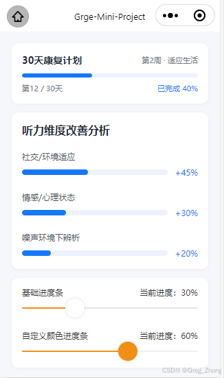
}三、总结
-
【30 天康复计划进度条】
优势:纯 CSS 双层 View + 数据绑定,实现简单、性能好的静态进度条,不依赖第三方组件
实现方式:通过style="width: {{rehabPercent}}%",把 JS 里计算好的百分比数值,动态绑定到上层填充条的宽度上,
-
【听力维度改善分析粗进度条】
基于1种的技术实现的基础上,额外加了 Flex 布局:用display: flex把进度条和右侧的 "+45%" 文字放在同一行,实现左右排列,纯静态展示、可以自由控制进度条的粗细、圆角、颜色,比原生组件更灵活,
-
【底部两个可拖动的滑块进度条】
优势:微信小程序官方提供的组件
实现方式:直接使用小程序官方提供的标签,无需手动写事件实现拖动和进度的计算