🧑💻 写在开头
点赞 + 收藏 === 学会🤣🤣🤣
背景
在做项目时,总会遇到UI给出渐变色的卡片或者按钮,但在做高亮的时候,由于没有过渡,显得尤为生硬。
过去的解决方案
在过去,我们如果要实现渐变色的过渡,通常会使用如下几种方法:
添加遮罩层,通过改变遮罩层的透明度做出淡入淡出的效果,实现过渡。
通过background-size/position使得渐变色移动,实现渐变色移动的效果。
通过filter: hue-rotate滤镜实现色相旋转,实现过渡。
但这几种方式都有各自的局限性:
遮罩层的方式看似平滑,但不是真正的过渡,差点意思。
background-size/position的方式需要计算好background-size和background-position,否则会出现渐变不完整的情况。并且只是实现了渐变的移动,而不是过渡。
filter: hue-rotate也需要计算好旋转角度,实现复杂度高,过渡的也不自然。
<div class="container">
  <div class="box1"></div>
  <div class="box2"></div>
  <div class="box3"></div>
</div>

.container {
  display: flex;
  align-items: center;
}

div {
  border-radius: 12px;
}

div + div {
  margin-left: 8px;
}

.box1 {
  position: relative;
  width: 300px;
  height: 200px;
  background: linear-gradient(45deg, #ff6b6b, #4ecdc4);
  overflow: hidden;
}
.box1::before {
  content: '';
  position: absolute;
  inset: 0;
  background: linear-gradient(45deg, #36fd72, #5f1ae0);
  opacity: 0;
  transition: opacity .8s;
}
.box1:hover::before {
  opacity: 1;
}

.box2 {
  width: 300px;
  height: 200px;
  background: linear-gradient(90deg, #ff6b6b, #4ecdc4, #23b9f5);
  background-size: 200% 100%;
  transition: background-position .8s;
}
.box2:hover {
  background-position: 100% 0;
}

.box3 {
  width: 300px;
  height: 200px;
  position: relative;
  overflow: hidden;
}
.box3::before {
  content: '';
  position: absolute;
  inset: -50%;
  background: linear-gradient(45deg, #ff6b6b, #4ecdc4);
  transition: filter .8s;
}
.box3:hover::before {
  filter: hue-rotate(320deg);
}
@property新规则
@property规则可以定义一个自定义属性,并且可以指定该属性的语法、是否继承、初始值等。
@property --color {
  syntax: '<color>';
  inherits: false;
  initial-value: #000000;
}
我们只需要把这个自定义属性--color应用到linear-gradient中,在特定的时候改变它的值,非常轻松就可以实现渐变色的过渡了。
<div class="box"></div>

@property --angle {
  syntax: '<angle>';
  inherits: false;
  initial-value: 94.57deg;
}
@property --start-color {
  syntax: '<color>';
  inherits: false;
  initial-value: #e0f2ff;
}
@property --start-percentage {
  syntax: '<percentage>';
  inherits: false;
  initial-value: 7.66%;
}
@property --end-color {
  syntax: '<color>';
  inherits: false;
  initial-value: #b1deff;
}
@property --end-percentage {
  syntax: '<percentage>';
  inherits: false;
  initial-value: 94.53%;
}

.box {
  width: 300px;
  height: 200px;
  background: linear-gradient(
    var(--angle),
    var(--start-color) var(--start-percentage),
    var(--end-color) var(--end-percentage)
  );
  border-radius: 12px;
  transition: --angle .8s, --start-color .8s, --start-percentage .8s, --end-color .8s, --end-percentage .8s;
}
.box:hover {
  --angle: 143.85deg;
  --start-color: #ffc510;
  --start-percentage: 14.66%;
  --end-color: #f44433;
  --end-percentage: 85.95%;
}
我们再看看@property规则中这些属性的含义。
Syntax语法描述符
Syntax用于描述自定义属性的数据类型,必填项,常见值包括:
数字(如0,1,2.5)
百分比(如0%,50%,100%)
长度单位(如px,em,rem)
颜色值
角度值(如deg,rad)
时间值(如s,ms)
图片
<*> 任意类型
Inherits继承描述符
Inherits用于描述自定义属性是否从父元素继承值,必填项:
true 从父元素继承值
false 不继承,每个元素独立
Initial-value初始值描述符
Initial-value用于描述自定义属性的初始值,在Syntax为通用时为可选。
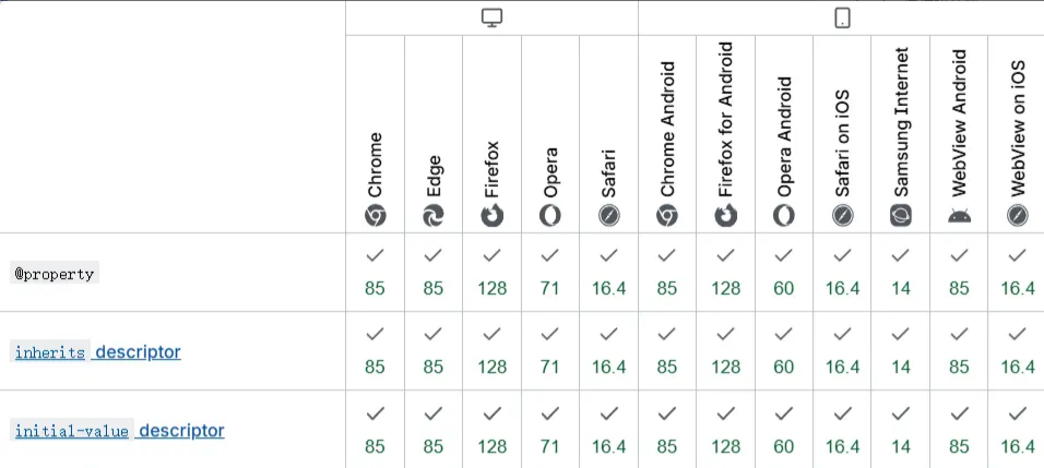
兼容性
@property目前仍是实验性规则,但主流浏览器较新版本都已支持。
总结与展望
@property规则的出现,标志着CSS在动态样式控制方面迈出了重要一步。它不仅解决了渐变色过渡的技术难题,更为未来的CSS动画和交互设计开辟了新的可能性。 随着浏览器支持的不断完善,我们可以期待:
更丰富的动画效果
更简洁的代码实现
更好的性能表现
如果对您有所帮助,欢迎您点个关注,我会定时更新技术文档,大家一起讨论学习,一起进步。