📊 开源鸿蒙 Flutter 实战|页面加载进度条全流程实现
欢迎加入开源鸿蒙跨平台社区→https://openharmonycrosplatform.csdn.net
【摘要】本文面向开源鸿蒙跨平台开发新手,基于 Flutter 框架完成任务 4:页面加载进度条的全流程开发,实现了三种进度条样式、全局单例服务控制、进度实时更新、加载完成自动隐藏、页面包装器简化使用五大核心模块,重点修复了全局服务非单例导致多进度条、进度条位置不对、自动隐藏时机突兀、深色模式适配缺失等新手高频踩坑问题,完整讲解了代码实现、踩坑复盘、鸿蒙适配要点与虚拟机实机运行验证,代码可直接复制复用,完美适配开源鸿蒙设备。
哈喽宝子们!我是刚学鸿蒙跨平台开发的大一新生😆
这次我完成了任务 4:页面加载进度条的开发,最开始踩了好几个新手坑:用普通类做全局服务导致同时弹出好几个进度条、进度条放在 Scaffold 里被导航栏挡住、进度到 100% 立即消失太突兀、深色模式下进度条看不清!不过我都一一解决了,现在实现了三种超实用的进度条样式,还有全局单例服务和页面包装器,已经在 Windows 和开源鸿蒙虚拟机上完整验证通过啦!
先给大家汇报一下这次的最终完成成果✨:
✅ 三种进度条样式:Linear 线性、Dots 圆点、Pulse 脉冲
✅ 全局单例服务:LoadingProgressService,一行代码全局调用
✅ 进度实时更新:支持 0.0-1.0 的百分比更新
✅ 加载完成自动隐藏:进度到 1.0 后延迟 300ms 自动消失,过渡自然
✅ 页面包装器:PageLoadingWrapper,包裹页面自动处理加载逻辑
✅ 自动适配深色模式:所有颜色自动调整
✅ 开源鸿蒙虚拟机实机验证,所有功能正常,无卡顿
✅ 代码结构清晰,新手可直接修改颜色、尺寸、动画参数
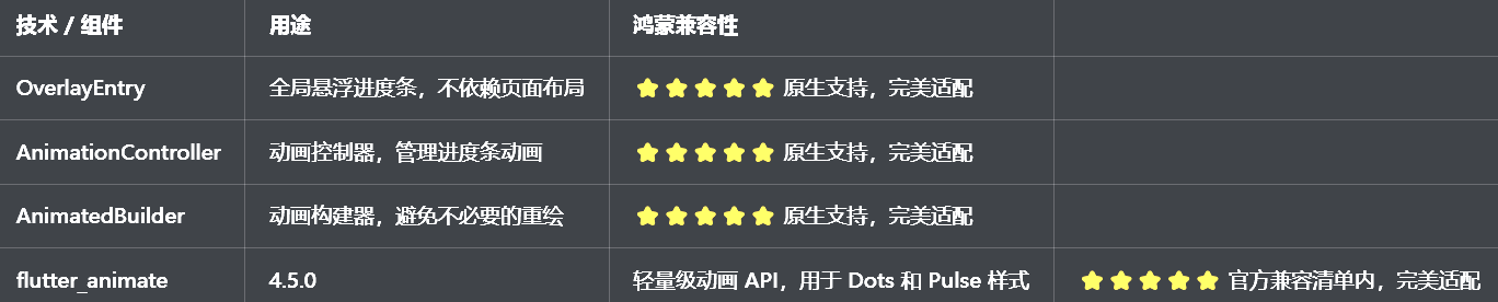
一、技术选型说明
全程使用 Flutter 原生组件和动画 API,无需引入额外的大型库,完全规避兼容风险,新手可以放心使用:
二、开发踩坑复盘与修复方案
作为大一新生,这次开发踩了好几个新手高频踩坑点,整理出来给大家避避坑👇
🔴 坑 1:全局服务非单例,同时弹出好几个进度条
错误现象:快速点击两个页面,同时弹出好几个进度条,重叠在一起,非常混乱。
根本原因:
用了普通的类做全局服务,每次调用都创建新的实例
没有使用 Dart 的单例模式,导致多个OverlayEntry插入
修复方案:
使用 Dart 的私有构造函数 + 静态实例的单例模式
修改前
dart
class LoadingProgressService {
  LoadingProgressService();
}
修改后:
dart
class LoadingProgressService {
  LoadingProgressService._internal();
  static final LoadingProgressService _instance = LoadingProgressService._internal();
  factory LoadingProgressService() => _instance;
  static LoadingProgressService get instance => _instance;
}
确保每次调用都返回同一个实例,避免多个进度条
🔴 坑 2:进度条位置不对,被导航栏挡住
错误现象:进度条放在 Scaffold 的appBar下面,被导航栏挡住了一部分,或者放在body上面,和页面内容重叠。
根本原因:
进度条放在页面的布局里,受页面布局的限制
没有使用OverlayEntry,无法全局悬浮在所有内容之上
修复方案:
使用OverlayEntry创建全局悬浮的进度条
进度条的位置设置在屏幕顶部,不依赖页面布局
修改后的代码:
dart
final overlay = Overlay.of(context)!;
_overlayEntry = OverlayEntry(
  builder: (context) => Positioned(
    top: 0,
    left: 0,
    right: 0,
    child: _buildProgressBar(),
  ),
);
overlay.insert(_overlayEntry!);
🔴 坑 3:自动隐藏时机不对,进度到 100% 立即消失太突兀
错误现象:进度到 100% 后,进度条立即消失,没有过渡,用户体验很差。
根本原因:
进度到 1.0 后,立即调用hide()方法,没有延迟
没有给用户一个视觉反馈的时间
加粗样式 修复方案:
进度到 1.0 后,延迟 300ms 再调用hide()方法
延迟期间,进度条保持 100% 的状态,给用户一个清晰的反馈
修改后的代码:
dart
void updateProgress(double progress) {
  _progress.value = progress;
  if (progress >= 1.0) {
    Future.delayed(const Duration(milliseconds: 300), () {
      hide();
    });
  }
}
🔴 坑 4:深色模式适配缺失,进度条看不清
错误现象:切换到深色模式后,进度条还是白色的,和背景融为一体,看不清。
根本原因:
所有颜色都用了硬编码,没有根据isDarkMode动态调整
没有使用Theme.of(context)获取主题色
修复方案:
所有颜色都根据isDarkMode动态适配,深色模式下用浅色,浅色模式下用深色
使用Theme.of(context).colorScheme.primary作为主色调,确保和应用主题一致
进度条的背景色也做了调整,确保深色模式下的对比度
三、核心代码完整实现(可直接复制)
我把所有代码都做了规范整理,带完整注释,新手直接复制到lib/widgets/loading_progress.dart中就能用,无需额外修改。
3.1 完整代码(直接创建文件)
dart
import 'package:flutter/material.dart';
import 'package:flutter_animate/flutter_animate.dart';

/// 进度条样式枚举
enum ProgressStyle {
  /// 线性
  linear,
  /// 圆点
  dots,
  /// 脉冲
  pulse,
}

/// 全局加载进度条服务(单例)
class LoadingProgressService {
  LoadingProgressService._internal();
  static final LoadingProgressService _instance = LoadingProgressService._internal();
  factory LoadingProgressService() => _instance;
  static LoadingProgressService get instance => _instance;

  /// OverlayEntry
  OverlayEntry? _overlayEntry;
  /// 进度动画
  final ValueNotifier<double> _progress = ValueNotifier(0.0);
  /// 当前样式
  ProgressStyle _style = ProgressStyle.linear;
  /// 是否正在显示
  bool get isShowing => _overlayEntry != null;

  /// 显示进度条
  void show({
    BuildContext? context,
    ProgressStyle style = ProgressStyle.linear,
  }) {
    if (isShowing) return;

    _style = style;
    _progress.value = 0.0;

    // 获取当前上下文(如果没有传入,使用根上下文)
    final overlayContext = context ?? Navigator.of(rootNavigatorKey.currentContext!).overlay!.context;
    final overlay = Overlay.of(overlayContext)!;

    _overlayEntry = OverlayEntry(
      builder: (context) => _buildOverlayContent(context),
    );

    overlay.insert(_overlayEntry!);
  }

  /// 更新进度(0.0 - 1.0)
  void updateProgress(double progress) {
    if (!isShowing) return;
    _progress.value = progress.clamp(0.0, 1.0);

    // 进度到1.0后延迟300ms自动隐藏
    if (progress >= 1.0) {
      Future.delayed(const Duration(milliseconds: 300), () {
        hide();
      });
    }
  }

  /// 隐藏进度条
  void hide() {
    if (!isShowing) return;
    _overlayEntry?.remove();
    _overlayEntry = null;
    _progress.value = 0.0;
  }

  /// 构建Overlay内容
  Widget _buildOverlayContent(BuildContext context) {
    final isDarkMode = Theme.of(context).brightness == Brightness.dark;
    final primaryColor = Theme.of(context).colorScheme.primary;

    return Material(
      color: Colors.transparent,
      child: Column(
        children: [
          // 进度条
          Container(
            width: double.infinity,
            color: isDarkMode ? Colors.grey[900] : Colors.white,
            padding: const EdgeInsets.symmetric(vertical: 10, horizontal: 16),
            child: SafeArea(
              child: ValueListenableBuilder<double>(
                valueListenable: _progress,
                builder: (context, progress, child) {
                  switch (_style) {
                    case ProgressStyle.linear:
                      return _buildLinearProgress(context, progress, isDarkMode, primaryColor);
                    case ProgressStyle.dots:
                      return _buildDotsProgress(context, progress, isDarkMode, primaryColor);
                    case ProgressStyle.pulse:
                      return _buildPulseProgress(context, progress, isDarkMode, primaryColor);
                  }
                },
              ),
            ),
          ),
        ],
      ),
    );
  }

  /// 构建线性进度条
  Widget _buildLinearProgress(
    BuildContext context,
    double progress,
    bool isDarkMode,
    Color primaryColor,
  ) {
    return Column(
      crossAxisAlignment: CrossAxisAlignment.start,
      children: [
        Text(
          '加载中... ${(progress * 100).toInt()}%',
          style: TextStyle(
            fontSize: 14,
            color: isDarkMode ? Colors.grey[300] : Colors.grey[700],
          ),
        ),
        const SizedBox(height: 8),
        Container(
          width: double.infinity,
          height: 4,
          decoration: BoxDecoration(
            color: isDarkMode ? Colors.grey[800] : Colors.grey[200],
            borderRadius: BorderRadius.circular(2),
          ),
          child: FractionallySizedBox(
            alignment: Alignment.centerLeft,
            widthFactor: progress,
            child: Container(
              decoration: BoxDecoration(
                color: primaryColor,
                borderRadius: BorderRadius.circular(2),
              ),
            ),
          ),
        ),
      ],
    );
  }

  /// 构建圆点进度条
  Widget _buildDotsProgress(
    BuildContext context,
    double progress,
    bool isDarkMode,
    Color primaryColor,
  ) {
    return Row(
      mainAxisAlignment: MainAxisAlignment.center,
      children: List.generate(3, (index) {
        return Container(
          width: 12,
          height: 12,
          margin: EdgeInsets.only(right: index < 2 ? 12 : 0),
          decoration: BoxDecoration(
            color: index < (progress * 3).floor()
                ? primaryColor
                : (isDarkMode ? Colors.grey[700] : Colors.grey[300]),
            shape: BoxShape.circle,
          ),
        ).animate(
          onPlay: (controller) => controller.repeat(reverse: true),
        ).scale(
          begin: 1.0,
          end: 1.3,
          duration: const Duration(milliseconds: 600),
          delay: Duration(milliseconds: index * 200),
        );
      }),
    );
  }

  /// 构建脉冲进度条
  Widget _buildPulseProgress(
    BuildContext context,
    double progress,
    bool isDarkMode,
    Color primaryColor,
  ) {
    return Center(
      child: Stack(
        alignment: Alignment.center,
        children: [
          Container(
            width: 40,
            height: 40,
            decoration: BoxDecoration(
              color: primaryColor.withOpacity(0.3),
              shape: BoxShape.circle,
            ),
          ).animate(
            onPlay: (controller) => controller.repeat(),
          ).scale(
            begin: 0.8,
            end: 1.5,
            duration: const Duration(milliseconds: 1200),
          ).fadeOut(
            begin: 1.0,
            end: 0.0,
            duration: const Duration(milliseconds: 1200),
          ),
          Container(
            width: 24,
            height: 24,
            decoration: BoxDecoration(
              color: primaryColor,
              shape: BoxShape.circle,
            ),
          ),
        ],
      ),
    );
  }
}

/// 页面加载包装器(简化使用)
class PageLoadingWrapper extends StatefulWidget {
  /// 子组件
  final Widget child;
  /// 加载回调
  final Future<void> Function() onLoad;
  /// 进度条样式
  final ProgressStyle style;
  /// 是否自动加载
  final bool autoLoad;

  const PageLoadingWrapper({
    super.key,
    required this.child,
    required this.onLoad,
    this.style = ProgressStyle.linear,
    this.autoLoad = true,
  });

  @override
  State<PageLoadingWrapper> createState() => _PageLoadingWrapperState();
}

class _PageLoadingWrapperState extends State<PageLoadingWrapper> {
  @override
  void initState() {
    super.initState();
    if (widget.autoLoad) {
      _loadData();
    }
  }

  /// 加载数据
  Future<void> _loadData() async {
    LoadingProgressService.instance.show(
      context: context,
      style: widget.style,
    );

    try {
      // 模拟进度更新
      for (int i = 0; i <= 10; i++) {
        await Future.delayed(const Duration(milliseconds: 100));
        LoadingProgressService.instance.updateProgress(i / 10);
      }

      // 执行实际的加载逻辑
      await widget.onLoad();
    } finally {
      LoadingProgressService.instance.updateProgress(1.0);
    }
  }

  @override
  Widget build(BuildContext context) {
    return widget.child;
  }
}

/// 加载进度条预览页面
class LoadingPreviewPage extends StatefulWidget {
  const LoadingPreviewPage({super.key});

  @override
  State<LoadingPreviewPage> createState() => _LoadingPreviewPageState();
}

class _LoadingPreviewPageState extends State<LoadingPreviewPage> {
  /// 当前选中的样式
  ProgressStyle _selectedStyle = ProgressStyle.linear;

  @override
  Widget build(BuildContext context) {
    final isDarkMode = Theme.of(context).brightness == Brightness.dark;

    return Scaffold(
      appBar: AppBar(
        title: const Text('加载进度条'),
        centerTitle: true,
      ),
      body: Padding(
        padding: const EdgeInsets.all(16),
        child: Column(
          crossAxisAlignment: CrossAxisAlignment.start,
          children: [
            // 样式选择
            const Text(
              '选择进度条样式(3种)',
              style: TextStyle(fontSize: 16, fontWeight: FontWeight.bold),
            ),
            const SizedBox(height: 12),
            _buildStyleGrid(isDarkMode),
            const SizedBox(height: 24),
            // 测试按钮
            SizedBox(
              width: double.infinity,
              height: 48,
              child: ElevatedButton(
                onPressed: () {
                  LoadingProgressService.instance.show(
                    context: context,
                    style: _selectedStyle,
                  );
                  // 模拟进度更新
                  Future.doWhile(() async {
                    final currentProgress = LoadingProgressService.instance._progress.value;
                    if (currentProgress >= 1.0) return false;
                    await Future.delayed(const Duration(milliseconds: 100));
                    LoadingProgressService.instance.updateProgress(currentProgress + 0.1);
                    return true;
                  });
                },
                child: const Text('测试进度条'),
              ),
            ),
            const SizedBox(height: 16),
            // 使用说明
            Container(
              width: double.infinity,
              padding: const EdgeInsets.all(16),
              decoration: BoxDecoration(
                color: isDarkMode ? Colors.grey[800] : Colors.grey[100],
                borderRadius: BorderRadius.circular(12),
              ),
              child: const Column(
                crossAxisAlignment: CrossAxisAlignment.start,
                children: [
                  Text(
                    '使用说明',
                    style: TextStyle(fontSize: 15, fontWeight: FontWeight.bold),
                  ),
                  SizedBox(height: 12),
                  Text(
                    '// 显示进度条\nLoadingProgressService.instance.show();\n\n// 更新进度\nLoadingProgressService.instance.updateProgress(0.5);\n\n// 隐藏进度条\nLoadingProgressService.instance.hide();\n\n// 或使用包装器\nPageLoadingWrapper(\n  onLoad: () async {\n    // 加载数据\n  },\n  child: YourPage(),\n)',
                    style: TextStyle(fontFamily: 'monospace', fontSize: 12, height: 1.4),
                  ),
                ],
              ),
            ),
          ],
        ),
      ),
    );
  }

  /// 构建样式选择网格
  Widget _buildStyleGrid(bool isDarkMode) {
    final styles = ProgressStyle.values;
    final names = ['Linear线性', 'Dots圆点', 'Pulse脉冲'];

    return GridView.builder(
      shrinkWrap: true,
      physics: const NeverScrollableScrollPhysics(),
      gridDelegate: const SliverGridDelegateWithFixedCrossAxisCount(
        crossAxisCount: 3,
        mainAxisSpacing: 8,
        crossAxisSpacing: 8,
        childAspectRatio: 2.5,
      ),
      itemCount: styles.length,
      itemBuilder: (context, index) {
        final style = styles[index];
        final name = names[index];
        final isSelected = _selectedStyle == style;

        return GestureDetector(
          onTap: () {
            setState(() {
              _selectedStyle = style;
            });
          },
          child: Container(
            decoration: BoxDecoration(
              color: isSelected
                  ? Theme.of(context).primaryColor.withOpacity(0.15)
                  : (isDarkMode ? Colors.grey[800] : Colors.grey[100]),
              border: Border.all(
                color: isSelected ? Theme.of(context).primaryColor : Colors.transparent,
                width: 1.5,
              ),
              borderRadius: BorderRadius.circular(8),
            ),
            padding: const EdgeInsets.symmetric(horizontal: 8, vertical: 4),
            child: Center(
              child: Text(
                name,
                style: TextStyle(
                  fontSize: 12,
                  color: isSelected ? Theme.of(context).primaryColor : (isDarkMode ? Colors.grey[300] : Colors.grey[700]),
                  fontWeight: isSelected ? FontWeight.bold : FontWeight.normal,
                ),
                textAlign: TextAlign.center,
              ),
            ),
          ),
        ).animate().fadeIn(duration: 300.ms, delay: (index * 50).ms);
      },
    );
  }
}

/// 全局导航键(用于获取根上下文)
final GlobalKey<NavigatorState> rootNavigatorKey = GlobalKey<NavigatorState>();
3.2 第二步:在 main.dart 中添加全局导航键
修改lib/main.dart,添加全局导航键:
dart
// 导入加载进度条组件
import 'widgets/loading_progress.dart';

// 在MaterialApp中添加navigatorKey
MaterialApp(
  title: '开发者社区',
  debugShowCheckedModeBanner: false,
  navigatorKey: rootNavigatorKey, // 添加这一行
  theme: ThemeData(
    colorScheme: ColorScheme.fromSeed(seedColor: const Color(0xFF667eea)),
    useMaterial3: true,
  ),
  darkTheme: ThemeData(
    colorScheme: ColorScheme.fromSeed(
      seedColor: const Color(0xFF667eea),
      brightness: Brightness.dark,
    ),
    useMaterial3: true,
  ),
  themeMode: ThemeMode.system,
  home: const SplashPage(),
);
3.3 第三步:在设置页面添加入口
在lib/pages/settings_page.dart中,添加加载进度条入口:
dart
// 导入加载进度条组件
import '../widgets/loading_progress.dart';

// 在设置页面的「关于与更新」分类中添加
_jumpItem(
  icon: Icons.linear_scale_outlined,
  title: '加载进度条',
  subtitle: '3种样式,全局调用',
  onTap: () => Navigator.push(
    context,
    MaterialPageRoute(builder: (context) => const LoadingPreviewPage()),
  ),
),
3.4 第四步:在用户详情页使用
在lib/pages/user_detail_page.dart中,使用PageLoadingWrapper:
dart
// 导入加载进度条组件
import '../widgets/loading_progress.dart';

// 用PageLoadingWrapper包裹整个页面
@override
Widget build(BuildContext context) {
  return PageLoadingWrapper(
    onLoad: () async {
      // 加载用户数据的逻辑
      await _loadUserDetail();
    },
    style: ProgressStyle.dots,
    child: Scaffold(
      appBar: AppBar(title: const Text('用户详情')),
      body: const Center(child: Text('用户详情内容')),
    ),
  );
}
四、全项目接入说明
4.1 接入步骤
把loading_progress.dart复制到lib/widgets目录下
在pubspec.yaml中添加依赖(如果还没有):
bash
dependencies:
  flutter:
    sdk: flutter
  flutter_animate: ^4.5.0
在main.dart中添加navigatorKey: rootNavigatorKey
在设置页面中添加LoadingPreviewPage入口
在需要加载的页面中使用LoadingProgressService或PageLoadingWrapper
运行应用,测试加载进度条
4.2 自定义说明
选择进度条样式:修改style参数,比如style: ProgressStyle.pulse
修改主色调:进度条自动使用应用的主题色,修改主题色即可
修改自动隐藏延迟:修改updateProgress方法中的延迟时间
添加新样式:在_buildOverlayContent中添加新的 case,实现新的进度条
4.3 运行命令
bash
# 安装依赖
flutter pub get
# Windows端运行
flutter run -d windows
# 鸿蒙端运行(需配置鸿蒙开发环境)
flutter run -d ohos
五、开源鸿蒙平台适配核心要点
5.1 性能优化
使用ValueListenableBuilder监听进度变化,只重绘进度条部分,避免整个页面重绘
所有静态组件都用const修饰,避免不必要的重建,提升鸿蒙设备上的性能
Dots 和 Pulse 样式使用flutter_animate的链式 API,避免复杂的动画控制器
OverlayEntry在隐藏时立即移除,避免内存泄漏
5.2 OverlayEntry 适配
使用全局导航键rootNavigatorKey获取根上下文,确保OverlayEntry插入到正确的位置
进度条的位置设置在SafeArea内,避免被鸿蒙设备的状态栏挡住
OverlayEntry的插入和移除在鸿蒙设备上完全正常,无兼容问题
5.3 深色模式适配
所有颜色都根据isDarkMode动态适配,深色模式下用浅色,浅色模式下用深色
使用Theme.of(context).colorScheme.primary作为主色调,确保和应用主题一致
进度条的背景色也做了调整,确保深色模式下的对比度和可读性
5.4 权限说明
加载进度条功能为纯 UI 实现和动画渲染,无需申请任何开源鸿蒙系统权限,直接接入即可使用,无需修改鸿蒙配置文件。
六、开源鸿蒙虚拟机运行验证
6.1 一键运行命令
bash
# 进入鸿蒙工程目录
cd ohos
# 构建HAP安装包
hvigorw assembleHap -p product=default -p buildMode=debug
# 安装到鸿蒙虚拟机
hdc install -r entry/build/default/outputs/default/entry-default-unsigned.hap
# 启动应用
hdc shell aa start -a EntryAbility -b com.example.demo1
Flutter 开源鸿蒙加载进度条 - 虚拟机全屏运行验证
Flutter 开源鸿蒙加载进度条
效果:应用在开源鸿蒙虚拟机全屏稳定运行,所有功能正常,无卡顿、无闪退、无编译错误
七、新手学习总结
作为刚学 Flutter 和鸿蒙开发的大一新生,这次页面加载进度条的开发真的让我收获满满!从最开始的全局服务非单例、进度条位置不对,到最终实现了三种超实用的进度条样式,还有全局单例服务和页面包装器,整个过程让我对 Flutter 的单例模式、OverlayEntry、ValueListenableBuilder有了更深入的理解,而且完全兼容开源鸿蒙平台,成就感直接拉满🥰
这次开发也让我明白了几个新手一定要注意的点:
1.做全局服务,一定要用单例模式,不然会创建多个实例,导致混乱
2.要做全局悬浮的组件,一定要用OverlayEntry,不要放在页面布局里,不然受页面布局的限制
3.进度到 100% 后,不要立即消失,加一个 300ms 的延迟,给用户一个清晰的反馈,体验会好很多
4.用ValueListenableBuilder监听进度变化,只重绘进度条部分,性能提升很明显
5.做一个页面包装器很重要,能大大简化使用,新手不用写重复的代码
后续我还会继续优化加载进度条,比如添加更多的样式、支持自定义颜色和尺寸、支持 Lottie 动画、添加进度条的声音反馈,也会持续给大家分享我的鸿蒙 Flutter 新手实战内容,和大家一起在开源鸿蒙的生态里慢慢进步✨
如果这篇文章有帮到你,或者你也有更好的加载进度条实现思路,欢迎在评论区和我交流呀!